Overview
Light of Dawn Academy is a global skill development platform committed to nurturing individuals through essential life and career-focused programs — including soft skills training, personal growth, and interview preparation. Their mission is to guide students and professionals toward greater confidence and career success. The client approached us to design a logo that embodies education, trust, and achievement while remaining aspirational and professional in its tone.
Objective
To create a logo that visually communicates Light of Dawn Academy’s mission and values by:
Representing trust, growth, and achievement through symbolic design
Incorporating universal educational elements that connect with students and professionals
Creating a logo that looks credible across both digital and academic use
Reflecting a balance of modernity, professionalism, and inspiration
Our Approach
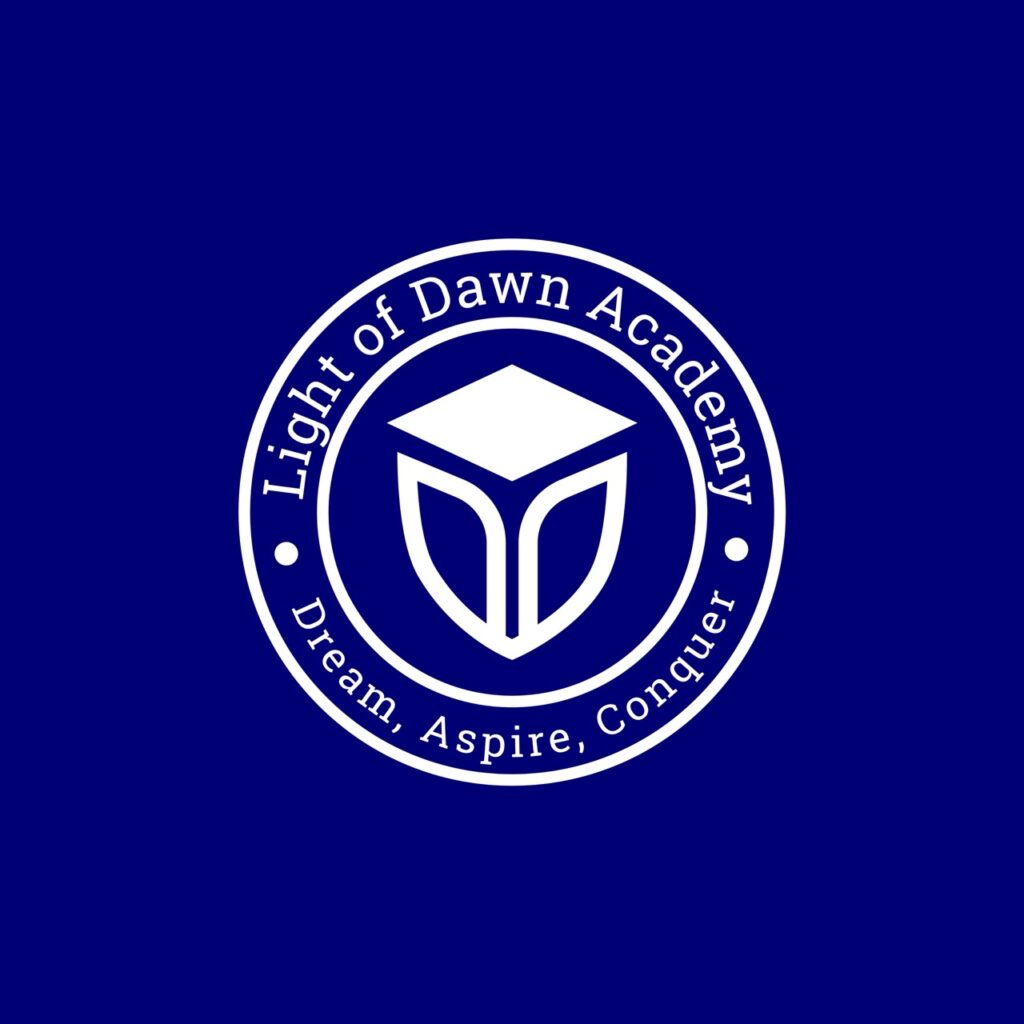
We developed a refined, meaningful logo that blends education, protection, and aspiration into a single mark.
Designed a shield outline to symbolize protection, resilience, and the academy’s promise to equip learners for the real world
Integrated a book icon inside the shield to represent foundational learning and personal development
Placed a graduation cap at the top of the shield as a universal symbol of academic achievement and goal fulfillment
Chose a blue and white color palette — blue for trust and intelligence, white for clarity and openness
Paired the symbol with a clean, professional font that reinforces credibility and approachability
Our Process
Understanding the Mission Behind the Name
We began with a collaborative discovery session to uncover the essence of Light of Dawn Academy. This phase focused on aligning the logo with the institution’s core values: growth, protection, achievement, and inspiration.
Key activities included:
Studying the academy’s programs in soft skills and personal development
Identifying the target audience: students, professionals, and career seekers
Gathering references and emotional cues tied to learning, mentorship, and progression
This insight helped shape a concept that would be timeless, professional, and emotionally resonant.
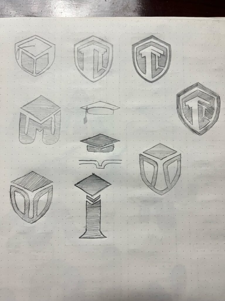
Turning Values Into Visual Symbols
With the brand’s mission clearly defined, we explored multiple concepts that could visually communicate trust, knowledge, and aspiration. Our goal was to build a logo that felt both academic and inspiring, appealing to a global learning audience.
Core directions explored:
Shield for resilience and structured support
Book for foundational learning and knowledge
Graduation cap for success, progress, and personal achievement
Each element was chosen to reinforce the academy’s promise: preparing learners for life and career.
Building a Balanced, Meaningful Mark
We brought the concept to life by carefully blending each symbol into a single unified mark. The shield, book, and cap were layered to feel purposeful, balanced, and easy to recognize.
Design decisions included:
A minimal yet strong shield outline to represent safety and preparation
A centered book icon to symbolize learning and clarity
A cap placed at the top, reinforcing growth and upward achievement
Clean line work for modernity, with proportions that ensure clarity even at small sizes
The result is a logo that instantly communicates a clear message of education and empowerment.
Crafting a Professional Brand Presence
Typography and color were carefully selected to maintain the credibility and warmth the brand needed. We used a sans-serif font for legibility and professionalism, paired with a calming color scheme.
Visual system elements:
A blue primary color symbolizing trust, wisdom, and intelligence
White as the secondary color for clarity and openness
A professional typeface that balances formality and approachability
Layouts optimized for vertical and horizontal usage
Together, these elements form a brand presence that feels aspirational yet grounded.
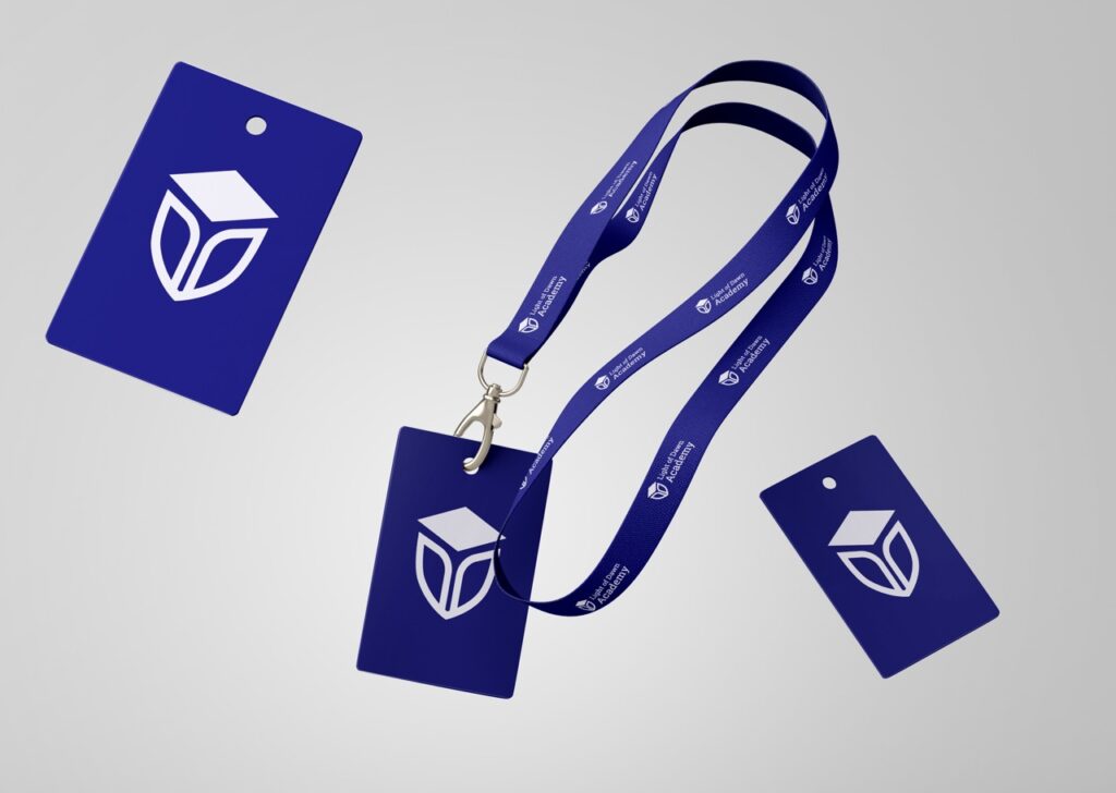
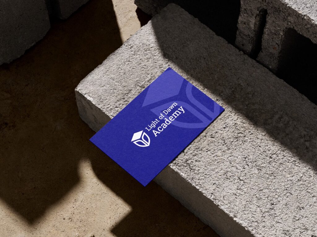
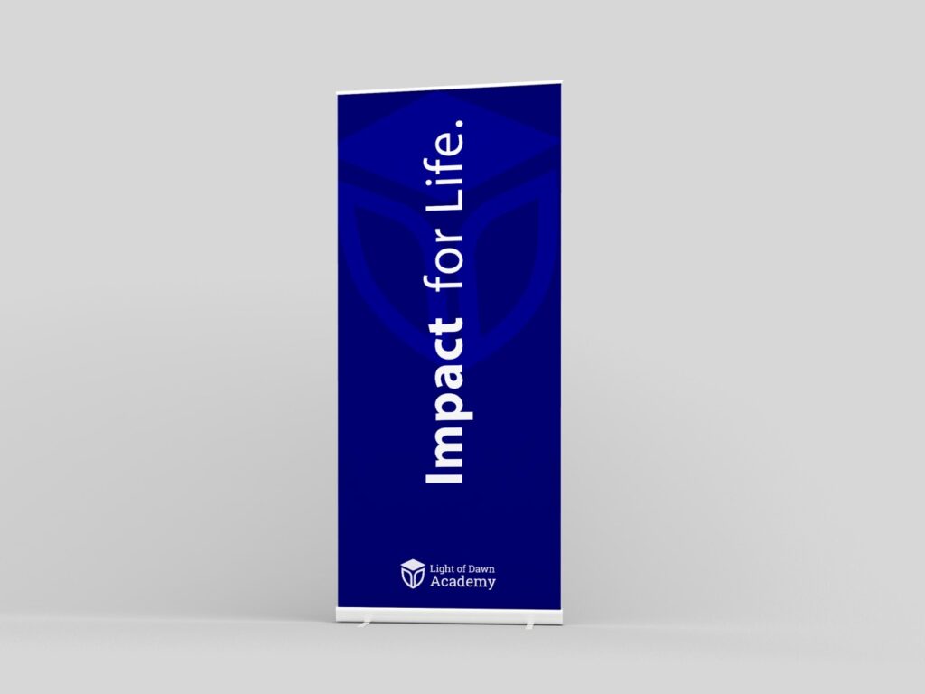
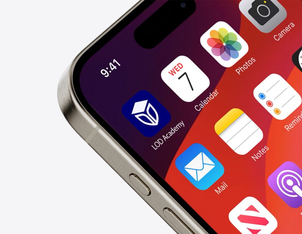
Ensuring Versatility Across All Mediums
To ensure the logo could adapt to real-world usage, we tested it across multiple mockups — including certificate headers, web platforms, mobile screens, and print materials.
Areas tested:
Responsive scaling from small app icons to large banners
Contrast and clarity in both digital and print environments
Integration with future brand materials like business cards and presentation decks
This step guaranteed long-term flexibility and visual consistency.
We packaged and delivered a complete logo suite.
Including color and black/white versions, vector files, and usage guidelines to support brand consistency across platforms.
Deliverables included:
Logo mark in all standard formats (SVG, PNG, PDF, EPS)
Color palette, font recommendations, and safe usage zones
Brand guidelines document for internal and external teams
Social media-ready assets and favicon sets for seamless digital deployment
Light of Dawn Academy now has a refined, trustworthy identity that will scale with its global mission — inspiring confidence in every learner they reach.
Key Outcomes
The final logo gives Light of Dawn Academy a strong, trust-building brand identity that reflects its role in empowering learners worldwide.
Educational Symbolism: Shield + book + cap deliver a clear, values-driven message aligned with learning and achievement
Credible First Impression: A professional, polished logo design that builds trust among students and professionals
Versatile Application: Easily adaptable across certifications, digital platforms, presentations, and marketing use
Emotional Connection: The aspirational tone of the logo resonates with learners who strive for growth and success
More Portfolios
Monday – Saturday : 9.00 am – 10:30 pm