Overview
PredictHer is a health-focused platform committed to empowering women through personalized wellness insights. With a vision rooted in care, inclusivity, and empowerment, the brand needed a logo that speaks directly to its audience while maintaining a modern, professional aesthetic. The goal was to create a visual identity that evokes trust, warmth, and connection, standing strong across app interfaces, digital marketing, and wellness campaigns.
Focus Areas: Logo Design, Feminine Identity, Brand Positioning
Objective
To design a logo that communicates care, inclusivity, and empowerment by:
Creating a symbolic mark that emotionally connects with women across all backgrounds
Representing the brand’s nurturing and holistic approach to women’s health
Integrating a color palette that feels warm, optimistic, and inclusive
Developing a visual identity that translates gracefully across app and marketing platforms
Our Approach
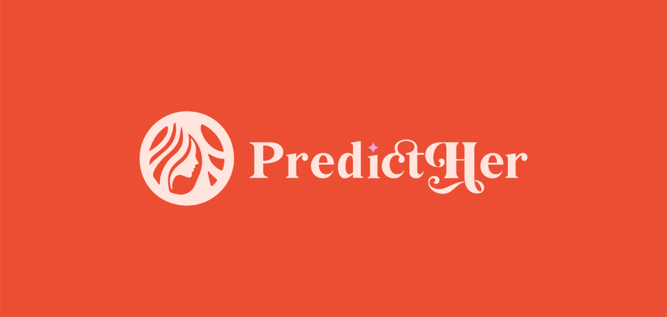
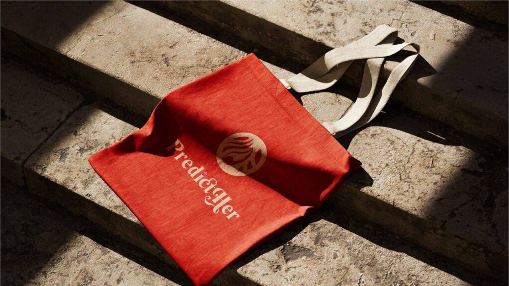
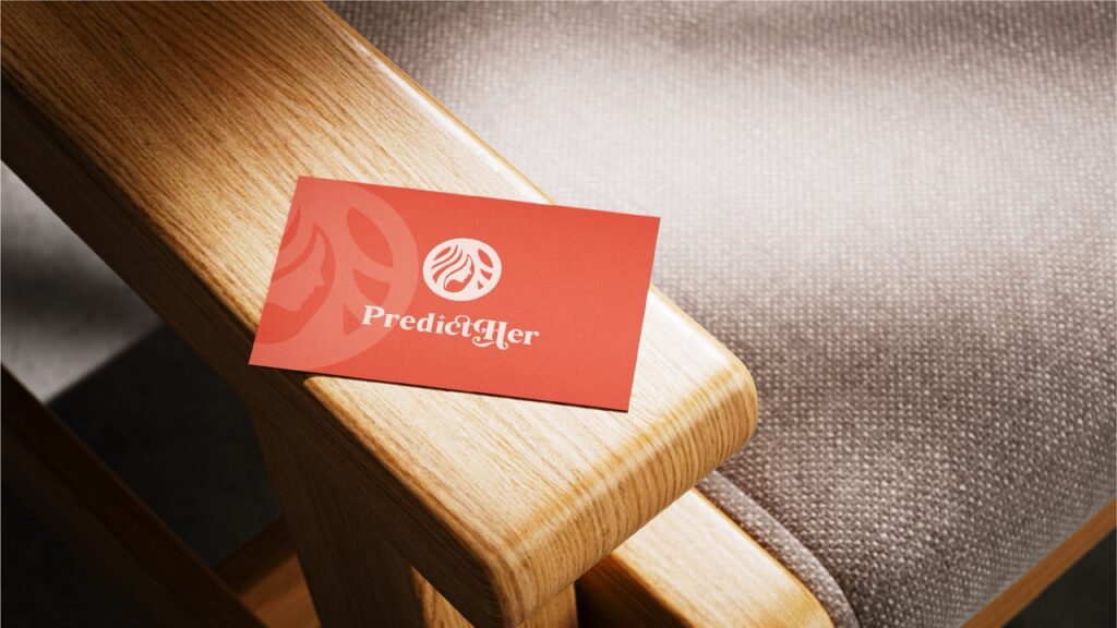
We designed a feminine yet strong logo using abstract symbolism and soft design language that captures PredictHer’s mission.
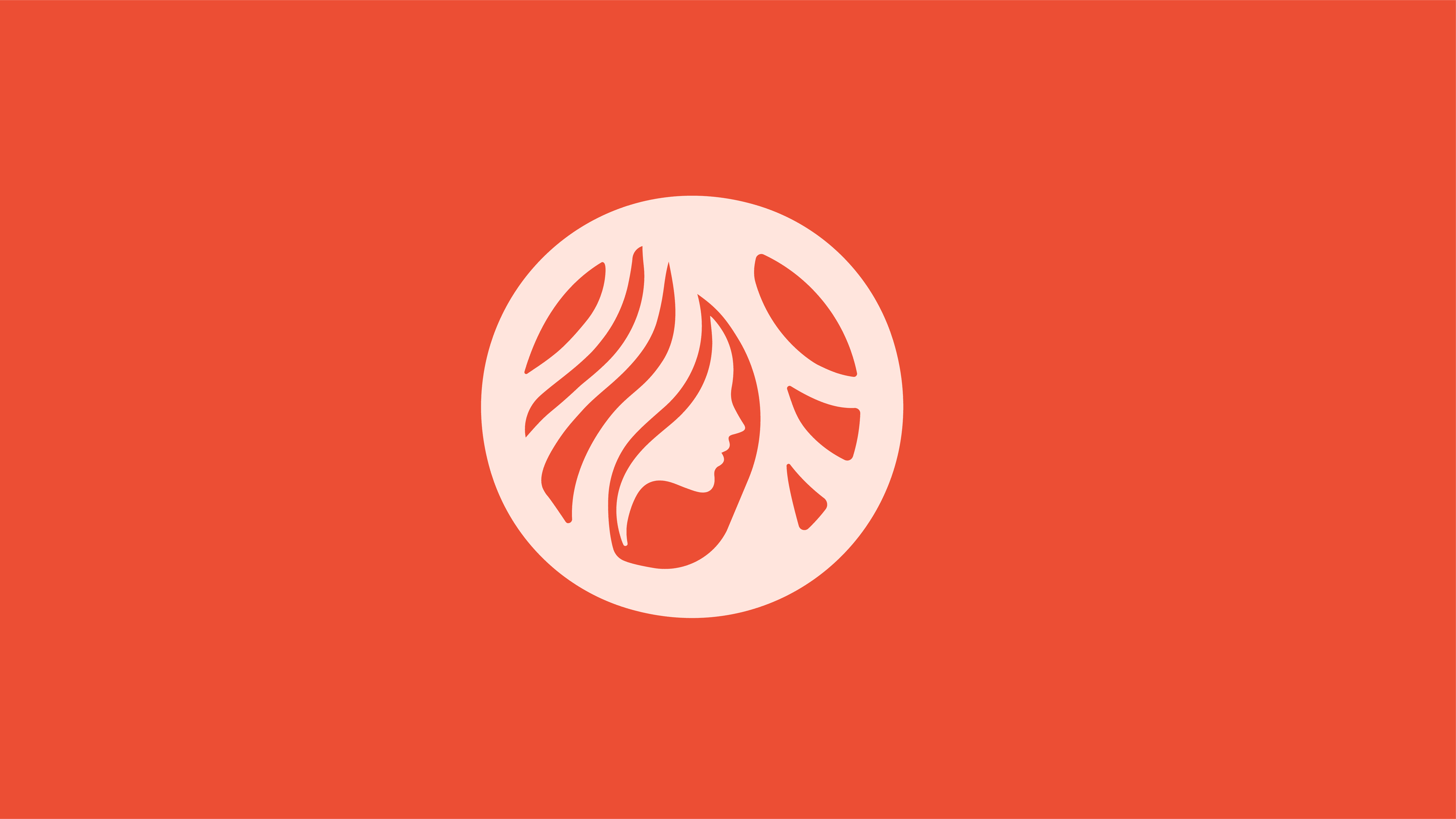
Combined a circle and female face silhouette to reflect unity, wholeness, and the brand’s women-centric focus
Used flowing hairlines within the mark to add elegance and visual softness, communicating care and calm
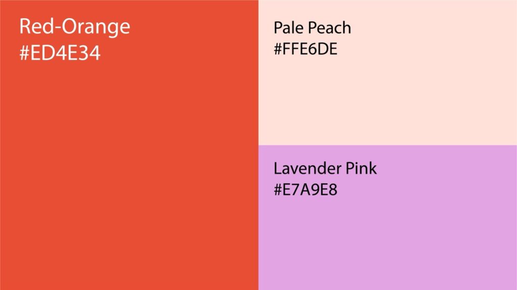
Built a color system with skin tones and orange shades, representing diversity, optimism, and trust
Paired the symbol with a feminine modern typeface that balances softness and clarity, making the brand feel approachable and professional
The final mark is elegant, emotionally resonant, and perfectly aligned with the values of PredictHer’s target audience.
Our Process
Defining the Emotional Core
We began with an in-depth discovery session to understand PredictHer’s purpose, target audience, and emotional tone. This involved analyzing brand values such as inclusivity, empowerment, and care — particularly in the context of women’s health.
Held stakeholder workshops to align on brand vision and tone
Identified key emotional drivers that would resonate with women across diverse backgrounds
Studied competitors in the wellness and femtech space to ensure visual differentiation
Mapped out scenarios of logo use across apps, social media, and wellness campaigns
This step ensured our design would carry not just aesthetic appeal but also emotional depth and cultural sensitivity.
Exploring Feminine and Symbolic Forms
With clarity on the brand’s personality, we explored a range of logo concepts rooted in feminine strength, unity, and softness. The goal was to avoid clichés and instead lean into abstract elegance.
Explored visual motifs like silhouettes, circles (wholeness), and flowing lines
Designed multiple rough sketches to visualize tone variations — from bold to nurturing
Prioritized abstract elements that felt symbolic, emotional, and inclusive
Gathered early feedback on symbolism alignment with the brand’s mission
This phase set the creative direction and narrowed down options that felt empowering yet gentle.
Balancing Beauty, Versatility, and Meaning
Once the core symbol was chosen, we moved into refining every detail — making sure the logo was clean, scalable, and meaningful.
Adjusted proportions to maintain elegance and balance at all sizes
Simplified intricate details to ensure clarity on mobile and digital platforms
Created variations for horizontal, vertical, and icon-only versions
Ensured harmony between the icon and typography for a cohesive visual system
Each refinement brought us closer to a logo that could speak powerfully across contexts — from a health app to a digital ad.
Creating a Visual Language of Warmth and Trust
A thoughtful color and typography system was crucial to evoke the emotional tone PredictHer needed — soft yet strong, approachable yet professional.
Developed a color palette with skin-tone neutrals and soft orange for warmth and inclusivity
Paired a feminine, modern sans-serif font that reflects both clarity and care
Created a hierarchy system for brand type — headlines, body, and UI-friendly styles
Tested accessibility and readability across backgrounds and screen types
This cohesive visual language gives PredictHer a distinct identity that feels human, modern, and empathetic.
Ensuring Real-World Functionality
Before finalization, we tested the logo across real-world scenarios to ensure it would maintain integrity and meaning in all usage environments.
Mocked up the logo on app splash screens, profile icons, social media banners, and wellness campaign posters
Evaluated clarity, recognition, and emotional tone across different screen sizes
Collected test feedback from a female-centric focus group to ensure the symbol felt welcoming and empowering
Iterated based on visual legibility in both dark and light backgrounds
These practical evaluations ensured the logo performed beautifully in every user touchpoint.
A Scalable Identity Rooted in Purpose
The project concluded with a complete brand asset package — built for clarity, elegance, and consistency.
Deliverables included:
High-resolution logo files in all formats (SVG, EPS, PNG, PDF)
Color palette, font guidelines, and usage specifications
Icon-only, wordmark-only, and lockup variations
Brand guidelines document with spacing rules, dos and don’ts, and cross-platform previews
Social media-ready branding assets and mockups to ensure visual impact across digital channels
The final result: a deeply symbolic, feminine, and scalable logo identity that positions PredictHer as a modern, inclusive leader in women’s wellness.
Key Outcomes
PredictHer now has a logo system that embodies wellness, strength, and feminine care — ready to connect meaningfully with its audience.
Empowering Symbolism: The circular shape with a female silhouette celebrates unity, identity, and wellness
Emotional Connection: Warm tones and soft lines make the logo relatable, trustworthy, and inclusive
Feminine Aesthetic: A flowing design paired with an elegant font creates a refined yet approachable identity
Cross-Platform Consistency: The logo adapts effortlessly across digital, app, and marketing use cases
More Portfolios
Monday – Saturday : 9.00 am – 10:30 pm
