Overview
Sadguna is a premium jewelry and divine statue store known for its elegant craftsmanship and spiritual sensibility. The brand serves customers who seek not just beauty, but meaningful, sacred value in their purchases. Sadguna approached us to create a visual identity that bridges luxury with spirituality — a brand that feels both timeless and elevated across jewelry packaging, signage, and marketing collateral.
Objective
To design a brand identity that captures the essence of spiritual richness and luxury by:
Combining elements of divinity and elegance into a unified brand mark
Merging the symbolic presence of Lord Ganesh with the sophistication of the brand initial
Developing a color system and typography that evoke prosperity, purity, and timelessness
Creating an identity system that works cohesively across retail, packaging, and digital use
Our Approach
We crafted a logo and brand identity that feel sacred, premium, and instantly recognizable.
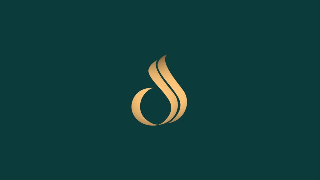
Designed a custom symbol merging the letter ‘S’ with Lord Ganesh, representing wisdom, prosperity, and spiritual harmony
Selected a gold and emerald green palette to signify wealth, grace, and renewal — balancing opulence with spirituality
Used a classic serif typeface to reflect heritage, tradition, and fine craftsmanship, ensuring it aligns with high-end expectations
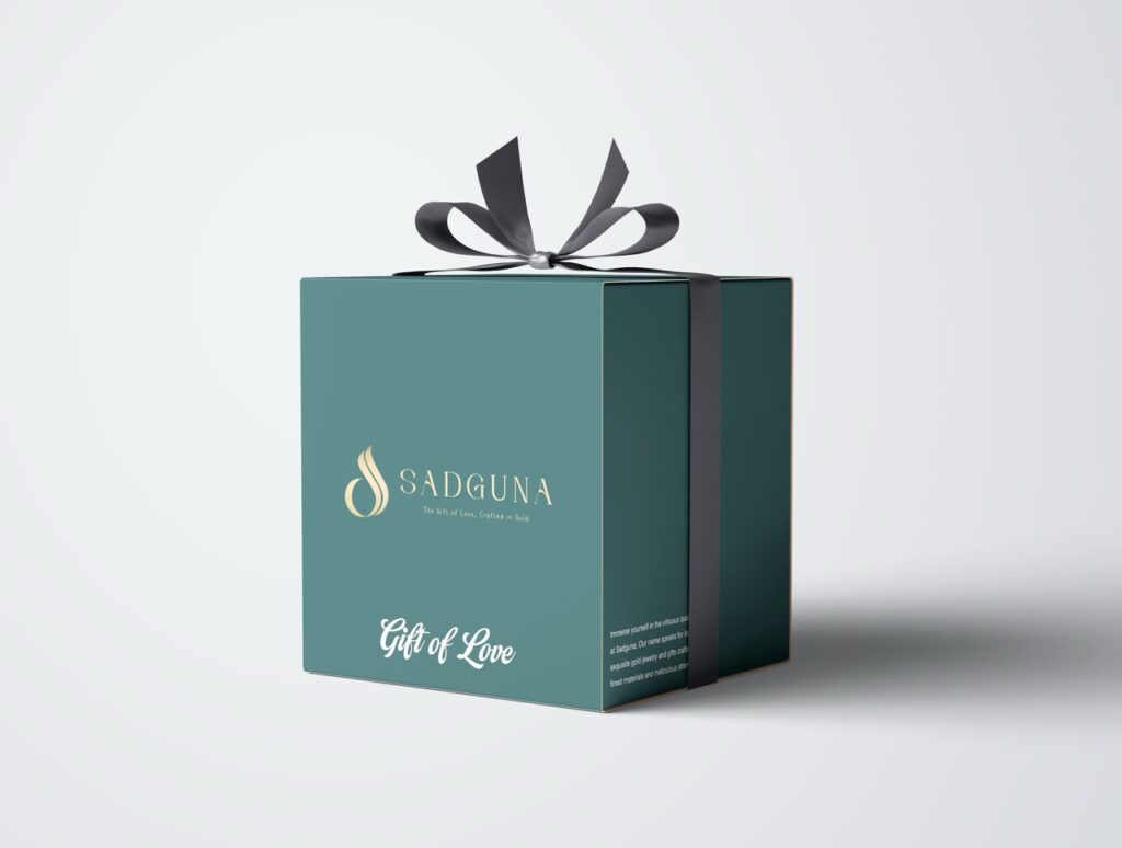
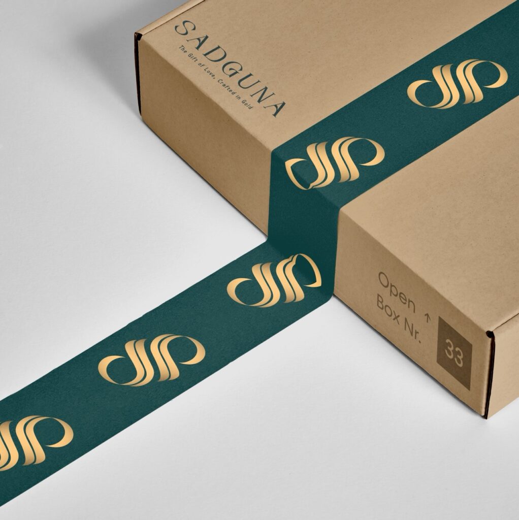
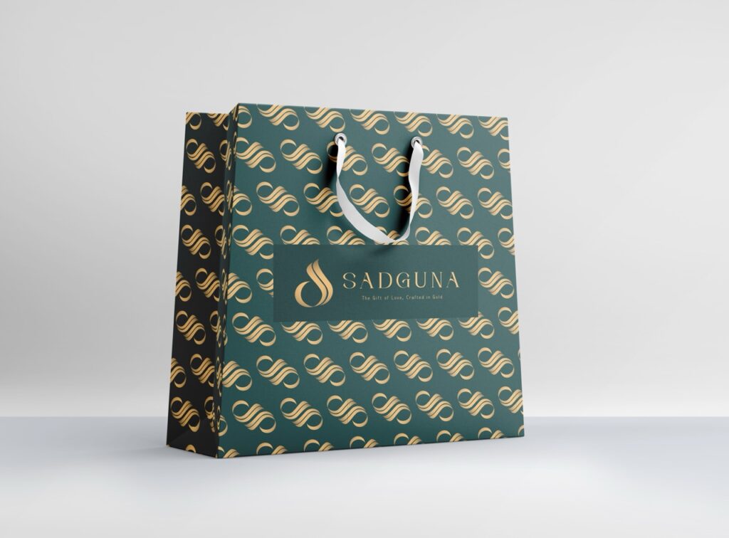
Applied the identity across premium materials — from foiled packaging to embossed stationery — to create a sense of exclusivity and reverence
Our Process
Unearthing Meaning Beyond Aesthetics
Our journey began with immersive discovery sessions to understand Sadguna’s dual essence — divine spirituality and high-end elegance. We explored the symbolic role of jewelry and sacred artifacts in customers’ lives to build a brand rooted in emotional and cultural depth.
Held stakeholder interviews to define the brand’s voice, values, and aspirations
Analyzed traditional Indian motifs and sacred symbolism relevant to the product offering
Conducted audience research to understand buyer sentiment and expectations around luxury + spirituality
Outlined key brand pillars: sacred, refined, meaningful, and timeless
This foundational phase ensured every design decision was anchored in Sadguna’s spiritual and premium positioning.
Fusing Divinity with Design
With clarity on vision, we moved into concept creation. The central challenge was to balance sacred symbolism with sophisticated design — creating a logo that resonates emotionally while standing out visually.
Explored the fusion of the brand’s initial ‘S’ with iconic elements of Lord Ganesh (trunk, head tilt, ear curves)
Sketched multiple logo directions to visualize variations in tone — from ornate to minimalist
Evaluated each concept for clarity, recall, and balance between religious symbolism and modern elegance
Iterated based on feedback to ensure alignment with both cultural reverence and luxury cues
The selected direction perfectly embodied Sadguna’s ethos: wise, graceful, and spiritually resonant.
Sculpting a Symbol of Grace and Wisdom
After selecting the ideal concept, we refined it into a timeless brand mark. Special attention was paid to proportion, curve detailing, and sacred balance within the symbol.
Adjusted symmetry and negative space to maintain visual harmony at all sizes
Crafted multiple lockups (icon-only, horizontal, stacked) for packaging and signage versatility
Tested logo legibility across materials like gold foil, embossing, and digital backdrops
Finalized a clean vector version that holds its elegance whether engraved or displayed online
The result was a unique logo that radiates both divine wisdom and premium craftsmanship.
Creating an Aura of Prosperity and Purity
We built a refined color and typography system to reflect Sadguna’s luxurious and spiritual essence. Every choice — from hue to stroke weight — was made to enhance storytelling and brand emotion.
Selected emerald green for renewal, prosperity, and calm energy
Paired it with gold to symbolize sacred wealth and divine brilliance
Used a heritage serif font with delicate curves for elegance and sophistication
Defined secondary colors and brand accents for texture, contrast, and mood control
Together, this visual system ensures a consistent, sacred-luxury feel across every touchpoint.
Translating the Identity Across Touchpoints
To bring the brand to life, we applied the identity system across various applications — making sure every customer interaction reflected beauty, spirituality, and elegance.
Designed packaging with gold-foiled textures, embossed icons, and deep-tone backgrounds
Developed signage concepts for in-store branding, balancing simplicity with presence
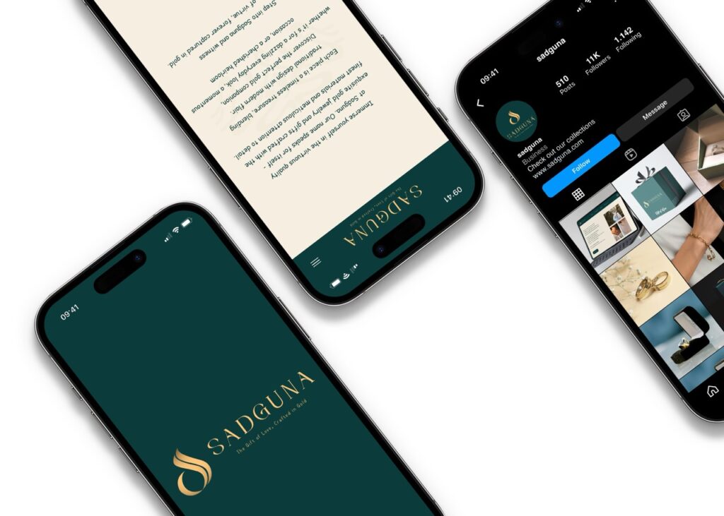
Created social media templates that carry forward the brand’s divine elegance online
Crafted certification cards and gift tags with soft patterns and storytelling elements
Each item reinforced Sadguna’s value — not just as a store, but as a sanctuary of sacred artistry.
A Timeless Identity for Sacred Luxury
The final stage involved preparing a comprehensive brand toolkit and guidelines to ensure consistency and ease of use for the Sadguna team.
Deliverables included:
Logo files in all formats (SVG, EPS, PNG, PDF) with gold and flat variants
Brand guidelines covering spacing, color codes, font usage, and do’s & don’ts
Application mockups for packaging, signage, and print collateral
Ready-to-use assets for marketing and digital platforms
The outcome: a brand identity that truly honors Sadguna’s dual soul — divine in spirit, premium in presence.
Key Outcomes
Sadguna’s branding is now a perfect reflection of its luxurious and sacred offerings.
Divine Meets Premium: A spiritually symbolic logo that elevates brand perception and emotional connection
Rich Visual Identity: Consistent use of gold and emerald green creates a lasting impression of tradition and luxury
Elegant Packaging System: Premium finishes and textures enhance the unboxing experience and communicate value
Memorable Presence: The logo’s symbolism and clean design ensure high recall across print, digital, and in-store applications
More Portfolios
Monday – Saturday : 9.00 am – 10:30 pm