

Avatar Alert
Original · freeA notification-style alert led by an avatar.
Copy prompt gives Claude Code, Cursor or v0 a ready-to-paste prompt that recreates this exact component.
npx shadcn@latest add https://webinnoventix.com/r/alert-avatar.json"use client";
import { useId, useState } from "react";
import { AnimatePresence, motion, useReducedMotion } from "motion/react";
type Notice = {
id: string;
name: string;
handle: string;
avatar: string;
time: string;
action: "commented" | "mentioned" | "assigned" | "approved";
message: string;
primary: string;
secondary: string;
unread: boolean;
};
const SEED: Notice[] = [
{
id: "n-1042",
name: "Priya Nair",
handle: "@priyaships",
avatar: "/img/gallery/g07.webp",
time: "2m ago",
action: "mentioned",
message:
"Left three comments on the checkout flow — the empty-cart state still needs copy before we ship Friday.",
primary: "Reply",
secondary: "View thread",
unread: true,
},
{
id: "n-1041",
name: "Marcus Bell",
handle: "@mbell",
avatar: "/img/gallery/g14.webp",
time: "18m ago",
action: "assigned",
message:
"Assigned you the “Reduce LCP on the pricing page” ticket. Target is under 2.5s on mobile.",
primary: "Accept",
secondary: "Reassign",
unread: true,
},
{
id: "n-1039",
name: "Dana Whitfield",
handle: "@danaw",
avatar: "/img/gallery/g22.webp",
time: "1h ago",
action: "approved",
message:
"Approved your pull request #418. Two small nits are non-blocking — merge whenever you’re ready.",
primary: "Merge",
secondary: "See diff",
unread: false,
},
{
id: "n-1036",
name: "Theo Okafor",
handle: "@theo",
avatar: "/img/gallery/g31.webp",
time: "3h ago",
action: "commented",
message:
"Replied in #design-review: “Love the new avatar stack, but let’s cut the shadow depth in half.”",
primary: "Open chat",
secondary: "Mute",
unread: false,
},
];
const ACTION_STYLES: Record<
Notice["action"],
{ label: string; dot: string; chip: string }
> = {
commented: {
label: "commented",
dot: "bg-sky-500",
chip: "bg-sky-50 text-sky-700 ring-sky-200 dark:bg-sky-950/50 dark:text-sky-300 dark:ring-sky-800",
},
mentioned: {
label: "mentioned you",
dot: "bg-violet-500",
chip: "bg-violet-50 text-violet-700 ring-violet-200 dark:bg-violet-950/50 dark:text-violet-300 dark:ring-violet-800",
},
assigned: {
label: "assigned you",
dot: "bg-amber-500",
chip: "bg-amber-50 text-amber-700 ring-amber-200 dark:bg-amber-950/50 dark:text-amber-300 dark:ring-amber-800",
},
approved: {
label: "approved",
dot: "bg-emerald-500",
chip: "bg-emerald-50 text-emerald-700 ring-emerald-200 dark:bg-emerald-950/50 dark:text-emerald-300 dark:ring-emerald-800",
},
};
export default function AlertAvatar() {
const reduce = useReducedMotion();
const [items, setItems] = useState<Notice[]>(SEED);
const [toast, setToast] = useState<string | null>(null);
const headingId = useId();
function dismiss(id: string) {
const target = items.find((n) => n.id === id);
setItems((prev) => prev.filter((n) => n.id !== id));
if (target) setToast(`Dismissed notification from ${target.name}`);
}
function markRead(id: string) {
setItems((prev) =>
prev.map((n) => (n.id === id ? { ...n, unread: false } : n)),
);
}
function reset() {
setItems(SEED);
setToast("Notifications restored");
}
const unreadCount = items.filter((n) => n.unread).length;
return (
<section
className="relative w-full bg-slate-50 px-4 py-16 sm:px-6 sm:py-20 dark:bg-slate-950"
aria-labelledby={headingId}
>
<style>{`
@keyframes alertavatar_slidein {
from { opacity: 0; transform: translateY(10px) scale(0.98); }
to { opacity: 1; transform: translateY(0) scale(1); }
}
@keyframes alertavatar_ping {
0% { transform: scale(1); opacity: 0.55; }
75%, 100% { transform: scale(2.2); opacity: 0; }
}
.alertavatar_card { animation: alertavatar_slidein 0.45s cubic-bezier(0.22, 1, 0.36, 1) both; }
.alertavatar_ping { animation: alertavatar_ping 1.8s cubic-bezier(0, 0, 0.2, 1) infinite; }
@media (prefers-reduced-motion: reduce) {
.alertavatar_card, .alertavatar_ping { animation: none !important; }
}
`}</style>
<div className="mx-auto max-w-xl">
<header className="mb-6 flex items-end justify-between gap-4">
<div>
<div className="flex items-center gap-2">
<h2
id={headingId}
className="text-lg font-semibold tracking-tight text-slate-900 dark:text-slate-100"
>
Notifications
</h2>
<span
className="inline-flex min-w-6 items-center justify-center rounded-full bg-indigo-600 px-2 py-0.5 text-xs font-semibold text-white tabular-nums dark:bg-indigo-500"
aria-label={`${unreadCount} unread`}
>
{unreadCount}
</span>
</div>
<p className="mt-1 text-sm text-slate-500 dark:text-slate-400">
Recent activity across your projects.
</p>
</div>
<button
type="button"
onClick={reset}
className="rounded-lg px-2.5 py-1.5 text-sm font-medium text-indigo-600 transition-colors hover:bg-indigo-50 focus:outline-none focus-visible:ring-2 focus-visible:ring-indigo-500 focus-visible:ring-offset-2 focus-visible:ring-offset-slate-50 dark:text-indigo-400 dark:hover:bg-indigo-950/50 dark:focus-visible:ring-offset-slate-950"
>
Restore
</button>
</header>
<ul className="flex flex-col gap-3" role="list">
<AnimatePresence initial={false}>
{items.map((n) => {
const meta = ACTION_STYLES[n.action];
return (
<motion.li
key={n.id}
layout={!reduce}
initial={reduce ? false : { opacity: 0, y: 10, scale: 0.98 }}
animate={{ opacity: 1, y: 0, scale: 1 }}
exit={
reduce
? { opacity: 0 }
: { opacity: 0, x: 32, scale: 0.96, transition: { duration: 0.22 } }
}
transition={{ duration: 0.35, ease: [0.22, 1, 0.36, 1] }}
className="list-none"
>
<div
role="alert"
className={`group relative overflow-hidden rounded-2xl border bg-white p-4 shadow-sm ring-1 ring-transparent transition-shadow hover:shadow-md dark:bg-slate-900 ${
n.unread
? "border-slate-200 dark:border-slate-800"
: "border-slate-200/70 dark:border-slate-800/70"
}`}
>
{n.unread && (
<span
className="absolute right-4 top-4 h-2 w-2 rounded-full bg-indigo-500"
aria-hidden="true"
>
<span className="alertavatar_ping absolute inset-0 rounded-full bg-indigo-500" />
</span>
)}
<div className="flex gap-3.5">
<div className="relative shrink-0">
{/* eslint-disable-next-line @next/next/no-img-element */}
<img
src={n.avatar}
alt={`${n.name}'s avatar`}
loading="lazy"
draggable={false}
className="h-11 w-11 rounded-full object-cover ring-2 ring-white dark:ring-slate-900"
/>
<span
className={`absolute -bottom-0.5 -right-0.5 h-3.5 w-3.5 rounded-full ring-2 ring-white dark:ring-slate-900 ${meta.dot}`}
aria-hidden="true"
/>
</div>
<div className="min-w-0 flex-1">
<div className="flex flex-wrap items-center gap-x-2 gap-y-1 pr-6">
<span className="truncate text-sm font-semibold text-slate-900 dark:text-slate-100">
{n.name}
</span>
<span
className={`inline-flex items-center rounded-full px-2 py-0.5 text-[11px] font-medium ring-1 ring-inset ${meta.chip}`}
>
{meta.label}
</span>
<span className="text-xs text-slate-400 dark:text-slate-500">
{n.time}
</span>
</div>
<p className="mt-1.5 text-sm leading-relaxed text-slate-600 dark:text-slate-300">
{n.message}
</p>
<div className="mt-3 flex items-center gap-2">
<button
type="button"
onClick={() => markRead(n.id)}
className="rounded-lg bg-indigo-600 px-3 py-1.5 text-xs font-semibold text-white transition-colors hover:bg-indigo-500 focus:outline-none focus-visible:ring-2 focus-visible:ring-indigo-500 focus-visible:ring-offset-2 focus-visible:ring-offset-white dark:focus-visible:ring-offset-slate-900"
>
{n.primary}
</button>
<button
type="button"
onClick={() => markRead(n.id)}
className="rounded-lg px-3 py-1.5 text-xs font-semibold text-slate-600 ring-1 ring-inset ring-slate-200 transition-colors hover:bg-slate-50 focus:outline-none focus-visible:ring-2 focus-visible:ring-indigo-500 dark:text-slate-300 dark:ring-slate-700 dark:hover:bg-slate-800"
>
{n.secondary}
</button>
</div>
</div>
<button
type="button"
onClick={() => dismiss(n.id)}
aria-label={`Dismiss notification from ${n.name}`}
className="absolute bottom-4 right-4 grid h-7 w-7 place-items-center rounded-lg text-slate-400 opacity-0 transition-all hover:bg-slate-100 hover:text-slate-700 focus:opacity-100 focus:outline-none focus-visible:ring-2 focus-visible:ring-indigo-500 group-hover:opacity-100 dark:hover:bg-slate-800 dark:hover:text-slate-200"
>
<svg
viewBox="0 0 20 20"
fill="none"
className="h-4 w-4"
aria-hidden="true"
>
<path
d="M5 5l10 10M15 5L5 15"
stroke="currentColor"
strokeWidth="1.75"
strokeLinecap="round"
/>
</svg>
</button>
</div>
</div>
</motion.li>
);
})}
</AnimatePresence>
</ul>
{items.length === 0 && (
<div className="alertavatar_card rounded-2xl border border-dashed border-slate-300 bg-white/50 px-6 py-12 text-center dark:border-slate-700 dark:bg-slate-900/50">
<div className="mx-auto mb-3 grid h-11 w-11 place-items-center rounded-full bg-emerald-50 text-emerald-600 dark:bg-emerald-950/50 dark:text-emerald-400">
<svg viewBox="0 0 20 20" fill="none" className="h-5 w-5" aria-hidden="true">
<path
d="M4 10.5l3.5 3.5L16 5.5"
stroke="currentColor"
strokeWidth="1.75"
strokeLinecap="round"
strokeLinejoin="round"
/>
</svg>
</div>
<p className="text-sm font-semibold text-slate-900 dark:text-slate-100">
You’re all caught up
</p>
<p className="mt-1 text-sm text-slate-500 dark:text-slate-400">
No new notifications right now.
</p>
</div>
)}
<p role="status" aria-live="polite" className="sr-only">
{toast}
</p>
</div>
</section>
);
}Dependencies
Licence
Built by Web Innoventix. Free for personal and commercial use, no attribution required.
Built by Web Innoventix
Need a custom interface, a full website, or SEO that gets you cited by AI? We design, build and rank it end to end.
Get a free quoteSimilar components
Browse all →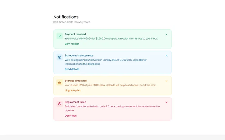
Soft Variants Alert
OriginalSoft-tinted alerts: success, info, warning and error, each with an icon.
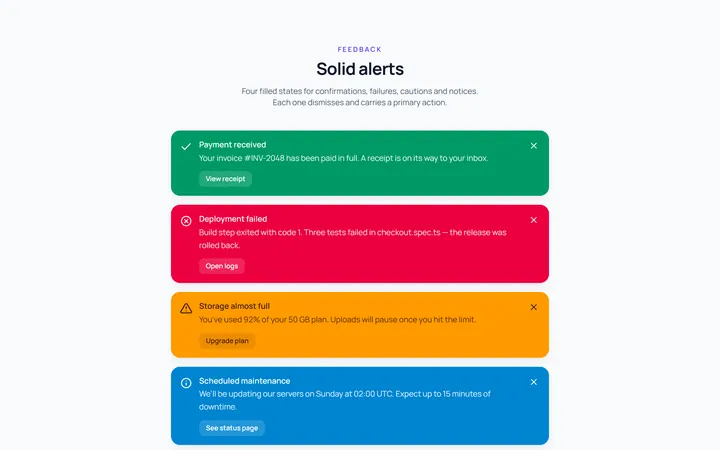
Solid Variants Alert
OriginalSolid-colour alerts across the four states.
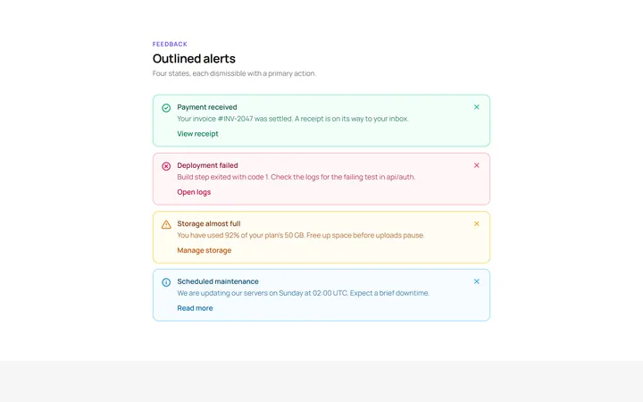
Outline Variants Alert
OriginalOutlined alerts across the four states.
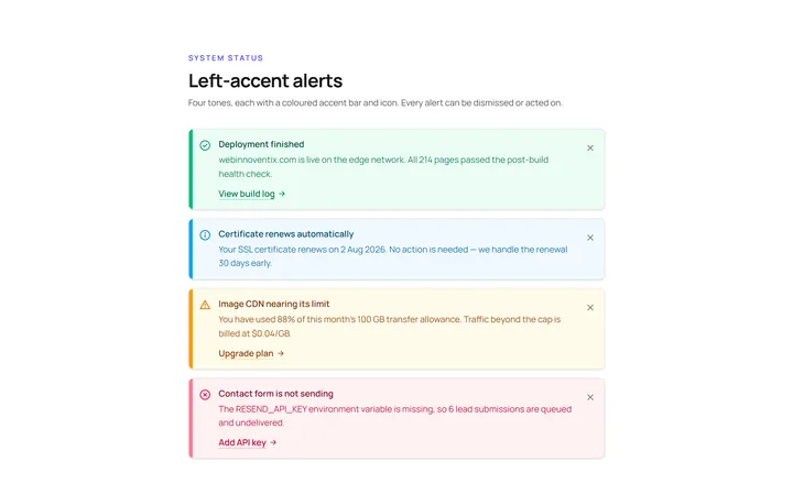
Left Accent Alert
OriginalAlerts with a coloured left accent bar and icon.
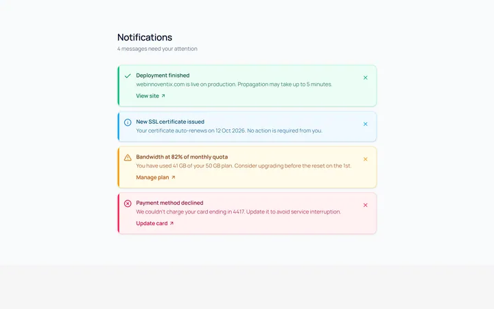
Dismissible Alert
OriginalDismissible alerts with a working close button.
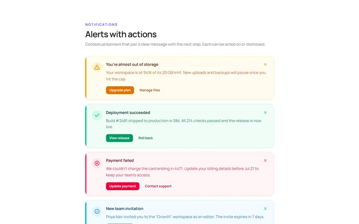
With Action Alert
OriginalAn alert with title, body and action buttons.
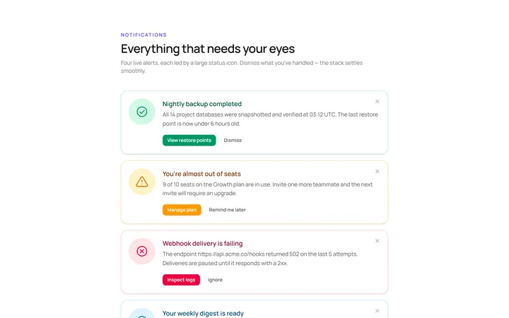
Icon Large Alert
OriginalAn alert led by a large circular icon.
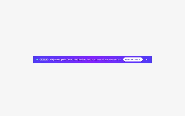
Banner Top Alert
OriginalA full-width top announcement banner, dismissible.
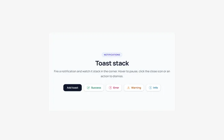
Toast Stack Alert
OriginalA stack of dismissible toasts in a corner.
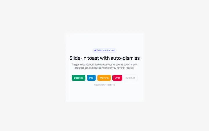
Toast Slide Alert
OriginalA toast that slides in with an icon and auto-dismiss progress.
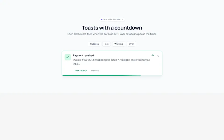
Progress Alert
OriginalAn alert with a countdown progress bar.
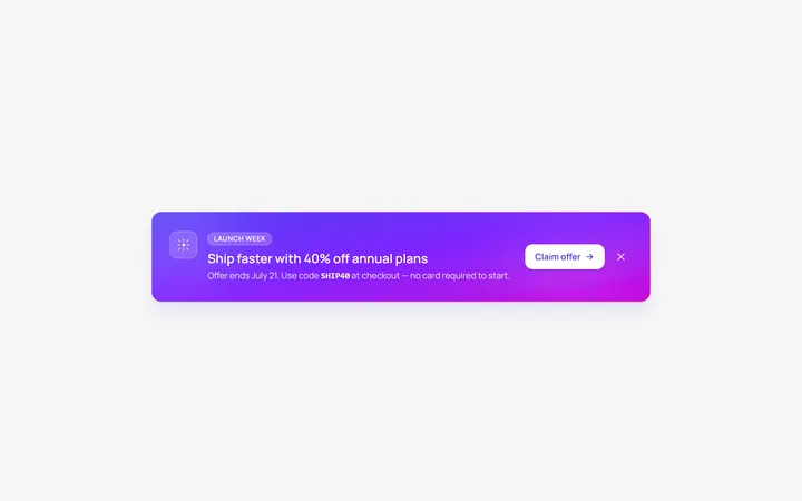
Gradient Alert
OriginalA gradient promo banner alert with a call to action.