

Cookie Alert
Original · freeA cookie-consent banner with accept and decline.
Copy prompt gives Claude Code, Cursor or v0 a ready-to-paste prompt that recreates this exact component.
npx shadcn@latest add https://webinnoventix.com/r/alert-cookie.json"use client";
import { useEffect, useId, useRef, useState, type KeyboardEvent } from "react";
type ConsentChoice = "accepted" | "declined" | "custom";
type CookieCategory = {
key: "essential" | "analytics" | "marketing";
label: string;
description: string;
locked: boolean;
};
const CATEGORIES: CookieCategory[] = [
{
key: "essential",
label: "Strictly necessary",
description: "Keeps you signed in and remembers this choice. Always on.",
locked: true,
},
{
key: "analytics",
label: "Analytics",
description: "Anonymous page-view and performance data so we can fix slow pages.",
locked: false,
},
{
key: "marketing",
label: "Marketing",
description: "Lets us measure ad campaigns and show you relevant offers.",
locked: false,
},
];
export default function AlertCookie() {
const [visible, setVisible] = useState(true);
const [choice, setChoice] = useState<ConsentChoice | null>(null);
const [showPrefs, setShowPrefs] = useState(false);
const [prefs, setPrefs] = useState<Record<CookieCategory["key"], boolean>>({
essential: true,
analytics: true,
marketing: false,
});
const headingId = useId();
const descId = useId();
const panelRef = useRef<HTMLDivElement | null>(null);
const acceptRef = useRef<HTMLButtonElement | null>(null);
useEffect(() => {
if (visible) {
const t = window.setTimeout(() => acceptRef.current?.focus(), 350);
return () => window.clearTimeout(t);
}
}, [visible]);
function onKeyDown(e: KeyboardEvent<HTMLDivElement>) {
if (e.key === "Escape" && !showPrefs) {
// Escape = decline non-essential, the privacy-safe default.
decline();
}
}
function accept() {
setPrefs({ essential: true, analytics: true, marketing: true });
setChoice("accepted");
setVisible(false);
}
function decline() {
setPrefs({ essential: true, analytics: false, marketing: false });
setChoice("declined");
setVisible(false);
}
function saveCustom() {
setChoice("custom");
setShowPrefs(false);
setVisible(false);
}
function toggle(key: CookieCategory["key"]) {
setPrefs((p) => ({ ...p, [key]: !p[key] }));
}
function reopen() {
setChoice(null);
setShowPrefs(false);
setVisible(true);
}
return (
<section className="relative w-full overflow-hidden bg-slate-50 px-4 py-20 dark:bg-slate-950 sm:px-6 sm:py-28">
<style>{`
@keyframes ckbnr-rise {
from { opacity: 0; transform: translateY(16px) scale(0.985); }
to { opacity: 1; transform: translateY(0) scale(1); }
}
@keyframes ckbnr-fade {
from { opacity: 0; transform: translateY(-4px); }
to { opacity: 1; transform: translateY(0); }
}
@keyframes ckbnr-crumb {
0%, 100% { transform: translateY(0); }
50% { transform: translateY(-2px); }
}
.ckbnr-rise { animation: ckbnr-rise 0.5s cubic-bezier(0.22, 1, 0.36, 1) both; }
.ckbnr-fade { animation: ckbnr-fade 0.3s ease both; }
.ckbnr-crumb { animation: ckbnr-crumb 3s ease-in-out infinite; }
@media (prefers-reduced-motion: reduce) {
.ckbnr-rise, .ckbnr-fade, .ckbnr-crumb { animation: none !important; }
}
`}</style>
<div className="mx-auto max-w-3xl">
<div className="text-center">
<h2 className="text-2xl font-semibold tracking-tight text-slate-900 dark:text-white sm:text-3xl">
Cookie consent banner
</h2>
<p className="mt-3 text-sm text-slate-600 dark:text-slate-400">
Accept, decline, or tune each category. Your choice appears below.
</p>
</div>
<div className="mt-8 flex flex-wrap items-center justify-center gap-3">
<div
aria-live="polite"
className="rounded-full border border-slate-200 bg-white px-4 py-2 text-sm text-slate-600 shadow-sm dark:border-slate-800 dark:bg-slate-900 dark:text-slate-300"
>
Current status:{" "}
<span className="font-semibold text-slate-900 dark:text-white">
{choice === "accepted"
? "All cookies accepted"
: choice === "declined"
? "Non-essential declined"
: choice === "custom"
? `Custom (${
[
prefs.analytics && "analytics",
prefs.marketing && "marketing",
]
.filter(Boolean)
.join(" + ") || "essential only"
})`
: "Awaiting your choice"}
</span>
</div>
{!visible && (
<button
type="button"
onClick={reopen}
className="rounded-full border border-slate-300 bg-white px-4 py-2 text-sm font-medium text-slate-700 shadow-sm transition hover:bg-slate-50 focus:outline-none focus-visible:ring-2 focus-visible:ring-indigo-500 focus-visible:ring-offset-2 focus-visible:ring-offset-slate-50 dark:border-slate-700 dark:bg-slate-900 dark:text-slate-200 dark:hover:bg-slate-800 dark:focus-visible:ring-offset-slate-950"
>
Reopen banner
</button>
)}
</div>
</div>
{visible && (
<div className="pointer-events-none fixed inset-x-0 bottom-0 z-50 flex justify-center px-4 pb-4 sm:px-6 sm:pb-6">
<div
ref={panelRef}
role="dialog"
aria-modal="false"
aria-labelledby={headingId}
aria-describedby={descId}
onKeyDown={onKeyDown}
className="ckbnr-rise pointer-events-auto w-full max-w-2xl rounded-2xl border border-slate-200 bg-white/95 p-5 shadow-2xl shadow-slate-900/10 backdrop-blur-md dark:border-slate-800 dark:bg-slate-900/95 dark:shadow-black/40 sm:p-6"
>
<div className="flex items-start gap-4">
<span
aria-hidden="true"
className="ckbnr-crumb mt-0.5 flex h-11 w-11 shrink-0 items-center justify-center rounded-xl bg-amber-100 text-amber-700 dark:bg-amber-500/15 dark:text-amber-400"
>
<svg
viewBox="0 0 24 24"
fill="none"
className="h-6 w-6"
stroke="currentColor"
strokeWidth={1.8}
strokeLinecap="round"
strokeLinejoin="round"
>
<path d="M12 2a10 10 0 1 0 10 10 3 3 0 0 1-3-3 3 3 0 0 1-3-3 3 3 0 0 1-4-4Z" />
<path d="M8.5 10.5h.01M12 14.5h.01M15.5 9.5h.01M9 15.5h.01M14.5 16h.01" />
</svg>
</span>
<div className="min-w-0 flex-1">
<h3
id={headingId}
className="text-base font-semibold text-slate-900 dark:text-white"
>
We use cookies to bake a better site
</h3>
<p
id={descId}
className="mt-1.5 text-sm leading-relaxed text-slate-600 dark:text-slate-400"
>
Essential cookies keep the site running. With your OK we also use
analytics and marketing cookies to improve pages and measure
campaigns. Read our{" "}
<a
href="/privacy"
target="_blank"
rel="noopener"
className="font-medium text-indigo-600 underline decoration-indigo-300 underline-offset-2 hover:text-indigo-500 dark:text-indigo-400 dark:decoration-indigo-500/60"
>
cookie policy
</a>
.
</p>
{showPrefs && (
<div className="ckbnr-fade mt-4 space-y-2.5">
{CATEGORIES.map((cat) => {
const on = prefs[cat.key];
return (
<div
key={cat.key}
className="flex items-start justify-between gap-3 rounded-xl border border-slate-200 bg-slate-50/70 p-3 dark:border-slate-800 dark:bg-slate-950/40"
>
<div className="min-w-0">
<p className="text-sm font-medium text-slate-800 dark:text-slate-200">
{cat.label}
</p>
<p className="mt-0.5 text-xs leading-relaxed text-slate-500 dark:text-slate-400">
{cat.description}
</p>
</div>
<button
type="button"
role="switch"
aria-checked={on}
aria-label={`${cat.label} cookies`}
disabled={cat.locked}
onClick={() => !cat.locked && toggle(cat.key)}
className={[
"relative mt-0.5 inline-flex h-6 w-11 shrink-0 items-center rounded-full transition focus:outline-none focus-visible:ring-2 focus-visible:ring-indigo-500 focus-visible:ring-offset-2 focus-visible:ring-offset-white dark:focus-visible:ring-offset-slate-900",
cat.locked
? "cursor-not-allowed bg-emerald-500/60"
: on
? "bg-indigo-600"
: "bg-slate-300 dark:bg-slate-700",
].join(" ")}
>
<span
className={[
"inline-block h-5 w-5 transform rounded-full bg-white shadow-sm transition",
on ? "translate-x-5" : "translate-x-0.5",
].join(" ")}
/>
</button>
</div>
);
})}
</div>
)}
<div className="mt-5 flex flex-col gap-2 sm:flex-row sm:flex-wrap sm:items-center">
<button
ref={acceptRef}
type="button"
onClick={accept}
className="inline-flex items-center justify-center rounded-xl bg-indigo-600 px-4 py-2.5 text-sm font-semibold text-white shadow-sm transition hover:bg-indigo-500 focus:outline-none focus-visible:ring-2 focus-visible:ring-indigo-500 focus-visible:ring-offset-2 focus-visible:ring-offset-white dark:focus-visible:ring-offset-slate-900"
>
Accept all
</button>
<button
type="button"
onClick={decline}
className="inline-flex items-center justify-center rounded-xl border border-slate-300 bg-white px-4 py-2.5 text-sm font-semibold text-slate-700 shadow-sm transition hover:bg-slate-50 focus:outline-none focus-visible:ring-2 focus-visible:ring-indigo-500 focus-visible:ring-offset-2 focus-visible:ring-offset-white dark:border-slate-700 dark:bg-slate-800 dark:text-slate-200 dark:hover:bg-slate-700 dark:focus-visible:ring-offset-slate-900"
>
Decline non-essential
</button>
{showPrefs ? (
<button
type="button"
onClick={saveCustom}
className="inline-flex items-center justify-center rounded-xl px-4 py-2.5 text-sm font-semibold text-indigo-600 transition hover:bg-indigo-50 focus:outline-none focus-visible:ring-2 focus-visible:ring-indigo-500 focus-visible:ring-offset-2 focus-visible:ring-offset-white dark:text-indigo-400 dark:hover:bg-indigo-500/10 dark:focus-visible:ring-offset-slate-900 sm:ml-auto"
>
Save preferences
</button>
) : (
<button
type="button"
onClick={() => setShowPrefs(true)}
aria-expanded={showPrefs}
className="inline-flex items-center justify-center rounded-xl px-4 py-2.5 text-sm font-semibold text-slate-600 transition hover:bg-slate-100 focus:outline-none focus-visible:ring-2 focus-visible:ring-indigo-500 focus-visible:ring-offset-2 focus-visible:ring-offset-white dark:text-slate-300 dark:hover:bg-slate-800 dark:focus-visible:ring-offset-slate-900 sm:ml-auto"
>
Manage preferences
</button>
)}
</div>
</div>
</div>
</div>
</div>
)}
</section>
);
}Dependencies
Licence
Built by Web Innoventix. Free for personal and commercial use, no attribution required.
Built by Web Innoventix
Need a custom interface, a full website, or SEO that gets you cited by AI? We design, build and rank it end to end.
Get a free quoteSimilar components
Browse all →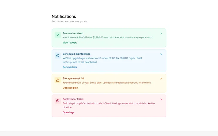
Soft Variants Alert
OriginalSoft-tinted alerts: success, info, warning and error, each with an icon.
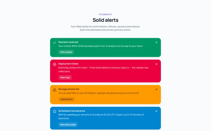
Solid Variants Alert
OriginalSolid-colour alerts across the four states.
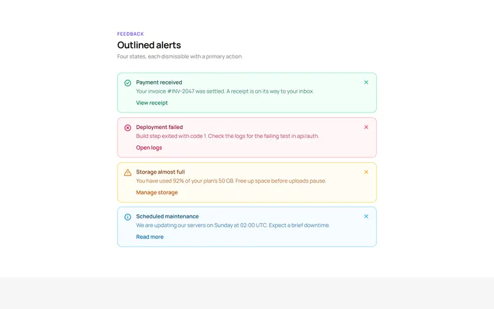
Outline Variants Alert
OriginalOutlined alerts across the four states.
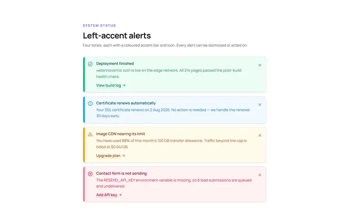
Left Accent Alert
OriginalAlerts with a coloured left accent bar and icon.
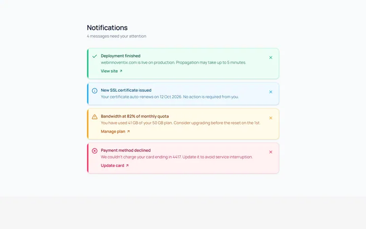
Dismissible Alert
OriginalDismissible alerts with a working close button.
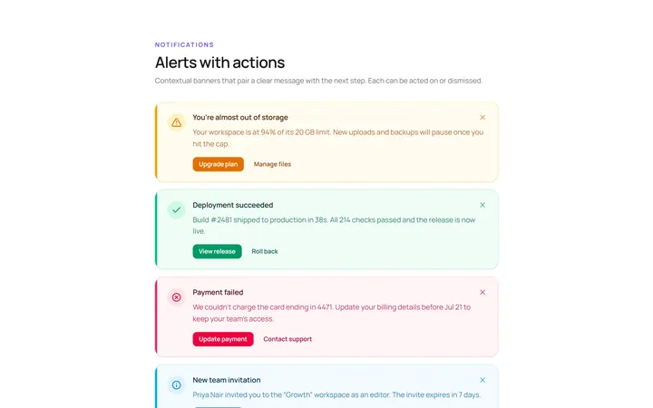
With Action Alert
OriginalAn alert with title, body and action buttons.
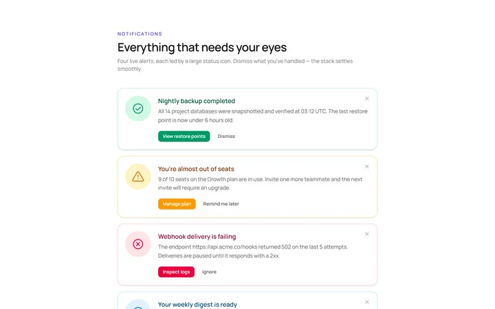
Icon Large Alert
OriginalAn alert led by a large circular icon.
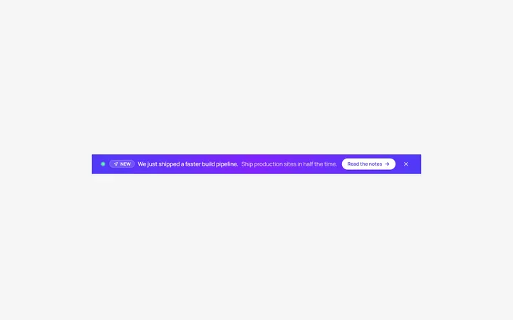
Banner Top Alert
OriginalA full-width top announcement banner, dismissible.
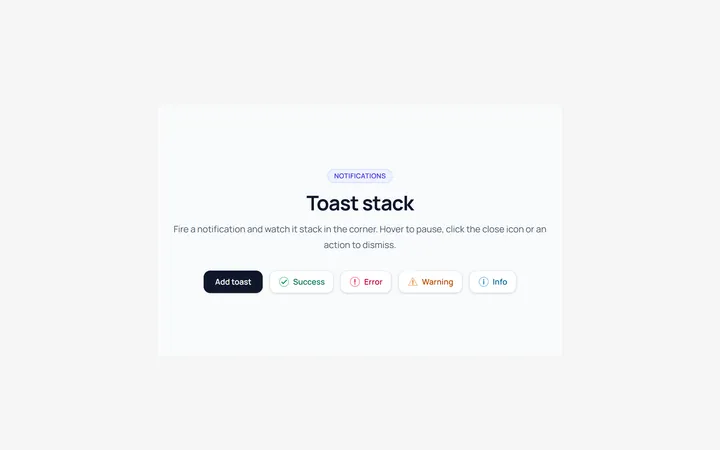
Toast Stack Alert
OriginalA stack of dismissible toasts in a corner.
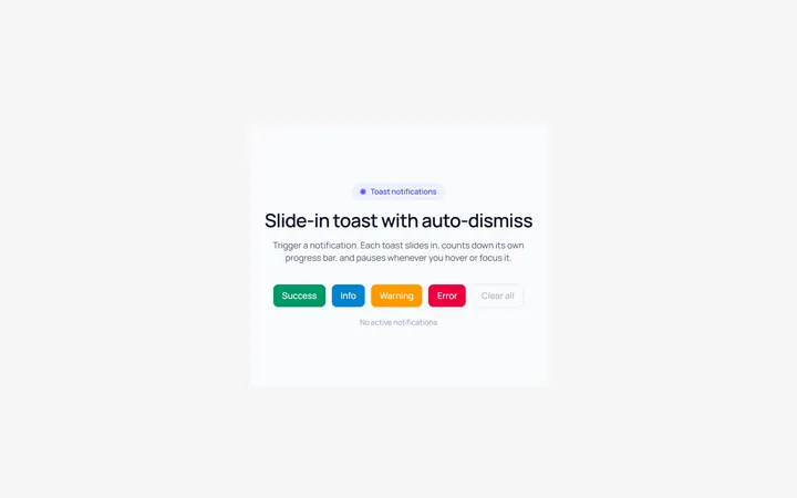
Toast Slide Alert
OriginalA toast that slides in with an icon and auto-dismiss progress.
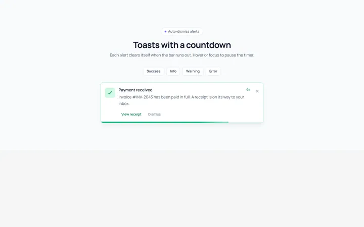
Progress Alert
OriginalAn alert with a countdown progress bar.
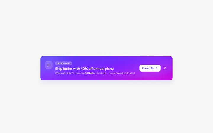
Gradient Alert
OriginalA gradient promo banner alert with a call to action.