

Grid Background
Original · freegrid line background with fade
Copy prompt gives Claude Code, Cursor or v0 a ready-to-paste prompt that recreates this exact component.
npx shadcn@latest add https://webinnoventix.com/r/bgx-grid.json"use client";
import { useId, useState, type CSSProperties } from "react";
import { motion, useReducedMotion } from "motion/react";
type Density = "sparse" | "regular" | "dense";
type Fade = "radial" | "topdown" | "vignette";
type Accent = "indigo" | "emerald" | "rose" | "amber";
const DENSITY: Record<Density, { label: string; size: number }> = {
sparse: { label: "Sparse", size: 72 },
regular: { label: "Regular", size: 44 },
dense: { label: "Dense", size: 26 },
};
const FADE: Record<Fade, { label: string; mask: string }> = {
radial: {
label: "Radial",
mask: "radial-gradient(ellipse 78% 66% at 50% 42%, #000 26%, transparent 74%)",
},
topdown: {
label: "Top-down",
mask: "linear-gradient(to bottom, #000 0%, #000 16%, transparent 88%)",
},
vignette: {
label: "Vignette",
mask: "radial-gradient(circle at 50% 50%, #000 40%, transparent 80%)",
},
};
const ACCENTS: Record<
Accent,
{ label: string; swatch: string; ring: string; focus: string; rgb: string }
> = {
indigo: {
label: "Indigo",
swatch: "bg-indigo-500",
ring: "peer-checked:ring-indigo-500",
focus: "peer-focus-visible:ring-indigo-500",
rgb: "99, 102, 241",
},
emerald: {
label: "Emerald",
swatch: "bg-emerald-500",
ring: "peer-checked:ring-emerald-500",
focus: "peer-focus-visible:ring-emerald-500",
rgb: "16, 185, 129",
},
rose: {
label: "Rose",
swatch: "bg-rose-500",
ring: "peer-checked:ring-rose-500",
focus: "peer-focus-visible:ring-rose-500",
rgb: "244, 63, 94",
},
amber: {
label: "Amber",
swatch: "bg-amber-500",
ring: "peer-checked:ring-amber-500",
focus: "peer-focus-visible:ring-amber-500",
rgb: "245, 158, 11",
},
};
const ACCENT_ORDER: Accent[] = ["indigo", "emerald", "rose", "amber"];
function gridStyle(size: number, minor: string, major: string): CSSProperties {
const major4 = `${size * 4}px ${size * 4}px`;
const minor1 = `${size}px ${size}px`;
return {
backgroundImage: [
`linear-gradient(to right, ${major} 1px, transparent 1px)`,
`linear-gradient(to bottom, ${major} 1px, transparent 1px)`,
`linear-gradient(to right, ${minor} 1px, transparent 1px)`,
`linear-gradient(to bottom, ${minor} 1px, transparent 1px)`,
].join(", "),
backgroundSize: `${major4}, ${major4}, ${minor1}, ${minor1}`,
backgroundPosition: "center center",
};
}
function Segmented<T extends string>(props: {
legend: string;
name: string;
value: T;
options: ReadonlyArray<{ value: T; label: string }>;
onChange: (value: T) => void;
}) {
const { legend, name, value, options, onChange } = props;
return (
<fieldset className="min-w-0">
<legend className="mb-2 text-xs font-semibold uppercase tracking-wider text-slate-500 dark:text-slate-400">
{legend}
</legend>
<div className="flex gap-1 rounded-xl bg-slate-100 p-1 dark:bg-slate-800/60">
{options.map((o) => (
<label key={o.value} className="relative flex-1">
<input
type="radio"
name={name}
value={o.value}
checked={value === o.value}
onChange={() => onChange(o.value)}
className="peer sr-only"
/>
<span className="flex cursor-pointer select-none items-center justify-center rounded-lg px-2.5 py-2 text-sm font-medium text-slate-600 transition-colors hover:text-slate-900 peer-checked:bg-white peer-checked:text-slate-900 peer-checked:shadow-sm peer-focus-visible:ring-2 peer-focus-visible:ring-indigo-500 peer-focus-visible:ring-offset-2 peer-focus-visible:ring-offset-slate-100 dark:text-slate-300 dark:hover:text-white dark:peer-checked:bg-slate-950 dark:peer-checked:text-white dark:peer-focus-visible:ring-offset-slate-800">
{o.label}
</span>
</label>
))}
</div>
</fieldset>
);
}
export default function BgxGrid() {
const reduce = useReducedMotion() ?? false;
const uid = useId();
const beamLabelId = `${uid}-beams`;
const [density, setDensity] = useState<Density>("regular");
const [fade, setFade] = useState<Fade>("radial");
const [accent, setAccent] = useState<Accent>("indigo");
const [beams, setBeams] = useState<boolean>(true);
const effectiveBeams = beams && !reduce;
const size = DENSITY[density].size;
const rgb = ACCENTS[accent].rgb;
const maskStyle: CSSProperties = {
maskImage: FADE[fade].mask,
WebkitMaskImage: FADE[fade].mask,
maskRepeat: "no-repeat",
WebkitMaskRepeat: "no-repeat",
maskSize: "100% 100%",
WebkitMaskSize: "100% 100%",
maskPosition: "center",
WebkitMaskPosition: "center",
};
function reset() {
setDensity("regular");
setFade("radial");
setAccent("indigo");
setBeams(true);
}
const densityOptions = (Object.keys(DENSITY) as Density[]).map((k) => ({
value: k,
label: DENSITY[k].label,
}));
const fadeOptions = (Object.keys(FADE) as Fade[]).map((k) => ({
value: k,
label: FADE[k].label,
}));
return (
<section className="relative w-full overflow-hidden bg-slate-50 text-slate-900 dark:bg-slate-950 dark:text-slate-100">
<style>{`
@keyframes bgxgrid-beam-x {
0% { transform: translateX(-32vw); opacity: 0; }
12% { opacity: 1; }
88% { opacity: 1; }
100% { transform: translateX(132vw); opacity: 0; }
}
@keyframes bgxgrid-beam-y {
0% { transform: translateY(-32vh); opacity: 0; }
12% { opacity: 1; }
88% { opacity: 1; }
100% { transform: translateY(132vh); opacity: 0; }
}
@keyframes bgxgrid-glow {
0%, 100% { opacity: 0.32; transform: translate(-50%, -50%) scale(1); }
50% { opacity: 0.58; transform: translate(-50%, -50%) scale(1.08); }
}
.bgxgrid-beam-x { animation: bgxgrid-beam-x 7.5s linear infinite; }
.bgxgrid-beam-y { animation: bgxgrid-beam-y 9.5s linear infinite; animation-delay: 1.2s; }
.bgxgrid-glow-anim { animation: bgxgrid-glow 6s ease-in-out infinite; }
@media (prefers-reduced-motion: reduce) {
.bgxgrid-beam-x, .bgxgrid-beam-y, .bgxgrid-glow-anim {
animation: none !important;
}
}
`}</style>
{/* Background: grid lines + fade mask + accent glow + optional beams */}
<div
aria-hidden="true"
className="pointer-events-none absolute inset-0 overflow-hidden"
style={maskStyle}
>
<div
className="absolute inset-0 dark:hidden"
style={gridStyle(size, "rgba(15, 23, 42, 0.06)", "rgba(15, 23, 42, 0.11)")}
/>
<div
className="absolute inset-0 hidden dark:block"
style={gridStyle(size, "rgba(148, 163, 184, 0.08)", "rgba(148, 163, 184, 0.15)")}
/>
<div
className={`absolute left-1/2 top-1/2 h-[34rem] w-[34rem] max-w-full -translate-x-1/2 -translate-y-1/2 rounded-full blur-2xl ${
effectiveBeams ? "bgxgrid-glow-anim" : ""
}`}
style={{
background: `radial-gradient(circle at center, rgba(${rgb}, 0.22), transparent 68%)`,
opacity: effectiveBeams ? undefined : 0.4,
}}
/>
{effectiveBeams && (
<>
<span
className="bgxgrid-beam-x absolute left-0 top-[34%] h-px w-[22%] will-change-transform"
style={{
background: `linear-gradient(90deg, transparent, rgba(${rgb}, 0.85), transparent)`,
}}
/>
<span
className="bgxgrid-beam-y absolute left-[62%] top-0 h-[22%] w-px will-change-transform"
style={{
background: `linear-gradient(180deg, transparent, rgba(${rgb}, 0.85), transparent)`,
}}
/>
</>
)}
</div>
{/* Foreground content */}
<div className="relative z-10 mx-auto max-w-6xl px-6 py-24 sm:py-32">
<motion.div
initial={reduce ? false : { opacity: 0, y: 18 }}
whileInView={reduce ? undefined : { opacity: 1, y: 0 }}
viewport={{ once: true, margin: "-80px" }}
transition={{ duration: 0.6, ease: [0.22, 1, 0.36, 1] }}
className="mx-auto max-w-2xl text-center"
>
<span className="inline-flex items-center gap-2 rounded-full border border-slate-200 bg-white/70 px-3 py-1 text-xs font-semibold uppercase tracking-widest text-slate-600 backdrop-blur dark:border-slate-800 dark:bg-slate-900/70 dark:text-slate-300">
<svg
viewBox="0 0 24 24"
aria-hidden="true"
className="h-3.5 w-3.5"
fill="none"
stroke="currentColor"
strokeWidth="1.6"
strokeLinecap="round"
>
<path d="M3 9h18M3 15h18M9 3v18M15 3v18" />
</svg>
Backgrounds / Grid
</span>
<h2 className="mt-6 text-balance text-4xl font-semibold tracking-tight sm:text-5xl">
A grid that knows when to disappear
</h2>
<p className="mt-5 text-pretty text-base leading-relaxed text-slate-600 dark:text-slate-300 sm:text-lg">
Structured guide lines that dissolve into the page, so your content
stays the hero. Tune the density, choose where the grid fades out,
and pick an accent that matches your product — every change updates
the backdrop live.
</p>
</motion.div>
<motion.div
initial={reduce ? false : { opacity: 0, y: 24 }}
whileInView={reduce ? undefined : { opacity: 1, y: 0 }}
viewport={{ once: true, margin: "-80px" }}
transition={{ duration: 0.6, delay: 0.08, ease: [0.22, 1, 0.36, 1] }}
className="mx-auto mt-12 max-w-3xl rounded-2xl border border-slate-200 bg-white/70 p-6 shadow-xl shadow-slate-900/5 backdrop-blur-md dark:border-slate-800 dark:bg-slate-900/60 dark:shadow-black/20 sm:p-8"
>
<div className="flex items-center justify-between gap-4">
<div>
<p className="text-sm font-semibold text-slate-900 dark:text-white">
Live controls
</p>
<p className="mt-0.5 text-xs text-slate-500 dark:text-slate-400">
Adjust the background behind this card.
</p>
</div>
<button
type="button"
onClick={reset}
className="inline-flex items-center gap-1.5 rounded-lg border border-slate-200 bg-white px-3 py-1.5 text-sm font-medium text-slate-700 transition-colors hover:bg-slate-50 focus-visible:outline-none focus-visible:ring-2 focus-visible:ring-indigo-500 focus-visible:ring-offset-2 focus-visible:ring-offset-white dark:border-slate-700 dark:bg-slate-800 dark:text-slate-200 dark:hover:bg-slate-700 dark:focus-visible:ring-offset-slate-900"
>
<svg
viewBox="0 0 24 24"
aria-hidden="true"
className="h-4 w-4"
fill="none"
stroke="currentColor"
strokeWidth="1.7"
strokeLinecap="round"
strokeLinejoin="round"
>
<path d="M3 12a9 9 0 1 0 3-6.7L3 8" />
<path d="M3 3v5h5" />
</svg>
Reset
</button>
</div>
<div className="mt-6 grid gap-6 sm:grid-cols-2">
<Segmented<Density>
legend="Density"
name={`${uid}-density`}
value={density}
options={densityOptions}
onChange={setDensity}
/>
<Segmented<Fade>
legend="Fade"
name={`${uid}-fade`}
value={fade}
options={fadeOptions}
onChange={setFade}
/>
</div>
<div className="mt-6 grid gap-6 sm:grid-cols-2 sm:items-start">
<fieldset>
<legend className="mb-2 text-xs font-semibold uppercase tracking-wider text-slate-500 dark:text-slate-400">
Accent
</legend>
<div className="flex gap-3">
{ACCENT_ORDER.map((a) => (
<label key={a} className="relative inline-flex">
<input
type="radio"
name={`${uid}-accent`}
value={a}
checked={accent === a}
onChange={() => setAccent(a)}
className="peer sr-only"
/>
<span
aria-hidden="true"
className={`grid h-9 w-9 cursor-pointer place-items-center rounded-full ring-2 ring-transparent ring-offset-2 ring-offset-white transition dark:ring-offset-slate-900 ${ACCENTS[a].swatch} ${ACCENTS[a].ring} ${ACCENTS[a].focus}`}
>
{accent === a && (
<svg
viewBox="0 0 24 24"
className="h-4 w-4 text-white"
fill="none"
stroke="currentColor"
strokeWidth="3"
strokeLinecap="round"
strokeLinejoin="round"
>
<path d="M5 13l4 4L19 7" />
</svg>
)}
</span>
<span className="sr-only">{ACCENTS[a].label}</span>
</label>
))}
</div>
</fieldset>
<div>
<p className="mb-2 text-xs font-semibold uppercase tracking-wider text-slate-500 dark:text-slate-400">
Motion
</p>
<div className="flex items-center justify-between rounded-xl bg-slate-100 px-4 py-3 dark:bg-slate-800/60">
<span
id={beamLabelId}
className="text-sm font-medium text-slate-700 dark:text-slate-200"
>
Animated beams
{reduce && (
<span className="mt-0.5 block text-xs font-normal text-slate-500 dark:text-slate-400">
Off — your system reduces motion.
</span>
)}
</span>
<button
type="button"
role="switch"
aria-checked={effectiveBeams}
aria-labelledby={beamLabelId}
disabled={reduce}
onClick={() => setBeams((v) => !v)}
className="relative inline-flex h-6 w-11 shrink-0 items-center rounded-full bg-slate-300 transition-colors focus-visible:outline-none focus-visible:ring-2 focus-visible:ring-indigo-500 focus-visible:ring-offset-2 focus-visible:ring-offset-slate-100 disabled:cursor-not-allowed disabled:opacity-40 aria-checked:bg-indigo-500 dark:bg-slate-700 dark:focus-visible:ring-offset-slate-800 dark:aria-checked:bg-indigo-500"
>
<span
className={`inline-block h-4 w-4 transform rounded-full bg-white shadow transition-transform ${
effectiveBeams ? "translate-x-6" : "translate-x-1"
}`}
/>
</button>
</div>
</div>
</div>
<p aria-live="polite" className="sr-only">
{`Grid density ${DENSITY[density].label}, ${FADE[fade].label} fade, ${ACCENTS[accent].label} accent, beams ${effectiveBeams ? "on" : "off"}.`}
</p>
</motion.div>
<p className="mx-auto mt-8 max-w-3xl text-center text-xs text-slate-400 dark:text-slate-500">
Pure CSS gradients masked with a fade — no images, no canvas. Renders
crisp on any background in light and dark.
</p>
</div>
</section>
);
}Dependencies
Licence
Built by Web Innoventix. Free for personal and commercial use, no attribution required.
Built by Web Innoventix
Need a custom interface, a full website, or SEO that gets you cited by AI? We design, build and rank it end to end.
Get a free quoteSimilar components
Browse all →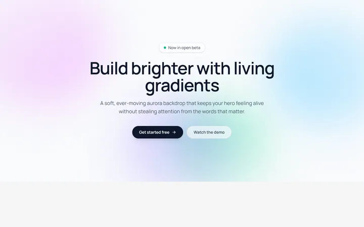
Aurora Blobs Background
OriginalAn animated hero section with soft, ever-drifting aurora gradient blobs floating behind staggered, blur-in content.

Retro Perspective Grid
OriginalA launch and waitlist section set over an infinite neon grid that scrolls into a glowing horizon with rising particles.
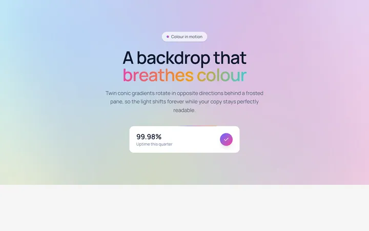
Conic Gradient Flow
OriginalA frosted hero backed by twin counter-rotating conic gradients, with flowing gradient text and an animated gradient-border stat card.
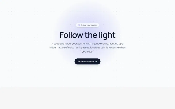
Spotlight Follow Background
OriginalA dot-grid section where a spring-eased spotlight follows the cursor and reveals a hidden lattice of coloured dots.
Dot Pattern Background
pattern.tsxA reusable animated background for React and Tailwind: dot pattern background.
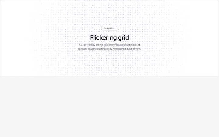
Flickering Grid Background
grid.tsxA reusable animated background for React and Tailwind: flickering grid background.
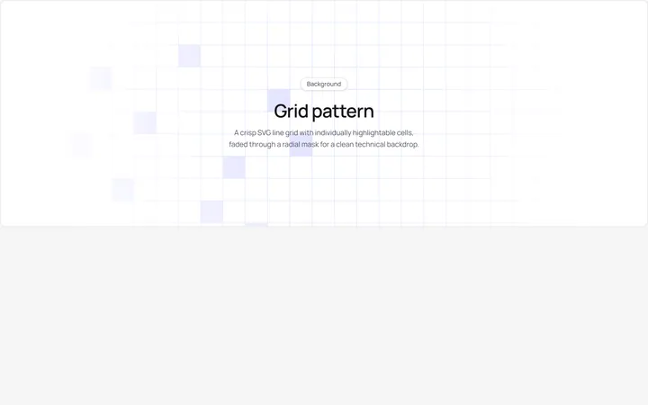
Grid Pattern Background
pattern.tsxA reusable animated background for React and Tailwind: grid pattern background.
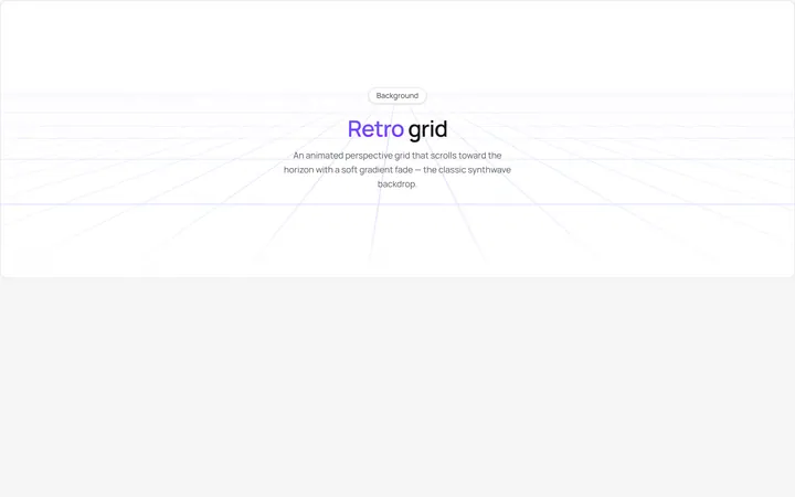
Retro Grid Background
grid.jsonA reusable animated background for React and Tailwind: retro grid background.
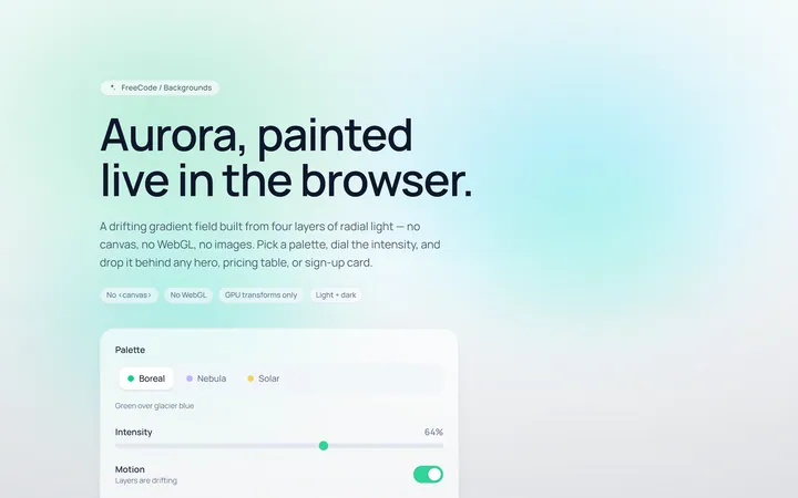
Aurora Background
Originalaurora gradient background
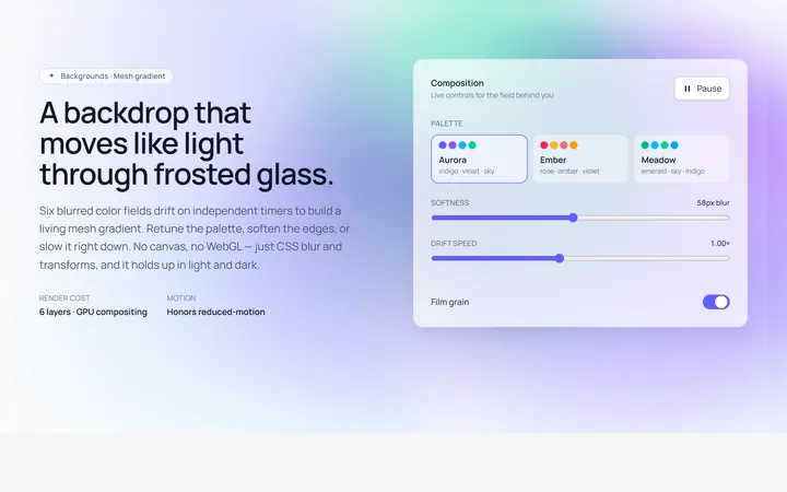
Mesh Gradient Background
Originalanimated mesh gradient background
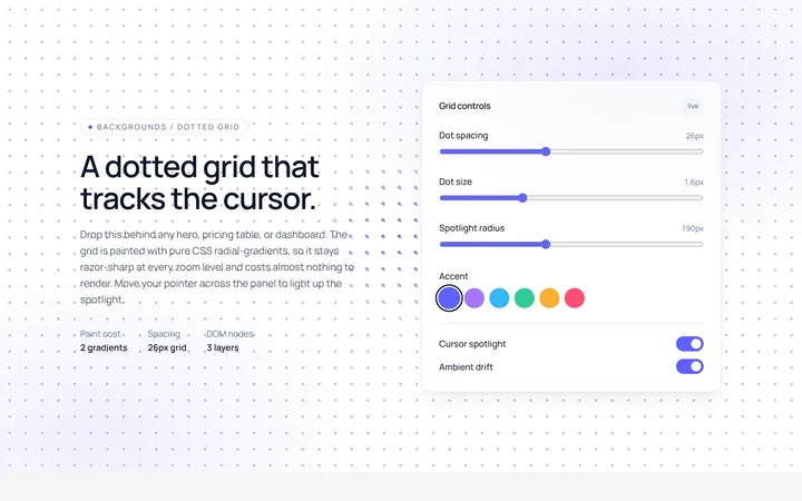
Dots Background
Originaldotted grid background
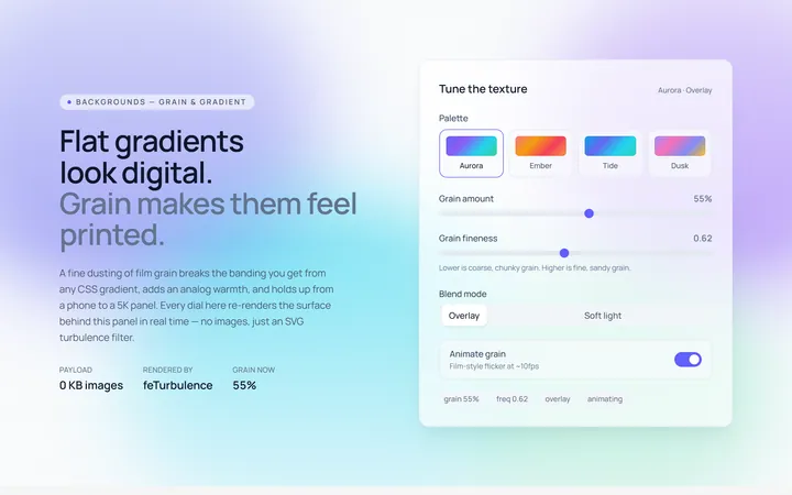
Noise Background
Originalnoise/grain gradient background