

Arrow Breadcrumb
Original · freearrow-chip breadcrumbs
Copy prompt gives Claude Code, Cursor or v0 a ready-to-paste prompt that recreates this exact component.
npx shadcn@latest add https://webinnoventix.com/r/crumb-arrow.json"use client";
import { useState, useRef, useEffect, useId } from "react";
import { useReducedMotion } from "motion/react";
type CatNode = { id: string; label: string; blurb: string; children: string[] };
type MenuItem = { id: string; label: string; sub?: string };
type MenuVariant = "overflow" | "browse";
const TREE: Record<string, CatNode> = {
root: { id: "root", label: "Catalog", blurb: "The full range across every discipline and season.", children: ["outdoor", "apparel", "footwear", "electronics"] },
outdoor: { id: "outdoor", label: "Outdoor", blurb: "Gear built for the backcountry, the crag, and everything in between.", children: ["camping", "climbing", "hiking", "water"] },
apparel: { id: "apparel", label: "Apparel", blurb: "Layers that move with you from trailhead to summit.", children: ["jackets", "baselayers", "pants"] },
footwear: { id: "footwear", label: "Footwear", blurb: "Traction and support for rock, trail, and approach.", children: ["climbShoes", "approach", "trailRun"] },
electronics: { id: "electronics", label: "Electronics", blurb: "Navigation, light, and tracking for long days out.", children: ["gps", "headlamps", "watches"] },
camping: { id: "camping", label: "Camping", blurb: "Shelters, sleep systems, and the backcountry kitchen.", children: ["tents", "sleeping", "stoves"] },
climbing: { id: "climbing", label: "Climbing", blurb: "Hardware and soft goods for vertical terrain.", children: ["ropes", "harnesses", "carabiners", "protection"] },
hiking: { id: "hiking", label: "Hiking", blurb: "Packs and poles for miles of trail.", children: ["packs", "poles"] },
water: { id: "water", label: "Water Sports", blurb: "Kit for rivers, lakes, and open water.", children: [] },
ropes: { id: "ropes", label: "Ropes", blurb: "Dynamic and static lines sorted by diameter and length.", children: [] },
harnesses: { id: "harnesses", label: "Harnesses", blurb: "Sit harnesses tuned to how and where you climb.", children: ["sport", "trad", "bigwall", "gym"] },
carabiners: { id: "carabiners", label: "Carabiners", blurb: "Lockers and non-lockers for every clip.", children: [] },
protection: { id: "protection", label: "Protection", blurb: "Cams, nuts, and slings for trad leads.", children: [] },
sport: { id: "sport", label: "Sport", blurb: "Lightweight harnesses built for bolted routes and redpoints.", children: [] },
trad: { id: "trad", label: "Trad", blurb: "Reinforced gear loops and padding for a full rack.", children: [] },
bigwall: { id: "bigwall", label: "Big Wall", blurb: "Made for hauling, hanging belays, and multi-day walls.", children: [] },
gym: { id: "gym", label: "Gym & Indoor", blurb: "Stripped-down comfort for plastic and training.", children: [] },
tents: { id: "tents", label: "Tents", blurb: "Freestanding and trekking-pole shelters.", children: [] },
sleeping: { id: "sleeping", label: "Sleep Systems", blurb: "Bags and pads rated for the season.", children: [] },
stoves: { id: "stoves", label: "Stoves", blurb: "Canister and liquid-fuel cookers.", children: [] },
packs: { id: "packs", label: "Backpacks", blurb: "Daypacks through multi-day haulers.", children: [] },
poles: { id: "poles", label: "Trekking Poles", blurb: "Folding and telescoping poles.", children: [] },
jackets: { id: "jackets", label: "Jackets", blurb: "Shells, insulation, and wind layers.", children: [] },
baselayers: { id: "baselayers", label: "Base Layers", blurb: "Merino and synthetic, next to skin.", children: [] },
pants: { id: "pants", label: "Pants", blurb: "Climbing and hiking bottoms.", children: [] },
climbShoes: { id: "climbShoes", label: "Climbing Shoes", blurb: "Aggressive downturn through all-day comfort.", children: [] },
approach: { id: "approach", label: "Approach Shoes", blurb: "Sticky rubber for the walk-in.", children: [] },
trailRun: { id: "trailRun", label: "Trail Runners", blurb: "Cushioned grip for fast miles.", children: [] },
gps: { id: "gps", label: "GPS Units", blurb: "Handheld navigation and satellite messaging.", children: [] },
headlamps: { id: "headlamps", label: "Headlamps", blurb: "Rechargeable and reactive lighting.", children: [] },
watches: { id: "watches", label: "Watches", blurb: "Altimeter and GPS wearables.", children: [] },
};
const DEFAULT_PATH = ["root", "outdoor", "climbing", "harnesses"];
const MAX_VISIBLE = 4;
const NEUTRAL_CHIP =
"bg-slate-100 text-slate-700 hover:bg-slate-200 dark:bg-slate-800 dark:text-slate-200 dark:hover:bg-slate-700";
const CURRENT_CHIP =
"bg-indigo-600 text-white dark:bg-indigo-500 dark:text-white";
const BROWSE_CHIP =
"bg-indigo-50 text-indigo-700 hover:bg-indigo-100 dark:bg-indigo-500/15 dark:text-indigo-300 dark:hover:bg-indigo-500/25";
function HomeIcon({ className }: { className?: string }) {
return (
<svg className={className} viewBox="0 0 24 24" fill="none" stroke="currentColor" strokeWidth={1.8} strokeLinecap="round" strokeLinejoin="round" aria-hidden="true">
<path d="M4 11.4 12 5l8 6.4" />
<path d="M6 10.4V19h12v-8.6" />
</svg>
);
}
function ChevronDownIcon({ className }: { className?: string }) {
return (
<svg className={className} viewBox="0 0 24 24" fill="none" stroke="currentColor" strokeWidth={2} strokeLinecap="round" strokeLinejoin="round" aria-hidden="true">
<path d="m6 9 6 6 6-6" />
</svg>
);
}
function ChevronRightIcon({ className }: { className?: string }) {
return (
<svg className={className} viewBox="0 0 24 24" fill="none" stroke="currentColor" strokeWidth={2} strokeLinecap="round" strokeLinejoin="round" aria-hidden="true">
<path d="m9 5 7 7-7 7" />
</svg>
);
}
function DotsIcon({ className }: { className?: string }) {
return (
<svg className={className} viewBox="0 0 24 24" fill="currentColor" aria-hidden="true">
<circle cx="5" cy="12" r="1.7" />
<circle cx="12" cy="12" r="1.7" />
<circle cx="19" cy="12" r="1.7" />
</svg>
);
}
function ResetIcon({ className }: { className?: string }) {
return (
<svg className={className} viewBox="0 0 24 24" fill="none" stroke="currentColor" strokeWidth={1.8} strokeLinecap="round" strokeLinejoin="round" aria-hidden="true">
<path d="M3.5 5v4h4" />
<path d="M4 12a8 8 0 1 1 2.3 5.6" />
</svg>
);
}
type CrumbMenuProps = {
variant: MenuVariant;
triggerLabel: string;
menuTitle: string;
items: MenuItem[];
align: "left" | "right";
animate: boolean;
onSelect: (id: string) => void;
};
function CrumbMenu({ variant, triggerLabel, menuTitle, items, align, animate, onSelect }: CrumbMenuProps) {
const [open, setOpen] = useState(false);
const [active, setActive] = useState(0);
const rootRef = useRef<HTMLLIElement>(null);
const btnRef = useRef<HTMLButtonElement>(null);
const itemRefs = useRef<Array<HTMLButtonElement | null>>([]);
const menuId = useId();
useEffect(() => {
if (open) itemRefs.current[active]?.focus();
}, [open, active]);
useEffect(() => {
if (!open) return;
function onDown(e: PointerEvent) {
if (!(e.target instanceof Node)) return;
if (rootRef.current && !rootRef.current.contains(e.target)) setOpen(false);
}
document.addEventListener("pointerdown", onDown);
return () => document.removeEventListener("pointerdown", onDown);
}, [open]);
function openMenu(idx: number) {
setActive(idx);
setOpen(true);
}
function choose(id: string) {
setOpen(false);
btnRef.current?.focus();
onSelect(id);
}
return (
<li ref={rootRef} className={`ca-seg relative inline-flex ${open ? "z-30" : "z-0"}`}>
<button
ref={btnRef}
type="button"
aria-haspopup="menu"
aria-expanded={open}
aria-controls={menuId}
aria-label={triggerLabel}
onClick={() => (open ? setOpen(false) : openMenu(0))}
onKeyDown={(e) => {
if (e.key === "ArrowDown") {
e.preventDefault();
openMenu(0);
} else if (e.key === "ArrowUp") {
e.preventDefault();
openMenu(items.length - 1);
} else if (e.key === "Escape") {
setOpen(false);
}
}}
style={{ paddingLeft: 22, paddingRight: 22 }}
className={`ca-arrow ca-focusable relative z-10 inline-flex h-11 items-center gap-1.5 text-sm font-medium outline-none transition-colors ${variant === "browse" ? BROWSE_CHIP : NEUTRAL_CHIP}`}
>
{variant === "overflow" ? (
<DotsIcon className="h-4 w-4" />
) : (
<>
<span>Browse</span>
<ChevronDownIcon className={`h-4 w-4 transition-transform duration-200 ${open ? "rotate-180" : ""}`} />
</>
)}
</button>
{open && (
<div
id={menuId}
role="menu"
aria-label={menuTitle}
onKeyDown={(e) => {
if (e.key === "ArrowDown") {
e.preventDefault();
setActive((i) => (i + 1) % items.length);
} else if (e.key === "ArrowUp") {
e.preventDefault();
setActive((i) => (i - 1 + items.length) % items.length);
} else if (e.key === "Home") {
e.preventDefault();
setActive(0);
} else if (e.key === "End") {
e.preventDefault();
setActive(items.length - 1);
} else if (e.key === "Escape") {
e.preventDefault();
setOpen(false);
btnRef.current?.focus();
} else if (e.key === "Tab") {
setOpen(false);
}
}}
className={`absolute ${align === "right" ? "right-0" : "left-0"} top-[calc(100%+8px)] z-40 min-w-[13rem] max-w-[min(18rem,80vw)] rounded-xl border border-slate-200 bg-white p-1.5 shadow-xl shadow-slate-900/10 dark:border-slate-700 dark:bg-slate-900 dark:shadow-black/50 ${animate ? "ca-menu-anim" : ""}`}
>
<p aria-hidden="true" className="px-2 pb-1 pt-1 text-[0.68rem] font-semibold uppercase tracking-wider text-slate-400 dark:text-slate-500">
{menuTitle}
</p>
{items.map((it, i) => (
<button
key={it.id}
ref={(el) => {
itemRefs.current[i] = el;
}}
role="menuitem"
type="button"
tabIndex={active === i ? 0 : -1}
onClick={() => choose(it.id)}
className={`flex w-full items-center justify-between gap-3 rounded-lg px-3 py-2 text-left text-sm outline-none transition-colors focus-visible:ring-2 focus-visible:ring-indigo-500 dark:focus-visible:ring-indigo-400 ${active === i ? "bg-slate-100 dark:bg-slate-800" : "hover:bg-slate-100 dark:hover:bg-slate-800"}`}
>
<span className="flex flex-col">
<span className="font-medium text-slate-800 dark:text-slate-100">{it.label}</span>
{it.sub && <span className="text-xs text-slate-500 dark:text-slate-400">{it.sub}</span>}
</span>
<ChevronRightIcon className="h-4 w-4 shrink-0 text-slate-400 dark:text-slate-500" />
</button>
))}
</div>
)}
</li>
);
}
export default function CrumbArrow() {
const reduce = useReducedMotion();
const animate = !reduce;
const [path, setPath] = useState<string[]>(DEFAULT_PATH);
const nodes = path.map((id, i) => ({ id, index: i, node: TREE[id] }));
const collapsed = nodes.length > MAX_VISIBLE;
const lead = collapsed ? nodes.slice(0, 1) : nodes;
const hidden = collapsed ? nodes.slice(1, nodes.length - 2) : [];
const tail = collapsed ? nodes.slice(nodes.length - 2) : [];
const current = TREE[path[path.length - 1]];
const isDefault = path.join("/") === DEFAULT_PATH.join("/");
const jumpTo = (id: string) => setPath(path.slice(0, path.indexOf(id) + 1));
const goDeeper = (id: string) => setPath([...path, id]);
const reset = () => setPath(DEFAULT_PATH);
const browseItems: MenuItem[] = current.children.map((cid) => {
const child = TREE[cid];
return {
id: cid,
label: child.label,
sub: child.children.length > 0 ? `${child.children.length} subcategories` : "Product listing",
};
});
const renderCrumb = (item: { id: string; index: number; node: CatNode }) => {
const isFirst = item.index === 0;
const isCurrent = item.index === path.length - 1;
const shape = isFirst ? "ca-arrow-first" : "ca-arrow";
const pad = isFirst ? { paddingLeft: 16, paddingRight: 22 } : { paddingLeft: 22, paddingRight: 22 };
const pop = animate ? " ca-pop-el" : "";
if (isCurrent) {
return (
<li key={item.id} className={`ca-seg relative inline-flex ${isFirst ? "ca-first" : ""}`}>
<span
aria-current="page"
style={pad}
className={`${shape}${pop} relative z-10 inline-flex h-11 items-center gap-1.5 text-sm font-semibold ${CURRENT_CHIP}`}
>
{isFirst && <HomeIcon className="h-4 w-4" />}
{item.node.label}
</span>
</li>
);
}
return (
<li key={item.id} className={`ca-seg relative inline-flex ${isFirst ? "ca-first" : ""}`}>
<button
type="button"
onClick={() => setPath(path.slice(0, item.index + 1))}
style={pad}
className={`${shape}${pop} ca-focusable relative z-10 inline-flex h-11 items-center gap-1.5 text-sm font-medium outline-none transition-colors ${NEUTRAL_CHIP}`}
>
{isFirst && <HomeIcon className="h-4 w-4" />}
{item.node.label}
</button>
</li>
);
};
return (
<section className="relative w-full overflow-hidden bg-gradient-to-b from-slate-50 to-white px-4 py-16 text-slate-900 sm:py-20 dark:from-slate-950 dark:to-slate-900 dark:text-slate-100">
<div className="mx-auto max-w-3xl">
<p className="text-xs font-semibold uppercase tracking-[0.2em] text-indigo-600 dark:text-indigo-400">Navigation</p>
<h2 className="mt-2 text-3xl font-bold tracking-tight sm:text-4xl">Arrow-chip breadcrumbs</h2>
<p className="mt-3 max-w-prose text-base leading-relaxed text-slate-600 dark:text-slate-300">
Drill through the catalog and watch the trail build itself. Every chip is a real control: click one to jump back
up, or open a menu to go a level deeper. Long trails fold away behind a menu so the row never runs off the edge.
</p>
<div className="mt-8 rounded-2xl border border-slate-200 bg-white/80 p-4 shadow-sm backdrop-blur sm:p-6 dark:border-slate-800 dark:bg-slate-900/70">
<div className="mb-4 flex items-center justify-between gap-3">
<span className="text-xs font-semibold uppercase tracking-wider text-slate-500 dark:text-slate-400">You are here</span>
<button
type="button"
onClick={reset}
disabled={isDefault}
className="inline-flex items-center gap-1.5 rounded-lg border border-slate-200 bg-white px-3 py-1.5 text-sm font-medium text-slate-600 shadow-sm outline-none transition-colors hover:bg-slate-50 focus-visible:ring-2 focus-visible:ring-indigo-500 disabled:cursor-not-allowed disabled:opacity-40 dark:border-slate-700 dark:bg-slate-900 dark:text-slate-300 dark:hover:bg-slate-800 dark:focus-visible:ring-indigo-400"
>
<ResetIcon className="h-4 w-4" />
Reset
</button>
</div>
<nav aria-label="Breadcrumb">
<ol className="flex flex-wrap items-center gap-1.5">
{lead.map(renderCrumb)}
{hidden.length > 0 && (
<CrumbMenu
variant="overflow"
align="left"
triggerLabel={`Show ${hidden.length} hidden ${hidden.length === 1 ? "level" : "levels"}`}
menuTitle="Jump to"
animate={animate}
items={hidden.map((h) => ({ id: h.id, label: h.node.label }))}
onSelect={jumpTo}
/>
)}
{tail.map(renderCrumb)}
{current.children.length > 0 && (
<CrumbMenu
variant="browse"
align="right"
triggerLabel={`Browse ${current.label} subcategories`}
menuTitle="Go deeper"
animate={animate}
items={browseItems}
onSelect={goDeeper}
/>
)}
</ol>
</nav>
<div aria-live="polite" className="mt-6 rounded-xl border border-slate-200 bg-slate-50/70 p-4 sm:p-5 dark:border-slate-800 dark:bg-slate-950/40">
<p className="text-xs font-semibold uppercase tracking-wider text-indigo-600 dark:text-indigo-400">Current section</p>
<h3 className="mt-1 text-lg font-semibold">{current.label}</h3>
<p className="mt-1 text-sm text-slate-600 dark:text-slate-300">{current.blurb}</p>
<p className="mt-3 text-sm font-medium text-slate-500 dark:text-slate-400">
{current.children.length > 0
? `${current.children.length} subcategories — use Browse to go deeper.`
: "Product listing — you have reached the deepest level of the tree."}
</p>
</div>
<p className="mt-4 text-xs text-slate-400 dark:text-slate-500">
Open a menu and use the Up and Down arrow keys to move; press Escape to close.
</p>
</div>
</div>
<style>{`
.ca-seg { --tip: 12px; }
.ca-arrow {
clip-path: polygon(0 0, calc(100% - var(--tip)) 0, 100% 50%, calc(100% - var(--tip)) 100%, 0 100%, var(--tip) 50%);
}
.ca-arrow-first {
clip-path: polygon(0 0, calc(100% - var(--tip)) 0, 100% 50%, calc(100% - var(--tip)) 100%, 0 100%);
}
.ca-seg::before {
content: "";
position: absolute;
inset: -2.5px;
z-index: 0;
pointer-events: none;
background: #6366f1;
opacity: 0;
transition: opacity .15s ease;
clip-path: polygon(0 0, calc(100% - var(--tip)) 0, 100% 50%, calc(100% - var(--tip)) 100%, 0 100%, var(--tip) 50%);
}
.ca-seg.ca-first::before {
clip-path: polygon(0 0, calc(100% - var(--tip)) 0, 100% 50%, calc(100% - var(--tip)) 100%, 0 100%);
}
.ca-seg:has(> .ca-focusable:focus-visible)::before { opacity: 1; }
@media (prefers-color-scheme: dark) {
.ca-seg::before { background: #818cf8; }
}
@keyframes ca-arrowchip-pop {
from { opacity: 0; transform: translateX(-8px); }
to { opacity: 1; transform: none; }
}
@keyframes ca-arrowchip-menu {
from { opacity: 0; transform: translateY(-6px) scale(.97); }
to { opacity: 1; transform: none; }
}
.ca-pop-el { animation: ca-arrowchip-pop .3s ease both; }
.ca-menu-anim { animation: ca-arrowchip-menu .16s ease both; transform-origin: top; }
@media (prefers-reduced-motion: reduce) {
.ca-pop-el, .ca-menu-anim { animation: none !important; }
}
`}</style>
</section>
);
}Dependencies
Licence
Built by Web Innoventix. Free for personal and commercial use, no attribution required.
Built by Web Innoventix
Need a custom interface, a full website, or SEO that gets you cited by AI? We design, build and rank it end to end.
Get a free quoteSimilar components
Browse all →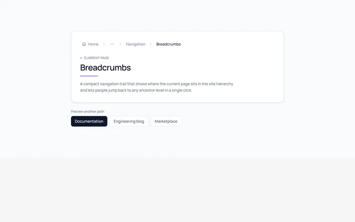
Basic Breadcrumb
Originalbasic breadcrumb trail
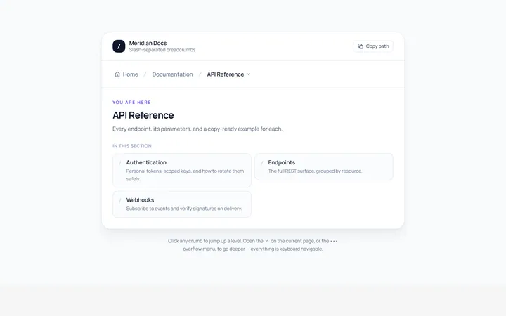
Slash Breadcrumb
Originalslash separator breadcrumbs
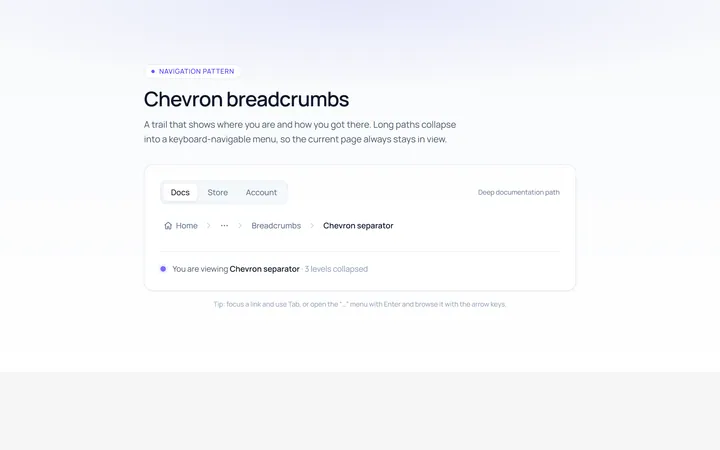
Chevron Breadcrumb
Originalchevron separator breadcrumbs
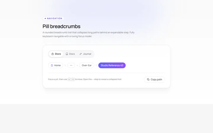
Pill Breadcrumb
Originalpill breadcrumbs
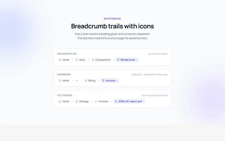
Icons Breadcrumb
Originalbreadcrumbs with icons
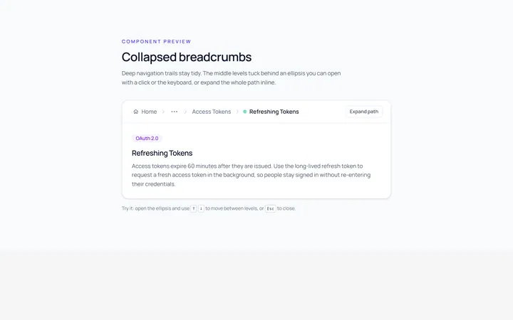
Collapsed Breadcrumb
Originalcollapsed breadcrumbs with ellipsis
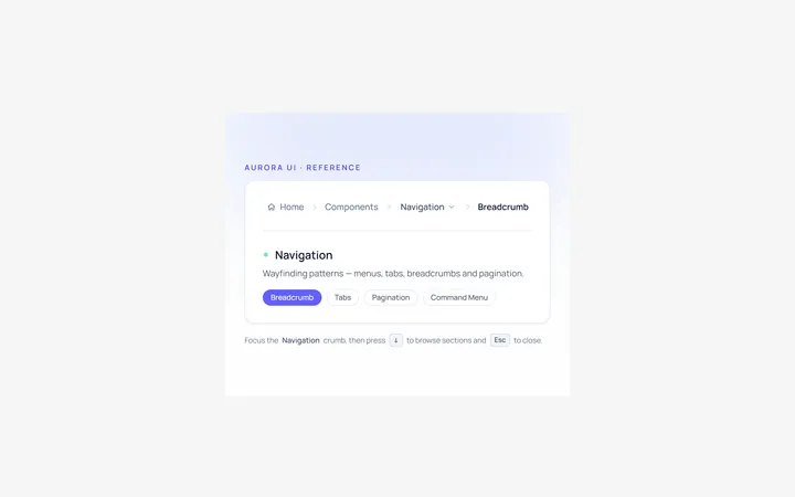
Dropdown Breadcrumb
Originalbreadcrumb with a dropdown level

Spotlight Hero
OriginalA centred hero with a soft radial spotlight, badge and dual call-to-action.

Split Hero
OriginalA two-column hero pairing a headline and CTAs with a product mock and social proof.

Gradient Spotlight Hero
OriginalA minimal centred hero with a soft gradient-mesh backdrop, announcement pill and dual call-to-action buttons.

App Preview Hero
OriginalA centred hero that pairs headline copy with a realistic product dashboard mock built entirely from markup, complete with browser chrome and a floating notification card.

Waitlist Capture Hero
OriginalA dark, focused hero with an inline email capture form and avatar social proof, ready for pre-launch waitlists.