

Collapsed Breadcrumb
Original · freecollapsed breadcrumbs with ellipsis
Copy prompt gives Claude Code, Cursor or v0 a ready-to-paste prompt that recreates this exact component.
npx shadcn@latest add https://webinnoventix.com/r/crumb-collapsed.json"use client";
import {
useState,
useRef,
useEffect,
useId,
Fragment,
type KeyboardEvent as ReactKeyboardEvent,
} from "react";
import { motion, AnimatePresence, useReducedMotion } from "motion/react";
type Crumb = { label: string; href: string };
type CrumbNode =
| { kind: "link"; crumb: Crumb; index: number }
| { kind: "current"; crumb: Crumb; index: number }
| { kind: "ellipsis" };
const TRAIL: Crumb[] = [
{ label: "Home", href: "/" },
{ label: "Developer Platform", href: "/developers" },
{ label: "Guides", href: "/developers/guides" },
{ label: "Authentication", href: "/developers/guides/auth" },
{ label: "OAuth 2.0", href: "/developers/guides/auth/oauth" },
{ label: "Access Tokens", href: "/developers/guides/auth/oauth/tokens" },
{
label: "Refreshing Tokens",
href: "/developers/guides/auth/oauth/tokens/refresh",
},
];
function Separator() {
return (
<svg
viewBox="0 0 20 20"
className="h-4 w-4 shrink-0 text-slate-300 dark:text-slate-600"
aria-hidden="true"
focusable="false"
>
<path
d="M7.75 4.5 12.5 10l-4.75 5.5"
fill="none"
stroke="currentColor"
strokeWidth={1.5}
strokeLinecap="round"
strokeLinejoin="round"
/>
</svg>
);
}
function HomeIcon() {
return (
<svg
viewBox="0 0 20 20"
className="h-4 w-4 shrink-0"
aria-hidden="true"
focusable="false"
>
<path
d="M3.5 9.25 10 3.75l6.5 5.5M5 8v7.25a.75.75 0 0 0 .75.75H8.5v-4a1 1 0 0 1 1-1h1a1 1 0 0 1 1 1v4h2.75a.75.75 0 0 0 .75-.75V8"
fill="none"
stroke="currentColor"
strokeWidth={1.5}
strokeLinecap="round"
strokeLinejoin="round"
/>
</svg>
);
}
export default function CrumbCollapsed() {
const reduce = useReducedMotion();
const panelId = useId();
const listId = useId();
const [open, setOpen] = useState(false);
const [expanded, setExpanded] = useState(false);
const triggerRef = useRef<HTMLButtonElement | null>(null);
const panelRef = useRef<HTMLDivElement | null>(null);
const linkRefs = useRef<Array<HTMLAnchorElement | null>>([]);
const first = TRAIL[0];
const current = TRAIL[TRAIL.length - 1];
const secondLast = TRAIL[TRAIL.length - 2];
const hidden = TRAIL.slice(1, TRAIL.length - 2);
useEffect(() => {
if (!open) return;
function onDown(e: MouseEvent) {
const t = e.target as Node;
if (panelRef.current?.contains(t)) return;
if (triggerRef.current?.contains(t)) return;
setOpen(false);
}
function onKey(e: KeyboardEvent) {
if (e.key === "Escape") {
setOpen(false);
triggerRef.current?.focus();
}
}
document.addEventListener("mousedown", onDown);
document.addEventListener("keydown", onKey);
return () => {
document.removeEventListener("mousedown", onDown);
document.removeEventListener("keydown", onKey);
};
}, [open]);
useEffect(() => {
if (!open) return;
const id = requestAnimationFrame(() => linkRefs.current[0]?.focus());
return () => cancelAnimationFrame(id);
}, [open]);
function onPanelKeyDown(e: ReactKeyboardEvent<HTMLDivElement>) {
const items = linkRefs.current.filter(Boolean) as HTMLAnchorElement[];
if (items.length === 0) return;
const active = items.indexOf(
(typeof document !== "undefined"
? document.activeElement
: null) as HTMLAnchorElement,
);
if (e.key === "ArrowDown") {
e.preventDefault();
items[active < items.length - 1 ? active + 1 : 0]?.focus();
} else if (e.key === "ArrowUp") {
e.preventDefault();
items[active > 0 ? active - 1 : items.length - 1]?.focus();
} else if (e.key === "Home") {
e.preventDefault();
items[0]?.focus();
} else if (e.key === "End") {
e.preventDefault();
items[items.length - 1]?.focus();
}
}
const focusRing =
"focus-visible:outline-none focus-visible:ring-2 focus-visible:ring-indigo-500 focus-visible:ring-offset-2 focus-visible:ring-offset-white dark:focus-visible:ring-offset-slate-900";
const linkClass =
"rounded-md px-1.5 py-1 text-sm font-medium text-slate-500 transition-colors hover:text-slate-900 hover:bg-slate-100 dark:text-slate-400 dark:hover:text-white dark:hover:bg-slate-800 " +
focusRing;
const nodes: CrumbNode[] = expanded
? TRAIL.map((crumb, index) =>
index === TRAIL.length - 1
? { kind: "current", crumb, index }
: { kind: "link", crumb, index },
)
: [
{ kind: "link", crumb: first, index: 0 },
{ kind: "ellipsis" },
{ kind: "link", crumb: secondLast, index: TRAIL.length - 2 },
{ kind: "current", crumb: current, index: TRAIL.length - 1 },
];
function keyFor(node: CrumbNode, i: number) {
if (node.kind === "ellipsis") return `ellipsis-${i}`;
return node.crumb.href;
}
return (
<section className="relative w-full bg-slate-50 px-4 py-16 text-slate-900 dark:bg-slate-950 dark:text-slate-50 sm:py-24">
<style>{`
@keyframes crumbc-pulse {
0%, 100% { transform: scale(1); opacity: 1; }
50% { transform: scale(1.55); opacity: 0.45; }
}
.crumbc-dot { animation: crumbc-pulse 2.6s ease-in-out infinite; }
@media (prefers-reduced-motion: reduce) {
.crumbc-dot { animation: none !important; }
}
`}</style>
<div className="mx-auto max-w-2xl">
<p className="text-xs font-semibold uppercase tracking-[0.22em] text-indigo-600 dark:text-indigo-400">
Component preview
</p>
<h2 className="mt-3 text-2xl font-semibold tracking-tight text-slate-900 dark:text-white sm:text-3xl">
Collapsed breadcrumbs
</h2>
<p className="mt-3 max-w-xl text-sm leading-relaxed text-slate-600 dark:text-slate-400">
Deep navigation trails stay tidy. The middle levels tuck behind an
ellipsis you can open with a click or the keyboard, or expand the
whole path inline.
</p>
<div className="mt-8 overflow-hidden rounded-2xl border border-slate-200 bg-white shadow-sm dark:border-slate-800 dark:bg-slate-900">
<div className="flex flex-wrap items-center justify-between gap-3 border-b border-slate-200 px-4 py-3 dark:border-slate-800 sm:px-5">
<nav aria-label="Breadcrumb" className="min-w-0">
<ol
id={listId}
className="flex flex-wrap items-center gap-x-0.5 gap-y-1"
>
{nodes.map((node, i) => (
<Fragment key={keyFor(node, i)}>
{i > 0 && (
<li aria-hidden="true" className="flex items-center">
<Separator />
</li>
)}
{node.kind === "link" && (
<li className="flex items-center">
<a href={node.crumb.href} className={linkClass}>
{node.index === 0 ? (
<span className="flex items-center gap-1.5">
<HomeIcon />
<span>{node.crumb.label}</span>
</span>
) : (
node.crumb.label
)}
</a>
</li>
)}
{node.kind === "current" && (
<li className="flex items-center">
<span
aria-current="page"
className="flex items-center gap-2 rounded-md px-1.5 py-1 text-sm font-semibold text-slate-900 dark:text-white"
>
<span
className="crumbc-dot h-1.5 w-1.5 rounded-full bg-emerald-500"
aria-hidden="true"
/>
{node.crumb.label}
</span>
</li>
)}
{node.kind === "ellipsis" && (
<li className="relative flex items-center">
<button
ref={triggerRef}
type="button"
onClick={() => setOpen((v) => !v)}
aria-haspopup="true"
aria-expanded={open}
aria-controls={panelId}
aria-label={`Show ${hidden.length} hidden breadcrumb levels`}
className={
"flex h-8 w-9 items-center justify-center rounded-md text-slate-500 transition-colors hover:bg-slate-100 hover:text-slate-900 dark:text-slate-400 dark:hover:bg-slate-800 dark:hover:text-white " +
(open
? "bg-slate-100 text-slate-900 dark:bg-slate-800 dark:text-white "
: "") +
focusRing
}
>
<svg
viewBox="0 0 24 24"
className="h-5 w-5"
aria-hidden="true"
focusable="false"
>
<circle cx="5" cy="12" r="1.6" fill="currentColor" />
<circle cx="12" cy="12" r="1.6" fill="currentColor" />
<circle cx="19" cy="12" r="1.6" fill="currentColor" />
</svg>
</button>
<AnimatePresence>
{open && (
<motion.div
ref={panelRef}
id={panelId}
role="group"
aria-label="Hidden breadcrumb levels"
onKeyDown={onPanelKeyDown}
initial={{
opacity: 0,
y: reduce ? 0 : -6,
scale: reduce ? 1 : 0.97,
}}
animate={{ opacity: 1, y: 0, scale: 1 }}
exit={{
opacity: 0,
y: reduce ? 0 : -6,
scale: reduce ? 1 : 0.97,
}}
transition={{
duration: reduce ? 0 : 0.16,
ease: [0.16, 1, 0.3, 1],
}}
className="absolute left-0 top-full z-20 mt-2 min-w-[15rem] rounded-xl border border-slate-200 bg-white p-1.5 shadow-xl shadow-slate-900/10 dark:border-slate-700 dark:bg-slate-800 dark:shadow-black/40"
>
<p className="px-2.5 pb-1.5 pt-1 text-[0.6875rem] font-semibold uppercase tracking-wider text-slate-400 dark:text-slate-500">
Skipped levels
</p>
<ul className="space-y-0.5">
{hidden.map((crumb, idx) => (
<li key={crumb.href}>
<a
href={crumb.href}
ref={(el) => {
linkRefs.current[idx] = el;
}}
onClick={() => setOpen(false)}
className={
"flex items-center gap-2.5 rounded-lg px-2.5 py-2 text-sm font-medium text-slate-600 transition-colors hover:bg-indigo-50 hover:text-indigo-700 dark:text-slate-300 dark:hover:bg-slate-700 dark:hover:text-white " +
focusRing
}
>
<span
aria-hidden="true"
className="flex h-5 w-5 items-center justify-center rounded-md bg-slate-100 text-[0.625rem] font-semibold text-slate-500 dark:bg-slate-700 dark:text-slate-300"
>
{idx + 1}
</span>
<span className="truncate">
{crumb.label}
</span>
</a>
</li>
))}
</ul>
</motion.div>
)}
</AnimatePresence>
</li>
)}
</Fragment>
))}
</ol>
</nav>
<button
type="button"
onClick={() => {
setExpanded((v) => !v);
setOpen(false);
}}
aria-expanded={expanded}
aria-controls={listId}
className={
"shrink-0 rounded-lg border border-slate-200 px-2.5 py-1.5 text-xs font-semibold text-slate-600 transition-colors hover:border-slate-300 hover:bg-slate-50 hover:text-slate-900 dark:border-slate-700 dark:text-slate-300 dark:hover:border-slate-600 dark:hover:bg-slate-800 dark:hover:text-white " +
focusRing
}
>
{expanded ? "Collapse path" : "Expand path"}
</button>
</div>
<div className="px-5 py-6 sm:px-6">
<span className="inline-flex items-center gap-1.5 rounded-full bg-violet-50 px-2.5 py-0.5 text-xs font-medium text-violet-700 dark:bg-violet-500/10 dark:text-violet-300">
OAuth 2.0
</span>
<h3 className="mt-3 text-lg font-semibold tracking-tight text-slate-900 dark:text-white">
Refreshing Tokens
</h3>
<p className="mt-2 text-sm leading-relaxed text-slate-600 dark:text-slate-400">
Access tokens expire 60 minutes after they are issued. Use the
long-lived refresh token to request a fresh access token in the
background, so people stay signed in without re-entering their
credentials.
</p>
</div>
</div>
<p className="mt-4 text-xs text-slate-500 dark:text-slate-500">
Try it: open the ellipsis and use{" "}
<kbd className="rounded border border-slate-300 bg-white px-1 py-0.5 font-mono text-[0.6875rem] text-slate-600 dark:border-slate-600 dark:bg-slate-800 dark:text-slate-300">
↑
</kbd>{" "}
<kbd className="rounded border border-slate-300 bg-white px-1 py-0.5 font-mono text-[0.6875rem] text-slate-600 dark:border-slate-600 dark:bg-slate-800 dark:text-slate-300">
↓
</kbd>{" "}
to move between levels, or{" "}
<kbd className="rounded border border-slate-300 bg-white px-1 py-0.5 font-mono text-[0.6875rem] text-slate-600 dark:border-slate-600 dark:bg-slate-800 dark:text-slate-300">
Esc
</kbd>{" "}
to close.
</p>
</div>
</section>
);
}Dependencies
Licence
Built by Web Innoventix. Free for personal and commercial use, no attribution required.
Built by Web Innoventix
Need a custom interface, a full website, or SEO that gets you cited by AI? We design, build and rank it end to end.
Get a free quoteSimilar components
Browse all →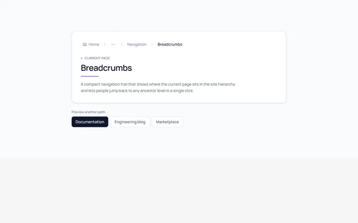
Basic Breadcrumb
Originalbasic breadcrumb trail
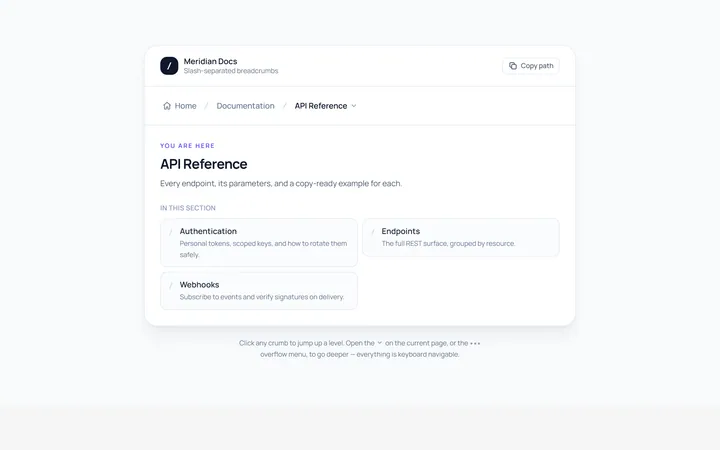
Slash Breadcrumb
Originalslash separator breadcrumbs
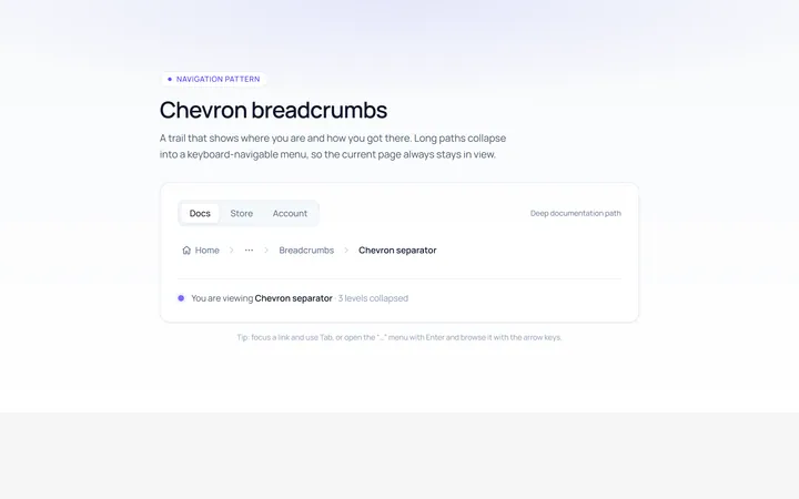
Chevron Breadcrumb
Originalchevron separator breadcrumbs
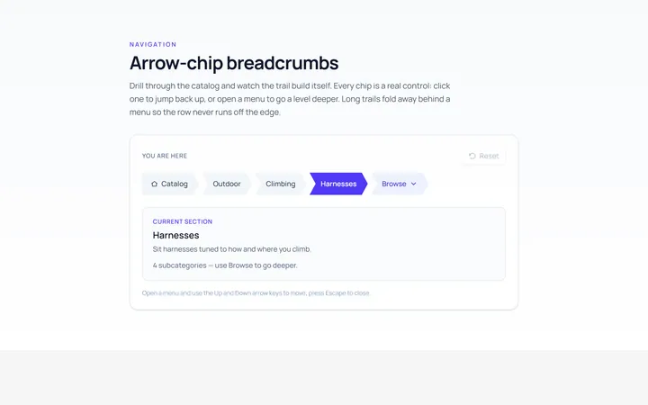
Arrow Breadcrumb
Originalarrow-chip breadcrumbs
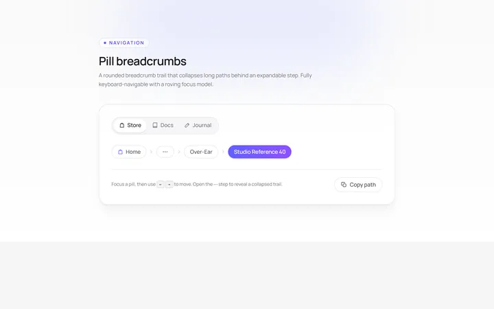
Pill Breadcrumb
Originalpill breadcrumbs
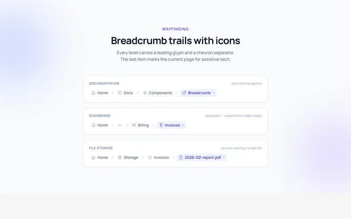
Icons Breadcrumb
Originalbreadcrumbs with icons
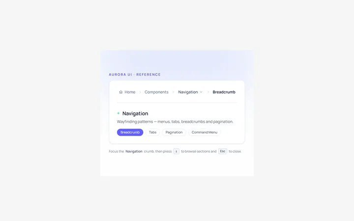
Dropdown Breadcrumb
Originalbreadcrumb with a dropdown level

Spotlight Hero
OriginalA centred hero with a soft radial spotlight, badge and dual call-to-action.

Split Hero
OriginalA two-column hero pairing a headline and CTAs with a product mock and social proof.

Gradient Spotlight Hero
OriginalA minimal centred hero with a soft gradient-mesh backdrop, announcement pill and dual call-to-action buttons.

App Preview Hero
OriginalA centred hero that pairs headline copy with a realistic product dashboard mock built entirely from markup, complete with browser chrome and a floating notification card.

Waitlist Capture Hero
OriginalA dark, focused hero with an inline email capture form and avatar social proof, ready for pre-launch waitlists.