

Icons Breadcrumb
Original · freebreadcrumbs with icons
Copy prompt gives Claude Code, Cursor or v0 a ready-to-paste prompt that recreates this exact component.
npx shadcn@latest add https://webinnoventix.com/r/crumb-icons.json"use client";
import { useState, type SVGProps } from "react";
import { motion, useReducedMotion, type Variants } from "motion/react";
type IconName =
| "home"
| "docs"
| "component"
| "tag"
| "grid"
| "box"
| "card"
| "receipt"
| "database"
| "folder"
| "file";
type Crumb = {
label: string;
href: string;
icon: IconName;
};
type Trail = {
id: string;
label: string;
hint: string;
collapsible?: boolean;
crumbs: Crumb[];
};
const trails: Trail[] = [
{
id: "docs",
label: "Documentation",
hint: "docs site navigation",
crumbs: [
{ label: "Home", href: "/", icon: "home" },
{ label: "Docs", href: "/docs", icon: "docs" },
{ label: "Components", href: "/docs/components", icon: "component" },
{ label: "Breadcrumb", href: "/docs/components/breadcrumb", icon: "tag" },
],
},
{
id: "dashboard",
label: "Dashboard",
hint: "deep path — expand the hidden steps",
collapsible: true,
crumbs: [
{ label: "Home", href: "/app", icon: "home" },
{ label: "Projects", href: "/app/projects", icon: "grid" },
{ label: "Aurora Web App", href: "/app/projects/aurora", icon: "box" },
{ label: "Billing", href: "/app/projects/aurora/billing", icon: "card" },
{ label: "Invoices", href: "/app/projects/aurora/billing/invoices", icon: "receipt" },
],
},
{
id: "files",
label: "File storage",
hint: "you are viewing a single file",
crumbs: [
{ label: "Home", href: "/drive", icon: "home" },
{ label: "Storage", href: "/drive/storage", icon: "database" },
{ label: "Invoices", href: "/drive/storage/invoices", icon: "folder" },
{ label: "2026-Q2-report.pdf", href: "/drive/storage/invoices/2026-q2-report.pdf", icon: "file" },
],
},
];
function CrumbIcon({ name, className }: { name: IconName; className?: string }) {
const base: SVGProps<SVGSVGElement> = {
viewBox: "0 0 24 24",
fill: "none",
stroke: "currentColor",
strokeWidth: 1.7,
strokeLinecap: "round",
strokeLinejoin: "round",
"aria-hidden": true,
className,
};
switch (name) {
case "home":
return (
<svg {...base}>
<path d="M3 10.75 12 3l9 7.75" />
<path d="M5.5 9.5V20a1 1 0 0 0 1 1h11a1 1 0 0 0 1-1V9.5" />
<path d="M9.5 21v-6h5v6" />
</svg>
);
case "docs":
return (
<svg {...base}>
<path d="M4 5.5A1.5 1.5 0 0 1 5.5 4H12v15H5.5A1.5 1.5 0 0 1 4 17.5v-12Z" />
<path d="M20 5.5A1.5 1.5 0 0 0 18.5 4H12v15h6.5a1.5 1.5 0 0 0 1.5-1.5v-12Z" />
</svg>
);
case "component":
return (
<svg {...base}>
<path d="M12 3.5 15 6.5 12 9.5 9 6.5 12 3.5Z" />
<path d="M6 9.5 9 12.5 6 15.5 3 12.5 6 9.5Z" />
<path d="M18 9.5 21 12.5 18 15.5 15 12.5 18 9.5Z" />
<path d="M12 15.5 15 18.5 12 21.5 9 18.5 12 15.5Z" />
</svg>
);
case "tag":
return (
<svg {...base}>
<path d="M3.6 12.5 12 4h6a2 2 0 0 1 2 2v6l-8.4 8.4a1.5 1.5 0 0 1-2.1 0l-5.9-5.9a1.5 1.5 0 0 1 0-2.1Z" />
<circle cx="16" cy="8" r="1.3" />
</svg>
);
case "grid":
return (
<svg {...base}>
<rect x="3.5" y="3.5" width="7" height="7" rx="1.5" />
<rect x="13.5" y="3.5" width="7" height="7" rx="1.5" />
<rect x="3.5" y="13.5" width="7" height="7" rx="1.5" />
<rect x="13.5" y="13.5" width="7" height="7" rx="1.5" />
</svg>
);
case "box":
return (
<svg {...base}>
<path d="M12 3 21 8v8l-9 5-9-5V8l9-5Z" />
<path d="m3 8 9 5 9-5" />
<path d="M12 13v8" />
</svg>
);
case "card":
return (
<svg {...base}>
<rect x="3" y="6" width="18" height="12" rx="2" />
<path d="M3 10h18" />
<path d="M7 14.5h4" />
</svg>
);
case "receipt":
return (
<svg {...base}>
<path d="M6 3.5h12v17l-2-1.2-2 1.2-2-1.2-2 1.2-2-1.2V3.5Z" />
<path d="M9 8h6" />
<path d="M9 11.5h4" />
</svg>
);
case "database":
return (
<svg {...base}>
<ellipse cx="12" cy="6" rx="7" ry="3" />
<path d="M5 6v6c0 1.66 3.13 3 7 3s7-1.34 7-3V6" />
<path d="M5 12v6c0 1.66 3.13 3 7 3s7-1.34 7-3v-6" />
</svg>
);
case "folder":
return (
<svg {...base}>
<path d="M3.5 6.5A1.5 1.5 0 0 1 5 5h4l2 2.5h6a1.5 1.5 0 0 1 1.5 1.5v9A1.5 1.5 0 0 1 17 19H5a1.5 1.5 0 0 1-1.5-1.5v-11Z" />
</svg>
);
case "file":
return (
<svg {...base}>
<path d="M6 3h7l5 5v12a1 1 0 0 1-1 1H6a1 1 0 0 1-1-1V4a1 1 0 0 1 1-1Z" />
<path d="M13 3v5h5" />
</svg>
);
default:
return null;
}
}
function Chevron() {
return (
<svg
viewBox="0 0 24 24"
fill="none"
stroke="currentColor"
strokeWidth={2}
strokeLinecap="round"
strokeLinejoin="round"
aria-hidden
className="mx-0.5 size-4 shrink-0 text-slate-300 dark:text-slate-600"
>
<path d="m9.5 6 6 6-6 6" />
</svg>
);
}
type RenderNode =
| { kind: "crumb"; crumb: Crumb; current: boolean }
| { kind: "ellipsis"; hidden: number };
function Breadcrumb({ trail, reduce }: { trail: Trail; reduce: boolean }) {
const [expanded, setExpanded] = useState(false);
const items = trail.crumbs;
const lastIndex = items.length - 1;
const collapsed = Boolean(trail.collapsible) && !expanded && items.length > 3;
const nodes: RenderNode[] = [];
if (collapsed) {
nodes.push({ kind: "crumb", crumb: items[0], current: false });
nodes.push({ kind: "ellipsis", hidden: lastIndex - 2 });
nodes.push({ kind: "crumb", crumb: items[lastIndex - 1], current: false });
nodes.push({ kind: "crumb", crumb: items[lastIndex], current: true });
} else {
items.forEach((crumb, i) => {
nodes.push({ kind: "crumb", crumb, current: i === lastIndex });
});
}
const container: Variants = {
hidden: {},
show: { transition: { staggerChildren: 0.07, delayChildren: 0.05 } },
};
const item: Variants = {
hidden: { opacity: 0, x: reduce ? 0 : -6 },
show: { opacity: 1, x: 0, transition: { duration: 0.35, ease: "easeOut" } },
};
const linkClass =
"group inline-flex items-center gap-1.5 rounded-lg px-2 py-1 text-sm font-medium text-slate-600 outline-none transition-colors hover:bg-slate-100 hover:text-slate-900 focus-visible:ring-2 focus-visible:ring-indigo-500 focus-visible:ring-offset-2 focus-visible:ring-offset-white dark:text-slate-300 dark:hover:bg-slate-800 dark:hover:text-white dark:focus-visible:ring-offset-slate-900";
const iconClass =
"size-4 shrink-0 text-slate-400 transition-colors group-hover:text-indigo-500 dark:text-slate-500 dark:group-hover:text-indigo-400";
return (
<nav aria-label={`Breadcrumb: ${trail.label}`}>
<motion.ol
variants={container}
initial="hidden"
whileInView="show"
viewport={{ once: true, amount: 0.6 }}
className="flex flex-wrap items-center gap-y-1"
>
{nodes.map((node, i) => (
<motion.li
key={node.kind === "ellipsis" ? "ellipsis" : node.crumb.href}
variants={item}
className="flex min-w-0 items-center"
>
{i > 0 && <Chevron />}
{node.kind === "ellipsis" ? (
<button
type="button"
onClick={() => setExpanded(true)}
aria-label={`Show ${node.hidden} hidden path segment${node.hidden === 1 ? "" : "s"}`}
className="inline-flex items-center rounded-lg px-2 py-1 text-slate-500 outline-none transition-colors hover:bg-slate-100 hover:text-slate-900 focus-visible:ring-2 focus-visible:ring-indigo-500 focus-visible:ring-offset-2 focus-visible:ring-offset-white dark:text-slate-400 dark:hover:bg-slate-800 dark:hover:text-white dark:focus-visible:ring-offset-slate-900"
>
<svg viewBox="0 0 24 24" fill="currentColor" aria-hidden className="size-4">
<circle cx="5" cy="12" r="1.7" />
<circle cx="12" cy="12" r="1.7" />
<circle cx="19" cy="12" r="1.7" />
</svg>
</button>
) : node.current ? (
<span
aria-current="page"
className="inline-flex min-w-0 items-center gap-1.5 rounded-lg bg-indigo-50 px-2 py-1 text-sm font-semibold text-indigo-700 dark:bg-indigo-500/10 dark:text-indigo-300"
>
<CrumbIcon name={node.crumb.icon} className="size-4 shrink-0 text-indigo-500 dark:text-indigo-400" />
<span className="truncate">{node.crumb.label}</span>
<span aria-hidden className="crmb-dot ml-0.5 size-1.5 shrink-0 rounded-full bg-emerald-500 dark:bg-emerald-400" />
</span>
) : (
<a href={node.crumb.href} className={linkClass}>
<CrumbIcon name={node.crumb.icon} className={iconClass} />
<span className="truncate">{node.crumb.label}</span>
</a>
)}
</motion.li>
))}
</motion.ol>
</nav>
);
}
export default function CrumbIcons() {
const reduce = Boolean(useReducedMotion());
return (
<section className="relative isolate w-full overflow-hidden bg-slate-50 px-6 py-20 dark:bg-slate-950 sm:py-24">
<style>{`
@keyframes crmb-pulse { 0%, 100% { opacity: 1; transform: scale(1); } 50% { opacity: .35; transform: scale(.6); } }
@keyframes crmb-drift { 0%, 100% { transform: translate3d(0, 0, 0); } 50% { transform: translate3d(0, -16px, 0); } }
.crmb-dot { animation: crmb-pulse 2.4s ease-in-out infinite; }
.crmb-blob { animation: crmb-drift 18s ease-in-out infinite; }
@media (prefers-reduced-motion: reduce) {
.crmb-dot, .crmb-blob { animation: none; }
}
`}</style>
<div aria-hidden className="pointer-events-none absolute inset-0 -z-10">
<div className="crmb-blob absolute -left-24 top-8 h-72 w-72 rounded-full bg-indigo-300/40 blur-3xl dark:bg-indigo-600/20" />
<div className="crmb-blob absolute -right-16 bottom-4 h-64 w-64 rounded-full bg-violet-300/40 blur-3xl dark:bg-violet-600/20" />
</div>
<div className="relative mx-auto max-w-2xl">
<motion.div
initial={reduce ? { opacity: 0 } : { opacity: 0, y: 16 }}
whileInView={{ opacity: 1, y: 0 }}
viewport={{ once: true, amount: 0.4 }}
transition={{ duration: 0.5, ease: "easeOut" }}
className="text-center"
>
<p className="text-sm font-semibold uppercase tracking-widest text-indigo-600 dark:text-indigo-400">
Wayfinding
</p>
<h2 className="mt-3 text-balance text-3xl font-bold tracking-tight text-slate-900 dark:text-white sm:text-4xl">
Breadcrumb trails with icons
</h2>
<p className="mx-auto mt-3 max-w-md text-pretty text-slate-600 dark:text-slate-400">
Every level carries a leading glyph and a chevron separator. The last item marks the
current page for assistive tech.
</p>
</motion.div>
<div className="mt-12 space-y-5">
{trails.map((trail) => (
<div
key={trail.id}
className="rounded-2xl border border-slate-200 bg-white p-5 shadow-sm shadow-slate-900/5 dark:border-slate-800 dark:bg-slate-900 dark:shadow-black/20"
>
<div className="mb-3 flex items-baseline justify-between gap-3">
<p className="text-xs font-semibold uppercase tracking-wider text-slate-500 dark:text-slate-400">
{trail.label}
</p>
<p className="truncate text-xs text-slate-400 dark:text-slate-500">{trail.hint}</p>
</div>
<div className="overflow-x-auto">
<Breadcrumb trail={trail} reduce={reduce} />
</div>
</div>
))}
</div>
</div>
</section>
);
}Dependencies
Licence
Built by Web Innoventix. Free for personal and commercial use, no attribution required.
Built by Web Innoventix
Need a custom interface, a full website, or SEO that gets you cited by AI? We design, build and rank it end to end.
Get a free quoteSimilar components
Browse all →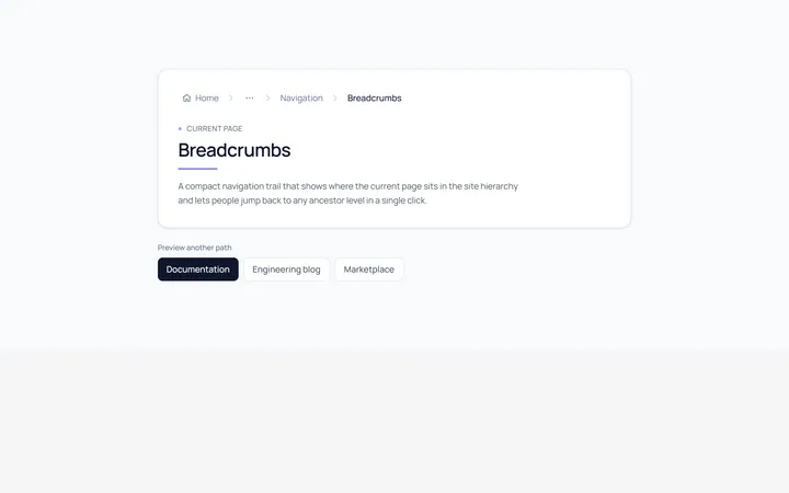
Basic Breadcrumb
Originalbasic breadcrumb trail
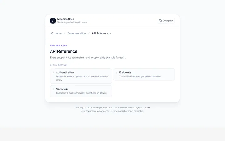
Slash Breadcrumb
Originalslash separator breadcrumbs
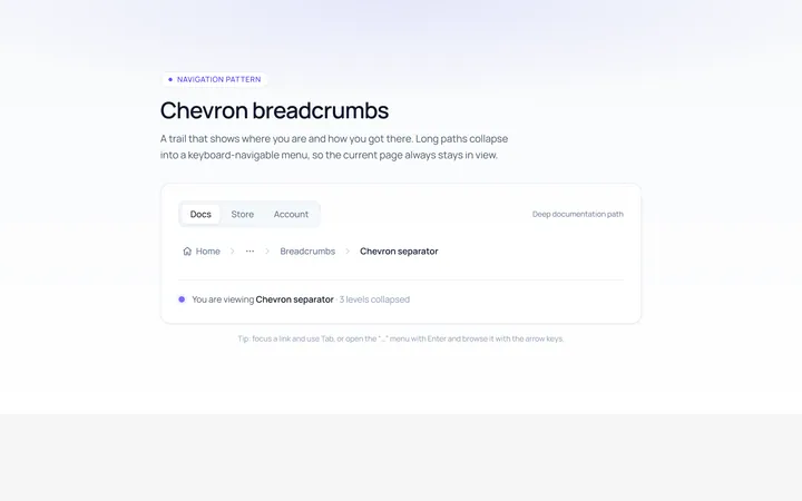
Chevron Breadcrumb
Originalchevron separator breadcrumbs
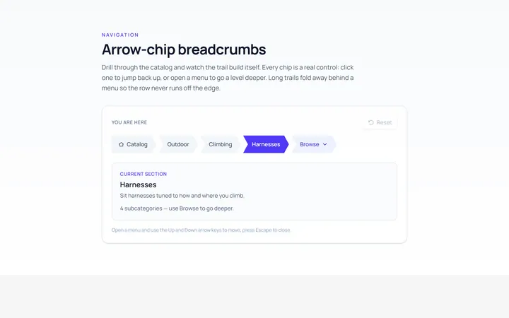
Arrow Breadcrumb
Originalarrow-chip breadcrumbs
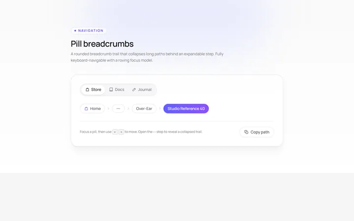
Pill Breadcrumb
Originalpill breadcrumbs
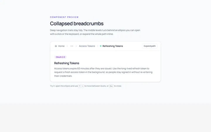
Collapsed Breadcrumb
Originalcollapsed breadcrumbs with ellipsis
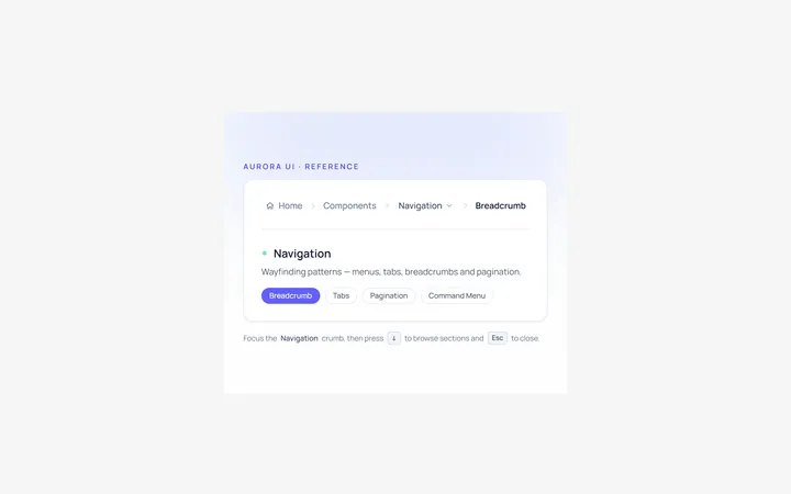
Dropdown Breadcrumb
Originalbreadcrumb with a dropdown level

Spotlight Hero
OriginalA centred hero with a soft radial spotlight, badge and dual call-to-action.

Split Hero
OriginalA two-column hero pairing a headline and CTAs with a product mock and social proof.

Gradient Spotlight Hero
OriginalA minimal centred hero with a soft gradient-mesh backdrop, announcement pill and dual call-to-action buttons.

App Preview Hero
OriginalA centred hero that pairs headline copy with a realistic product dashboard mock built entirely from markup, complete with browser chrome and a floating notification card.

Waitlist Capture Hero
OriginalA dark, focused hero with an inline email capture form and avatar social proof, ready for pre-launch waitlists.