

Slash Breadcrumb
Original · freeslash separator breadcrumbs
Copy prompt gives Claude Code, Cursor or v0 a ready-to-paste prompt that recreates this exact component.
npx shadcn@latest add https://webinnoventix.com/r/crumb-slash.json"use client";
import {
Fragment,
useCallback,
useEffect,
useId,
useMemo,
useRef,
useState,
type KeyboardEvent as ReactKeyboardEvent,
type ReactNode,
} from "react";
import { AnimatePresence, motion, useReducedMotion } from "motion/react";
type PageNode = {
id: string;
label: string;
blurb: string;
children?: PageNode[];
};
const SITE: PageNode = {
id: "home",
label: "Home",
blurb: "The Meridian developer platform — ship analytics, pipelines, and alerts without babysitting infrastructure.",
children: [
{
id: "products",
label: "Products",
blurb: "Everything Meridian builds, grouped by what the job actually is.",
children: [
{
id: "analytics",
label: "Analytics Suite",
blurb: "Self-serve dashboards, funnels, and cohorts that read straight from your warehouse.",
children: [
{
id: "dashboards",
label: "Dashboards",
blurb: "Drag-and-drop boards that refresh on a schedule you set, down to the minute.",
children: [
{
id: "custom-views",
label: "Custom Views",
blurb: "Saved slices of a dashboard scoped to a team, a region, or a single account.",
children: [
{
id: "retention",
label: "Retention Panel",
blurb: "A pinned view that tracks week-over-week retention against last quarter's baseline.",
},
],
},
{ id: "funnels", label: "Funnels", blurb: "Step conversion with drop-off reasons attached to every stage." },
{ id: "cohorts", label: "Cohorts", blurb: "Group users by first action and watch how each batch behaves over time." },
],
},
{ id: "alerting", label: "Alerting", blurb: "Threshold and anomaly alerts routed to Slack, email, or a webhook." },
],
},
{
id: "pipeline",
label: "Data Pipeline",
blurb: "Move data in, reshape it, and land it where analysts can reach it.",
children: [
{ id: "connectors", label: "Connectors", blurb: "Managed syncs for 40+ sources, backfilled and incremental." },
{ id: "transforms", label: "Transforms", blurb: "Version-controlled SQL models that run on every fresh load." },
],
},
],
},
{
id: "docs",
label: "Documentation",
blurb: "Guides, references, and recipes for building on Meridian.",
children: [
{ id: "start", label: "Getting Started", blurb: "From zero to a live dashboard in about fifteen minutes." },
{
id: "api",
label: "API Reference",
blurb: "Every endpoint, its parameters, and a copy-ready example for each.",
children: [
{ id: "auth", label: "Authentication", blurb: "Personal tokens, scoped keys, and how to rotate them safely." },
{
id: "endpoints",
label: "Endpoints",
blurb: "The full REST surface, grouped by resource.",
children: [
{ id: "list-users", label: "List users", blurb: "Paginated GET with filtering by role and status." },
{ id: "create-user", label: "Create user", blurb: "POST a new member and assign starting permissions." },
],
},
{ id: "webhooks", label: "Webhooks", blurb: "Subscribe to events and verify signatures on delivery." },
],
},
{ id: "guides", label: "Guides", blurb: "Task-shaped walkthroughs for the things people ask about most." },
],
},
{ id: "pricing", label: "Pricing", blurb: "Usage-based plans with a generous free tier and no seat charges." },
{ id: "changelog", label: "Changelog", blurb: "What shipped, what changed, and what's deprecated — updated weekly." },
],
};
function resolvePath(ids: string[]): PageNode[] {
const out: PageNode[] = [];
let level: PageNode[] = [SITE];
for (const id of ids) {
const found = level.find((node) => node.id === id);
if (!found) break;
out.push(found);
level = found.children ?? [];
}
return out;
}
const MAX_INLINE = 4;
type MenuItem = { id: string; label: string; hint?: string; onSelect: () => void };
function CrumbMenu({
items,
renderTrigger,
triggerAriaLabel,
triggerClassName,
triggerAriaCurrent,
reduce,
}: {
items: MenuItem[];
renderTrigger: (open: boolean) => ReactNode;
triggerAriaLabel: string;
triggerClassName: string;
triggerAriaCurrent?: boolean;
reduce: boolean;
}) {
const [open, setOpen] = useState(false);
const [activeIndex, setActiveIndex] = useState(0);
const menuId = useId();
const btnRef = useRef<HTMLButtonElement | null>(null);
const menuRef = useRef<HTMLDivElement | null>(null);
const itemRefs = useRef<(HTMLButtonElement | null)[]>([]);
const close = useCallback((focusTrigger: boolean) => {
setOpen(false);
if (focusTrigger) btnRef.current?.focus();
}, []);
useEffect(() => {
if (!open) return;
setActiveIndex(0);
const raf = requestAnimationFrame(() => itemRefs.current[0]?.focus());
return () => cancelAnimationFrame(raf);
}, [open]);
useEffect(() => {
if (!open) return;
function onPointerDown(event: PointerEvent) {
const target = event.target as Node;
if (menuRef.current?.contains(target) || btnRef.current?.contains(target)) return;
setOpen(false);
}
document.addEventListener("pointerdown", onPointerDown);
return () => document.removeEventListener("pointerdown", onPointerDown);
}, [open]);
const moveTo = useCallback(
(next: number) => {
const count = items.length;
if (count === 0) return;
const idx = (next + count) % count;
setActiveIndex(idx);
itemRefs.current[idx]?.focus();
},
[items.length],
);
function onMenuKeyDown(event: ReactKeyboardEvent<HTMLDivElement>) {
switch (event.key) {
case "ArrowDown":
event.preventDefault();
moveTo(activeIndex + 1);
break;
case "ArrowUp":
event.preventDefault();
moveTo(activeIndex - 1);
break;
case "Home":
event.preventDefault();
moveTo(0);
break;
case "End":
event.preventDefault();
moveTo(items.length - 1);
break;
case "Escape":
event.preventDefault();
close(true);
break;
case "Tab":
setOpen(false);
break;
default:
break;
}
}
function onTriggerKeyDown(event: ReactKeyboardEvent<HTMLButtonElement>) {
if (event.key === "ArrowDown" || event.key === "ArrowUp") {
event.preventDefault();
setOpen(true);
}
}
return (
<span className="relative inline-flex">
<button
ref={btnRef}
type="button"
aria-haspopup="menu"
aria-expanded={open}
aria-controls={open ? menuId : undefined}
aria-current={triggerAriaCurrent ? "page" : undefined}
aria-label={triggerAriaLabel}
onClick={() => setOpen((prev) => !prev)}
onKeyDown={onTriggerKeyDown}
className={triggerClassName}
>
{renderTrigger(open)}
</button>
<AnimatePresence>
{open && (
<motion.div
id={menuId}
ref={menuRef}
role="menu"
aria-label={triggerAriaLabel}
onKeyDown={onMenuKeyDown}
initial={reduce ? false : { opacity: 0, y: -6, scale: 0.97 }}
animate={{ opacity: 1, y: 0, scale: 1 }}
exit={reduce ? { opacity: 0 } : { opacity: 0, y: -6, scale: 0.97 }}
transition={{ duration: reduce ? 0 : 0.16, ease: [0.16, 1, 0.3, 1] }}
className="absolute left-0 top-[calc(100%+0.4rem)] z-30 w-64 origin-top overflow-hidden rounded-2xl border border-slate-200 bg-white/95 p-1.5 shadow-2xl shadow-slate-900/10 backdrop-blur dark:border-white/10 dark:bg-slate-900/95 dark:shadow-black/50"
>
{items.map((item, index) => (
<button
key={item.id}
ref={(el) => {
itemRefs.current[index] = el;
}}
type="button"
role="menuitem"
tabIndex={-1}
onClick={() => {
item.onSelect();
setOpen(false);
}}
className="group flex w-full items-start gap-2.5 rounded-xl px-3 py-2 text-left transition-colors hover:bg-slate-100 focus:bg-slate-100 focus-visible:outline-none focus-visible:ring-2 focus-visible:ring-inset focus-visible:ring-indigo-500 dark:hover:bg-white/10 dark:focus:bg-white/10 dark:focus-visible:ring-indigo-400"
>
<span className="mt-0.5 select-none font-mono text-sm text-indigo-500 dark:text-indigo-400" aria-hidden="true">
/
</span>
<span className="flex min-w-0 flex-col">
<span className="truncate text-sm font-medium text-slate-800 dark:text-slate-100">{item.label}</span>
{item.hint ? (
<span className="truncate text-xs text-slate-500 dark:text-slate-400">{item.hint}</span>
) : null}
</span>
</button>
))}
</motion.div>
)}
</AnimatePresence>
</span>
);
}
function HomeIcon() {
return (
<svg viewBox="0 0 24 24" fill="none" stroke="currentColor" strokeWidth="1.9" strokeLinecap="round" strokeLinejoin="round" className="h-4 w-4" aria-hidden="true">
<path d="M3 10.5 12 3l9 7.5" />
<path d="M5 9.5V20a1 1 0 0 0 1 1h4v-6h4v6h4a1 1 0 0 0 1-1V9.5" />
</svg>
);
}
function SlashSeparator() {
return (
<svg viewBox="0 0 20 20" fill="none" className="h-4 w-4 text-slate-300 dark:text-slate-600" aria-hidden="true">
<line x1="7" y1="16" x2="13" y2="4" stroke="currentColor" strokeWidth="1.6" strokeLinecap="round" />
</svg>
);
}
function DotsIcon() {
return (
<svg viewBox="0 0 20 20" fill="currentColor" className="h-4 w-4" aria-hidden="true">
<circle cx="4" cy="10" r="1.6" />
<circle cx="10" cy="10" r="1.6" />
<circle cx="16" cy="10" r="1.6" />
</svg>
);
}
function ChevronIcon({ className }: { className?: string }) {
return (
<svg viewBox="0 0 20 20" fill="none" stroke="currentColor" strokeWidth="1.9" strokeLinecap="round" strokeLinejoin="round" className={className} aria-hidden="true">
<path d="m6 8 4 4 4-4" />
</svg>
);
}
function CopyIcon() {
return (
<svg viewBox="0 0 20 20" fill="none" stroke="currentColor" strokeWidth="1.7" strokeLinecap="round" strokeLinejoin="round" className="h-4 w-4" aria-hidden="true">
<rect x="7" y="7" width="10" height="10" rx="2" />
<path d="M13 7V5a2 2 0 0 0-2-2H5a2 2 0 0 0-2 2v6a2 2 0 0 0 2 2h2" />
</svg>
);
}
function CheckIcon() {
return (
<svg viewBox="0 0 20 20" fill="none" stroke="currentColor" strokeWidth="2.1" strokeLinecap="round" strokeLinejoin="round" className="h-4 w-4" aria-hidden="true">
<path d="m4 10.5 4 4 8-9" />
</svg>
);
}
const linkClass =
"inline-flex items-center gap-1.5 rounded-lg px-2 py-1 text-sm font-medium text-slate-500 transition-colors hover:bg-slate-100 hover:text-slate-900 focus-visible:outline-none focus-visible:ring-2 focus-visible:ring-indigo-500 focus-visible:ring-offset-2 focus-visible:ring-offset-white dark:text-slate-400 dark:hover:bg-white/10 dark:hover:text-white dark:focus-visible:ring-indigo-400 dark:focus-visible:ring-offset-slate-950";
const currentTriggerClass =
"inline-flex items-center gap-1 rounded-lg px-2 py-1 text-sm font-semibold text-slate-900 transition-colors hover:bg-slate-100 focus-visible:outline-none focus-visible:ring-2 focus-visible:ring-indigo-500 focus-visible:ring-offset-2 focus-visible:ring-offset-white dark:text-white dark:hover:bg-white/10 dark:focus-visible:ring-indigo-400 dark:focus-visible:ring-offset-slate-950";
const overflowTriggerClass =
"inline-flex items-center justify-center rounded-lg px-1.5 py-1.5 text-slate-500 transition-colors hover:bg-slate-100 hover:text-slate-900 focus-visible:outline-none focus-visible:ring-2 focus-visible:ring-indigo-500 focus-visible:ring-offset-2 focus-visible:ring-offset-white dark:text-slate-400 dark:hover:bg-white/10 dark:hover:text-white dark:focus-visible:ring-indigo-400 dark:focus-visible:ring-offset-slate-950";
type Rendered =
| { kind: "crumb"; node: PageNode; depth: number; isCurrent: boolean }
| { kind: "overflow"; hidden: { node: PageNode; depth: number }[] };
export default function CrumbSlash() {
const reduce = useReducedMotion() ?? false;
const [pathIds, setPathIds] = useState<string[]>(["home", "docs", "api"]);
const [copied, setCopied] = useState(false);
const copyTimer = useRef<number | null>(null);
const trail = useMemo(() => resolvePath(pathIds), [pathIds]);
const current = trail[trail.length - 1];
const childList = current.children ?? [];
const pathString = useMemo(() => trail.map((node) => node.label).join(" / "), [trail]);
const navigateTo = useCallback((depth: number) => {
setPathIds((ids) => ids.slice(0, depth + 1));
}, []);
const goDeeper = useCallback((childId: string) => {
setPathIds((ids) => [...ids, childId]);
}, []);
useEffect(() => {
return () => {
if (copyTimer.current !== null) window.clearTimeout(copyTimer.current);
};
}, []);
const copyPath = useCallback(async () => {
try {
await navigator.clipboard?.writeText(pathString);
setCopied(true);
if (copyTimer.current !== null) window.clearTimeout(copyTimer.current);
copyTimer.current = window.setTimeout(() => setCopied(false), 1800);
} catch {
setCopied(false);
}
}, [pathString]);
const items: Rendered[] = useMemo(() => {
const out: Rendered[] = [];
if (trail.length <= MAX_INLINE) {
trail.forEach((node, depth) => {
out.push({ kind: "crumb", node, depth, isCurrent: depth === trail.length - 1 });
});
return out;
}
out.push({ kind: "crumb", node: trail[0], depth: 0, isCurrent: false });
const hidden = trail.slice(1, -2).map((node, i) => ({ node, depth: i + 1 }));
out.push({ kind: "overflow", hidden });
const tailStart = trail.length - 2;
trail.slice(-2).forEach((node, i) => {
const depth = tailStart + i;
out.push({ kind: "crumb", node, depth, isCurrent: depth === trail.length - 1 });
});
return out;
}, [trail]);
const styleId = useId();
return (
<section className="relative w-full overflow-hidden bg-slate-50 px-4 py-16 text-slate-900 sm:px-6 sm:py-20 dark:bg-slate-950 dark:text-slate-100">
<style>{`
@keyframes crumbslash-${styleId}-fadeup {
from { opacity: 0; transform: translateY(8px); }
to { opacity: 1; transform: translateY(0); }
}
@keyframes crumbslash-${styleId}-pop {
0% { opacity: 0; transform: scale(0.85); }
60% { transform: scale(1.06); }
100% { opacity: 1; transform: scale(1); }
}
.crumbslash-${styleId}-fadeup { animation: crumbslash-${styleId}-fadeup 0.4s cubic-bezier(0.16,1,0.3,1) both; }
.crumbslash-${styleId}-pop { animation: crumbslash-${styleId}-pop 0.22s ease-out both; }
@media (prefers-reduced-motion: reduce) {
.crumbslash-${styleId}-fadeup, .crumbslash-${styleId}-pop { animation: none !important; }
}
`}</style>
<div
aria-hidden="true"
className="pointer-events-none absolute inset-0 -z-10 bg-[radial-gradient(60rem_40rem_at_50%_-10%,rgba(99,102,241,0.10),transparent)] dark:bg-[radial-gradient(60rem_40rem_at_50%_-10%,rgba(99,102,241,0.16),transparent)]"
/>
<div className="mx-auto max-w-3xl">
<div className="overflow-hidden rounded-3xl border border-slate-200 bg-white shadow-xl shadow-slate-900/5 dark:border-white/10 dark:bg-slate-900/70 dark:shadow-black/40">
<div className="border-b border-slate-200 px-5 py-4 sm:px-7 sm:py-5 dark:border-white/10">
<div className="flex flex-wrap items-center justify-between gap-3">
<div className="flex items-center gap-2.5">
<span className="grid h-8 w-8 place-items-center rounded-xl bg-slate-900 font-mono text-base font-bold text-white dark:bg-white dark:text-slate-900">
/
</span>
<div>
<p className="text-sm font-semibold leading-none text-slate-900 dark:text-white">Meridian Docs</p>
<p className="mt-1 text-xs leading-none text-slate-500 dark:text-slate-400">Slash-separated breadcrumbs</p>
</div>
</div>
<button
type="button"
onClick={copyPath}
aria-label={copied ? "Path copied to clipboard" : "Copy current path"}
className="inline-flex items-center gap-1.5 rounded-lg border border-slate-200 bg-white px-2.5 py-1.5 text-xs font-medium text-slate-600 transition-colors hover:border-slate-300 hover:text-slate-900 focus-visible:outline-none focus-visible:ring-2 focus-visible:ring-indigo-500 focus-visible:ring-offset-2 focus-visible:ring-offset-white dark:border-white/10 dark:bg-white/5 dark:text-slate-300 dark:hover:border-white/20 dark:hover:text-white dark:focus-visible:ring-indigo-400 dark:focus-visible:ring-offset-slate-950"
>
<span className={copied ? `crumbslash-${styleId}-pop text-emerald-500 dark:text-emerald-400` : ""}>
{copied ? <CheckIcon /> : <CopyIcon />}
</span>
<span aria-hidden="true">{copied ? "Copied" : "Copy path"}</span>
</button>
</div>
</div>
<nav aria-label="Breadcrumb" className="px-4 py-4 sm:px-6 sm:py-5">
<ol className="flex flex-wrap items-center gap-x-0.5 gap-y-1.5">
{items.map((item, index) => (
<Fragment key={item.kind === "overflow" ? "overflow" : item.node.id}>
<li className="relative flex items-center">
{item.kind === "overflow" ? (
<CrumbMenu
reduce={reduce}
triggerAriaLabel="Show hidden breadcrumb levels"
triggerClassName={overflowTriggerClass}
renderTrigger={() => <DotsIcon />}
items={item.hidden.map((h) => ({
id: h.node.id,
label: h.node.label,
hint: h.node.blurb,
onSelect: () => navigateTo(h.depth),
}))}
/>
) : item.isCurrent ? (
childList.length > 0 ? (
<CrumbMenu
reduce={reduce}
triggerAriaCurrent
triggerAriaLabel={`Current page, ${item.node.label}. Browse sub-pages`}
triggerClassName={currentTriggerClass}
renderTrigger={(open) => (
<>
{item.depth === 0 ? <HomeIcon /> : null}
<span>{item.node.label}</span>
<ChevronIcon className={`h-4 w-4 text-slate-400 transition-transform duration-200 dark:text-slate-500 ${open ? "rotate-180" : ""}`} />
</>
)}
items={childList.map((child) => ({
id: child.id,
label: child.label,
hint: child.blurb,
onSelect: () => goDeeper(child.id),
}))}
/>
) : (
<span aria-current="page" className="inline-flex items-center gap-1.5 rounded-lg px-2 py-1 text-sm font-semibold text-slate-900 dark:text-white">
{item.depth === 0 ? <HomeIcon /> : null}
{item.node.label}
</span>
)
) : (
<button type="button" onClick={() => navigateTo(item.depth)} className={linkClass}>
{item.depth === 0 ? <HomeIcon /> : null}
<span>{item.node.label}</span>
</button>
)}
</li>
{index < items.length - 1 ? (
<li aria-hidden="true" className="flex items-center">
<SlashSeparator />
</li>
) : null}
</Fragment>
))}
</ol>
</nav>
<div key={current.id} className={`crumbslash-${styleId}-fadeup border-t border-slate-200 px-5 py-6 sm:px-7 sm:py-7 dark:border-white/10`}>
<p className="text-[0.68rem] font-semibold uppercase tracking-[0.18em] text-indigo-600 dark:text-indigo-400">You are here</p>
<h2 className="mt-2 text-xl font-bold tracking-tight text-slate-900 sm:text-2xl dark:text-white">{current.label}</h2>
<p className="mt-2 max-w-prose text-sm leading-relaxed text-slate-600 dark:text-slate-300">{current.blurb}</p>
{childList.length > 0 ? (
<div className="mt-6">
<p className="mb-2.5 text-xs font-semibold uppercase tracking-wide text-slate-400 dark:text-slate-500">In this section</p>
<ul className="grid gap-2 sm:grid-cols-2">
{childList.map((child) => (
<li key={child.id}>
<button
type="button"
onClick={() => goDeeper(child.id)}
className="group flex w-full items-start gap-3 rounded-xl border border-slate-200 bg-slate-50/60 px-3.5 py-3 text-left transition-colors hover:border-indigo-300 hover:bg-white focus-visible:outline-none focus-visible:ring-2 focus-visible:ring-indigo-500 focus-visible:ring-offset-2 focus-visible:ring-offset-white dark:border-white/10 dark:bg-white/[0.03] dark:hover:border-indigo-400/60 dark:hover:bg-white/[0.06] dark:focus-visible:ring-indigo-400 dark:focus-visible:ring-offset-slate-950"
>
<span className="mt-0.5 select-none font-mono text-sm text-slate-300 transition-colors group-hover:text-indigo-500 dark:text-slate-600 dark:group-hover:text-indigo-400" aria-hidden="true">
/
</span>
<span className="flex min-w-0 flex-col">
<span className="text-sm font-semibold text-slate-800 dark:text-slate-100">{child.label}</span>
<span className="mt-0.5 line-clamp-2 text-xs leading-relaxed text-slate-500 dark:text-slate-400">{child.blurb}</span>
</span>
</button>
</li>
))}
</ul>
</div>
) : (
<div className="mt-6 rounded-xl border border-dashed border-slate-200 px-4 py-3 text-xs text-slate-500 dark:border-white/10 dark:text-slate-400">
This is a leaf page — use the breadcrumb slashes above to step back up the tree.
</div>
)}
</div>
</div>
<p className="mx-auto mt-5 max-w-md text-center text-xs leading-relaxed text-slate-500 dark:text-slate-400">
Click any crumb to jump up a level. Open the{" "}
<ChevronIcon className="inline h-3.5 w-3.5 -translate-y-px text-slate-400 dark:text-slate-500" /> on the current page, or the{" "}
<span className="font-mono text-slate-400 dark:text-slate-500">•••</span> overflow menu, to go deeper — everything is keyboard navigable.
</p>
</div>
</section>
);
}Dependencies
Licence
Built by Web Innoventix. Free for personal and commercial use, no attribution required.
Built by Web Innoventix
Need a custom interface, a full website, or SEO that gets you cited by AI? We design, build and rank it end to end.
Get a free quoteSimilar components
Browse all →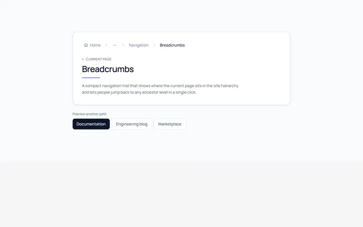
Basic Breadcrumb
Originalbasic breadcrumb trail
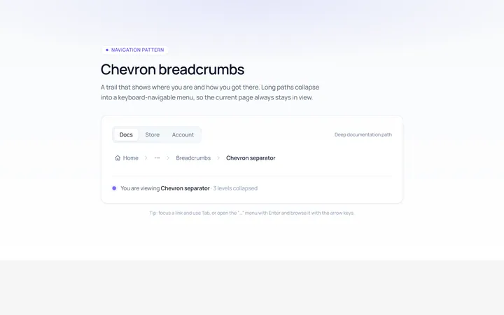
Chevron Breadcrumb
Originalchevron separator breadcrumbs
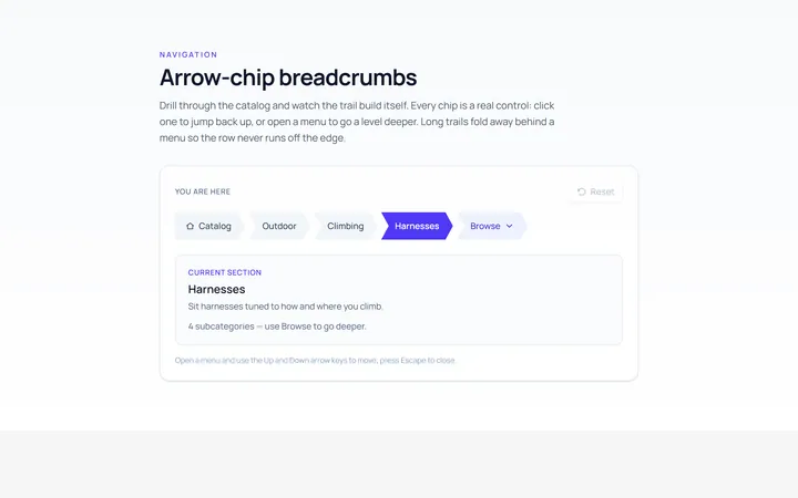
Arrow Breadcrumb
Originalarrow-chip breadcrumbs
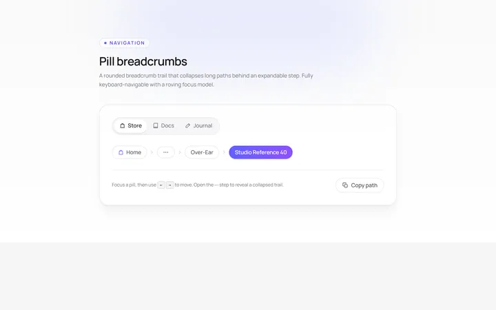
Pill Breadcrumb
Originalpill breadcrumbs
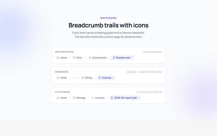
Icons Breadcrumb
Originalbreadcrumbs with icons
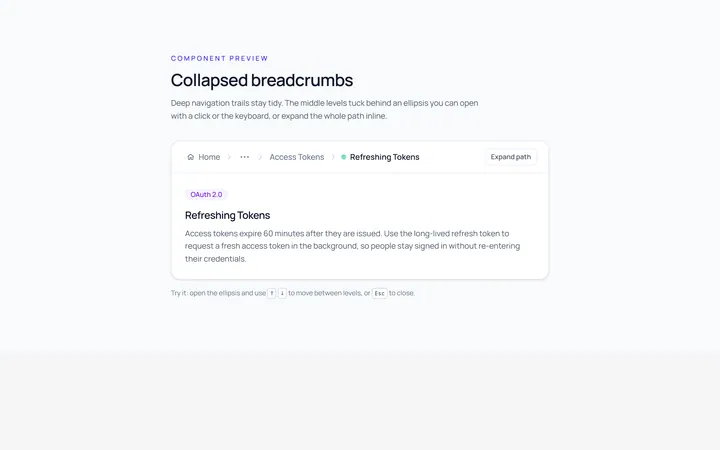
Collapsed Breadcrumb
Originalcollapsed breadcrumbs with ellipsis
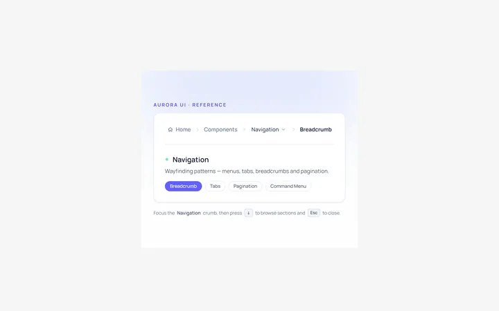
Dropdown Breadcrumb
Originalbreadcrumb with a dropdown level

Spotlight Hero
OriginalA centred hero with a soft radial spotlight, badge and dual call-to-action.

Split Hero
OriginalA two-column hero pairing a headline and CTAs with a product mock and social proof.

Gradient Spotlight Hero
OriginalA minimal centred hero with a soft gradient-mesh backdrop, announcement pill and dual call-to-action buttons.

App Preview Hero
OriginalA centred hero that pairs headline copy with a realistic product dashboard mock built entirely from markup, complete with browser chrome and a floating notification card.

Waitlist Capture Hero
OriginalA dark, focused hero with an inline email capture form and avatar social proof, ready for pre-launch waitlists.