

Gradient Set Button
Original · freeGradient-filled buttons with a hover shift.
Copy prompt gives Claude Code, Cursor or v0 a ready-to-paste prompt that recreates this exact component.
npx shadcn@latest add https://webinnoventix.com/r/btn-gradient-set.json"use client";
import { useState } from "react";
type Size = "sm" | "md" | "lg";
const sizeMap: Record<Size, string> = {
sm: "text-sm px-4 py-2 gap-1.5 rounded-lg",
md: "text-sm px-5 py-2.5 gap-2 rounded-xl",
lg: "text-base px-7 py-3.5 gap-2.5 rounded-2xl",
};
const iconSizeMap: Record<Size, string> = {
sm: "h-4 w-4",
md: "h-4 w-4",
lg: "h-5 w-5",
};
const focusRing =
"focus-visible:outline-none focus-visible:ring-2 focus-visible:ring-offset-2 focus-visible:ring-offset-white dark:focus-visible:ring-offset-slate-950";
const baseBtn =
"relative inline-flex select-none items-center justify-center overflow-hidden font-semibold text-white antialiased transition-transform duration-200 will-change-transform active:translate-y-px disabled:cursor-not-allowed disabled:opacity-50 disabled:active:translate-y-0";
function ArrowIcon({ className }: { className: string }) {
return (
<svg
className={className}
viewBox="0 0 24 24"
fill="none"
stroke="currentColor"
strokeWidth={2.2}
strokeLinecap="round"
strokeLinejoin="round"
aria-hidden="true"
>
<path d="M5 12h14" />
<path d="M13 6l6 6-6 6" />
</svg>
);
}
function SparkIcon({ className }: { className: string }) {
return (
<svg
className={className}
viewBox="0 0 24 24"
fill="currentColor"
aria-hidden="true"
>
<path d="M12 2l1.9 5.6a4 4 0 0 0 2.5 2.5L22 12l-5.6 1.9a4 4 0 0 0-2.5 2.5L12 22l-1.9-5.6a4 4 0 0 0-2.5-2.5L2 12l5.6-1.9a4 4 0 0 0 2.5-2.5L12 2z" />
</svg>
);
}
function HeartIcon({ className, filled }: { className: string; filled: boolean }) {
return (
<svg
className={className}
viewBox="0 0 24 24"
fill={filled ? "currentColor" : "none"}
stroke="currentColor"
strokeWidth={2.2}
strokeLinecap="round"
strokeLinejoin="round"
aria-hidden="true"
>
<path d="M20.8 5.6a5.4 5.4 0 0 0-7.6 0L12 6.8l-1.2-1.2a5.4 5.4 0 0 0-7.6 7.6L12 21.6l8.8-8.4a5.4 5.4 0 0 0 0-7.6z" />
</svg>
);
}
function CheckIcon({ className }: { className: string }) {
return (
<svg
className={className}
viewBox="0 0 24 24"
fill="none"
stroke="currentColor"
strokeWidth={2.6}
strokeLinecap="round"
strokeLinejoin="round"
aria-hidden="true"
>
<path d="M20 6L9 17l-5-5" />
</svg>
);
}
function CopyIcon({ className }: { className: string }) {
return (
<svg
className={className}
viewBox="0 0 24 24"
fill="none"
stroke="currentColor"
strokeWidth={2.2}
strokeLinecap="round"
strokeLinejoin="round"
aria-hidden="true"
>
<rect x="9" y="9" width="11" height="11" rx="2" />
<path d="M5 15V5a2 2 0 0 1 2-2h10" />
</svg>
);
}
function Spinner({ className }: { className: string }) {
return (
<svg className={className} viewBox="0 0 24 24" fill="none" aria-hidden="true">
<circle
cx="12"
cy="12"
r="9"
stroke="currentColor"
strokeOpacity="0.3"
strokeWidth="3"
/>
<path
d="M21 12a9 9 0 0 0-9-9"
stroke="currentColor"
strokeWidth="3"
strokeLinecap="round"
/>
</svg>
);
}
/* Shared "hover shift" gradient shell: an over-sized gradient layer that slides
its background-position on hover, plus a glossy top highlight for tactility. */
function GradientFace({ gradient }: { gradient: string }) {
return (
<>
<span
aria-hidden="true"
className={`gbtn-face absolute inset-0 -z-10 bg-[length:200%_100%] bg-[position:0%_50%] transition-[background-position] duration-500 ease-out ${gradient}`}
/>
<span
aria-hidden="true"
className="pointer-events-none absolute inset-x-0 top-0 -z-10 h-1/2 rounded-[inherit] bg-gradient-to-b from-white/25 to-transparent"
/>
</>
);
}
export default function BtnGradientSet() {
const [size, setSize] = useState<Size>("md");
const [liked, setLiked] = useState(false);
const [likeCount, setLikeCount] = useState(1284);
const [copied, setCopied] = useState(false);
const [loading, setLoading] = useState(false);
const [subscribed, setSubscribed] = useState(false);
const sz = sizeMap[size];
const isz = iconSizeMap[size];
function toggleLike() {
setLiked((prev) => {
setLikeCount((c) => (prev ? c - 1 : c + 1));
return !prev;
});
}
async function copyCoupon() {
try {
await navigator.clipboard.writeText("INNOV25");
} catch {
/* clipboard unavailable — still reflect the intent in UI */
}
setCopied(true);
window.setTimeout(() => setCopied(false), 1800);
}
function fakeSubmit() {
if (loading || subscribed) return;
setLoading(true);
window.setTimeout(() => {
setLoading(false);
setSubscribed(true);
}, 1400);
}
return (
<section className="relative w-full bg-slate-50 px-6 py-20 dark:bg-slate-950">
<style>{`
@keyframes gbtnShine {
0% { transform: translateX(-140%) skewX(-18deg); opacity: 0; }
18% { opacity: 0.9; }
60% { opacity: 0.9; }
100% { transform: translateX(140%) skewX(-18deg); opacity: 0; }
}
@keyframes gbtnPop {
0% { transform: scale(1); }
45% { transform: scale(1.35); }
100% { transform: scale(1); }
}
.gbtn-shine::after {
content: "";
position: absolute;
top: 0;
left: 0;
bottom: 0;
width: 45%;
background: linear-gradient(90deg, transparent, rgba(255,255,255,0.55), transparent);
transform: translateX(-140%) skewX(-18deg);
pointer-events: none;
}
.gbtn-shine:hover::after,
.gbtn-shine:focus-visible::after {
animation: gbtnShine 0.9s ease-out;
}
.group\\/g:hover .gbtn-face,
.gbtn-face:hover {
background-position: 100% 50%;
}
.gbtn-pop { animation: gbtnPop 0.42s ease-out; }
@media (prefers-reduced-motion: reduce) {
.gbtn-face { transition: none !important; }
.gbtn-shine::after { display: none !important; }
.gbtn-pop { animation: none !important; }
}
`}</style>
<div className="mx-auto max-w-4xl">
<header className="mb-12 text-center">
<p className="mb-3 text-xs font-semibold uppercase tracking-[0.2em] text-indigo-600 dark:text-indigo-400">
FreeCode / Buttons
</p>
<h2 className="text-3xl font-bold tracking-tight text-slate-900 dark:text-white sm:text-4xl">
Gradient Button Set
</h2>
<p className="mx-auto mt-3 max-w-lg text-sm text-slate-600 dark:text-slate-400">
Gradient-filled buttons with a smooth hover shift, glossy highlight
and a light sweep — tactile, focus-ringed and fully keyboard
accessible.
</p>
</header>
{/* Size switcher */}
<div className="mb-12 flex items-center justify-center gap-2">
<span className="mr-1 text-xs font-medium text-slate-500 dark:text-slate-400">
Size
</span>
{(["sm", "md", "lg"] as const).map((s) => {
const active = size === s;
return (
<button
key={s}
type="button"
aria-pressed={active}
onClick={() => setSize(s)}
className={`rounded-lg px-3 py-1.5 text-xs font-semibold uppercase tracking-wide transition-colors ${focusRing} focus-visible:ring-indigo-500 ${
active
? "bg-slate-900 text-white dark:bg-white dark:text-slate-900"
: "bg-slate-200 text-slate-600 hover:bg-slate-300 dark:bg-slate-800 dark:text-slate-300 dark:hover:bg-slate-700"
}`}
>
{s}
</button>
);
})}
</div>
{/* Primary gradient variants */}
<div className="mb-14 flex flex-wrap items-center justify-center gap-4">
<button
type="button"
className={`group/g gbtn-shine ${baseBtn} ${sz} shadow-lg shadow-indigo-500/30 hover:shadow-xl hover:shadow-indigo-500/40 ${focusRing} focus-visible:ring-indigo-500`}
>
<GradientFace gradient="bg-gradient-to-r from-indigo-500 via-violet-500 to-fuchsia-500" />
Get started free
<ArrowIcon
className={`${isz} transition-transform duration-200 group-hover/g:translate-x-0.5`}
/>
</button>
<button
type="button"
className={`group/g gbtn-shine ${baseBtn} ${sz} shadow-lg shadow-emerald-500/30 hover:shadow-xl hover:shadow-emerald-500/40 ${focusRing} focus-visible:ring-emerald-500`}
>
<GradientFace gradient="bg-gradient-to-r from-emerald-500 via-teal-500 to-sky-500" />
<SparkIcon className={isz} />
Upgrade to Pro
</button>
<button
type="button"
className={`group/g gbtn-shine ${baseBtn} ${sz} shadow-lg shadow-rose-500/30 hover:shadow-xl hover:shadow-rose-500/40 ${focusRing} focus-visible:ring-rose-500`}
>
<GradientFace gradient="bg-gradient-to-r from-rose-500 via-pink-500 to-amber-400" />
Start 14-day trial
</button>
</div>
{/* Outline gradient + ghost row */}
<div className="mb-14 flex flex-wrap items-center justify-center gap-4">
{/* Gradient-border (outline) button */}
<button
type="button"
className={`group/g relative inline-flex select-none items-center justify-center overflow-hidden rounded-xl bg-gradient-to-r from-indigo-500 via-violet-500 to-fuchsia-500 bg-[length:200%_100%] bg-[position:0%_50%] p-[1.5px] font-semibold transition-[background-position,transform] duration-500 ease-out hover:bg-[position:100%_50%] active:translate-y-px ${focusRing} focus-visible:ring-violet-500`}
>
<span
className={`inline-flex items-center gap-2 rounded-[10px] bg-white ${sz} dark:bg-slate-950`}
>
<span className="bg-gradient-to-r from-indigo-600 via-violet-600 to-fuchsia-600 bg-clip-text text-transparent dark:from-indigo-300 dark:via-violet-300 dark:to-fuchsia-300">
Read the docs
</span>
</span>
</button>
{/* Icon-only gradient like button */}
<button
type="button"
aria-pressed={liked}
aria-label={liked ? "Unlike this project" : "Like this project"}
onClick={toggleLike}
className={`group/g gbtn-shine ${baseBtn} ${sizeMap[size]} !px-4 shadow-lg shadow-rose-500/30 hover:shadow-xl hover:shadow-rose-500/40 ${focusRing} focus-visible:ring-rose-500`}
>
<GradientFace
gradient={
liked
? "bg-gradient-to-r from-rose-500 via-pink-500 to-rose-600"
: "bg-gradient-to-r from-slate-600 via-slate-700 to-slate-800"
}
/>
<HeartIcon
key={liked ? "on" : "off"}
filled={liked}
className={`${isz} ${liked ? "gbtn-pop" : ""}`}
/>
<span className="tabular-nums">{likeCount.toLocaleString()}</span>
</button>
{/* Copy coupon */}
<button
type="button"
onClick={copyCoupon}
aria-label={copied ? "Coupon code copied" : "Copy coupon code INNOV25"}
className={`group/g gbtn-shine ${baseBtn} ${sz} shadow-lg shadow-sky-500/30 hover:shadow-xl hover:shadow-sky-500/40 ${focusRing} focus-visible:ring-sky-500`}
>
<GradientFace
gradient={
copied
? "bg-gradient-to-r from-emerald-500 via-teal-500 to-emerald-600"
: "bg-gradient-to-r from-sky-500 via-blue-500 to-indigo-500"
}
/>
{copied ? (
<CheckIcon className={`${isz} gbtn-pop`} />
) : (
<CopyIcon className={isz} />
)}
<span className="tabular-nums">{copied ? "Copied!" : "INNOV25"}</span>
</button>
</div>
{/* Async / loading + success states */}
<div className="flex flex-wrap items-center justify-center gap-4">
<button
type="button"
onClick={fakeSubmit}
disabled={loading || subscribed}
aria-live="polite"
className={`group/g gbtn-shine ${baseBtn} ${sz} min-w-[13rem] shadow-lg shadow-violet-500/30 hover:shadow-xl hover:shadow-violet-500/40 ${focusRing} focus-visible:ring-violet-500`}
>
<GradientFace
gradient={
subscribed
? "bg-gradient-to-r from-emerald-500 via-teal-500 to-emerald-600"
: "bg-gradient-to-r from-violet-500 via-purple-500 to-indigo-500"
}
/>
{loading ? (
<>
<Spinner className={`${isz} animate-spin`} />
Subscribing…
</>
) : subscribed ? (
<>
<CheckIcon className={`${isz} gbtn-pop`} />
You're in!
</>
) : (
<>
<SparkIcon className={isz} />
Subscribe to newsletter
</>
)}
</button>
{/* Disabled example */}
<button
type="button"
disabled
className={`${baseBtn} ${sz} shadow-lg`}
>
<GradientFace gradient="bg-gradient-to-r from-slate-400 to-slate-500 dark:from-slate-600 dark:to-slate-700" />
Sold out
</button>
</div>
</div>
</section>
);
}Dependencies
Licence
Built by Web Innoventix. Free for personal and commercial use, no attribution required.
Built by Web Innoventix
Need a custom interface, a full website, or SEO that gets you cited by AI? We design, build and rank it end to end.
Get a free quoteSimilar components
Browse all →
Shimmer Button
MITA dark pill button with a continuous conic-gradient light shimmer sweeping around its border.
Rainbow Gradient Button
MITA button wrapped in an animated multi-colour gradient border with a matching blurred underglow.
Interactive Hover Button
MITA pill button whose dot expands to fill the surface and reveals an arrow label on hover.
Pulsating Button
MITA solid button that emits a soft, continuously pulsing glow ring to draw the eye to the primary action.
Shiny Button
MITA frosted-glass button with a spring-animated light sweeping across its text and border.
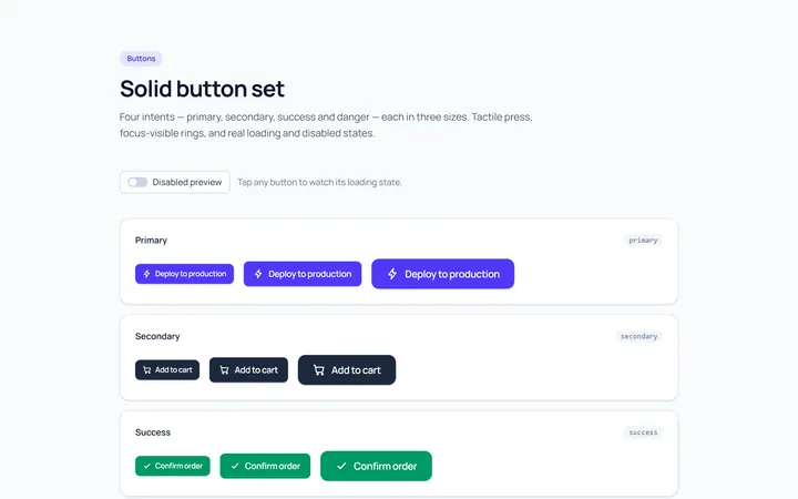
Solid Set Button
OriginalA set of solid buttons: primary, secondary, success and danger, in three sizes.
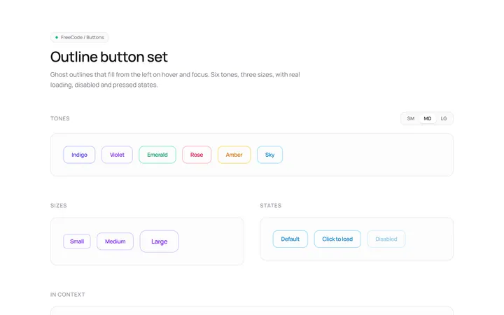
Outline Set Button
OriginalOutline button variants across colours and sizes with a hover fill.
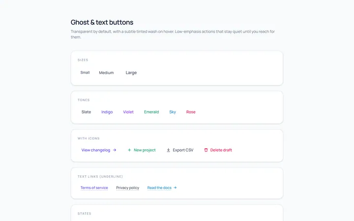
Ghost Set Button
OriginalGhost and text buttons with subtle hover backgrounds.
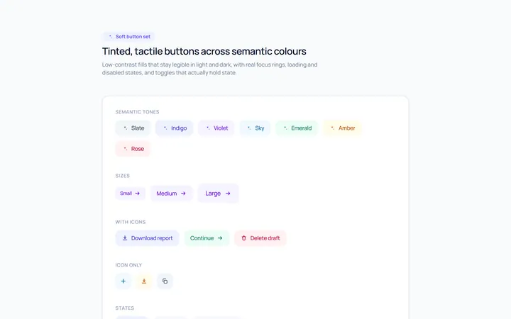
Soft Set Button
OriginalSoft, tinted buttons across semantic colours.
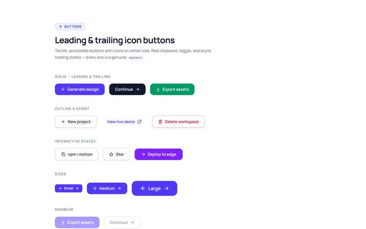
Icon Leading Button
OriginalButtons with leading and trailing icons.
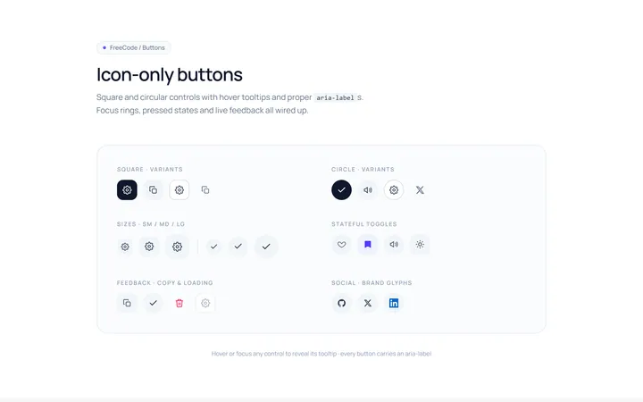
Icon Only Button
OriginalSquare and circular icon-only buttons with tooltips and aria-labels.
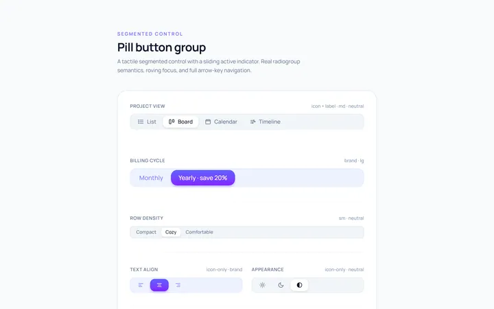
Pill Group Button
OriginalA segmented pill button group with a sliding active indicator.