

Outline Set Button
Original · freeOutline button variants across colours and sizes with a hover fill.
Copy prompt gives Claude Code, Cursor or v0 a ready-to-paste prompt that recreates this exact component.
npx shadcn@latest add https://webinnoventix.com/r/btn-outline-set.json"use client";
import { useState, type ReactNode } from "react";
type Tone = "indigo" | "violet" | "emerald" | "rose" | "amber" | "sky";
type Size = "sm" | "md" | "lg";
const tones: Record<
Tone,
{
label: string;
text: string;
border: string;
ring: string;
fill: string;
hoverText: string;
}
> = {
indigo: {
label: "Indigo",
text: "text-indigo-600 dark:text-indigo-300",
border: "border-indigo-300 dark:border-indigo-500/60",
ring: "focus-visible:ring-indigo-500/50",
fill: "bg-indigo-600 dark:bg-indigo-500",
hoverText: "group-hover:text-white group-focus-visible:text-white",
},
violet: {
label: "Violet",
text: "text-violet-600 dark:text-violet-300",
border: "border-violet-300 dark:border-violet-500/60",
ring: "focus-visible:ring-violet-500/50",
fill: "bg-violet-600 dark:bg-violet-500",
hoverText: "group-hover:text-white group-focus-visible:text-white",
},
emerald: {
label: "Emerald",
text: "text-emerald-600 dark:text-emerald-300",
border: "border-emerald-300 dark:border-emerald-500/60",
ring: "focus-visible:ring-emerald-500/50",
fill: "bg-emerald-600 dark:bg-emerald-500",
hoverText: "group-hover:text-white group-focus-visible:text-white",
},
rose: {
label: "Rose",
text: "text-rose-600 dark:text-rose-300",
border: "border-rose-300 dark:border-rose-500/60",
ring: "focus-visible:ring-rose-500/50",
fill: "bg-rose-600 dark:bg-rose-500",
hoverText: "group-hover:text-white group-focus-visible:text-white",
},
amber: {
label: "Amber",
text: "text-amber-600 dark:text-amber-300",
border: "border-amber-300 dark:border-amber-500/60",
ring: "focus-visible:ring-amber-500/50",
fill: "bg-amber-500 dark:bg-amber-500",
hoverText:
"group-hover:text-zinc-900 group-focus-visible:text-zinc-900 dark:group-hover:text-zinc-900 dark:group-focus-visible:text-zinc-900",
},
sky: {
label: "Sky",
text: "text-sky-600 dark:text-sky-300",
border: "border-sky-300 dark:border-sky-500/60",
ring: "focus-visible:ring-sky-500/50",
fill: "bg-sky-600 dark:bg-sky-500",
hoverText: "group-hover:text-white group-focus-visible:text-white",
},
};
const sizeStyles: Record<Size, string> = {
sm: "h-9 px-4 text-sm gap-1.5 rounded-lg",
md: "h-11 px-5 text-sm gap-2 rounded-xl",
lg: "h-14 px-7 text-base gap-2.5 rounded-2xl",
};
function Spinner({ className = "" }: { className?: string }) {
return (
<svg
viewBox="0 0 24 24"
className={`bos-spin h-4 w-4 ${className}`}
fill="none"
aria-hidden="true"
>
<circle
cx="12"
cy="12"
r="9"
stroke="currentColor"
strokeWidth="3"
className="opacity-25"
/>
<path
d="M21 12a9 9 0 0 0-9-9"
stroke="currentColor"
strokeWidth="3"
strokeLinecap="round"
/>
</svg>
);
}
type OutlineButtonProps = {
tone: Tone;
size: Size;
children: ReactNode;
onClick?: () => void;
disabled?: boolean;
loading?: boolean;
pressed?: boolean;
ariaLabel?: string;
leading?: ReactNode;
full?: boolean;
};
function OutlineButton({
tone,
size,
children,
onClick,
disabled = false,
loading = false,
pressed,
ariaLabel,
leading,
full = false,
}: OutlineButtonProps) {
const t = tones[tone];
const isDisabled = disabled || loading;
return (
<button
type="button"
onClick={onClick}
disabled={isDisabled}
aria-label={ariaLabel}
aria-busy={loading || undefined}
aria-pressed={pressed}
className={[
"group relative isolate inline-flex select-none items-center justify-center overflow-hidden",
"border bg-transparent font-semibold tracking-tight",
"transition-[transform,box-shadow,border-color] duration-200 ease-out",
"outline-none focus-visible:ring-2 focus-visible:ring-offset-2",
"focus-visible:ring-offset-white dark:focus-visible:ring-offset-zinc-950",
"active:scale-[0.97] disabled:cursor-not-allowed disabled:opacity-45 disabled:active:scale-100",
sizeStyles[size],
t.text,
t.border,
t.ring,
full ? "w-full" : "",
pressed ? "shadow-inner" : "",
].join(" ")}
>
{/* hover fill sweep */}
<span
aria-hidden="true"
className={[
"bos-fill absolute inset-0 -z-10 origin-left scale-x-0 rounded-[inherit]",
"transition-transform duration-300 ease-out",
"group-hover:scale-x-100 group-focus-visible:scale-x-100",
"group-disabled:!scale-x-0",
pressed ? "scale-x-100" : "",
t.fill,
].join(" ")}
/>
<span
className={[
"relative inline-flex items-center justify-center gap-[inherit]",
"transition-colors duration-200 ease-out",
isDisabled ? "" : t.hoverText,
pressed
? tone === "amber"
? "text-zinc-900"
: "text-white"
: "",
].join(" ")}
>
{loading ? <Spinner /> : leading}
{children}
</span>
</button>
);
}
export default function BtnOutlineSet() {
const [loadingTone, setLoadingTone] = useState<Tone | null>(null);
const [saved, setSaved] = useState(false);
const [followed, setFollowed] = useState(false);
const [size, setSize] = useState<Size>("md");
const toneOrder: Tone[] = [
"indigo",
"violet",
"emerald",
"rose",
"amber",
"sky",
];
const sizeOrder: Size[] = ["sm", "md", "lg"];
const runLoad = (tone: Tone) => {
setLoadingTone(tone);
window.setTimeout(() => setLoadingTone(null), 1600);
};
return (
<section className="relative w-full bg-white px-5 py-20 text-zinc-900 dark:bg-zinc-950 dark:text-zinc-100 sm:px-8">
<style>{`
@keyframes bos-spin { to { transform: rotate(360deg); } }
.bos-spin { animation: bos-spin 0.7s linear infinite; }
@media (prefers-reduced-motion: reduce) {
.bos-spin { animation: none; }
.bos-fill { transition-duration: 1ms; }
}
`}</style>
<div className="mx-auto max-w-5xl">
<header className="mb-14 max-w-2xl">
<span className="inline-flex items-center gap-2 rounded-full border border-zinc-200 bg-zinc-50 px-3 py-1 text-xs font-medium text-zinc-500 dark:border-zinc-800 dark:bg-zinc-900 dark:text-zinc-400">
<span className="h-1.5 w-1.5 rounded-full bg-emerald-500" />
FreeCode / Buttons
</span>
<h2 className="mt-4 text-3xl font-semibold tracking-tight sm:text-4xl">
Outline button set
</h2>
<p className="mt-3 text-base leading-relaxed text-zinc-500 dark:text-zinc-400">
Ghost outlines that fill from the left on hover and focus. Six tones,
three sizes, with real loading, disabled and pressed states.
</p>
</header>
{/* Tone matrix */}
<div className="mb-16">
<div className="mb-5 flex items-center justify-between gap-4">
<h3 className="text-sm font-semibold uppercase tracking-wider text-zinc-400 dark:text-zinc-500">
Tones
</h3>
{/* size switcher */}
<div
role="group"
aria-label="Preview button size"
className="inline-flex rounded-xl border border-zinc-200 bg-zinc-50 p-1 dark:border-zinc-800 dark:bg-zinc-900"
>
{sizeOrder.map((s) => (
<button
key={s}
type="button"
onClick={() => setSize(s)}
aria-pressed={size === s}
className={[
"rounded-lg px-3 py-1 text-xs font-semibold uppercase tracking-wide outline-none transition-colors",
"focus-visible:ring-2 focus-visible:ring-indigo-500/50",
size === s
? "bg-white text-zinc-900 shadow-sm dark:bg-zinc-700 dark:text-white"
: "text-zinc-500 hover:text-zinc-800 dark:text-zinc-400 dark:hover:text-zinc-200",
].join(" ")}
>
{s}
</button>
))}
</div>
</div>
<div className="flex flex-wrap gap-4 rounded-2xl border border-zinc-200 bg-zinc-50/60 p-8 dark:border-zinc-800 dark:bg-zinc-900/40">
{toneOrder.map((tone) => (
<OutlineButton key={tone} tone={tone} size={size}>
{tones[tone].label}
</OutlineButton>
))}
</div>
</div>
{/* Sizes column */}
<div className="mb-16 grid gap-10 sm:grid-cols-2">
<div>
<h3 className="mb-5 text-sm font-semibold uppercase tracking-wider text-zinc-400 dark:text-zinc-500">
Sizes
</h3>
<div className="flex flex-wrap items-center gap-4 rounded-2xl border border-zinc-200 bg-zinc-50/60 p-8 dark:border-zinc-800 dark:bg-zinc-900/40">
{sizeOrder.map((s) => (
<OutlineButton key={s} tone="violet" size={s}>
{s === "sm" ? "Small" : s === "md" ? "Medium" : "Large"}
</OutlineButton>
))}
</div>
</div>
<div>
<h3 className="mb-5 text-sm font-semibold uppercase tracking-wider text-zinc-400 dark:text-zinc-500">
States
</h3>
<div className="flex flex-wrap items-center gap-4 rounded-2xl border border-zinc-200 bg-zinc-50/60 p-8 dark:border-zinc-800 dark:bg-zinc-900/40">
<OutlineButton tone="sky" size="md">
Default
</OutlineButton>
<OutlineButton
tone="sky"
size="md"
loading={loadingTone === "sky"}
onClick={() => runLoad("sky")}
>
{loadingTone === "sky" ? "Saving" : "Click to load"}
</OutlineButton>
<OutlineButton tone="sky" size="md" disabled>
Disabled
</OutlineButton>
</div>
</div>
</div>
{/* With icons + real toggles */}
<div>
<h3 className="mb-5 text-sm font-semibold uppercase tracking-wider text-zinc-400 dark:text-zinc-500">
In context
</h3>
<div className="flex flex-wrap items-center gap-4 rounded-2xl border border-zinc-200 bg-zinc-50/60 p-8 dark:border-zinc-800 dark:bg-zinc-900/40">
{/* Save toggle */}
<OutlineButton
tone="emerald"
size="md"
pressed={saved}
onClick={() => setSaved((v) => !v)}
leading={
<svg
viewBox="0 0 24 24"
className="h-4 w-4"
fill={saved ? "currentColor" : "none"}
stroke="currentColor"
strokeWidth="2"
aria-hidden="true"
>
<path
d="M6 3h12a1 1 0 0 1 1 1v16l-7-4-7 4V4a1 1 0 0 1 1-1Z"
strokeLinejoin="round"
/>
</svg>
}
>
{saved ? "Saved" : "Save"}
</OutlineButton>
{/* Follow toggle */}
<OutlineButton
tone="rose"
size="md"
pressed={followed}
onClick={() => setFollowed((v) => !v)}
leading={
<svg
viewBox="0 0 24 24"
className="h-4 w-4"
fill={followed ? "currentColor" : "none"}
stroke="currentColor"
strokeWidth="2"
aria-hidden="true"
>
<path
d="M12 20s-7-4.35-9.5-8.5C1 8.5 2.5 5 6 5c2 0 3.2 1.2 4 2.3C10.8 6.2 12 5 14 5c3.5 0 5 3.5 3.5 6.5C19 15.65 12 20 12 20Z"
strokeLinejoin="round"
/>
</svg>
}
>
{followed ? "Following" : "Follow"}
</OutlineButton>
{/* Async action */}
<OutlineButton
tone="indigo"
size="md"
loading={loadingTone === "indigo"}
onClick={() => runLoad("indigo")}
leading={
<svg
viewBox="0 0 24 24"
className="h-4 w-4"
fill="none"
stroke="currentColor"
strokeWidth="2"
aria-hidden="true"
>
<path
d="M12 5v14M5 12h14"
strokeLinecap="round"
/>
</svg>
}
>
{loadingTone === "indigo" ? "Working" : "New project"}
</OutlineButton>
{/* Icon only */}
<OutlineButton
tone="amber"
size="md"
ariaLabel="Add to favourites"
>
<svg
viewBox="0 0 24 24"
className="h-4 w-4"
fill="none"
stroke="currentColor"
strokeWidth="2"
aria-hidden="true"
>
<path
d="m12 3 2.6 5.3 5.9.9-4.2 4.1 1 5.8L12 16.9 6.7 19.6l1-5.8L3.5 9.7l5.9-.9L12 3Z"
strokeLinejoin="round"
strokeLinecap="round"
/>
</svg>
</OutlineButton>
</div>
</div>
</div>
</section>
);
}Dependencies
Licence
Built by Web Innoventix. Free for personal and commercial use, no attribution required.
Built by Web Innoventix
Need a custom interface, a full website, or SEO that gets you cited by AI? We design, build and rank it end to end.
Get a free quoteSimilar components
Browse all →
Shimmer Button
MITA dark pill button with a continuous conic-gradient light shimmer sweeping around its border.
Rainbow Gradient Button
MITA button wrapped in an animated multi-colour gradient border with a matching blurred underglow.
Interactive Hover Button
MITA pill button whose dot expands to fill the surface and reveals an arrow label on hover.
Pulsating Button
MITA solid button that emits a soft, continuously pulsing glow ring to draw the eye to the primary action.
Shiny Button
MITA frosted-glass button with a spring-animated light sweeping across its text and border.
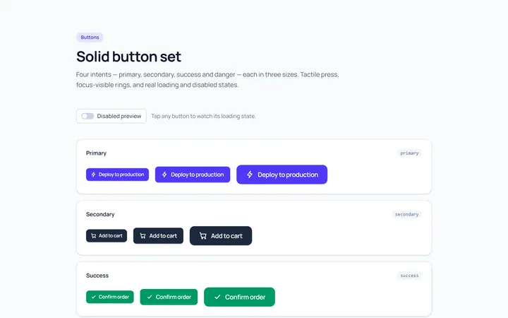
Solid Set Button
OriginalA set of solid buttons: primary, secondary, success and danger, in three sizes.
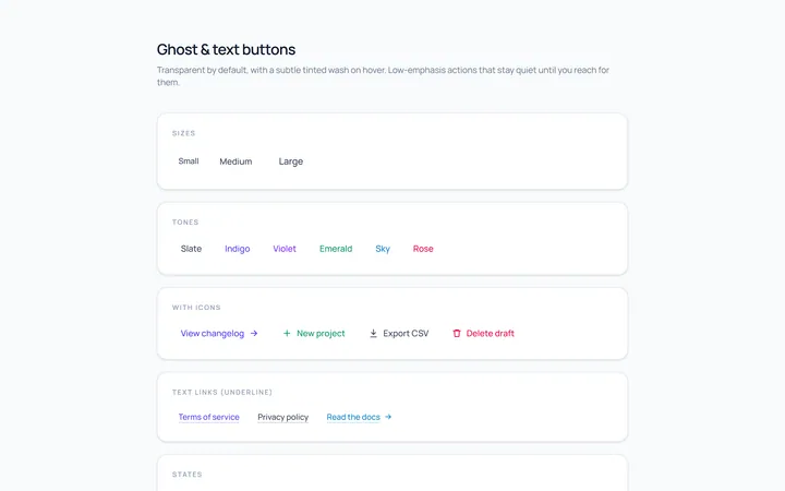
Ghost Set Button
OriginalGhost and text buttons with subtle hover backgrounds.
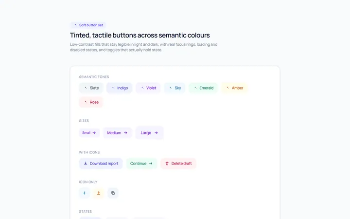
Soft Set Button
OriginalSoft, tinted buttons across semantic colours.
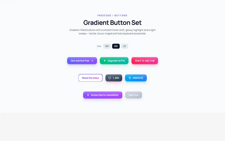
Gradient Set Button
OriginalGradient-filled buttons with a hover shift.
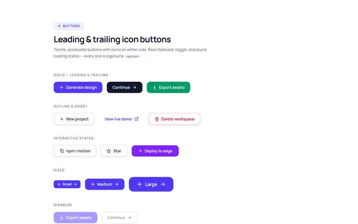
Icon Leading Button
OriginalButtons with leading and trailing icons.
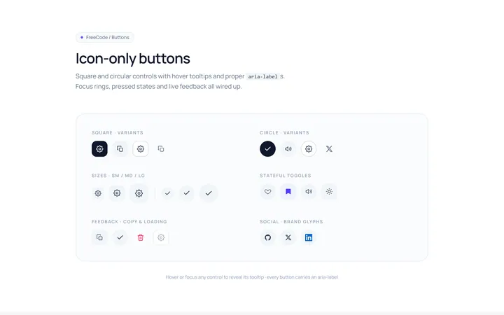
Icon Only Button
OriginalSquare and circular icon-only buttons with tooltips and aria-labels.
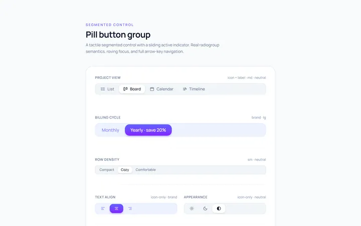
Pill Group Button
OriginalA segmented pill button group with a sliding active indicator.