

Basic Carousel
Original · freebasic image carousel with arrows and dots
byWeb InnoventixReact + Tailwind
carbasiccarousels
Copy prompt gives Claude Code, Cursor or v0 a ready-to-paste prompt that recreates this exact component.
npx shadcn@latest add https://webinnoventix.com/r/car-basic.jsoncar-basic.tsx
"use client";
import { useCallback, useEffect, useState, type KeyboardEvent } from "react";
import {
AnimatePresence,
motion,
useReducedMotion,
type PanInfo,
type Variants,
} from "motion/react";
interface Slide {
src: string;
place: string;
title: string;
description: string;
}
const SLIDES: ReadonlyArray<Slide> = [
{
src: "/img/gallery/g01.webp",
place: "Kyoto, Japan",
title: "Arashiyama at first light",
description:
"The bamboo grove is quietest just after dawn, before the tour buses arrive around eight.",
},
{
src: "/img/gallery/g02.webp",
place: "Santorini, Greece",
title: "The whitewashed cliffs of Oia",
description:
"Book a caldera-facing room a full day ahead of the equinox and the sunset lines up perfectly.",
},
{
src: "/img/gallery/g03.webp",
place: "Banff, Canada",
title: "Moraine Lake in early autumn",
description:
"The glacial blue peaks in the second week of September, right as the larches turn gold.",
},
{
src: "/img/gallery/g04.webp",
place: "Marrakech, Morocco",
title: "Through the souks of the medina",
description:
"Hire a local guide for the first hour; after that the tangle of alleys starts to make sense.",
},
{
src: "/img/gallery/g05.webp",
place: "Lofoten, Norway",
title: "Midnight sun over the fjords",
description:
"From late May the sun never fully sets, so the golden hour stretches across the whole night.",
},
{
src: "/img/gallery/g06.webp",
place: "Queenstown, New Zealand",
title: "Above Lake Wakatipu",
description:
"The gondola to Bob's Peak takes ten minutes and frames the Remarkables end to end.",
},
];
const AUTOPLAY_MS = 5000;
const SWIPE_THRESHOLD = 80;
const SWIPE_POWER = 8000;
const slideVariants: Variants = {
enter: (dir: number) => ({ x: dir >= 0 ? "100%" : "-100%", opacity: 0 }),
center: { x: "0%", opacity: 1 },
exit: (dir: number) => ({ x: dir >= 0 ? "-100%" : "100%", opacity: 0 }),
};
const fadeVariants: Variants = {
enter: { x: "0%", opacity: 0 },
center: { x: "0%", opacity: 1 },
exit: { x: "0%", opacity: 0 },
};
export default function CarBasic() {
const reduced = useReducedMotion();
const [index, setIndex] = useState(0);
const [direction, setDirection] = useState(0);
const [isPlaying, setIsPlaying] = useState(true);
const [hovered, setHovered] = useState(false);
const active = SLIDES[index];
const total = SLIDES.length;
const running = isPlaying && !hovered && !reduced;
const paginate = useCallback((dir: number) => {
setDirection(dir);
setIndex((prev) => (prev + dir + SLIDES.length) % SLIDES.length);
}, []);
const goTo = useCallback(
(target: number) => {
setDirection(target > index ? 1 : -1);
setIndex(target);
},
[index],
);
useEffect(() => {
if (!running) return;
const id = window.setInterval(() => paginate(1), AUTOPLAY_MS);
return () => window.clearInterval(id);
}, [running, index, paginate]);
const onKeyDown = (event: KeyboardEvent<HTMLDivElement>) => {
if (event.key === "ArrowLeft") {
event.preventDefault();
paginate(-1);
} else if (event.key === "ArrowRight") {
event.preventDefault();
paginate(1);
} else if (event.key === "Home") {
event.preventDefault();
goTo(0);
} else if (event.key === "End") {
event.preventDefault();
goTo(total - 1);
}
};
const onDragEnd = (
_event: MouseEvent | TouchEvent | PointerEvent,
info: PanInfo,
) => {
const power = Math.abs(info.offset.x) * info.velocity.x;
if (info.offset.x < -SWIPE_THRESHOLD || power < -SWIPE_POWER) {
paginate(1);
} else if (info.offset.x > SWIPE_THRESHOLD || power > SWIPE_POWER) {
paginate(-1);
}
};
const transition = reduced
? { duration: 0.25 }
: {
x: { type: "spring" as const, stiffness: 320, damping: 34 },
opacity: { duration: 0.35 },
};
return (
<section className="relative w-full bg-gradient-to-b from-slate-50 to-white px-4 py-16 sm:px-6 sm:py-24 lg:px-8 dark:from-slate-950 dark:to-slate-900">
<style>{`
@keyframes carbasic-kenburns {
from { transform: scale(1.06); }
to { transform: scale(1.14); }
}
@keyframes carbasic-progress {
from { width: 0%; }
to { width: 100%; }
}
@keyframes carbasic-caption {
from { opacity: 0; transform: translateY(10px); }
to { opacity: 1; transform: translateY(0); }
}
.carbasic-kb { animation: carbasic-kenburns 7s ease-out forwards; }
.carbasic-caption { animation: carbasic-caption 0.5s ease-out both; }
.carbasic-fill { animation: carbasic-progress linear forwards; }
@media (prefers-reduced-motion: reduce) {
.carbasic-kb,
.carbasic-caption,
.carbasic-fill { animation: none !important; }
.carbasic-kb { transform: none !important; }
}
`}</style>
<div className="mx-auto max-w-5xl">
<header className="mb-8 max-w-2xl sm:mb-10">
<p className="text-sm font-semibold uppercase tracking-widest text-indigo-600 dark:text-indigo-400">
Featured escapes
</p>
<h2 className="mt-2 text-3xl font-bold tracking-tight text-slate-900 sm:text-4xl dark:text-white">
Six places worth the flight
</h2>
<p className="mt-3 text-base leading-relaxed text-slate-600 dark:text-slate-300">
A short reel from this year’s shoots. Use the arrows, the dots,
or your keyboard’s arrow keys to move between destinations.
</p>
</header>
<div
role="group"
aria-roledescription="carousel"
aria-label="Featured travel destinations"
tabIndex={0}
onKeyDown={onKeyDown}
onMouseEnter={() => setHovered(true)}
onMouseLeave={() => setHovered(false)}
onFocus={() => setHovered(true)}
onBlur={() => setHovered(false)}
className="group relative overflow-hidden rounded-3xl bg-slate-200 shadow-xl shadow-slate-900/10 ring-1 ring-slate-900/5 focus-visible:outline-none focus-visible:ring-2 focus-visible:ring-indigo-500 focus-visible:ring-offset-2 dark:bg-slate-800 dark:shadow-black/40 dark:ring-white/10 dark:focus-visible:ring-offset-slate-900"
>
<div className="relative aspect-[16/10] w-full sm:aspect-[16/9]">
<AnimatePresence initial={false} custom={direction}>
<motion.div
key={index}
custom={direction}
variants={reduced ? fadeVariants : slideVariants}
initial="enter"
animate="center"
exit="exit"
transition={transition}
drag="x"
dragConstraints={{ left: 0, right: 0 }}
dragElastic={0.18}
onDragEnd={onDragEnd}
aria-roledescription="slide"
aria-label={`${index + 1} of ${total}`}
className="absolute inset-0 cursor-grab active:cursor-grabbing"
>
<div className="relative h-full w-full overflow-hidden">
{/* eslint-disable-next-line @next/next/no-img-element */}
<img
src={active.src}
alt={`${active.place} — ${active.title}`}
loading="lazy"
draggable={false}
className="carbasic-kb absolute inset-0 h-full w-full select-none object-cover"
/>
<div className="pointer-events-none absolute inset-0 bg-gradient-to-t from-slate-950/85 via-slate-950/25 to-transparent" />
<div className="carbasic-caption absolute inset-x-0 bottom-0 p-5 sm:p-8">
<span className="inline-flex items-center gap-1.5 rounded-full bg-white/15 px-3 py-1 text-xs font-semibold uppercase tracking-wide text-white ring-1 ring-inset ring-white/25 backdrop-blur">
<svg
viewBox="0 0 24 24"
aria-hidden="true"
className="h-3.5 w-3.5"
fill="none"
stroke="currentColor"
strokeWidth={2}
strokeLinecap="round"
strokeLinejoin="round"
>
<path d="M21 10c0 6-9 12-9 12s-9-6-9-12a9 9 0 0 1 18 0Z" />
<circle cx="12" cy="10" r="3" />
</svg>
{active.place}
</span>
<h3 className="mt-3 text-xl font-bold text-white sm:text-2xl">
{active.title}
</h3>
<p className="mt-1.5 max-w-md text-sm leading-relaxed text-slate-200 sm:text-base">
{active.description}
</p>
</div>
</div>
</motion.div>
</AnimatePresence>
<motion.button
type="button"
onClick={() => paginate(-1)}
whileTap={{ scale: reduced ? 1 : 0.9 }}
aria-label="Previous slide"
className="absolute left-3 top-1/2 z-10 flex h-11 w-11 -translate-y-1/2 items-center justify-center rounded-full bg-white/85 text-slate-900 shadow-lg ring-1 ring-slate-900/10 backdrop-blur transition hover:bg-white focus-visible:outline-none focus-visible:ring-2 focus-visible:ring-indigo-500 focus-visible:ring-offset-2 dark:bg-slate-900/80 dark:text-white dark:ring-white/15 dark:hover:bg-slate-900 dark:focus-visible:ring-offset-slate-900"
>
<svg
viewBox="0 0 24 24"
aria-hidden="true"
className="h-5 w-5"
fill="none"
stroke="currentColor"
strokeWidth={2}
strokeLinecap="round"
strokeLinejoin="round"
>
<path d="m15 18-6-6 6-6" />
</svg>
</motion.button>
<motion.button
type="button"
onClick={() => paginate(1)}
whileTap={{ scale: reduced ? 1 : 0.9 }}
aria-label="Next slide"
className="absolute right-3 top-1/2 z-10 flex h-11 w-11 -translate-y-1/2 items-center justify-center rounded-full bg-white/85 text-slate-900 shadow-lg ring-1 ring-slate-900/10 backdrop-blur transition hover:bg-white focus-visible:outline-none focus-visible:ring-2 focus-visible:ring-indigo-500 focus-visible:ring-offset-2 dark:bg-slate-900/80 dark:text-white dark:ring-white/15 dark:hover:bg-slate-900 dark:focus-visible:ring-offset-slate-900"
>
<svg
viewBox="0 0 24 24"
aria-hidden="true"
className="h-5 w-5"
fill="none"
stroke="currentColor"
strokeWidth={2}
strokeLinecap="round"
strokeLinejoin="round"
>
<path d="m9 18 6-6-6-6" />
</svg>
</motion.button>
{!reduced && (
<div className="absolute inset-x-0 bottom-0 z-10 h-1 bg-white/25">
<div
key={index}
className="carbasic-fill h-full bg-indigo-400"
style={{
animationDuration: `${AUTOPLAY_MS}ms`,
animationPlayState: running ? "running" : "paused",
}}
/>
</div>
)}
</div>
</div>
<div className="mt-5 flex items-center justify-between gap-4">
<div
className="flex items-center gap-2.5"
role="tablist"
aria-label="Choose a slide"
>
{SLIDES.map((slide, i) => {
const isActive = i === index;
return (
<button
key={slide.src}
type="button"
role="tab"
aria-selected={isActive}
aria-label={`Go to slide ${i + 1}: ${slide.place}`}
onClick={() => goTo(i)}
className={`h-2.5 rounded-full transition-all duration-300 focus-visible:outline-none focus-visible:ring-2 focus-visible:ring-indigo-500 focus-visible:ring-offset-2 dark:focus-visible:ring-offset-slate-900 ${
isActive
? "w-7 bg-indigo-600 dark:bg-indigo-400"
: "w-2.5 bg-slate-300 hover:bg-slate-400 dark:bg-slate-600 dark:hover:bg-slate-500"
}`}
/>
);
})}
</div>
<div className="flex items-center gap-3">
<span
className="text-sm font-semibold tabular-nums text-slate-500 dark:text-slate-400"
aria-hidden="true"
>
{String(index + 1).padStart(2, "0")}
<span className="mx-1 text-slate-300 dark:text-slate-600">/</span>
{String(total).padStart(2, "0")}
</span>
<button
type="button"
onClick={() => setIsPlaying((prev) => !prev)}
aria-label={isPlaying ? "Pause autoplay" : "Start autoplay"}
className="inline-flex items-center gap-2 rounded-full border border-slate-300 bg-white px-3.5 py-2 text-sm font-medium text-slate-700 shadow-sm transition hover:bg-slate-50 focus-visible:outline-none focus-visible:ring-2 focus-visible:ring-indigo-500 focus-visible:ring-offset-2 dark:border-slate-700 dark:bg-slate-800 dark:text-slate-200 dark:hover:bg-slate-700 dark:focus-visible:ring-offset-slate-900"
>
{isPlaying ? (
<svg
viewBox="0 0 24 24"
aria-hidden="true"
className="h-4 w-4"
fill="currentColor"
>
<rect x="6" y="5" width="4" height="14" rx="1" />
<rect x="14" y="5" width="4" height="14" rx="1" />
</svg>
) : (
<svg
viewBox="0 0 24 24"
aria-hidden="true"
className="h-4 w-4"
fill="currentColor"
>
<path d="M8 5.14v13.72a1 1 0 0 0 1.5.86l11-6.86a1 1 0 0 0 0-1.72l-11-6.86A1 1 0 0 0 8 5.14Z" />
</svg>
)}
<span className="hidden sm:inline">
{isPlaying ? "Pause" : "Play"}
</span>
</button>
</div>
</div>
<div aria-live="polite" aria-atomic="true" className="sr-only">
{`Slide ${index + 1} of ${total}: ${active.place}, ${active.title}`}
</div>
</div>
</section>
);
}Dependencies
motion
Licence
Built by Web Innoventix. Free for personal and commercial use, no attribution required.
Built by Web Innoventix
Need a custom interface, a full website, or SEO that gets you cited by AI? We design, build and rank it end to end.
Get a free quoteSimilar components
Browse all →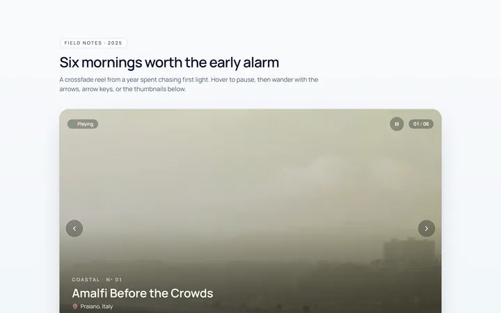
Fade Carousel
Originalcrossfade carousel
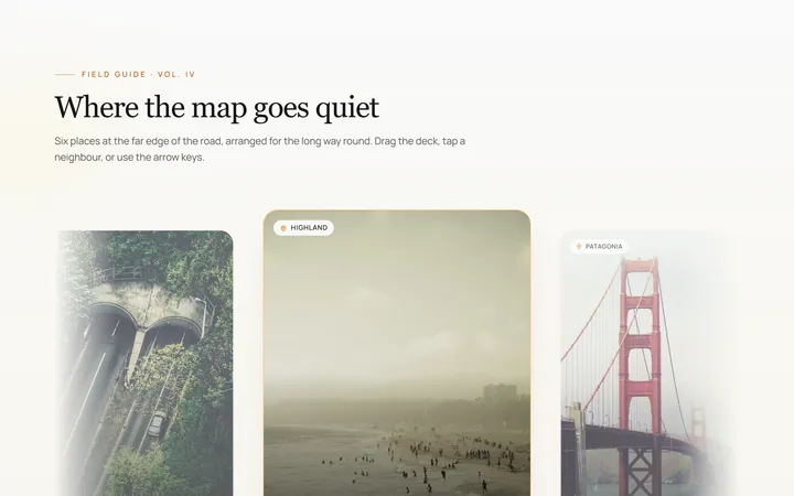
Cards Carousel
Originalpeeking card carousel
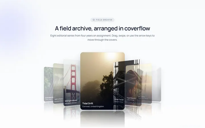
Coverflow Carousel
Original3D coverflow carousel
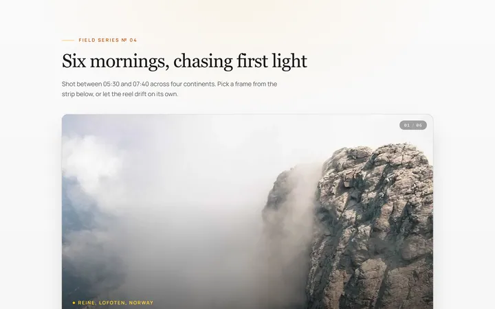
Thumbnails Carousel
Originalcarousel synced with thumbnails
Autoplay Carousel
Originalautoplay carousel with progress and pause
Dots Carousel
Originalcarousel with animated dot indicators
Vertical Carousel
Originalvertical carousel
Multi Carousel
Originalmulti-item responsive carousel
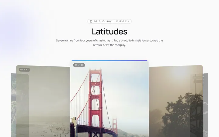
Center Focus Carousel
Originalcentre-focused scaling carousel
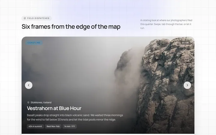
Progress Carousel
Originalcarousel with a progress bar
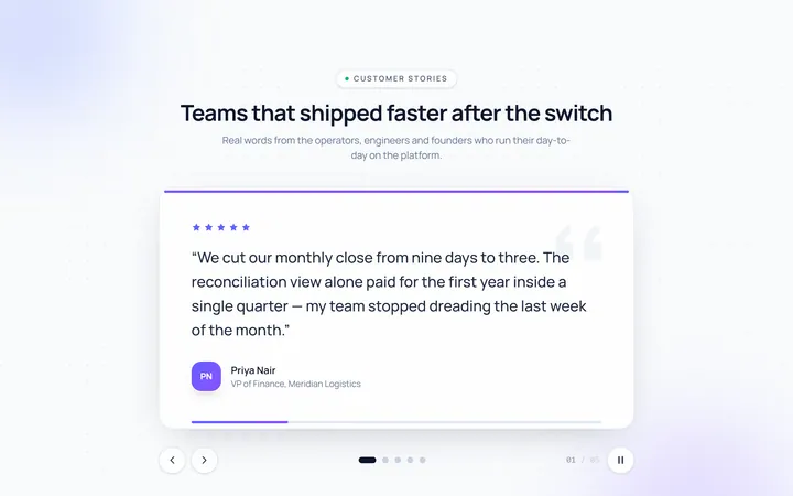
Testimonial Carousel
Originaltestimonial quote carousel

Logos Carousel
Originallogo carousel strip