

Thumbnails Carousel
Original · freecarousel synced with thumbnails
byWeb InnoventixReact + Tailwind
carthumbnailscarousels
Copy prompt gives Claude Code, Cursor or v0 a ready-to-paste prompt that recreates this exact component.
npx shadcn@latest add https://webinnoventix.com/r/car-thumbnails.jsoncar-thumbnails.tsx
"use client";

import { useEffect, useRef, useState, type KeyboardEvent } from "react";
import { AnimatePresence, motion, useReducedMotion } from "motion/react";

type Slide = {
  src: string;
  location: string;
  country: string;
  title: string;
  meta: string;
  description: string;
};

const SLIDES: Slide[] = [
  {
    src: "/img/gallery/g01.webp",
    location: "Reine, Lofoten",
    country: "Norway",
    title: "Blue Hour Over the Fjord",
    meta: "05:52 · f/8 · 1/60s · ISO 400",
    description:
      "Granite peaks hold the last of the polar dark while the fishing harbour below begins to wake.",
  },
  {
    src: "/img/gallery/g02.webp",
    location: "Salar de Uyuni",
    country: "Bolivia",
    title: "Mirror of the Salt Flat",
    meta: "18:20 · f/11 · 1/200s · ISO 100",
    description:
      "A thin skin of rain turns four thousand square miles of salt into a flawless reflection of the sky.",
  },
  {
    src: "/img/gallery/g03.webp",
    location: "Cannon Beach",
    country: "Oregon",
    title: "Cedar Boardwalk at Dawn",
    meta: "06:15 · f/5.6 · 1/125s · ISO 320",
    description:
      "Fog peels off the Pacific and threads slowly between the old-growth cedars that line the trail.",
  },
  {
    src: "/img/gallery/g04.webp",
    location: "Bologna",
    country: "Italy",
    title: "Terracotta and Morning Haze",
    meta: "07:40 · f/9 · 1/250s · ISO 200",
    description:
      "Nine centuries of rooftops step down toward the Piazza Maggiore under a warm, low haze.",
  },
  {
    src: "/img/gallery/g05.webp",
    location: "Sossusvlei",
    country: "Namibia",
    title: "Red Dunes, First Sun",
    meta: "06:48 · f/13 · 1/320s · ISO 100",
    description:
      "Sand carried inland over a million years glows crimson the instant the sun clears the ridge.",
  },
  {
    src: "/img/gallery/g06.webp",
    location: "Peggy's Cove",
    country: "Nova Scotia",
    title: "Harbour Fog and the Light",
    meta: "05:30 · f/7.1 · 1/100s · ISO 500",
    description:
      "The lighthouse fades in and out of view as Atlantic fog drifts across the granite shore.",
  },
];

const DURATION_MS = 5200;

function IconChevronLeft() {
  return (
    <svg viewBox="0 0 24 24" aria-hidden="true" fill="none" className="h-5 w-5">
      <path
        d="M15 5l-7 7 7 7"
        stroke="currentColor"
        strokeWidth="1.75"
        strokeLinecap="round"
        strokeLinejoin="round"
      />
    </svg>
  );
}

function IconChevronRight() {
  return (
    <svg viewBox="0 0 24 24" aria-hidden="true" fill="none" className="h-5 w-5">
      <path
        d="M9 5l7 7-7 7"
        stroke="currentColor"
        strokeWidth="1.75"
        strokeLinecap="round"
        strokeLinejoin="round"
      />
    </svg>
  );
}

function IconPlay() {
  return (
    <svg viewBox="0 0 24 24" aria-hidden="true" className="h-4 w-4">
      <path d="M8 5.5v13l11-6.5-11-6.5z" fill="currentColor" />
    </svg>
  );
}

function IconPause() {
  return (
    <svg viewBox="0 0 24 24" aria-hidden="true" className="h-4 w-4">
      <path
        d="M8 5h3v14H8zM13 5h3v14h-3z"
        fill="currentColor"
      />
    </svg>
  );
}

export default function CarThumbnails() {
  const reduce = useReducedMotion() ?? false;
  const count = SLIDES.length;

  const [active, setActive] = useState<number>(0);
  const [isPlaying, setIsPlaying] = useState<boolean>(true);
  const [paused, setPaused] = useState<boolean>(false);

  const autoAdvance = isPlaying && !reduce && !paused;

  const progressRef = useRef<HTMLDivElement | null>(null);
  const elapsedRef = useRef<number>(0);
  const lastRef = useRef<number | null>(null);
  const thumbRefs = useRef<Array<HTMLButtonElement | null>>([]);

  const go = (dir: number) => setActive((a) => (a + dir + count) % count);

  // Reset the progress meter whenever the active slide changes.
  useEffect(() => {
    elapsedRef.current = 0;
    if (progressRef.current) progressRef.current.style.width = "0%";
  }, [active]);

  // Drive auto-advance + the progress fill with requestAnimationFrame.
  useEffect(() => {
    if (!autoAdvance) {
      lastRef.current = null;
      return;
    }
    let raf = 0;
    const tick = (now: number) => {
      if (lastRef.current === null) lastRef.current = now;
      const dt = now - lastRef.current;
      lastRef.current = now;
      elapsedRef.current += dt;
      const pct = Math.min(elapsedRef.current / DURATION_MS, 1);
      if (progressRef.current) progressRef.current.style.width = `${pct * 100}%`;
      if (pct >= 1) {
        elapsedRef.current = 0;
        lastRef.current = null;
        setActive((a) => (a + 1) % count);
        return;
      }
      raf = requestAnimationFrame(tick);
    };
    raf = requestAnimationFrame(tick);
    return () => {
      cancelAnimationFrame(raf);
      lastRef.current = null;
    };
  }, [autoAdvance, active, count]);

  // Keep the active thumbnail in view within its scroll strip.
  useEffect(() => {
    const el = thumbRefs.current[active];
    if (el)
      el.scrollIntoView({
        inline: "center",
        block: "nearest",
        behavior: reduce ? "auto" : "smooth",
      });
  }, [active, reduce]);

  const onTabKeyDown = (e: KeyboardEvent<HTMLButtonElement>) => {
    let next: number | null = null;
    if (e.key === "ArrowRight" || e.key === "ArrowDown") next = (active + 1) % count;
    else if (e.key === "ArrowLeft" || e.key === "ArrowUp")
      next = (active - 1 + count) % count;
    else if (e.key === "Home") next = 0;
    else if (e.key === "End") next = count - 1;
    if (next !== null) {
      e.preventDefault();
      setActive(next);
      thumbRefs.current[next]?.focus();
    }
  };

  const current = SLIDES[active];
  const showProgress = isPlaying && !reduce;

  return (
    <section
      className="relative w-full overflow-hidden bg-neutral-50 text-neutral-900 dark:bg-neutral-950 dark:text-neutral-100"
      aria-roledescription="carousel"
      aria-label="First light — a synced photo gallery"
    >
      <style>{`
        .carthumb-glow { animation: carthumb-glow 15s ease-in-out infinite alternate; }
        @keyframes carthumb-glow {
          0%   { opacity: .5;  transform: translate3d(-2%, -1%, 0) scale(1); }
          100% { opacity: .95; transform: translate3d(2%, 1%, 0) scale(1.08); }
        }
        .carthumb-strip { scrollbar-width: thin; scrollbar-color: rgba(120,120,120,.4) transparent; }
        .carthumb-strip::-webkit-scrollbar { height: 6px; }
        .carthumb-strip::-webkit-scrollbar-thumb { background: rgba(120,120,120,.35); border-radius: 9999px; }
        .carthumb-strip::-webkit-scrollbar-track { background: transparent; }
        @media (prefers-reduced-motion: reduce) {
          .carthumb-glow { animation: none !important; }
        }
      `}</style>

      {/* Atmospheric background */}
      <div
        aria-hidden="true"
        className="carthumb-glow pointer-events-none absolute inset-x-0 top-0 h-[60%] bg-[radial-gradient(60%_60%_at_50%_0%,rgba(245,158,11,0.14),transparent_70%)]"
      />
      <div
        aria-hidden="true"
        className="pointer-events-none absolute inset-0 bg-[linear-gradient(to_bottom,transparent,rgba(0,0,0,0.02))] dark:bg-[linear-gradient(to_bottom,transparent,rgba(0,0,0,0.35))]"
      />

      <div className="relative mx-auto max-w-5xl px-6 py-20 sm:py-24 lg:px-8">
        {/* Header */}
        <div className="mb-10 flex flex-col gap-4">
          <div className="flex items-center gap-3">
            <span className="h-px w-8 bg-amber-500/70" aria-hidden="true" />
            <span className="text-xs font-semibold uppercase tracking-[0.22em] text-amber-700 dark:text-amber-400">
              Field Series № 04
            </span>
          </div>
          <h2 className="max-w-2xl font-serif text-4xl font-medium leading-tight tracking-tight text-neutral-900 sm:text-5xl dark:text-neutral-50">
            Six mornings, chasing first light
          </h2>
          <p className="max-w-xl text-base leading-relaxed text-neutral-600 dark:text-neutral-400">
            Shot between 05:30 and 07:40 across four continents. Pick a frame from
            the strip below, or let the reel drift on its own.
          </p>
        </div>

        {/* Live announcement for assistive tech */}
        <div aria-live="polite" className="sr-only">
          {`Photograph ${active + 1} of ${count}: ${current.title}, ${current.location}, ${current.country}.`}
        </div>

        {/* Main stage */}
        <div
          className="group relative overflow-hidden rounded-2xl bg-neutral-900 shadow-2xl shadow-neutral-900/20 ring-1 ring-neutral-900/10 dark:ring-white/10"
          onMouseEnter={() => setPaused(true)}
          onMouseLeave={() => setPaused(false)}
          onFocusCapture={() => setPaused(true)}
          onBlurCapture={() => setPaused(false)}
        >
          <div
            id="carthumb-panel"
            role="tabpanel"
            tabIndex={0}
            aria-labelledby={`carthumb-tab-${active}`}
            className="relative aspect-[3/2] w-full outline-none focus-visible:ring-2 focus-visible:ring-inset focus-visible:ring-amber-400"
          >
            <AnimatePresence initial={false}>
              <motion.div
                key={active}
                className="absolute inset-0 will-change-transform"
                initial={{ opacity: 0, scale: reduce ? 1 : 1.08 }}
                animate={{ opacity: 1, scale: 1 }}
                exit={{ opacity: 0 }}
                transition={{
                  opacity: { duration: reduce ? 0 : 0.7, ease: "easeInOut" },
                  scale: { duration: reduce ? 0 : 7, ease: "easeOut" },
                }}
              >
                {/* eslint-disable-next-line @next/next/no-img-element */}
                <img
                  src={current.src}
                  alt={`${current.title} — ${current.location}, ${current.country} at dawn.`}
                  loading="lazy"
                  draggable={false}
                  className="h-full w-full select-none object-cover"
                />
              </motion.div>
            </AnimatePresence>

            {/* Bottom scrim */}
            <div
              aria-hidden="true"
              className="pointer-events-none absolute inset-0 bg-[linear-gradient(to_top,rgba(0,0,0,0.78)_0%,rgba(0,0,0,0.28)_38%,transparent_65%)]"
            />

            {/* Index counter */}
            <div className="absolute right-4 top-4 rounded-full bg-black/35 px-3 py-1 font-mono text-xs tracking-widest text-white/80 backdrop-blur">
              {String(active + 1).padStart(2, "0")}
              <span className="mx-1 text-white/40">/</span>
              {String(count).padStart(2, "0")}
            </div>

            {/* Caption */}
            <motion.div
              key={`cap-${active}`}
              initial={{ opacity: 0, y: reduce ? 0 : 14 }}
              animate={{ opacity: 1, y: 0 }}
              transition={{ duration: reduce ? 0 : 0.5, delay: reduce ? 0 : 0.12 }}
              className="absolute inset-x-0 bottom-0 p-5 sm:p-7"
            >
              <p className="mb-1 flex items-center gap-2 text-xs font-semibold uppercase tracking-[0.18em] text-amber-300">
                <span className="inline-block h-1.5 w-1.5 rounded-full bg-amber-400" aria-hidden="true" />
                {current.location}, {current.country}
              </p>
              <h3 className="font-serif text-2xl font-medium text-white sm:text-3xl">
                {current.title}
              </h3>
              <p className="mt-1.5 max-w-lg text-sm leading-relaxed text-neutral-200/90">
                {current.description}
              </p>
              <p className="mt-2 font-mono text-[11px] tracking-wide text-neutral-300/70">
                {current.meta}
              </p>
            </motion.div>

            {/* Prev / Next */}
            <button
              type="button"
              onClick={() => go(-1)}
              aria-label="Previous photograph"
              className="absolute left-3 top-1/2 grid h-11 w-11 -translate-y-1/2 place-items-center rounded-full border border-white/20 bg-black/25 text-white opacity-0 backdrop-blur transition hover:bg-black/45 focus-visible:opacity-100 focus-visible:outline-none focus-visible:ring-2 focus-visible:ring-amber-400 group-hover:opacity-100"
            >
              <IconChevronLeft />
            </button>
            <button
              type="button"
              onClick={() => go(1)}
              aria-label="Next photograph"
              className="absolute right-3 top-1/2 grid h-11 w-11 -translate-y-1/2 place-items-center rounded-full border border-white/20 bg-black/25 text-white opacity-0 backdrop-blur transition hover:bg-black/45 focus-visible:opacity-100 focus-visible:outline-none focus-visible:ring-2 focus-visible:ring-amber-400 group-hover:opacity-100"
            >
              <IconChevronRight />
            </button>

            {/* Auto-advance progress */}
            {showProgress && (
              <div
                aria-hidden="true"
                className="absolute inset-x-0 bottom-0 h-[3px] bg-white/15"
              >
                <div
                  ref={progressRef}
                  className="h-full w-0 bg-amber-400"
                  style={{ transition: "none" }}
                />
              </div>
            )}
          </div>
        </div>

        {/* Controls row */}
        <div className="mt-5 flex items-center justify-between gap-4">
          <button
            type="button"
            onClick={() => setIsPlaying((p) => !p)}
            aria-pressed={isPlaying}
            aria-label={isPlaying ? "Pause slideshow" : "Play slideshow"}
            disabled={reduce}
            className="inline-flex items-center gap-2 rounded-full border border-neutral-300 bg-white px-4 py-2 text-sm font-medium text-neutral-700 shadow-sm transition hover:border-neutral-400 hover:text-neutral-900 focus-visible:outline-none focus-visible:ring-2 focus-visible:ring-amber-500 focus-visible:ring-offset-2 focus-visible:ring-offset-neutral-50 disabled:cursor-not-allowed disabled:opacity-40 dark:border-neutral-700 dark:bg-neutral-900 dark:text-neutral-300 dark:hover:border-neutral-600 dark:hover:text-neutral-100 dark:focus-visible:ring-offset-neutral-950"
          >
            {isPlaying ? <IconPause /> : <IconPlay />}
            <span>
              {reduce ? "Motion off" : isPlaying ? "Pause" : "Play"}
            </span>
          </button>

          <p className="hidden text-xs text-neutral-500 sm:block dark:text-neutral-500">
            Use{" "}
            <kbd className="rounded border border-neutral-300 bg-neutral-100 px-1.5 py-0.5 font-mono text-[11px] text-neutral-600 dark:border-neutral-700 dark:bg-neutral-800 dark:text-neutral-300">
              ←
            </kbd>{" "}
            <kbd className="rounded border border-neutral-300 bg-neutral-100 px-1.5 py-0.5 font-mono text-[11px] text-neutral-600 dark:border-neutral-700 dark:bg-neutral-800 dark:text-neutral-300">
              →
            </kbd>{" "}
            on the strip to browse.
          </p>
        </div>

        {/* Thumbnail strip (synced) */}
        <div
          role="tablist"
          aria-label="Photograph thumbnails"
          className="carthumb-strip mt-4 flex snap-x snap-mandatory gap-3 overflow-x-auto pb-3"
        >
          {SLIDES.map((slide, i) => {
            const selected = i === active;
            return (
              <button
                key={slide.src}
                ref={(el) => {
                  thumbRefs.current[i] = el;
                }}
                type="button"
                role="tab"
                id={`carthumb-tab-${i}`}
                aria-selected={selected}
                aria-controls="carthumb-panel"
                aria-label={`${slide.title}, ${slide.location}`}
                tabIndex={selected ? 0 : -1}
                onClick={() => setActive(i)}
                onKeyDown={onTabKeyDown}
                className={`relative shrink-0 snap-start overflow-hidden rounded-xl outline-none transition focus-visible:ring-2 focus-visible:ring-amber-500 focus-visible:ring-offset-2 focus-visible:ring-offset-neutral-50 dark:focus-visible:ring-offset-neutral-950 ${
                  selected
                    ? "ring-2 ring-amber-500"
                    : "opacity-60 ring-1 ring-neutral-900/10 hover:opacity-100 dark:ring-white/10"
                }`}
              >
                <span className="block h-16 w-24 sm:h-20 sm:w-32">
                  {/* eslint-disable-next-line @next/next/no-img-element */}
                  <img
                    src={slide.src}
                    alt=""
                    loading="lazy"
                    draggable={false}
                    className="h-full w-full select-none object-cover"
                  />
                </span>
                <span
                  aria-hidden="true"
                  className={`absolute left-1.5 top-1.5 rounded bg-black/45 px-1.5 py-0.5 font-mono text-[10px] tracking-widest text-white/90 backdrop-blur ${
                    selected ? "opacity-100" : "opacity-0"
                  }`}
                >
                  {String(i + 1).padStart(2, "0")}
                </span>
                {!selected && (
                  <span
                    aria-hidden="true"
                    className="absolute inset-0 bg-neutral-950/10 dark:bg-neutral-950/20"
                  />
                )}
              </button>
            );
          })}
        </div>
      </div>
    </section>
  );
}
Dependencies
motion
Licence
Built by Web Innoventix. Free for personal and commercial use, no attribution required.
Built by Web Innoventix
Need a custom interface, a full website, or SEO that gets you cited by AI? We design, build and rank it end to end.
Get a free quoteSimilar components
Browse all →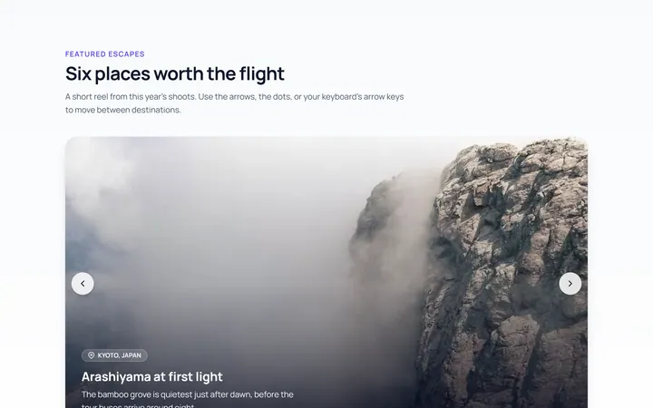
Basic Carousel
Originalbasic image carousel with arrows and dots
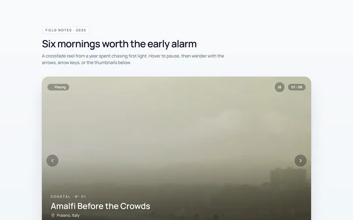
Fade Carousel
Originalcrossfade carousel
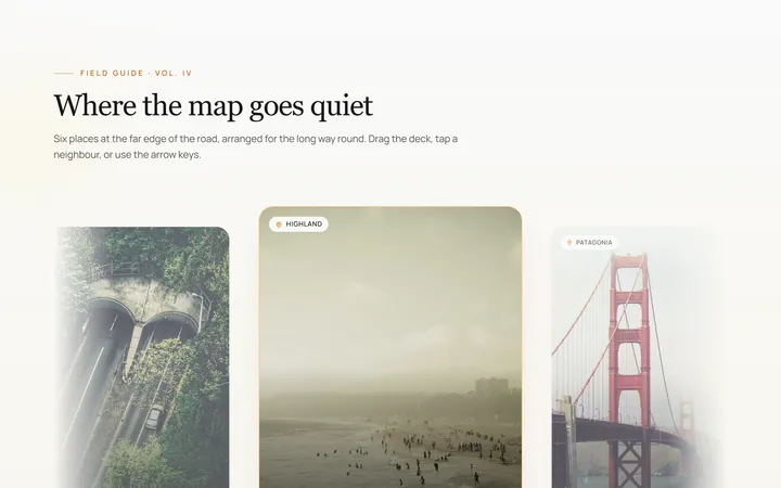
Cards Carousel
Originalpeeking card carousel
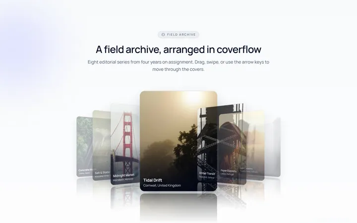
Coverflow Carousel
Original3D coverflow carousel
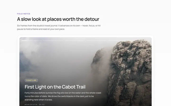
Autoplay Carousel
Originalautoplay carousel with progress and pause
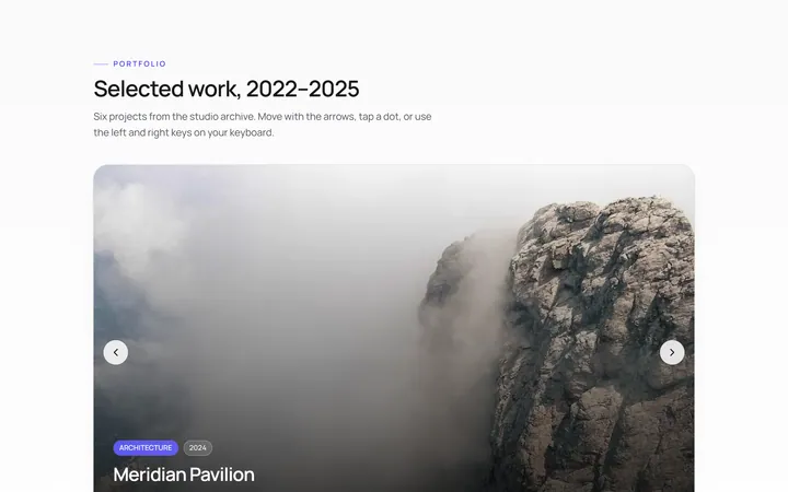
Dots Carousel
Originalcarousel with animated dot indicators
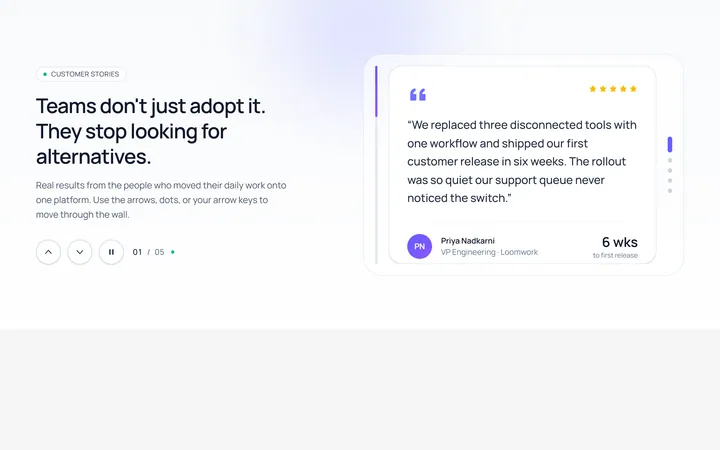
Vertical Carousel
Originalvertical carousel
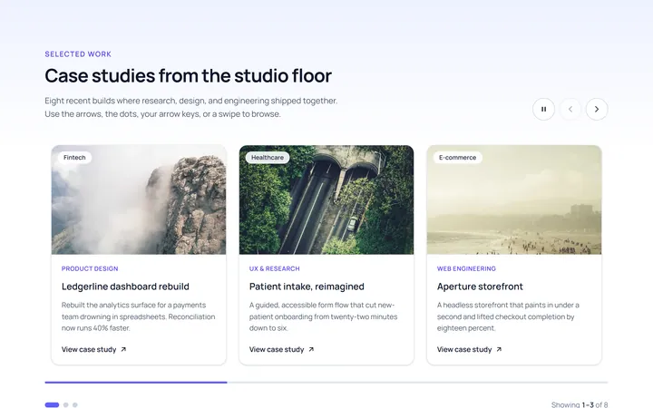
Multi Carousel
Originalmulti-item responsive carousel
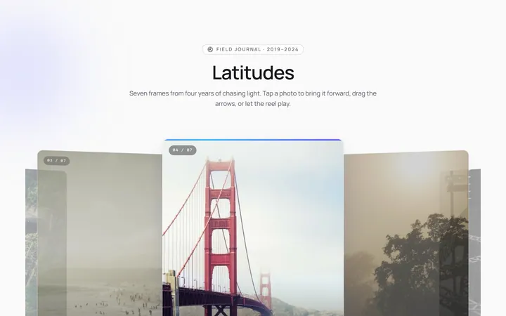
Center Focus Carousel
Originalcentre-focused scaling carousel
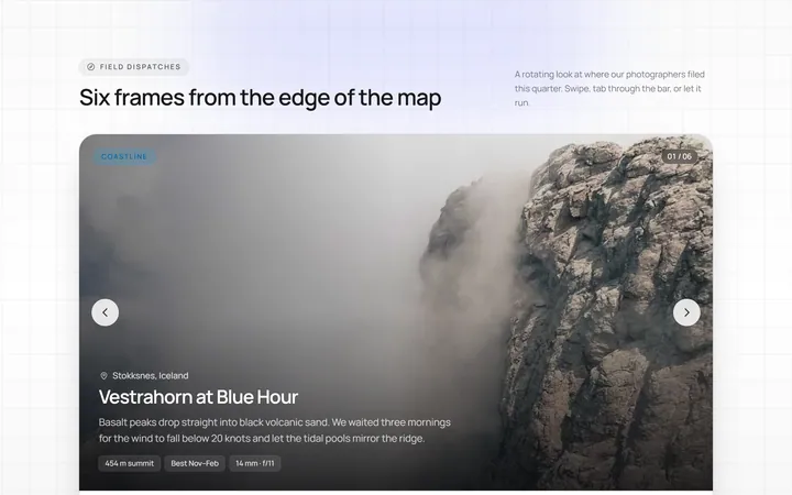
Progress Carousel
Originalcarousel with a progress bar
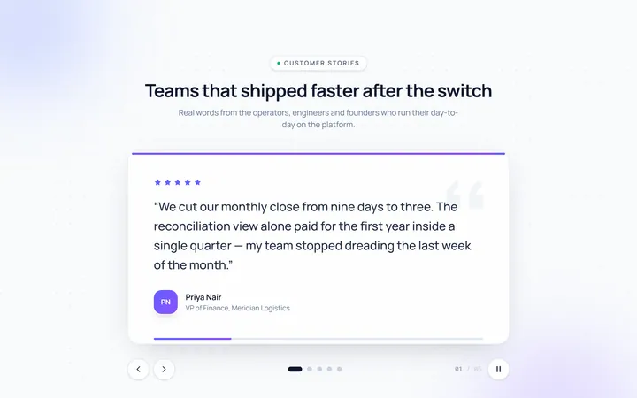
Testimonial Carousel
Originaltestimonial quote carousel

Logos Carousel
Originallogo carousel strip