

Progress Carousel
Original · freecarousel with a progress bar
byWeb InnoventixReact + Tailwind
carprogresscarousels
Copy prompt gives Claude Code, Cursor or v0 a ready-to-paste prompt that recreates this exact component.
npx shadcn@latest add https://webinnoventix.com/r/car-progress.jsoncar-progress.tsx
"use client";

import {
  useCallback,
  useEffect,
  useRef,
  useState,
  type FocusEvent as ReactFocusEvent,
  type KeyboardEvent as ReactKeyboardEvent,
} from "react";
import { AnimatePresence, motion, useReducedMotion, type Variants } from "motion/react";

type AccentKey = "sky" | "amber" | "emerald" | "violet" | "rose" | "indigo";

type Slide = {
  id: string;
  category: string;
  accent: AccentKey;
  title: string;
  location: string;
  blurb: string;
  chips: string[];
  img: string;
};

const ACCENT: Record<AccentKey, string> = {
  sky: "bg-sky-500/15 text-sky-700 ring-sky-500/30 dark:bg-sky-400/15 dark:text-sky-200 dark:ring-sky-300/25",
  amber:
    "bg-amber-500/15 text-amber-700 ring-amber-500/30 dark:bg-amber-400/15 dark:text-amber-200 dark:ring-amber-300/25",
  emerald:
    "bg-emerald-500/15 text-emerald-700 ring-emerald-500/30 dark:bg-emerald-400/15 dark:text-emerald-200 dark:ring-emerald-300/25",
  violet:
    "bg-violet-500/15 text-violet-700 ring-violet-500/30 dark:bg-violet-400/15 dark:text-violet-200 dark:ring-violet-300/25",
  rose: "bg-rose-500/15 text-rose-700 ring-rose-500/30 dark:bg-rose-400/15 dark:text-rose-200 dark:ring-rose-300/25",
  indigo:
    "bg-indigo-500/15 text-indigo-700 ring-indigo-500/30 dark:bg-indigo-400/15 dark:text-indigo-200 dark:ring-indigo-300/25",
};

const SLIDES: Slide[] = [
  {
    id: "vestrahorn",
    category: "Coastline",
    accent: "sky",
    title: "Vestrahorn at Blue Hour",
    location: "Stokksnes, Iceland",
    blurb:
      "Basalt peaks drop straight into black volcanic sand. We waited three mornings for the wind to fall below 20 knots and let the tidal pools mirror the ridge.",
    chips: ["454 m summit", "Best Nov–Feb", "14 mm · f/11"],
    img: "/img/gallery/g01.webp",
  },
  {
    id: "danxia",
    category: "Geology",
    accent: "amber",
    title: "Rainbow Ridgelines",
    location: "Zhangye Danxia, China",
    blurb:
      "Iron and sandstone laid down over 24 million years, tilted on edge by the same collision that raised the Himalaya. The colour is real — no filter survives the midday glare.",
    chips: ["24 M years", "Best at dusk", "70 mm · f/8"],
    img: "/img/gallery/g02.webp",
  },
  {
    id: "socotra",
    category: "Ancient Flora",
    accent: "emerald",
    title: "Dragon's Blood Grove",
    location: "Socotra, Yemen",
    blurb:
      "Umbrella canopies that harvest their own monsoon and bleed crimson resin when cut. Nearly two in five plants on this island grow nowhere else on Earth.",
    chips: ["37% endemic", "Monsoon-fed", "24 mm · f/5.6"],
    img: "/img/gallery/g03.webp",
  },
  {
    id: "paine",
    category: "Alpine",
    accent: "violet",
    title: "The Granite Towers",
    location: "Torres del Paine, Chile",
    blurb:
      "Three vertical spires of 12-million-year-old granite, catching first light for barely ninety seconds before the Patagonian cloud closes back over them.",
    chips: ["2,500 m", "90-sec light", "35 mm · f/9"],
    img: "/img/gallery/g04.webp",
  },
  {
    id: "lofoten",
    category: "Arctic",
    accent: "rose",
    title: "Red Cabins, White Peaks",
    location: "Lofoten, Norway",
    blurb:
      "Fishing rorbuer painted with leftover cod-liver ochre, still lived in through a winter that never fully turns the lights on. Filed at 68° north.",
    chips: ["68° N", "Polar night", "50 mm · f/4"],
    img: "/img/gallery/g05.webp",
  },
  {
    id: "wadirum",
    category: "Desert",
    accent: "indigo",
    title: "Valley of the Moon",
    location: "Wadi Rum, Jordan",
    blurb:
      "Sandstone and granite worn into corridors wide enough to lose a convoy in. The Bedouin who guided us have mapped every spring here for six centuries.",
    chips: ["600 yrs guided", "Best sunrise", "24 mm · f/11"],
    img: "/img/gallery/g06.webp",
  },
];

const DURATION = 5400;

function IconChevron({ className }: { className?: string }) {
  return (
    <svg viewBox="0 0 24 24" fill="none" aria-hidden="true" className={className}>
      <path d="M15 5l-7 7 7 7" stroke="currentColor" strokeWidth="2" strokeLinecap="round" strokeLinejoin="round" />
    </svg>
  );
}

function IconPlay({ className }: { className?: string }) {
  return (
    <svg viewBox="0 0 24 24" fill="currentColor" aria-hidden="true" className={className}>
      <path d="M8 5.14v13.72a1 1 0 0 0 1.53.85l10.79-6.86a1 1 0 0 0 0-1.7L9.53 4.29A1 1 0 0 0 8 5.14z" />
    </svg>
  );
}

function IconPause({ className }: { className?: string }) {
  return (
    <svg viewBox="0 0 24 24" fill="currentColor" aria-hidden="true" className={className}>
      <rect x="6" y="5" width="4" height="14" rx="1.2" />
      <rect x="14" y="5" width="4" height="14" rx="1.2" />
    </svg>
  );
}

function IconPin({ className }: { className?: string }) {
  return (
    <svg viewBox="0 0 24 24" fill="none" aria-hidden="true" className={className}>
      <path
        d="M12 21s-6.5-5.6-6.5-10.2A6.5 6.5 0 0 1 12 4.3a6.5 6.5 0 0 1 6.5 6.5C18.5 15.4 12 21 12 21z"
        stroke="currentColor"
        strokeWidth="1.6"
        strokeLinejoin="round"
      />
      <circle cx="12" cy="10.6" r="2.3" stroke="currentColor" strokeWidth="1.6" />
    </svg>
  );
}

function IconCompass({ className }: { className?: string }) {
  return (
    <svg viewBox="0 0 24 24" fill="none" aria-hidden="true" className={className}>
      <circle cx="12" cy="12" r="9" stroke="currentColor" strokeWidth="1.6" />
      <path d="M15.5 8.5l-2 5-5 2 2-5 5-2z" stroke="currentColor" strokeWidth="1.6" strokeLinejoin="round" />
    </svg>
  );
}

export default function CarProgress() {
  const reduce = !!useReducedMotion();
  const count = SLIDES.length;

  const [index, setIndex] = useState(0);
  const [direction, setDirection] = useState(1);
  const [isPlaying, setIsPlaying] = useState(true);
  const [hovered, setHovered] = useState(false);
  const [focused, setFocused] = useState(false);

  const fillRef = useRef<HTMLSpanElement | null>(null);
  const rafRef = useRef<number | null>(null);
  const startRef = useRef<number>(0);
  const elapsedRef = useRef<number>(0);

  const playing = isPlaying && !hovered && !focused;

  const goTo = useCallback(
    (next: number) => {
      setDirection(next > index || (index === count - 1 && next === 0) ? 1 : -1);
      setIndex(((next % count) + count) % count);
    },
    [index, count],
  );

  const goNext = useCallback(() => {
    setDirection(1);
    setIndex((i) => (i + 1) % count);
  }, [count]);

  const goPrev = useCallback(() => {
    setDirection(-1);
    setIndex((i) => (i - 1 + count) % count);
  }, [count]);

  // Honour reduced-motion: never auto-rotate by default (user can still opt in).
  useEffect(() => {
    if (reduce) setIsPlaying(false);
  }, [reduce]);

  // Reset the progress timer whenever the active slide changes.
  useEffect(() => {
    elapsedRef.current = 0;
    if (fillRef.current) fillRef.current.style.width = "0%";
  }, [index]);

  // Drive the segmented progress bar + auto-advance.
  useEffect(() => {
    if (!playing) {
      if (rafRef.current !== null) cancelAnimationFrame(rafRef.current);
      rafRef.current = null;
      return;
    }
    startRef.current = performance.now() - elapsedRef.current;
    const tick = (now: number) => {
      const elapsed = now - startRef.current;
      elapsedRef.current = elapsed;
      const p = Math.min(elapsed / DURATION, 1);
      if (fillRef.current) fillRef.current.style.width = `${p * 100}%`;
      if (p >= 1) {
        setDirection(1);
        setIndex((i) => (i + 1) % count);
        return;
      }
      rafRef.current = requestAnimationFrame(tick);
    };
    rafRef.current = requestAnimationFrame(tick);
    return () => {
      if (rafRef.current !== null) cancelAnimationFrame(rafRef.current);
      rafRef.current = null;
    };
  }, [playing, index, count]);

  const onKeyDown = (e: ReactKeyboardEvent<HTMLElement>) => {
    if (e.key === "ArrowRight") {
      e.preventDefault();
      goNext();
    } else if (e.key === "ArrowLeft") {
      e.preventDefault();
      goPrev();
    } else if (e.key === "Home") {
      e.preventDefault();
      goTo(0);
    } else if (e.key === "End") {
      e.preventDefault();
      goTo(count - 1);
    }
  };

  const onBlurCapture = (e: ReactFocusEvent<HTMLElement>) => {
    if (!e.currentTarget.contains(e.relatedTarget as Node | null)) setFocused(false);
  };

  const slideVariants: Variants = {
    enter: (dir: number) => ({ opacity: 0, x: reduce ? 0 : dir * 56, scale: reduce ? 1 : 1.02 }),
    center: { opacity: 1, x: 0, scale: 1 },
    exit: (dir: number) => ({ opacity: 0, x: reduce ? 0 : dir * -56, scale: reduce ? 1 : 0.99 }),
  };

  const active = SLIDES[index];

  return (
    <section
      className="relative w-full overflow-hidden bg-gradient-to-b from-zinc-50 via-white to-zinc-100 px-4 py-20 text-zinc-900 sm:px-6 sm:py-24 dark:from-zinc-950 dark:via-zinc-950 dark:to-black dark:text-zinc-50"
      aria-labelledby="carprog-heading"
    >
      <style>{`
        @keyframes carprog-kenburns {
          from { transform: scale(1.05) translate3d(0, 0, 0); }
          to   { transform: scale(1.16) translate3d(-2%, -1.5%, 0); }
        }
        @keyframes carprog-rise {
          from { opacity: 0; transform: translateY(14px); }
          to   { opacity: 1; transform: translateY(0); }
        }
        @keyframes carprog-sheen {
          0%   { transform: translateX(-130%); }
          60%  { transform: translateX(360%); }
          100% { transform: translateX(360%); }
        }
        @keyframes carprog-grid {
          from { background-position: 0 0; }
          to   { background-position: 44px 0; }
        }
        .carprog-kenburns { animation: carprog-kenburns 9s ease-out both; }
        .carprog-rise-1 { animation: carprog-rise .6s .04s cubic-bezier(.22,1,.36,1) both; }
        .carprog-rise-2 { animation: carprog-rise .6s .12s cubic-bezier(.22,1,.36,1) both; }
        .carprog-rise-3 { animation: carprog-rise .6s .2s cubic-bezier(.22,1,.36,1) both; }
        .carprog-rise-4 { animation: carprog-rise .6s .28s cubic-bezier(.22,1,.36,1) both; }
        .carprog-sheen { animation: carprog-sheen 2.6s ease-in-out infinite; }
        .carprog-grid { animation: carprog-grid 22s linear infinite; }
        @media (prefers-reduced-motion: reduce) {
          .carprog-kenburns,
          .carprog-rise-1, .carprog-rise-2, .carprog-rise-3, .carprog-rise-4,
          .carprog-sheen, .carprog-grid { animation: none !important; }
        }
      `}</style>

      {/* Atmosphere */}
      <div
        aria-hidden="true"
        className="carprog-grid pointer-events-none absolute inset-0 opacity-[0.05] dark:opacity-[0.08]"
        style={{
          backgroundImage:
            "linear-gradient(to right, currentColor 1px, transparent 1px), linear-gradient(to bottom, currentColor 1px, transparent 1px)",
          backgroundSize: "44px 44px",
        }}
      />
      <div
        aria-hidden="true"
        className="pointer-events-none absolute -top-24 left-1/2 h-72 w-[42rem] -translate-x-1/2 rounded-full bg-indigo-400/20 blur-3xl dark:bg-indigo-500/15"
      />

      <div className="relative mx-auto max-w-5xl">
        {/* Header */}
        <div className="mb-8 flex flex-col gap-3 sm:mb-10 sm:flex-row sm:items-end sm:justify-between">
          <div>
            <span className="inline-flex items-center gap-2 rounded-full bg-zinc-900/5 px-3 py-1 text-[0.7rem] font-semibold uppercase tracking-[0.18em] text-zinc-600 ring-1 ring-zinc-900/10 dark:bg-white/5 dark:text-zinc-300 dark:ring-white/10">
              <IconCompass className="h-3.5 w-3.5" />
              Field Dispatches
            </span>
            <h2
              id="carprog-heading"
              className="mt-4 text-3xl font-semibold tracking-tight text-balance sm:text-4xl"
            >
              Six frames from the edge of the map
            </h2>
          </div>
          <p className="max-w-xs text-sm leading-relaxed text-zinc-500 dark:text-zinc-400">
            A rotating look at where our photographers filed this quarter. Swipe, tab through the bar, or let it run.
          </p>
        </div>

        {/* Carousel */}
        <div
          role="group"
          aria-roledescription="carousel"
          aria-label="Field dispatches photo carousel"
          onKeyDown={onKeyDown}
          onPointerEnter={() => setHovered(true)}
          onPointerLeave={() => setHovered(false)}
          onFocusCapture={() => setFocused(true)}
          onBlurCapture={onBlurCapture}
          className="group/carousel relative overflow-hidden rounded-[1.75rem] bg-white ring-1 ring-zinc-900/10 shadow-[0_30px_60px_-30px_rgba(24,24,27,0.5)] dark:bg-zinc-900 dark:ring-white/10"
        >
          {/* Stage */}
          <div
            className="relative aspect-[16/11] w-full overflow-hidden bg-zinc-200 sm:aspect-[16/9] dark:bg-zinc-800"
            aria-live={playing ? "off" : "polite"}
            aria-atomic="true"
          >
            <AnimatePresence initial={false} custom={direction} mode="popLayout">
              <motion.div
                key={active.id}
                custom={direction}
                variants={slideVariants}
                initial="enter"
                animate="center"
                exit="exit"
                transition={{
                  duration: reduce ? 0.25 : 0.65,
                  ease: [0.22, 1, 0.36, 1],
                }}
                className="absolute inset-0"
                role="group"
                aria-roledescription="slide"
                aria-label={`${index + 1} of ${count}: ${active.title}, ${active.location}`}
              >
                <div className="absolute inset-0 overflow-hidden">
                  {/* eslint-disable-next-line @next/next/no-img-element */}
                  <img
                    src={active.img}
                    alt={`${active.title} — ${active.location}`}
                    loading="lazy"
                    draggable={false}
                    className="carprog-kenburns h-full w-full object-cover"
                  />
                </div>

                {/* Legibility scrims */}
                <div
                  aria-hidden="true"
                  className="absolute inset-0 bg-gradient-to-t from-zinc-950/85 via-zinc-950/25 to-zinc-950/10"
                />
                <div
                  aria-hidden="true"
                  className="absolute inset-0 bg-gradient-to-r from-zinc-950/45 via-transparent to-transparent"
                />

                {/* Top row */}
                <div className="absolute inset-x-0 top-0 flex items-start justify-between p-4 sm:p-6">
                  <span
                    className={`carprog-rise-1 inline-flex items-center rounded-full px-3 py-1 text-[0.7rem] font-semibold uppercase tracking-[0.14em] ring-1 backdrop-blur-sm ${ACCENT[active.accent]}`}
                  >
                    {active.category}
                  </span>
                  <span className="carprog-rise-1 rounded-full bg-zinc-950/40 px-2.5 py-1 text-xs font-medium tabular-nums text-white ring-1 ring-white/15 backdrop-blur-sm">
                    {String(index + 1).padStart(2, "0")} / {String(count).padStart(2, "0")}
                  </span>
                </div>

                {/* Caption */}
                <div className="absolute inset-x-0 bottom-0 p-5 sm:p-8">
                  <div className="max-w-xl">
                    <p className="carprog-rise-1 flex items-center gap-1.5 text-sm font-medium text-white/80">
                      <IconPin className="h-4 w-4 text-white/70" />
                      {active.location}
                    </p>
                    <h3 className="carprog-rise-2 mt-1.5 text-2xl font-semibold tracking-tight text-white text-balance sm:text-3xl">
                      {active.title}
                    </h3>
                    <p className="carprog-rise-3 mt-2.5 text-sm leading-relaxed text-white/75 sm:text-base">
                      {active.blurb}
                    </p>
                    <ul className="carprog-rise-4 mt-4 flex flex-wrap gap-2">
                      {active.chips.map((chip) => (
                        <li
                          key={chip}
                          className="rounded-md bg-white/10 px-2.5 py-1 text-xs font-medium text-white/85 ring-1 ring-white/15 backdrop-blur-sm"
                        >
                          {chip}
                        </li>
                      ))}
                    </ul>
                  </div>
                </div>
              </motion.div>
            </AnimatePresence>

            {/* Arrow controls */}
            <button
              type="button"
              onClick={goPrev}
              aria-label="Previous slide"
              className="absolute left-3 top-1/2 z-10 grid h-11 w-11 -translate-y-1/2 place-items-center rounded-full bg-white/85 text-zinc-800 ring-1 ring-zinc-900/10 backdrop-blur transition hover:bg-white focus-visible:outline-none focus-visible:ring-2 focus-visible:ring-indigo-500 focus-visible:ring-offset-2 focus-visible:ring-offset-zinc-950/40 sm:left-5 dark:bg-zinc-900/80 dark:text-zinc-100 dark:ring-white/15 dark:hover:bg-zinc-900"
            >
              <IconChevron className="h-5 w-5" />
            </button>
            <button
              type="button"
              onClick={goNext}
              aria-label="Next slide"
              className="absolute right-3 top-1/2 z-10 grid h-11 w-11 -translate-y-1/2 place-items-center rounded-full bg-white/85 text-zinc-800 ring-1 ring-zinc-900/10 backdrop-blur transition hover:bg-white focus-visible:outline-none focus-visible:ring-2 focus-visible:ring-indigo-500 focus-visible:ring-offset-2 focus-visible:ring-offset-zinc-950/40 sm:right-5 dark:bg-zinc-900/80 dark:text-zinc-100 dark:ring-white/15 dark:hover:bg-zinc-900"
            >
              <IconChevron className="h-5 w-5 rotate-180" />
            </button>
          </div>

          {/* Control bar with segmented progress */}
          <div className="flex items-center gap-3 border-t border-zinc-900/10 bg-white/60 px-4 py-4 sm:gap-4 sm:px-6 dark:border-white/10 dark:bg-zinc-900/60">
            <button
              type="button"
              onClick={() => setIsPlaying((p) => !p)}
              aria-label={isPlaying ? "Pause automatic rotation" : "Start automatic rotation"}
              aria-pressed={isPlaying}
              className="grid h-9 w-9 shrink-0 place-items-center rounded-full bg-zinc-900 text-white ring-1 ring-zinc-900/10 transition hover:bg-zinc-700 focus-visible:outline-none focus-visible:ring-2 focus-visible:ring-indigo-500 focus-visible:ring-offset-2 focus-visible:ring-offset-white dark:bg-white dark:text-zinc-900 dark:ring-white/20 dark:hover:bg-zinc-200 dark:focus-visible:ring-offset-zinc-900"
            >
              {isPlaying ? <IconPause className="h-4 w-4" /> : <IconPlay className="ml-0.5 h-4 w-4" />}
            </button>

            <div role="group" aria-label="Choose slide" className="flex min-w-0 flex-1 items-center gap-1.5 sm:gap-2">
              {SLIDES.map((s, i) => {
                const isActive = i === index;
                const isDone = i < index;
                return (
                  <button
                    key={s.id}
                    type="button"
                    onClick={() => goTo(i)}
                    aria-label={`Go to slide ${i + 1}: ${s.title}`}
                    aria-current={isActive ? "true" : undefined}
                    className="group/seg relative h-6 min-w-6 flex-1 rounded-full focus-visible:outline-none focus-visible:ring-2 focus-visible:ring-indigo-500 focus-visible:ring-offset-2 focus-visible:ring-offset-white dark:focus-visible:ring-offset-zinc-900"
                  >
                    <span className="absolute inset-x-0 top-1/2 block h-1.5 -translate-y-1/2 overflow-hidden rounded-full bg-zinc-300 transition-all group-hover/seg:h-2 dark:bg-zinc-700">
                      <span
                        ref={isActive ? fillRef : undefined}
                        className="relative block h-full rounded-full bg-gradient-to-r from-indigo-500 to-violet-500 dark:from-indigo-400 dark:to-violet-400"
                        style={{ width: isDone ? "100%" : "0%" }}
                      >
                        {isActive && !reduce ? (
                          <span
                            aria-hidden="true"
                            className="carprog-sheen absolute inset-y-0 left-0 w-8 bg-gradient-to-r from-transparent via-white/60 to-transparent"
                          />
                        ) : null}
                      </span>
                    </span>
                  </button>
                );
              })}
            </div>

            <p className="shrink-0 text-xs font-semibold tabular-nums text-zinc-500 dark:text-zinc-400" aria-hidden="true">
              {String(index + 1).padStart(2, "0")}
              <span className="mx-0.5 text-zinc-300 dark:text-zinc-600">/</span>
              {String(count).padStart(2, "0")}
            </p>
          </div>
        </div>

        {/* Live status for assistive tech */}
        <p className="sr-only" role="status" aria-live="polite">
          {`Slide ${index + 1} of ${count}: ${active.title}, ${active.location}. ${
            isPlaying ? "Automatic rotation on." : "Automatic rotation paused."
          }`}
        </p>
      </div>
    </section>
  );
}
Dependencies
motion
Licence
Built by Web Innoventix. Free for personal and commercial use, no attribution required.
Built by Web Innoventix
Need a custom interface, a full website, or SEO that gets you cited by AI? We design, build and rank it end to end.
Get a free quoteSimilar components
Browse all →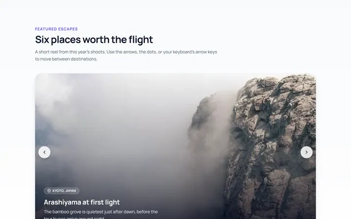
Basic Carousel
Originalbasic image carousel with arrows and dots
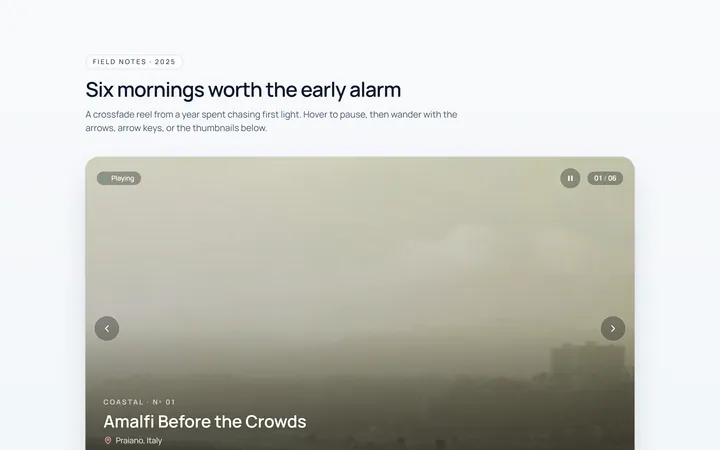
Fade Carousel
Originalcrossfade carousel
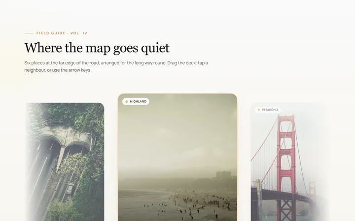
Cards Carousel
Originalpeeking card carousel
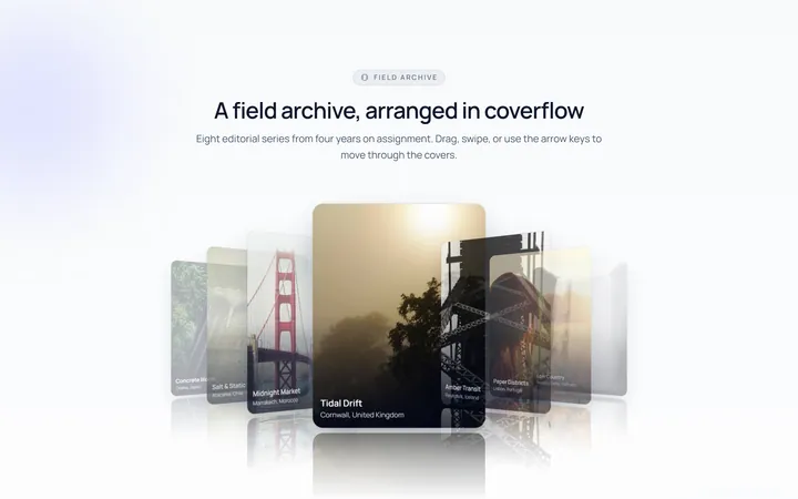
Coverflow Carousel
Original3D coverflow carousel
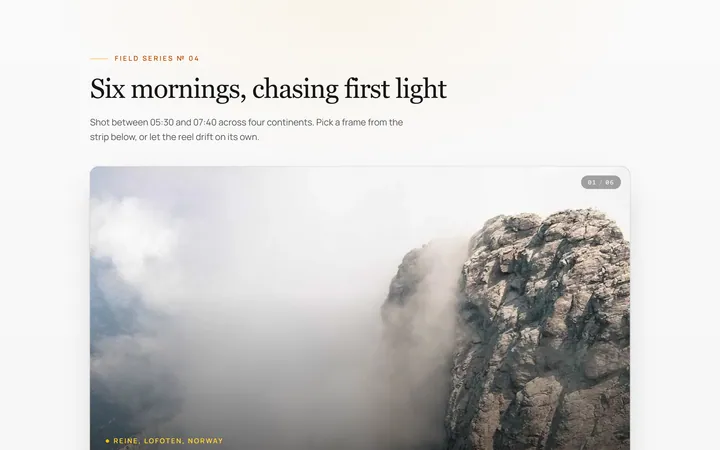
Thumbnails Carousel
Originalcarousel synced with thumbnails
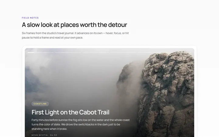
Autoplay Carousel
Originalautoplay carousel with progress and pause
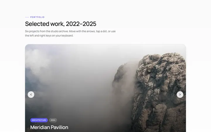
Dots Carousel
Originalcarousel with animated dot indicators
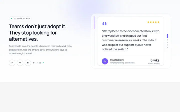
Vertical Carousel
Originalvertical carousel
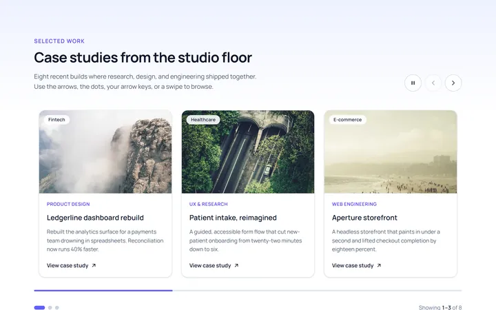
Multi Carousel
Originalmulti-item responsive carousel
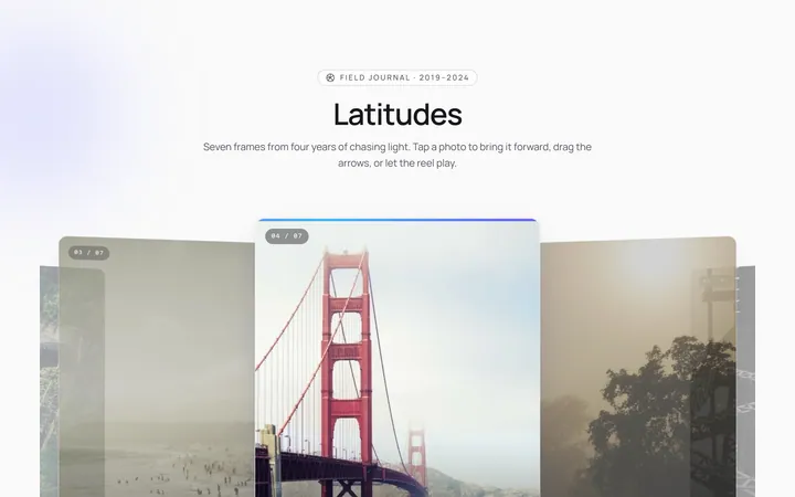
Center Focus Carousel
Originalcentre-focused scaling carousel
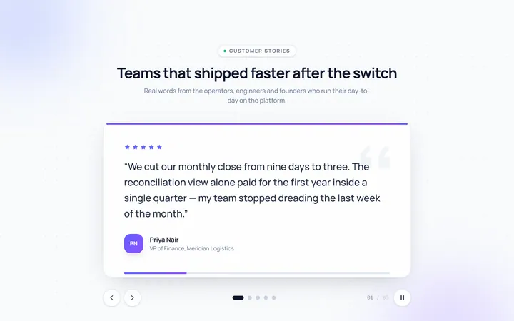
Testimonial Carousel
Originaltestimonial quote carousel
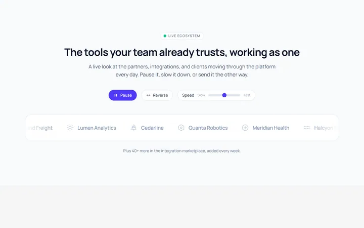
Logos Carousel
Originallogo carousel strip