

Dots Carousel
Original · freecarousel with animated dot indicators
byWeb InnoventixReact + Tailwind
cardotscarousels
Copy prompt gives Claude Code, Cursor or v0 a ready-to-paste prompt that recreates this exact component.
npx shadcn@latest add https://webinnoventix.com/r/car-dots.jsoncar-dots.tsx
"use client";
import {
useCallback,
useId,
useState,
type KeyboardEvent,
} from "react";
import {
AnimatePresence,
motion,
useReducedMotion,
type Variants,
} from "motion/react";
type Slide = {
img: string;
title: string;
tag: string;
year: string;
blurb: string;
};
const SLIDES: Slide[] = [
{
img: "/img/gallery/g01.webp",
title: "Meridian Pavilion",
tag: "Architecture",
year: "2024",
blurb:
"A folded-steel canopy that tracks the sun across a public courtyard in Lisbon.",
},
{
img: "/img/gallery/g02.webp",
title: "Coastal Reserve Center",
tag: "Landscape",
year: "2023",
blurb:
"Boardwalks thread through restored wetlands without ever touching the water table.",
},
{
img: "/img/gallery/g03.webp",
title: "Atrium Nine",
tag: "Interior",
year: "2024",
blurb:
"Nine storeys of borrowed daylight funnelled down a single mirror-clad core.",
},
{
img: "/img/gallery/g04.webp",
title: "The Long Table",
tag: "Product",
year: "2023",
blurb:
"One continuous oak surface seating forty, milled from a single fallen tree.",
},
{
img: "/img/gallery/g05.webp",
title: "Nightline Transit Hub",
tag: "Urban",
year: "2025",
blurb:
"A station that stays warm, quiet and legible long after the last train leaves.",
},
{
img: "/img/gallery/g06.webp",
title: "Salt Flat Observatory",
tag: "Installation",
year: "2022",
blurb:
"A mirrored ring that dissolves into the horizon at the exact hour of golden light.",
},
];
const DURATION = "5500ms";
function pad(n: number): string {
return String(n).padStart(2, "0");
}
export default function CarDots() {
const reduce = !!useReducedMotion();
const headingId = useId();
const [[index, direction], setSlide] = useState<[number, number]>([0, 0]);
const [playing, setPlaying] = useState(true);
const [hovering, setHovering] = useState(false);
const [focusWithin, setFocusWithin] = useState(false);
const count = SLIDES.length;
const current = SLIDES[index];
const effectivePlaying = playing && !reduce && !hovering && !focusWithin;
const go = useCallback((dir: number) => {
setSlide(([i]) => [(i + dir + SLIDES.length) % SLIDES.length, dir]);
}, []);
const jumpTo = useCallback((next: number) => {
setSlide(([i]) => [next, next >= i ? 1 : -1]);
}, []);
const onKeyDown = (e: KeyboardEvent<HTMLDivElement>) => {
if (e.key === "ArrowLeft") {
e.preventDefault();
go(-1);
} else if (e.key === "ArrowRight") {
e.preventDefault();
go(1);
} else if (e.key === "Home") {
e.preventDefault();
jumpTo(0);
} else if (e.key === "End") {
e.preventDefault();
jumpTo(count - 1);
}
};
const variants: Variants = {
enter: (dir: number) => ({
opacity: 0,
x: reduce ? 0 : dir >= 0 ? 72 : -72,
}),
center: { opacity: 1, x: 0 },
exit: (dir: number) => ({
opacity: 0,
x: reduce ? 0 : dir >= 0 ? -72 : 72,
}),
};
return (
<section
data-cardots
aria-labelledby={headingId}
className="relative w-full overflow-hidden bg-gradient-to-b from-zinc-50 to-white py-16 dark:from-zinc-950 dark:to-black sm:py-24"
>
<style>{`
@keyframes carDots-fill { from { transform: scaleX(0); } to { transform: scaleX(1); } }
@keyframes carDots-zoom { from { transform: scale(1); } to { transform: scale(1.06); } }
@media (prefers-reduced-motion: reduce) {
[data-cardots] .cardots-anim { animation: none !important; }
}
`}</style>
<div className="mx-auto max-w-5xl px-4 sm:px-6">
<header className="mb-8 flex flex-col gap-3 sm:mb-10">
<span className="inline-flex w-fit items-center gap-2 text-xs font-semibold uppercase tracking-[0.2em] text-indigo-600 dark:text-indigo-400">
<span className="h-px w-6 bg-indigo-500/60" aria-hidden="true" />
Portfolio
</span>
<h2
id={headingId}
className="text-balance text-3xl font-semibold tracking-tight text-zinc-900 dark:text-white sm:text-4xl"
>
Selected work, 2022–2025
</h2>
<p className="max-w-xl text-pretty text-sm leading-relaxed text-zinc-600 dark:text-zinc-400 sm:text-base">
Six projects from the studio archive. Move with the arrows, tap a
dot, or use the left and right keys on your keyboard.
</p>
</header>
{/* eslint-disable-next-line jsx-a11y/no-noninteractive-tabindex */}
<div
role="region"
aria-roledescription="carousel"
aria-label="Selected work gallery"
tabIndex={0}
onKeyDown={onKeyDown}
onMouseEnter={() => setHovering(true)}
onMouseLeave={() => setHovering(false)}
onFocusCapture={() => setFocusWithin(true)}
onBlurCapture={(e) => {
if (!e.currentTarget.contains(e.relatedTarget as Node | null)) {
setFocusWithin(false);
}
}}
className="group/carousel overflow-hidden rounded-3xl bg-white shadow-xl shadow-zinc-900/5 ring-1 ring-zinc-200 focus-visible:outline-none focus-visible:ring-2 focus-visible:ring-indigo-500 focus-visible:ring-offset-2 focus-visible:ring-offset-zinc-50 dark:bg-zinc-900 dark:shadow-black/40 dark:ring-zinc-800 dark:focus-visible:ring-offset-zinc-950"
>
<div className="relative aspect-[16/10] w-full overflow-hidden bg-zinc-200 dark:bg-zinc-800">
<AnimatePresence initial={false} custom={direction}>
<motion.div
key={index}
custom={direction}
variants={variants}
initial="enter"
animate="center"
exit="exit"
transition={{
x: { type: "spring", stiffness: 300, damping: 34 },
opacity: { duration: 0.35 },
}}
className="absolute inset-0"
role="group"
aria-roledescription="slide"
aria-label={`${index + 1} of ${count}`}
>
<div className="absolute inset-0 overflow-hidden">
{/* eslint-disable-next-line @next/next/no-img-element */}
<img
src={current.img}
alt={`${current.title} — ${current.tag}, ${current.year}`}
loading="lazy"
draggable={false}
className={`h-full w-full object-cover ${
reduce
? ""
: "cardots-anim [animation:carDots-zoom_9s_ease-out_forwards]"
}`}
/>
</div>
<div
className="absolute inset-0 bg-gradient-to-t from-black/85 via-black/35 to-transparent"
aria-hidden="true"
/>
<div className="absolute inset-x-0 bottom-0 flex flex-col gap-3 p-6 sm:p-8">
<div className="flex items-center gap-2 text-[0.7rem] font-medium">
<span className="rounded-full bg-indigo-500/90 px-2.5 py-1 uppercase tracking-wide text-white">
{current.tag}
</span>
<span className="rounded-full bg-white/15 px-2.5 py-1 tabular-nums text-white/90 ring-1 ring-inset ring-white/25 backdrop-blur">
{current.year}
</span>
</div>
<h3 className="text-2xl font-semibold tracking-tight text-white sm:text-3xl">
{current.title}
</h3>
<p className="max-w-md text-pretty text-sm leading-relaxed text-white/85">
{current.blurb}
</p>
</div>
</motion.div>
</AnimatePresence>
<button
type="button"
onClick={() => go(-1)}
aria-label="Previous slide"
className="absolute left-3 top-1/2 grid h-10 w-10 -translate-y-1/2 place-items-center rounded-full bg-white/85 text-zinc-900 ring-1 ring-black/10 backdrop-blur transition hover:bg-white focus-visible:outline-none focus-visible:ring-2 focus-visible:ring-indigo-500 focus-visible:ring-offset-2 focus-visible:ring-offset-black/20 dark:bg-zinc-900/75 dark:text-zinc-100 dark:ring-white/10 dark:hover:bg-zinc-900 sm:left-4"
>
<svg
viewBox="0 0 24 24"
className="h-5 w-5"
fill="none"
stroke="currentColor"
strokeWidth={2}
strokeLinecap="round"
strokeLinejoin="round"
aria-hidden="true"
>
<path d="M15 6l-6 6 6 6" />
</svg>
</button>
<button
type="button"
onClick={() => go(1)}
aria-label="Next slide"
className="absolute right-3 top-1/2 grid h-10 w-10 -translate-y-1/2 place-items-center rounded-full bg-white/85 text-zinc-900 ring-1 ring-black/10 backdrop-blur transition hover:bg-white focus-visible:outline-none focus-visible:ring-2 focus-visible:ring-indigo-500 focus-visible:ring-offset-2 focus-visible:ring-offset-black/20 dark:bg-zinc-900/75 dark:text-zinc-100 dark:ring-white/10 dark:hover:bg-zinc-900 sm:right-4"
>
<svg
viewBox="0 0 24 24"
className="h-5 w-5"
fill="none"
stroke="currentColor"
strokeWidth={2}
strokeLinecap="round"
strokeLinejoin="round"
aria-hidden="true"
>
<path d="M9 6l6 6-6 6" />
</svg>
</button>
</div>
<div className="flex items-center justify-between gap-4 border-t border-zinc-200 bg-white/70 px-4 py-3 dark:border-zinc-800 dark:bg-zinc-900/70 sm:px-6">
<p className="text-sm font-medium tabular-nums text-zinc-500 dark:text-zinc-400">
<span className="text-zinc-900 dark:text-white">
{pad(index + 1)}
</span>{" "}
/ {pad(count)}
</p>
<div
role="group"
aria-label="Choose slide"
className="flex items-center gap-2"
>
{SLIDES.map((s, i) => {
const active = i === index;
return (
<button
key={s.title}
type="button"
onClick={() => jumpTo(i)}
aria-label={`Go to slide ${i + 1}: ${s.title}`}
aria-current={active ? "true" : undefined}
className="group/dot grid h-6 place-items-center rounded-full px-0.5 focus-visible:outline-none focus-visible:ring-2 focus-visible:ring-indigo-500 focus-visible:ring-offset-2 focus-visible:ring-offset-white dark:focus-visible:ring-offset-zinc-900"
>
<span
className={`relative block h-2.5 overflow-hidden rounded-full transition-all duration-300 ease-out ${
active
? "w-9 bg-indigo-200 dark:bg-indigo-500/25"
: "w-2.5 bg-zinc-300 group-hover/dot:bg-zinc-400 dark:bg-zinc-700 dark:group-hover/dot:bg-zinc-500"
}`}
>
{active && (
<span
key={index}
onAnimationEnd={() => go(1)}
style={{
animationPlayState: effectivePlaying
? "running"
: "paused",
}}
className="cardots-anim absolute inset-0 origin-left rounded-full bg-indigo-500 [animation:carDots-fill_5500ms_linear_forwards] dark:bg-indigo-400"
/>
)}
</span>
</button>
);
})}
</div>
<button
type="button"
onClick={() => setPlaying((p) => !p)}
aria-label={playing ? "Pause autoplay" : "Start autoplay"}
aria-pressed={playing}
className="grid h-9 w-9 place-items-center rounded-full text-zinc-600 ring-1 ring-zinc-200 transition hover:bg-zinc-100 hover:text-zinc-900 focus-visible:outline-none focus-visible:ring-2 focus-visible:ring-indigo-500 focus-visible:ring-offset-2 focus-visible:ring-offset-white dark:text-zinc-300 dark:ring-zinc-700 dark:hover:bg-zinc-800 dark:hover:text-white dark:focus-visible:ring-offset-zinc-900"
>
{playing ? (
<svg
viewBox="0 0 24 24"
className="h-4 w-4"
fill="currentColor"
aria-hidden="true"
>
<rect x="6" y="5" width="4" height="14" rx="1" />
<rect x="14" y="5" width="4" height="14" rx="1" />
</svg>
) : (
<svg
viewBox="0 0 24 24"
className="h-4 w-4"
fill="currentColor"
aria-hidden="true"
>
<path d="M8 5.14v13.72a1 1 0 0 0 1.52.85l11-6.86a1 1 0 0 0 0-1.7l-11-6.86A1 1 0 0 0 8 5.14Z" />
</svg>
)}
</button>
</div>
</div>
<div aria-live="polite" aria-atomic="true" className="sr-only">
{`Slide ${index + 1} of ${count}: ${current.title}, ${current.tag}, ${current.year}.`}
</div>
</div>
</section>
);
}Dependencies
motion
Licence
Built by Web Innoventix. Free for personal and commercial use, no attribution required.
Built by Web Innoventix
Need a custom interface, a full website, or SEO that gets you cited by AI? We design, build and rank it end to end.
Get a free quoteSimilar components
Browse all →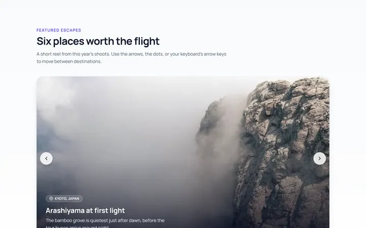
Basic Carousel
Originalbasic image carousel with arrows and dots
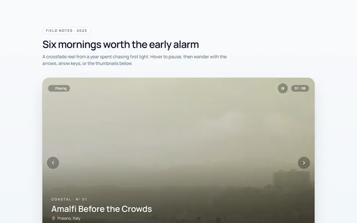
Fade Carousel
Originalcrossfade carousel
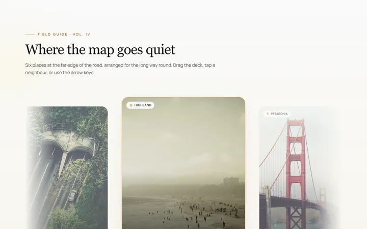
Cards Carousel
Originalpeeking card carousel
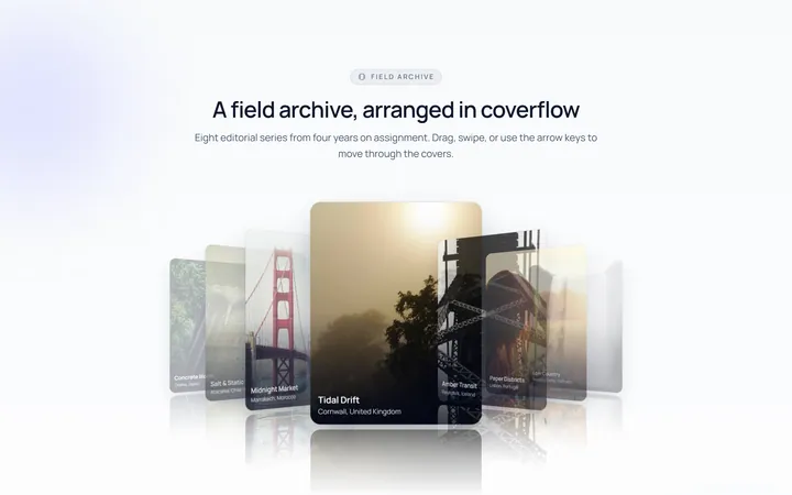
Coverflow Carousel
Original3D coverflow carousel
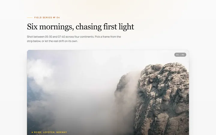
Thumbnails Carousel
Originalcarousel synced with thumbnails
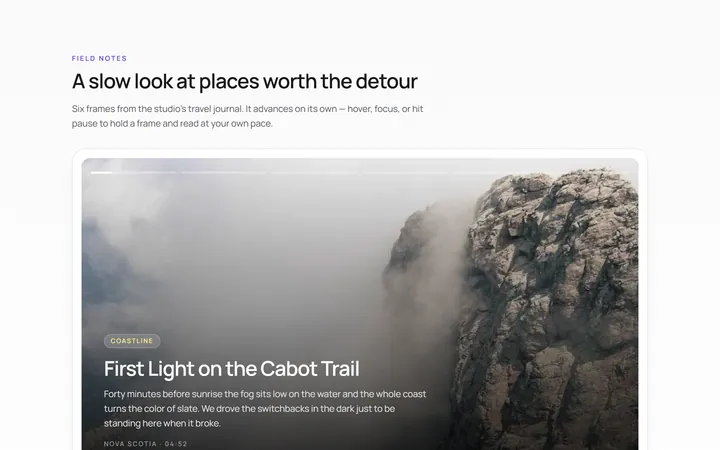
Autoplay Carousel
Originalautoplay carousel with progress and pause
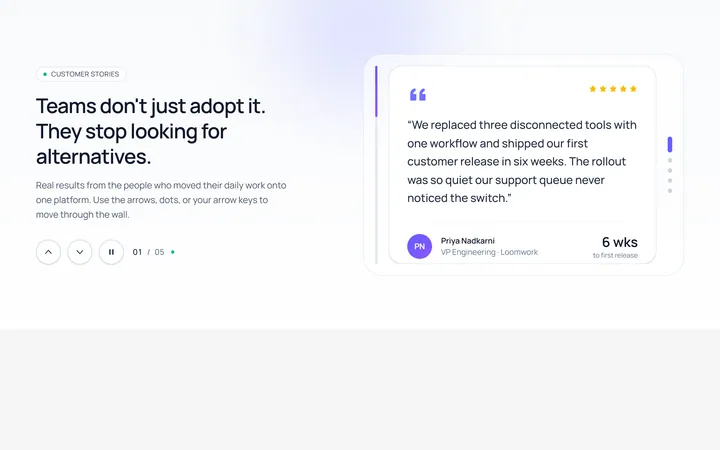
Vertical Carousel
Originalvertical carousel
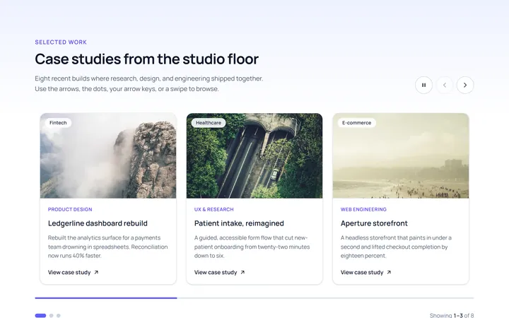
Multi Carousel
Originalmulti-item responsive carousel
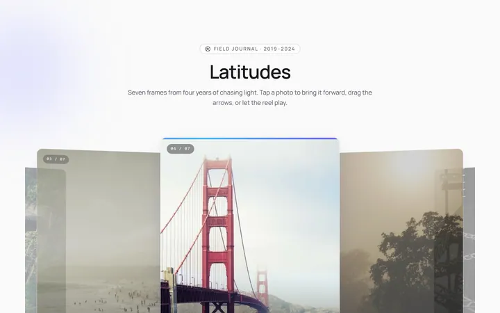
Center Focus Carousel
Originalcentre-focused scaling carousel
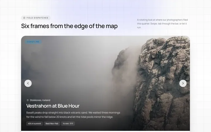
Progress Carousel
Originalcarousel with a progress bar
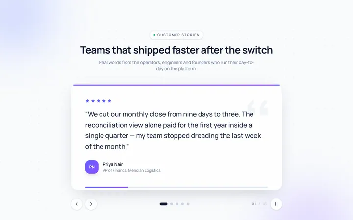
Testimonial Carousel
Originaltestimonial quote carousel

Logos Carousel
Originallogo carousel strip