

Colour Gradient Picker
Original · freegradient builder picker
Copy prompt gives Claude Code, Cursor or v0 a ready-to-paste prompt that recreates this exact component.
npx shadcn@latest add https://webinnoventix.com/r/color-gradient-picker.json"use client";
import {
useCallback,
useEffect,
useId,
useMemo,
useRef,
useState,
type KeyboardEvent as ReactKeyboardEvent,
type PointerEvent as ReactPointerEvent,
} from "react";
import { motion, useReducedMotion } from "motion/react";
type GradientKind = "linear" | "radial" | "conic";
type ColorStop = {
/** 0..1 position along the track */
offset: number;
/** hue 0..360 */
h: number;
/** saturation 0..100 */
s: number;
/** lightness 0..100 */
l: number;
/** alpha 0..1 */
a: number;
};
type Stop = ColorStop & { id: string };
type Preset = {
name: string;
kind: GradientKind;
angle: number;
stops: ColorStop[];
};
const clamp = (value: number, min: number, max: number): number =>
Math.min(max, Math.max(min, value));
const round = (value: number, places = 0): number => {
const factor = 10 ** places;
return Math.round(value * factor) / factor;
};
let stopSeq = 0;
const nextStopId = (): string => {
stopSeq += 1;
return `gs-${stopSeq}`;
};
const withIds = (stops: ColorStop[]): Stop[] =>
stops.map((stop) => ({ ...stop, id: nextStopId() }));
function hslToRgb(h: number, s: number, l: number): [number, number, number] {
const sat = s / 100;
const lig = l / 100;
const k = (n: number): number => (n + h / 30) % 12;
const a = sat * Math.min(lig, 1 - lig);
const f = (n: number): number =>
lig - a * Math.max(-1, Math.min(k(n) - 3, Math.min(9 - k(n), 1)));
return [
Math.round(f(0) * 255),
Math.round(f(8) * 255),
Math.round(f(4) * 255),
];
}
function toHex(stop: ColorStop): string {
const [r, g, b] = hslToRgb(stop.h, stop.s, stop.l);
const pair = (n: number): string => n.toString(16).padStart(2, "0");
const base = `#${pair(r)}${pair(g)}${pair(b)}`;
if (stop.a >= 1) return base.toUpperCase();
return `${base}${pair(Math.round(stop.a * 255))}`.toUpperCase();
}
function stopColor(stop: ColorStop): string {
return `hsl(${round(stop.h)} ${round(stop.s)}% ${round(stop.l)}% / ${round(stop.a, 2)})`;
}
/** A flat colour expressed as an image layer, so it can sit above the checkerboard. */
function flatLayer(stop: ColorStop): string {
const color = stopColor(stop);
return `linear-gradient(${color}, ${color})`;
}
function buildCss(
kind: GradientKind,
angle: number,
stops: ColorStop[],
): string {
const ordered = [...stops].sort((a, b) => a.offset - b.offset);
const body = ordered
.map((stop) => `${stopColor(stop)} ${round(stop.offset * 100, 1)}%`)
.join(", ");
if (kind === "linear") return `linear-gradient(${round(angle)}deg, ${body})`;
if (kind === "conic")
return `conic-gradient(from ${round(angle)}deg at 50% 50%, ${body})`;
return `radial-gradient(circle at 50% 50%, ${body})`;
}
const PRESETS: Preset[] = [
{
name: "Solar Flare",
kind: "linear",
angle: 118,
stops: [
{ offset: 0, h: 44, s: 96, l: 62, a: 1 },
{ offset: 0.52, h: 12, s: 88, l: 58, a: 1 },
{ offset: 1, h: 336, s: 72, l: 44, a: 1 },
],
},
{
name: "Deep Signal",
kind: "linear",
angle: 205,
stops: [
{ offset: 0, h: 199, s: 92, l: 60, a: 1 },
{ offset: 0.48, h: 244, s: 76, l: 55, a: 1 },
{ offset: 1, h: 268, s: 68, l: 32, a: 1 },
],
},
{
name: "Moss Halo",
kind: "radial",
angle: 0,
stops: [
{ offset: 0, h: 152, s: 78, l: 68, a: 1 },
{ offset: 0.62, h: 168, s: 58, l: 40, a: 1 },
{ offset: 1, h: 200, s: 44, l: 18, a: 1 },
],
},
{
name: "Dial Tone",
kind: "conic",
angle: 90,
stops: [
{ offset: 0, h: 262, s: 84, l: 62, a: 1 },
{ offset: 0.34, h: 330, s: 82, l: 60, a: 1 },
{ offset: 0.68, h: 26, s: 90, l: 60, a: 1 },
{ offset: 1, h: 262, s: 84, l: 62, a: 1 },
],
},
{
name: "Cold Steel",
kind: "linear",
angle: 160,
stops: [
{ offset: 0, h: 214, s: 24, l: 88, a: 1 },
{ offset: 0.55, h: 218, s: 18, l: 52, a: 1 },
{ offset: 1, h: 222, s: 26, l: 22, a: 1 },
],
},
{
name: "Fade To Clear",
kind: "linear",
angle: 90,
stops: [
{ offset: 0, h: 254, s: 88, l: 60, a: 1 },
{ offset: 1, h: 190, s: 92, l: 56, a: 0 },
],
},
];
const CHECKERBOARD =
"repeating-conic-gradient(rgba(120,120,130,0.28) 0% 25%, transparent 0% 50%) 50% / 12px 12px";
const KIND_LABEL: Record<GradientKind, string> = {
linear: "Linear",
radial: "Radial",
conic: "Conic",
};
const ANGLE_LABEL: Record<GradientKind, string | null> = {
linear: "Angle",
radial: null,
conic: "Start angle",
};
type SliderProps = {
label: string;
value: number;
min: number;
max: number;
step: number;
suffix?: string;
trackStyle?: string;
onChange: (value: number) => void;
};
function ChannelSlider({
label,
value,
min,
max,
step,
suffix = "",
trackStyle,
onChange,
}: SliderProps) {
const id = useId();
return (
<div className="grid gap-1.5">
<div className="flex items-baseline justify-between">
<label
htmlFor={id}
className="text-[11px] font-medium uppercase tracking-[0.14em] text-slate-500 dark:text-slate-400"
>
{label}
</label>
<span className="font-mono text-xs tabular-nums text-slate-700 dark:text-slate-200">
{round(value, step < 1 ? 2 : 0)}
{suffix}
</span>
</div>
<div className="relative">
{trackStyle ? (
<div
aria-hidden="true"
className="pointer-events-none absolute inset-x-0 top-1/2 h-2.5 -translate-y-1/2 rounded-full ring-1 ring-inset ring-slate-900/10 dark:ring-white/15"
style={{ background: trackStyle }}
/>
) : null}
<input
id={id}
type="range"
min={min}
max={max}
step={step}
value={value}
onChange={(event) => onChange(Number(event.target.value))}
className="cgp-range relative w-full cursor-pointer appearance-none bg-transparent focus-visible:outline-none"
/>
</div>
</div>
);
}
export default function ColorGradientPicker() {
const reduceMotion = useReducedMotion();
const trackRef = useRef<HTMLDivElement | null>(null);
const dragRef = useRef<string | null>(null);
const copyTimer = useRef<number | null>(null);
const [initialStops] = useState<Stop[]>(() => withIds(PRESETS[0].stops));
const [kind, setKind] = useState<GradientKind>("linear");
const [angle, setAngle] = useState<number>(118);
const [stops, setStops] = useState<Stop[]>(initialStops);
const [activeId, setActiveId] = useState<string>(initialStops[0].id);
const [copied, setCopied] = useState<string | null>(null);
const sorted = useMemo(
() => [...stops].sort((a, b) => a.offset - b.offset),
[stops],
);
const active = useMemo(
() => stops.find((stop) => stop.id === activeId) ?? stops[0],
[stops, activeId],
);
const css = useMemo(() => buildCss(kind, angle, stops), [kind, angle, stops]);
const ribbon = useMemo(() => buildCss("linear", 90, stops), [stops]);
useEffect(
() => () => {
if (copyTimer.current !== null) window.clearTimeout(copyTimer.current);
},
[],
);
const patchActive = useCallback(
(patch: Partial<Stop>) => {
setStops((prev) =>
prev.map((stop) => (stop.id === activeId ? { ...stop, ...patch } : stop)),
);
},
[activeId],
);
const offsetFromClientX = useCallback((clientX: number): number => {
const track = trackRef.current;
if (!track) return 0;
const rect = track.getBoundingClientRect();
if (rect.width === 0) return 0;
return clamp((clientX - rect.left) / rect.width, 0, 1);
}, []);
useEffect(() => {
const handleMove = (event: PointerEvent): void => {
const id = dragRef.current;
if (id === null) return;
event.preventDefault();
const offset = offsetFromClientX(event.clientX);
setStops((prev) =>
prev.map((stop) => (stop.id === id ? { ...stop, offset } : stop)),
);
};
const handleUp = (): void => {
dragRef.current = null;
};
window.addEventListener("pointermove", handleMove);
window.addEventListener("pointerup", handleUp);
window.addEventListener("pointercancel", handleUp);
return () => {
window.removeEventListener("pointermove", handleMove);
window.removeEventListener("pointerup", handleUp);
window.removeEventListener("pointercancel", handleUp);
};
}, [offsetFromClientX]);
const addStopAt = useCallback(
(offset: number) => {
if (stops.length >= 6) return;
const ordered = [...stops].sort((a, b) => a.offset - b.offset);
let before = ordered[0];
let after = ordered[ordered.length - 1];
for (let i = 0; i < ordered.length - 1; i += 1) {
if (offset >= ordered[i].offset && offset <= ordered[i + 1].offset) {
before = ordered[i];
after = ordered[i + 1];
break;
}
}
const span = after.offset - before.offset;
const t = span === 0 ? 0.5 : clamp((offset - before.offset) / span, 0, 1);
const mix = (from: number, to: number): number => from + (to - from) * t;
const created: Stop = {
id: nextStopId(),
offset,
h: mix(before.h, after.h),
s: mix(before.s, after.s),
l: mix(before.l, after.l),
a: mix(before.a, after.a),
};
setStops((prev) => [...prev, created]);
setActiveId(created.id);
},
[stops],
);
const removeStop = useCallback(
(id: string) => {
if (stops.length <= 2) return;
const next = stops.filter((stop) => stop.id !== id);
setStops(next);
if (id === activeId) setActiveId(next[0].id);
},
[stops, activeId],
);
const handleTrackPointerDown = (
event: ReactPointerEvent<HTMLDivElement>,
): void => {
if (event.target !== event.currentTarget) return;
addStopAt(offsetFromClientX(event.clientX));
};
const handleThumbKeyDown = (
event: ReactKeyboardEvent<HTMLButtonElement>,
stop: Stop,
): void => {
const step = event.shiftKey ? 0.1 : 0.01;
let offset: number | null = null;
if (event.key === "ArrowLeft" || event.key === "ArrowDown") {
offset = clamp(stop.offset - step, 0, 1);
} else if (event.key === "ArrowRight" || event.key === "ArrowUp") {
offset = clamp(stop.offset + step, 0, 1);
} else if (event.key === "Home") {
offset = 0;
} else if (event.key === "End") {
offset = 1;
} else if (event.key === "Delete" || event.key === "Backspace") {
event.preventDefault();
removeStop(stop.id);
return;
}
if (offset === null) return;
event.preventDefault();
setActiveId(stop.id);
const target = offset;
setStops((prev) =>
prev.map((item) =>
item.id === stop.id ? { ...item, offset: target } : item,
),
);
};
const applyPreset = (preset: Preset): void => {
const next = withIds(preset.stops);
setKind(preset.kind);
setAngle(preset.angle);
setStops(next);
setActiveId(next[0].id);
};
const distributeEvenly = (): void => {
const ordered = [...stops].sort((a, b) => a.offset - b.offset);
const gap = ordered.length > 1 ? 1 / (ordered.length - 1) : 0;
const spaced = new Map(
ordered.map((stop, index) => [stop.id, index * gap] as const),
);
setStops((prev) =>
prev.map((stop) => ({ ...stop, offset: spaced.get(stop.id) ?? stop.offset })),
);
};
const reverseStops = (): void => {
setStops((prev) => prev.map((stop) => ({ ...stop, offset: 1 - stop.offset })));
};
const copy = async (text: string, tag: string): Promise<void> => {
try {
await navigator.clipboard.writeText(text);
setCopied(tag);
} catch {
setCopied("error");
}
if (copyTimer.current !== null) window.clearTimeout(copyTimer.current);
copyTimer.current = window.setTimeout(() => setCopied(null), 1600);
};
const hueTrack =
"linear-gradient(90deg, hsl(0 90% 55%), hsl(60 90% 55%), hsl(120 90% 45%), hsl(180 90% 45%), hsl(240 90% 55%), hsl(300 90% 55%), hsl(360 90% 55%))";
const satTrack = active
? `linear-gradient(90deg, hsl(${round(active.h)} 0% ${round(active.l)}%), hsl(${round(active.h)} 100% ${round(active.l)}%))`
: undefined;
const lightTrack = active
? `linear-gradient(90deg, #000, hsl(${round(active.h)} ${round(active.s)}% 50%), #fff)`
: undefined;
const alphaTrack = active
? `linear-gradient(90deg, hsl(${round(active.h)} ${round(active.s)}% ${round(active.l)}% / 0), hsl(${round(active.h)} ${round(active.s)}% ${round(active.l)}% / 1)), ${CHECKERBOARD}`
: undefined;
const tailwindSnippet = `bg-[${buildCss(kind, angle, stops).replace(/\s+/g, "_")}]`;
return (
<section className="relative w-full bg-slate-50 px-4 py-16 text-slate-900 sm:px-6 sm:py-20 dark:bg-slate-950 dark:text-slate-50">
<style>{`
@keyframes cgpPickerPulse {
0%, 100% { opacity: 0.55; transform: scale(1); }
50% { opacity: 0.9; transform: scale(1.08); }
}
.cgp-range {
height: 26px;
}
.cgp-range::-webkit-slider-runnable-track {
height: 10px;
border-radius: 999px;
background: transparent;
}
.cgp-range::-moz-range-track {
height: 10px;
border-radius: 999px;
background: transparent;
}
.cgp-range::-webkit-slider-thumb {
-webkit-appearance: none;
appearance: none;
margin-top: -4px;
height: 18px;
width: 18px;
border-radius: 999px;
background: #ffffff;
border: 1px solid rgba(15, 23, 42, 0.35);
box-shadow: 0 1px 3px rgba(15, 23, 42, 0.35);
cursor: grab;
}
.cgp-range::-moz-range-thumb {
height: 18px;
width: 18px;
border-radius: 999px;
background: #ffffff;
border: 1px solid rgba(15, 23, 42, 0.35);
box-shadow: 0 1px 3px rgba(15, 23, 42, 0.35);
cursor: grab;
}
.cgp-range:focus-visible::-webkit-slider-thumb {
outline: 2px solid #6366f1;
outline-offset: 2px;
}
.cgp-range:focus-visible::-moz-range-thumb {
outline: 2px solid #6366f1;
outline-offset: 2px;
}
.cgp-pulse {
animation: cgpPickerPulse 2.6s ease-in-out infinite;
}
@media (prefers-reduced-motion: reduce) {
.cgp-pulse {
animation: none;
}
}
`}</style>
<div className="mx-auto w-full max-w-5xl">
<header className="mb-8 flex flex-wrap items-end justify-between gap-4">
<div>
<p className="mb-2 inline-flex items-center gap-2 rounded-full border border-slate-200 bg-white px-3 py-1 text-[11px] font-medium uppercase tracking-[0.16em] text-slate-500 dark:border-slate-800 dark:bg-slate-900 dark:text-slate-400">
<span
className="cgp-pulse h-1.5 w-1.5 rounded-full bg-indigo-500"
aria-hidden="true"
/>
Gradient studio
</p>
<h2 className="text-2xl font-semibold tracking-tight sm:text-3xl">
Gradient builder
</h2>
<p className="mt-2 max-w-lg text-sm text-slate-600 dark:text-slate-400">
Click the ribbon to drop a stop, drag to reposition, and tune hue,
saturation, lightness and alpha per stop. Copy the CSS when it
looks right.
</p>
</div>
<div
role="group"
aria-label="Gradient type"
className="inline-flex rounded-xl border border-slate-200 bg-white p-1 dark:border-slate-800 dark:bg-slate-900"
>
{(Object.keys(KIND_LABEL) as GradientKind[]).map((option) => (
<button
key={option}
type="button"
aria-pressed={kind === option}
onClick={() => setKind(option)}
className={`rounded-lg px-3.5 py-1.5 text-sm font-medium transition-colors focus-visible:outline-none focus-visible:ring-2 focus-visible:ring-indigo-500 focus-visible:ring-offset-2 focus-visible:ring-offset-white dark:focus-visible:ring-offset-slate-900 ${
kind === option
? "bg-slate-900 text-white dark:bg-slate-100 dark:text-slate-900"
: "text-slate-600 hover:bg-slate-100 dark:text-slate-400 dark:hover:bg-slate-800"
}`}
>
{KIND_LABEL[option]}
</button>
))}
</div>
</header>
<div className="grid gap-6 lg:grid-cols-[1.15fr_1fr]">
<div className="grid gap-5">
<motion.div
initial={reduceMotion ? false : { opacity: 0, y: 10 }}
animate={{ opacity: 1, y: 0 }}
transition={{ duration: reduceMotion ? 0 : 0.4, ease: "easeOut" }}
className="overflow-hidden rounded-2xl border border-slate-200 bg-white shadow-sm dark:border-slate-800 dark:bg-slate-900"
>
<div
className="h-56 w-full sm:h-72"
style={{ background: CHECKERBOARD }}
>
<div
className="h-full w-full"
style={{ background: css }}
role="img"
aria-label={`${KIND_LABEL[kind]} gradient preview with ${stops.length} colour stops`}
/>
</div>
<div className="border-t border-slate-200 p-4 dark:border-slate-800">
<div className="mb-2 flex items-center justify-between">
<span className="text-[11px] font-medium uppercase tracking-[0.14em] text-slate-500 dark:text-slate-400">
Stops ({stops.length}/6)
</span>
<span className="text-[11px] text-slate-400 dark:text-slate-500">
Click track to add · Delete to remove
</span>
</div>
<div className="pb-1 pt-1">
<div
ref={trackRef}
onPointerDown={handleTrackPointerDown}
className="relative h-9 w-full cursor-copy rounded-lg ring-1 ring-inset ring-slate-900/10 dark:ring-white/15"
style={{ background: `${ribbon}, ${CHECKERBOARD}` }}
>
{sorted.map((stop) => {
const isActive = stop.id === active?.id;
return (
<button
key={stop.id}
type="button"
role="slider"
aria-label={`Stop at ${round(stop.offset * 100)} percent, ${toHex(stop)}`}
aria-valuemin={0}
aria-valuemax={100}
aria-valuenow={round(stop.offset * 100)}
aria-valuetext={`${round(stop.offset * 100)} percent`}
onPointerDown={(event) => {
event.stopPropagation();
dragRef.current = stop.id;
setActiveId(stop.id);
}}
onKeyDown={(event) => handleThumbKeyDown(event, stop)}
onFocus={() => setActiveId(stop.id)}
className={`absolute top-1/2 h-7 w-7 -translate-x-1/2 -translate-y-1/2 cursor-grab touch-none rounded-full border-2 shadow-md transition-[box-shadow,border-color] focus-visible:outline-none focus-visible:ring-2 focus-visible:ring-indigo-500 focus-visible:ring-offset-2 focus-visible:ring-offset-white active:cursor-grabbing dark:focus-visible:ring-offset-slate-900 ${
isActive
? "z-20 border-white ring-2 ring-slate-900 dark:border-slate-900 dark:ring-white"
: "z-10 border-white/90 dark:border-slate-900/90"
}`}
style={{
left: `${stop.offset * 100}%`,
background: `${flatLayer(stop)}, ${CHECKERBOARD}`,
}}
/>
);
})}
</div>
</div>
<div className="mt-4 flex flex-wrap gap-2">
<button
type="button"
onClick={distributeEvenly}
className="inline-flex items-center gap-1.5 rounded-lg border border-slate-200 bg-white px-3 py-1.5 text-xs font-medium text-slate-700 transition-colors hover:bg-slate-50 focus-visible:outline-none focus-visible:ring-2 focus-visible:ring-indigo-500 focus-visible:ring-offset-2 focus-visible:ring-offset-white dark:border-slate-700 dark:bg-slate-800 dark:text-slate-200 dark:hover:bg-slate-700 dark:focus-visible:ring-offset-slate-900"
>
<svg
viewBox="0 0 16 16"
className="h-3.5 w-3.5"
fill="none"
stroke="currentColor"
strokeWidth="1.5"
strokeLinecap="round"
aria-hidden="true"
>
<path d="M2 3v10M8 3v10M14 3v10" />
</svg>
Distribute
</button>
<button
type="button"
onClick={reverseStops}
className="inline-flex items-center gap-1.5 rounded-lg border border-slate-200 bg-white px-3 py-1.5 text-xs font-medium text-slate-700 transition-colors hover:bg-slate-50 focus-visible:outline-none focus-visible:ring-2 focus-visible:ring-indigo-500 focus-visible:ring-offset-2 focus-visible:ring-offset-white dark:border-slate-700 dark:bg-slate-800 dark:text-slate-200 dark:hover:bg-slate-700 dark:focus-visible:ring-offset-slate-900"
>
<svg
viewBox="0 0 16 16"
className="h-3.5 w-3.5"
fill="none"
stroke="currentColor"
strokeWidth="1.5"
strokeLinecap="round"
strokeLinejoin="round"
aria-hidden="true"
>
<path d="M3 6h10L10 3M13 10H3l3 3" />
</svg>
Reverse
</button>
<button
type="button"
onClick={() => addStopAt(0.5)}
disabled={stops.length >= 6}
className="inline-flex items-center gap-1.5 rounded-lg border border-slate-200 bg-white px-3 py-1.5 text-xs font-medium text-slate-700 transition-colors hover:bg-slate-50 focus-visible:outline-none focus-visible:ring-2 focus-visible:ring-indigo-500 focus-visible:ring-offset-2 focus-visible:ring-offset-white disabled:cursor-not-allowed disabled:opacity-40 dark:border-slate-700 dark:bg-slate-800 dark:text-slate-200 dark:hover:bg-slate-700 dark:focus-visible:ring-offset-slate-900"
>
<svg
viewBox="0 0 16 16"
className="h-3.5 w-3.5"
fill="none"
stroke="currentColor"
strokeWidth="1.5"
strokeLinecap="round"
aria-hidden="true"
>
<path d="M8 3v10M3 8h10" />
</svg>
Add stop
</button>
<button
type="button"
onClick={() => active && removeStop(active.id)}
disabled={stops.length <= 2}
className="inline-flex items-center gap-1.5 rounded-lg border border-rose-200 bg-white px-3 py-1.5 text-xs font-medium text-rose-600 transition-colors hover:bg-rose-50 focus-visible:outline-none focus-visible:ring-2 focus-visible:ring-rose-500 focus-visible:ring-offset-2 focus-visible:ring-offset-white disabled:cursor-not-allowed disabled:opacity-40 dark:border-rose-900 dark:bg-slate-800 dark:text-rose-400 dark:hover:bg-rose-950 dark:focus-visible:ring-offset-slate-900"
>
<svg
viewBox="0 0 16 16"
className="h-3.5 w-3.5"
fill="none"
stroke="currentColor"
strokeWidth="1.5"
strokeLinecap="round"
strokeLinejoin="round"
aria-hidden="true"
>
<path d="M3 4.5h10M6.5 4.5V3h3v1.5M4.5 4.5l.5 8h6l.5-8" />
</svg>
Remove
</button>
</div>
</div>
</motion.div>
<div className="rounded-2xl border border-slate-200 bg-white p-4 dark:border-slate-800 dark:bg-slate-900">
<span className="mb-3 block text-[11px] font-medium uppercase tracking-[0.14em] text-slate-500 dark:text-slate-400">
Presets
</span>
<div className="grid grid-cols-2 gap-2 sm:grid-cols-3">
{PRESETS.map((preset) => (
<button
key={preset.name}
type="button"
onClick={() => applyPreset(preset)}
className="group flex items-center gap-2.5 rounded-xl border border-slate-200 bg-white p-2 text-left transition-colors hover:border-slate-300 hover:bg-slate-50 focus-visible:outline-none focus-visible:ring-2 focus-visible:ring-indigo-500 focus-visible:ring-offset-2 focus-visible:ring-offset-white dark:border-slate-800 dark:bg-slate-900 dark:hover:border-slate-700 dark:hover:bg-slate-800 dark:focus-visible:ring-offset-slate-900"
>
<span
aria-hidden="true"
className="h-8 w-8 shrink-0 rounded-lg ring-1 ring-inset ring-slate-900/10 dark:ring-white/15"
style={{
background: `${buildCss(preset.kind, preset.angle, preset.stops)}, ${CHECKERBOARD}`,
}}
/>
<span className="truncate text-xs font-medium text-slate-700 dark:text-slate-300">
{preset.name}
</span>
</button>
))}
</div>
</div>
</div>
<div className="grid gap-5">
<div className="rounded-2xl border border-slate-200 bg-white p-4 dark:border-slate-800 dark:bg-slate-900">
<div className="mb-4 flex items-center justify-between gap-3">
<span className="text-[11px] font-medium uppercase tracking-[0.14em] text-slate-500 dark:text-slate-400">
Selected stop
</span>
{active ? (
<span className="inline-flex items-center gap-2">
<span
aria-hidden="true"
className="h-5 w-5 rounded-md ring-1 ring-inset ring-slate-900/15 dark:ring-white/20"
style={{
background: `${flatLayer(active)}, ${CHECKERBOARD}`,
}}
/>
<span className="font-mono text-xs tabular-nums text-slate-700 dark:text-slate-200">
{toHex(active)}
</span>
</span>
) : null}
</div>
{active ? (
<div className="grid gap-4">
<ChannelSlider
label="Hue"
value={round(active.h)}
min={0}
max={360}
step={1}
suffix="°"
trackStyle={hueTrack}
onChange={(value) => patchActive({ h: value })}
/>
<ChannelSlider
label="Saturation"
value={round(active.s)}
min={0}
max={100}
step={1}
suffix="%"
trackStyle={satTrack}
onChange={(value) => patchActive({ s: value })}
/>
<ChannelSlider
label="Lightness"
value={round(active.l)}
min={0}
max={100}
step={1}
suffix="%"
trackStyle={lightTrack}
onChange={(value) => patchActive({ l: value })}
/>
<ChannelSlider
label="Alpha"
value={round(active.a, 2)}
min={0}
max={1}
step={0.01}
trackStyle={alphaTrack}
onChange={(value) => patchActive({ a: value })}
/>
<ChannelSlider
label="Position"
value={round(active.offset * 100)}
min={0}
max={100}
step={1}
suffix="%"
onChange={(value) => patchActive({ offset: value / 100 })}
/>
{ANGLE_LABEL[kind] ? (
<ChannelSlider
label={ANGLE_LABEL[kind] as string}
value={angle}
min={0}
max={360}
step={1}
suffix="°"
onChange={setAngle}
/>
) : (
<p className="rounded-lg bg-slate-50 px-3 py-2 text-xs text-slate-500 dark:bg-slate-800 dark:text-slate-400">
Radial gradients ignore angle — the ramp runs outward from
the centre.
</p>
)}
</div>
) : null}
</div>
<div className="rounded-2xl border border-slate-200 bg-white p-4 dark:border-slate-800 dark:bg-slate-900">
<div className="mb-3 flex items-center justify-between">
<span className="text-[11px] font-medium uppercase tracking-[0.14em] text-slate-500 dark:text-slate-400">
Output
</span>
<span
aria-live="polite"
className="text-[11px] font-medium text-emerald-600 dark:text-emerald-400"
>
{copied === "css"
? "CSS copied"
: copied === "tw"
? "Class copied"
: copied === "error"
? "Copy blocked"
: ""}
</span>
</div>
<div className="grid gap-3">
<div className="rounded-xl border border-slate-200 bg-slate-50 p-3 dark:border-slate-800 dark:bg-slate-950">
<code className="block max-h-28 overflow-auto whitespace-pre-wrap break-all font-mono text-[11px] leading-relaxed text-slate-700 dark:text-slate-300">
background: {css};
</code>
</div>
<div className="flex gap-2">
<button
type="button"
onClick={() => void copy(`background: ${css};`, "css")}
className="inline-flex flex-1 items-center justify-center gap-2 rounded-lg bg-slate-900 px-3 py-2 text-xs font-semibold text-white transition-colors hover:bg-slate-800 focus-visible:outline-none focus-visible:ring-2 focus-visible:ring-indigo-500 focus-visible:ring-offset-2 focus-visible:ring-offset-white dark:bg-slate-100 dark:text-slate-900 dark:hover:bg-white dark:focus-visible:ring-offset-slate-900"
>
<svg
viewBox="0 0 16 16"
className="h-3.5 w-3.5"
fill="none"
stroke="currentColor"
strokeWidth="1.5"
strokeLinecap="round"
strokeLinejoin="round"
aria-hidden="true"
>
<rect x="5.5" y="5.5" width="8" height="8" rx="1.5" />
<path d="M10.5 5.5v-2a1.5 1.5 0 0 0-1.5-1.5H4a1.5 1.5 0 0 0-1.5 1.5V9A1.5 1.5 0 0 0 4 10.5h1.5" />
</svg>
Copy CSS
</button>
<button
type="button"
onClick={() => void copy(tailwindSnippet, "tw")}
className="inline-flex flex-1 items-center justify-center gap-2 rounded-lg border border-slate-200 bg-white px-3 py-2 text-xs font-semibold text-slate-700 transition-colors hover:bg-slate-50 focus-visible:outline-none focus-visible:ring-2 focus-visible:ring-indigo-500 focus-visible:ring-offset-2 focus-visible:ring-offset-white dark:border-slate-700 dark:bg-slate-800 dark:text-slate-200 dark:hover:bg-slate-700 dark:focus-visible:ring-offset-slate-900"
>
Copy Tailwind class
</button>
</div>
</div>
<dl className="mt-4 grid grid-cols-3 gap-2 border-t border-slate-200 pt-3 dark:border-slate-800">
<div>
<dt className="text-[10px] uppercase tracking-[0.14em] text-slate-400 dark:text-slate-500">
Type
</dt>
<dd className="text-xs font-medium text-slate-700 dark:text-slate-300">
{KIND_LABEL[kind]}
</dd>
</div>
<div>
<dt className="text-[10px] uppercase tracking-[0.14em] text-slate-400 dark:text-slate-500">
Stops
</dt>
<dd className="text-xs font-medium tabular-nums text-slate-700 dark:text-slate-300">
{stops.length}
</dd>
</div>
<div>
<dt className="text-[10px] uppercase tracking-[0.14em] text-slate-400 dark:text-slate-500">
Angle
</dt>
<dd className="text-xs font-medium tabular-nums text-slate-700 dark:text-slate-300">
{kind === "radial" ? "n/a" : `${round(angle)}°`}
</dd>
</div>
</dl>
</div>
</div>
</div>
</div>
</section>
);
}Dependencies
Licence
Built by Web Innoventix. Free for personal and commercial use, no attribution required.
Built by Web Innoventix
Need a custom interface, a full website, or SEO that gets you cited by AI? We design, build and rank it end to end.
Get a free quoteSimilar components
Browse all →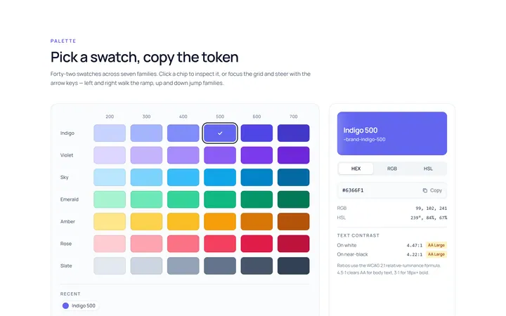
Colour Swatch Picker
Originalswatch colour picker
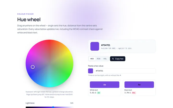
Colour Hue Wheel
Originalhue wheel colour picker
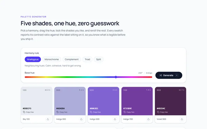
Colour Palette
Originalpalette generator with copy
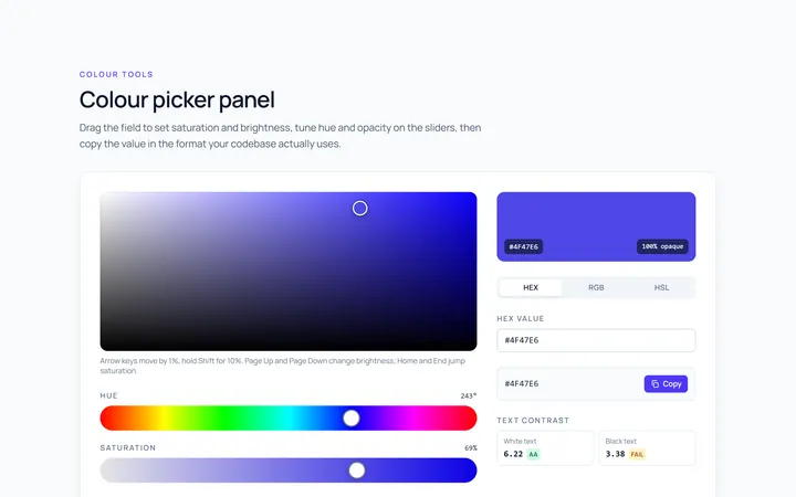
Colour Picker Panel
Originalfull colour picker panel with sliders
Colour Hex Input
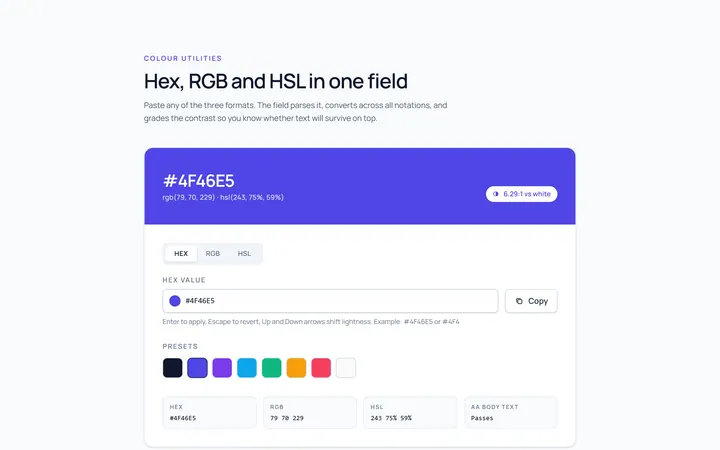
Originalhex/rgb input with preview
Colour Shades
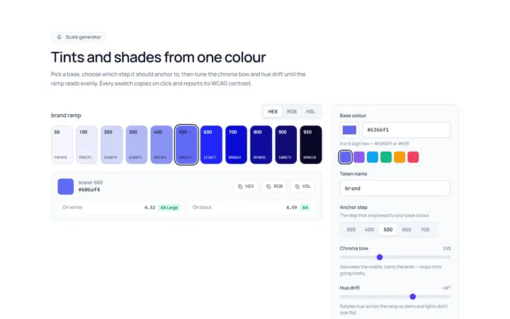
Originalshade and tint scale generator
Colour Scheme
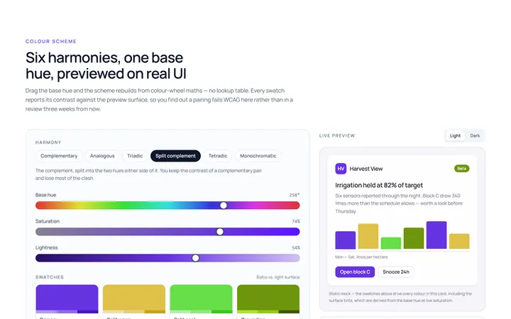
Originalcolour scheme preview swatches

Spotlight Hero
OriginalA centred hero with a soft radial spotlight, badge and dual call-to-action.

Split Hero
OriginalA two-column hero pairing a headline and CTAs with a product mock and social proof.

Gradient Spotlight Hero
OriginalA minimal centred hero with a soft gradient-mesh backdrop, announcement pill and dual call-to-action buttons.

App Preview Hero
OriginalA centred hero that pairs headline copy with a realistic product dashboard mock built entirely from markup, complete with browser chrome and a floating notification card.

Waitlist Capture Hero
OriginalA dark, focused hero with an inline email capture form and avatar social proof, ready for pre-launch waitlists.