

Colour Scheme
Original · freecolour scheme preview swatches
Copy prompt gives Claude Code, Cursor or v0 a ready-to-paste prompt that recreates this exact component.
npx shadcn@latest add https://webinnoventix.com/r/color-scheme.json"use client";
import { useCallback, useEffect, useId, useMemo, useRef, useState } from "react";
import { motion, useReducedMotion } from "motion/react";
type HarmonyId =
| "complementary"
| "analogous"
| "triadic"
| "split"
| "tetradic"
| "mono";
type Step = { role: string; dh: number; ds: number; dl: number };
type Harmony = { id: HarmonyId; label: string; blurb: string; steps: Step[] };
type Swatch = { role: string; slug: string; h: number; s: number; l: number; hex: string };
type Canvas = "light" | "dark";
type CopyState = { key: string; ok: boolean } | null;
const HARMONIES: Harmony[] = [
{
id: "complementary",
label: "Complementary",
blurb:
"Two hues from opposite ends of the wheel. Highest tension of the six — keep the accent under 10% of the surface or it fights the primary.",
steps: [
{ role: "Primary", dh: 0, ds: 0, dl: 0 },
{ role: "Primary soft", dh: 0, ds: -18, dl: 20 },
{ role: "Accent", dh: 180, ds: -4, dl: 2 },
{ role: "Accent deep", dh: 180, ds: 6, dl: -16 },
],
},
{
id: "analogous",
label: "Analogous",
blurb:
"Neighbours within a 90° arc. Reads calm and cohesive, which is why it suits long-form reading surfaces and empty states.",
steps: [
{ role: "Lead", dh: -30, ds: -6, dl: 6 },
{ role: "Primary", dh: 0, ds: 0, dl: 0 },
{ role: "Trail", dh: 30, ds: -4, dl: 4 },
{ role: "Anchor", dh: 60, ds: 8, dl: -18 },
],
},
{
id: "triadic",
label: "Triadic",
blurb:
"Three hues spaced 120° apart. Vivid and balanced — best when one hue leads and the other two stay in badges, charts and icons.",
steps: [
{ role: "Primary", dh: 0, ds: 0, dl: 0 },
{ role: "Second", dh: 120, ds: -6, dl: 4 },
{ role: "Third", dh: 240, ds: -6, dl: 4 },
],
},
{
id: "split",
label: "Split complement",
blurb:
"The complement, split into the two hues either side of it. You keep the contrast of a complementary pair and lose most of the clash.",
steps: [
{ role: "Primary", dh: 0, ds: 0, dl: 0 },
{ role: "Split warm", dh: 150, ds: -4, dl: 4 },
{ role: "Split cool", dh: 210, ds: -4, dl: 4 },
{ role: "Grounding", dh: 180, ds: 10, dl: -22 },
],
},
{
id: "tetradic",
label: "Tetradic",
blurb:
"Two complementary pairs on a rectangle. Four hues is a lot of budget — pick one dominant and let the rest carry data, not chrome.",
steps: [
{ role: "Primary", dh: 0, ds: 0, dl: 0 },
{ role: "Offset", dh: 90, ds: -8, dl: 6 },
{ role: "Complement", dh: 180, ds: -4, dl: 2 },
{ role: "Counter", dh: 270, ds: -8, dl: 6 },
],
},
{
id: "mono",
label: "Monochromatic",
blurb:
"One hue, five lightness stops. Nothing ever clashes, so hierarchy has to come from weight, spacing and contrast instead.",
steps: [
{ role: "Wash", dh: 0, ds: -26, dl: 30 },
{ role: "Light", dh: 0, ds: -12, dl: 16 },
{ role: "Primary", dh: 0, ds: 0, dl: 0 },
{ role: "Dark", dh: 0, ds: 4, dl: -16 },
{ role: "Deepest", dh: 0, ds: 8, dl: -28 },
],
},
];
const clamp = (v: number, lo: number, hi: number): number =>
Math.min(hi, Math.max(lo, v));
const wrapHue = (h: number): number => ((h % 360) + 360) % 360;
function hslToHex(h: number, s: number, l: number): string {
const hn = wrapHue(h);
const sn = clamp(s, 0, 100) / 100;
const ln = clamp(l, 0, 100) / 100;
const c = (1 - Math.abs(2 * ln - 1)) * sn;
const x = c * (1 - Math.abs(((hn / 60) % 2) - 1));
const m = ln - c / 2;
let r = 0;
let g = 0;
let b = 0;
if (hn < 60) {
r = c;
g = x;
} else if (hn < 120) {
r = x;
g = c;
} else if (hn < 180) {
g = c;
b = x;
} else if (hn < 240) {
g = x;
b = c;
} else if (hn < 300) {
r = x;
b = c;
} else {
r = c;
b = x;
}
const to = (v: number): string =>
Math.round((v + m) * 255)
.toString(16)
.padStart(2, "0");
return `#${to(r)}${to(g)}${to(b)}`;
}
function channel(v: number): number {
const c = v / 255;
return c <= 0.03928 ? c / 12.92 : Math.pow((c + 0.055) / 1.055, 2.4);
}
function luminance(hex: string): number {
const h = hex.replace("#", "");
const r = parseInt(h.slice(0, 2), 16);
const g = parseInt(h.slice(2, 4), 16);
const b = parseInt(h.slice(4, 6), 16);
return 0.2126 * channel(r) + 0.7152 * channel(g) + 0.0722 * channel(b);
}
function contrast(a: string, b: string): number {
const la = luminance(a);
const lb = luminance(b);
return (Math.max(la, lb) + 0.05) / (Math.min(la, lb) + 0.05);
}
function inkOn(hex: string): string {
return contrast(hex, "#ffffff") >= 3.4 ? "#ffffff" : "#0b1120";
}
function slugify(role: string): string {
return role.toLowerCase().replace(/[^a-z0-9]+/g, "-");
}
function CopyGlyph() {
return (
<svg
viewBox="0 0 20 20"
aria-hidden="true"
className="h-3.5 w-3.5"
fill="none"
stroke="currentColor"
strokeWidth={1.6}
strokeLinecap="round"
strokeLinejoin="round"
>
<rect x="7.5" y="7.5" width="8.5" height="8.5" rx="2" />
<path d="M12.5 4.5H6A1.5 1.5 0 0 0 4.5 6v6.5" />
</svg>
);
}
function TickGlyph({ tone }: { tone: string }) {
return (
<svg
viewBox="0 0 20 20"
aria-hidden="true"
className="h-3.5 w-3.5"
fill="none"
stroke={tone}
strokeWidth={2.4}
strokeLinecap="round"
strokeLinejoin="round"
>
<path d="M4.6 10.6 8.2 14.2 15.4 6.5" />
</svg>
);
}
function ShuffleGlyph() {
return (
<svg
viewBox="0 0 20 20"
aria-hidden="true"
className="h-4 w-4"
fill="none"
stroke="currentColor"
strokeWidth={1.6}
strokeLinecap="round"
strokeLinejoin="round"
>
<path d="M3 6h3.2l7.6 8H17" />
<path d="M3 14h3.2l2.4-2.6" />
<path d="M11.4 8.2 13.8 6H17" />
<path d="m14.6 3.6 2.4 2.4-2.4 2.4" />
<path d="m14.6 11.6 2.4 2.4-2.4 2.4" />
</svg>
);
}
export default function ColorScheme() {
const uid = useId();
const reduced = useReducedMotion();
const [harmonyId, setHarmonyId] = useState<HarmonyId>("split");
const [hue, setHue] = useState<number>(258);
const [sat, setSat] = useState<number>(74);
const [light, setLight] = useState<number>(54);
const [canvas, setCanvas] = useState<Canvas>("light");
const [copied, setCopied] = useState<CopyState>(null);
const timer = useRef<ReturnType<typeof setTimeout> | null>(null);
useEffect(() => {
return () => {
if (timer.current) clearTimeout(timer.current);
};
}, []);
const harmony = useMemo(
() => HARMONIES.find((h) => h.id === harmonyId) ?? HARMONIES[0],
[harmonyId],
);
const swatches = useMemo<Swatch[]>(
() =>
harmony.steps.map((step) => {
const h = wrapHue(hue + step.dh);
const s = clamp(sat + step.ds, 8, 100);
const l = clamp(light + step.dl, 8, 94);
return { role: step.role, slug: slugify(step.role), h, s, l, hex: hslToHex(h, s, l) };
}),
[harmony, hue, sat, light],
);
const surface = useMemo(() => {
if (canvas === "dark") {
return {
page: hslToHex(hue, clamp(sat * 0.28, 8, 26), 9),
card: hslToHex(hue, clamp(sat * 0.24, 6, 22), 14),
line: hslToHex(hue, clamp(sat * 0.3, 8, 28), 24),
ink: hslToHex(hue, 14, 96),
mute: hslToHex(hue, 12, 68),
};
}
return {
page: hslToHex(hue, clamp(sat * 0.4, 10, 42), 97),
card: hslToHex(hue, clamp(sat * 0.5, 10, 46), 99.5),
line: hslToHex(hue, clamp(sat * 0.35, 8, 32), 88),
ink: hslToHex(hue, 26, 13),
mute: hslToHex(hue, 14, 42),
};
}, [canvas, hue, sat]);
const primary = swatches.find((s) => s.role === "Primary") ?? swatches[0];
const accent = swatches[swatches.length - 1] ?? primary;
const cssBlock = useMemo(() => {
const lines = swatches.map((s) => ` --scheme-${s.slug}: ${s.hex.toUpperCase()};`);
return [`/* ${harmony.label} · base hsl(${Math.round(hue)} ${sat}% ${light}%) */`, ":root {", ...lines, "}"].join(
"\n",
);
}, [swatches, harmony.label, hue, sat, light]);
const write = useCallback(async (key: string, text: string) => {
if (timer.current) clearTimeout(timer.current);
let ok = true;
try {
await navigator.clipboard.writeText(text);
} catch {
ok = false;
}
setCopied({ key, ok });
timer.current = setTimeout(() => setCopied(null), 1800);
}, []);
const roll = useCallback(() => {
setHue(Math.floor(Math.random() * 360));
setSat(58 + Math.floor(Math.random() * 32));
setLight(44 + Math.floor(Math.random() * 18));
setCopied(null);
}, []);
const hueTrack = `linear-gradient(to right, ${[0, 60, 120, 180, 240, 300, 360]
.map((h) => `${hslToHex(h, sat, light)} ${(h / 360) * 100}%`)
.join(", ")})`;
const satTrack = `linear-gradient(to right, ${hslToHex(hue, 8, light)}, ${hslToHex(hue, 100, light)})`;
const lightTrack = `linear-gradient(to right, ${hslToHex(hue, sat, 22)}, ${hslToHex(hue, sat, 54)}, ${hslToHex(hue, sat, 86)})`;
const bars = [62, 88, 41, 74, 96, 53];
return (
<section className="relative w-full bg-white px-5 py-20 text-slate-900 sm:px-8 sm:py-24 dark:bg-slate-950 dark:text-slate-100">
<style>{`
@keyframes csch-copy-pop {
0% { transform: scale(.82); opacity: 0; }
60% { transform: scale(1.06); opacity: 1; }
100% { transform: scale(1); opacity: 1; }
}
@keyframes csch-bar-rise {
from { transform: scaleY(.12); opacity: .3; }
to { transform: scaleY(1); opacity: 1; }
}
.csch-copy-pop { animation: csch-copy-pop 240ms cubic-bezier(.2,.8,.2,1) both; }
.csch-bar { transform-origin: bottom; animation: csch-bar-rise 620ms cubic-bezier(.2,.8,.2,1) both; }
.csch-range {
-webkit-appearance: none;
appearance: none;
width: 100%;
height: 1.25rem;
border-radius: 9999px;
background-repeat: no-repeat;
background-size: 100% 100%;
cursor: pointer;
}
.csch-range::-webkit-slider-runnable-track {
height: 1.25rem;
border-radius: 9999px;
background: transparent;
}
.csch-range::-webkit-slider-thumb {
-webkit-appearance: none;
appearance: none;
height: 1.25rem;
width: 1.25rem;
border-radius: 9999px;
background: #ffffff;
border: 2px solid rgba(15, 23, 42, .78);
box-shadow: 0 1px 4px rgba(2, 6, 23, .35);
}
.csch-range::-moz-range-track {
height: 1.25rem;
border-radius: 9999px;
background: transparent;
}
.csch-range::-moz-range-thumb {
height: 1.125rem;
width: 1.125rem;
border-radius: 9999px;
background: #ffffff;
border: 2px solid rgba(15, 23, 42, .78);
box-shadow: 0 1px 4px rgba(2, 6, 23, .35);
}
@media (prefers-reduced-motion: reduce) {
.csch-copy-pop, .csch-bar { animation: none !important; }
}
`}</style>
<div className="mx-auto w-full max-w-6xl">
<header className="max-w-2xl">
<p className="text-xs font-semibold uppercase tracking-[0.18em] text-indigo-600 dark:text-indigo-400">
Colour scheme
</p>
<h2 className="mt-3 text-3xl font-semibold tracking-tight text-balance sm:text-4xl">
Six harmonies, one base hue, previewed on real UI
</h2>
<p className="mt-3 text-sm leading-relaxed text-slate-600 dark:text-slate-400">
Drag the base hue and the scheme rebuilds from colour-wheel maths — no lookup
table. Every swatch reports its contrast against the preview surface, so you
find out a pairing fails WCAG here rather than in a review three weeks from now.
</p>
</header>
<div className="mt-10 grid gap-6 lg:grid-cols-[minmax(0,1fr)_minmax(0,26rem)]">
<div className="flex flex-col gap-6 rounded-2xl border border-slate-200 bg-slate-50/70 p-4 sm:p-6 dark:border-slate-800 dark:bg-slate-900/40">
<fieldset>
<legend className="text-[0.6875rem] font-semibold uppercase tracking-[0.14em] text-slate-500 dark:text-slate-500">
Harmony
</legend>
<div className="mt-2.5 flex flex-wrap gap-1.5">
{HARMONIES.map((h) => (
<label key={h.id}>
<input
type="radio"
name={`${uid}-harmony`}
value={h.id}
checked={harmonyId === h.id}
onChange={() => {
setHarmonyId(h.id);
setCopied(null);
}}
className="peer sr-only"
/>
<span className="block cursor-pointer rounded-full border border-slate-200 bg-white px-3 py-1.5 text-xs font-semibold text-slate-600 transition-colors hover:border-slate-300 hover:text-slate-900 peer-checked:border-slate-900 peer-checked:bg-slate-900 peer-checked:text-white peer-focus-visible:outline-none peer-focus-visible:ring-2 peer-focus-visible:ring-indigo-500 peer-focus-visible:ring-offset-2 peer-focus-visible:ring-offset-slate-50 dark:border-slate-700 dark:bg-slate-950/60 dark:text-slate-400 dark:hover:text-slate-100 dark:peer-checked:border-white dark:peer-checked:bg-white dark:peer-checked:text-slate-950 dark:peer-focus-visible:ring-offset-slate-900">
{h.label}
</span>
</label>
))}
</div>
<p className="mt-3 max-w-xl text-xs leading-relaxed text-slate-600 dark:text-slate-400">
{harmony.blurb}
</p>
</fieldset>
<div className="grid gap-4">
<div>
<div className="flex items-baseline justify-between gap-3">
<label
htmlFor={`${uid}-hue`}
className="text-xs font-medium text-slate-700 dark:text-slate-300"
>
Base hue
</label>
<span className="font-mono text-xs tabular-nums text-slate-500 dark:text-slate-500">
{Math.round(hue)}°
</span>
</div>
<input
id={`${uid}-hue`}
type="range"
min={0}
max={359}
step={1}
value={hue}
onChange={(event) => {
setHue(Number(event.target.value));
setCopied(null);
}}
style={{ backgroundImage: hueTrack }}
className="csch-range mt-2 ring-1 ring-inset ring-slate-900/10 focus-visible:outline-none focus-visible:ring-2 focus-visible:ring-slate-900 focus-visible:ring-offset-2 focus-visible:ring-offset-slate-50 dark:ring-white/15 dark:focus-visible:ring-white dark:focus-visible:ring-offset-slate-900"
/>
</div>
<div>
<div className="flex items-baseline justify-between gap-3">
<label
htmlFor={`${uid}-sat`}
className="text-xs font-medium text-slate-700 dark:text-slate-300"
>
Saturation
</label>
<span className="font-mono text-xs tabular-nums text-slate-500 dark:text-slate-500">
{sat}%
</span>
</div>
<input
id={`${uid}-sat`}
type="range"
min={12}
max={100}
step={1}
value={sat}
onChange={(event) => {
setSat(Number(event.target.value));
setCopied(null);
}}
style={{ backgroundImage: satTrack }}
className="csch-range mt-2 ring-1 ring-inset ring-slate-900/10 focus-visible:outline-none focus-visible:ring-2 focus-visible:ring-slate-900 focus-visible:ring-offset-2 focus-visible:ring-offset-slate-50 dark:ring-white/15 dark:focus-visible:ring-white dark:focus-visible:ring-offset-slate-900"
/>
</div>
<div>
<div className="flex items-baseline justify-between gap-3">
<label
htmlFor={`${uid}-light`}
className="text-xs font-medium text-slate-700 dark:text-slate-300"
>
Lightness
</label>
<span className="font-mono text-xs tabular-nums text-slate-500 dark:text-slate-500">
{light}%
</span>
</div>
<input
id={`${uid}-light`}
type="range"
min={26}
max={72}
step={1}
value={light}
onChange={(event) => {
setLight(Number(event.target.value));
setCopied(null);
}}
style={{ backgroundImage: lightTrack }}
className="csch-range mt-2 ring-1 ring-inset ring-slate-900/10 focus-visible:outline-none focus-visible:ring-2 focus-visible:ring-slate-900 focus-visible:ring-offset-2 focus-visible:ring-offset-slate-50 dark:ring-white/15 dark:focus-visible:ring-white dark:focus-visible:ring-offset-slate-900"
/>
</div>
</div>
<div>
<div className="flex items-baseline justify-between gap-3">
<p className="text-[0.6875rem] font-semibold uppercase tracking-[0.14em] text-slate-500 dark:text-slate-500">
Swatches
</p>
<p className="text-[0.6875rem] text-slate-500 dark:text-slate-500">
Ratio vs. {canvas} surface
</p>
</div>
<ul className="mt-2.5 flex flex-wrap gap-2.5">
{swatches.map((sw) => {
const ratio = contrast(sw.hex, surface.card);
const pass = ratio >= 4.5;
const large = !pass && ratio >= 3;
const isCopied = copied?.key === sw.slug;
return (
<li key={sw.slug} className="min-w-[8.5rem] flex-1">
<button
type="button"
onClick={() => write(sw.slug, sw.hex.toUpperCase())}
aria-label={`Copy ${sw.role} ${sw.hex.toUpperCase()} to clipboard`}
className="group block w-full overflow-hidden rounded-xl border border-slate-200 bg-white text-left transition-colors hover:border-slate-300 focus-visible:outline-none focus-visible:ring-2 focus-visible:ring-slate-900 focus-visible:ring-offset-2 focus-visible:ring-offset-slate-50 dark:border-slate-700 dark:bg-slate-950/50 dark:hover:border-slate-600 dark:focus-visible:ring-white dark:focus-visible:ring-offset-slate-900"
>
<span
className="flex h-16 items-center justify-center"
style={{ backgroundColor: sw.hex }}
>
{isCopied ? (
<span className="csch-copy-pop inline-flex items-center gap-1 rounded-full bg-white/85 px-2 py-0.5 text-[0.625rem] font-semibold text-slate-900">
<TickGlyph tone="#0b1120" />
{copied?.ok ? "Copied" : "Copy failed"}
</span>
) : (
<span
className="opacity-0 transition-opacity group-hover:opacity-100 group-focus-visible:opacity-100"
style={{ color: inkOn(sw.hex) }}
>
<CopyGlyph />
</span>
)}
</span>
<span aria-hidden="true" className="flex h-2 w-full">
{[22, 12, -14].map((d) => (
<span
key={d}
className="flex-1"
style={{
backgroundColor: hslToHex(
sw.h,
clamp(sw.s - d * 0.4, 8, 100),
clamp(sw.l + d, 8, 96),
),
}}
/>
))}
</span>
<span className="block px-2.5 py-2">
<span className="block truncate text-xs font-semibold text-slate-800 dark:text-slate-200">
{sw.role}
</span>
<motion.span
key={sw.hex}
initial={reduced ? false : { opacity: 0, y: 3 }}
animate={{ opacity: 1, y: 0 }}
transition={{ duration: 0.18, ease: [0.2, 0.8, 0.2, 1] }}
className="mt-0.5 block font-mono text-[0.6875rem] tabular-nums text-slate-500 dark:text-slate-500"
>
{sw.hex.toUpperCase()}
</motion.span>
<span
className={`mt-1.5 inline-block rounded px-1.5 py-0.5 text-[0.625rem] font-semibold tabular-nums ${
pass
? "bg-emerald-100 text-emerald-800 dark:bg-emerald-500/15 dark:text-emerald-300"
: large
? "bg-amber-100 text-amber-800 dark:bg-amber-500/15 dark:text-amber-300"
: "bg-rose-100 text-rose-800 dark:bg-rose-500/15 dark:text-rose-300"
}`}
>
{ratio.toFixed(2)}:1 {pass ? "AA" : large ? "AA Large" : "Fail"}
</span>
</span>
</button>
</li>
);
})}
</ul>
</div>
<div className="flex flex-wrap items-center gap-2 border-t border-slate-200 pt-4 dark:border-slate-800">
<button
type="button"
onClick={roll}
className="inline-flex items-center gap-2 rounded-lg border border-slate-200 bg-white px-3 py-2 text-xs font-semibold text-slate-700 transition-colors hover:border-slate-300 hover:bg-slate-100 focus-visible:outline-none focus-visible:ring-2 focus-visible:ring-indigo-500 focus-visible:ring-offset-2 focus-visible:ring-offset-slate-50 dark:border-slate-700 dark:bg-slate-950/60 dark:text-slate-300 dark:hover:bg-slate-800 dark:focus-visible:ring-offset-slate-900"
>
<ShuffleGlyph />
Roll a base
</button>
<button
type="button"
onClick={() => write("css", cssBlock)}
className="inline-flex items-center gap-2 rounded-lg bg-slate-900 px-3 py-2 text-xs font-semibold text-white transition-colors hover:bg-slate-800 focus-visible:outline-none focus-visible:ring-2 focus-visible:ring-indigo-500 focus-visible:ring-offset-2 focus-visible:ring-offset-slate-50 dark:bg-white dark:text-slate-950 dark:hover:bg-slate-200 dark:focus-visible:ring-offset-slate-900"
>
{copied?.key === "css" ? (
<>
<TickGlyph tone="currentColor" />
{copied.ok ? "CSS copied" : "Copy failed"}
</>
) : (
<>
<CopyGlyph />
Copy CSS variables
</>
)}
</button>
<p className="text-[0.6875rem] text-slate-500 dark:text-slate-500">
{swatches.length} custom properties, named by role.
</p>
</div>
<p aria-live="polite" className="sr-only">
{copied
? copied.ok
? `${copied.key === "css" ? "CSS variables" : copied.key} copied to clipboard`
: "Clipboard unavailable — select the value and copy it manually"
: ""}
</p>
</div>
<div className="flex flex-col gap-3">
<div className="flex items-center justify-between gap-3">
<p className="text-[0.6875rem] font-semibold uppercase tracking-[0.14em] text-slate-500 dark:text-slate-500">
Live preview
</p>
<fieldset className="flex gap-1 rounded-lg bg-slate-100 p-1 dark:bg-slate-800">
<legend className="sr-only">Preview surface</legend>
{(["light", "dark"] as const).map((mode) => (
<label key={mode}>
<input
type="radio"
name={`${uid}-canvas`}
value={mode}
checked={canvas === mode}
onChange={() => setCanvas(mode)}
className="peer sr-only"
/>
<span className="block cursor-pointer rounded-md px-2.5 py-1 text-[0.6875rem] font-semibold capitalize text-slate-600 transition-colors peer-checked:bg-white peer-checked:text-slate-900 peer-checked:shadow-sm peer-focus-visible:outline-none peer-focus-visible:ring-2 peer-focus-visible:ring-indigo-500 peer-focus-visible:ring-offset-2 peer-focus-visible:ring-offset-slate-100 dark:text-slate-400 dark:peer-checked:bg-slate-950 dark:peer-checked:text-white dark:peer-focus-visible:ring-offset-slate-800">
{mode}
</span>
</label>
))}
</fieldset>
</div>
<motion.div
key={`${harmony.id}-${canvas}`}
initial={reduced ? false : { opacity: 0, y: 8 }}
animate={{ opacity: 1, y: 0 }}
transition={{ duration: 0.24, ease: [0.2, 0.8, 0.2, 1] }}
className="rounded-2xl p-4 ring-1 ring-inset ring-slate-900/10 sm:p-5 dark:ring-white/10"
style={{ backgroundColor: surface.page }}
>
<div
className="rounded-xl p-4 sm:p-5"
style={{ backgroundColor: surface.card, boxShadow: `0 1px 2px ${surface.line}` }}
>
<div className="flex items-center justify-between gap-3">
<div className="flex items-center gap-2">
<span
aria-hidden="true"
className="grid h-7 w-7 place-items-center rounded-lg text-xs font-bold"
style={{ backgroundColor: primary.hex, color: inkOn(primary.hex) }}
>
HV
</span>
<span
className="text-sm font-semibold tracking-tight"
style={{ color: surface.ink }}
>
Harvest View
</span>
</div>
<span
className="rounded-full px-2 py-0.5 text-[0.625rem] font-semibold"
style={{ backgroundColor: accent.hex, color: inkOn(accent.hex) }}
>
Beta
</span>
</div>
<p
className="mt-4 text-base font-semibold leading-snug tracking-tight"
style={{ color: surface.ink }}
>
Irrigation held at 82% of target
</p>
<p className="mt-1.5 text-xs leading-relaxed" style={{ color: surface.mute }}>
Six sensors reported through the night. Block C drew 340 litres more than
the schedule allows — worth a look before Thursday.
</p>
<div className="mt-4 flex items-end gap-1.5" aria-hidden="true">
{bars.map((v, i) => {
const sw = swatches[i % swatches.length];
return (
<span
key={v}
className="csch-bar flex-1 rounded-t-sm"
style={{
height: `${(v / 100) * 72}px`,
backgroundColor: sw.hex,
animationDelay: `${i * 55}ms`,
}}
/>
);
})}
</div>
<div
className="mt-1.5 h-px w-full"
aria-hidden="true"
style={{ backgroundColor: surface.line }}
/>
<p className="mt-1.5 text-[0.625rem]" style={{ color: surface.mute }}>
Mon — Sat, litres per hectare
</p>
<div className="mt-4 flex flex-wrap gap-2">
<span
className="rounded-lg px-3 py-1.5 text-xs font-semibold"
style={{ backgroundColor: primary.hex, color: inkOn(primary.hex) }}
>
Open block C
</span>
<span
className="rounded-lg px-3 py-1.5 text-xs font-semibold"
style={{
color: surface.ink,
boxShadow: `inset 0 0 0 1px ${surface.line}`,
}}
>
Snooze 24h
</span>
</div>
</div>
<p className="mt-3 px-1 text-[0.625rem] leading-relaxed" style={{ color: surface.mute }}>
Static mock — the swatches above drive every colour in this card, including
the surface tints, which are derived from the base hue at low saturation.
</p>
</motion.div>
<pre className="overflow-x-auto rounded-xl border border-slate-200 bg-slate-50 p-3 font-mono text-[0.6875rem] leading-relaxed text-slate-700 dark:border-slate-800 dark:bg-slate-900/60 dark:text-slate-300">
<code>{cssBlock}</code>
</pre>
</div>
</div>
</div>
</section>
);
}Dependencies
Licence
Built by Web Innoventix. Free for personal and commercial use, no attribution required.
Built by Web Innoventix
Need a custom interface, a full website, or SEO that gets you cited by AI? We design, build and rank it end to end.
Get a free quoteSimilar components
Browse all →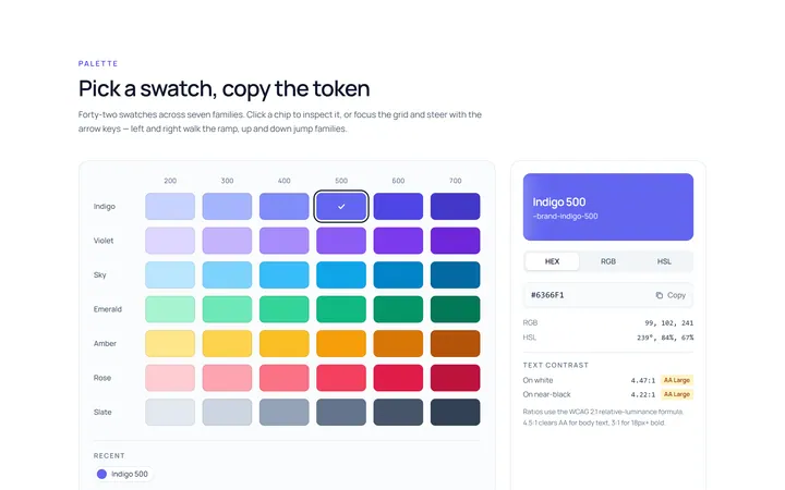
Colour Swatch Picker
Originalswatch colour picker
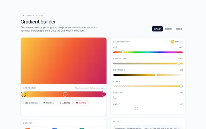
Colour Gradient Picker
Originalgradient builder picker
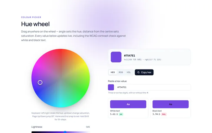
Colour Hue Wheel
Originalhue wheel colour picker
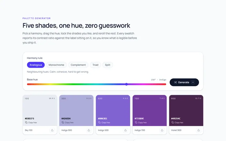
Colour Palette
Originalpalette generator with copy
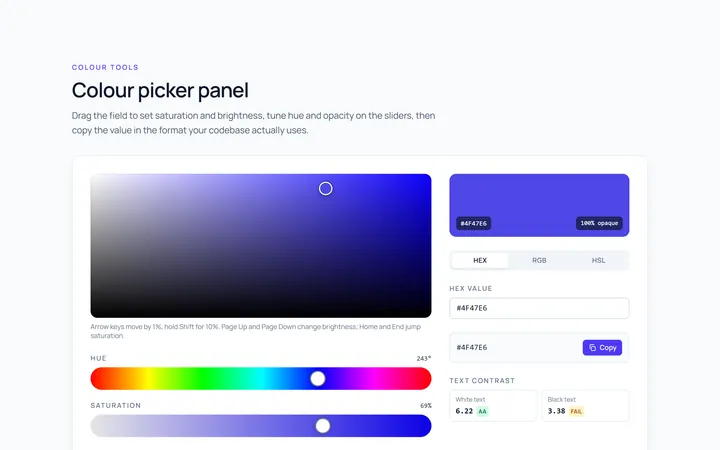
Colour Picker Panel
Originalfull colour picker panel with sliders
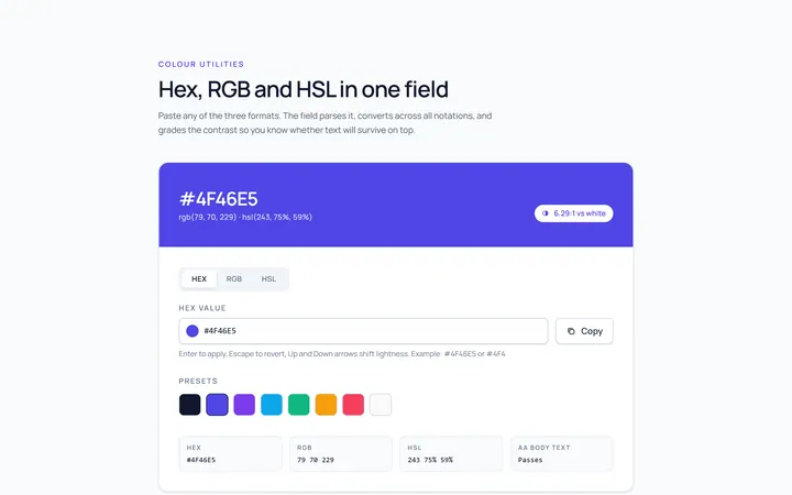
Colour Hex Input
Originalhex/rgb input with preview
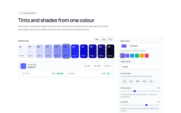
Colour Shades
Originalshade and tint scale generator

Spotlight Hero
OriginalA centred hero with a soft radial spotlight, badge and dual call-to-action.

Split Hero
OriginalA two-column hero pairing a headline and CTAs with a product mock and social proof.

Gradient Spotlight Hero
OriginalA minimal centred hero with a soft gradient-mesh backdrop, announcement pill and dual call-to-action buttons.

App Preview Hero
OriginalA centred hero that pairs headline copy with a realistic product dashboard mock built entirely from markup, complete with browser chrome and a floating notification card.

Waitlist Capture Hero
OriginalA dark, focused hero with an inline email capture form and avatar social proof, ready for pre-launch waitlists.