

Colour Picker Panel
Original · freefull colour picker panel with sliders
Copy prompt gives Claude Code, Cursor or v0 a ready-to-paste prompt that recreates this exact component.
npx shadcn@latest add https://webinnoventix.com/r/color-picker-panel.json"use client";
import {
useCallback,
useEffect,
useId,
useMemo,
useRef,
useState,
type ChangeEvent,
type CSSProperties,
type KeyboardEvent as ReactKeyboardEvent,
type PointerEvent as ReactPointerEvent,
} from "react";
import { motion, useReducedMotion } from "motion/react";
/* ------------------------------- colour math ------------------------------ */
type Hsv = { h: number; s: number; v: number; a: number };
type Rgb = { r: number; g: number; b: number };
type Format = "hex" | "rgb" | "hsl";
const clamp = (n: number, min: number, max: number): number =>
n < min ? min : n > max ? max : n;
function hsvToRgb(h: number, s: number, v: number): Rgb {
const sN = s / 100;
const vN = v / 100;
const c = vN * sN;
const x = c * (1 - Math.abs(((h / 60) % 2) - 1));
const m = vN - c;
let r = 0;
let g = 0;
let b = 0;
if (h < 60) {
r = c;
g = x;
} else if (h < 120) {
r = x;
g = c;
} else if (h < 180) {
g = c;
b = x;
} else if (h < 240) {
g = x;
b = c;
} else if (h < 300) {
r = x;
b = c;
} else {
r = c;
b = x;
}
return {
r: Math.round((r + m) * 255),
g: Math.round((g + m) * 255),
b: Math.round((b + m) * 255),
};
}
function rgbToHsv(r: number, g: number, b: number): Omit<Hsv, "a"> {
const rN = r / 255;
const gN = g / 255;
const bN = b / 255;
const max = Math.max(rN, gN, bN);
const min = Math.min(rN, gN, bN);
const d = max - min;
let h = 0;
if (d !== 0) {
if (max === rN) h = 60 * (((gN - bN) / d) % 6);
else if (max === gN) h = 60 * ((bN - rN) / d + 2);
else h = 60 * ((rN - gN) / d + 4);
}
if (h < 0) h += 360;
return {
h: Math.round(h),
s: Math.round((max === 0 ? 0 : d / max) * 100),
v: Math.round(max * 100),
};
}
function rgbToHsl(r: number, g: number, b: number): { h: number; s: number; l: number } {
const rN = r / 255;
const gN = g / 255;
const bN = b / 255;
const max = Math.max(rN, gN, bN);
const min = Math.min(rN, gN, bN);
const d = max - min;
const l = (max + min) / 2;
let h = 0;
let s = 0;
if (d !== 0) {
s = d / (1 - Math.abs(2 * l - 1));
if (max === rN) h = 60 * (((gN - bN) / d) % 6);
else if (max === gN) h = 60 * ((bN - rN) / d + 2);
else h = 60 * ((rN - gN) / d + 4);
}
if (h < 0) h += 360;
return { h: Math.round(h), s: Math.round(s * 100), l: Math.round(l * 100) };
}
const toHexPair = (n: number): string =>
clamp(Math.round(n), 0, 255).toString(16).padStart(2, "0");
function hsvToHex(h: number, s: number, v: number, a = 1): string {
const { r, g, b } = hsvToRgb(h, s, v);
const base = `#${toHexPair(r)}${toHexPair(g)}${toHexPair(b)}`;
return a >= 1 ? base.toUpperCase() : `${base}${toHexPair(a * 255)}`.toUpperCase();
}
function parseHex(input: string): Hsv | null {
const raw = input.trim().replace(/^#/, "");
if (!/^([0-9a-fA-F]{3,4}|[0-9a-fA-F]{6}|[0-9a-fA-F]{8})$/.test(raw)) return null;
const expand = (part: string): string => (part.length === 1 ? part + part : part);
let r: string;
let g: string;
let b: string;
let a = "ff";
if (raw.length <= 4) {
r = expand(raw[0]);
g = expand(raw[1]);
b = expand(raw[2]);
if (raw.length === 4) a = expand(raw[3]);
} else {
r = raw.slice(0, 2);
g = raw.slice(2, 4);
b = raw.slice(4, 6);
if (raw.length === 8) a = raw.slice(6, 8);
}
const rn = parseInt(r, 16);
const gn = parseInt(g, 16);
const bn = parseInt(b, 16);
const { h, s, v } = rgbToHsv(rn, gn, bn);
return { h, s, v, a: Math.round((parseInt(a, 16) / 255) * 100) / 100 };
}
function relativeLuminance({ r, g, b }: Rgb): number {
const channel = (c: number): number => {
const sN = c / 255;
return sN <= 0.03928 ? sN / 12.92 : ((sN + 0.055) / 1.055) ** 2.4;
};
return 0.2126 * channel(r) + 0.7152 * channel(g) + 0.0722 * channel(b);
}
function contrastRatio(a: number, b: number): number {
const hi = Math.max(a, b);
const lo = Math.min(a, b);
return Math.round(((hi + 0.05) / (lo + 0.05)) * 100) / 100;
}
function formatColor(color: Hsv, format: Format): string {
const { r, g, b } = hsvToRgb(color.h, color.s, color.v);
const opaque = color.a >= 1;
if (format === "hex") return hsvToHex(color.h, color.s, color.v, color.a);
if (format === "rgb") {
return opaque
? `rgb(${r} ${g} ${b})`
: `rgb(${r} ${g} ${b} / ${Math.round(color.a * 100)}%)`;
}
const { h, s, l } = rgbToHsl(r, g, b);
return opaque
? `hsl(${h} ${s}% ${l}%)`
: `hsl(${h} ${s}% ${l}% / ${Math.round(color.a * 100)}%)`;
}
/* --------------------------------- presets -------------------------------- */
const PRESETS: ReadonlyArray<{ name: string; hex: string }> = [
{ name: "Indigo Ink", hex: "#4F46E5" },
{ name: "Violet Haze", hex: "#7C3AED" },
{ name: "Sky Signal", hex: "#0EA5E9" },
{ name: "Emerald Field", hex: "#10B981" },
{ name: "Amber Flare", hex: "#F59E0B" },
{ name: "Rose Alert", hex: "#F43F5E" },
{ name: "Slate Deep", hex: "#0F172A" },
{ name: "Zinc Fog", hex: "#A1A1AA" },
];
const FORMATS: ReadonlyArray<{ id: Format; label: string }> = [
{ id: "hex", label: "HEX" },
{ id: "rgb", label: "RGB" },
{ id: "hsl", label: "HSL" },
];
const INITIAL: Hsv = { h: 243, s: 69, v: 90, a: 1 };
/* --------------------------------- slider --------------------------------- */
type SliderRowProps = {
label: string;
value: number;
min: number;
max: number;
step: number;
suffix: string;
track: string;
checker?: boolean;
onChange: (next: number) => void;
format?: (value: number) => string;
};
function SliderRow({
label,
value,
min,
max,
step,
suffix,
track,
checker = false,
onChange,
format,
}: SliderRowProps) {
const id = useId();
const display = format ? format(value) : `${Math.round(value)}${suffix}`;
return (
<div>
<div className="mb-2 flex items-baseline justify-between gap-3">
<label
htmlFor={id}
className="text-xs font-semibold uppercase tracking-[0.14em] text-slate-500 dark:text-slate-400"
>
{label}
</label>
<span className="font-mono text-xs tabular-nums text-slate-700 dark:text-slate-200">
{display}
</span>
</div>
<div
className={[
"relative h-10 rounded-full ring-1 ring-inset ring-slate-900/10 dark:ring-white/15",
checker ? "cpp-checker bg-white dark:bg-zinc-900" : "",
].join(" ")}
>
<div
aria-hidden="true"
className="absolute inset-0 rounded-full"
style={{ backgroundImage: track }}
/>
<input
id={id}
type="range"
min={min}
max={max}
step={step}
value={value}
aria-valuetext={display}
onChange={(event: ChangeEvent<HTMLInputElement>) =>
onChange(Number(event.target.value))
}
className="cpp-range absolute inset-0 h-10 w-full cursor-pointer rounded-full focus:outline-none"
/>
</div>
</div>
);
}
/* -------------------------------- component ------------------------------- */
export default function ColorPickerPanel() {
const reduceMotion = useReducedMotion();
const [color, setColor] = useState<Hsv>(INITIAL);
const [format, setFormat] = useState<Format>("hex");
const [hexDraft, setHexDraft] = useState<string>(hsvToHex(INITIAL.h, INITIAL.s, INITIAL.v));
const [hexFocused, setHexFocused] = useState(false);
const [hexValid, setHexValid] = useState(true);
const [recents, setRecents] = useState<string[]>(["#0EA5E9", "#10B981", "#F59E0B"]);
const [status, setStatus] = useState<"idle" | "copied" | "failed">("idle");
const padRef = useRef<HTMLDivElement | null>(null);
const draggingRef = useRef(false);
const timerRef = useRef<number | null>(null);
const hexInputId = useId();
const padHintId = useId();
useEffect(() => {
return () => {
if (timerRef.current !== null) window.clearTimeout(timerRef.current);
};
}, []);
const canonicalHex = useMemo(
() => hsvToHex(color.h, color.s, color.v, color.a),
[color]
);
const solidHex = useMemo(() => hsvToHex(color.h, color.s, color.v), [color]);
const rgb = useMemo(() => hsvToRgb(color.h, color.s, color.v), [color]);
const output = useMemo(() => formatColor(color, format), [color, format]);
// While the field has focus the user's raw keystrokes win; otherwise mirror state.
const hexValue = hexFocused ? hexDraft : canonicalHex;
const contrast = useMemo(() => {
const lum = relativeLuminance(rgb);
return {
onWhite: contrastRatio(lum, relativeLuminance({ r: 255, g: 255, b: 255 })),
onBlack: contrastRatio(lum, relativeLuminance({ r: 0, g: 0, b: 0 })),
};
}, [rgb]);
const setChannel = useCallback((patch: Partial<Hsv>) => {
setColor((prev) => ({ ...prev, ...patch }));
setStatus("idle");
}, []);
const applyFromPointer = useCallback((clientX: number, clientY: number) => {
const node = padRef.current;
if (!node) return;
const rect = node.getBoundingClientRect();
if (rect.width === 0 || rect.height === 0) return;
const s = clamp(((clientX - rect.left) / rect.width) * 100, 0, 100);
const v = clamp(100 - ((clientY - rect.top) / rect.height) * 100, 0, 100);
setColor((prev) => ({ ...prev, s: Math.round(s), v: Math.round(v) }));
setStatus("idle");
}, []);
const onPadPointerDown = useCallback(
(event: ReactPointerEvent<HTMLDivElement>) => {
if (event.button !== 0 && event.pointerType === "mouse") return;
event.preventDefault();
draggingRef.current = true;
event.currentTarget.setPointerCapture(event.pointerId);
event.currentTarget.focus();
applyFromPointer(event.clientX, event.clientY);
},
[applyFromPointer]
);
const onPadPointerMove = useCallback(
(event: ReactPointerEvent<HTMLDivElement>) => {
if (!draggingRef.current) return;
applyFromPointer(event.clientX, event.clientY);
},
[applyFromPointer]
);
const onPadPointerUp = useCallback((event: ReactPointerEvent<HTMLDivElement>) => {
draggingRef.current = false;
if (event.currentTarget.hasPointerCapture(event.pointerId)) {
event.currentTarget.releasePointerCapture(event.pointerId);
}
}, []);
const onPadKeyDown = useCallback(
(event: ReactKeyboardEvent<HTMLDivElement>) => {
const big = event.shiftKey ? 10 : 1;
let handled = true;
setColor((prev) => {
switch (event.key) {
case "ArrowLeft":
return { ...prev, s: clamp(prev.s - big, 0, 100) };
case "ArrowRight":
return { ...prev, s: clamp(prev.s + big, 0, 100) };
case "ArrowUp":
return { ...prev, v: clamp(prev.v + big, 0, 100) };
case "ArrowDown":
return { ...prev, v: clamp(prev.v - big, 0, 100) };
case "Home":
return { ...prev, s: 0 };
case "End":
return { ...prev, s: 100 };
case "PageUp":
return { ...prev, v: clamp(prev.v + 10, 0, 100) };
case "PageDown":
return { ...prev, v: clamp(prev.v - 10, 0, 100) };
default:
handled = false;
return prev;
}
});
if (handled) {
event.preventDefault();
setStatus("idle");
}
},
[]
);
const onHexChange = useCallback((event: ChangeEvent<HTMLInputElement>) => {
const next = event.target.value;
setHexDraft(next);
const parsed = parseHex(next);
setHexValid(parsed !== null || next.trim() === "" || next.trim() === "#");
if (parsed) {
setColor(parsed);
setStatus("idle");
}
}, []);
const flash = useCallback((next: "copied" | "failed") => {
setStatus(next);
if (timerRef.current !== null) window.clearTimeout(timerRef.current);
timerRef.current = window.setTimeout(() => setStatus("idle"), 1600);
}, []);
const onCopy = useCallback(async () => {
try {
if (!navigator.clipboard) throw new Error("Clipboard unavailable");
await navigator.clipboard.writeText(output);
flash("copied");
} catch {
flash("failed");
}
}, [output, flash]);
const onSaveSwatch = useCallback(() => {
setRecents((prev) => {
const filtered = prev.filter((item) => item !== canonicalHex);
return [canonicalHex, ...filtered].slice(0, 8);
});
}, [canonicalHex]);
const applyHex = useCallback((hex: string) => {
const parsed = parseHex(hex);
if (!parsed) return;
setColor(parsed);
setStatus("idle");
}, []);
const hueTrack =
"linear-gradient(to right, #FF0000 0%, #FFFF00 17%, #00FF00 33%, #00FFFF 50%, #0000FF 67%, #FF00FF 83%, #FF0000 100%)";
const satTrack = `linear-gradient(to right, ${hsvToHex(color.h, 0, color.v)}, ${hsvToHex(color.h, 100, color.v)})`;
const valTrack = `linear-gradient(to right, #000000, ${hsvToHex(color.h, color.s, 100)})`;
const alphaTrack = `linear-gradient(to right, ${solidHex}00, ${solidHex})`;
const padStyle: CSSProperties = {
backgroundColor: hsvToHex(color.h, 100, 100),
backgroundImage:
"linear-gradient(to top, #000000, rgba(0,0,0,0)), linear-gradient(to right, #FFFFFF, rgba(255,255,255,0))",
};
const panelMotion = reduceMotion
? { initial: { opacity: 1 }, animate: { opacity: 1 } }
: {
initial: { opacity: 0, y: 18 },
whileInView: { opacity: 1, y: 0 },
viewport: { once: true, amount: 0.25 },
transition: { duration: 0.5, ease: [0.22, 1, 0.36, 1] as const },
};
return (
<section className="relative w-full bg-slate-50 px-4 py-20 text-slate-900 sm:px-6 md:py-28 dark:bg-zinc-950 dark:text-slate-100">
<style>{`
.cpp-checker {
background-image: conic-gradient(from 90deg, rgba(148,163,184,0.45) 25%, transparent 0 50%, rgba(148,163,184,0.45) 0 75%, transparent 0);
background-size: 12px 12px;
background-position: 0 0;
}
.cpp-range {
-webkit-appearance: none;
appearance: none;
background: transparent;
}
.cpp-range::-webkit-slider-runnable-track {
height: 40px;
background: transparent;
border: none;
}
.cpp-range::-webkit-slider-thumb {
-webkit-appearance: none;
appearance: none;
width: 28px;
height: 28px;
margin-top: 6px;
border-radius: 9999px;
background: #ffffff;
border: 2px solid rgba(15, 23, 42, 0.55);
box-shadow: 0 1px 6px rgba(15, 23, 42, 0.35);
cursor: grab;
}
.cpp-range::-webkit-slider-thumb:active { cursor: grabbing; }
.cpp-range::-moz-range-track {
height: 40px;
background: transparent;
border: none;
}
.cpp-range::-moz-range-thumb {
width: 24px;
height: 24px;
border-radius: 9999px;
background: #ffffff;
border: 2px solid rgba(15, 23, 42, 0.55);
box-shadow: 0 1px 6px rgba(15, 23, 42, 0.35);
cursor: grab;
}
.cpp-range:focus-visible::-webkit-slider-thumb {
outline: 2px solid #6366f1;
outline-offset: 3px;
}
.cpp-range:focus-visible::-moz-range-thumb {
outline: 2px solid #6366f1;
outline-offset: 3px;
}
@keyframes cpp-swatch-pop {
0% { transform: scale(0.6); opacity: 0; }
60% { transform: scale(1.08); opacity: 1; }
100% { transform: scale(1); opacity: 1; }
}
@keyframes cpp-status-in {
from { transform: translateY(4px); opacity: 0; }
to { transform: translateY(0); opacity: 1; }
}
.cpp-pop { animation: cpp-swatch-pop 280ms cubic-bezier(0.22, 1, 0.36, 1) both; }
.cpp-status { animation: cpp-status-in 220ms ease-out both; }
@media (prefers-reduced-motion: reduce) {
.cpp-pop, .cpp-status { animation: none !important; }
}
`}</style>
<motion.div
{...panelMotion}
className="mx-auto w-full max-w-5xl"
>
<header className="mb-8 max-w-2xl">
<p className="text-xs font-semibold uppercase tracking-[0.2em] text-indigo-600 dark:text-indigo-400">
Colour tools
</p>
<h2 className="mt-3 text-3xl font-semibold tracking-tight text-slate-900 sm:text-4xl dark:text-white">
Colour picker panel
</h2>
<p className="mt-3 text-base leading-relaxed text-slate-600 dark:text-slate-400">
Drag the field to set saturation and brightness, tune hue and opacity on the
sliders, then copy the value in the format your codebase actually uses.
</p>
</header>
<div className="overflow-hidden rounded-2xl border border-slate-200 bg-white shadow-xl shadow-slate-900/5 dark:border-white/10 dark:bg-zinc-900 dark:shadow-black/40">
<div className="grid gap-8 p-6 sm:p-8 lg:grid-cols-[minmax(0,1fr)_320px]">
{/* -------- left: field + sliders -------- */}
<div>
<div
ref={padRef}
role="application"
tabIndex={0}
aria-label="Saturation and brightness field"
aria-describedby={padHintId}
onPointerDown={onPadPointerDown}
onPointerMove={onPadPointerMove}
onPointerUp={onPadPointerUp}
onPointerCancel={onPadPointerUp}
onKeyDown={onPadKeyDown}
style={padStyle}
className="relative h-56 w-full touch-none select-none rounded-xl ring-1 ring-inset ring-slate-900/10 focus:outline-none focus-visible:ring-2 focus-visible:ring-indigo-500 focus-visible:ring-offset-2 focus-visible:ring-offset-white sm:h-64 dark:ring-white/15 dark:focus-visible:ring-offset-zinc-900"
>
<span
aria-hidden="true"
className="pointer-events-none absolute h-6 w-6 -translate-x-1/2 -translate-y-1/2 rounded-full border-2 border-white shadow-[0_0_0_1px_rgba(15,23,42,0.5),0_2px_8px_rgba(15,23,42,0.45)]"
style={{
left: `${color.s}%`,
top: `${100 - color.v}%`,
backgroundColor: solidHex,
}}
/>
</div>
<p
id={padHintId}
className="mt-2 text-xs text-slate-500 dark:text-slate-400"
>
Arrow keys move by 1%, hold Shift for 10%. Page Up and Page Down change
brightness; Home and End jump saturation.
</p>
<p className="sr-only" aria-live="polite">
{`Saturation ${color.s} percent, brightness ${color.v} percent, ${canonicalHex}`}
</p>
<div className="mt-6 space-y-5">
<SliderRow
label="Hue"
value={color.h}
min={0}
max={360}
step={1}
suffix="°"
track={hueTrack}
onChange={(h) => setChannel({ h })}
/>
<SliderRow
label="Saturation"
value={color.s}
min={0}
max={100}
step={1}
suffix="%"
track={satTrack}
onChange={(s) => setChannel({ s })}
/>
<SliderRow
label="Brightness"
value={color.v}
min={0}
max={100}
step={1}
suffix="%"
track={valTrack}
onChange={(v) => setChannel({ v })}
/>
<SliderRow
label="Opacity"
value={color.a}
min={0}
max={1}
step={0.01}
suffix="%"
track={alphaTrack}
checker
onChange={(a) => setChannel({ a })}
format={(a) => `${Math.round(a * 100)}%`}
/>
</div>
</div>
{/* -------- right: output, presets, recents -------- */}
<div className="flex flex-col gap-6">
<div className="cpp-checker rounded-xl bg-white ring-1 ring-inset ring-slate-900/10 dark:bg-zinc-950 dark:ring-white/15">
<div
className="flex h-28 items-end justify-between rounded-xl p-3"
style={{ backgroundColor: `rgb(${rgb.r} ${rgb.g} ${rgb.b} / ${color.a})` }}
>
<span className="rounded-md bg-slate-900/70 px-2 py-1 font-mono text-xs font-medium text-white backdrop-blur-sm">
{canonicalHex}
</span>
<span className="rounded-md bg-slate-900/70 px-2 py-1 font-mono text-[11px] text-white backdrop-blur-sm">
{Math.round(color.a * 100)}% opaque
</span>
</div>
</div>
<div
role="radiogroup"
aria-label="Output format"
className="grid grid-cols-3 gap-1 rounded-lg bg-slate-100 p-1 dark:bg-zinc-800"
>
{FORMATS.map((item) => {
const active = format === item.id;
return (
<button
key={item.id}
type="button"
role="radio"
aria-checked={active}
onClick={() => {
setFormat(item.id);
setStatus("idle");
}}
className={[
"rounded-md px-3 py-1.5 text-xs font-semibold tracking-wide transition-colors",
"focus:outline-none focus-visible:ring-2 focus-visible:ring-indigo-500 focus-visible:ring-offset-2 focus-visible:ring-offset-slate-100 dark:focus-visible:ring-offset-zinc-800",
active
? "bg-white text-slate-900 shadow-sm dark:bg-zinc-950 dark:text-white"
: "text-slate-500 hover:text-slate-800 dark:text-slate-400 dark:hover:text-slate-100",
].join(" ")}
>
{item.label}
</button>
);
})}
</div>
<div>
<label
htmlFor={hexInputId}
className="mb-2 block text-xs font-semibold uppercase tracking-[0.14em] text-slate-500 dark:text-slate-400"
>
Hex value
</label>
<input
id={hexInputId}
type="text"
inputMode="text"
spellCheck={false}
autoComplete="off"
value={hexValue}
aria-invalid={!hexValid}
onChange={onHexChange}
onFocus={() => {
setHexDraft(canonicalHex);
setHexValid(true);
setHexFocused(true);
}}
onBlur={() => {
setHexFocused(false);
setHexValid(true);
}}
className={[
"w-full rounded-lg border bg-white px-3 py-2 font-mono text-sm uppercase text-slate-900 transition-colors",
"focus:outline-none focus-visible:ring-2 focus-visible:ring-indigo-500 focus-visible:ring-offset-2 focus-visible:ring-offset-white dark:focus-visible:ring-offset-zinc-900",
"dark:bg-zinc-950 dark:text-slate-100",
hexValid
? "border-slate-300 dark:border-white/15"
: "border-rose-500 dark:border-rose-500",
].join(" ")}
/>
{!hexValid ? (
<p className="mt-1.5 text-xs text-rose-600 dark:text-rose-400">
Use 3, 4, 6 or 8 hex digits — for example #4F46E5 or #4F46E5CC.
</p>
) : null}
</div>
<div className="rounded-lg border border-slate-200 bg-slate-50 p-3 dark:border-white/10 dark:bg-zinc-950">
<div className="flex items-center justify-between gap-2">
<code className="min-w-0 flex-1 truncate font-mono text-sm text-slate-800 dark:text-slate-200">
{output}
</code>
<button
type="button"
onClick={onCopy}
className="inline-flex shrink-0 items-center gap-1.5 rounded-md bg-indigo-600 px-2.5 py-1.5 text-xs font-semibold text-white transition-colors hover:bg-indigo-500 focus:outline-none focus-visible:ring-2 focus-visible:ring-indigo-500 focus-visible:ring-offset-2 focus-visible:ring-offset-slate-50 dark:focus-visible:ring-offset-zinc-950"
>
<svg
aria-hidden="true"
viewBox="0 0 24 24"
className="h-3.5 w-3.5"
fill="none"
stroke="currentColor"
strokeWidth="2"
strokeLinecap="round"
strokeLinejoin="round"
>
{status === "copied" ? (
<path d="m5 12 5 5L20 7" />
) : (
<>
<rect x="9" y="9" width="12" height="12" rx="2" />
<path d="M5 15V5a2 2 0 0 1 2-2h10" />
</>
)}
</svg>
{status === "copied" ? "Copied" : "Copy"}
</button>
</div>
{status !== "idle" ? (
<p
className={[
"cpp-status mt-2 text-xs",
status === "copied"
? "text-emerald-600 dark:text-emerald-400"
: "text-rose-600 dark:text-rose-400",
].join(" ")}
role="status"
>
{status === "copied"
? `${output} is on your clipboard.`
: "Clipboard blocked — select the value and copy manually."}
</p>
) : null}
</div>
<div>
<p className="mb-2 text-xs font-semibold uppercase tracking-[0.14em] text-slate-500 dark:text-slate-400">
Text contrast
</p>
<div className="grid grid-cols-2 gap-2">
{[
{ label: "White text", ratio: contrast.onWhite },
{ label: "Black text", ratio: contrast.onBlack },
].map((item) => {
const pass = item.ratio >= 4.5;
return (
<div
key={item.label}
className="rounded-lg border border-slate-200 px-2.5 py-2 dark:border-white/10"
>
<p className="text-[11px] text-slate-500 dark:text-slate-400">
{item.label}
</p>
<p className="mt-0.5 flex items-baseline gap-1.5">
<span className="font-mono text-sm font-semibold tabular-nums text-slate-900 dark:text-slate-100">
{item.ratio.toFixed(2)}
</span>
<span
className={[
"rounded px-1 py-0.5 text-[10px] font-bold",
pass
? "bg-emerald-100 text-emerald-700 dark:bg-emerald-500/15 dark:text-emerald-400"
: "bg-amber-100 text-amber-700 dark:bg-amber-500/15 dark:text-amber-400",
].join(" ")}
>
{pass ? "AA" : "FAIL"}
</span>
</p>
</div>
);
})}
</div>
</div>
</div>
</div>
{/* -------- footer: presets + recents -------- */}
<div className="border-t border-slate-200 bg-slate-50 px-6 py-5 sm:px-8 dark:border-white/10 dark:bg-zinc-950">
<div className="flex flex-wrap items-start justify-between gap-6">
<div>
<p className="mb-2.5 text-xs font-semibold uppercase tracking-[0.14em] text-slate-500 dark:text-slate-400">
Palette
</p>
<ul className="flex flex-wrap gap-2">
{PRESETS.map((preset) => {
const active = solidHex === preset.hex.toUpperCase();
return (
<li key={preset.hex}>
<button
type="button"
onClick={() => applyHex(preset.hex)}
aria-pressed={active}
title={`${preset.name} · ${preset.hex}`}
className={[
"h-8 w-8 rounded-lg ring-1 ring-inset ring-slate-900/15 transition-transform hover:scale-110",
"focus:outline-none focus-visible:ring-2 focus-visible:ring-indigo-500 focus-visible:ring-offset-2 focus-visible:ring-offset-slate-50 dark:ring-white/20 dark:focus-visible:ring-offset-zinc-950",
active ? "ring-2 ring-indigo-500 dark:ring-indigo-400" : "",
].join(" ")}
style={{ backgroundColor: preset.hex }}
>
<span className="sr-only">{`${preset.name}, ${preset.hex}`}</span>
</button>
</li>
);
})}
</ul>
</div>
<div>
<div className="mb-2.5 flex items-center gap-3">
<p className="text-xs font-semibold uppercase tracking-[0.14em] text-slate-500 dark:text-slate-400">
Recent
</p>
<button
type="button"
onClick={onSaveSwatch}
className="rounded-md border border-slate-300 px-2 py-0.5 text-[11px] font-semibold text-slate-700 transition-colors hover:border-slate-400 hover:text-slate-900 focus:outline-none focus-visible:ring-2 focus-visible:ring-indigo-500 focus-visible:ring-offset-2 focus-visible:ring-offset-slate-50 dark:border-white/20 dark:text-slate-300 dark:hover:text-white dark:focus-visible:ring-offset-zinc-950"
>
Save swatch
</button>
</div>
{recents.length === 0 ? (
<p className="text-xs text-slate-500 dark:text-slate-400">
Nothing saved yet.
</p>
) : (
<ul className="flex flex-wrap gap-2">
{recents.map((hex) => (
<li key={hex}>
<button
type="button"
onClick={() => applyHex(hex)}
title={hex}
className="cpp-pop cpp-checker h-8 w-8 rounded-lg bg-white ring-1 ring-inset ring-slate-900/15 transition-transform hover:scale-110 focus:outline-none focus-visible:ring-2 focus-visible:ring-indigo-500 focus-visible:ring-offset-2 focus-visible:ring-offset-slate-50 dark:bg-zinc-900 dark:ring-white/20 dark:focus-visible:ring-offset-zinc-950"
>
<span
aria-hidden="true"
className="block h-full w-full rounded-lg"
style={{ backgroundColor: hex }}
/>
<span className="sr-only">{`Apply ${hex}`}</span>
</button>
</li>
))}
</ul>
)}
</div>
</div>
</div>
</div>
</motion.div>
</section>
);
}Dependencies
Licence
Built by Web Innoventix. Free for personal and commercial use, no attribution required.
Built by Web Innoventix
Need a custom interface, a full website, or SEO that gets you cited by AI? We design, build and rank it end to end.
Get a free quoteSimilar components
Browse all →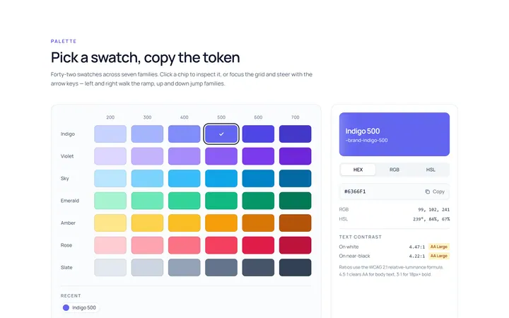
Colour Swatch Picker
Originalswatch colour picker
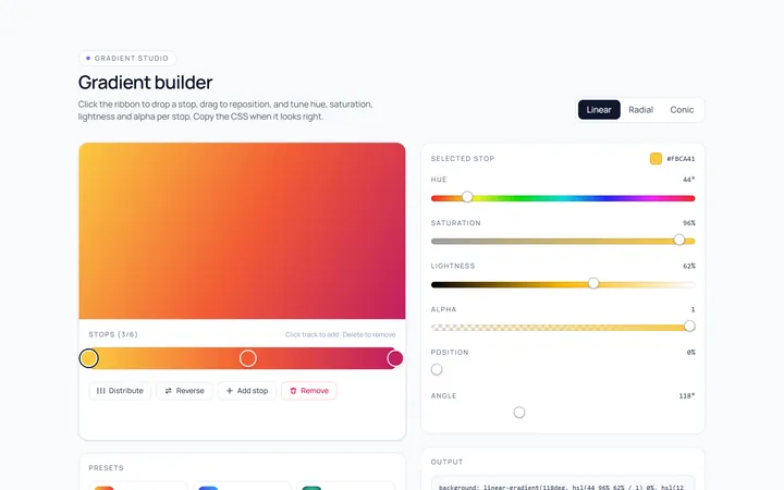
Colour Gradient Picker
Originalgradient builder picker
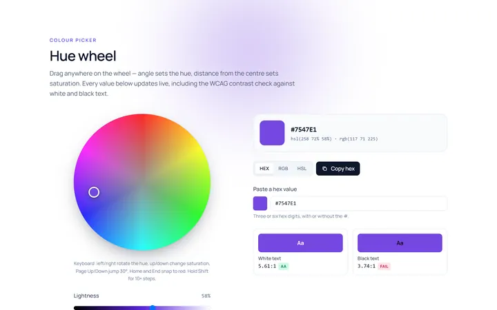
Colour Hue Wheel
Originalhue wheel colour picker
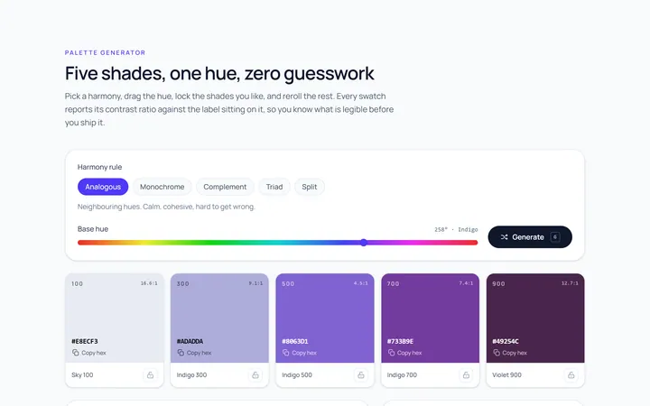
Colour Palette
Originalpalette generator with copy
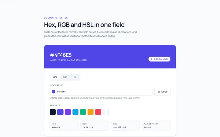
Colour Hex Input
Originalhex/rgb input with preview
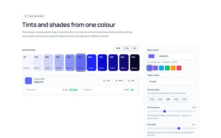
Colour Shades
Originalshade and tint scale generator
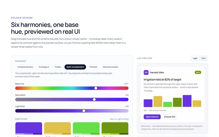
Colour Scheme
Originalcolour scheme preview swatches

Spotlight Hero
OriginalA centred hero with a soft radial spotlight, badge and dual call-to-action.

Split Hero
OriginalA two-column hero pairing a headline and CTAs with a product mock and social proof.

Gradient Spotlight Hero
OriginalA minimal centred hero with a soft gradient-mesh backdrop, announcement pill and dual call-to-action buttons.

App Preview Hero
OriginalA centred hero that pairs headline copy with a realistic product dashboard mock built entirely from markup, complete with browser chrome and a floating notification card.

Waitlist Capture Hero
OriginalA dark, focused hero with an inline email capture form and avatar social proof, ready for pre-launch waitlists.