

Colour Hue Wheel
Original · freehue wheel colour picker
Copy prompt gives Claude Code, Cursor or v0 a ready-to-paste prompt that recreates this exact component.
npx shadcn@latest add https://webinnoventix.com/r/color-hue-wheel.json"use client";
import {
useCallback,
useEffect,
useId,
useMemo,
useRef,
useState,
type ChangeEvent,
type CSSProperties,
type KeyboardEvent as ReactKeyboardEvent,
type PointerEvent as ReactPointerEvent,
} from "react";
import { motion, useReducedMotion } from "motion/react";
/* --------------------------------- colour -------------------------------- */
type Rgb = [number, number, number];
type Format = "hex" | "rgb" | "hsl";
function clamp(v: number, min: number, max: number): number {
return v < min ? min : v > max ? max : v;
}
function wrapHue(h: number): number {
return ((h % 360) + 360) % 360;
}
function hslToRgb(h: number, s: number, l: number): Rgb {
const sN = s / 100;
const lN = l / 100;
const c = (1 - Math.abs(2 * lN - 1)) * sN;
const hp = wrapHue(h) / 60;
const x = c * (1 - Math.abs((hp % 2) - 1));
const m = lN - c / 2;
let r = 0;
let g = 0;
let b = 0;
if (hp < 1) {
r = c;
g = x;
} else if (hp < 2) {
r = x;
g = c;
} else if (hp < 3) {
g = c;
b = x;
} else if (hp < 4) {
g = x;
b = c;
} else if (hp < 5) {
r = x;
b = c;
} else {
r = c;
b = x;
}
return [
Math.round((r + m) * 255),
Math.round((g + m) * 255),
Math.round((b + m) * 255),
];
}
function rgbToHsl(r: number, g: number, b: number): [number, number, number] {
const rN = r / 255;
const gN = g / 255;
const bN = b / 255;
const max = Math.max(rN, gN, bN);
const min = Math.min(rN, gN, bN);
const d = max - min;
const l = (max + min) / 2;
let h = 0;
let s = 0;
if (d !== 0) {
s = d / (1 - Math.abs(2 * l - 1));
if (max === rN) h = ((gN - bN) / d) % 6;
else if (max === gN) h = (bN - rN) / d + 2;
else h = (rN - gN) / d + 4;
h *= 60;
}
return [Math.round(wrapHue(h)), Math.round(s * 100), Math.round(l * 100)];
}
function rgbToHex(r: number, g: number, b: number): string {
return `#${[r, g, b]
.map((v) => clamp(Math.round(v), 0, 255).toString(16).padStart(2, "0"))
.join("")
.toUpperCase()}`;
}
function hexToRgb(input: string): Rgb | null {
const raw = input.trim().replace(/^#/, "");
const short = /^[0-9a-fA-F]{3}$/.test(raw);
const long = /^[0-9a-fA-F]{6}$/.test(raw);
if (!short && !long) return null;
const full = short
? raw
.split("")
.map((c) => c + c)
.join("")
: raw;
return [
parseInt(full.slice(0, 2), 16),
parseInt(full.slice(2, 4), 16),
parseInt(full.slice(4, 6), 16),
];
}
function channelLuma(c: number): number {
const s = c / 255;
return s <= 0.03928 ? s / 12.92 : Math.pow((s + 0.055) / 1.055, 2.4);
}
function luminance([r, g, b]: Rgb): number {
return 0.2126 * channelLuma(r) + 0.7152 * channelLuma(g) + 0.0722 * channelLuma(b);
}
function contrastRatio(a: number, b: number): number {
const hi = Math.max(a, b);
const lo = Math.min(a, b);
return (hi + 0.05) / (lo + 0.05);
}
/* ---------------------------------- data --------------------------------- */
type Preset = { name: string; hex: string };
const PRESETS: readonly Preset[] = [
{ name: "Harbour Indigo", hex: "#4F46E5" },
{ name: "Kelp Green", hex: "#059669" },
{ name: "Signal Amber", hex: "#F59E0B" },
{ name: "Clay Rose", hex: "#E11D48" },
{ name: "Meridian Sky", hex: "#0EA5E9" },
{ name: "Iris Violet", hex: "#8B5CF6" },
];
type Harmony = { label: string; offsets: readonly number[] };
const HARMONIES: readonly Harmony[] = [
{ label: "Complement", offsets: [180] },
{ label: "Analogous", offsets: [-30, 30] },
{ label: "Triad", offsets: [120, 240] },
{ label: "Split", offsets: [150, 210] },
];
const WHITE_LUMA = 1;
const BLACK_LUMA = 0;
/* -------------------------------- component ------------------------------- */
export default function ColorHueWheel() {
const reduce = useReducedMotion();
const uid = useId();
const lightId = `${uid}-light`;
const hexId = `${uid}-hex`;
const wheelHintId = `${uid}-hint`;
const [hue, setHue] = useState(258);
const [sat, setSat] = useState(72);
const [light, setLight] = useState(58);
const [dragging, setDragging] = useState(false);
const [format, setFormat] = useState<Format>("hex");
const [copied, setCopied] = useState(false);
const [hexDraft, setHexDraft] = useState("");
const wheelRef = useRef<HTMLDivElement | null>(null);
const hexFocused = useRef(false);
const copyTimer = useRef<number | null>(null);
const rgb = useMemo<Rgb>(() => hslToRgb(hue, sat, light), [hue, sat, light]);
const hex = useMemo(() => rgbToHex(rgb[0], rgb[1], rgb[2]), [rgb]);
const solid = `hsl(${hue} ${sat}% ${light}%)`;
const onWhite = useMemo(
() => contrastRatio(luminance(rgb), WHITE_LUMA),
[rgb],
);
const onBlack = useMemo(
() => contrastRatio(luminance(rgb), BLACK_LUMA),
[rgb],
);
const value = useMemo(() => {
if (format === "rgb") return `rgb(${rgb[0]}, ${rgb[1]}, ${rgb[2]})`;
if (format === "hsl") return `hsl(${hue}, ${sat}%, ${light}%)`;
return hex;
}, [format, rgb, hue, sat, light, hex]);
/* keep the hex field in sync unless the user is typing in it */
useEffect(() => {
if (!hexFocused.current) setHexDraft(hex);
}, [hex]);
useEffect(() => {
return () => {
if (copyTimer.current !== null) window.clearTimeout(copyTimer.current);
};
}, []);
/* the wheel: angle = hue (0 at 12 o'clock, clockwise), radius = saturation */
const applyFromPoint = useCallback((clientX: number, clientY: number) => {
const el = wheelRef.current;
if (!el) return;
const box = el.getBoundingClientRect();
const radius = box.width / 2;
if (radius <= 0) return;
const dx = clientX - (box.left + radius);
const dy = clientY - (box.top + box.height / 2);
const dist = Math.sqrt(dx * dx + dy * dy);
if (dist > 2) {
setHue(Math.round(wrapHue((Math.atan2(dx, -dy) * 180) / Math.PI)));
}
setSat(Math.round(clamp((dist / radius) * 100, 0, 100)));
}, []);
const handlePointerDown = (e: ReactPointerEvent<HTMLDivElement>) => {
if (e.button !== 0 && e.pointerType === "mouse") return;
e.currentTarget.setPointerCapture(e.pointerId);
setDragging(true);
applyFromPoint(e.clientX, e.clientY);
e.currentTarget.focus();
};
const handlePointerMove = (e: ReactPointerEvent<HTMLDivElement>) => {
if (!dragging) return;
e.preventDefault();
applyFromPoint(e.clientX, e.clientY);
};
const endDrag = (e: ReactPointerEvent<HTMLDivElement>) => {
if (!dragging) return;
if (e.currentTarget.hasPointerCapture(e.pointerId)) {
e.currentTarget.releasePointerCapture(e.pointerId);
}
setDragging(false);
};
const handleWheelKey = (e: ReactKeyboardEvent<HTMLDivElement>) => {
const step = e.shiftKey ? 10 : 1;
let handled = true;
switch (e.key) {
case "ArrowRight":
setHue((h) => wrapHue(h + step));
break;
case "ArrowLeft":
setHue((h) => wrapHue(h - step));
break;
case "ArrowUp":
setSat((s) => clamp(s + step, 0, 100));
break;
case "ArrowDown":
setSat((s) => clamp(s - step, 0, 100));
break;
case "PageUp":
setHue((h) => wrapHue(h + 30));
break;
case "PageDown":
setHue((h) => wrapHue(h - 30));
break;
case "Home":
setHue(0);
break;
case "End":
setHue(359);
break;
default:
handled = false;
}
if (handled) e.preventDefault();
};
const applyHex = useCallback((input: string) => {
const parsed = hexToRgb(input);
if (!parsed) return false;
const [h, s, l] = rgbToHsl(parsed[0], parsed[1], parsed[2]);
setHue(h);
setSat(s);
setLight(l);
return true;
}, []);
const handleHexChange = (e: ChangeEvent<HTMLInputElement>) => {
const next = e.target.value;
setHexDraft(next);
applyHex(next);
};
const hexValid = hexToRgb(hexDraft) !== null;
const copy = async () => {
try {
await navigator.clipboard.writeText(value);
setCopied(true);
if (copyTimer.current !== null) window.clearTimeout(copyTimer.current);
copyTimer.current = window.setTimeout(() => setCopied(false), 1600);
} catch {
setCopied(false);
}
};
/* wheel paint: hue ring at the live lightness, desaturating toward centre */
const conic = useMemo(() => {
const stops: string[] = [];
for (let i = 0; i <= 24; i += 1) {
const h = i * 15;
stops.push(`hsl(${h} 100% ${light}%) ${(i / 24) * 100}%`);
}
return `conic-gradient(from 0deg at 50% 50%, ${stops.join(", ")})`;
}, [light]);
const wheelStyle: CSSProperties = {
backgroundImage: `radial-gradient(circle closest-side, hsl(0 0% ${light}%) 0%, hsl(0 0% ${light}% / 0) 100%), ${conic}`,
};
const rad = (hue * Math.PI) / 180;
const thumbLeft = 50 + (sat / 100) * 50 * Math.sin(rad);
const thumbTop = 50 - (sat / 100) * 50 * Math.cos(rad);
const thumbTransition = reduce
? { duration: 0 }
: dragging
? { duration: 0 }
: { type: "spring" as const, stiffness: 380, damping: 30 };
return (
<section className="relative w-full overflow-hidden bg-white px-4 py-20 text-slate-900 sm:px-6 sm:py-24 dark:bg-slate-950 dark:text-slate-100">
<style>{`
@keyframes chw-pop {
0% { transform: scale(.72); opacity: 0; }
60% { transform: scale(1.06); opacity: 1; }
100% { transform: scale(1); opacity: 1; }
}
@keyframes chw-halo {
0%, 100% { opacity: .30; }
50% { opacity: .55; }
}
.chw-pop { animation: chw-pop .32s cubic-bezier(.34,1.56,.64,1) both; }
.chw-halo { animation: chw-halo 9s ease-in-out infinite; }
@media (prefers-reduced-motion: reduce) {
.chw-pop, .chw-halo { animation: none !important; }
}
`}</style>
{/* ambient wash tinted by the live colour */}
<div
aria-hidden="true"
className="chw-halo pointer-events-none absolute -top-40 left-1/2 h-[36rem] w-[36rem] -translate-x-1/2 rounded-full blur-3xl"
style={{ background: `radial-gradient(circle, ${solid}, transparent 66%)` }}
/>
<div className="relative mx-auto max-w-5xl">
<header className="mb-10 max-w-2xl">
<p className="text-xs font-semibold uppercase tracking-[0.18em] text-indigo-600 dark:text-indigo-400">
Colour picker
</p>
<h2 className="mt-3 text-3xl font-semibold tracking-tight text-slate-900 sm:text-4xl dark:text-white">
Hue wheel
</h2>
<p className="mt-3 text-base leading-relaxed text-slate-600 dark:text-slate-400">
Drag anywhere on the wheel — angle sets the hue, distance from the
centre sets saturation. Every value below updates live, including
the WCAG contrast check against white and black text.
</p>
</header>
<div className="grid gap-8 lg:grid-cols-[minmax(0,1fr)_minmax(0,1.05fr)] lg:gap-12">
{/* ------------------------------ wheel ----------------------------- */}
<div className="flex flex-col items-center gap-6">
<div className="relative w-full max-w-[22rem]">
<div
ref={wheelRef}
role="slider"
tabIndex={0}
aria-label="Hue and saturation wheel"
aria-describedby={wheelHintId}
aria-valuemin={0}
aria-valuemax={360}
aria-valuenow={hue}
aria-valuetext={`Hue ${hue} degrees, saturation ${sat} percent`}
onPointerDown={handlePointerDown}
onPointerMove={handlePointerMove}
onPointerUp={endDrag}
onPointerCancel={endDrag}
onKeyDown={handleWheelKey}
className="relative aspect-square w-full cursor-crosshair touch-none select-none rounded-full shadow-[0_18px_50px_-18px_rgba(15,23,42,0.55)] ring-1 ring-slate-900/10 outline-none focus-visible:ring-4 focus-visible:ring-indigo-500 focus-visible:ring-offset-4 focus-visible:ring-offset-white dark:ring-white/15 dark:focus-visible:ring-offset-slate-950"
style={wheelStyle}
>
<motion.div
aria-hidden="true"
className="pointer-events-none absolute h-7 w-7 rounded-full border-[3px] border-white shadow-[0_2px_10px_rgba(15,23,42,0.5)] ring-1 ring-slate-900/25"
style={{
left: `${thumbLeft}%`,
top: `${thumbTop}%`,
backgroundColor: solid,
x: "-50%",
y: "-50%",
}}
animate={{
left: `${thumbLeft}%`,
top: `${thumbTop}%`,
scale: dragging && !reduce ? 1.22 : 1,
}}
transition={thumbTransition}
/>
</div>
</div>
<p
id={wheelHintId}
className="max-w-[22rem] text-center text-xs leading-relaxed text-slate-500 dark:text-slate-400"
>
Keyboard: left/right rotate the hue, up/down change saturation,
Page Up/Down jump 30°, Home and End snap to red. Hold Shift for
10× steps.
</p>
{/* lightness */}
<div className="w-full max-w-[22rem]">
<div className="mb-2 flex items-baseline justify-between">
<label
htmlFor={lightId}
className="text-sm font-medium text-slate-700 dark:text-slate-300"
>
Lightness
</label>
<span className="font-mono text-sm tabular-nums text-slate-500 dark:text-slate-400">
{light}%
</span>
</div>
<input
id={lightId}
type="range"
min={0}
max={100}
step={1}
value={light}
onChange={(e) => setLight(Number(e.target.value))}
className="h-2.5 w-full cursor-pointer appearance-none rounded-full outline-none ring-1 ring-slate-900/10 focus-visible:ring-4 focus-visible:ring-indigo-500 dark:ring-white/15"
style={{
backgroundImage: `linear-gradient(to right, hsl(${hue} ${sat}% 0%), hsl(${hue} ${sat}% 50%), hsl(${hue} ${sat}% 100%))`,
}}
/>
</div>
</div>
{/* ----------------------------- readout ---------------------------- */}
<div className="flex flex-col gap-6">
<div
className="flex items-center gap-4 rounded-2xl border border-slate-200 bg-slate-50 p-4 dark:border-slate-800 dark:bg-slate-900"
>
<div
aria-hidden="true"
className="h-16 w-16 shrink-0 rounded-xl ring-1 ring-slate-900/10 dark:ring-white/15"
style={{ backgroundColor: solid }}
/>
<div className="min-w-0">
<p className="font-mono text-lg font-semibold tracking-tight text-slate-900 dark:text-white">
{hex}
</p>
<p className="mt-0.5 truncate font-mono text-xs text-slate-500 dark:text-slate-400">
hsl({hue} {sat}% {light}%) · rgb({rgb[0]} {rgb[1]} {rgb[2]})
</p>
</div>
</div>
{/* format + copy */}
<div className="flex flex-wrap items-center gap-2">
<div
className="inline-flex rounded-lg border border-slate-200 bg-slate-100 p-1 dark:border-slate-800 dark:bg-slate-900"
>
{(["hex", "rgb", "hsl"] as const).map((f) => (
<button
key={f}
type="button"
aria-pressed={format === f}
onClick={() => setFormat(f)}
className={`rounded-md px-3 py-1.5 text-xs font-semibold uppercase tracking-wide outline-none transition-colors focus-visible:ring-2 focus-visible:ring-indigo-500 focus-visible:ring-offset-2 focus-visible:ring-offset-slate-100 dark:focus-visible:ring-offset-slate-900 ${
format === f
? "bg-white text-slate-900 shadow-sm dark:bg-slate-700 dark:text-white"
: "text-slate-500 hover:text-slate-800 dark:text-slate-400 dark:hover:text-slate-200"
}`}
>
{f}
</button>
))}
</div>
<button
type="button"
onClick={copy}
className="inline-flex items-center gap-2 rounded-lg bg-slate-900 px-3.5 py-2 text-sm font-medium text-white outline-none transition-colors hover:bg-slate-700 focus-visible:ring-2 focus-visible:ring-indigo-500 focus-visible:ring-offset-2 focus-visible:ring-offset-white dark:bg-white dark:text-slate-900 dark:hover:bg-slate-200 dark:focus-visible:ring-offset-slate-950"
>
{copied ? (
<svg
aria-hidden="true"
viewBox="0 0 20 20"
className="chw-pop h-4 w-4"
fill="none"
stroke="currentColor"
strokeWidth="2"
strokeLinecap="round"
strokeLinejoin="round"
>
<path d="M4.5 10.5l3.5 3.5 7.5-8" />
</svg>
) : (
<svg
aria-hidden="true"
viewBox="0 0 20 20"
className="h-4 w-4"
fill="none"
stroke="currentColor"
strokeWidth="1.6"
strokeLinecap="round"
strokeLinejoin="round"
>
<rect x="7" y="7" width="9" height="9" rx="2" />
<path d="M13 4.5H6A1.5 1.5 0 004.5 6v7" />
</svg>
)}
{copied ? "Copied" : `Copy ${format}`}
</button>
<span aria-live="polite" className="sr-only">
{copied ? `${value} copied to clipboard` : ""}
</span>
</div>
{/* hex input */}
<div>
<label
htmlFor={hexId}
className="mb-2 block text-sm font-medium text-slate-700 dark:text-slate-300"
>
Paste a hex value
</label>
<div className="flex items-center gap-2">
<span
aria-hidden="true"
className="h-9 w-9 shrink-0 rounded-md ring-1 ring-slate-900/10 dark:ring-white/15"
style={{ backgroundColor: hexValid ? hexDraft : "transparent" }}
/>
<input
id={hexId}
type="text"
inputMode="text"
spellCheck={false}
autoComplete="off"
value={hexDraft}
aria-invalid={!hexValid}
aria-describedby={`${hexId}-help`}
onFocus={() => {
hexFocused.current = true;
}}
onBlur={() => {
hexFocused.current = false;
setHexDraft(hex);
}}
onChange={handleHexChange}
className={`w-full rounded-lg border bg-white px-3 py-2 font-mono text-sm text-slate-900 outline-none transition-colors placeholder:text-slate-400 focus-visible:ring-2 focus-visible:ring-indigo-500 dark:bg-slate-900 dark:text-white ${
hexValid
? "border-slate-200 dark:border-slate-800"
: "border-rose-400 dark:border-rose-500"
}`}
placeholder="#4F46E5"
/>
</div>
<p
id={`${hexId}-help`}
className={`mt-1.5 text-xs ${
hexValid
? "text-slate-500 dark:text-slate-400"
: "text-rose-600 dark:text-rose-400"
}`}
>
{hexValid
? "Three or six hex digits, with or without the #."
: "Not a hex colour — try #4F46E5 or 4F46E5."}
</p>
</div>
{/* contrast */}
<div className="grid grid-cols-2 gap-3">
<ContrastCard label="White text" ratio={onWhite} solid={solid} textColor="#FFFFFF" />
<ContrastCard label="Black text" ratio={onBlack} solid={solid} textColor="#000000" />
</div>
</div>
</div>
{/* ---------------------------- harmonies --------------------------- */}
<div className="mt-12 border-t border-slate-200 pt-8 dark:border-slate-800">
<h3 className="text-sm font-semibold text-slate-900 dark:text-white">
Harmonies from this hue
</h3>
<p className="mt-1 text-sm text-slate-500 dark:text-slate-400">
Pick one to move the wheel to that angle.
</p>
<div className="mt-4 flex flex-wrap gap-x-8 gap-y-5">
{HARMONIES.map((h) => (
<div key={h.label}>
<p className="mb-2 text-xs font-medium uppercase tracking-wide text-slate-500 dark:text-slate-400">
{h.label}
</p>
<div className="flex gap-2">
{h.offsets.map((offset) => {
const nh = wrapHue(hue + offset);
const nrgb = hslToRgb(nh, sat, light);
const nhex = rgbToHex(nrgb[0], nrgb[1], nrgb[2]);
return (
<button
key={offset}
type="button"
onClick={() => setHue(nh)}
title={`${nhex} · ${nh}°`}
className="h-11 w-11 rounded-lg outline-none ring-1 ring-slate-900/10 transition-transform hover:scale-105 focus-visible:ring-2 focus-visible:ring-indigo-500 focus-visible:ring-offset-2 focus-visible:ring-offset-white dark:ring-white/15 dark:focus-visible:ring-offset-slate-950"
style={{ backgroundColor: `hsl(${nh} ${sat}% ${light}%)` }}
>
<span className="sr-only">
{`Set hue to ${nh} degrees, ${nhex}`}
</span>
</button>
);
})}
</div>
</div>
))}
<div>
<p className="mb-2 text-xs font-medium uppercase tracking-wide text-slate-500 dark:text-slate-400">
Starting points
</p>
<div className="flex flex-wrap gap-2">
{PRESETS.map((p) => (
<button
key={p.hex}
type="button"
onClick={() => applyHex(p.hex)}
title={`${p.name} · ${p.hex}`}
className="h-11 w-11 rounded-lg outline-none ring-1 ring-slate-900/10 transition-transform hover:scale-105 focus-visible:ring-2 focus-visible:ring-indigo-500 focus-visible:ring-offset-2 focus-visible:ring-offset-white dark:ring-white/15 dark:focus-visible:ring-offset-slate-950"
style={{ backgroundColor: p.hex }}
>
<span className="sr-only">{`${p.name}, ${p.hex}`}</span>
</button>
))}
</div>
</div>
</div>
</div>
</div>
</section>
);
}
/* ------------------------------ sub-component ----------------------------- */
function ContrastCard({
label,
ratio,
solid,
textColor,
}: {
label: string;
ratio: number;
solid: string;
textColor: string;
}) {
const rounded = Math.round(ratio * 100) / 100;
const aa = ratio >= 4.5;
const aaa = ratio >= 7;
const grade = aaa ? "AAA" : aa ? "AA" : "Fail";
return (
<div className="rounded-xl border border-slate-200 p-3 dark:border-slate-800">
<div
className="mb-2 flex h-12 items-center justify-center rounded-lg text-sm font-semibold"
style={{ backgroundColor: solid, color: textColor }}
>
Aa
</div>
<p className="text-xs font-medium text-slate-700 dark:text-slate-300">{label}</p>
<p className="mt-0.5 flex items-baseline gap-1.5">
<span className="font-mono text-sm tabular-nums text-slate-900 dark:text-white">
{rounded.toFixed(2)}:1
</span>
<span
className={`rounded px-1.5 py-0.5 text-[10px] font-bold uppercase tracking-wide ${
aa
? "bg-emerald-100 text-emerald-700 dark:bg-emerald-500/15 dark:text-emerald-400"
: "bg-rose-100 text-rose-700 dark:bg-rose-500/15 dark:text-rose-400"
}`}
>
{grade}
</span>
</p>
</div>
);
}Dependencies
Licence
Built by Web Innoventix. Free for personal and commercial use, no attribution required.
Built by Web Innoventix
Need a custom interface, a full website, or SEO that gets you cited by AI? We design, build and rank it end to end.
Get a free quoteSimilar components
Browse all →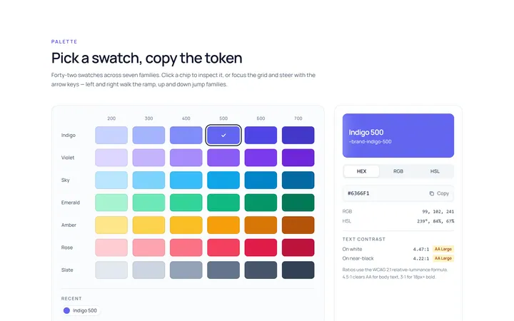
Colour Swatch Picker
Originalswatch colour picker
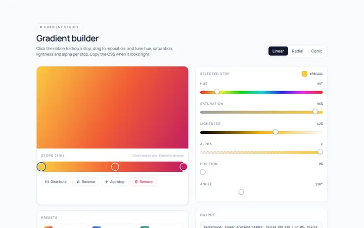
Colour Gradient Picker
Originalgradient builder picker
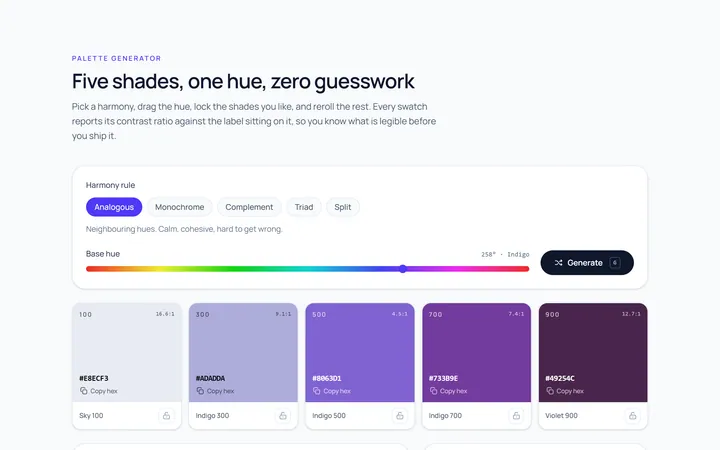
Colour Palette
Originalpalette generator with copy
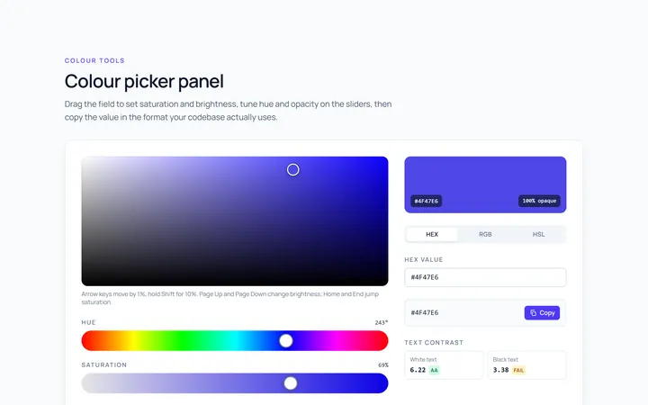
Colour Picker Panel
Originalfull colour picker panel with sliders
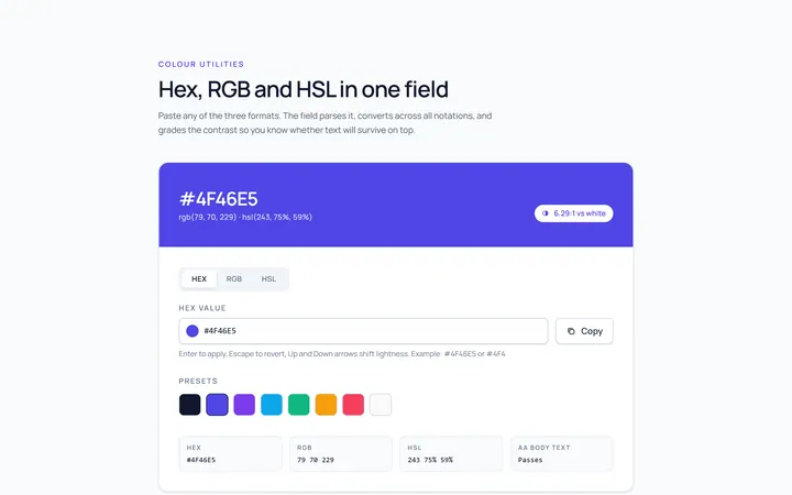
Colour Hex Input
Originalhex/rgb input with preview
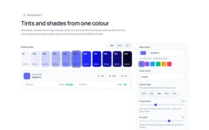
Colour Shades
Originalshade and tint scale generator
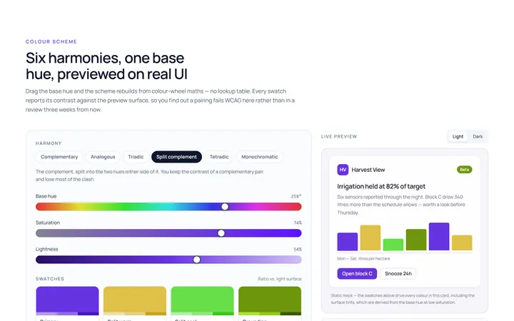
Colour Scheme
Originalcolour scheme preview swatches

Spotlight Hero
OriginalA centred hero with a soft radial spotlight, badge and dual call-to-action.

Split Hero
OriginalA two-column hero pairing a headline and CTAs with a product mock and social proof.

Gradient Spotlight Hero
OriginalA minimal centred hero with a soft gradient-mesh backdrop, announcement pill and dual call-to-action buttons.

App Preview Hero
OriginalA centred hero that pairs headline copy with a realistic product dashboard mock built entirely from markup, complete with browser chrome and a floating notification card.

Waitlist Capture Hero
OriginalA dark, focused hero with an inline email capture form and avatar social proof, ready for pre-launch waitlists.