

Accordion Vertical Gallery
Original · freeVertical stacked image panels where the active one expands to show its photo and caption.
Copy prompt gives Claude Code, Cursor or v0 a ready-to-paste prompt that recreates this exact component.
npx shadcn@latest add https://webinnoventix.com/r/gallery-accordion-vertical.json"use client";
import { useState, useRef, useCallback } from "react";
import {
motion,
AnimatePresence,
useInView,
type Variants,
} from "motion/react";
type Panel = {
src: string;
alt: string;
title: string;
category: string;
place: string;
year: string;
caption: string;
};
const PANELS: Panel[] = [
{
src: "/img/gallery/g04.webp",
alt: "Fog rolling between dark evergreen ridgelines at first light",
title: "Timberline at Dawn",
category: "Landscape",
place: "Cascade Range, Oregon",
year: "2024",
caption:
"Shot at 5:41 a.m. as the valley inversion burned off. The cold air held the fog just below the ridge, so the tree line looked like it was floating on a sea of cloud.",
},
{
src: "/img/gallery/g11.webp",
alt: "Neon signage reflected in wet pavement on a narrow city lane",
title: "After the Rain, Nakameguro",
category: "Street",
place: "Tokyo, Japan",
year: "2023",
caption:
"A ten-minute downpour turned the whole alley into a mirror. I waited for a single cyclist to cut through the reflection and pressed once.",
},
{
src: "/img/gallery/g19.webp",
alt: "Sunlit interior courtyard with a spiral staircase and warm terracotta walls",
title: "The Spiral, Casa Fontana",
category: "Architecture",
place: "Seville, Spain",
year: "2024",
caption:
"Midday light does something remarkable to terracotta. The staircase becomes a sundial, and every hour the shadow lands on a different step.",
},
{
src: "/img/gallery/g07.webp",
alt: "Close portrait of a weathered fisherman mending a net by the harbour",
title: "Anders, Harbour Mender",
category: "Portrait",
place: "Lofoten, Norway",
year: "2022",
caption:
"He mended nets for forty-one winters. We spoke for an hour before he let me raise the camera, and the trust is the only reason this frame exists.",
},
{
src: "/img/gallery/g23.webp",
alt: "Wind-carved orange sand dunes under a deep cobalt sky",
title: "Dune 45, Long Shadow",
category: "Landscape",
place: "Sossusvlei, Namibia",
year: "2023",
caption:
"Climbing the ridgeline in the dark to reach the crest before sunrise. The wind resets these edges every night, so no two mornings look the same.",
},
{
src: "/img/gallery/g30.webp",
alt: "Steam rising from a ceramic bowl in a minimalist kitchen with morning light",
title: "First Pour",
category: "Still Life",
place: "Studio, Copenhagen",
year: "2025",
caption:
"A single window, a black backdrop, and the steam doing all the work. Natural light only, no diffusion; the contrast is the whole point.",
},
{
src: "/img/gallery/g15.webp",
alt: "Long-exposure river of car light trails winding through a mountain pass at dusk",
title: "Pass Road, Blue Hour",
category: "Long Exposure",
place: "Dolomites, Italy",
year: "2024",
caption:
"Thirty-second exposure stacked four times to fill the switchbacks with light. The blue hour gives you maybe eleven usable minutes.",
},
{
src: "/img/gallery/g28.webp",
alt: "Two figures walking a vast salt flat that mirrors the pastel sky perfectly",
title: "Mirror Season",
category: "Landscape",
place: "Salar de Uyuni, Bolivia",
year: "2023",
caption:
"A thin film of water over the salt turns the ground into a perfect mirror. We walked out a kilometre to lose every horizon line.",
},
];
const PREFIX = "gav";
const captionVariants: Variants = {
hidden: { opacity: 0, y: 14 },
show: (i: number) => ({
opacity: 1,
y: 0,
transition: { delay: 0.12 + i * 0.06, duration: 0.45, ease: [0.22, 1, 0.36, 1] },
}),
};
export default function GalleryAccordionVertical() {
const [active, setActive] = useState<number>(0);
const sectionRef = useRef<HTMLDivElement>(null);
const tabRefs = useRef<(HTMLButtonElement | null)[]>([]);
const inView = useInView(sectionRef, { once: true, margin: "-80px" });
const onKeyNav = useCallback(
(e: React.KeyboardEvent, index: number) => {
let next: number | null = null;
if (e.key === "ArrowDown" || e.key === "ArrowRight") {
next = Math.min(PANELS.length - 1, index + 1);
} else if (e.key === "ArrowUp" || e.key === "ArrowLeft") {
next = Math.max(0, index - 1);
} else if (e.key === "Home") {
next = 0;
} else if (e.key === "End") {
next = PANELS.length - 1;
}
if (next !== null) {
e.preventDefault();
setActive(next);
tabRefs.current[next]?.focus();
}
},
[]
);
return (
<section className="relative w-full overflow-hidden bg-gradient-to-b from-white via-slate-50 to-slate-100 py-20 dark:from-neutral-950 dark:via-neutral-950 dark:to-black sm:py-28">
<style>{`
@keyframes ${PREFIX}-rise {
from { opacity: 0; transform: translateY(28px); }
to { opacity: 1; transform: translateY(0); }
}
@keyframes ${PREFIX}-glow {
0%, 100% { opacity: 0.35; }
50% { opacity: 0.7; }
}
.${PREFIX}-head { animation: ${PREFIX}-rise 0.7s cubic-bezier(0.22,1,0.36,1) both; }
.${PREFIX}-orb { animation: ${PREFIX}-glow 7s ease-in-out infinite; }
@media (prefers-reduced-motion: reduce) {
.${PREFIX}-head, .${PREFIX}-orb { animation: none !important; }
}
`}</style>
{/* ambient background accents */}
<div
aria-hidden
className={`${PREFIX}-orb pointer-events-none absolute -left-24 top-24 h-72 w-72 rounded-full bg-indigo-400/20 blur-3xl dark:bg-indigo-600/20`}
/>
<div
aria-hidden
className={`${PREFIX}-orb pointer-events-none absolute -right-16 bottom-16 h-80 w-80 rounded-full bg-violet-400/20 blur-3xl dark:bg-violet-700/20`}
style={{ animationDelay: "1.4s" }}
/>
<div className="relative mx-auto w-full max-w-6xl px-5 sm:px-8">
{/* header */}
<div className={`${PREFIX}-head mb-10 max-w-2xl sm:mb-14`}>
<div className="mb-4 inline-flex items-center gap-2 rounded-full border border-slate-200 bg-white/70 px-3.5 py-1.5 text-xs font-medium uppercase tracking-[0.18em] text-indigo-600 backdrop-blur dark:border-neutral-800 dark:bg-neutral-900/70 dark:text-indigo-300">
<span className="h-1.5 w-1.5 rounded-full bg-indigo-500 dark:bg-indigo-400" />
Field Notes
</div>
<h2 className="text-3xl font-semibold tracking-tight text-slate-900 dark:text-white sm:text-4xl md:text-5xl">
Eight frames, eight mornings
</h2>
<p className="mt-4 text-base leading-relaxed text-slate-600 dark:text-neutral-400 sm:text-lg">
A vertical field journal. Open a panel to expand the photograph and read
the note behind the shot. Use the arrow keys to move between frames.
</p>
</div>
{/* accordion */}
<div
ref={sectionRef}
role="tablist"
aria-label="Photograph gallery"
aria-orientation="vertical"
className="flex flex-col gap-2.5"
>
{PANELS.map((panel, i) => {
const isActive = i === active;
return (
<motion.div
key={panel.src}
role="presentation"
initial={{ opacity: 0, y: 20 }}
animate={inView ? { opacity: 1, y: 0 } : {}}
transition={{
delay: 0.15 + i * 0.05,
duration: 0.5,
ease: [0.22, 1, 0.36, 1],
}}
className={`group relative overflow-hidden rounded-2xl border transition-colors duration-500 ${
isActive
? "border-indigo-300 bg-white shadow-xl shadow-indigo-500/10 dark:border-indigo-500/40 dark:bg-neutral-900 dark:shadow-black/40"
: "border-slate-200 bg-white/60 hover:border-slate-300 dark:border-neutral-800 dark:bg-neutral-900/50 dark:hover:border-neutral-700"
}`}
>
<button
type="button"
role="tab"
ref={(el) => {
tabRefs.current[i] = el;
}}
id={`${PREFIX}-tab-${i}`}
aria-selected={isActive}
aria-expanded={isActive}
aria-controls={`${PREFIX}-panel-${i}`}
tabIndex={isActive ? 0 : -1}
onClick={() => setActive(i)}
onKeyDown={(e) => onKeyNav(e, i)}
className="flex w-full items-center gap-4 px-4 py-4 text-left focus:outline-none focus-visible:ring-2 focus-visible:ring-indigo-500 focus-visible:ring-offset-2 focus-visible:ring-offset-white dark:focus-visible:ring-offset-neutral-900 sm:px-6 sm:py-5"
>
{/* index / thumb */}
<div className="relative flex h-12 w-12 shrink-0 items-center justify-center overflow-hidden rounded-xl sm:h-14 sm:w-14">
{/* eslint-disable-next-line @next/next/no-img-element */}
<img
src={panel.src}
alt=""
loading="lazy"
draggable={false}
className={`absolute inset-0 h-full w-full object-cover transition-all duration-500 ${
isActive
? "scale-100 opacity-100"
: "scale-110 opacity-70 grayscale group-hover:opacity-90 group-hover:grayscale-0"
}`}
/>
<span className="absolute inset-0 ring-1 ring-inset ring-black/10 dark:ring-white/10" />
</div>
<div className="min-w-0 flex-1">
<div className="flex items-center gap-2">
<span
className={`text-[11px] font-semibold uppercase tracking-[0.16em] transition-colors ${
isActive
? "text-indigo-600 dark:text-indigo-300"
: "text-slate-400 dark:text-neutral-500"
}`}
>
{panel.category}
</span>
<span className="text-[11px] tabular-nums text-slate-400 dark:text-neutral-600">
· {panel.year}
</span>
</div>
<h3
className={`mt-0.5 truncate text-lg font-medium tracking-tight transition-colors sm:text-xl ${
isActive
? "text-slate-900 dark:text-white"
: "text-slate-700 dark:text-neutral-300"
}`}
>
{panel.title}
</h3>
</div>
{/* chevron */}
<span
aria-hidden
className={`flex h-8 w-8 shrink-0 items-center justify-center rounded-full border transition-all duration-500 ${
isActive
? "rotate-180 border-indigo-300 bg-indigo-50 text-indigo-600 dark:border-indigo-500/40 dark:bg-indigo-500/15 dark:text-indigo-300"
: "border-slate-200 bg-transparent text-slate-400 dark:border-neutral-700 dark:text-neutral-500"
}`}
>
<svg
width="16"
height="16"
viewBox="0 0 24 24"
fill="none"
stroke="currentColor"
strokeWidth="2.2"
strokeLinecap="round"
strokeLinejoin="round"
>
<path d="m6 9 6 6 6-6" />
</svg>
</span>
</button>
{/* expanding body */}
<AnimatePresence initial={false}>
{isActive && (
<motion.div
key="body"
id={`${PREFIX}-panel-${i}`}
role="tabpanel"
aria-labelledby={`${PREFIX}-tab-${i}`}
initial={{ height: 0, opacity: 0 }}
animate={{ height: "auto", opacity: 1 }}
exit={{ height: 0, opacity: 0 }}
transition={{ duration: 0.5, ease: [0.22, 1, 0.36, 1] }}
className="overflow-hidden"
>
<div className="grid gap-5 px-4 pb-5 sm:grid-cols-[1.4fr_1fr] sm:gap-6 sm:px-6 sm:pb-6">
{/* photo */}
<div className="relative overflow-hidden rounded-xl bg-slate-100 dark:bg-neutral-800">
{/* eslint-disable-next-line @next/next/no-img-element */}
<img
src={panel.src}
alt={panel.alt}
loading="lazy"
draggable={false}
className="h-full max-h-[420px] w-full object-cover"
/>
<div className="pointer-events-none absolute inset-0 bg-gradient-to-t from-black/30 via-transparent to-transparent" />
<div className="pointer-events-none absolute inset-0 ring-1 ring-inset ring-black/10 dark:ring-white/10" />
</div>
{/* caption block */}
<div className="flex flex-col justify-center">
<motion.p
custom={0}
variants={captionVariants}
initial="hidden"
animate="show"
className="text-base leading-relaxed text-slate-700 dark:text-neutral-300"
>
{panel.caption}
</motion.p>
<motion.dl
custom={1}
variants={captionVariants}
initial="hidden"
animate="show"
className="mt-5 grid grid-cols-2 gap-4 border-t border-slate-200 pt-5 dark:border-neutral-800"
>
<div>
<dt className="text-[11px] font-semibold uppercase tracking-[0.16em] text-slate-400 dark:text-neutral-500">
Location
</dt>
<dd className="mt-1 text-sm font-medium text-slate-800 dark:text-neutral-200">
{panel.place}
</dd>
</div>
<div>
<dt className="text-[11px] font-semibold uppercase tracking-[0.16em] text-slate-400 dark:text-neutral-500">
Captured
</dt>
<dd className="mt-1 text-sm font-medium text-slate-800 dark:text-neutral-200">
{panel.year}
</dd>
</div>
</motion.dl>
<motion.div
custom={2}
variants={captionVariants}
initial="hidden"
animate="show"
className="mt-5"
>
<span className="inline-flex items-center gap-2 rounded-full bg-indigo-50 px-3 py-1.5 text-xs font-medium text-indigo-700 dark:bg-indigo-500/15 dark:text-indigo-300">
<span className="h-1.5 w-1.5 rounded-full bg-indigo-500 dark:bg-indigo-400" />
Frame {String(i + 1).padStart(2, "0")} of{" "}
{String(PANELS.length).padStart(2, "0")}
</span>
</motion.div>
</div>
</div>
</motion.div>
)}
</AnimatePresence>
{/* active accent bar */}
<span
aria-hidden
className={`pointer-events-none absolute left-0 top-0 h-full w-1 origin-top bg-gradient-to-b from-indigo-500 to-violet-500 transition-transform duration-500 ${
isActive ? "scale-y-100" : "scale-y-0"
}`}
/>
</motion.div>
);
})}
</div>
{/* footer hint */}
<p className="mt-8 text-center text-xs text-slate-400 dark:text-neutral-600">
{PANELS.length} photographs · shot on location · ↑ ↓ to browse
</p>
</div>
</section>
);
}Dependencies
Licence
Built by Web Innoventix. Free for personal and commercial use, no attribution required.
Built by Web Innoventix
Need a custom interface, a full website, or SEO that gets you cited by AI? We design, build and rank it end to end.
Get a free quoteSimilar components
Browse all →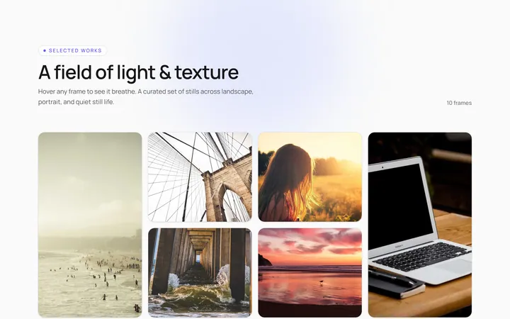
Hover Caption Gallery
OriginalA responsive image grid where each tile subtly zooms and reveals a caption bar on hover.
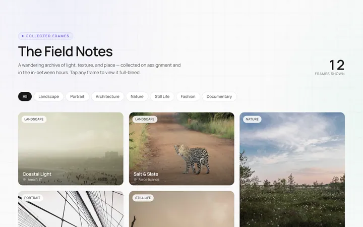
Masonry Gallery
OriginalA Pinterest-style masonry gallery using CSS columns with varied-height images; tiles lift and brighten on hover.
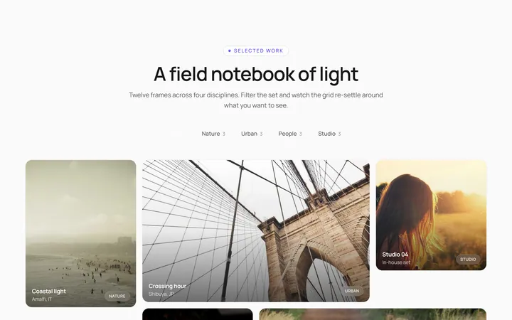
Filterable Gallery
OriginalA filterable gallery with category tabs; clicking a tab animates the grid to show only that category.
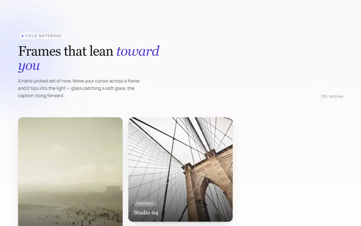
Tilt Cards Gallery
OriginalA grid of image cards that tilt in 3D toward the cursor on hover, with a soft glare.
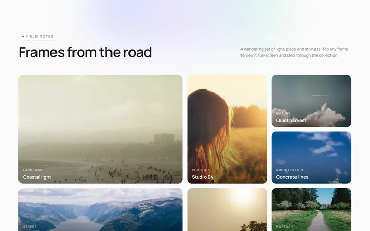
Lightbox Gallery
OriginalA thumbnail grid where clicking a thumb opens a full-screen lightbox with prev/next arrows and keyboard support.
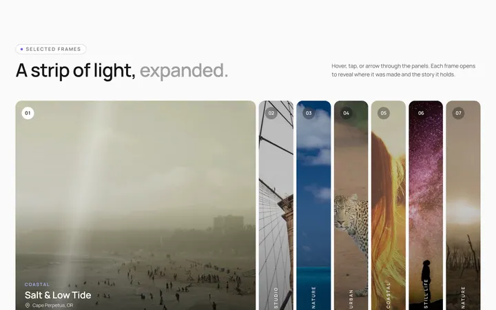
Expanding Strip Gallery
OriginalA horizontal strip of image panels; hovering a panel expands it and shrinks the others to reveal its caption.
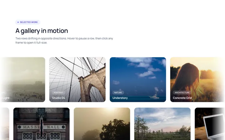
Marquee Gallery
OriginalTwo rows of images auto-scrolling in opposite directions, pausing on hover, with edge fade masks.
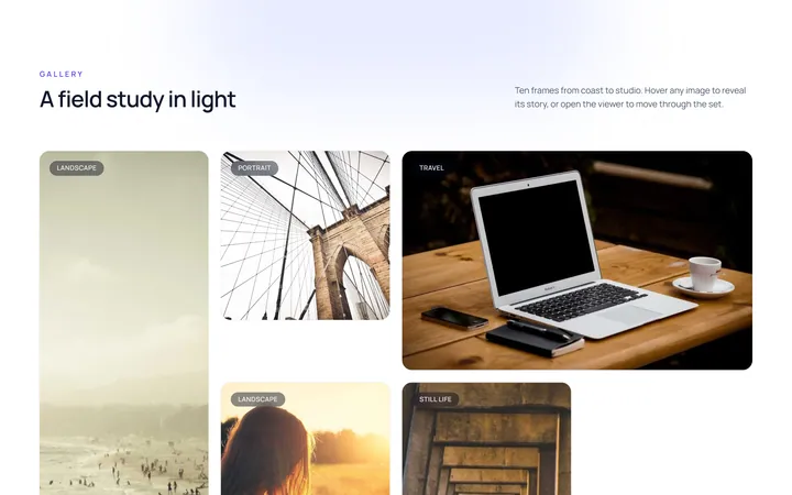
Hover Zoom Overlay Gallery
OriginalA grid where each image scales up under a dark gradient overlay revealing a title and a view button on hover.
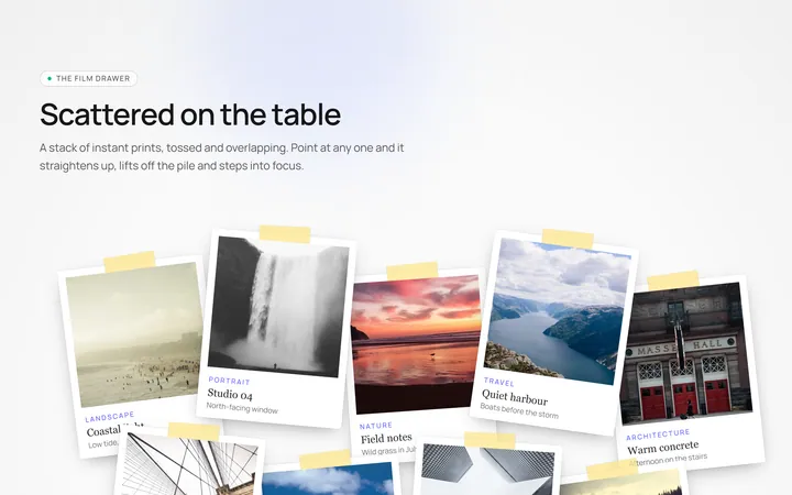
Polaroid Stack Gallery
OriginalA scattered stack of slightly-rotated polaroid photos that straighten and lift on hover.
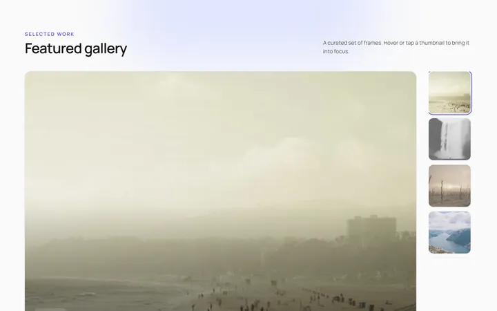
Featured Thumbs Gallery
OriginalA large featured image with a thumbnail row; selecting a thumbnail swaps the featured image with a crossfade.
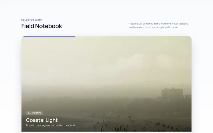
Carousel Gallery
OriginalAn image carousel with arrows and dots, smooth slide transitions and autoplay that pauses on hover.
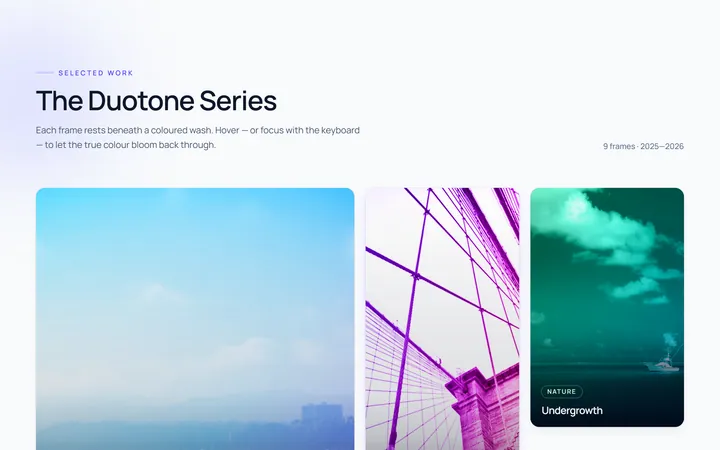
Duotone Hover Gallery
OriginalA grid where images sit under a coloured duotone wash that clears to full colour on hover.