

Fade Grid Gallery
Original · freeA clean image grid whose tiles fade and rise in, staggered, on scroll.
Copy prompt gives Claude Code, Cursor or v0 a ready-to-paste prompt that recreates this exact component.
npx shadcn@latest add https://webinnoventix.com/r/gallery-fade-grid.json"use client";
import { useCallback, useEffect, useRef, useState } from "react";
import {
AnimatePresence,
motion,
useReducedMotion,
type Variants,
} from "motion/react";
type Photo = {
id: string;
src: string;
title: string;
category: string;
alt: string;
/** Feature tiles span a 2x2 block on larger screens. */
feature?: boolean;
};
const PHOTOS: Photo[] = [
{
id: "g01",
src: "/img/gallery/g01.webp",
title: "Morning Fog, Cascade Ridge",
category: "Landscape",
alt: "Layered pine ridgelines dissolving into low morning fog at first light.",
feature: true,
},
{
id: "g02",
src: "/img/gallery/g02.webp",
title: "The Weaver's Hands",
category: "Portrait",
alt: "Close portrait of an elderly weaver's hands drawing red thread across a loom.",
},
{
id: "g03",
src: "/img/gallery/g03.webp",
title: "Saffron Market, Old Town",
category: "Street",
alt: "A crowded morning spice market lit by warm saffron and amber tones.",
},
{
id: "g04",
src: "/img/gallery/g04.webp",
title: "Tidal Flats at Dawn",
category: "Landscape",
alt: "Mirror-smooth tidal flats reflecting a pale pink dawn sky.",
},
{
id: "g05",
src: "/img/gallery/g05.webp",
title: "Studio Still Life No. 4",
category: "Still Life",
alt: "A minimal studio still life of glass vessels casting long shadows.",
},
{
id: "g06",
src: "/img/gallery/g06.webp",
title: "Neon After Rain",
category: "Street",
alt: "A rain-slick city street reflecting violet and indigo neon signage at night.",
},
{
id: "g07",
src: "/img/gallery/g07.webp",
title: "Grandmother's Kitchen",
category: "Portrait",
alt: "A grandmother laughing in a sunlit kitchen doorway, flour on her apron.",
},
{
id: "g08",
src: "/img/gallery/g08.webp",
title: "Dunes, Hour of Blue",
category: "Landscape",
alt: "Wind-carved desert dunes under deep blue twilight before sunrise.",
feature: true,
},
{
id: "g09",
src: "/img/gallery/g09.webp",
title: "Ceramic & Shadow",
category: "Still Life",
alt: "A single hand-thrown ceramic bowl casting a crisp shadow on linen.",
},
{
id: "g10",
src: "/img/gallery/g10.webp",
title: "Rooftop Sabha",
category: "Portrait",
alt: "Friends gathered on a rooftop at golden hour, city skyline behind them.",
},
{
id: "g11",
src: "/img/gallery/g11.webp",
title: "Terraced Fields, Monsoon",
category: "Landscape",
alt: "Emerald monsoon-green rice terraces stepping down a misted hillside.",
},
{
id: "g12",
src: "/img/gallery/g12.webp",
title: "The Last Ferry",
category: "Street",
alt: "A lone commuter boarding the last evening ferry across still water.",
},
];
const tileVariants: Variants = {
hidden: (custom: { y: number }) => ({ opacity: 0, y: custom.y }),
visible: (custom: { delay: number }) => ({
opacity: 1,
y: 0,
transition: {
duration: 0.65,
delay: custom.delay,
ease: [0.22, 1, 0.36, 1],
},
}),
};
export default function GalleryFadeGrid() {
const reduce = useReducedMotion();
const [openIndex, setOpenIndex] = useState<number | null>(null);
const triggerRefs = useRef<Array<HTMLButtonElement | null>>([]);
const lastFocused = useRef<HTMLButtonElement | null>(null);
const closeRef = useRef<HTMLButtonElement | null>(null);
const open = useCallback((index: number) => {
lastFocused.current = triggerRefs.current[index] ?? null;
setOpenIndex(index);
}, []);
const close = useCallback(() => {
setOpenIndex(null);
lastFocused.current?.focus();
}, []);
const step = useCallback((dir: 1 | -1) => {
setOpenIndex((prev) => {
if (prev === null) return prev;
return (prev + dir + PHOTOS.length) % PHOTOS.length;
});
}, []);
useEffect(() => {
if (openIndex === null) return;
const onKey = (e: KeyboardEvent) => {
if (e.key === "Escape") {
e.preventDefault();
close();
} else if (e.key === "ArrowRight") {
e.preventDefault();
step(1);
} else if (e.key === "ArrowLeft") {
e.preventDefault();
step(-1);
}
};
window.addEventListener("keydown", onKey);
const raf = requestAnimationFrame(() => closeRef.current?.focus());
document.body.style.overflow = "hidden";
return () => {
window.removeEventListener("keydown", onKey);
cancelAnimationFrame(raf);
document.body.style.overflow = "";
};
}, [openIndex, close, step]);
const active = openIndex === null ? null : PHOTOS[openIndex];
return (
<section
aria-labelledby="gfg-heading"
className="relative w-full overflow-hidden bg-white px-5 py-20 text-neutral-900 sm:px-8 sm:py-28 dark:bg-neutral-950 dark:text-neutral-100"
>
<style>{`
@keyframes gfg-drift {
0%, 100% { background-position: 0% 50%; }
50% { background-position: 100% 50%; }
}
@keyframes gfg-pulse {
0%, 100% { transform: scale(1); opacity: 1; }
50% { transform: scale(1.6); opacity: 0.35; }
}
.gfg-badge-glow {
background-size: 220% 220%;
animation: gfg-drift 9s ease-in-out infinite;
}
.gfg-dot { animation: gfg-pulse 2.6s ease-in-out infinite; }
@media (prefers-reduced-motion: reduce) {
.gfg-badge-glow, .gfg-dot { animation: none; }
}
`}</style>
{/* ambient background wash */}
<div
aria-hidden
className="pointer-events-none absolute inset-0 -z-10 opacity-70 dark:opacity-100"
>
<div className="absolute -left-24 top-0 h-72 w-72 rounded-full bg-indigo-200/40 blur-3xl dark:bg-indigo-500/10" />
<div className="absolute -right-16 bottom-10 h-80 w-80 rounded-full bg-violet-200/40 blur-3xl dark:bg-violet-500/10" />
</div>
<div className="mx-auto max-w-6xl">
{/* header */}
<div className="mx-auto max-w-2xl text-center">
<span className="gfg-badge-glow inline-flex items-center gap-2 rounded-full bg-gradient-to-r from-indigo-100 via-violet-100 to-indigo-100 px-3.5 py-1.5 text-xs font-medium tracking-wide text-indigo-700 ring-1 ring-inset ring-indigo-200/80 dark:from-indigo-500/10 dark:via-violet-500/10 dark:to-indigo-500/10 dark:text-indigo-300 dark:ring-indigo-400/20">
<span className="gfg-dot h-1.5 w-1.5 rounded-full bg-indigo-500 dark:bg-indigo-400" />
Fieldwork — a travelling collection
</span>
<h2
id="gfg-heading"
className="mt-5 text-balance text-3xl font-semibold tracking-tight sm:text-4xl md:text-5xl"
>
Twelve frames from the road
</h2>
<p className="mx-auto mt-4 max-w-xl text-pretty text-base leading-relaxed text-neutral-600 dark:text-neutral-400">
Portraits, landscapes and quiet still lifes, gathered across a year
of slow travel. Select any frame to view it full-size.
</p>
</div>
{/* grid */}
<ul
className="mt-14 grid list-none grid-flow-dense auto-rows-[8.5rem] grid-cols-2 gap-3 sm:auto-rows-[10rem] sm:grid-cols-3 sm:gap-4 lg:auto-rows-[11.5rem] lg:grid-cols-4"
>
{PHOTOS.map((photo, i) => (
<motion.li
key={photo.id}
variants={tileVariants}
custom={{ y: reduce ? 0 : 26, delay: (i % 4) * 0.08 }}
initial="hidden"
whileInView="visible"
viewport={{ once: true, amount: 0.35, margin: "0px 0px -60px 0px" }}
className={
photo.feature
? "col-span-2 row-span-2"
: "col-span-1 row-span-1"
}
>
<button
type="button"
ref={(el) => {
triggerRefs.current[i] = el;
}}
onClick={() => open(i)}
aria-label={`View “${photo.title}” — ${photo.category}`}
className="group relative block h-full w-full overflow-hidden rounded-2xl bg-neutral-100 ring-1 ring-inset ring-neutral-900/5 transition-shadow duration-300 hover:shadow-xl hover:shadow-neutral-900/10 focus:outline-none focus-visible:ring-2 focus-visible:ring-indigo-500 focus-visible:ring-offset-2 focus-visible:ring-offset-white dark:bg-neutral-900 dark:ring-white/10 dark:hover:shadow-black/40 dark:focus-visible:ring-offset-neutral-950"
>
{/* eslint-disable-next-line @next/next/no-img-element */}
<img
src={photo.src}
alt={photo.alt}
loading="lazy"
draggable={false}
className="h-full w-full object-cover transition-transform duration-[600ms] ease-out will-change-transform group-hover:scale-[1.06]"
/>
{/* caption overlay */}
<div className="pointer-events-none absolute inset-0 flex flex-col justify-end bg-gradient-to-t from-black/70 via-black/10 to-transparent p-3 opacity-0 transition-opacity duration-300 group-hover:opacity-100 group-focus-visible:opacity-100 sm:p-4">
<span className="text-[0.65rem] font-semibold uppercase tracking-widest text-indigo-200">
{photo.category}
</span>
<span className="mt-0.5 text-sm font-medium leading-snug text-white sm:text-base">
{photo.title}
</span>
</div>
</button>
</motion.li>
))}
</ul>
</div>
{/* lightbox */}
<AnimatePresence>
{active && (
<motion.div
key="gfg-lightbox"
role="dialog"
aria-modal="true"
aria-label={`${active.title} — ${active.category}`}
className="fixed inset-0 z-50 flex items-center justify-center p-4 sm:p-8"
initial={{ opacity: 0 }}
animate={{ opacity: 1 }}
exit={{ opacity: 0 }}
transition={{ duration: 0.25 }}
>
<button
type="button"
aria-label="Close gallery viewer"
onClick={close}
className="absolute inset-0 -z-10 cursor-default bg-neutral-950/80 backdrop-blur-md"
/>
<motion.figure
className="relative flex max-h-full w-full max-w-4xl flex-col overflow-hidden rounded-2xl bg-white shadow-2xl ring-1 ring-white/10 dark:bg-neutral-900"
initial={{ opacity: 0, scale: reduce ? 1 : 0.94, y: reduce ? 0 : 12 }}
animate={{ opacity: 1, scale: 1, y: 0 }}
exit={{ opacity: 0, scale: reduce ? 1 : 0.96, y: reduce ? 0 : 8 }}
transition={{ duration: 0.3, ease: [0.22, 1, 0.36, 1] }}
>
<div className="relative flex min-h-0 flex-1 items-center justify-center bg-neutral-100 dark:bg-neutral-950">
{/* eslint-disable-next-line @next/next/no-img-element */}
<img
src={active.src}
alt={active.alt}
loading="lazy"
draggable={false}
className="max-h-[70vh] w-full object-contain"
/>
<button
type="button"
aria-label="Previous photo"
onClick={() => step(-1)}
className="absolute left-2 top-1/2 flex h-10 w-10 -translate-y-1/2 items-center justify-center rounded-full bg-white/85 text-neutral-800 shadow-md ring-1 ring-black/5 transition hover:bg-white focus:outline-none focus-visible:ring-2 focus-visible:ring-indigo-500 sm:left-3 dark:bg-neutral-800/85 dark:text-neutral-100 dark:hover:bg-neutral-800"
>
<svg viewBox="0 0 24 24" className="h-5 w-5" fill="none" stroke="currentColor" strokeWidth={2} aria-hidden>
<path d="M15 6l-6 6 6 6" strokeLinecap="round" strokeLinejoin="round" />
</svg>
</button>
<button
type="button"
aria-label="Next photo"
onClick={() => step(1)}
className="absolute right-2 top-1/2 flex h-10 w-10 -translate-y-1/2 items-center justify-center rounded-full bg-white/85 text-neutral-800 shadow-md ring-1 ring-black/5 transition hover:bg-white focus:outline-none focus-visible:ring-2 focus-visible:ring-indigo-500 sm:right-3 dark:bg-neutral-800/85 dark:text-neutral-100 dark:hover:bg-neutral-800"
>
<svg viewBox="0 0 24 24" className="h-5 w-5" fill="none" stroke="currentColor" strokeWidth={2} aria-hidden>
<path d="M9 6l6 6-6 6" strokeLinecap="round" strokeLinejoin="round" />
</svg>
</button>
<button
type="button"
ref={closeRef}
aria-label="Close gallery viewer"
onClick={close}
className="absolute right-2 top-2 flex h-9 w-9 items-center justify-center rounded-full bg-white/85 text-neutral-800 shadow-md ring-1 ring-black/5 transition hover:bg-white focus:outline-none focus-visible:ring-2 focus-visible:ring-indigo-500 sm:right-3 sm:top-3 dark:bg-neutral-800/85 dark:text-neutral-100 dark:hover:bg-neutral-800"
>
<svg viewBox="0 0 24 24" className="h-5 w-5" fill="none" stroke="currentColor" strokeWidth={2} aria-hidden>
<path d="M6 6l12 12M18 6L6 18" strokeLinecap="round" />
</svg>
</button>
</div>
<figcaption className="flex items-center justify-between gap-4 border-t border-neutral-200 px-5 py-4 dark:border-white/10">
<div className="min-w-0">
<p className="text-[0.65rem] font-semibold uppercase tracking-widest text-indigo-600 dark:text-indigo-400">
{active.category}
</p>
<p className="truncate text-sm font-medium text-neutral-900 sm:text-base dark:text-neutral-100">
{active.title}
</p>
</div>
<span className="shrink-0 text-xs tabular-nums text-neutral-500 dark:text-neutral-400">
{(openIndex ?? 0) + 1} / {PHOTOS.length}
</span>
</figcaption>
</motion.figure>
</motion.div>
)}
</AnimatePresence>
</section>
);
}Dependencies
Licence
Built by Web Innoventix. Free for personal and commercial use, no attribution required.
Built by Web Innoventix
Need a custom interface, a full website, or SEO that gets you cited by AI? We design, build and rank it end to end.
Get a free quoteSimilar components
Browse all →
Hover Caption Gallery
OriginalA responsive image grid where each tile subtly zooms and reveals a caption bar on hover.
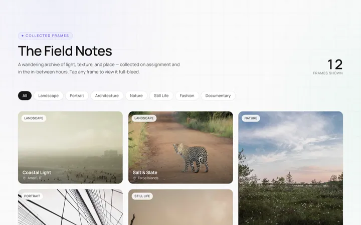
Masonry Gallery
OriginalA Pinterest-style masonry gallery using CSS columns with varied-height images; tiles lift and brighten on hover.

Filterable Gallery
OriginalA filterable gallery with category tabs; clicking a tab animates the grid to show only that category.
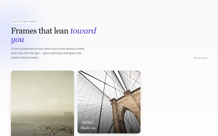
Tilt Cards Gallery
OriginalA grid of image cards that tilt in 3D toward the cursor on hover, with a soft glare.
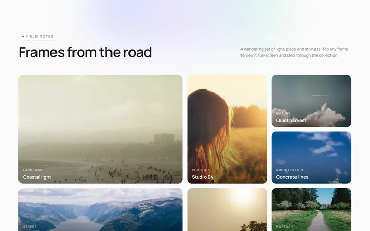
Lightbox Gallery
OriginalA thumbnail grid where clicking a thumb opens a full-screen lightbox with prev/next arrows and keyboard support.
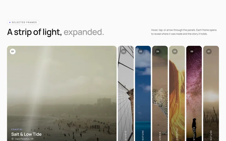
Expanding Strip Gallery
OriginalA horizontal strip of image panels; hovering a panel expands it and shrinks the others to reveal its caption.
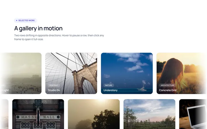
Marquee Gallery
OriginalTwo rows of images auto-scrolling in opposite directions, pausing on hover, with edge fade masks.
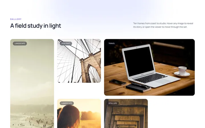
Hover Zoom Overlay Gallery
OriginalA grid where each image scales up under a dark gradient overlay revealing a title and a view button on hover.
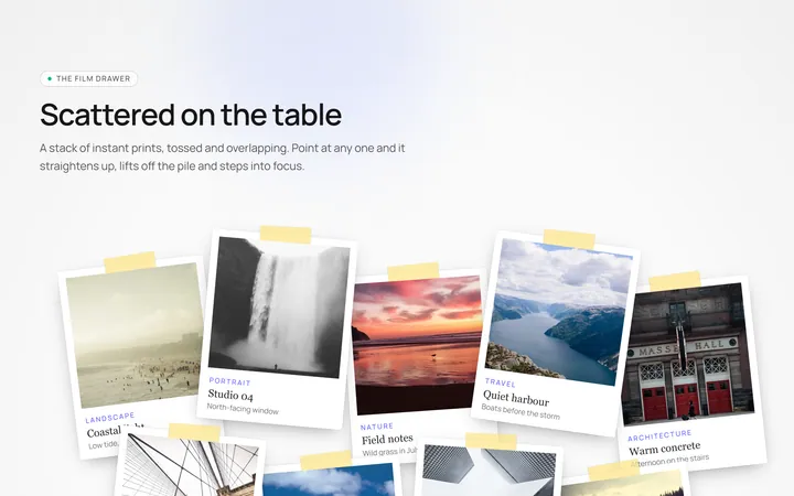
Polaroid Stack Gallery
OriginalA scattered stack of slightly-rotated polaroid photos that straighten and lift on hover.
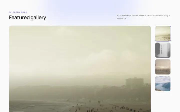
Featured Thumbs Gallery
OriginalA large featured image with a thumbnail row; selecting a thumbnail swaps the featured image with a crossfade.
Carousel Gallery
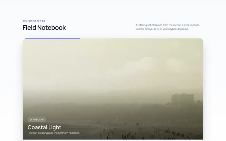
OriginalAn image carousel with arrows and dots, smooth slide transitions and autoplay that pauses on hover.
Duotone Hover Gallery
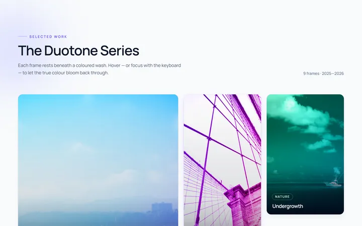
OriginalA grid where images sit under a coloured duotone wash that clears to full colour on hover.