

Hero Zoom Gallery
Original · freeA featured hero image that zooms on scroll and transitions into a thumbnail grid.
Copy prompt gives Claude Code, Cursor or v0 a ready-to-paste prompt that recreates this exact component.
npx shadcn@latest add https://webinnoventix.com/r/gallery-hero-zoom.json"use client";
import { useRef, useState, useCallback, useEffect } from "react";
import {
motion,
useScroll,
useTransform,
AnimatePresence,
type MotionValue,
} from "motion/react";
type Shape = "portrait" | "landscape" | "square";
interface Photo {
src: string;
alt: string;
title: string;
category: string;
location: string;
shape: Shape;
}
const HERO: Photo = {
src: "/img/gallery/g07.webp",
alt: "Dawn light spilling across a fog-filled alpine valley",
title: "First Light, Untethered",
category: "Landscape",
location: "Dolomites, Italy",
shape: "landscape",
};
const THUMBS: Photo[] = [
{
src: "/img/gallery/g12.webp",
alt: "A lone hiker crossing a wooden bridge above a granite gorge",
title: "The Long Way Down",
category: "Adventure",
location: "Verzasca, Switzerland",
shape: "portrait",
},
{
src: "/img/gallery/g03.webp",
alt: "Sunlit dunes rippling into deep shadow at golden hour",
title: "Wind Made Visible",
category: "Desert",
location: "Sossusvlei, Namibia",
shape: "square",
},
{
src: "/img/gallery/g21.webp",
alt: "Turquoise glacial lake framed by dark pine forest",
title: "Meltwater Blue",
category: "Landscape",
location: "Banff, Canada",
shape: "landscape",
},
{
src: "/img/gallery/g18.webp",
alt: "Weathered fisherman mending nets on a stone quay",
title: "Hands That Remember",
category: "Portrait",
location: "Essaouira, Morocco",
shape: "portrait",
},
{
src: "/img/gallery/g29.webp",
alt: "City skyline reflected in rain-slicked pavement at dusk",
title: "After the Rain",
category: "Urban",
location: "Osaka, Japan",
shape: "square",
},
{
src: "/img/gallery/g05.webp",
alt: "Terraced rice fields stepping down a misted hillside",
title: "Green Staircase",
category: "Landscape",
location: "Bali, Indonesia",
shape: "landscape",
},
{
src: "/img/gallery/g24.webp",
alt: "Northern lights arcing over a snow-covered cabin",
title: "Cold Cathedral",
category: "Night Sky",
location: "Tromsø, Norway",
shape: "portrait",
},
{
src: "/img/gallery/g16.webp",
alt: "Close-up of cracked salt flats stretching to the horizon",
title: "Broken Mirror",
category: "Abstract",
location: "Uyuni, Bolivia",
shape: "square",
},
];
const PREFIX = "ghz";
function ThumbCard({
photo,
index,
progress,
onOpen,
}: {
photo: Photo;
index: number;
progress: MotionValue<number>;
onOpen: (i: number) => void;
}) {
// Staggered reveal: each card eases in over a slice of the reveal window.
const start = 0.55 + index * 0.035;
const end = Math.min(start + 0.22, 1);
const opacity = useTransform(progress, [start, end], [0, 1]);
const y = useTransform(progress, [start, end], [48, 0]);
const scale = useTransform(progress, [start, end], [0.94, 1]);
const span =
photo.shape === "landscape"
? "sm:col-span-2"
: photo.shape === "portrait"
? "sm:row-span-2"
: "";
const aspect =
photo.shape === "landscape"
? "aspect-[16/11]"
: photo.shape === "portrait"
? "aspect-[4/5]"
: "aspect-square";
return (
<motion.button
type="button"
onClick={() => onOpen(index)}
style={{ opacity, y, scale }}
className={`group relative overflow-hidden rounded-2xl bg-slate-200 text-left ring-1 ring-slate-900/5 focus:outline-none focus-visible:ring-2 focus-visible:ring-indigo-500 focus-visible:ring-offset-2 focus-visible:ring-offset-slate-50 dark:bg-zinc-800 dark:ring-white/10 dark:focus-visible:ring-offset-zinc-950 ${span} ${aspect}`}
aria-label={`Open ${photo.title}, ${photo.category}, ${photo.location}`}
>
{/* eslint-disable-next-line @next/next/no-img-element */}
<img
src={photo.src}
alt={photo.alt}
loading="lazy"
draggable={false}
className="h-full w-full object-cover transition-transform duration-700 ease-out will-change-transform group-hover:scale-105"
/>
<div className="pointer-events-none absolute inset-0 bg-gradient-to-t from-slate-950/75 via-slate-950/10 to-transparent opacity-80 transition-opacity duration-500 group-hover:opacity-100" />
<div className="pointer-events-none absolute inset-x-0 bottom-0 translate-y-1.5 p-4 transition-transform duration-500 group-hover:translate-y-0">
<span className="inline-flex items-center rounded-full bg-white/15 px-2.5 py-0.5 text-[10px] font-semibold uppercase tracking-[0.14em] text-white backdrop-blur-sm">
{photo.category}
</span>
<h3 className="mt-2 text-base font-semibold leading-tight text-white">
{photo.title}
</h3>
<p className="text-xs text-white/70">{photo.location}</p>
</div>
</motion.button>
);
}
export default function GalleryHeroZoom() {
const sectionRef = useRef<HTMLElement>(null);
const { scrollYProgress } = useScroll({
target: sectionRef,
offset: ["start start", "end end"],
});
// Hero zooms and fades as the grid takes over.
const heroScale = useTransform(scrollYProgress, [0, 0.5], [1, 1.28]);
const heroRadius = useTransform(scrollYProgress, [0, 0.4], [0, 40]);
const heroInset = useTransform(scrollYProgress, [0, 0.4], [0, 6]);
const heroOpacity = useTransform(scrollYProgress, [0.34, 0.55], [1, 0]);
const heroTextY = useTransform(scrollYProgress, [0, 0.35], [0, -60]);
const heroTextOpacity = useTransform(scrollYProgress, [0, 0.22], [1, 0]);
const gridOpacity = useTransform(scrollYProgress, [0.48, 0.62], [0, 1]);
const gridPointer = useTransform(scrollYProgress, (v) =>
v > 0.5 ? "auto" : "none",
);
const railOpacity = useTransform(scrollYProgress, [0, 0.18], [1, 0]);
const [lightbox, setLightbox] = useState<number | null>(null);
const all = [HERO, ...THUMBS];
const openAt = useCallback((i: number) => setLightbox(i), []);
const close = useCallback(() => setLightbox(null), []);
const step = useCallback(
(dir: number) =>
setLightbox((prev) =>
prev === null ? prev : (prev + dir + all.length) % all.length,
),
[all.length],
);
useEffect(() => {
if (lightbox === null) return;
const onKey = (e: KeyboardEvent) => {
if (e.key === "Escape") close();
else if (e.key === "ArrowRight") step(1);
else if (e.key === "ArrowLeft") step(-1);
};
window.addEventListener("keydown", onKey);
document.body.style.overflow = "hidden";
return () => {
window.removeEventListener("keydown", onKey);
document.body.style.overflow = "";
};
}, [lightbox, close, step]);
const active = lightbox === null ? null : all[lightbox];
return (
<section
ref={sectionRef}
className="relative w-full bg-slate-50 text-slate-900 dark:bg-zinc-950 dark:text-zinc-50"
aria-label="Featured photography gallery"
>
<style>{`
@keyframes ${PREFIX}-fade-up {
from { opacity: 0; transform: translateY(14px); }
to { opacity: 1; transform: translateY(0); }
}
@keyframes ${PREFIX}-pop {
from { opacity: 0; transform: scale(0.96); }
to { opacity: 1; transform: scale(1); }
}
@keyframes ${PREFIX}-nudge {
0%, 100% { transform: translateY(0); opacity: 0.6; }
50% { transform: translateY(7px); opacity: 1; }
}
.${PREFIX}-scrollcue { animation: ${PREFIX}-nudge 1.9s ease-in-out infinite; }
.${PREFIX}-lb-panel { animation: ${PREFIX}-pop 0.32s cubic-bezier(0.16,1,0.3,1) both; }
.${PREFIX}-lb-meta { animation: ${PREFIX}-fade-up 0.42s ease-out 0.08s both; }
@media (prefers-reduced-motion: reduce) {
.${PREFIX}-scrollcue,
.${PREFIX}-lb-panel,
.${PREFIX}-lb-meta { animation: none !important; }
}
`}</style>
{/* Scroll driver: tall track so the sticky stage has room to animate. */}
<div className="relative h-[320vh]">
<div className="sticky top-0 flex h-screen flex-col overflow-hidden">
{/* Kicker rail */}
<motion.div
style={{ opacity: railOpacity }}
className="mx-auto flex w-full max-w-7xl items-center justify-between px-6 pt-8 sm:px-10"
>
<div className="flex items-center gap-3">
<span className="h-2 w-2 rounded-full bg-emerald-500" />
<span className="text-xs font-semibold uppercase tracking-[0.22em] text-slate-500 dark:text-zinc-400">
Field Notes — Vol. 04
</span>
</div>
<span className="hidden text-xs font-medium tracking-wide text-slate-400 dark:text-zinc-500 sm:block">
Scroll to explore the collection
</span>
</motion.div>
{/* Hero stage */}
<div className="relative flex flex-1 items-center justify-center px-4 pb-4 sm:px-8">
<motion.figure
style={{
scale: heroScale,
opacity: heroOpacity,
borderRadius: heroRadius,
marginLeft: heroInset,
marginRight: heroInset,
}}
className="relative h-full w-full max-w-7xl origin-center overflow-hidden bg-slate-300 shadow-2xl shadow-slate-900/30 will-change-transform dark:bg-zinc-800 dark:shadow-black/50"
>
{/* eslint-disable-next-line @next/next/no-img-element */}
<img
src={HERO.src}
alt={HERO.alt}
loading="lazy"
draggable={false}
className="h-full w-full object-cover"
/>
<div className="absolute inset-0 bg-gradient-to-t from-slate-950/70 via-slate-950/5 to-slate-950/25" />
<motion.figcaption
style={{ y: heroTextY, opacity: heroTextOpacity }}
className="absolute inset-x-0 bottom-0 mx-auto max-w-7xl px-6 pb-8 sm:px-12 sm:pb-14"
>
<span className="inline-flex items-center rounded-full bg-white/15 px-3 py-1 text-[11px] font-semibold uppercase tracking-[0.16em] text-white backdrop-blur-md ring-1 ring-white/25">
{HERO.category} · {HERO.location}
</span>
<h1 className="mt-4 max-w-2xl text-4xl font-semibold leading-[1.05] tracking-tight text-white sm:text-6xl">
{HERO.title}
</h1>
<p className="mt-3 max-w-lg text-sm leading-relaxed text-white/75 sm:text-base">
A slow-travel photo series chasing the hour before the world
wakes up. Keep scrolling — the frame opens into the full
archive.
</p>
</motion.figcaption>
<div className="pointer-events-none absolute inset-x-0 bottom-5 flex justify-center">
<div className={`${PREFIX}-scrollcue flex flex-col items-center gap-1 text-white/70`}>
<span className="text-[10px] font-medium uppercase tracking-[0.2em]">
Scroll
</span>
<svg width="16" height="16" viewBox="0 0 24 24" fill="none" aria-hidden="true">
<path d="M12 5v14M6 13l6 6 6-6" stroke="currentColor" strokeWidth="2" strokeLinecap="round" strokeLinejoin="round" />
</svg>
</div>
</div>
</motion.figure>
{/* Thumbnail grid emerges as the hero recedes */}
<motion.div
style={{ opacity: gridOpacity, pointerEvents: gridPointer }}
className="absolute inset-0 flex items-center justify-center overflow-y-auto px-4 py-6 sm:px-8"
>
<div className="mx-auto w-full max-w-7xl">
<div className="mb-5 flex flex-wrap items-end justify-between gap-3">
<div>
<h2 className="text-2xl font-semibold tracking-tight text-slate-900 dark:text-zinc-50 sm:text-3xl">
The Full Archive
</h2>
<p className="mt-1 text-sm text-slate-500 dark:text-zinc-400">
Nine frames from nine countries. Tap any image to view it
full-bleed.
</p>
</div>
<span className="rounded-full border border-slate-200 px-3 py-1 text-xs font-medium text-slate-500 dark:border-zinc-800 dark:text-zinc-400">
{all.length} photographs
</span>
</div>
<div className="grid auto-rows-[minmax(0,1fr)] grid-cols-2 gap-3 sm:grid-cols-4 sm:gap-4">
{THUMBS.map((photo, i) => (
<ThumbCard
key={photo.src}
photo={photo}
index={i}
progress={scrollYProgress}
onOpen={(idx) => openAt(idx + 1)}
/>
))}
</div>
</div>
</motion.div>
</div>
</div>
</div>
{/* Lightbox */}
<AnimatePresence>
{active && (
<motion.div
key="lightbox"
initial={{ opacity: 0 }}
animate={{ opacity: 1 }}
exit={{ opacity: 0 }}
transition={{ duration: 0.25 }}
className="fixed inset-0 z-50 flex items-center justify-center bg-slate-950/90 p-4 backdrop-blur-md sm:p-8"
role="dialog"
aria-modal="true"
aria-label={`${active.title}, ${active.location}`}
onClick={close}
>
<button
type="button"
onClick={close}
className="absolute right-4 top-4 z-10 flex h-11 w-11 items-center justify-center rounded-full bg-white/10 text-white ring-1 ring-white/20 transition hover:bg-white/20 focus:outline-none focus-visible:ring-2 focus-visible:ring-white sm:right-6 sm:top-6"
aria-label="Close viewer"
>
<svg width="20" height="20" viewBox="0 0 24 24" fill="none" aria-hidden="true">
<path d="M6 6l12 12M18 6L6 18" stroke="currentColor" strokeWidth="2" strokeLinecap="round" />
</svg>
</button>
<button
type="button"
onClick={(e) => {
e.stopPropagation();
step(-1);
}}
className="absolute left-3 top-1/2 z-10 flex h-11 w-11 -translate-y-1/2 items-center justify-center rounded-full bg-white/10 text-white ring-1 ring-white/20 transition hover:bg-white/20 focus:outline-none focus-visible:ring-2 focus-visible:ring-white sm:left-6"
aria-label="Previous photograph"
>
<svg width="22" height="22" viewBox="0 0 24 24" fill="none" aria-hidden="true">
<path d="M15 6l-6 6 6 6" stroke="currentColor" strokeWidth="2" strokeLinecap="round" strokeLinejoin="round" />
</svg>
</button>
<button
type="button"
onClick={(e) => {
e.stopPropagation();
step(1);
}}
className="absolute right-3 top-1/2 z-10 flex h-11 w-11 -translate-y-1/2 items-center justify-center rounded-full bg-white/10 text-white ring-1 ring-white/20 transition hover:bg-white/20 focus:outline-none focus-visible:ring-2 focus-visible:ring-white sm:right-6"
aria-label="Next photograph"
>
<svg width="22" height="22" viewBox="0 0 24 24" fill="none" aria-hidden="true">
<path d="M9 6l6 6-6 6" stroke="currentColor" strokeWidth="2" strokeLinecap="round" strokeLinejoin="round" />
</svg>
</button>
<figure
className={`${PREFIX}-lb-panel relative flex max-h-full w-full max-w-5xl flex-col overflow-hidden rounded-2xl bg-zinc-900 ring-1 ring-white/10`}
onClick={(e) => e.stopPropagation()}
>
{/* eslint-disable-next-line @next/next/no-img-element */}
<img
src={active.src}
alt={active.alt}
loading="lazy"
draggable={false}
className="max-h-[72vh] w-full object-contain"
/>
<figcaption className={`${PREFIX}-lb-meta flex flex-wrap items-center justify-between gap-2 border-t border-white/10 px-5 py-4`}>
<div>
<span className="text-[10px] font-semibold uppercase tracking-[0.16em] text-indigo-300">
{active.category}
</span>
<h3 className="text-lg font-semibold leading-tight text-white">
{active.title}
</h3>
<p className="text-sm text-white/60">{active.location}</p>
</div>
<span className="text-xs font-medium text-white/40">
{(lightbox ?? 0) + 1} / {all.length}
</span>
</figcaption>
</figure>
</motion.div>
)}
</AnimatePresence>
</section>
);
}Dependencies
Licence
Built by Web Innoventix. Free for personal and commercial use, no attribution required.
Built by Web Innoventix
Need a custom interface, a full website, or SEO that gets you cited by AI? We design, build and rank it end to end.
Get a free quoteSimilar components
Browse all →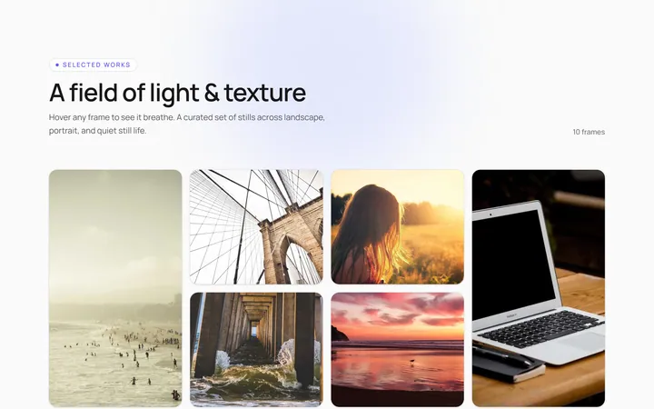
Hover Caption Gallery
OriginalA responsive image grid where each tile subtly zooms and reveals a caption bar on hover.
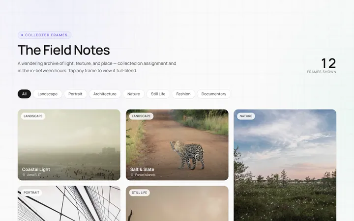
Masonry Gallery
OriginalA Pinterest-style masonry gallery using CSS columns with varied-height images; tiles lift and brighten on hover.
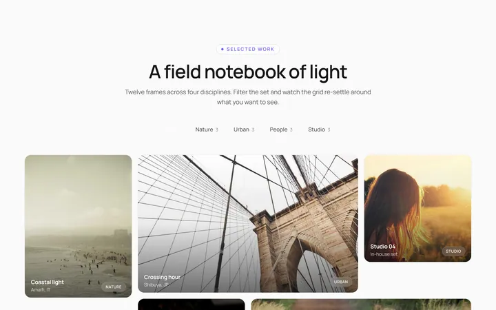
Filterable Gallery
OriginalA filterable gallery with category tabs; clicking a tab animates the grid to show only that category.
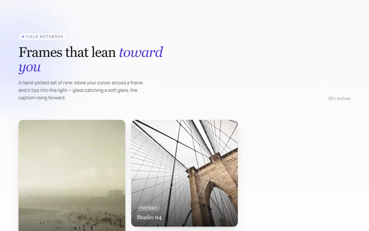
Tilt Cards Gallery
OriginalA grid of image cards that tilt in 3D toward the cursor on hover, with a soft glare.
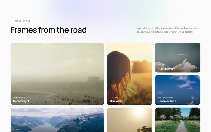
Lightbox Gallery
OriginalA thumbnail grid where clicking a thumb opens a full-screen lightbox with prev/next arrows and keyboard support.
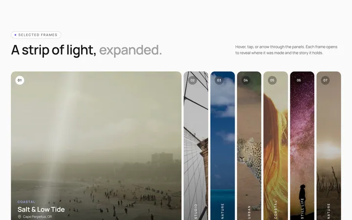
Expanding Strip Gallery
OriginalA horizontal strip of image panels; hovering a panel expands it and shrinks the others to reveal its caption.
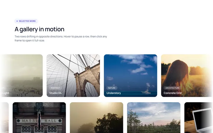
Marquee Gallery
OriginalTwo rows of images auto-scrolling in opposite directions, pausing on hover, with edge fade masks.
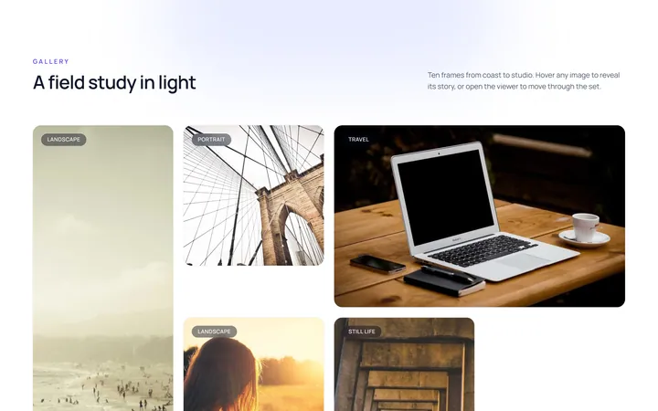
Hover Zoom Overlay Gallery
OriginalA grid where each image scales up under a dark gradient overlay revealing a title and a view button on hover.
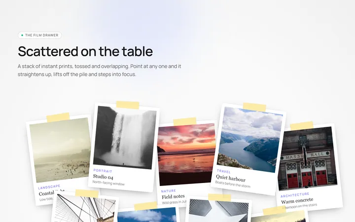
Polaroid Stack Gallery
OriginalA scattered stack of slightly-rotated polaroid photos that straighten and lift on hover.
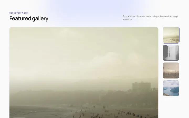
Featured Thumbs Gallery
OriginalA large featured image with a thumbnail row; selecting a thumbnail swaps the featured image with a crossfade.
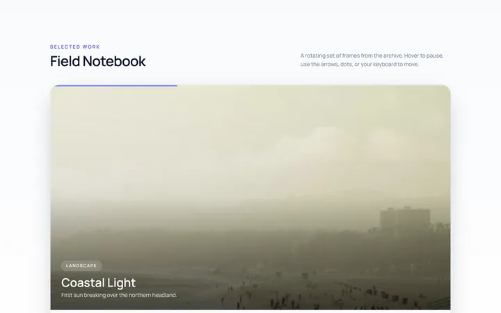
Carousel Gallery
OriginalAn image carousel with arrows and dots, smooth slide transitions and autoplay that pauses on hover.
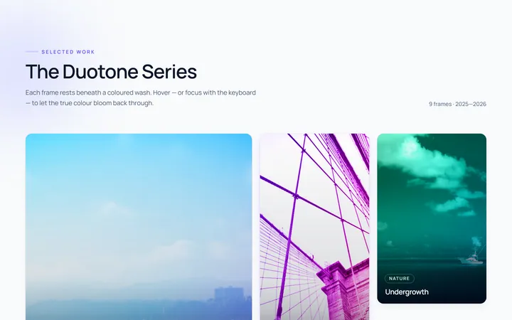
Duotone Hover Gallery
OriginalA grid where images sit under a coloured duotone wash that clears to full colour on hover.