

Tilt Shine Gallery
Original · freeImage cards that tilt toward the cursor with a diagonal shine sweep on hover.
Copy prompt gives Claude Code, Cursor or v0 a ready-to-paste prompt that recreates this exact component.
npx shadcn@latest add https://webinnoventix.com/r/gallery-tilt-shine.json"use client";
import type * as React from "react";
import { useCallback, useRef, useState } from "react";
import {
motion,
useMotionValue,
useMotionTemplate,
useSpring,
} from "motion/react";
type Photo = {
id: number;
src: string;
title: string;
category: string;
caption: string;
location: string;
span: "tall" | "wide" | "square";
};
const PHOTOS: Photo[] = [
{
id: 1,
src: "/img/gallery/g03.webp",
title: "Concrete Cathedral",
category: "Architecture",
caption: "Brutalist stairwell caught in low winter sun.",
location: "Marseille, FR",
span: "tall",
},
{
id: 2,
src: "/img/gallery/g11.webp",
title: "Salt Flats at Dusk",
category: "Landscape",
caption: "Mirror pools stretch to a bruised horizon.",
location: "Uyuni, BO",
span: "wide",
},
{
id: 3,
src: "/img/gallery/g07.webp",
title: "Market Blur",
category: "Street",
caption: "A vendor's hands, a hundred frames per second.",
location: "Marrakech, MA",
span: "square",
},
{
id: 4,
src: "/img/gallery/g19.webp",
title: "Fern Understory",
category: "Nature",
caption: "First light filtering through old-growth canopy.",
location: "Olympic NP, US",
span: "tall",
},
{
id: 5,
src: "/img/gallery/g22.webp",
title: "Neon After Rain",
category: "Night",
caption: "Reflections pooling on a slick crosswalk.",
location: "Osaka, JP",
span: "square",
},
{
id: 6,
src: "/img/gallery/g14.webp",
title: "Dune Ridgeline",
category: "Landscape",
caption: "Wind-carved crests before the heat sets in.",
location: "Sossusvlei, NA",
span: "wide",
},
{
id: 7,
src: "/img/gallery/g28.webp",
title: "Studio Portrait, No. 4",
category: "Portrait",
caption: "Single softbox, one honest expression.",
location: "Berlin, DE",
span: "tall",
},
{
id: 8,
src: "/img/gallery/g05.webp",
title: "Harbor Cranes",
category: "Industrial",
caption: "Steel silhouettes against a flat grey sky.",
location: "Rotterdam, NL",
span: "square",
},
{
id: 9,
src: "/img/gallery/g31.webp",
title: "Terraced Fields",
category: "Landscape",
caption: "Contours of a hillside farmed for centuries.",
location: "Yuanyang, CN",
span: "wide",
},
];
const spanClass: Record<Photo["span"], string> = {
tall: "sm:row-span-2 aspect-[3/4]",
wide: "sm:col-span-2 aspect-[16/10]",
square: "aspect-square",
};
function TiltCard({ photo, index }: { photo: Photo; index: number }) {
const ref = useRef<HTMLButtonElement>(null);
const [hovered, setHovered] = useState(false);
const rx = useSpring(useMotionValue(0), {
stiffness: 220,
damping: 22,
mass: 0.6,
});
const ry = useSpring(useMotionValue(0), {
stiffness: 220,
damping: 22,
mass: 0.6,
});
const glowX = useMotionValue(50);
const glowY = useMotionValue(50);
const handleMove = useCallback(
(e: React.PointerEvent<HTMLButtonElement>) => {
const el = ref.current;
if (!el) return;
const rect = el.getBoundingClientRect();
const px = (e.clientX - rect.left) / rect.width;
const py = (e.clientY - rect.top) / rect.height;
const MAX = 9;
ry.set((px - 0.5) * 2 * MAX);
rx.set((0.5 - py) * 2 * MAX);
glowX.set(px * 100);
glowY.set(py * 100);
},
[rx, ry, glowX, glowY],
);
const reset = useCallback(() => {
rx.set(0);
ry.set(0);
glowX.set(50);
glowY.set(50);
setHovered(false);
}, [rx, ry, glowX, glowY]);
const glow = useMotionTemplate`radial-gradient(circle at ${glowX}% ${glowY}%, rgba(255,255,255,0.28), rgba(255,255,255,0) 55%)`;
return (
<motion.button
ref={ref}
type="button"
aria-label={`${photo.title} — ${photo.category}, ${photo.location}`}
onPointerMove={handleMove}
onPointerEnter={() => setHovered(true)}
onPointerLeave={reset}
onBlur={reset}
style={{ rotateX: rx, rotateY: ry, transformPerspective: 1000 }}
className={`gts-card group relative block w-full overflow-hidden rounded-2xl border border-slate-200/70 bg-slate-100 text-left shadow-sm outline-none transition-shadow duration-300 [transform-style:preserve-3d] hover:shadow-2xl hover:shadow-indigo-500/20 focus-visible:ring-2 focus-visible:ring-indigo-500 focus-visible:ring-offset-2 focus-visible:ring-offset-slate-50 dark:border-white/10 dark:bg-zinc-900 dark:hover:shadow-violet-500/25 dark:focus-visible:ring-violet-400 dark:focus-visible:ring-offset-zinc-950 ${spanClass[photo.span]}`}
>
{/* eslint-disable-next-line @next/next/no-img-element */}
<img
src={photo.src}
alt={`${photo.title} — ${photo.caption}`}
loading="lazy"
draggable={false}
className="absolute inset-0 h-full w-full object-cover transition-transform duration-500 ease-out group-hover:scale-[1.06]"
style={{ transform: "translateZ(0)" }}
/>
{/* cursor-follow soft glow */}
<motion.span
aria-hidden
style={{ backgroundImage: glow, opacity: hovered ? 1 : 0 }}
className="pointer-events-none absolute inset-0 z-10 mix-blend-soft-light transition-opacity duration-300"
/>
{/* diagonal shine sweep on hover */}
<span
aria-hidden
className="gts-shine pointer-events-none absolute inset-0 z-20 opacity-0 group-hover:opacity-100"
/>
{/* readability gradient */}
<span
aria-hidden
className="pointer-events-none absolute inset-0 z-20 bg-gradient-to-t from-slate-950/85 via-slate-950/10 to-transparent"
/>
{/* content */}
<span
className="absolute inset-x-0 bottom-0 z-30 flex translate-z-0 flex-col gap-2 p-4 sm:p-5"
style={{ transform: "translateZ(40px)" }}
>
<span className="flex items-center gap-2">
<span className="inline-flex items-center rounded-full border border-white/25 bg-white/10 px-2.5 py-0.5 text-[10px] font-semibold uppercase tracking-[0.14em] text-white backdrop-blur-sm">
{photo.category}
</span>
<span className="text-[11px] font-medium text-white/70">
{photo.location}
</span>
</span>
<span className="block text-lg font-semibold leading-tight text-white drop-shadow-sm sm:text-xl">
{photo.title}
</span>
<span className="max-w-[46ch] translate-y-1 text-sm leading-snug text-white/80 opacity-0 transition-all duration-300 group-hover:translate-y-0 group-hover:opacity-100 group-focus-visible:translate-y-0 group-focus-visible:opacity-100">
{photo.caption}
</span>
</span>
{/* ring highlight */}
<span
aria-hidden
className="pointer-events-none absolute inset-0 z-30 rounded-2xl ring-1 ring-inset ring-white/10"
/>
<span className="sr-only">Photo {index + 1} of {PHOTOS.length}</span>
</motion.button>
);
}
export default function GalleryTiltShine() {
return (
<section className="relative w-full overflow-hidden bg-slate-50 px-4 py-20 text-slate-900 sm:px-6 sm:py-28 lg:px-8 dark:bg-zinc-950 dark:text-slate-100">
<style>{`
@keyframes gts-sweep {
0% { transform: translateX(-140%) skewX(-18deg); }
100% { transform: translateX(140%) skewX(-18deg); }
}
.gts-shine::before {
content: "";
position: absolute;
top: -20%;
left: 0;
height: 140%;
width: 45%;
background: linear-gradient(
100deg,
rgba(255,255,255,0) 0%,
rgba(255,255,255,0.35) 45%,
rgba(255,255,255,0.65) 50%,
rgba(255,255,255,0.35) 55%,
rgba(255,255,255,0) 100%
);
mix-blend-mode: overlay;
transform: translateX(-140%) skewX(-18deg);
}
.gts-card:hover .gts-shine::before {
animation: gts-sweep 900ms cubic-bezier(0.22, 0.61, 0.36, 1) forwards;
}
@media (prefers-reduced-motion: reduce) {
.gts-card { transform: none !important; }
.gts-shine::before { animation: none !important; opacity: 0 !important; }
}
`}</style>
{/* ambient backdrop */}
<div
aria-hidden
className="pointer-events-none absolute inset-0 -z-10 opacity-70 [background:radial-gradient(60rem_40rem_at_15%_-10%,theme(colors.indigo.200),transparent),radial-gradient(50rem_35rem_at_100%_10%,theme(colors.violet.200),transparent)] dark:opacity-40 dark:[background:radial-gradient(60rem_40rem_at_15%_-10%,theme(colors.indigo.600),transparent),radial-gradient(50rem_35rem_at_100%_10%,theme(colors.violet.700),transparent)]"
/>
<div className="mx-auto max-w-6xl">
<header className="mb-12 flex flex-col gap-4 sm:mb-16 sm:flex-row sm:items-end sm:justify-between">
<div className="max-w-2xl">
<p className="mb-3 inline-flex items-center gap-2 rounded-full border border-slate-300/70 bg-white/60 px-3 py-1 text-xs font-medium uppercase tracking-[0.16em] text-slate-500 backdrop-blur dark:border-white/10 dark:bg-white/5 dark:text-slate-400">
<span className="h-1.5 w-1.5 rounded-full bg-emerald-500" />
Field Journal — 2026
</p>
<h2 className="text-3xl font-semibold tracking-tight text-slate-900 sm:text-4xl lg:text-5xl dark:text-white">
Frames from the road
</h2>
<p className="mt-4 text-base leading-relaxed text-slate-600 sm:text-lg dark:text-slate-400">
Move your cursor across each frame — the card leans toward you and
a sheen of light sweeps the surface. A small collection of nine
shots from this year's travels.
</p>
</div>
<p className="shrink-0 text-sm font-medium text-slate-500 dark:text-slate-400">
{PHOTOS.length} photographs
</p>
</header>
<div className="grid grid-cols-1 gap-4 sm:grid-cols-2 sm:gap-5 lg:grid-cols-3">
{PHOTOS.map((photo, i) => (
<TiltCard key={photo.id} photo={photo} index={i} />
))}
</div>
</div>
</section>
);
}Dependencies
Licence
Built by Web Innoventix. Free for personal and commercial use, no attribution required.
Built by Web Innoventix
Need a custom interface, a full website, or SEO that gets you cited by AI? We design, build and rank it end to end.
Get a free quoteSimilar components
Browse all →
Hover Caption Gallery
OriginalA responsive image grid where each tile subtly zooms and reveals a caption bar on hover.
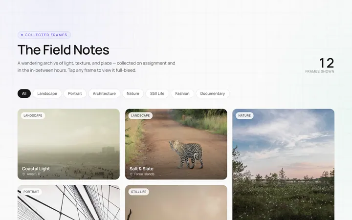
Masonry Gallery
OriginalA Pinterest-style masonry gallery using CSS columns with varied-height images; tiles lift and brighten on hover.

Filterable Gallery
OriginalA filterable gallery with category tabs; clicking a tab animates the grid to show only that category.
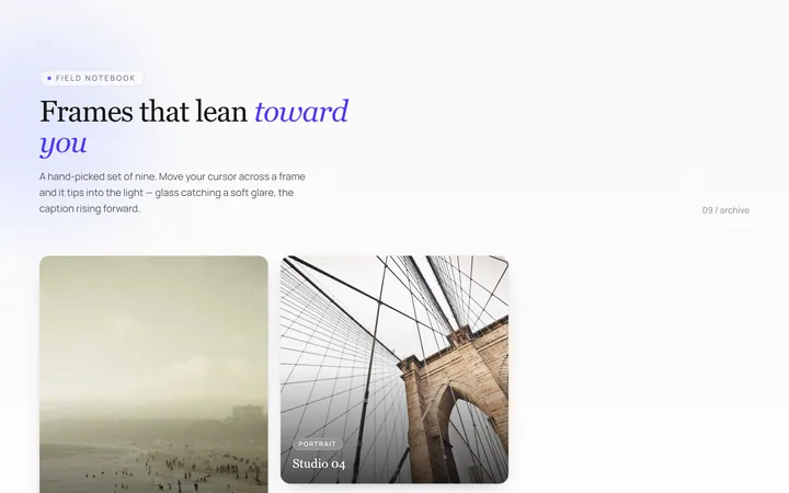
Tilt Cards Gallery
OriginalA grid of image cards that tilt in 3D toward the cursor on hover, with a soft glare.
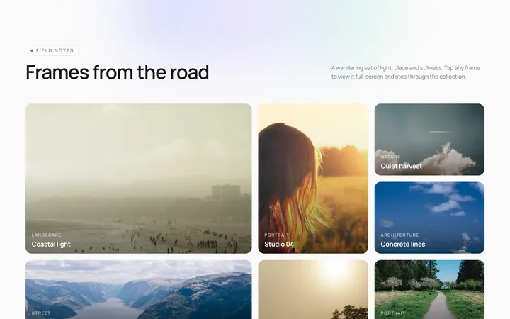
Lightbox Gallery
OriginalA thumbnail grid where clicking a thumb opens a full-screen lightbox with prev/next arrows and keyboard support.
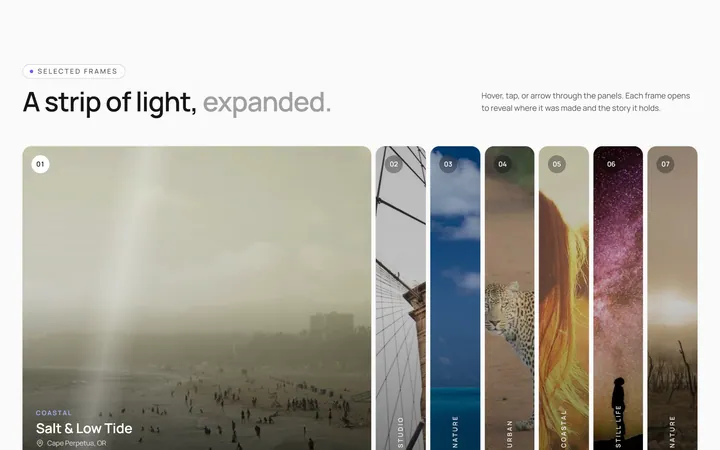
Expanding Strip Gallery
OriginalA horizontal strip of image panels; hovering a panel expands it and shrinks the others to reveal its caption.
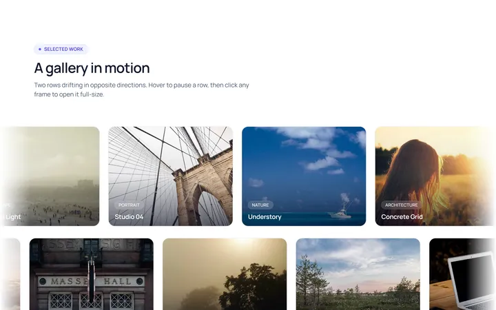
Marquee Gallery
OriginalTwo rows of images auto-scrolling in opposite directions, pausing on hover, with edge fade masks.

Hover Zoom Overlay Gallery
OriginalA grid where each image scales up under a dark gradient overlay revealing a title and a view button on hover.

Polaroid Stack Gallery
OriginalA scattered stack of slightly-rotated polaroid photos that straighten and lift on hover.
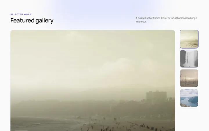
Featured Thumbs Gallery
OriginalA large featured image with a thumbnail row; selecting a thumbnail swaps the featured image with a crossfade.
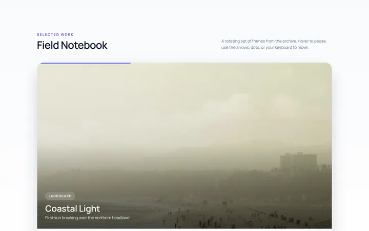
Carousel Gallery
OriginalAn image carousel with arrows and dots, smooth slide transitions and autoplay that pauses on hover.

Duotone Hover Gallery
OriginalA grid where images sit under a coloured duotone wash that clears to full colour on hover.