

Vertical Marquee Gallery
Original · freeVertical columns of images auto-scrolling up and down, pausing on hover.
Copy prompt gives Claude Code, Cursor or v0 a ready-to-paste prompt that recreates this exact component.
npx shadcn@latest add https://webinnoventix.com/r/gallery-vertical-marquee.json"use client";
import { useCallback, useEffect, useState } from "react";
import { AnimatePresence, motion } from "motion/react";
type Orientation = "portrait" | "landscape" | "square";
interface Photo {
src: string;
alt: string;
title: string;
category: string;
orientation: Orientation;
}
const PHOTOS: Photo[] = [
{ src: "/img/gallery/g01.webp", alt: "Sunlit glass atrium with a suspended spiral staircase", title: "Atrium Light", category: "Architecture", orientation: "portrait" },
{ src: "/img/gallery/g02.webp", alt: "Cracked salt flats glowing orange under a low dawn sun", title: "Salt Flats at Dawn", category: "Landscape", orientation: "landscape" },
{ src: "/img/gallery/g03.webp", alt: "Unglazed ceramic bowls arranged on a linen cloth", title: "Ceramics, Unglazed", category: "Still Life", orientation: "square" },
{ src: "/img/gallery/g04.webp", alt: "Rain-slicked Parisian street reflecting café lights at night", title: "Rue de Seine", category: "Street", orientation: "portrait" },
{ src: "/img/gallery/g05.webp", alt: "Small ferry crossing a mirror-calm fjord between steep cliffs", title: "Fjord Crossing", category: "Landscape", orientation: "landscape" },
{ src: "/img/gallery/g06.webp", alt: "Studio portrait of a woman lit in deep blue evening tones", title: "Blue Hour Portrait", category: "Portrait", orientation: "square" },
{ src: "/img/gallery/g07.webp", alt: "Raw concrete stairwell curving upward toward a skylight", title: "Concrete Stair", category: "Architecture", orientation: "portrait" },
{ src: "/img/gallery/g08.webp", alt: "Rippled desert dunes casting long shadows at golden hour", title: "Dune Shadows", category: "Landscape", orientation: "landscape" },
{ src: "/img/gallery/g09.webp", alt: "Breakfast table set with coffee and fruit in soft morning light", title: "Morning Table", category: "Interiors", orientation: "square" },
{ src: "/img/gallery/g10.webp", alt: "Market vendor arranging produce beneath a striped awning", title: "Market Vendor", category: "Street", orientation: "portrait" },
{ src: "/img/gallery/g11.webp", alt: "Wooden pier vanishing into thick sea fog at first light", title: "Pier Fog", category: "Landscape", orientation: "landscape" },
{ src: "/img/gallery/g12.webp", alt: "Single tulip stem in a glass vase against a studio backdrop", title: "Studio Bloom", category: "Still Life", orientation: "square" },
];
const COLUMNS: { photos: Photo[]; animation: string }[] = [
{ photos: [PHOTOS[0], PHOTOS[3], PHOTOS[6], PHOTOS[9]], animation: "gvm-up-slow" },
{ photos: [PHOTOS[1], PHOTOS[4], PHOTOS[7], PHOTOS[10]], animation: "gvm-down-mid" },
{ photos: [PHOTOS[2], PHOTOS[5], PHOTOS[8], PHOTOS[11]], animation: "gvm-up-fast" },
];
const ASPECT: Record<Orientation, string> = {
portrait: "aspect-[10/13]",
landscape: "aspect-[13/9]",
square: "aspect-square",
};
function PhotoCard({
photo,
index,
onOpen,
ariaHidden,
}: {
photo: Photo;
index: number;
onOpen: (i: number) => void;
ariaHidden: boolean;
}) {
return (
<button
type="button"
onClick={() => onOpen(index)}
aria-hidden={ariaHidden}
tabIndex={ariaHidden ? -1 : 0}
aria-label={`View ${photo.title}, ${photo.category}`}
className="group/card relative block w-full overflow-hidden rounded-2xl bg-slate-200 outline-none ring-indigo-500/70 transition-shadow duration-300 focus-visible:ring-2 dark:bg-zinc-800"
>
<div className={`${ASPECT[photo.orientation]} w-full overflow-hidden`}>
{/* eslint-disable-next-line @next/next/no-img-element */}
<img
src={photo.src}
alt={photo.alt}
loading="lazy"
draggable={false}
className="h-full w-full object-cover transition-transform duration-700 ease-out will-change-transform group-hover/card:scale-[1.05]"
/>
</div>
<div className="pointer-events-none absolute inset-0 bg-gradient-to-t from-slate-950/75 via-slate-950/5 to-transparent opacity-70 transition-opacity duration-300 group-hover/card:opacity-100" />
<div className="pointer-events-none absolute inset-x-0 bottom-0 translate-y-1 p-4 opacity-90 transition-all duration-300 group-hover/card:translate-y-0 group-hover/card:opacity-100">
<span className="inline-flex items-center rounded-full bg-white/15 px-2.5 py-0.5 text-[11px] font-medium uppercase tracking-[0.14em] text-white/90 backdrop-blur-sm ring-1 ring-white/25">
{photo.category}
</span>
<p className="mt-2 text-sm font-semibold leading-tight text-white drop-shadow-sm">
{photo.title}
</p>
</div>
</button>
);
}
export default function GalleryVerticalMarquee() {
const [active, setActive] = useState<number | null>(null);
const open = useCallback((i: number) => setActive(i), []);
const close = useCallback(() => setActive(null), []);
const step = useCallback(
(dir: number) =>
setActive((prev) =>
prev === null ? prev : (prev + dir + PHOTOS.length) % PHOTOS.length
),
[]
);
useEffect(() => {
if (active === null) return;
const onKey = (e: KeyboardEvent) => {
if (e.key === "Escape") close();
else if (e.key === "ArrowRight") step(1);
else if (e.key === "ArrowLeft") step(-1);
};
window.addEventListener("keydown", onKey);
const prevOverflow = document.body.style.overflow;
document.body.style.overflow = "hidden";
return () => {
window.removeEventListener("keydown", onKey);
document.body.style.overflow = prevOverflow;
};
}, [active, close, step]);
const current = active === null ? null : PHOTOS[active];
return (
<section className="relative w-full overflow-hidden bg-slate-50 px-5 py-20 sm:px-8 sm:py-24 lg:px-12 dark:bg-zinc-950">
<style>{`
@keyframes gvm-scroll-up { from { transform: translateY(0); } to { transform: translateY(-50%); } }
@keyframes gvm-scroll-down { from { transform: translateY(-50%); } to { transform: translateY(0); } }
.gvm-up-slow { animation: gvm-scroll-up 46s linear infinite; }
.gvm-down-mid { animation: gvm-scroll-down 34s linear infinite; }
.gvm-up-fast { animation: gvm-scroll-up 28s linear infinite; }
.gvm-col:hover .gvm-track,
.gvm-col:focus-within .gvm-track { animation-play-state: paused; }
@media (prefers-reduced-motion: reduce) {
.gvm-track { animation: none !important; transform: none !important; }
}
`}</style>
{/* ambient glow */}
<div
aria-hidden="true"
className="pointer-events-none absolute -top-24 left-1/2 h-72 w-[42rem] -translate-x-1/2 rounded-full bg-indigo-300/30 blur-[120px] dark:bg-indigo-600/20"
/>
<div className="relative mx-auto max-w-6xl">
<header className="mx-auto max-w-2xl text-center">
<span className="inline-flex items-center gap-2 rounded-full border border-slate-200 bg-white/70 px-3 py-1 text-xs font-medium uppercase tracking-[0.2em] text-indigo-600 shadow-sm backdrop-blur dark:border-zinc-800 dark:bg-zinc-900/70 dark:text-indigo-300">
<span className="h-1.5 w-1.5 rounded-full bg-indigo-500" />
Field Notebook
</span>
<h2 className="mt-5 text-balance text-3xl font-semibold tracking-tight text-slate-900 sm:text-4xl lg:text-5xl dark:text-white">
Frames from the road
</h2>
<p className="mx-auto mt-4 max-w-xl text-pretty text-base leading-relaxed text-slate-600 dark:text-zinc-400">
A rolling reel of stills gathered across cities, coastlines, and quiet
interiors. Hover a column to hold it still, then open any frame.
</p>
</header>
<div className="relative mt-14">
{/* top / bottom fades */}
<div
aria-hidden="true"
className="pointer-events-none absolute inset-x-0 top-0 z-10 h-24 bg-gradient-to-b from-slate-50 to-transparent dark:from-zinc-950"
/>
<div
aria-hidden="true"
className="pointer-events-none absolute inset-x-0 bottom-0 z-10 h-24 bg-gradient-to-t from-slate-50 to-transparent dark:from-zinc-950"
/>
<ul
className="grid h-[560px] grid-cols-2 gap-4 sm:h-[620px] sm:gap-5 lg:h-[720px] lg:grid-cols-3"
aria-label="Photo gallery, auto-scrolling columns"
>
{COLUMNS.map((col, ci) => {
const flatOffset = ci; // maps to PHOTOS interleave below
return (
<li
key={ci}
className={`gvm-col relative overflow-hidden ${
ci === 2 ? "hidden lg:block" : ""
}`}
>
<div className={`gvm-track ${col.animation} flex flex-col gap-4 sm:gap-5`}>
{[...col.photos, ...col.photos].map((photo, pi) => {
const isClone = pi >= col.photos.length;
const baseIndex = pi % col.photos.length;
const globalIndex = baseIndex * 3 + flatOffset;
return (
<PhotoCard
key={`${ci}-${pi}`}
photo={photo}
index={globalIndex}
onOpen={open}
ariaHidden={isClone}
/>
);
})}
</div>
</li>
);
})}
</ul>
</div>
</div>
{/* Lightbox */}
<AnimatePresence>
{current && (
<motion.div
role="dialog"
aria-modal="true"
aria-label={`${current.title}, ${current.category}`}
initial={{ opacity: 0 }}
animate={{ opacity: 1 }}
exit={{ opacity: 0 }}
transition={{ duration: 0.2 }}
onClick={close}
className="fixed inset-0 z-50 flex items-center justify-center bg-slate-950/80 p-4 backdrop-blur-md sm:p-8"
>
<button
type="button"
onClick={close}
aria-label="Close viewer"
className="absolute right-4 top-4 z-10 inline-flex h-10 w-10 items-center justify-center rounded-full bg-white/10 text-white outline-none ring-white/60 transition hover:bg-white/20 focus-visible:ring-2"
>
<svg viewBox="0 0 24 24" className="h-5 w-5" fill="none" stroke="currentColor" strokeWidth={2} aria-hidden="true">
<path strokeLinecap="round" d="M6 6l12 12M18 6L6 18" />
</svg>
</button>
<button
type="button"
onClick={(e) => {
e.stopPropagation();
step(-1);
}}
aria-label="Previous photo"
className="absolute left-3 top-1/2 z-10 inline-flex h-11 w-11 -translate-y-1/2 items-center justify-center rounded-full bg-white/10 text-white outline-none ring-white/60 transition hover:bg-white/20 focus-visible:ring-2 sm:left-6"
>
<svg viewBox="0 0 24 24" className="h-6 w-6" fill="none" stroke="currentColor" strokeWidth={2} aria-hidden="true">
<path strokeLinecap="round" strokeLinejoin="round" d="M15 6l-6 6 6 6" />
</svg>
</button>
<button
type="button"
onClick={(e) => {
e.stopPropagation();
step(1);
}}
aria-label="Next photo"
className="absolute right-3 top-1/2 z-10 inline-flex h-11 w-11 -translate-y-1/2 items-center justify-center rounded-full bg-white/10 text-white outline-none ring-white/60 transition hover:bg-white/20 focus-visible:ring-2 sm:right-6"
>
<svg viewBox="0 0 24 24" className="h-6 w-6" fill="none" stroke="currentColor" strokeWidth={2} aria-hidden="true">
<path strokeLinecap="round" strokeLinejoin="round" d="M9 6l6 6-6 6" />
</svg>
</button>
<motion.figure
key={active}
initial={{ opacity: 0, scale: 0.96, y: 12 }}
animate={{ opacity: 1, scale: 1, y: 0 }}
exit={{ opacity: 0, scale: 0.97 }}
transition={{ type: "spring", stiffness: 260, damping: 28 }}
onClick={(e) => e.stopPropagation()}
className="relative flex max-h-[85vh] w-full max-w-3xl flex-col overflow-hidden rounded-3xl bg-white shadow-2xl ring-1 ring-white/10 dark:bg-zinc-900"
>
<div className="flex min-h-0 flex-1 items-center justify-center bg-slate-100 dark:bg-zinc-950">
{/* eslint-disable-next-line @next/next/no-img-element */}
<img
src={current.src}
alt={current.alt}
loading="lazy"
draggable={false}
className="max-h-[70vh] w-auto max-w-full object-contain"
/>
</div>
<figcaption className="flex items-center justify-between gap-4 border-t border-slate-200 px-6 py-4 dark:border-zinc-800">
<div>
<p className="text-base font-semibold text-slate-900 dark:text-white">
{current.title}
</p>
<p className="mt-0.5 text-xs uppercase tracking-[0.14em] text-indigo-600 dark:text-indigo-300">
{current.category}
</p>
</div>
<span className="shrink-0 text-sm tabular-nums text-slate-400 dark:text-zinc-500">
{(active ?? 0) + 1} / {PHOTOS.length}
</span>
</figcaption>
</motion.figure>
</motion.div>
)}
</AnimatePresence>
</section>
);
}Dependencies
Licence
Built by Web Innoventix. Free for personal and commercial use, no attribution required.
Built by Web Innoventix
Need a custom interface, a full website, or SEO that gets you cited by AI? We design, build and rank it end to end.
Get a free quoteSimilar components
Browse all →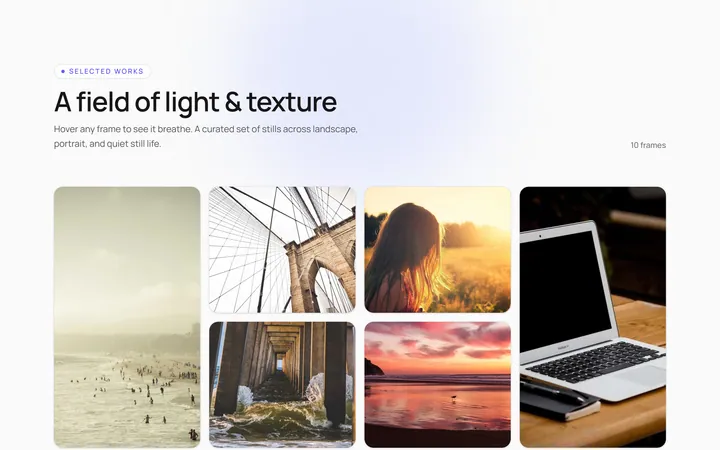
Hover Caption Gallery
OriginalA responsive image grid where each tile subtly zooms and reveals a caption bar on hover.
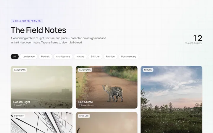
Masonry Gallery
OriginalA Pinterest-style masonry gallery using CSS columns with varied-height images; tiles lift and brighten on hover.
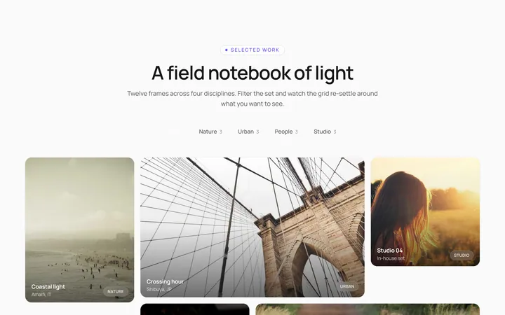
Filterable Gallery
OriginalA filterable gallery with category tabs; clicking a tab animates the grid to show only that category.
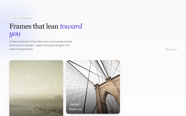
Tilt Cards Gallery
OriginalA grid of image cards that tilt in 3D toward the cursor on hover, with a soft glare.
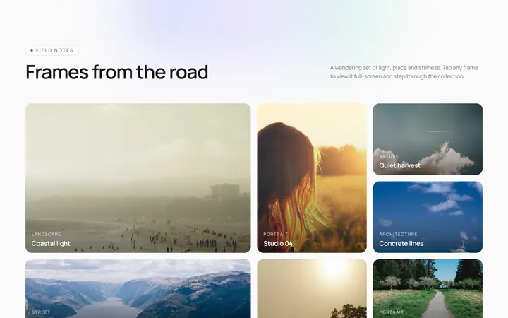
Lightbox Gallery
OriginalA thumbnail grid where clicking a thumb opens a full-screen lightbox with prev/next arrows and keyboard support.
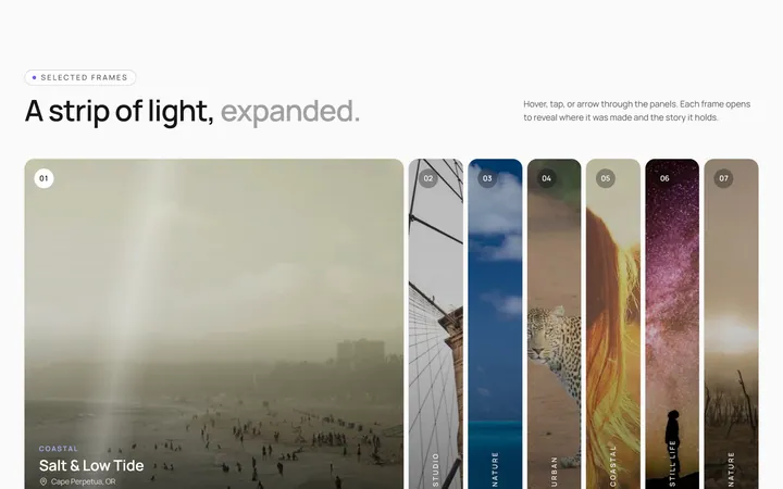
Expanding Strip Gallery
OriginalA horizontal strip of image panels; hovering a panel expands it and shrinks the others to reveal its caption.
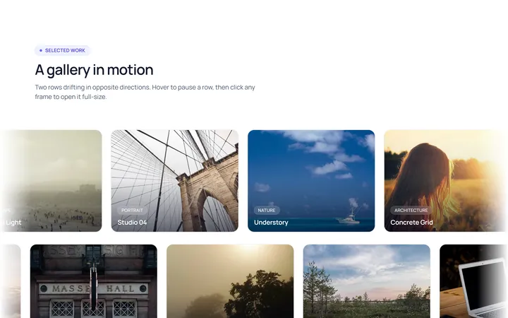
Marquee Gallery
OriginalTwo rows of images auto-scrolling in opposite directions, pausing on hover, with edge fade masks.
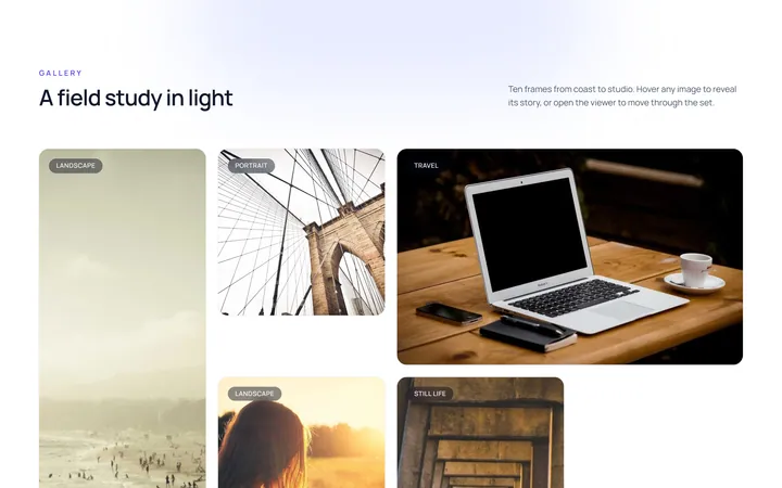
Hover Zoom Overlay Gallery
OriginalA grid where each image scales up under a dark gradient overlay revealing a title and a view button on hover.
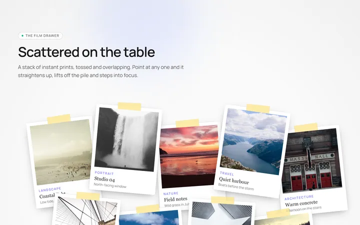
Polaroid Stack Gallery
OriginalA scattered stack of slightly-rotated polaroid photos that straighten and lift on hover.
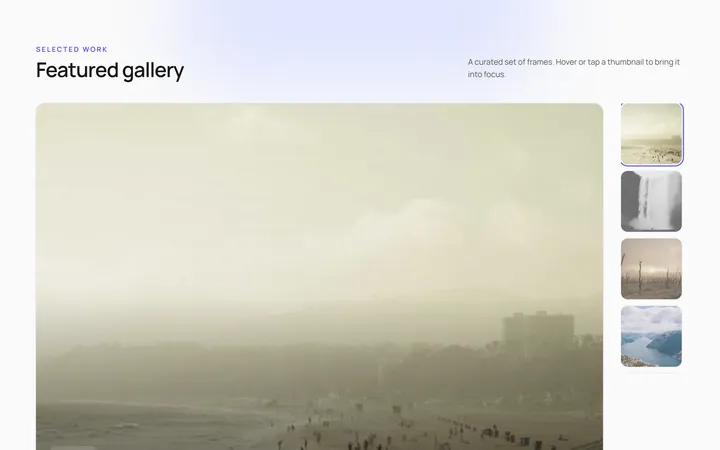
Featured Thumbs Gallery
OriginalA large featured image with a thumbnail row; selecting a thumbnail swaps the featured image with a crossfade.
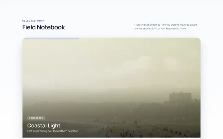
Carousel Gallery
OriginalAn image carousel with arrows and dots, smooth slide transitions and autoplay that pauses on hover.
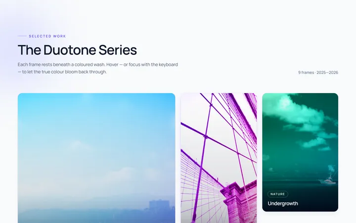
Duotone Hover Gallery
OriginalA grid where images sit under a coloured duotone wash that clears to full colour on hover.