

Char Counter Input
Original · freeinput with a live character counter
Copy prompt gives Claude Code, Cursor or v0 a ready-to-paste prompt that recreates this exact component.
npx shadcn@latest add https://webinnoventix.com/r/inp-char-counter.json"use client";
import { useId, useState } from "react";
import { motion, useReducedMotion } from "motion/react";
type CounterStatus = "ok" | "warn" | "over";
function statusFor(
length: number,
max: number,
warnRemaining: number
): CounterStatus {
const remaining = max - length;
if (remaining < 0) return "over";
if (remaining <= warnRemaining) return "warn";
return "ok";
}
const statusText: Record<CounterStatus, string> = {
ok: "text-slate-400 dark:text-slate-500",
warn: "text-amber-600 dark:text-amber-400",
over: "text-rose-600 dark:text-rose-400",
};
const statusFill: Record<CounterStatus, string> = {
ok: "bg-indigo-500 dark:bg-indigo-400",
warn: "bg-amber-500 dark:bg-amber-400",
over: "bg-rose-500 dark:bg-rose-400",
};
const statusStroke: Record<CounterStatus, string> = {
ok: "text-indigo-500 dark:text-indigo-400",
warn: "text-amber-500 dark:text-amber-400",
over: "text-rose-500 dark:text-rose-400",
};
const statusRing: Record<CounterStatus, string> = {
ok: "focus-visible:ring-indigo-500 dark:focus-visible:ring-indigo-400",
warn: "focus-visible:ring-amber-500 dark:focus-visible:ring-amber-400",
over: "focus-visible:ring-rose-500 dark:focus-visible:ring-rose-400",
};
/* ── Variant 1 · hard-limited single-line field ─────────────────────────── */
function DisplayNameField() {
const reduce = useReducedMotion();
const uid = useId();
const inputId = `${uid}-name`;
const hintId = `${uid}-name-hint`;
const countId = `${uid}-name-count`;
const max = 32;
const [value, setValue] = useState("Ava Thompson");
const status = statusFor(value.length, max, 6);
const pct = Math.min(value.length / max, 1) * 100;
const barTransition = reduce
? { duration: 0 }
: { type: "spring" as const, stiffness: 320, damping: 34 };
return (
<div className="flex flex-col gap-2">
<div className="flex items-baseline justify-between gap-3">
<label
htmlFor={inputId}
className="text-sm font-medium text-slate-800 dark:text-slate-200"
>
Display name
</label>
<motion.span
id={countId}
role="status"
aria-live="polite"
animate={{ scale: !reduce && status !== "ok" ? 1.06 : 1 }}
transition={barTransition}
className={`text-xs font-semibold tabular-nums ${statusText[status]}`}
>
{value.length}
<span className="text-slate-300 dark:text-slate-600"> / {max}</span>
</motion.span>
</div>
<input
id={inputId}
type="text"
value={value}
maxLength={max}
onChange={(e) => setValue(e.target.value)}
aria-describedby={`${hintId} ${countId}`}
placeholder="e.g. Ava Thompson"
className={`w-full rounded-xl border border-slate-300 bg-white px-3.5 py-2.5 text-sm text-slate-900 shadow-sm outline-none transition placeholder:text-slate-400 focus-visible:border-transparent focus-visible:ring-2 dark:border-slate-700 dark:bg-slate-950 dark:text-slate-100 dark:placeholder:text-slate-500 ${statusRing[status]}`}
/>
<div className="h-1 w-full overflow-hidden rounded-full bg-slate-200 dark:bg-slate-800">
<motion.div
className={`relative h-full rounded-full ${statusFill[status]}`}
animate={{ width: `${pct}%` }}
transition={barTransition}
>
<span className="inpcc-shimmer pointer-events-none absolute inset-0 bg-gradient-to-r from-transparent via-white/60 to-transparent dark:via-white/25" />
</motion.div>
</div>
<p id={hintId} className="text-xs text-slate-500 dark:text-slate-400">
Shown on your public profile. Letters, spaces, and emoji welcome.
</p>
</div>
);
}
/* ── Variant 2 · soft-limited textarea with over-limit warning ──────────── */
function BioField() {
const reduce = useReducedMotion();
const uid = useId();
const areaId = `${uid}-bio`;
const hintId = `${uid}-bio-hint`;
const countId = `${uid}-bio-count`;
const errId = `${uid}-bio-err`;
const max = 160;
const [value, setValue] = useState(
"Product designer in Lisbon. I turn messy ideas into calm, usable interfaces."
);
const status = statusFor(value.length, max, 20);
const remaining = max - value.length;
const over = status === "over";
const pct = Math.min(value.length / max, 1) * 100;
const barTransition = reduce
? { duration: 0 }
: { type: "spring" as const, stiffness: 300, damping: 32 };
const describedBy = over
? `${hintId} ${countId} ${errId}`
: `${hintId} ${countId}`;
return (
<div className="flex flex-col gap-2">
<div className="flex items-baseline justify-between gap-3">
<label
htmlFor={areaId}
className="text-sm font-medium text-slate-800 dark:text-slate-200"
>
Short bio
</label>
<motion.span
id={countId}
role="status"
aria-live="polite"
animate={{ scale: !reduce && status !== "ok" ? 1.06 : 1 }}
transition={barTransition}
className={`text-xs font-semibold tabular-nums ${statusText[status]}`}
>
{over ? `${remaining} over` : `${remaining} left`}
</motion.span>
</div>
<textarea
id={areaId}
rows={3}
value={value}
onChange={(e) => setValue(e.target.value)}
aria-invalid={over}
aria-describedby={describedBy}
placeholder="Tell people what you do in a sentence or two."
className={`w-full resize-none rounded-xl border bg-white px-3.5 py-2.5 text-sm leading-relaxed text-slate-900 shadow-sm outline-none transition placeholder:text-slate-400 focus-visible:border-transparent focus-visible:ring-2 dark:bg-slate-950 dark:text-slate-100 dark:placeholder:text-slate-500 ${
over
? "border-rose-400 dark:border-rose-500/70"
: "border-slate-300 dark:border-slate-700"
} ${statusRing[status]}`}
/>
<div className="h-1 w-full overflow-hidden rounded-full bg-slate-200 dark:bg-slate-800">
<motion.div
className={`relative h-full rounded-full ${statusFill[status]}`}
animate={{ width: `${pct}%` }}
transition={barTransition}
>
<span className="inpcc-shimmer pointer-events-none absolute inset-0 bg-gradient-to-r from-transparent via-white/60 to-transparent dark:via-white/25" />
</motion.div>
</div>
{over ? (
<p
id={errId}
role="alert"
className="inpcc-pop text-xs font-medium text-rose-600 dark:text-rose-400"
>
Trim {remaining * -1} character{remaining * -1 === 1 ? "" : "s"} to
save your bio.
</p>
) : (
<p id={hintId} className="text-xs text-slate-500 dark:text-slate-400">
Aim for a punchy line — the counter turns amber near the limit.
</p>
)}
</div>
);
}
/* ── Variant 3 · composer with a circular ring counter ──────────────────── */
function ComposerField() {
const reduce = useReducedMotion();
const uid = useId();
const areaId = `${uid}-post`;
const countId = `${uid}-post-count`;
const max = 240;
const [value, setValue] = useState("");
const status = statusFor(value.length, max, 20);
const remaining = max - value.length;
const over = status === "over";
const empty = value.trim().length === 0;
const R = 13;
const CIRC = 2 * Math.PI * R;
const progress = Math.min(value.length / max, 1);
const offset = CIRC * (1 - progress);
const ringTransition = reduce
? { duration: 0 }
: { type: "spring" as const, stiffness: 260, damping: 30 };
return (
<div className="flex flex-col gap-3">
<label
htmlFor={areaId}
className="text-sm font-medium text-slate-800 dark:text-slate-200"
>
New post
</label>
<textarea
id={areaId}
rows={3}
value={value}
onChange={(e) => setValue(e.target.value)}
aria-invalid={over}
aria-describedby={countId}
placeholder="What's happening?"
className={`w-full resize-none rounded-xl border bg-white px-3.5 py-2.5 text-sm leading-relaxed text-slate-900 shadow-sm outline-none transition placeholder:text-slate-400 focus-visible:border-transparent focus-visible:ring-2 dark:bg-slate-950 dark:text-slate-100 dark:placeholder:text-slate-500 ${
over
? "border-rose-400 dark:border-rose-500/70"
: "border-slate-300 dark:border-slate-700"
} ${statusRing[status]}`}
/>
<div className="flex items-center justify-between gap-3">
<div className="flex items-center gap-2" aria-hidden="true">
<span className="rounded-full border border-slate-200 px-2 py-0.5 text-[11px] font-medium text-slate-500 dark:border-slate-700 dark:text-slate-400">
Everyone can reply
</span>
</div>
<div className="flex items-center gap-3">
<div className="relative flex items-center gap-2">
{status !== "ok" ? (
<motion.span
key="ring-remaining"
initial={reduce ? false : { opacity: 0, x: 4 }}
animate={{ opacity: 1, x: 0 }}
transition={ringTransition}
className={`text-xs font-semibold tabular-nums ${statusText[status]}`}
>
{remaining}
</motion.span>
) : null}
<span className="relative inline-flex h-8 w-8 items-center justify-center">
<svg
viewBox="0 0 32 32"
className="h-8 w-8 -rotate-90"
aria-hidden="true"
>
<circle
cx="16"
cy="16"
r={R}
fill="none"
strokeWidth="3"
className="stroke-slate-200 dark:stroke-slate-700"
/>
<motion.circle
cx="16"
cy="16"
r={R}
fill="none"
strokeWidth="3"
strokeLinecap="round"
stroke="currentColor"
strokeDasharray={CIRC}
className={statusStroke[status]}
animate={{ strokeDashoffset: offset }}
transition={ringTransition}
/>
</svg>
{over ? (
<svg
viewBox="0 0 20 20"
className="absolute h-3.5 w-3.5 text-rose-600 dark:text-rose-400"
aria-hidden="true"
>
<path
d="M10 6v5m0 3h.01"
fill="none"
stroke="currentColor"
strokeWidth="2"
strokeLinecap="round"
/>
</svg>
) : null}
</span>
<span id={countId} role="status" aria-live="polite" className="sr-only">
{over
? `${remaining * -1} characters over the ${max} limit`
: `${remaining} characters remaining`}
</span>
</div>
<button
type="button"
disabled={empty || over}
onClick={() => setValue("")}
className="inline-flex items-center gap-1.5 rounded-full bg-indigo-600 px-4 py-1.5 text-sm font-semibold text-white shadow-sm outline-none transition hover:bg-indigo-500 focus-visible:ring-2 focus-visible:ring-indigo-500 focus-visible:ring-offset-2 focus-visible:ring-offset-white disabled:cursor-not-allowed disabled:opacity-40 dark:bg-indigo-500 dark:hover:bg-indigo-400 dark:focus-visible:ring-indigo-400 dark:focus-visible:ring-offset-slate-900"
>
<svg
viewBox="0 0 20 20"
className="h-3.5 w-3.5"
fill="none"
aria-hidden="true"
>
<path
d="M3 10.5 8 15l9-11"
stroke="currentColor"
strokeWidth="2.2"
strokeLinecap="round"
strokeLinejoin="round"
/>
</svg>
Post
</button>
</div>
</div>
</div>
);
}
export default function InpCharCounter() {
return (
<section className="relative w-full overflow-hidden bg-gradient-to-b from-slate-50 to-white px-6 py-20 sm:px-8 dark:from-slate-950 dark:to-slate-900">
<style>{`
@keyframes inpcc-shimmer {
0% { transform: translateX(-120%); }
100% { transform: translateX(120%); }
}
@keyframes inpcc-pop {
0% { opacity: 0; transform: translateY(3px); }
100% { opacity: 1; transform: translateY(0); }
}
.inpcc-shimmer { animation: inpcc-shimmer 1.9s linear infinite; }
.inpcc-pop { animation: inpcc-pop 220ms ease-out both; }
@media (prefers-reduced-motion: reduce) {
.inpcc-shimmer, .inpcc-pop { animation: none; }
}
`}</style>
{/* soft ambient backdrop */}
<div
aria-hidden="true"
className="pointer-events-none absolute -top-24 left-1/2 h-72 w-[38rem] -translate-x-1/2 rounded-full bg-indigo-200/40 blur-3xl dark:bg-indigo-500/10"
/>
<div className="relative mx-auto max-w-2xl">
<header className="mb-10 text-center">
<span className="inline-flex items-center gap-1.5 rounded-full border border-slate-200 bg-white/70 px-3 py-1 text-xs font-medium text-slate-600 backdrop-blur dark:border-slate-700 dark:bg-slate-900/70 dark:text-slate-300">
<span className="h-1.5 w-1.5 rounded-full bg-emerald-500" />
inputs · character counter
</span>
<h2 className="mt-4 text-2xl font-semibold tracking-tight text-slate-900 sm:text-3xl dark:text-slate-50">
Type with confidence
</h2>
<p className="mx-auto mt-2 max-w-md text-sm text-slate-600 dark:text-slate-400">
Live counters that stay quiet until they matter, then guide you back
under the limit.
</p>
</header>
<div className="grid gap-4">
<div className="rounded-2xl border border-slate-200 bg-white p-6 shadow-sm dark:border-slate-800 dark:bg-slate-900">
<DisplayNameField />
</div>
<div className="rounded-2xl border border-slate-200 bg-white p-6 shadow-sm dark:border-slate-800 dark:bg-slate-900">
<BioField />
</div>
<div className="rounded-2xl border border-slate-200 bg-white p-6 shadow-sm dark:border-slate-800 dark:bg-slate-900">
<ComposerField />
</div>
</div>
</div>
</section>
);
}Dependencies
Licence
Built by Web Innoventix. Free for personal and commercial use, no attribution required.
Built by Web Innoventix
Need a custom interface, a full website, or SEO that gets you cited by AI? We design, build and rank it end to end.
Get a free quoteSimilar components
Browse all →
Basic Set Input
Originaldefault, hover, focus, disabled, error text inputs

Floating Label Input
Originallabel that floats up on focus/fill
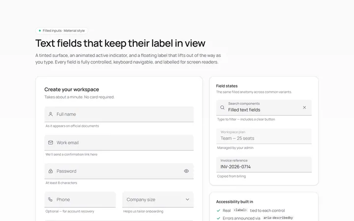
Filled Input
Originalfilled material-style inputs

Underline Input
Originalminimal underline inputs with animated bar

Search Input
Originalsearch box with icon and clear

Search Suggest Input
Originalsearch with a live suggestions dropdown

Password Toggle Input
Originalpassword field with show/hide toggle

Textarea Autosize Input
Originaltextarea that grows with content
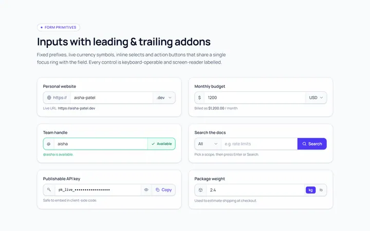
Addon Group Input
Originalinput group with leading/trailing addons

Currency Input
Originalcurrency input with formatting
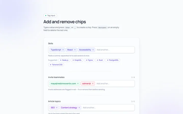
Tags Input
Originaltag input, add and remove chips

OTP Input
Original6-box one-time-code input with paste