

Clearable Input
Original · freeinput with a clear (x) button
Copy prompt gives Claude Code, Cursor or v0 a ready-to-paste prompt that recreates this exact component.
npx shadcn@latest add https://webinnoventix.com/r/inp-clearable.json"use client";
import {
useCallback,
useEffect,
useId,
useRef,
useState,
type ChangeEvent,
type KeyboardEvent,
type ReactNode,
} from "react";
import { AnimatePresence, motion, useReducedMotion } from "motion/react";
/* ---------------------------------- icons --------------------------------- */
function SearchIcon({ className }: { className?: string }) {
return (
<svg
className={className}
viewBox="0 0 24 24"
fill="none"
stroke="currentColor"
strokeWidth={2}
strokeLinecap="round"
strokeLinejoin="round"
aria-hidden="true"
>
<circle cx="11" cy="11" r="7" />
<path d="m20 20-3.2-3.2" />
</svg>
);
}
function MailIcon({ className }: { className?: string }) {
return (
<svg
className={className}
viewBox="0 0 24 24"
fill="none"
stroke="currentColor"
strokeWidth={2}
strokeLinecap="round"
strokeLinejoin="round"
aria-hidden="true"
>
<rect x="3" y="5" width="18" height="14" rx="2" />
<path d="m3.5 7 8.5 6 8.5-6" />
</svg>
);
}
function TagIcon({ className }: { className?: string }) {
return (
<svg
className={className}
viewBox="0 0 24 24"
fill="none"
stroke="currentColor"
strokeWidth={2}
strokeLinecap="round"
strokeLinejoin="round"
aria-hidden="true"
>
<path d="M3 11.5V4a1 1 0 0 1 1-1h7.5a1 1 0 0 1 .7.3l8.5 8.5a1 1 0 0 1 0 1.4l-7.5 7.5a1 1 0 0 1-1.4 0L3.3 12.2a1 1 0 0 1-.3-.7Z" />
<circle cx="7.5" cy="7.5" r="1.25" fill="currentColor" stroke="none" />
</svg>
);
}
function XIcon({ className }: { className?: string }) {
return (
<svg
className={className}
viewBox="0 0 24 24"
fill="none"
stroke="currentColor"
strokeWidth={2.2}
strokeLinecap="round"
strokeLinejoin="round"
aria-hidden="true"
>
<path d="M6 6 18 18M18 6 6 18" />
</svg>
);
}
function CheckIcon({ className }: { className?: string }) {
return (
<svg
className={className}
viewBox="0 0 24 24"
fill="none"
stroke="currentColor"
strokeWidth={2.4}
strokeLinecap="round"
strokeLinejoin="round"
aria-hidden="true"
>
<path d="m4 12.5 5 5 11-11" />
</svg>
);
}
/* ----------------------------- reusable input ----------------------------- */
type InputMode = "text" | "email" | "search" | "tel" | "url" | "numeric";
type ClearableInputProps = {
label: string;
placeholder: string;
type?: "text" | "email" | "search" | "tel" | "url";
inputMode?: InputMode;
defaultValue?: string;
leadingIcon?: ReactNode;
hint?: string;
autoComplete?: string;
maxLength?: number;
showCount?: boolean;
transform?: (raw: string) => string;
validate?: (value: string) => string | null;
onValueChange?: (value: string) => void;
};
function ClearableInput({
label,
placeholder,
type = "text",
inputMode = "text",
defaultValue = "",
leadingIcon,
hint,
autoComplete,
maxLength,
showCount = false,
transform,
validate,
onValueChange,
}: ClearableInputProps) {
const reduce = useReducedMotion();
const uid = useId();
const inputId = `${uid}-input`;
const msgId = `${uid}-msg`;
const [value, setValue] = useState(defaultValue);
const [touched, setTouched] = useState(false);
const [justCleared, setJustCleared] = useState(false);
const inputRef = useRef<HTMLInputElement>(null);
const toastTimer = useRef<number | null>(null);
useEffect(() => {
return () => {
if (toastTimer.current !== null) window.clearTimeout(toastTimer.current);
};
}, []);
const commit = useCallback(
(next: string) => {
setValue(next);
onValueChange?.(next);
},
[onValueChange],
);
const handleChange = (e: ChangeEvent<HTMLInputElement>) => {
const next = transform ? transform(e.target.value) : e.target.value;
commit(next);
if (justCleared) setJustCleared(false);
};
const clear = useCallback(() => {
commit("");
setTouched(false);
setJustCleared(true);
if (toastTimer.current !== null) window.clearTimeout(toastTimer.current);
toastTimer.current = window.setTimeout(() => setJustCleared(false), 1600);
inputRef.current?.focus();
}, [commit]);
const handleKeyDown = (e: KeyboardEvent<HTMLInputElement>) => {
if (e.key === "Escape" && value.length > 0) {
e.preventDefault();
clear();
}
};
const hasValue = value.length > 0;
const error = validate && touched && hasValue ? validate(value) : null;
const describedBy = error || hint ? msgId : undefined;
return (
<div className="w-full">
<label
htmlFor={inputId}
className="mb-1.5 block text-sm font-medium text-slate-700 dark:text-slate-200"
>
{label}
</label>
<div
className={[
"group relative flex items-center gap-1 rounded-xl border bg-white px-1.5 shadow-sm transition-colors dark:bg-slate-900",
"focus-within:ring-2",
error
? "border-rose-400 focus-within:border-rose-500 focus-within:ring-rose-500/25 dark:border-rose-500/60 dark:focus-within:border-rose-400"
: "border-slate-300 focus-within:border-indigo-500 focus-within:ring-indigo-500/25 dark:border-slate-700 dark:focus-within:border-indigo-400",
].join(" ")}
>
{leadingIcon ? (
<span className="pl-1.5 text-slate-400 dark:text-slate-500">{leadingIcon}</span>
) : null}
<input
ref={inputRef}
id={inputId}
type={type}
inputMode={inputMode}
value={value}
placeholder={placeholder}
autoComplete={autoComplete}
maxLength={maxLength}
aria-invalid={error ? true : undefined}
aria-describedby={describedBy}
onChange={handleChange}
onKeyDown={handleKeyDown}
onBlur={() => setTouched(true)}
className="min-w-0 flex-1 bg-transparent px-1.5 py-2.5 text-sm text-slate-900 outline-none placeholder:text-slate-400 dark:text-slate-100 dark:placeholder:text-slate-500 [&::-webkit-search-cancel-button]:appearance-none [&::-webkit-search-decoration]:appearance-none"
/>
<AnimatePresence initial={false}>
{hasValue ? (
<motion.button
key="clear"
type="button"
onClick={clear}
aria-label={`Clear ${label.toLowerCase()}`}
title="Clear"
initial={reduce ? false : { opacity: 0, scale: 0.5 }}
animate={{ opacity: 1, scale: 1 }}
exit={reduce ? { opacity: 0 } : { opacity: 0, scale: 0.5 }}
transition={reduce ? { duration: 0 } : { type: "spring", stiffness: 520, damping: 26 }}
className="mr-0.5 inline-flex h-8 w-8 shrink-0 items-center justify-center rounded-lg text-slate-400 transition-colors hover:bg-slate-100 hover:text-slate-600 focus-visible:outline-none focus-visible:ring-2 focus-visible:ring-indigo-500 focus-visible:ring-offset-1 focus-visible:ring-offset-white dark:hover:bg-slate-800 dark:hover:text-slate-200 dark:focus-visible:ring-offset-slate-900"
>
<XIcon className="h-4 w-4" />
</motion.button>
) : null}
</AnimatePresence>
</div>
<div className="mt-1.5 flex min-h-[1.25rem] items-center justify-between gap-3">
<div className="flex items-center gap-2">
{error || hint ? (
<p
id={msgId}
className={
error
? "text-xs font-medium text-rose-600 dark:text-rose-400"
: "text-xs text-slate-500 dark:text-slate-400"
}
>
{error ?? hint}
</p>
) : null}
{justCleared ? (
<span
role="status"
className="inpclr-toast inline-flex items-center gap-1 rounded-full bg-emerald-100 px-2 py-0.5 text-xs font-medium text-emerald-700 dark:bg-emerald-500/15 dark:text-emerald-300"
>
<CheckIcon className="h-3 w-3" />
Cleared
</span>
) : null}
</div>
{showCount && maxLength ? (
<span
className={[
"shrink-0 text-xs tabular-nums",
value.length >= maxLength
? "text-amber-600 dark:text-amber-400"
: "text-slate-400 dark:text-slate-500",
].join(" ")}
>
{value.length}/{maxLength}
</span>
) : null}
</div>
</div>
);
}
/* ------------------------------- showcase --------------------------------- */
const DIRECTORY = [
"Ashgrove Studio",
"Brightwater Labs",
"Copperline Design Co.",
"Dovetail Interactive",
"Everwood Systems",
"Fernbank Digital",
"Granite & Oak",
"Harborview Media",
"Ironwood Collective",
"Juniper Type Foundry",
];
function emailError(v: string): string | null {
return /^[^\s@]+@[^\s@]+\.[^\s@]{2,}$/.test(v)
? null
: "Enter a valid address like name@company.com";
}
export default function ClearableInputShowcase() {
const [query, setQuery] = useState("");
const needle = query.trim().toLowerCase();
const matches = needle
? DIRECTORY.filter((name) => name.toLowerCase().includes(needle))
: DIRECTORY;
return (
<section className="relative w-full bg-slate-50 px-4 py-16 text-slate-900 sm:py-24 dark:bg-slate-950 dark:text-slate-100">
<style>{`
@keyframes inpclr-toast {
0% { opacity: 0; transform: translateY(3px) scale(0.94); }
18% { opacity: 1; transform: translateY(0) scale(1); }
78% { opacity: 1; transform: translateY(0) scale(1); }
100% { opacity: 0; transform: translateY(-2px) scale(0.97); }
}
@keyframes inpclr-pulse {
0%, 100% { opacity: 1; transform: scale(1); }
50% { opacity: 0.35; transform: scale(0.7); }
}
@keyframes inpclr-sheen {
0% { background-position: 0% 50%; }
100% { background-position: 200% 50%; }
}
.inpclr-toast { animation: inpclr-toast 1.6s ease forwards; }
.inpclr-dot { animation: inpclr-pulse 1.8s ease-in-out infinite; }
.inpclr-bar { background-size: 200% 100%; animation: inpclr-sheen 4s linear infinite; }
@media (prefers-reduced-motion: reduce) {
.inpclr-toast, .inpclr-dot, .inpclr-bar { animation: none !important; }
}
`}</style>
<div className="mx-auto w-full max-w-2xl">
<header className="mb-10">
<span className="inline-flex items-center gap-2 rounded-full border border-slate-200 bg-white px-3 py-1 text-xs font-medium text-slate-500 dark:border-slate-800 dark:bg-slate-900 dark:text-slate-400">
<span className="inpclr-dot h-1.5 w-1.5 rounded-full bg-indigo-500" />
Inputs / Clearable
</span>
<h2 className="mt-4 text-2xl font-semibold tracking-tight text-slate-900 sm:text-3xl dark:text-white">
Type, then clear it in one tap
</h2>
<p className="mt-2 max-w-prose text-sm text-slate-600 dark:text-slate-300">
A reset button appears the moment there is text. Click it, or press{" "}
<kbd className="rounded border border-slate-300 bg-white px-1.5 py-0.5 font-mono text-[11px] text-slate-600 dark:border-slate-700 dark:bg-slate-800 dark:text-slate-300">
Esc
</kbd>{" "}
while focused — focus stays in the field so you can keep going.
</p>
</header>
<div className="space-y-6">
{/* --- Live-filter search --- */}
<article className="overflow-hidden rounded-2xl border border-slate-200 bg-white shadow-sm dark:border-slate-800 dark:bg-slate-900">
<div className="inpclr-bar h-1 w-full bg-gradient-to-r from-indigo-500 via-violet-500 to-sky-500" />
<div className="p-5 sm:p-6">
<ClearableInput
label="Search the studio directory"
placeholder="Try “design”, “labs”, or a name…"
type="search"
inputMode="search"
leadingIcon={<SearchIcon className="h-4 w-4" />}
onValueChange={setQuery}
/>
<p
aria-live="polite"
className="mt-3 text-xs font-medium text-slate-500 dark:text-slate-400"
>
{matches.length} of {DIRECTORY.length} studios
{needle ? (
<>
{" "}
matching “<span className="text-slate-700 dark:text-slate-200">{query.trim()}</span>”
</>
) : null}
</p>
<ul className="mt-3 flex flex-wrap gap-2">
{matches.length > 0 ? (
matches.map((name) => (
<li
key={name}
className="rounded-lg border border-slate-200 bg-slate-50 px-2.5 py-1 text-xs text-slate-700 dark:border-slate-700 dark:bg-slate-800 dark:text-slate-200"
>
{name}
</li>
))
) : (
<li className="text-xs text-slate-400 dark:text-slate-500">
No studios match that search yet.
</li>
)}
</ul>
</div>
</article>
{/* --- Email + Promo, side by side on wider screens --- */}
<div className="grid gap-6 sm:grid-cols-2">
<article className="rounded-2xl border border-slate-200 bg-white p-5 shadow-sm sm:p-6 dark:border-slate-800 dark:bg-slate-900">
<ClearableInput
label="Work email"
placeholder="you@company.com"
type="email"
inputMode="email"
autoComplete="email"
leadingIcon={<MailIcon className="h-4 w-4" />}
hint="We only use this to send your invite."
validate={emailError}
defaultValue="salman@company"
/>
</article>
<article className="rounded-2xl border border-slate-200 bg-white p-5 shadow-sm sm:p-6 dark:border-slate-800 dark:bg-slate-900">
<ClearableInput
label="Promo code"
placeholder="LAUNCH25"
type="text"
autoComplete="off"
leadingIcon={<TagIcon className="h-4 w-4" />}
hint="Case-insensitive — we upper-case it for you."
maxLength={12}
showCount
transform={(raw) => raw.toUpperCase().replace(/\s+/g, "")}
defaultValue="EARLYBIRD"
/>
</article>
</div>
</div>
</div>
</section>
);
}Dependencies
Licence
Built by Web Innoventix. Free for personal and commercial use, no attribution required.
Built by Web Innoventix
Need a custom interface, a full website, or SEO that gets you cited by AI? We design, build and rank it end to end.
Get a free quoteSimilar components
Browse all →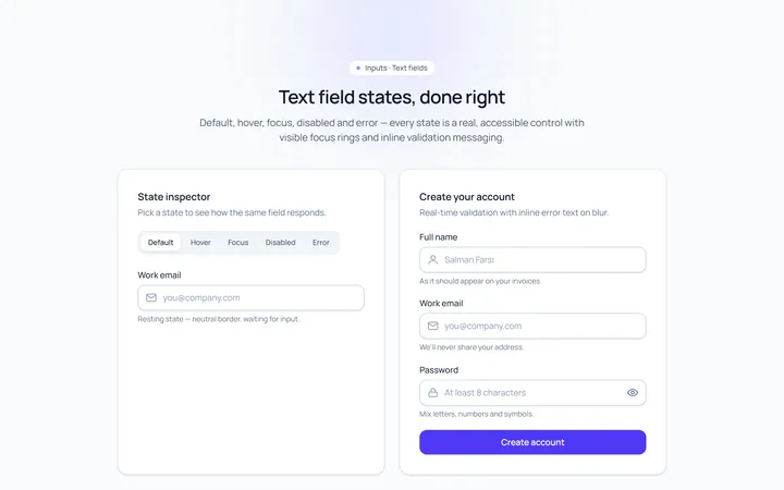
Basic Set Input
Originaldefault, hover, focus, disabled, error text inputs
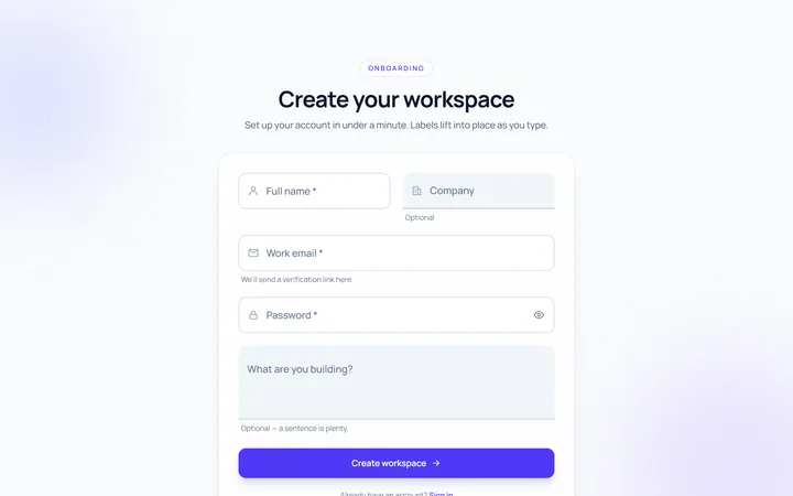
Floating Label Input
Originallabel that floats up on focus/fill
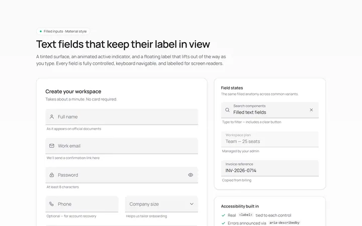
Filled Input
Originalfilled material-style inputs
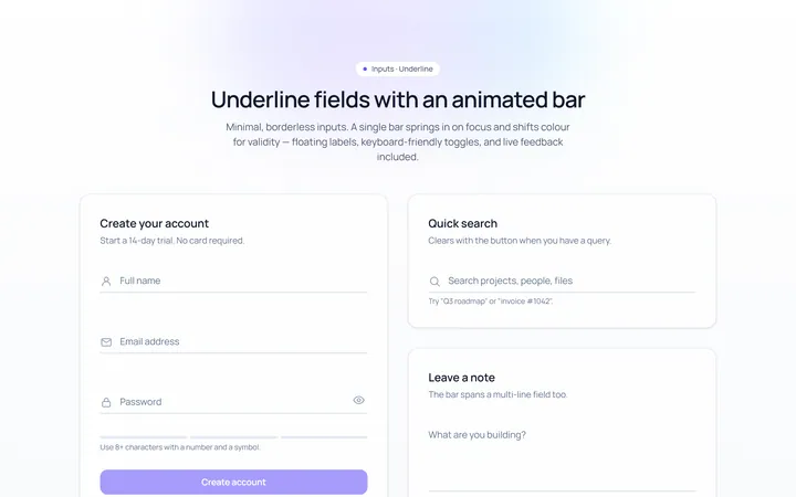
Underline Input
Originalminimal underline inputs with animated bar
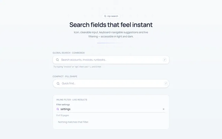
Search Input
Originalsearch box with icon and clear
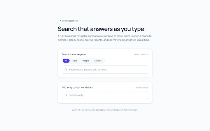
Search Suggest Input
Originalsearch with a live suggestions dropdown
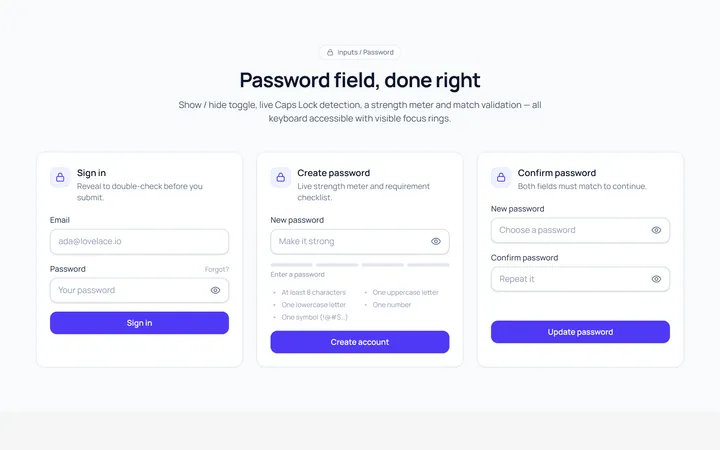
Password Toggle Input
Originalpassword field with show/hide toggle
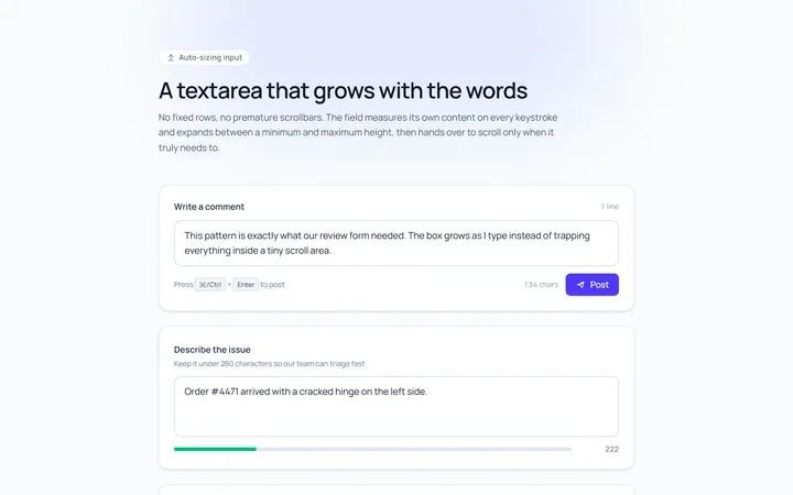
Textarea Autosize Input
Originaltextarea that grows with content
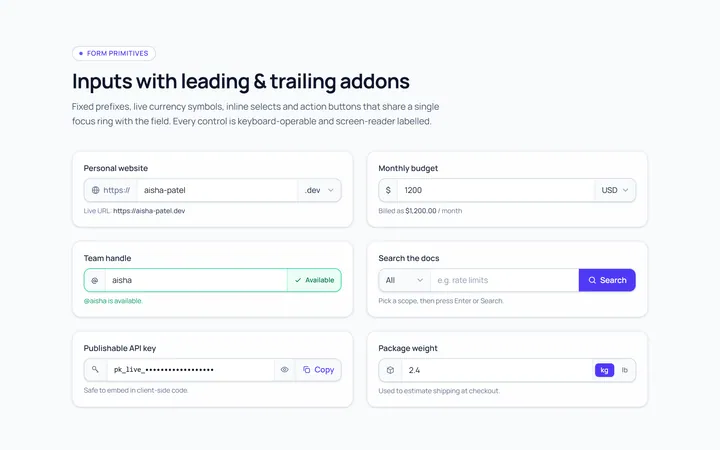
Addon Group Input
Originalinput group with leading/trailing addons
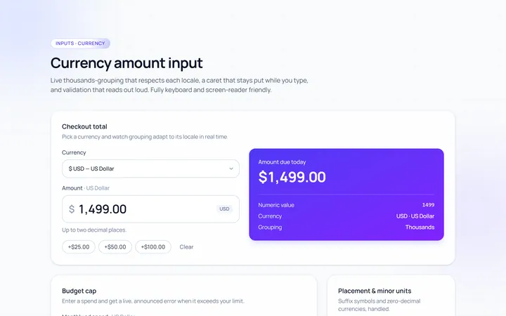
Currency Input
Originalcurrency input with formatting
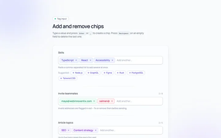
Tags Input
Originaltag input, add and remove chips
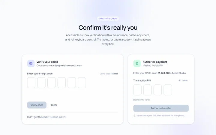
OTP Input
Original6-box one-time-code input with paste