

Color Picker Input
Original · freeswatch color picker input
Copy prompt gives Claude Code, Cursor or v0 a ready-to-paste prompt that recreates this exact component.
npx shadcn@latest add https://webinnoventix.com/r/inp-color-picker.json"use client";
import { useMemo, useRef, useState } from "react";
import type { KeyboardEvent } from "react";
import { AnimatePresence, motion, useReducedMotion } from "motion/react";
type Swatch = { name: string; hex: string };
const ACCENTS: Swatch[] = [
{ name: "Indigo", hex: "#6366f1" },
{ name: "Violet", hex: "#8b5cf6" },
{ name: "Sky", hex: "#0ea5e9" },
{ name: "Emerald", hex: "#10b981" },
{ name: "Amber", hex: "#f59e0b" },
{ name: "Rose", hex: "#f43f5e" },
{ name: "Slate", hex: "#64748b" },
{ name: "Graphite", hex: "#3f3f46" },
];
const LABELS: Swatch[] = [
{ name: "Rose", hex: "#f43f5e" },
{ name: "Amber", hex: "#f59e0b" },
{ name: "Emerald", hex: "#10b981" },
{ name: "Sky", hex: "#0ea5e9" },
{ name: "Violet", hex: "#8b5cf6" },
{ name: "Slate", hex: "#64748b" },
];
const HEX_RE = /^#?([0-9a-fA-F]{3}|[0-9a-fA-F]{6})$/;
function isValidHex(raw: string): boolean {
return HEX_RE.test(raw.trim());
}
function normalizeHex(raw: string): string {
let c = raw.trim().replace(/^#/, "").toLowerCase();
if (c.length === 3) {
c = c
.split("")
.map((ch) => ch + ch)
.join("");
}
return `#${c}`;
}
function relativeLuminance(hex: string): number {
const c = normalizeHex(hex).slice(1);
const r = parseInt(c.slice(0, 2), 16) / 255;
const g = parseInt(c.slice(2, 4), 16) / 255;
const b = parseInt(c.slice(4, 6), 16) / 255;
const lin = (v: number): number =>
v <= 0.03928 ? v / 12.92 : Math.pow((v + 0.055) / 1.055, 2.4);
return 0.2126 * lin(r) + 0.7152 * lin(g) + 0.0722 * lin(b);
}
function readableInk(hex: string): string {
return relativeLuminance(hex) > 0.45 ? "#0f172a" : "#ffffff";
}
function nameFor(hex: string, table: Swatch[]): string {
const match = table.find((s) => s.hex.toLowerCase() === hex.toLowerCase());
return match ? match.name : "Custom";
}
function CheckIcon({ tint }: { tint: string }) {
return (
<svg
viewBox="0 0 24 24"
width="15"
height="15"
fill="none"
stroke={tint}
strokeWidth={3.2}
strokeLinecap="round"
strokeLinejoin="round"
aria-hidden="true"
>
<path d="M5 13l4 4L19 7" />
</svg>
);
}
function PaletteIcon() {
return (
<svg
viewBox="0 0 24 24"
width="18"
height="18"
fill="none"
stroke="currentColor"
strokeWidth={1.7}
strokeLinecap="round"
strokeLinejoin="round"
aria-hidden="true"
>
<path d="M12 3a9 9 0 1 0 0 18c1.1 0 1.7-.9 1.4-1.9-.4-1.2.4-2.1 1.6-2.1H17a4 4 0 0 0 4-4c0-5-4-8-9-8Z" />
<circle cx="7.5" cy="10.5" r="1" fill="currentColor" stroke="none" />
<circle cx="12" cy="7.5" r="1" fill="currentColor" stroke="none" />
<circle cx="16.5" cy="10.5" r="1" fill="currentColor" stroke="none" />
</svg>
);
}
function SwatchGroup({
swatches,
value,
onChange,
label,
size = "md",
}: {
swatches: Swatch[];
value: string;
onChange: (hex: string) => void;
label: string;
size?: "md" | "sm";
}) {
const reduce = useReducedMotion();
const refs = useRef<Array<HTMLButtonElement | null>>([]);
const selectedIndex = swatches.findIndex(
(s) => s.hex.toLowerCase() === value.toLowerCase(),
);
const move = (target: number): void => {
const i = (target + swatches.length) % swatches.length;
onChange(swatches[i].hex);
refs.current[i]?.focus();
};
const onKeyDown = (e: KeyboardEvent<HTMLButtonElement>, index: number): void => {
switch (e.key) {
case "ArrowRight":
case "ArrowDown":
e.preventDefault();
move(index + 1);
break;
case "ArrowLeft":
case "ArrowUp":
e.preventDefault();
move(index - 1);
break;
case "Home":
e.preventDefault();
move(0);
break;
case "End":
e.preventDefault();
move(swatches.length - 1);
break;
case " ":
case "Enter":
e.preventDefault();
onChange(swatches[index].hex);
break;
default:
break;
}
};
const dim = size === "sm" ? "h-8 w-8" : "h-11 w-11";
return (
<div role="radiogroup" aria-label={label} className="flex flex-wrap gap-2.5">
{swatches.map((s, i) => {
const selected = i === selectedIndex;
const tabbable = selectedIndex === -1 ? i === 0 : selected;
return (
<button
key={s.hex}
ref={(el) => {
refs.current[i] = el;
}}
type="button"
role="radio"
aria-checked={selected}
aria-label={`${s.name} ${s.hex}`}
title={`${s.name} · ${s.hex}`}
tabIndex={tabbable ? 0 : -1}
onClick={() => onChange(s.hex)}
onKeyDown={(e) => onKeyDown(e, i)}
style={{ backgroundColor: s.hex }}
className={[
"relative grid place-items-center rounded-xl outline-none",
dim,
"ring-1 ring-black/10 dark:ring-white/15",
"transition-transform duration-150 hover:scale-105 active:scale-95",
"focus-visible:ring-2 focus-visible:ring-offset-2 focus-visible:ring-indigo-500",
"focus-visible:ring-offset-white dark:focus-visible:ring-offset-slate-900",
selected
? "scale-105 ring-2 ring-offset-2 ring-slate-900 ring-offset-white dark:ring-white dark:ring-offset-slate-900"
: "",
].join(" ")}
>
<AnimatePresence initial={false}>
{selected ? (
<motion.span
key="check"
initial={reduce ? false : { scale: 0, opacity: 0 }}
animate={{ scale: 1, opacity: 1 }}
exit={reduce ? { opacity: 0 } : { scale: 0, opacity: 0 }}
transition={
reduce
? { duration: 0 }
: { type: "spring", stiffness: 520, damping: 24 }
}
className="pointer-events-none flex"
>
<CheckIcon tint={readableInk(s.hex)} />
</motion.span>
) : null}
</AnimatePresence>
</button>
);
})}
</div>
);
}
export default function SwatchColorPicker() {
const [accent, setAccent] = useState<string>("#6366f1");
const [hexDraft, setHexDraft] = useState<string>("#6366f1");
const [labelColor, setLabelColor] = useState<string>("#10b981");
const applyAccent = (next: string): void => {
const norm = normalizeHex(next);
setAccent(norm);
setHexDraft(norm);
};
const onHexInput = (raw: string): void => {
setHexDraft(raw);
if (isValidHex(raw)) {
setAccent(normalizeHex(raw));
}
};
const hexValid = isValidHex(hexDraft);
const accentName = useMemo(() => nameFor(accent, ACCENTS), [accent]);
const labelName = useMemo(() => nameFor(labelColor, LABELS), [labelColor]);
return (
<section className="relative w-full bg-slate-50 px-4 py-16 text-slate-900 sm:py-20 dark:bg-slate-950 dark:text-slate-100">
<style>{`
@keyframes scp-pulse {
0%, 100% { opacity: .55; transform: scale(1); }
50% { opacity: 0; transform: scale(1.45); }
}
@keyframes scp-rise {
from { opacity: 0; transform: translateY(8px); }
to { opacity: 1; transform: none; }
}
.scp-pulse { animation: scp-pulse 2.4s ease-in-out infinite; }
.scp-rise { animation: scp-rise .5s cubic-bezier(.22,1,.36,1) both; }
@media (prefers-reduced-motion: reduce) {
.scp-pulse, .scp-rise { animation: none !important; }
}
`}</style>
<div className="mx-auto max-w-5xl">
<header className="scp-rise mb-10 max-w-2xl">
<span className="inline-flex items-center gap-2 rounded-full border border-slate-200 bg-white px-3 py-1 text-xs font-medium text-slate-600 dark:border-slate-700 dark:bg-slate-900 dark:text-slate-300">
<PaletteIcon />
Appearance
</span>
<h2 className="mt-4 text-2xl font-semibold tracking-tight sm:text-3xl">
Swatch color picker
</h2>
<p className="mt-2 text-sm leading-relaxed text-slate-600 dark:text-slate-400">
An accessible swatch input with a roving-tabindex radio group, arrow-key
navigation, a synced hex field, and a native custom picker. Try the
arrow keys, Home / End, or type a hex value.
</p>
</header>
<div className="grid gap-6 lg:grid-cols-5">
{/* Primary picker */}
<div className="scp-rise rounded-2xl border border-slate-200 bg-white p-6 shadow-sm lg:col-span-3 dark:border-slate-800 dark:bg-slate-900">
<div className="flex items-start justify-between gap-4">
<div>
<h3 className="text-sm font-semibold">Brand accent</h3>
<p className="mt-1 text-xs text-slate-500 dark:text-slate-400">
Used across buttons, links, and highlights in your dashboard.
</p>
</div>
<div className="flex items-center gap-3">
<div className="relative grid h-14 w-14 place-items-center">
<span
style={{ borderColor: accent }}
className="scp-pulse absolute inset-0 rounded-2xl border-2"
aria-hidden="true"
/>
<span
style={{ backgroundColor: accent }}
className="h-14 w-14 rounded-2xl ring-1 ring-black/10 dark:ring-white/15"
/>
</div>
<div className="text-right">
<div className="text-sm font-semibold">{accentName}</div>
<div className="font-mono text-xs uppercase text-slate-500 dark:text-slate-400">
{accent}
</div>
</div>
</div>
</div>
<div className="mt-6">
<SwatchGroup
swatches={ACCENTS}
value={accent}
onChange={applyAccent}
label="Brand accent color"
/>
</div>
<div className="mt-6 flex flex-wrap items-end gap-4 border-t border-slate-100 pt-5 dark:border-slate-800">
<div className="flex-1">
<label
htmlFor="scp-hex"
className="mb-1.5 block text-xs font-medium text-slate-600 dark:text-slate-300"
>
Custom hex
</label>
<div className="relative">
<span className="pointer-events-none absolute left-3 top-1/2 -translate-y-1/2 font-mono text-sm text-slate-400">
#
</span>
<input
id="scp-hex"
type="text"
inputMode="text"
autoComplete="off"
spellCheck={false}
maxLength={7}
value={hexDraft.replace(/^#/, "")}
onChange={(e) => onHexInput(e.target.value)}
aria-invalid={!hexValid}
aria-describedby="scp-hex-hint"
placeholder="6366f1"
className={[
"w-full rounded-lg border bg-white py-2.5 pl-7 pr-3 font-mono text-sm uppercase tracking-wide outline-none",
"text-slate-900 placeholder:text-slate-400 dark:bg-slate-950 dark:text-slate-100",
"focus-visible:ring-2 focus-visible:ring-offset-2 focus-visible:ring-offset-white dark:focus-visible:ring-offset-slate-900",
hexValid
? "border-slate-300 focus-visible:ring-indigo-500 dark:border-slate-700"
: "border-rose-400 focus-visible:ring-rose-500 dark:border-rose-500",
].join(" ")}
/>
</div>
<p
id="scp-hex-hint"
className={[
"mt-1.5 text-xs",
hexValid
? "text-slate-400 dark:text-slate-500"
: "text-rose-600 dark:text-rose-400",
].join(" ")}
>
{hexValid
? "3 or 6 hex digits (e.g. f43f5e)."
: "Enter a valid hex color."}
</p>
</div>
<div>
<label
htmlFor="scp-native"
className="mb-1.5 block text-xs font-medium text-slate-600 dark:text-slate-300"
>
Picker
</label>
<div className="flex items-center gap-2 rounded-lg border border-slate-300 bg-white p-1.5 dark:border-slate-700 dark:bg-slate-950">
<input
id="scp-native"
type="color"
value={accent}
onChange={(e) => applyAccent(e.target.value)}
aria-label="Open the system color picker"
className="h-9 w-10 cursor-pointer rounded-md border-0 bg-transparent p-0 outline-none focus-visible:ring-2 focus-visible:ring-indigo-500"
/>
<span className="pr-1 text-xs text-slate-500 dark:text-slate-400">
Eyedrop
</span>
</div>
</div>
</div>
</div>
{/* Compact label-color variant */}
<div className="scp-rise rounded-2xl border border-slate-200 bg-white p-6 shadow-sm lg:col-span-2 dark:border-slate-800 dark:bg-slate-900">
<h3 className="text-sm font-semibold">Label color</h3>
<p className="mt-1 text-xs text-slate-500 dark:text-slate-400">
A compact swatch row for tags and status chips.
</p>
<div className="mt-5">
<SwatchGroup
swatches={LABELS}
value={labelColor}
onChange={setLabelColor}
label="Label color"
size="sm"
/>
</div>
<div className="mt-6 rounded-xl border border-slate-100 bg-slate-50 p-4 dark:border-slate-800 dark:bg-slate-950">
<p className="mb-2 text-xs font-medium text-slate-500 dark:text-slate-400">
Preview
</p>
<span
style={{
backgroundColor: labelColor,
color: readableInk(labelColor),
}}
className="inline-flex items-center gap-1.5 rounded-full px-3 py-1 text-xs font-semibold"
>
<span
style={{ backgroundColor: readableInk(labelColor) }}
className="h-1.5 w-1.5 rounded-full opacity-80"
/>
{labelName}
</span>
</div>
</div>
</div>
</div>
</section>
);
}Dependencies
Licence
Built by Web Innoventix. Free for personal and commercial use, no attribution required.
Built by Web Innoventix
Need a custom interface, a full website, or SEO that gets you cited by AI? We design, build and rank it end to end.
Get a free quoteSimilar components
Browse all →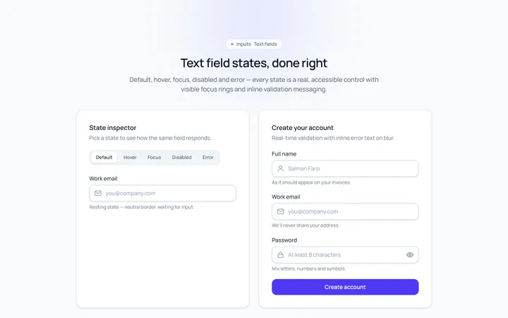
Basic Set Input
Originaldefault, hover, focus, disabled, error text inputs
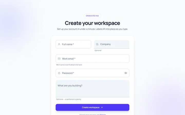
Floating Label Input
Originallabel that floats up on focus/fill
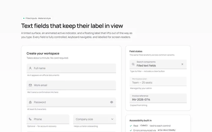
Filled Input
Originalfilled material-style inputs
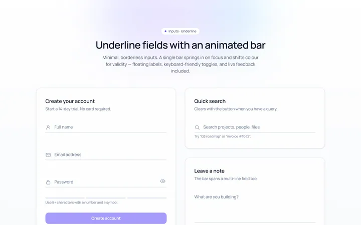
Underline Input
Originalminimal underline inputs with animated bar
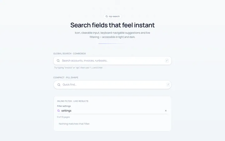
Search Input
Originalsearch box with icon and clear
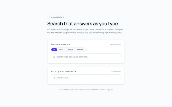
Search Suggest Input
Originalsearch with a live suggestions dropdown
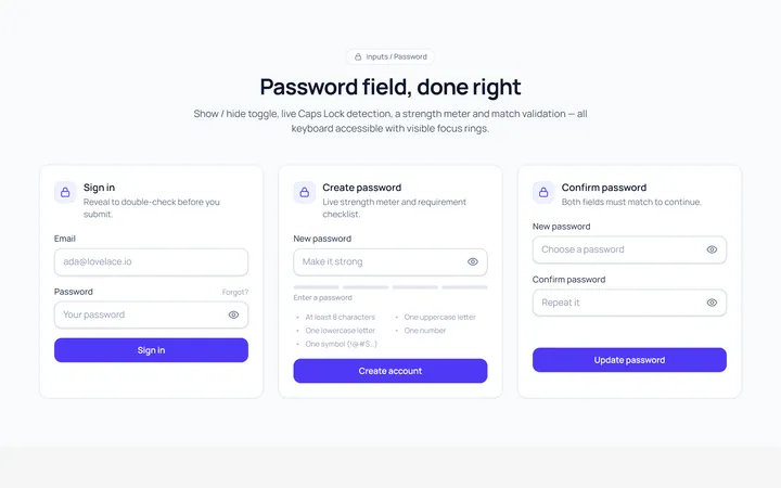
Password Toggle Input
Originalpassword field with show/hide toggle
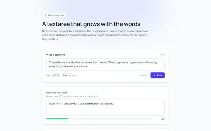
Textarea Autosize Input
Originaltextarea that grows with content
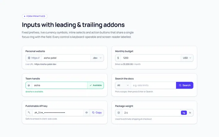
Addon Group Input
Originalinput group with leading/trailing addons
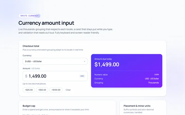
Currency Input
Originalcurrency input with formatting
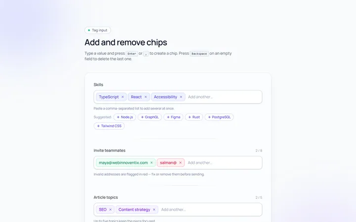
Tags Input
Originaltag input, add and remove chips
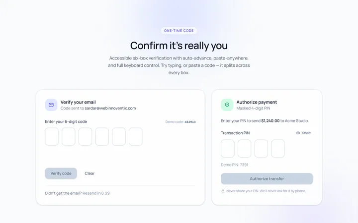
OTP Input
Original6-box one-time-code input with paste