

Inline Edit Input
Original · freeclick-to-edit inline text field
Copy prompt gives Claude Code, Cursor or v0 a ready-to-paste prompt that recreates this exact component.
npx shadcn@latest add https://webinnoventix.com/r/inp-inline-edit.json"use client";
import {
useCallback,
useEffect,
useId,
useRef,
useState,
} from "react";
import type { ChangeEvent, KeyboardEvent } from "react";
import { motion, useReducedMotion } from "motion/react";
/* ------------------------------------------------------------------ *
* Keyframes (unique inpie- prefix) + reduced-motion guard
* ------------------------------------------------------------------ */
const INPIE_KEYFRAMES = `
@keyframes inpie-pop {
0% { opacity: 0; transform: scale(0.82); }
55% { transform: scale(1.06); }
100% { opacity: 1; transform: scale(1); }
}
@keyframes inpie-shake {
0%, 100% { transform: translateX(0); }
22% { transform: translateX(-5px); }
44% { transform: translateX(5px); }
66% { transform: translateX(-3px); }
88% { transform: translateX(2px); }
}
.inpie-pop { animation: inpie-pop 0.28s cubic-bezier(0.34, 1.56, 0.64, 1) both; }
.inpie-shake { animation: inpie-shake 0.34s ease-in-out both; }
@media (prefers-reduced-motion: reduce) {
.inpie-pop, .inpie-shake { animation: none !important; }
}
`;
/* ------------------------------------------------------------------ *
* Inline SVG icons
* ------------------------------------------------------------------ */
function PencilIcon({ className }: { className?: string }) {
return (
<svg
viewBox="0 0 24 24"
fill="none"
stroke="currentColor"
strokeWidth={2}
strokeLinecap="round"
strokeLinejoin="round"
className={className}
aria-hidden="true"
>
<path d="M12 20h9" />
<path d="M16.5 3.5a2.121 2.121 0 0 1 3 3L7 19l-4 1 1-4Z" />
</svg>
);
}
function CheckIcon({ className }: { className?: string }) {
return (
<svg
viewBox="0 0 24 24"
fill="none"
stroke="currentColor"
strokeWidth={2.5}
strokeLinecap="round"
strokeLinejoin="round"
className={className}
aria-hidden="true"
>
<path d="m20 6-11 11-5-5" />
</svg>
);
}
function CloseIcon({ className }: { className?: string }) {
return (
<svg
viewBox="0 0 24 24"
fill="none"
stroke="currentColor"
strokeWidth={2.5}
strokeLinecap="round"
strokeLinejoin="round"
className={className}
aria-hidden="true"
>
<path d="M18 6 6 18" />
<path d="m6 6 12 12" />
</svg>
);
}
/* ------------------------------------------------------------------ *
* InlineEdit primitive — click-to-edit text field
* ------------------------------------------------------------------ */
type Validator = (value: string) => string | null;
type InlineEditProps = {
label: string;
value: string;
onSave: (next: string) => void;
placeholder?: string;
multiline?: boolean;
type?: "text" | "email";
inputMode?: "text" | "email";
size?: "md" | "lg";
validate?: Validator;
};
function InlineEdit({
label,
value,
onSave,
placeholder = "Add a value",
multiline = false,
type = "text",
inputMode,
size = "md",
validate,
}: InlineEditProps) {
const reduce = useReducedMotion();
const uid = useId();
const labelId = `${uid}-label`;
const valueId = `${uid}-value`;
const inputId = `${uid}-input`;
const errorId = `${uid}-error`;
const hintId = `${uid}-hint`;
const [editing, setEditing] = useState(false);
const [draft, setDraft] = useState(value);
const [error, setError] = useState<string | null>(null);
const [saved, setSaved] = useState(false);
const inputRef = useRef<HTMLInputElement | HTMLTextAreaElement | null>(null);
const triggerRef = useRef<HTMLButtonElement | null>(null);
const wasEditing = useRef(false);
const setInputRef = useCallback(
(el: HTMLInputElement | HTMLTextAreaElement | null) => {
inputRef.current = el;
},
[],
);
// Focus the input on entering edit mode; return focus to trigger on exit.
useEffect(() => {
if (editing) {
const el = inputRef.current;
if (el) {
el.focus();
el.select();
}
} else if (wasEditing.current) {
triggerRef.current?.focus();
}
wasEditing.current = editing;
}, [editing]);
// Auto-dismiss the "Saved" confirmation.
useEffect(() => {
if (!saved) return;
const t = window.setTimeout(() => setSaved(false), 1900);
return () => window.clearTimeout(t);
}, [saved]);
const startEditing = () => {
setDraft(value);
setError(null);
setEditing(true);
};
const commit = () => {
const next = draft.trim();
if (validate) {
const message = validate(next);
if (message) {
setError(message);
const el = inputRef.current;
if (el) el.focus();
return;
}
}
if (next !== value) {
onSave(next);
setSaved(true);
}
setEditing(false);
};
const cancel = () => {
setError(null);
setEditing(false);
};
const handleChange = (
e: ChangeEvent<HTMLInputElement | HTMLTextAreaElement>,
) => {
setDraft(e.target.value);
if (error) setError(null);
};
const handleKeyDown = (
e: KeyboardEvent<HTMLInputElement | HTMLTextAreaElement>,
) => {
if (e.key === "Escape") {
e.preventDefault();
cancel();
return;
}
if (multiline && e.key === "Enter" && (e.metaKey || e.ctrlKey)) {
e.preventDefault();
commit();
}
};
const handleSubmit = (e: { preventDefault: () => void }) => {
e.preventDefault();
commit();
};
const isLarge = size === "lg";
const isEmpty = value.trim().length === 0;
const textSize = isLarge
? "text-xl font-semibold tracking-tight sm:text-2xl"
: "text-[15px]";
const hint = multiline
? "⌘ / Ctrl + Enter to save · Esc to cancel"
: "Enter to save · Esc to cancel";
return (
<div>
{/* Label row */}
<div className="flex items-center justify-between gap-3">
<span
id={labelId}
className="text-[11px] font-semibold uppercase tracking-[0.12em] text-zinc-500 dark:text-zinc-400"
>
{label}
</span>
{saved ? (
<span
className="inpie-pop inline-flex items-center gap-1 rounded-full bg-emerald-50 px-2 py-0.5 text-[11px] font-semibold text-emerald-700 ring-1 ring-inset ring-emerald-600/20 dark:bg-emerald-400/10 dark:text-emerald-300 dark:ring-emerald-400/25"
role="status"
>
<CheckIcon className="h-3 w-3" />
Saved
</span>
) : null}
</div>
{/* Control */}
<div className="mt-1.5">
{editing ? (
<motion.form
onSubmit={handleSubmit}
className="space-y-2.5"
initial={reduce ? false : { opacity: 0, y: -3 }}
animate={reduce ? undefined : { opacity: 1, y: 0 }}
transition={reduce ? undefined : { duration: 0.16, ease: "easeOut" }}
>
{multiline ? (
<textarea
id={inputId}
ref={setInputRef}
value={draft}
onChange={handleChange}
onKeyDown={handleKeyDown}
rows={4}
placeholder={placeholder}
aria-labelledby={labelId}
aria-invalid={error ? true : undefined}
aria-describedby={error ? errorId : hintId}
className={`${error ? "inpie-shake" : ""} w-full resize-y rounded-xl border bg-white px-3.5 py-2.5 text-[15px] leading-relaxed text-zinc-900 shadow-sm outline-none transition placeholder:text-zinc-400 dark:bg-zinc-900 dark:text-zinc-100 dark:placeholder:text-zinc-500 ${
error
? "border-rose-400 ring-4 ring-rose-500/15 dark:border-rose-500"
: "border-indigo-400 ring-4 ring-indigo-500/15 dark:border-indigo-500"
}`}
/>
) : (
<input
id={inputId}
ref={setInputRef}
type={type}
inputMode={inputMode}
autoComplete="off"
value={draft}
onChange={handleChange}
onKeyDown={handleKeyDown}
placeholder={placeholder}
aria-labelledby={labelId}
aria-invalid={error ? true : undefined}
aria-describedby={error ? errorId : hintId}
className={`${error ? "inpie-shake" : ""} ${textSize} w-full rounded-xl border bg-white px-3.5 py-2.5 text-zinc-900 shadow-sm outline-none transition placeholder:text-zinc-400 dark:bg-zinc-900 dark:text-zinc-100 dark:placeholder:text-zinc-500 ${
error
? "border-rose-400 ring-4 ring-rose-500/15 dark:border-rose-500"
: "border-indigo-400 ring-4 ring-indigo-500/15 dark:border-indigo-500"
}`}
/>
)}
{error ? (
<p
id={errorId}
role="alert"
className="text-xs font-medium text-rose-600 dark:text-rose-400"
>
{error}
</p>
) : null}
<div className="flex items-center justify-between gap-3">
<span
id={hintId}
className="hidden text-xs text-zinc-400 sm:inline dark:text-zinc-500"
>
{hint}
</span>
<div className="flex items-center gap-2">
<button
type="button"
onClick={cancel}
className="inline-flex items-center gap-1.5 rounded-lg px-3 py-1.5 text-sm font-medium text-zinc-600 transition-colors hover:bg-zinc-100 focus-visible:outline-none focus-visible:ring-2 focus-visible:ring-zinc-400 dark:text-zinc-300 dark:hover:bg-zinc-800 dark:focus-visible:ring-zinc-500"
>
<CloseIcon className="h-3.5 w-3.5" />
Cancel
</button>
<button
type="submit"
className="inline-flex items-center gap-1.5 rounded-lg bg-indigo-600 px-3.5 py-1.5 text-sm font-semibold text-white shadow-sm transition-colors hover:bg-indigo-500 focus-visible:outline-none focus-visible:ring-2 focus-visible:ring-indigo-500 focus-visible:ring-offset-2 focus-visible:ring-offset-white dark:focus-visible:ring-offset-zinc-900"
>
<CheckIcon className="h-3.5 w-3.5" />
Save
</button>
</div>
</div>
</motion.form>
) : (
<button
ref={triggerRef}
type="button"
onClick={startEditing}
title="Click to edit"
aria-labelledby={`${labelId} ${valueId}`}
className={`group flex w-full gap-3 rounded-xl border border-transparent px-3.5 py-2.5 text-left transition-colors hover:border-zinc-200 hover:bg-zinc-50 focus-visible:outline-none focus-visible:ring-2 focus-visible:ring-indigo-500 focus-visible:ring-offset-2 focus-visible:ring-offset-white dark:hover:border-zinc-700 dark:hover:bg-zinc-800/50 dark:focus-visible:ring-offset-zinc-900 ${
multiline ? "items-start" : "items-center justify-between"
}`}
>
<span
id={valueId}
className={`${textSize} min-w-0 ${
multiline ? "whitespace-pre-line" : "truncate"
} ${
isEmpty
? "text-zinc-400 dark:text-zinc-500"
: "text-zinc-900 dark:text-zinc-100"
}`}
>
{isEmpty ? placeholder : value}
</span>
<span
className={`flex shrink-0 items-center gap-1 text-xs font-medium text-zinc-400 opacity-0 transition-opacity group-hover:opacity-100 group-focus-visible:opacity-100 dark:text-zinc-500 ${
multiline ? "pt-0.5" : ""
}`}
aria-hidden="true"
>
<PencilIcon className="h-3.5 w-3.5" />
<span className="hidden sm:inline">Edit</span>
</span>
</button>
)}
</div>
</div>
);
}
/* ------------------------------------------------------------------ *
* Validators
* ------------------------------------------------------------------ */
const requiredValidator =
(field: string): Validator =>
(v) =>
v.trim().length === 0 ? `${field} can’t be empty.` : null;
const emailValidator: Validator = (v) => {
if (v.trim().length === 0) return "Email can’t be empty.";
return /^[^\s@]+@[^\s@]+\.[^\s@]+$/.test(v.trim())
? null
: "Enter a valid email address.";
};
/* ------------------------------------------------------------------ *
* Demo — shows several variants of the primitive
* ------------------------------------------------------------------ */
export default function InlineEditField() {
const [reportTitle, setReportTitle] = useState("Q3 Growth Report — Draft");
const [fullName, setFullName] = useState("Amara Okafor");
const [email, setEmail] = useState("amara.okafor@northwind.dev");
const [role, setRole] = useState("Principal Product Designer");
const [location, setLocation] = useState("Lisbon, Portugal");
const [bio, setBio] = useState(
"I lead the design-systems team at Northwind and write about interface craft. Lately I’ve been exploring how restrained motion makes a product feel more trustworthy.",
);
return (
<section className="relative w-full overflow-hidden bg-zinc-50 px-4 py-16 sm:px-6 sm:py-24 dark:bg-zinc-950">
<style>{INPIE_KEYFRAMES}</style>
{/* Atmosphere */}
<div
aria-hidden="true"
className="pointer-events-none absolute -right-24 -top-24 h-72 w-72 rounded-full bg-gradient-to-br from-indigo-400/20 to-violet-400/10 blur-3xl dark:from-indigo-500/12 dark:to-violet-500/10"
/>
<div
aria-hidden="true"
className="pointer-events-none absolute -bottom-32 -left-24 h-72 w-72 rounded-full bg-gradient-to-tr from-sky-400/15 to-emerald-300/10 blur-3xl dark:from-sky-500/10 dark:to-emerald-500/8"
/>
<div className="relative mx-auto max-w-xl">
{/* Heading */}
<header className="mb-8">
<span className="inline-flex items-center gap-1.5 rounded-full bg-white px-3 py-1 text-[11px] font-semibold uppercase tracking-[0.14em] text-indigo-600 shadow-sm ring-1 ring-inset ring-zinc-200 dark:bg-zinc-900 dark:text-indigo-400 dark:ring-zinc-800">
<PencilIcon className="h-3 w-3" />
Inline editing
</span>
<h2 className="mt-4 text-2xl font-bold tracking-tight text-zinc-900 sm:text-3xl dark:text-zinc-50">
Edit in place, without leaving the page.
</h2>
<p className="mt-2 text-sm leading-relaxed text-zinc-600 dark:text-zinc-400">
Click any field to swap the value for a text input. Press{" "}
<kbd className="rounded border border-zinc-300 bg-white px-1 py-0.5 text-[11px] font-medium text-zinc-700 dark:border-zinc-700 dark:bg-zinc-800 dark:text-zinc-200">
Enter
</kbd>{" "}
to save,{" "}
<kbd className="rounded border border-zinc-300 bg-white px-1 py-0.5 text-[11px] font-medium text-zinc-700 dark:border-zinc-700 dark:bg-zinc-800 dark:text-zinc-200">
Esc
</kbd>{" "}
to cancel.
</p>
</header>
{/* Card */}
<div className="rounded-2xl border border-zinc-200 bg-white p-5 shadow-sm sm:p-7 dark:border-zinc-800 dark:bg-zinc-900">
{/* Variant 1 — large title */}
<InlineEdit
label="Report title"
value={reportTitle}
onSave={setReportTitle}
placeholder="Untitled report"
size="lg"
validate={requiredValidator("Title")}
/>
<div className="my-6 h-px bg-zinc-100 dark:bg-zinc-800" />
{/* Variant 2 — profile field list */}
<div className="divide-y divide-zinc-100 dark:divide-zinc-800">
<div className="py-4 first:pt-0">
<InlineEdit
label="Full name"
value={fullName}
onSave={setFullName}
placeholder="Add your name"
validate={requiredValidator("Name")}
/>
</div>
<div className="py-4">
<InlineEdit
label="Email"
value={email}
onSave={setEmail}
type="email"
inputMode="email"
placeholder="you@company.com"
validate={emailValidator}
/>
</div>
<div className="py-4">
<InlineEdit
label="Job title"
value={role}
onSave={setRole}
placeholder="What do you do?"
/>
</div>
<div className="py-4 last:pb-0">
<InlineEdit
label="Location"
value={location}
onSave={setLocation}
placeholder="City, Country"
/>
</div>
</div>
<div className="my-6 h-px bg-zinc-100 dark:bg-zinc-800" />
{/* Variant 3 — multiline */}
<InlineEdit
label="Bio"
value={bio}
onSave={setBio}
multiline
placeholder="Tell people a little about yourself"
/>
</div>
<p className="mt-4 text-center text-xs text-zinc-400 dark:text-zinc-500">
Changes are kept in local state for this demo.
</p>
</div>
</section>
);
}Dependencies
Licence
Built by Web Innoventix. Free for personal and commercial use, no attribution required.
Built by Web Innoventix
Need a custom interface, a full website, or SEO that gets you cited by AI? We design, build and rank it end to end.
Get a free quoteSimilar components
Browse all →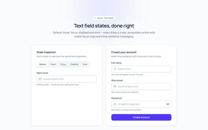
Basic Set Input
Originaldefault, hover, focus, disabled, error text inputs
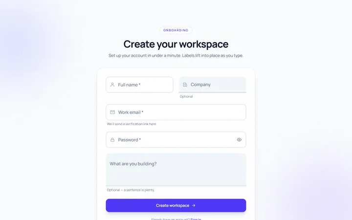
Floating Label Input
Originallabel that floats up on focus/fill
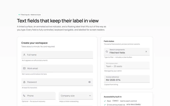
Filled Input
Originalfilled material-style inputs
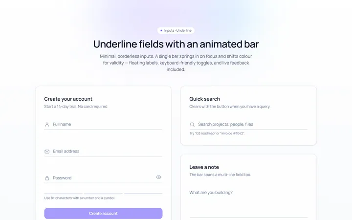
Underline Input
Originalminimal underline inputs with animated bar
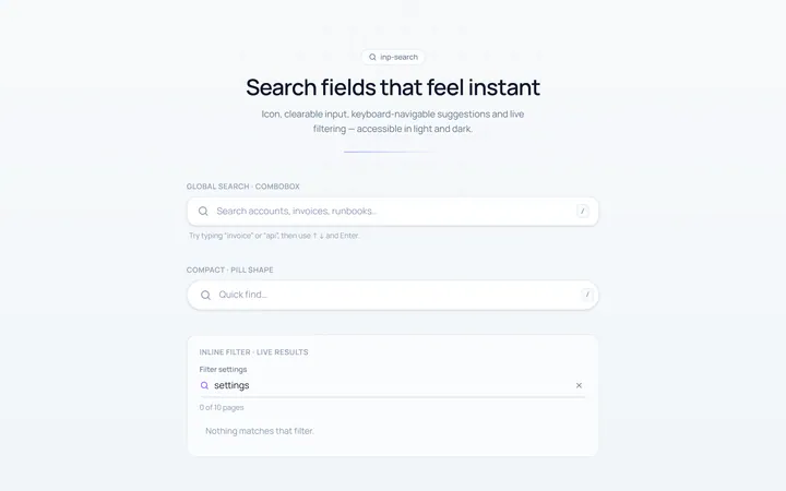
Search Input
Originalsearch box with icon and clear
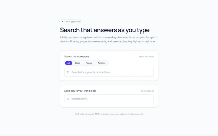
Search Suggest Input
Originalsearch with a live suggestions dropdown
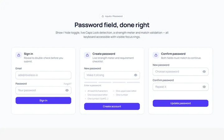
Password Toggle Input
Originalpassword field with show/hide toggle
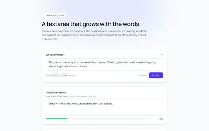
Textarea Autosize Input
Originaltextarea that grows with content
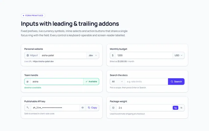
Addon Group Input
Originalinput group with leading/trailing addons
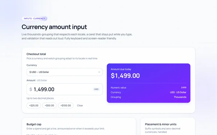
Currency Input
Originalcurrency input with formatting
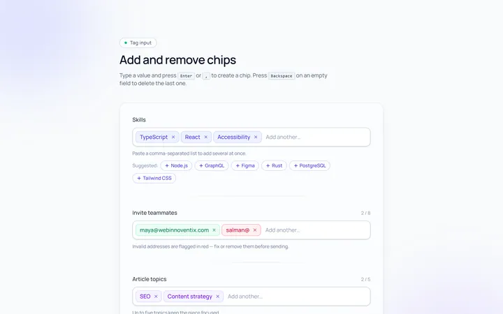
Tags Input
Originaltag input, add and remove chips
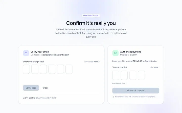
OTP Input
Original6-box one-time-code input with paste