

Quantity Stepper Input
Original · freenumeric quantity stepper with +/-
Copy prompt gives Claude Code, Cursor or v0 a ready-to-paste prompt that recreates this exact component.
npx shadcn@latest add https://webinnoventix.com/r/inp-quantity-stepper.json"use client";
import { useEffect, useId, useMemo, useRef, useState } from "react";
import { AnimatePresence, motion, useReducedMotion } from "motion/react";
type Size = "sm" | "md" | "lg";
interface StepperProps {
label: string;
min?: number;
max?: number;
step?: number;
initial?: number;
size?: Size;
unitPrice?: number;
currency?: string;
stock?: number;
disabled?: boolean;
onChange?: (value: number) => void;
}
const SIZES: Record<
Size,
{ btn: string; input: string; icon: string; radius: string }
> = {
sm: { btn: "h-8 w-8", input: "h-8 w-10 text-sm", icon: "h-3.5 w-3.5", radius: "rounded-lg" },
md: { btn: "h-11 w-11", input: "h-11 w-12 text-base", icon: "h-4 w-4", radius: "rounded-xl" },
lg: { btn: "h-14 w-14", input: "h-14 w-16 text-xl", icon: "h-5 w-5", radius: "rounded-2xl" },
};
function MinusIcon({ className }: { className: string }) {
return (
<svg viewBox="0 0 24 24" fill="none" aria-hidden="true" className={className}>
<path d="M5 12h14" stroke="currentColor" strokeWidth="2.2" strokeLinecap="round" />
</svg>
);
}
function PlusIcon({ className }: { className: string }) {
return (
<svg viewBox="0 0 24 24" fill="none" aria-hidden="true" className={className}>
<path d="M12 5v14M5 12h14" stroke="currentColor" strokeWidth="2.2" strokeLinecap="round" />
</svg>
);
}
function Stepper({
label,
min = 1,
max = 99,
step = 1,
initial,
size = "md",
unitPrice,
currency = "USD",
stock,
disabled = false,
onChange,
}: StepperProps) {
const effectiveMax = typeof stock === "number" ? Math.min(max, stock) : max;
const start = Math.min(effectiveMax, Math.max(min, initial ?? min));
const [value, setValue] = useState(start);
const [draft, setDraft] = useState(String(start));
const [nonce, setNonce] = useState(0);
const [hint, setHint] = useState<{ id: number; d: number } | null>(null);
const reduce = useReducedMotion();
const inputId = useId();
const valueRef = useRef(value);
valueRef.current = value;
const holdTimer = useRef<ReturnType<typeof setTimeout> | null>(null);
const repeatInt = useRef<ReturnType<typeof setInterval> | null>(null);
const hintTimer = useRef<ReturnType<typeof setTimeout> | null>(null);
const didRepeat = useRef(false);
const money = useMemo(
() => new Intl.NumberFormat("en-US", { style: "currency", currency }),
[currency],
);
const clamp = (n: number) => Math.min(effectiveMax, Math.max(min, n));
const flashHint = (d: number) => {
if (reduce || d === 0) return;
const id = Date.now();
setHint({ id, d });
if (hintTimer.current) clearTimeout(hintTimer.current);
hintTimer.current = setTimeout(() => setHint(null), 650);
};
const setTo = (raw: number, feedback: boolean) => {
const prev = valueRef.current;
const next = clamp(Number.isFinite(raw) ? raw : prev);
if (next === prev) return prev;
valueRef.current = next;
setValue(next);
setDraft(String(next));
if (feedback) {
flashHint(next - prev);
setNonce((n) => n + 1);
}
onChange?.(next);
return next;
};
const stepOnce = (dir: 1 | -1) => {
const prev = valueRef.current;
const next = setTo(prev + dir * step, true);
if (next === prev) stopHold();
};
const stopHold = () => {
if (holdTimer.current) {
clearTimeout(holdTimer.current);
holdTimer.current = null;
}
if (repeatInt.current) {
clearInterval(repeatInt.current);
repeatInt.current = null;
}
};
const startHold = (dir: 1 | -1) => {
if (disabled) return;
holdTimer.current = setTimeout(() => {
didRepeat.current = true;
stepOnce(dir);
repeatInt.current = setInterval(() => stepOnce(dir), 110);
}, 400);
};
const handleClick = (dir: 1 | -1) => {
if (disabled) return;
if (didRepeat.current) {
didRepeat.current = false;
return;
}
stepOnce(dir);
};
const handleKeyDown = (e: React.KeyboardEvent<HTMLInputElement>) => {
if (disabled) return;
if (e.key === "ArrowUp") {
e.preventDefault();
stepOnce(1);
} else if (e.key === "ArrowDown") {
e.preventDefault();
stepOnce(-1);
} else if (e.key === "Home") {
e.preventDefault();
setTo(min, true);
} else if (e.key === "End") {
e.preventDefault();
setTo(effectiveMax, true);
}
};
const handleChange = (e: React.ChangeEvent<HTMLInputElement>) => {
const raw = e.target.value.replace(/[^\d]/g, "");
setDraft(raw);
if (raw !== "") setTo(Number(raw), false);
};
const handleBlur = () => {
setTo(draft === "" ? min : Number(draft), false);
setDraft(String(valueRef.current));
};
useEffect(
() => () => {
if (holdTimer.current) clearTimeout(holdTimer.current);
if (repeatInt.current) clearInterval(repeatInt.current);
if (hintTimer.current) clearTimeout(hintTimer.current);
},
[],
);
const s = SIZES[size];
const atMin = disabled || value <= min;
const atMax = disabled || value >= effectiveMax;
const btnBase =
"relative inline-flex select-none items-center justify-center text-zinc-600 transition-[background-color,transform,color] duration-150 hover:bg-zinc-100 hover:text-zinc-900 active:scale-90 focus-visible:outline-none focus-visible:ring-2 focus-visible:ring-inset focus-visible:ring-indigo-500 disabled:cursor-not-allowed disabled:text-zinc-300 disabled:hover:bg-transparent dark:text-zinc-300 dark:hover:bg-zinc-800 dark:hover:text-white dark:disabled:text-zinc-600";
const low = typeof stock === "number" && stock > 0 && stock <= 8;
const out = typeof stock === "number" && stock <= 0;
return (
<div className="flex flex-col gap-3">
<div className="flex items-baseline justify-between gap-4">
<label
htmlFor={inputId}
className="text-sm font-semibold text-zinc-800 dark:text-zinc-100"
>
{label}
</label>
{typeof stock === "number" && (
<span
className={
"inline-flex items-center gap-1.5 text-xs font-medium " +
(out
? "text-rose-600 dark:text-rose-400"
: low
? "text-amber-600 dark:text-amber-400"
: "text-emerald-600 dark:text-emerald-400")
}
>
<span
className={
"qs-pulse h-1.5 w-1.5 rounded-full " +
(out ? "bg-rose-500" : low ? "bg-amber-500" : "bg-emerald-500")
}
/>
{out ? "Out of stock" : low ? `Only ${stock} left` : `${stock} in stock`}
</span>
)}
</div>
<div className="flex flex-wrap items-center gap-x-4 gap-y-2">
<div
role="group"
aria-label={label}
className={
"relative inline-flex items-stretch border bg-white shadow-sm dark:bg-zinc-900 " +
s.radius +
(disabled
? " border-zinc-200 opacity-60 dark:border-zinc-800"
: " border-zinc-200 dark:border-zinc-700")
}
>
<span
key={nonce}
aria-hidden="true"
className={"qs-pop pointer-events-none absolute inset-0 " + s.radius}
/>
<button
type="button"
aria-label={`Decrease ${label.toLowerCase()}`}
aria-controls={inputId}
disabled={atMin}
onClick={() => handleClick(-1)}
onPointerDown={() => startHold(-1)}
onPointerUp={stopHold}
onPointerLeave={stopHold}
onPointerCancel={stopHold}
className={btnBase + " rounded-l-[inherit] " + s.btn}
>
<MinusIcon className={s.icon} />
</button>
<div className="relative flex items-center border-x border-zinc-200 dark:border-zinc-700">
<input
id={inputId}
type="text"
inputMode="numeric"
pattern="[0-9]*"
role="spinbutton"
aria-valuemin={min}
aria-valuemax={effectiveMax}
aria-valuenow={value}
aria-label={`${label} quantity`}
disabled={disabled}
value={draft}
onChange={handleChange}
onKeyDown={handleKeyDown}
onBlur={handleBlur}
className={
"bg-transparent text-center font-semibold tabular-nums text-zinc-900 outline-none focus-visible:ring-2 focus-visible:ring-inset focus-visible:ring-indigo-500 disabled:cursor-not-allowed dark:text-white " +
s.input
}
/>
<AnimatePresence>
{hint && (
<motion.span
key={hint.id}
aria-hidden="true"
initial={{ opacity: 0, y: 2, scale: 0.7 }}
animate={{ opacity: 1, y: -16, scale: 1 }}
exit={{ opacity: 0, y: -24 }}
transition={{ duration: 0.42, ease: "easeOut" }}
className={
"pointer-events-none absolute left-1/2 top-0 -translate-x-1/2 text-xs font-bold " +
(hint.d > 0
? "text-emerald-600 dark:text-emerald-400"
: "text-rose-600 dark:text-rose-400")
}
>
{hint.d > 0 ? `+${hint.d}` : hint.d}
</motion.span>
)}
</AnimatePresence>
</div>
<button
type="button"
aria-label={`Increase ${label.toLowerCase()}`}
aria-controls={inputId}
disabled={atMax}
onClick={() => handleClick(1)}
onPointerDown={() => startHold(1)}
onPointerUp={stopHold}
onPointerLeave={stopHold}
onPointerCancel={stopHold}
className={btnBase + " rounded-r-[inherit] " + s.btn}
>
<PlusIcon className={s.icon} />
</button>
</div>
{typeof unitPrice === "number" && (
<div className="flex flex-col leading-tight">
<span className="text-base font-bold tabular-nums text-zinc-900 dark:text-white">
{money.format(unitPrice * value)}
</span>
<span className="text-xs text-zinc-500 dark:text-zinc-400">
{money.format(unitPrice)} each
</span>
</div>
)}
</div>
<span className="sr-only" aria-live="polite">
{value} {label} selected
</span>
</div>
);
}
export default function QuantityStepper() {
return (
<section className="relative w-full overflow-hidden bg-zinc-50 px-6 py-20 text-zinc-900 dark:bg-zinc-950 dark:text-zinc-50 sm:px-10">
<style>{`
@keyframes qs-pop {
0% { box-shadow: 0 0 0 0 rgba(99,102,241,0.45); }
100% { box-shadow: 0 0 0 7px rgba(99,102,241,0); }
}
.qs-pop { animation: qs-pop 0.5s ease-out; }
@keyframes qs-pulse {
0%, 100% { opacity: 1; transform: scale(1); }
50% { opacity: 0.35; transform: scale(0.8); }
}
.qs-pulse { animation: qs-pulse 1.8s ease-in-out infinite; }
@media (prefers-reduced-motion: reduce) {
.qs-pop, .qs-pulse { animation: none !important; }
}
`}</style>
<div
aria-hidden="true"
className="pointer-events-none absolute -top-24 left-1/2 h-72 w-72 -translate-x-1/2 rounded-full bg-indigo-200/40 blur-3xl dark:bg-indigo-500/10"
/>
<div className="relative mx-auto max-w-4xl">
<header className="mb-12 text-center">
<span className="inline-flex items-center rounded-full border border-zinc-200 bg-white px-3 py-1 text-xs font-semibold uppercase tracking-wider text-indigo-600 dark:border-zinc-800 dark:bg-zinc-900 dark:text-indigo-400">
Inputs
</span>
<h2 className="mt-4 text-3xl font-bold tracking-tight sm:text-4xl">
Quantity stepper
</h2>
<p className="mx-auto mt-3 max-w-lg text-sm text-zinc-500 dark:text-zinc-400">
Type a value, tap the controls, or press and hold to fast-forward.
Arrow keys, Home and End all work.
</p>
</header>
<div className="grid grid-cols-1 gap-5 sm:grid-cols-2">
<div className="rounded-2xl border border-zinc-200 bg-white p-6 dark:border-zinc-800 dark:bg-zinc-900">
<p className="mb-1 text-xs font-medium uppercase tracking-wide text-zinc-400 dark:text-zinc-500">
Product cart line
</p>
<p className="mb-5 text-lg font-semibold">Cedarwood Pour-Over Kit</p>
<Stepper
label="Quantity"
min={1}
max={12}
initial={2}
size="md"
unitPrice={38}
/>
</div>
<div className="rounded-2xl border border-zinc-200 bg-white p-6 dark:border-zinc-800 dark:bg-zinc-900">
<p className="mb-1 text-xs font-medium uppercase tracking-wide text-zinc-400 dark:text-zinc-500">
Limited inventory
</p>
<p className="mb-5 text-lg font-semibold">Barrel-Aged Maple Syrup</p>
<Stepper
label="Bottles"
min={0}
stock={6}
initial={1}
size="md"
unitPrice={24}
/>
</div>
<div className="rounded-2xl border border-zinc-200 bg-white p-6 dark:border-zinc-800 dark:bg-zinc-900">
<p className="mb-4 text-xs font-medium uppercase tracking-wide text-zinc-400 dark:text-zinc-500">
Compact booking row
</p>
<div className="flex flex-col gap-5 sm:flex-row sm:items-start sm:gap-8">
<Stepper label="Guests" min={1} max={8} initial={2} size="sm" />
<Stepper label="Rooms" min={1} max={4} initial={1} size="sm" />
</div>
</div>
<div className="rounded-2xl border border-zinc-200 bg-white p-6 dark:border-zinc-800 dark:bg-zinc-900">
<p className="mb-1 text-xs font-medium uppercase tracking-wide text-zinc-400 dark:text-zinc-500">
Large / unavailable
</p>
<p className="mb-5 text-lg font-semibold">Handmade Ceramic Mug</p>
<div className="flex flex-col gap-6">
<Stepper label="Set size" min={2} max={24} step={2} initial={6} size="lg" />
<Stepper label="Gift box" min={0} stock={0} disabled size="sm" />
</div>
</div>
</div>
</div>
</section>
);
}Dependencies
Licence
Built by Web Innoventix. Free for personal and commercial use, no attribution required.
Built by Web Innoventix
Need a custom interface, a full website, or SEO that gets you cited by AI? We design, build and rank it end to end.
Get a free quoteSimilar components
Browse all →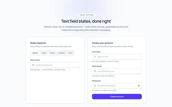
Basic Set Input
Originaldefault, hover, focus, disabled, error text inputs
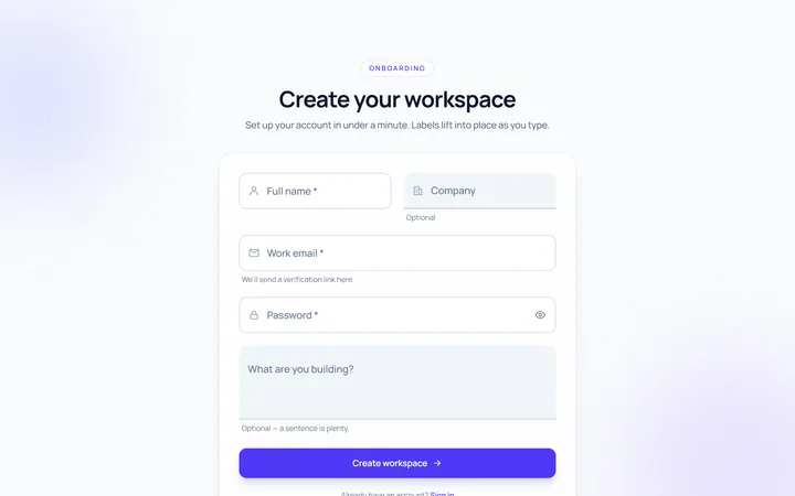
Floating Label Input
Originallabel that floats up on focus/fill
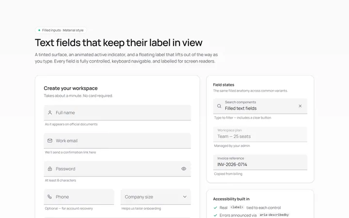
Filled Input
Originalfilled material-style inputs
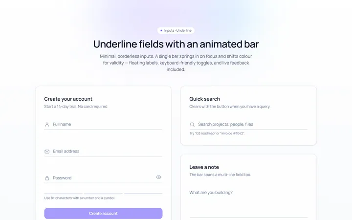
Underline Input
Originalminimal underline inputs with animated bar
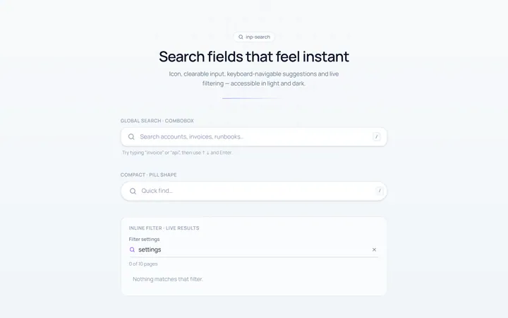
Search Input
Originalsearch box with icon and clear
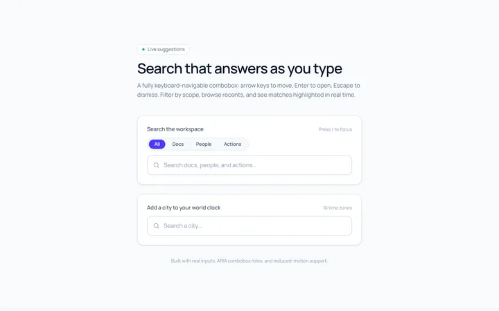
Search Suggest Input
Originalsearch with a live suggestions dropdown
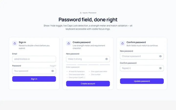
Password Toggle Input
Originalpassword field with show/hide toggle
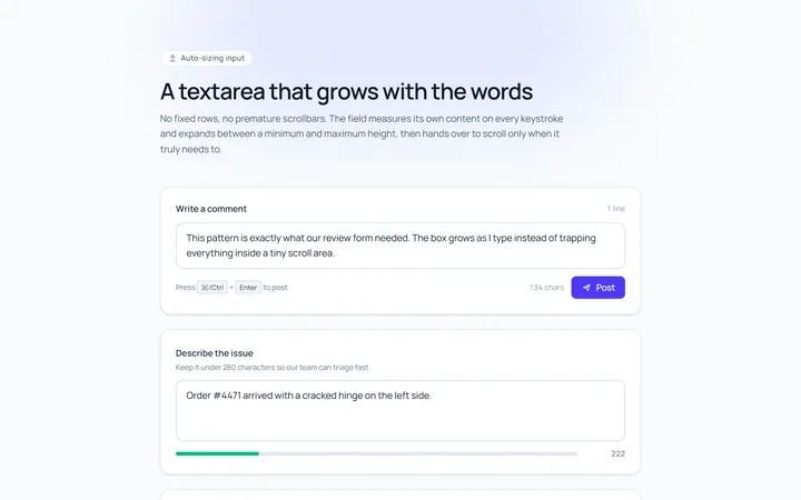
Textarea Autosize Input
Originaltextarea that grows with content
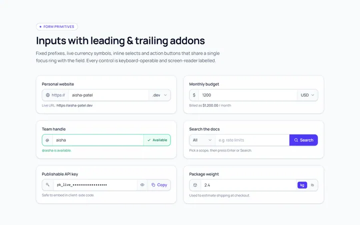
Addon Group Input
Originalinput group with leading/trailing addons
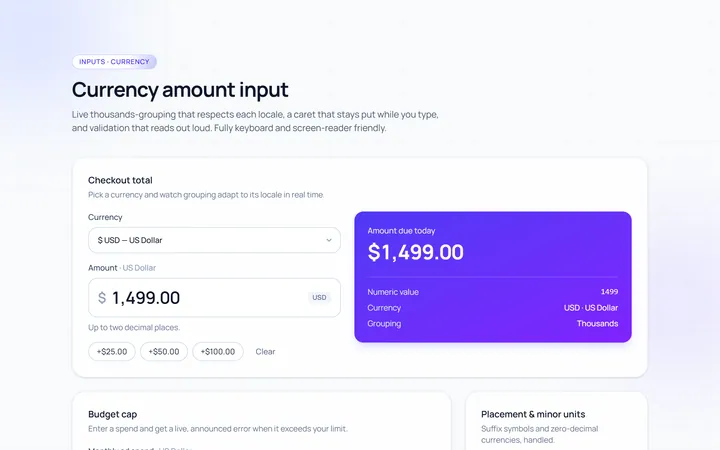
Currency Input
Originalcurrency input with formatting
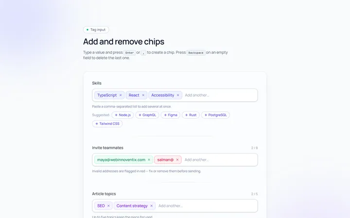
Tags Input
Originaltag input, add and remove chips
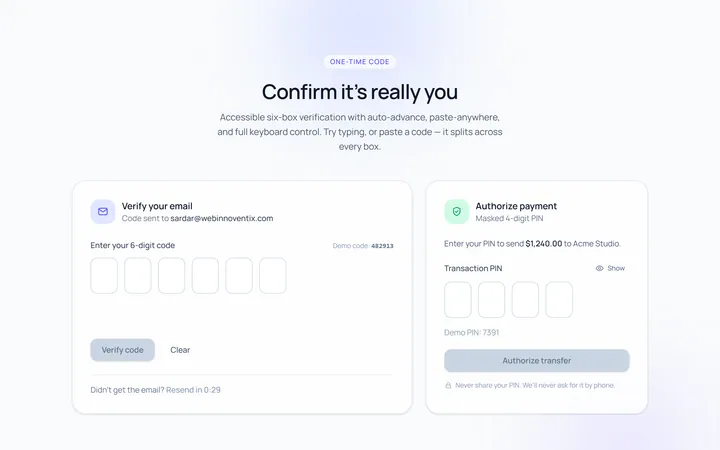
OTP Input
Original6-box one-time-code input with paste