

Textarea Count Input
Original · freetextarea with max length and counter
Copy prompt gives Claude Code, Cursor or v0 a ready-to-paste prompt that recreates this exact component.
npx shadcn@latest add https://webinnoventix.com/r/inp-textarea-count.json"use client";
import { useId, useState } from "react";
import { motion, useReducedMotion } from "motion/react";
type Tone = "calm" | "near" | "over";
type FieldConfig = {
label: string;
hint: string;
placeholder: string;
maxLength: number;
minLength?: number;
rows: number;
enforce: boolean;
initial: string;
};
type ToneStyles = {
bar: string;
counter: string;
border: string;
focus: string;
chip: string;
};
function toneStyles(tone: Tone): ToneStyles {
if (tone === "over") {
return {
bar: "bg-rose-500",
counter: "text-rose-600 dark:text-rose-400",
border: "border-rose-400 dark:border-rose-500/70",
focus: "focus-visible:ring-rose-500/60",
chip: "bg-rose-50 text-rose-700 ring-rose-200 dark:bg-rose-500/10 dark:text-rose-300 dark:ring-rose-500/30",
};
}
if (tone === "near") {
return {
bar: "bg-amber-500",
counter: "text-amber-600 dark:text-amber-400",
border: "border-amber-400 dark:border-amber-500/60",
focus: "focus-visible:ring-amber-500/60",
chip: "bg-amber-50 text-amber-700 ring-amber-200 dark:bg-amber-500/10 dark:text-amber-300 dark:ring-amber-500/30",
};
}
return {
bar: "bg-indigo-500",
counter: "text-slate-500 dark:text-slate-400",
border: "border-slate-300 dark:border-slate-700",
focus: "focus-visible:ring-indigo-500/50",
chip: "bg-indigo-50 text-indigo-700 ring-indigo-200 dark:bg-indigo-500/10 dark:text-indigo-300 dark:ring-indigo-500/30",
};
}
function WarnIcon() {
return (
<svg
viewBox="0 0 20 20"
aria-hidden="true"
className="itc-pulse h-3.5 w-3.5 shrink-0"
fill="none"
stroke="currentColor"
strokeWidth={1.8}
strokeLinecap="round"
strokeLinejoin="round"
>
<path d="M10 6.5v4" />
<path d="M10 13.5h.01" />
<path d="M8.6 3.2 1.9 15a1.6 1.6 0 0 0 1.4 2.4h13.4A1.6 1.6 0 0 0 18.1 15L11.4 3.2a1.6 1.6 0 0 0-2.8 0Z" />
</svg>
);
}
function CheckIcon() {
return (
<svg
viewBox="0 0 20 20"
aria-hidden="true"
className="h-3.5 w-3.5 shrink-0"
fill="none"
stroke="currentColor"
strokeWidth={1.8}
strokeLinecap="round"
strokeLinejoin="round"
>
<path d="m4.5 10.5 3.5 3.5 7.5-8" />
</svg>
);
}
function CountField({ config }: { config: FieldConfig }) {
const { label, hint, placeholder, maxLength, minLength, rows, enforce, initial } = config;
const reduce = useReducedMotion();
const uid = useId();
const areaId = `${uid}-area`;
const hintId = `${uid}-hint`;
const countId = `${uid}-count`;
const [value, setValue] = useState(initial);
const count = value.length;
const remaining = maxLength - count;
const isOver = count > maxLength;
const isNear = !isOver && count >= Math.floor(maxLength * 0.85);
const belowMin = typeof minLength === "number" && count > 0 && count < minLength;
const tone: Tone = isOver ? "over" : isNear ? "near" : "calm";
const styles = toneStyles(tone);
const pct = Math.min((count / maxLength) * 100, 100);
function handleChange(event: React.ChangeEvent<HTMLTextAreaElement>) {
const next = event.target.value;
if (enforce && next.length > maxLength) {
setValue(next.slice(0, maxLength));
return;
}
setValue(next);
}
let message: React.ReactNode = <span className="text-slate-500 dark:text-slate-400">{hint}</span>;
if (isOver) {
const over = count - maxLength;
message = (
<span className="inline-flex items-center gap-1.5 font-medium text-rose-600 dark:text-rose-400">
<WarnIcon />
{over.toLocaleString()} character{over === 1 ? "" : "s"} over the limit
</span>
);
} else if (belowMin && typeof minLength === "number") {
const more = minLength - count;
message = (
<span className="font-medium text-amber-600 dark:text-amber-400">
{more.toLocaleString()} more to reach the {minLength}-character minimum
</span>
);
} else if (enforce && count === maxLength) {
message = (
<span className="inline-flex items-center gap-1.5 font-medium text-amber-600 dark:text-amber-400">
<CheckIcon />
Character limit reached
</span>
);
}
return (
<div className="rounded-2xl border border-slate-200 bg-white/80 p-5 shadow-sm shadow-slate-900/[0.03] backdrop-blur-sm transition-colors dark:border-slate-800 dark:bg-slate-900/60 dark:shadow-black/20 sm:p-6">
<div className="mb-2.5 flex items-baseline justify-between gap-3">
<label htmlFor={areaId} className="text-sm font-semibold text-slate-800 dark:text-slate-100">
{label}
</label>
<span
className={`rounded-full px-2 py-0.5 text-[11px] font-medium uppercase tracking-wide ring-1 ring-inset ${styles.chip}`}
>
{enforce ? "Hard limit" : "Soft limit"}
</span>
</div>
<textarea
id={areaId}
rows={rows}
value={value}
onChange={handleChange}
placeholder={placeholder}
maxLength={enforce ? maxLength : undefined}
aria-describedby={`${hintId} ${countId}`}
aria-invalid={isOver}
spellCheck
className={`block w-full resize-y rounded-xl border bg-white px-3.5 py-3 text-sm leading-relaxed text-slate-900 outline-none transition-[border-color,box-shadow] placeholder:text-slate-400 focus-visible:ring-2 focus-visible:ring-offset-2 focus-visible:ring-offset-white dark:bg-slate-950/40 dark:text-slate-100 dark:placeholder:text-slate-500 dark:focus-visible:ring-offset-slate-900 ${styles.border} ${styles.focus}`}
/>
<div className="mt-2.5 h-1.5 w-full overflow-hidden rounded-full bg-slate-100 dark:bg-slate-800">
<motion.div
className={`h-full rounded-full ${styles.bar}`}
initial={false}
animate={{ width: `${pct}%` }}
transition={reduce ? { duration: 0 } : { type: "spring", stiffness: 260, damping: 32 }}
/>
</div>
<div className="mt-2 flex items-center justify-between gap-3 text-xs">
<p id={hintId} className="min-w-0 truncate">
{message}
</p>
<p
id={countId}
aria-live="polite"
className={`shrink-0 font-mono tabular-nums ${styles.counter}`}
>
<span className="font-semibold">{count.toLocaleString()}</span>
<span className="text-slate-400 dark:text-slate-600"> / {maxLength.toLocaleString()}</span>
{isOver ? (
<span className="ml-1 font-semibold">({remaining.toLocaleString()})</span>
) : null}
</p>
</div>
<div className="mt-3 flex items-center justify-end">
<button
type="button"
onClick={() => setValue("")}
disabled={count === 0}
className="rounded-lg px-2.5 py-1 text-xs font-medium text-slate-500 outline-none transition-colors hover:text-slate-900 focus-visible:ring-2 focus-visible:ring-indigo-500/60 focus-visible:ring-offset-2 focus-visible:ring-offset-white disabled:cursor-not-allowed disabled:opacity-40 dark:text-slate-400 dark:hover:text-white dark:focus-visible:ring-offset-slate-900"
>
Clear
</button>
</div>
</div>
);
}
const FIELDS: FieldConfig[] = [
{
label: "Share your feedback",
hint: "Tell us what's working and what needs attention.",
placeholder: "The onboarding flow felt smooth, but exporting to CSV kept timing out on large boards…",
maxLength: 280,
rows: 4,
enforce: false,
initial:
"Loving the new keyboard shortcuts. One request: let me pin a saved view so it opens by default.",
},
{
label: "Professional bio",
hint: "Appears on your public profile card.",
placeholder: "Product designer focused on developer tools and design systems.",
maxLength: 160,
rows: 3,
enforce: true,
initial: "",
},
{
label: "Describe the issue",
hint: "Include steps to reproduce so our team can help faster.",
placeholder: "What happened, what you expected, and any error messages you saw…",
maxLength: 600,
minLength: 40,
rows: 5,
enforce: false,
initial: "The invite email never arrived.",
},
];
export default function InpTextareaCount() {
return (
<section className="relative w-full bg-slate-50 px-5 py-16 text-slate-900 dark:bg-slate-950 dark:text-slate-100 sm:px-8 sm:py-24">
<style>{`
@keyframes itc-pulse {
0%, 100% { opacity: 1; transform: scale(1); }
50% { opacity: 0.5; transform: scale(0.86); }
}
.itc-pulse { animation: itc-pulse 1.6s ease-in-out infinite; transform-origin: center; }
@media (prefers-reduced-motion: reduce) {
.itc-pulse { animation: none !important; }
}
`}</style>
<div
aria-hidden="true"
className="pointer-events-none absolute inset-x-0 top-0 h-64 bg-gradient-to-b from-indigo-100/60 to-transparent dark:from-indigo-500/10"
/>
<div className="relative mx-auto max-w-2xl">
<header className="mb-10 text-center">
<span className="inline-flex items-center gap-1.5 rounded-full bg-white px-3 py-1 text-xs font-medium text-indigo-600 ring-1 ring-inset ring-indigo-200 dark:bg-slate-900 dark:text-indigo-300 dark:ring-indigo-500/30">
<span className="h-1.5 w-1.5 rounded-full bg-indigo-500" />
Inputs · Character counter
</span>
<h2 className="mt-4 text-balance text-3xl font-semibold tracking-tight sm:text-4xl">
Textareas that count every character
</h2>
<p className="mx-auto mt-3 max-w-md text-pretty text-sm leading-relaxed text-slate-600 dark:text-slate-400">
Live counting, a progress track, and clear feedback as you approach or cross the limit —
with soft caps that warn and hard caps that stop.
</p>
</header>
<div className="flex flex-col gap-5">
{FIELDS.map((config) => (
<CountField key={config.label} config={config} />
))}
</div>
</div>
</section>
);
}Dependencies
Licence
Built by Web Innoventix. Free for personal and commercial use, no attribution required.
Built by Web Innoventix
Need a custom interface, a full website, or SEO that gets you cited by AI? We design, build and rank it end to end.
Get a free quoteSimilar components
Browse all →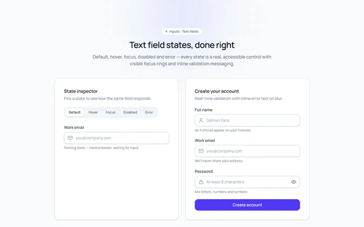
Basic Set Input
Originaldefault, hover, focus, disabled, error text inputs
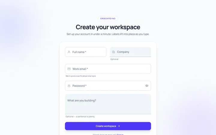
Floating Label Input
Originallabel that floats up on focus/fill
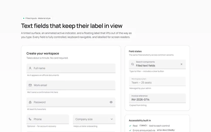
Filled Input
Originalfilled material-style inputs

Underline Input
Originalminimal underline inputs with animated bar

Search Input
Originalsearch box with icon and clear

Search Suggest Input
Originalsearch with a live suggestions dropdown
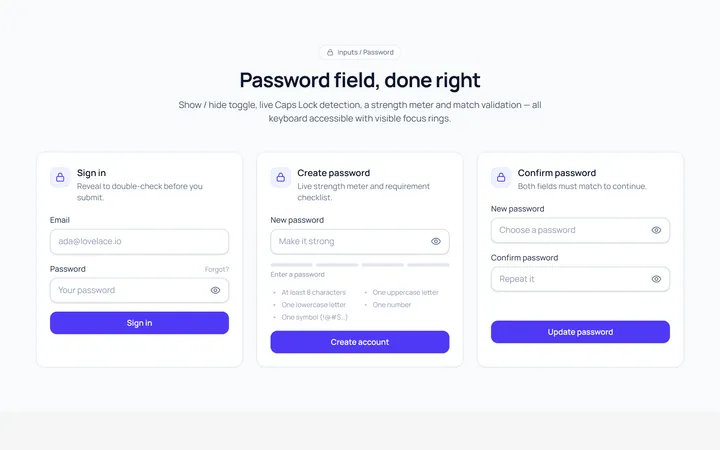
Password Toggle Input
Originalpassword field with show/hide toggle
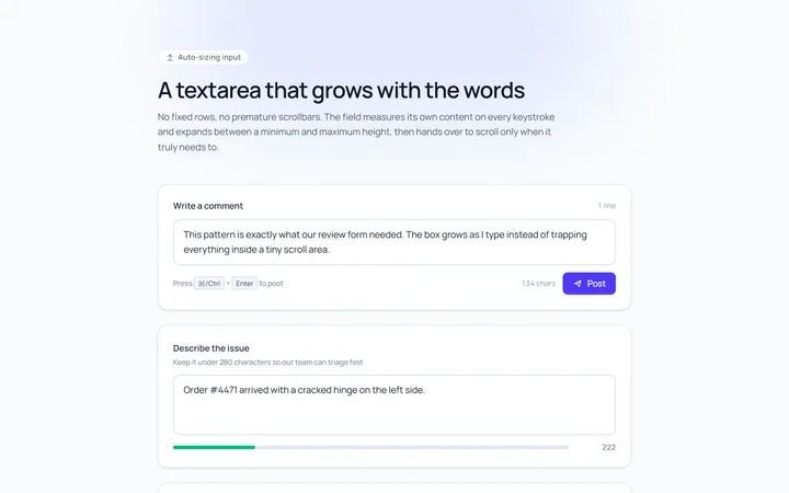
Textarea Autosize Input
Originaltextarea that grows with content
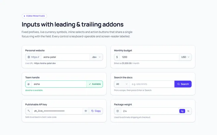
Addon Group Input
Originalinput group with leading/trailing addons
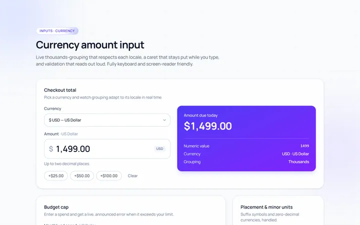
Currency Input
Originalcurrency input with formatting
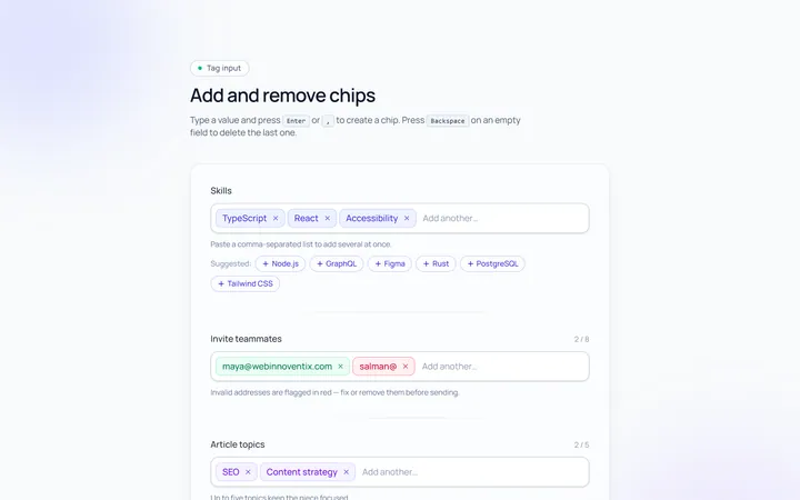
Tags Input
Originaltag input, add and remove chips

OTP Input
Original6-box one-time-code input with paste