

With Icon Input
Original · freeinputs with leading icons across states
Copy prompt gives Claude Code, Cursor or v0 a ready-to-paste prompt that recreates this exact component.
npx shadcn@latest add https://webinnoventix.com/r/inp-with-icon.json"use client";
import { useId, useRef, useState } from "react";
import type { ChangeEvent, ReactNode } from "react";
import { AnimatePresence, motion, useReducedMotion } from "motion/react";
/* ------------------------------------------------------------------ */
/* utilities */
/* ------------------------------------------------------------------ */
type FieldState = "idle" | "success" | "error" | "loading" | "disabled";
function cx(...parts: Array<string | false | null | undefined>): string {
return parts.filter(Boolean).join(" ");
}
function fieldTone(state: FieldState): {
border: string;
ring: string;
icon: string;
msg: string;
} {
switch (state) {
case "error":
return {
border: "border-rose-300 dark:border-rose-500/60",
ring: "focus-within:border-rose-400 focus-within:ring-rose-500/25 dark:focus-within:border-rose-400",
icon: "text-rose-500 dark:text-rose-400",
msg: "text-rose-600 dark:text-rose-400",
};
case "success":
return {
border: "border-emerald-300 dark:border-emerald-500/60",
ring: "focus-within:border-emerald-400 focus-within:ring-emerald-500/25 dark:focus-within:border-emerald-400",
icon: "text-emerald-500 dark:text-emerald-400",
msg: "text-emerald-600 dark:text-emerald-400",
};
case "disabled":
return {
border: "border-slate-200 dark:border-slate-800",
ring: "",
icon: "text-slate-300 dark:text-slate-600",
msg: "text-slate-400 dark:text-slate-600",
};
default:
return {
border: "border-slate-300 dark:border-slate-700",
ring: "focus-within:border-indigo-400 focus-within:ring-indigo-500/25 dark:focus-within:border-indigo-400",
icon: "text-slate-400 group-focus-within:text-indigo-500 dark:text-slate-500 dark:group-focus-within:text-indigo-400",
msg: "text-slate-500 dark:text-slate-400",
};
}
}
/* ------------------------------------------------------------------ */
/* inline icons */
/* ------------------------------------------------------------------ */
type IconProps = { className?: string };
function MailIcon({ className }: IconProps) {
return (
<svg viewBox="0 0 24 24" fill="none" aria-hidden="true" className={className}>
<rect x="3" y="5" width="18" height="14" rx="2.5" stroke="currentColor" strokeWidth="1.7" />
<path d="m4 7 6.6 4.7a2.4 2.4 0 0 0 2.8 0L20 7" stroke="currentColor" strokeWidth="1.7" strokeLinecap="round" />
</svg>
);
}
function LockIcon({ className }: IconProps) {
return (
<svg viewBox="0 0 24 24" fill="none" aria-hidden="true" className={className}>
<rect x="4.5" y="10.5" width="15" height="9" rx="2.2" stroke="currentColor" strokeWidth="1.7" />
<path d="M8 10.5V8a4 4 0 0 1 8 0v2.5" stroke="currentColor" strokeWidth="1.7" strokeLinecap="round" />
<circle cx="12" cy="15" r="1.4" fill="currentColor" />
</svg>
);
}
function SearchIcon({ className }: IconProps) {
return (
<svg viewBox="0 0 24 24" fill="none" aria-hidden="true" className={className}>
<circle cx="11" cy="11" r="6.5" stroke="currentColor" strokeWidth="1.7" />
<path d="m16 16 4 4" stroke="currentColor" strokeWidth="1.7" strokeLinecap="round" />
</svg>
);
}
function GlobeIcon({ className }: IconProps) {
return (
<svg viewBox="0 0 24 24" fill="none" aria-hidden="true" className={className}>
<circle cx="12" cy="12" r="8.5" stroke="currentColor" strokeWidth="1.7" />
<path d="M3.5 12h17M12 3.5c2.4 2.3 3.6 5.4 3.6 8.5S14.4 18.2 12 20.5c-2.4-2.3-3.6-5.4-3.6-8.5S9.6 5.8 12 3.5Z" stroke="currentColor" strokeWidth="1.7" strokeLinecap="round" />
</svg>
);
}
function EyeIcon({ className }: IconProps) {
return (
<svg viewBox="0 0 24 24" fill="none" aria-hidden="true" className={className}>
<path d="M2.5 12S6 5.5 12 5.5 21.5 12 21.5 12 18 18.5 12 18.5 2.5 12 2.5 12Z" stroke="currentColor" strokeWidth="1.7" strokeLinejoin="round" />
<circle cx="12" cy="12" r="2.8" stroke="currentColor" strokeWidth="1.7" />
</svg>
);
}
function EyeOffIcon({ className }: IconProps) {
return (
<svg viewBox="0 0 24 24" fill="none" aria-hidden="true" className={className}>
<path d="M4 5 20 19" stroke="currentColor" strokeWidth="1.7" strokeLinecap="round" />
<path d="M9.6 9.6A2.8 2.8 0 0 0 12 14.8c.7 0 1.4-.3 1.9-.8" stroke="currentColor" strokeWidth="1.7" strokeLinecap="round" />
<path d="M6.3 6.5C4 8 2.5 12 2.5 12s3.5 6.5 9.5 6.5c1.5 0 2.8-.4 4-1M16.7 16A13 13 0 0 0 21.5 12S18 5.5 12 5.5c-.6 0-1.1 0-1.6.1" stroke="currentColor" strokeWidth="1.7" strokeLinecap="round" strokeLinejoin="round" />
</svg>
);
}
function XIcon({ className }: IconProps) {
return (
<svg viewBox="0 0 24 24" fill="none" aria-hidden="true" className={className}>
<path d="m6 6 12 12M18 6 6 18" stroke="currentColor" strokeWidth="1.8" strokeLinecap="round" />
</svg>
);
}
function CheckCircleIcon({ className }: IconProps) {
return (
<svg viewBox="0 0 24 24" fill="none" aria-hidden="true" className={className}>
<circle cx="12" cy="12" r="8.5" stroke="currentColor" strokeWidth="1.7" />
<path d="m8.5 12 2.4 2.4 4.6-4.8" stroke="currentColor" strokeWidth="1.8" strokeLinecap="round" strokeLinejoin="round" />
</svg>
);
}
function AlertCircleIcon({ className }: IconProps) {
return (
<svg viewBox="0 0 24 24" fill="none" aria-hidden="true" className={className}>
<circle cx="12" cy="12" r="8.5" stroke="currentColor" strokeWidth="1.7" />
<path d="M12 8v5" stroke="currentColor" strokeWidth="1.8" strokeLinecap="round" />
<circle cx="12" cy="16" r="1" fill="currentColor" />
</svg>
);
}
function Spinner({ className }: IconProps) {
return (
<svg viewBox="0 0 24 24" fill="none" aria-hidden="true" className={cx("iwi-spinner", className)}>
<circle cx="12" cy="12" r="9" stroke="currentColor" strokeOpacity="0.22" strokeWidth="3" />
<path d="M21 12a9 9 0 0 0-9-9" stroke="currentColor" strokeWidth="3" strokeLinecap="round" />
</svg>
);
}
/* ------------------------------------------------------------------ */
/* field component */
/* ------------------------------------------------------------------ */
interface IconInputProps {
label: string;
icon: ReactNode;
value: string;
onChange?: (e: ChangeEvent<HTMLInputElement>) => void;
type?: string;
placeholder?: string;
state?: FieldState;
message?: string;
trailing?: ReactNode;
prefix?: string;
focused?: boolean;
labelHidden?: boolean;
autoComplete?: string;
inputMode?: "text" | "email" | "search" | "url" | "numeric";
}
function IconInput({
label,
icon,
value,
onChange,
type = "text",
placeholder,
state = "idle",
message,
trailing,
prefix,
focused = false,
labelHidden = false,
autoComplete,
inputMode,
}: IconInputProps) {
const reduce = useReducedMotion();
const uid = useId();
const inputId = `${uid}-input`;
const msgId = `${uid}-msg`;
const tone = fieldTone(state);
const disabled = state === "disabled";
let trailingNode: ReactNode = trailing;
if (!trailingNode) {
if (state === "loading") {
trailingNode = <Spinner className="h-5 w-5 text-indigo-500 dark:text-indigo-400" />;
} else if (state === "success") {
trailingNode = <CheckCircleIcon className="h-5 w-5 text-emerald-500 dark:text-emerald-400" />;
} else if (state === "error") {
trailingNode = <AlertCircleIcon className="h-5 w-5 text-rose-500 dark:text-rose-400" />;
}
}
return (
<div>
<label
htmlFor={inputId}
className={cx(
"mb-1.5 block text-sm font-medium text-slate-700 dark:text-slate-300",
labelHidden && "sr-only",
)}
>
{label}
</label>
<div
className={cx(
"group relative flex h-12 items-center gap-2.5 rounded-xl border px-3.5 shadow-sm transition-[color,box-shadow,border-color] duration-200 focus-within:ring-2",
disabled ? "cursor-not-allowed bg-slate-50 dark:bg-slate-900/30" : "bg-white dark:bg-slate-900/50",
tone.border,
tone.ring,
focused && "border-indigo-400 ring-2 ring-indigo-500/25 dark:border-indigo-400",
)}
>
<span className={cx("flex shrink-0 items-center transition-colors [&>svg]:h-5 [&>svg]:w-5", tone.icon)}>
{icon}
</span>
{prefix ? (
<span className="select-none text-sm text-slate-400 dark:text-slate-500">{prefix}</span>
) : null}
<input
id={inputId}
type={type}
value={value}
onChange={onChange}
placeholder={placeholder}
disabled={disabled}
autoComplete={autoComplete}
inputMode={inputMode}
aria-invalid={state === "error" || undefined}
aria-busy={state === "loading" || undefined}
aria-describedby={message ? msgId : undefined}
className={cx(
"min-w-0 flex-1 bg-transparent text-sm text-slate-900 outline-none placeholder:text-slate-400",
"disabled:cursor-not-allowed dark:text-slate-100 dark:placeholder:text-slate-500",
prefix ? "pl-0" : "",
)}
/>
{trailingNode ? (
<span className="flex shrink-0 items-center">{trailingNode}</span>
) : null}
</div>
<AnimatePresence initial={false}>
{message ? (
<motion.p
key={message}
id={msgId}
role={state === "error" ? "alert" : undefined}
aria-live={state === "error" ? "assertive" : "polite"}
initial={reduce ? false : { opacity: 0, y: -4 }}
animate={{ opacity: 1, y: 0 }}
exit={reduce ? { opacity: 0 } : { opacity: 0, y: -4 }}
transition={{ duration: 0.18, ease: "easeOut" }}
className={cx("mt-1.5 flex items-center gap-1.5 text-xs", tone.msg)}
>
{message}
</motion.p>
) : null}
</AnimatePresence>
</div>
);
}
/* small reusable trailing button (toggle / clear) */
function TrailingButton({
label,
onClick,
children,
}: {
label: string;
onClick: () => void;
children: ReactNode;
}) {
return (
<button
type="button"
onClick={onClick}
aria-label={label}
className="inline-flex h-7 w-7 items-center justify-center rounded-md text-slate-400 transition hover:bg-slate-100 hover:text-slate-600 focus-visible:outline-none focus-visible:ring-2 focus-visible:ring-indigo-500/60 dark:text-slate-500 dark:hover:bg-slate-800 dark:hover:text-slate-300"
>
{children}
</button>
);
}
/* ------------------------------------------------------------------ */
/* demo */
/* ------------------------------------------------------------------ */
const EMAIL_RE = /^[^\s@]+@[^\s@]+\.[^\s@]+$/;
export default function InpWithIcon() {
const [email, setEmail] = useState("");
const [pwd, setPwd] = useState("");
const [showPwd, setShowPwd] = useState(false);
const [site, setSite] = useState("");
const [search, setSearch] = useState("");
const [searching, setSearching] = useState(false);
const searchTimer = useRef<ReturnType<typeof setTimeout> | null>(null);
const emailState: FieldState =
email.length === 0 ? "idle" : EMAIL_RE.test(email) ? "success" : "error";
const emailMsg =
emailState === "error"
? "Enter a valid address like name@company.com."
: emailState === "success"
? "We'll send the receipt here."
: "Use your work address for team invites.";
const pwdState: FieldState =
pwd.length === 0 ? "idle" : pwd.length >= 8 ? "success" : "error";
const pwdMsg =
pwd.length === 0
? "Use at least 8 characters."
: pwd.length >= 8
? "Strong enough to continue."
: "A little short — keep going.";
function handleSearch(e: ChangeEvent<HTMLInputElement>) {
const v = e.target.value;
setSearch(v);
if (searchTimer.current) clearTimeout(searchTimer.current);
if (v.trim().length > 0) {
setSearching(true);
searchTimer.current = setTimeout(() => setSearching(false), 900);
} else {
setSearching(false);
}
}
function clearSearch() {
if (searchTimer.current) clearTimeout(searchTimer.current);
setSearch("");
setSearching(false);
}
const gallery: Array<{
label: string;
dot: string;
state: FieldState;
value: string;
message?: string;
focused?: boolean;
placeholder?: string;
}> = [
{ label: "Default", dot: "bg-slate-400", state: "idle", value: "", placeholder: "name@company.com" },
{ label: "Focused", dot: "bg-indigo-500", state: "idle", value: "", focused: true, placeholder: "name@company.com" },
{ label: "Filled", dot: "bg-slate-500", state: "idle", value: "jordan@acme.co" },
{ label: "Success", dot: "bg-emerald-500", state: "success", value: "jordan@acme.co", message: "Address verified." },
{ label: "Error", dot: "bg-rose-500", state: "error", value: "jordan@acme", message: "That domain looks incomplete." },
{ label: "Loading", dot: "bg-indigo-500", state: "loading", value: "jordan@acme.co", message: "Checking availability…" },
{ label: "Disabled", dot: "bg-slate-300 dark:bg-slate-600", state: "disabled", value: "billing@acme.co" },
];
return (
<section className="relative w-full overflow-hidden bg-gradient-to-b from-slate-50 to-white px-4 py-16 sm:py-24 dark:from-slate-950 dark:to-slate-900">
<style>{`
@keyframes iwi-spin { to { transform: rotate(360deg); } }
.iwi-spinner { animation: iwi-spin 0.7s linear infinite; transform-origin: center; }
@media (prefers-reduced-motion: reduce) {
.iwi-spinner { animation-duration: 1.6s; }
}
`}</style>
<div
aria-hidden="true"
className="pointer-events-none absolute -top-24 left-1/2 h-72 w-72 -translate-x-1/2 rounded-full bg-indigo-400/15 blur-3xl dark:bg-indigo-500/10"
/>
<div className="relative mx-auto max-w-5xl">
<header className="mx-auto mb-12 max-w-2xl text-center">
<span className="inline-flex items-center gap-2 rounded-full border border-slate-200 bg-white/70 px-3 py-1 text-xs font-medium text-slate-600 shadow-sm backdrop-blur dark:border-slate-800 dark:bg-slate-900/60 dark:text-slate-300">
<SearchIcon className="h-3.5 w-3.5 text-indigo-500 dark:text-indigo-400" />
Inputs · with leading icon
</span>
<h2 className="mt-4 text-3xl font-semibold tracking-tight text-slate-900 sm:text-4xl dark:text-slate-50">
Icon inputs, every state
</h2>
<p className="mt-3 text-base text-slate-600 dark:text-slate-400">
One accessible field — validated, toggled, cleared, loading, and disabled.
Keyboard-friendly with visible focus rings in light and dark.
</p>
</header>
<div className="grid gap-6 lg:grid-cols-2 lg:gap-8">
{/* interactive form */}
<form
onSubmit={(e) => e.preventDefault()}
noValidate
className="rounded-2xl border border-slate-200 bg-white/70 p-6 shadow-sm backdrop-blur sm:p-8 dark:border-slate-800 dark:bg-slate-900/40"
>
<h3 className="mb-5 text-sm font-semibold uppercase tracking-wide text-slate-500 dark:text-slate-400">
Live & interactive
</h3>
<div className="space-y-5">
<IconInput
label="Work email"
icon={<MailIcon />}
type="email"
inputMode="email"
autoComplete="email"
placeholder="name@company.com"
value={email}
onChange={(e) => setEmail(e.target.value)}
state={emailState}
message={emailMsg}
/>
<IconInput
label="Password"
icon={<LockIcon />}
type={showPwd ? "text" : "password"}
autoComplete="new-password"
placeholder="••••••••"
value={pwd}
onChange={(e) => setPwd(e.target.value)}
state={pwdState}
message={pwdMsg}
trailing={
<TrailingButton
label={showPwd ? "Hide password" : "Show password"}
onClick={() => setShowPwd((v) => !v)}
>
{showPwd ? <EyeOffIcon className="h-5 w-5" /> : <EyeIcon className="h-5 w-5" />}
</TrailingButton>
}
/>
<IconInput
label="Search invoices"
icon={<SearchIcon />}
type="search"
inputMode="search"
placeholder="Invoice #, client, or amount"
value={search}
onChange={handleSearch}
state={searching ? "loading" : "idle"}
trailing={
search && !searching ? (
<TrailingButton label="Clear search" onClick={clearSearch}>
<XIcon className="h-4 w-4" />
</TrailingButton>
) : undefined
}
/>
<IconInput
label="Company website"
icon={<GlobeIcon />}
type="url"
inputMode="url"
autoComplete="url"
prefix="https://"
placeholder="acme.co"
value={site}
onChange={(e) => setSite(e.target.value)}
message="Shown on your public invoices."
/>
<button
type="submit"
className="mt-1 inline-flex h-11 w-full items-center justify-center gap-2 rounded-xl bg-indigo-600 px-4 text-sm font-semibold text-white shadow-sm transition hover:bg-indigo-500 focus-visible:outline-none focus-visible:ring-2 focus-visible:ring-indigo-500/60 focus-visible:ring-offset-2 focus-visible:ring-offset-white active:scale-[.99] dark:bg-indigo-500 dark:hover:bg-indigo-400 dark:focus-visible:ring-offset-slate-900"
>
Save contact details
</button>
</div>
</form>
{/* states gallery */}
<div className="rounded-2xl border border-slate-200 bg-white/70 p-6 shadow-sm backdrop-blur sm:p-8 dark:border-slate-800 dark:bg-slate-900/40">
<h3 className="mb-5 text-sm font-semibold uppercase tracking-wide text-slate-500 dark:text-slate-400">
State reference
</h3>
<div className="grid gap-5 sm:grid-cols-2">
{gallery.map((item) => (
<div key={item.label}>
<span className="mb-2 inline-flex items-center gap-1.5 rounded-full bg-slate-100 px-2.5 py-1 text-xs font-medium text-slate-600 dark:bg-slate-800 dark:text-slate-300">
<span className={cx("h-1.5 w-1.5 rounded-full", item.dot)} />
{item.label}
</span>
<IconInput
label={`Account email — ${item.label} state`}
labelHidden
icon={<MailIcon />}
type="email"
placeholder={item.placeholder ?? "name@company.com"}
value={item.value}
state={item.state}
message={item.message}
focused={item.focused}
/>
</div>
))}
</div>
</div>
</div>
</div>
</section>
);
}Dependencies
Licence
Built by Web Innoventix. Free for personal and commercial use, no attribution required.
Built by Web Innoventix
Need a custom interface, a full website, or SEO that gets you cited by AI? We design, build and rank it end to end.
Get a free quoteSimilar components
Browse all →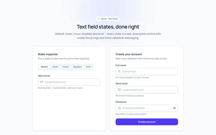
Basic Set Input
Originaldefault, hover, focus, disabled, error text inputs
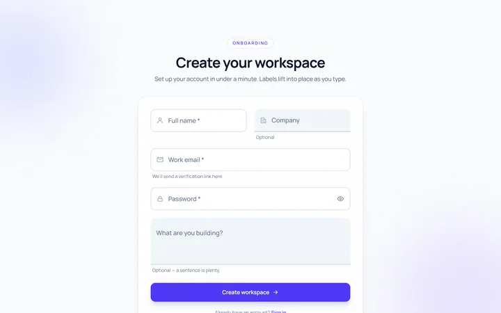
Floating Label Input
Originallabel that floats up on focus/fill
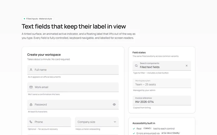
Filled Input
Originalfilled material-style inputs
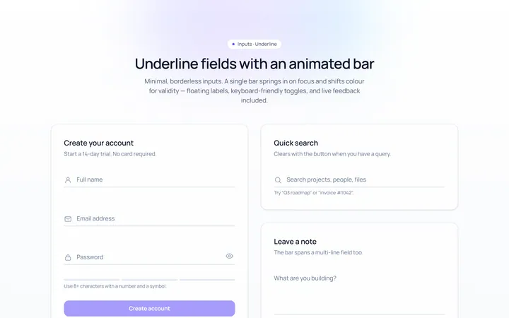
Underline Input
Originalminimal underline inputs with animated bar
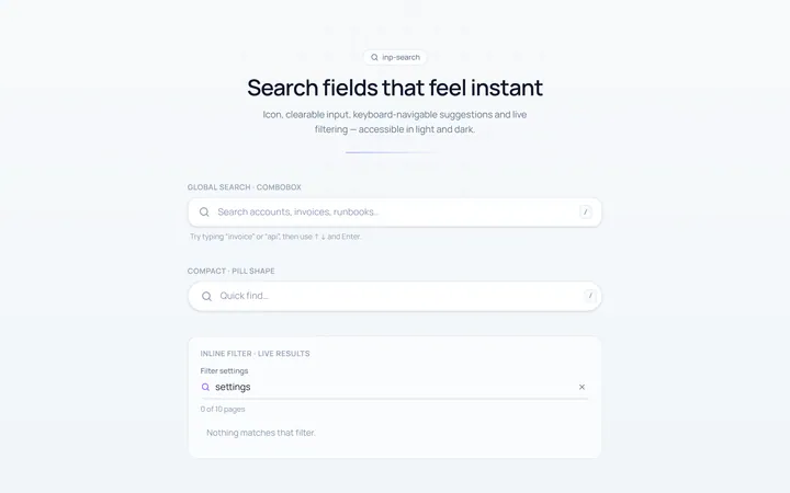
Search Input
Originalsearch box with icon and clear
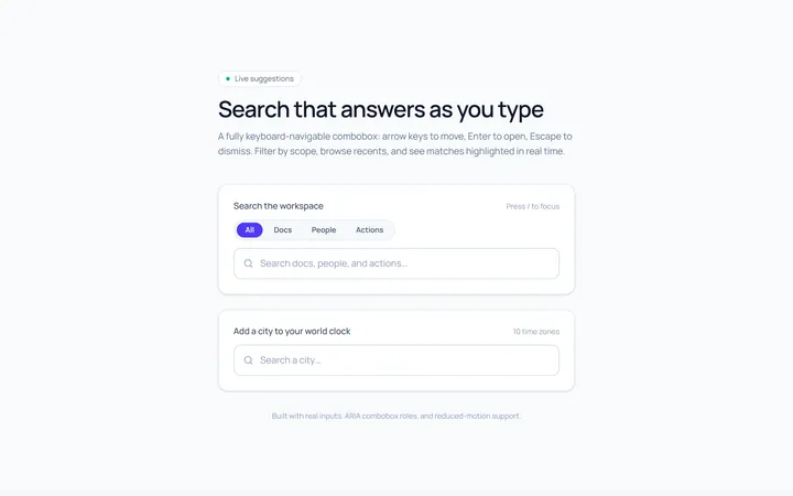
Search Suggest Input
Originalsearch with a live suggestions dropdown
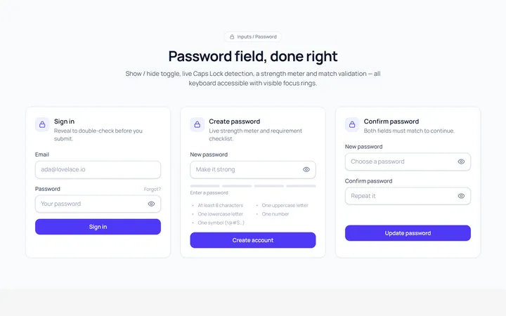
Password Toggle Input
Originalpassword field with show/hide toggle
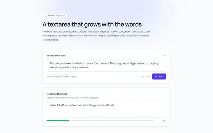
Textarea Autosize Input
Originaltextarea that grows with content
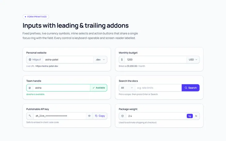
Addon Group Input
Originalinput group with leading/trailing addons
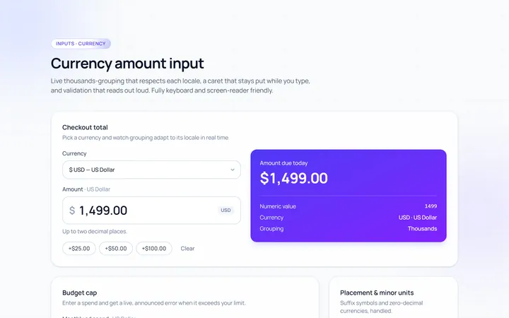
Currency Input
Originalcurrency input with formatting
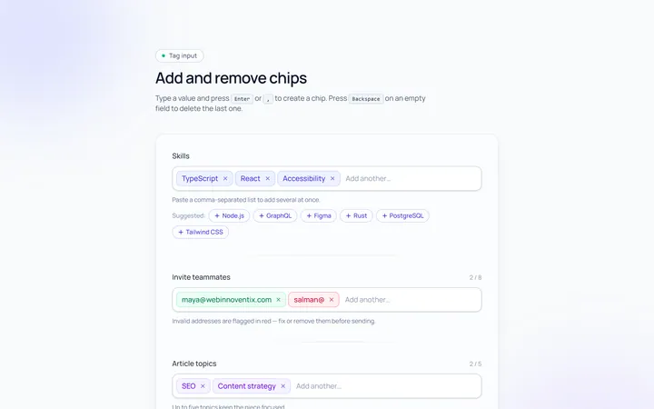
Tags Input
Originaltag input, add and remove chips
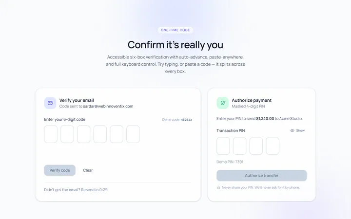
OTP Input
Original6-box one-time-code input with paste