

Gradient Ring Loader
Original · freegradient conic ring spinner
byWeb InnoventixReact + Tailwind
loadgradientringloaders
Copy prompt gives Claude Code, Cursor or v0 a ready-to-paste prompt that recreates this exact component.
npx shadcn@latest add https://webinnoventix.com/r/load-gradient-ring.jsonload-gradient-ring.tsx
"use client";

import { useEffect, useMemo, useRef, useState } from "react";
import { motion, useReducedMotion } from "motion/react";

type SizeKey = "sm" | "md" | "lg";
type ThicknessKey = "thin" | "medium" | "bold";
type PaletteKey = "aurora" | "meadow" | "sunset" | "graphite";

type Stops = [string, string, string];

const SIZES: Record<SizeKey, { px: number; label: string }> = {
  sm: { px: 92, label: "Small" },
  md: { px: 136, label: "Medium" },
  lg: { px: 188, label: "Large" },
};

const THICKNESS: Record<ThicknessKey, { px: number; label: string }> = {
  thin: { px: 6, label: "Thin" },
  medium: { px: 11, label: "Medium" },
  bold: { px: 17, label: "Bold" },
};

const PALETTES: Record<PaletteKey, { label: string; stops: Stops }> = {
  aurora: { label: "Aurora", stops: ["#6366f1", "#8b5cf6", "#0ea5e9"] },
  meadow: { label: "Meadow", stops: ["#10b981", "#14b8a6", "#22c55e"] },
  sunset: { label: "Sunset", stops: ["#f43f5e", "#fb7185", "#f59e0b"] },
  graphite: { label: "Graphite", stops: ["#64748b", "#94a3b8", "#cbd5e1"] },
};

function buildConic([a, b, c]: Stops): string {
  return `conic-gradient(from 0deg, ${a}00 0deg, ${a}59 62deg, ${b}b3 192deg, ${c}f2 322deg, ${c} 360deg)`;
}

function buildMask(thickness: number): string {
  return `radial-gradient(farthest-side, transparent calc(100% - ${thickness}px), #000 calc(100% - ${thickness}px))`;
}

type Option = { value: string; label: string; hint?: string; swatch?: string };

function ControlGroup({
  legend,
  name,
  options,
  value,
  onChange,
}: {
  legend: string;
  name: string;
  options: Option[];
  value: string;
  onChange: (next: string) => void;
}) {
  return (
    <fieldset className="min-w-0">
      <legend className="mb-2 text-xs font-semibold uppercase tracking-wider text-slate-500 dark:text-zinc-400">
        {legend}
      </legend>
      <div className="flex flex-wrap gap-2">
        {options.map((opt) => {
          const checked = opt.value === value;
          return (
            <label
              key={opt.value}
              className="group relative cursor-pointer select-none"
            >
              <input
                type="radio"
                name={name}
                value={opt.value}
                checked={checked}
                onChange={() => onChange(opt.value)}
                className="peer sr-only"
              />
              <span className="flex items-center gap-2 rounded-xl border border-slate-300 bg-white px-3.5 py-2 text-sm font-medium text-slate-600 transition-colors peer-checked:border-indigo-600 peer-checked:bg-indigo-600 peer-checked:text-white peer-focus-visible:outline-none peer-focus-visible:ring-2 peer-focus-visible:ring-indigo-500 peer-focus-visible:ring-offset-2 peer-focus-visible:ring-offset-white group-hover:border-slate-400 dark:border-zinc-700 dark:bg-zinc-900 dark:text-zinc-300 dark:peer-checked:border-indigo-500 dark:peer-checked:bg-indigo-500 dark:peer-focus-visible:ring-offset-zinc-900 dark:group-hover:border-zinc-600">
                {opt.swatch ? (
                  <span
                    aria-hidden
                    className="h-4 w-4 shrink-0 rounded-full ring-1 ring-black/10 dark:ring-white/15"
                    style={{ backgroundImage: opt.swatch }}
                  />
                ) : null}
                <span>{opt.label}</span>
                {opt.hint ? (
                  <span className="text-xs font-normal text-slate-400 peer-checked:text-white/80 dark:text-zinc-500">
                    {opt.hint}
                  </span>
                ) : null}
              </span>
            </label>
          );
        })}
      </div>
    </fieldset>
  );
}

export default function LoadGradientRing() {
  const reduced = useReducedMotion();

  const [isPlaying, setIsPlaying] = useState(true);
  const [speed, setSpeed] = useState(62);
  const [size, setSize] = useState<SizeKey>("md");
  const [thickness, setThickness] = useState<ThicknessKey>("medium");
  const [palette, setPalette] = useState<PaletteKey>("aurora");
  const [pct, setPct] = useState(68);

  const animate = isPlaying && !reduced;

  const duration = useMemo(() => 2.8 - (speed / 100) * 2.35, [speed]);

  const stops = PALETTES[palette].stops;
  const sizePx = SIZES[size].px;
  const thicknessPx = THICKNESS[thickness].px;
  const conic = useMemo(() => buildConic(stops), [stops]);
  const mask = useMemo(() => buildMask(thicknessPx), [thicknessPx]);

  const intervalRef = useRef<number | null>(null);

  useEffect(() => {
    if (!animate) return;
    const step = Math.max(38, duration * 56);
    intervalRef.current = window.setInterval(() => {
      setPct((prev) => (prev >= 100 ? 0 : prev + 1));
    }, step);
    return () => {
      if (intervalRef.current !== null) window.clearInterval(intervalRef.current);
    };
  }, [animate, duration]);

  const headSize = Math.max(6, thicknessPx * 1.18);
  const headColor = stops[2];

  const paletteOptions: Option[] = (Object.keys(PALETTES) as PaletteKey[]).map(
    (key) => {
      const [a, b, c] = PALETTES[key].stops;
      return {
        value: key,
        label: PALETTES[key].label,
        swatch: `linear-gradient(135deg, ${a}, ${b}, ${c})`,
      };
    }
  );

  const sizeOptions: Option[] = (Object.keys(SIZES) as SizeKey[]).map((key) => ({
    value: key,
    label: SIZES[key].label,
  }));

  const thicknessOptions: Option[] = (Object.keys(THICKNESS) as ThicknessKey[]).map(
    (key) => ({ value: key, label: THICKNESS[key].label })
  );

  function reset() {
    setIsPlaying(true);
    setSpeed(62);
    setSize("md");
    setThickness("medium");
    setPalette("aurora");
    setPct(68);
  }

  const statusText = reduced
    ? "Reduced motion is on — animation paused"
    : isPlaying
    ? "Syncing workspace assets…"
    : "Paused — press play to resume";

  return (
    <section className="relative w-full overflow-hidden bg-white px-6 py-20 text-slate-900 sm:py-24 dark:bg-zinc-950 dark:text-white">
      <style>{`
        @keyframes lgr-rotate { to { transform: rotate(360deg); } }
        .lgr-spin {
          animation: lgr-rotate 1.4s linear infinite;
          transform-origin: 50% 50%;
          will-change: transform;
        }
        @media (prefers-reduced-motion: reduce) {
          .lgr-spin { animation: none !important; }
        }
      `}</style>

      <div
        aria-hidden
        className="pointer-events-none absolute inset-0 -z-10 opacity-70 [background:radial-gradient(60%_50%_at_50%_0%,rgba(99,102,241,0.12),transparent_70%)] dark:opacity-100 dark:[background:radial-gradient(60%_50%_at_50%_0%,rgba(99,102,241,0.18),transparent_70%)]"
      />

      <div className="mx-auto max-w-6xl">
        <header className="mx-auto max-w-2xl text-center">
          <p className="inline-flex items-center gap-2 rounded-full border border-slate-200 bg-slate-50 px-3 py-1 text-xs font-semibold uppercase tracking-wider text-indigo-600 dark:border-zinc-800 dark:bg-zinc-900 dark:text-indigo-300">
            <span className="h-1.5 w-1.5 rounded-full bg-indigo-500" />
            Loaders
          </p>
          <h2 className="mt-4 text-3xl font-bold tracking-tight sm:text-4xl">
            Conic gradient ring
          </h2>
          <p className="mt-3 text-base leading-relaxed text-slate-600 dark:text-zinc-400">
            An indeterminate loader for optimistic states — pending saves,
            background sync, streaming responses. Tune the ring live and it stays
            crisp at every size.
          </p>
        </header>

        <div className="mt-12 grid items-stretch gap-6 lg:grid-cols-2">
          {/* Preview */}
          <motion.div
            initial={reduced ? false : { opacity: 0, y: 12 }}
            animate={{ opacity: 1, y: 0 }}
            transition={{ duration: 0.5, ease: "easeOut" }}
            className="flex flex-col items-center justify-center rounded-3xl border border-slate-200 bg-slate-50 p-8 dark:border-zinc-800 dark:bg-zinc-900"
          >
            <div
              role="status"
              aria-live="polite"
              className="flex flex-col items-center"
            >
              <span className="sr-only">Content is loading, please wait.</span>

              <div
                className="relative"
                style={{ width: sizePx, height: sizePx }}
              >
                {/* Static track */}
                <div
                  aria-hidden
                  className="absolute inset-0 rounded-full border-slate-200 dark:border-zinc-800"
                  style={{ borderWidth: thicknessPx, borderStyle: "solid" }}
                />

                {/* Rotating gradient arc */}
                <div
                  aria-hidden
                  className="lgr-spin absolute inset-0"
                  style={{
                    animationDuration: `${duration}s`,
                    animationPlayState: animate ? "running" : "paused",
                  }}
                >
                  <div
                    className="absolute inset-0 rounded-full"
                    style={{
                      backgroundImage: conic,
                      WebkitMaskImage: mask,
                      maskImage: mask,
                    }}
                  />
                  {/* Comet head */}
                  <div
                    className="absolute rounded-full"
                    style={{
                      width: headSize,
                      height: headSize,
                      top: thicknessPx / 2 - headSize / 2,
                      left: "50%",
                      transform: "translateX(-50%)",
                      background: headColor,
                      boxShadow: `0 0 ${thicknessPx * 1.4}px ${headColor}`,
                    }}
                  />
                </div>

                {/* Center readout */}
                <div className="absolute inset-0 flex flex-col items-center justify-center">
                  <div className="flex items-baseline font-semibold tabular-nums">
                    <motion.span
                      key={pct}
                      initial={reduced ? false : { opacity: 0.5, scale: 0.92 }}
                      animate={{ opacity: 1, scale: 1 }}
                      transition={{ duration: 0.15, ease: "easeOut" }}
                      className="text-2xl text-slate-900 dark:text-white"
                    >
                      {pct}
                    </motion.span>
                    <span className="text-sm text-slate-400 dark:text-zinc-500">
                      %
                    </span>
                  </div>
                  <span className="mt-0.5 text-[10px] font-medium uppercase tracking-widest text-slate-400 dark:text-zinc-500">
                    Loading
                  </span>
                </div>
              </div>
            </div>

            <p className="mt-8 h-5 text-sm text-slate-500 dark:text-zinc-400">
              {statusText}
            </p>

            <div className="mt-4 flex items-center gap-2">
              <button
                type="button"
                onClick={() => setIsPlaying((p) => !p)}
                aria-pressed={isPlaying}
                className="inline-flex items-center gap-2 rounded-xl bg-indigo-600 px-4 py-2 text-sm font-semibold text-white transition-colors hover:bg-indigo-500 focus-visible:outline-none focus-visible:ring-2 focus-visible:ring-indigo-500 focus-visible:ring-offset-2 focus-visible:ring-offset-slate-50 dark:bg-indigo-500 dark:hover:bg-indigo-400 dark:focus-visible:ring-offset-zinc-900"
              >
                {isPlaying ? (
                  <svg
                    aria-hidden
                    viewBox="0 0 20 20"
                    className="h-4 w-4"
                    fill="currentColor"
                  >
                    <rect x="5" y="4" width="4" height="12" rx="1" />
                    <rect x="11" y="4" width="4" height="12" rx="1" />
                  </svg>
                ) : (
                  <svg
                    aria-hidden
                    viewBox="0 0 20 20"
                    className="h-4 w-4"
                    fill="currentColor"
                  >
                    <path d="M6 4.2c0-.8.86-1.28 1.53-.86l9 5.8a1 1 0 0 1 0 1.72l-9 5.8A1 1 0 0 1 6 15.8V4.2Z" />
                  </svg>
                )}
                {isPlaying ? "Pause" : "Play"}
              </button>

              <button
                type="button"
                onClick={reset}
                className="inline-flex items-center gap-2 rounded-xl border border-slate-300 bg-white px-4 py-2 text-sm font-semibold text-slate-700 transition-colors hover:border-slate-400 focus-visible:outline-none focus-visible:ring-2 focus-visible:ring-indigo-500 focus-visible:ring-offset-2 focus-visible:ring-offset-slate-50 dark:border-zinc-700 dark:bg-zinc-900 dark:text-zinc-200 dark:hover:border-zinc-600 dark:focus-visible:ring-offset-zinc-900"
              >
                <svg
                  aria-hidden
                  viewBox="0 0 20 20"
                  className="h-4 w-4"
                  fill="none"
                  stroke="currentColor"
                  strokeWidth={1.8}
                  strokeLinecap="round"
                  strokeLinejoin="round"
                >
                  <path d="M4 10a6 6 0 1 1 1.8 4.3" />
                  <path d="M4 5.5V10h4.5" />
                </svg>
                Reset
              </button>
            </div>
          </motion.div>

          {/* Controls */}
          <div className="flex flex-col gap-6 rounded-3xl border border-slate-200 bg-white p-8 dark:border-zinc-800 dark:bg-zinc-900">
            <div>
              <label
                htmlFor="lgr-speed"
                className="mb-2 flex items-center justify-between text-xs font-semibold uppercase tracking-wider text-slate-500 dark:text-zinc-400"
              >
                <span>Rotation speed</span>
                <span className="font-mono text-[11px] normal-case tracking-normal text-slate-400 dark:text-zinc-500">
                  {duration.toFixed(2)}s / rev
                </span>
              </label>
              <input
                id="lgr-speed"
                type="range"
                min={10}
                max={100}
                step={1}
                value={speed}
                onChange={(e) => setSpeed(Number(e.target.value))}
                aria-valuetext={`${duration.toFixed(2)} seconds per revolution`}
                className="h-2 w-full cursor-pointer appearance-none rounded-full bg-slate-200 accent-indigo-600 focus-visible:outline-none focus-visible:ring-2 focus-visible:ring-indigo-500 focus-visible:ring-offset-2 focus-visible:ring-offset-white dark:bg-zinc-800 dark:accent-indigo-400 dark:focus-visible:ring-offset-zinc-900"
              />
              <div className="mt-1 flex justify-between text-[11px] text-slate-400 dark:text-zinc-500">
                <span>Slow</span>
                <span>Fast</span>
              </div>
            </div>

            <ControlGroup
              legend="Size"
              name="lgr-size"
              options={sizeOptions}
              value={size}
              onChange={(v) => setSize(v as SizeKey)}
            />

            <ControlGroup
              legend="Thickness"
              name="lgr-thickness"
              options={thicknessOptions}
              value={thickness}
              onChange={(v) => setThickness(v as ThicknessKey)}
            />

            <ControlGroup
              legend="Palette"
              name="lgr-palette"
              options={paletteOptions}
              value={palette}
              onChange={(v) => setPalette(v as PaletteKey)}
            />

            <p className="mt-auto rounded-xl bg-slate-50 px-4 py-3 text-xs leading-relaxed text-slate-500 dark:bg-zinc-950 dark:text-zinc-400">
              Built with a masked{" "}
              <code className="font-mono text-slate-700 dark:text-zinc-200">
                conic-gradient
              </code>{" "}
              — no SVG stroke math, no extra requests. Motion is disabled
              automatically when the visitor prefers reduced motion.
            </p>
          </div>
        </div>
      </div>
    </section>
  );
}
Dependencies
motion
Licence
Built by Web Innoventix. Free for personal and commercial use, no attribution required.
Built by Web Innoventix
Need a custom interface, a full website, or SEO that gets you cited by AI? We design, build and rank it end to end.
Get a free quoteSimilar components
Browse all →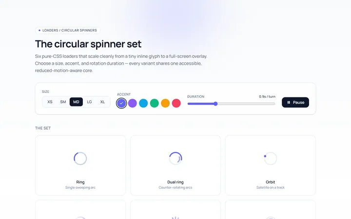
Spinner Set Loader
Originalset of circular spinners in sizes
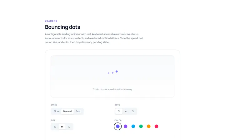
Dots Loader
Originalbouncing dots loader
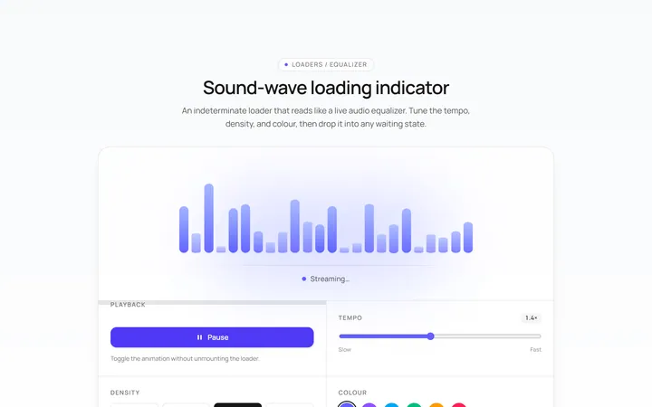
Bars Loader
Originalequalizer bars loader
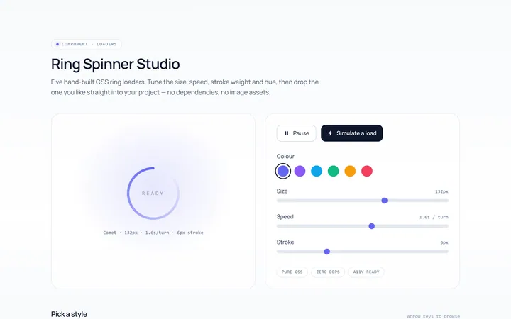
Ring Loader
Originalring spinner loader
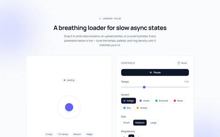
Pulse Loader
Originalpulsing circle loader
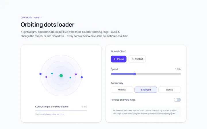
Orbit Loader
Originalorbiting dots loader
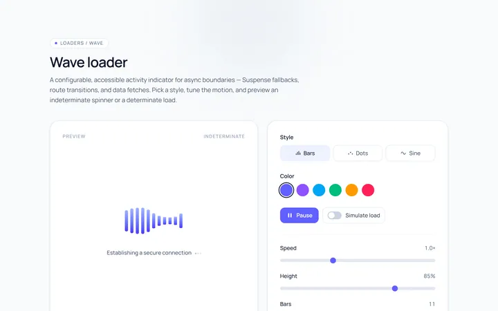
Wave Loader
Originalwave loader
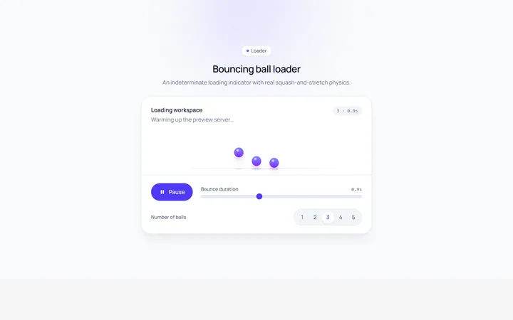
Bounce Loader
Originalbouncing ball loader
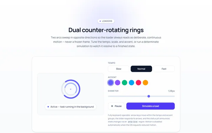
Dual Ring Loader
Originaldual counter-rotating rings
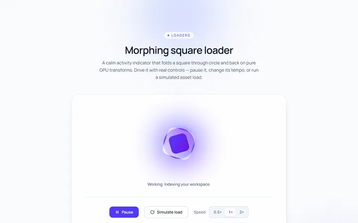
Square Loader
Originalmorphing square loader
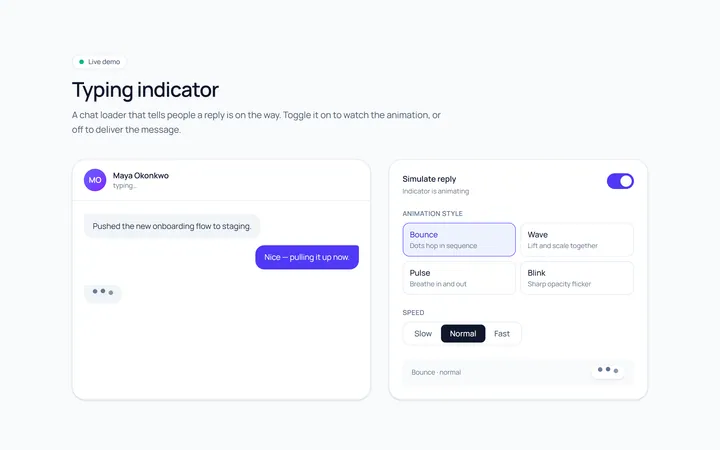
Typing Loader
Originaltyping indicator loader
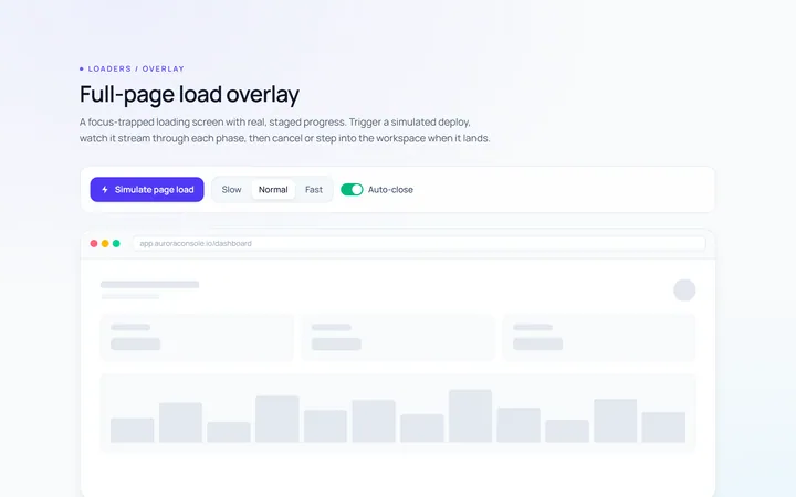
Page Overlay Loader
Originalfull-page loading overlay with progress