

Ring Loader
Original · freering spinner loader
byWeb InnoventixReact + Tailwind
loadringloaders
Copy prompt gives Claude Code, Cursor or v0 a ready-to-paste prompt that recreates this exact component.
npx shadcn@latest add https://webinnoventix.com/r/load-ring.jsonload-ring.tsx
"use client";
import { useEffect, useMemo, useRef, useState } from "react";
import type { CSSProperties, KeyboardEvent, ReactNode } from "react";
import { motion, useReducedMotion } from "motion/react";
/* ------------------------------------------------------------------ */
/* Data */
/* ------------------------------------------------------------------ */
type ThemeKey = "indigo" | "violet" | "sky" | "emerald" | "amber" | "rose";
type VariantKey = "arc" | "dual" | "comet" | "orbit" | "segments";
const THEME_ORDER: ThemeKey[] = ["indigo", "violet", "sky", "emerald", "amber", "rose"];
const THEME_MAP: Record<ThemeKey, { label: string; rgb: string }> = {
indigo: { label: "Indigo", rgb: "99 102 241" },
violet: { label: "Violet", rgb: "139 92 246" },
sky: { label: "Sky", rgb: "14 165 233" },
emerald: { label: "Emerald", rgb: "16 185 129" },
amber: { label: "Amber", rgb: "245 158 11" },
rose: { label: "Rose", rgb: "244 63 94" },
};
const VARIANT_ORDER: VariantKey[] = ["arc", "dual", "comet", "orbit", "segments"];
const VARIANT_MAP: Record<VariantKey, { label: string; blurb: string }> = {
arc: { label: "Arc", blurb: "One sweeping arc on a faint track. The dependable default." },
dual: { label: "Dual Orbit", blurb: "Two arcs spinning against each other for extra momentum." },
comet: { label: "Comet", blurb: "A conic tail fading into a bright leading head." },
orbit: { label: "Satellite", blurb: "A lone dot circling a quiet ring. Calm and minimal." },
segments: { label: "Twelve Bars", blurb: "The classic segmented fade every system loader uses." },
};
const KEYFRAMES = `
@keyframes lr_spin { to { transform: rotate(360deg); } }
@keyframes lr_spinrev { to { transform: rotate(-360deg); } }
@keyframes lr_fade { 0% { opacity: 1; } 100% { opacity: 0.16; } }
@media (prefers-reduced-motion: reduce) {
.lr-scope * { animation: none !important; }
}
`;
/* ------------------------------------------------------------------ */
/* Custom-property style helper */
/* ------------------------------------------------------------------ */
type StyleVars = CSSProperties & Record<`--${string}`, string>;
const anim = (name: string, extra: CSSProperties): CSSProperties => ({
animationName: name,
animationDuration: "var(--lr-dur)",
animationTimingFunction: "linear",
animationIterationCount: "infinite",
animationPlayState: "var(--lr-play)",
...extra,
});
/* ------------------------------------------------------------------ */
/* The ring itself (shared by hero + gallery) */
/* ------------------------------------------------------------------ */
interface RingProps {
variant: VariantKey;
size: number;
thickness: number;
dur: number;
running: boolean;
rgb: string;
}
function Ring({ variant, size, thickness, dur, running, rgb }: RingProps) {
const vars: StyleVars = {
"--lr-thick": `${thickness}px`,
"--lr-dur": `${dur}s`,
"--lr-play": running ? "running" : "paused",
"--lr-rgb": rgb,
"--lr-size": `${size}px`,
width: `${size}px`,
height: `${size}px`,
};
return (
<span className="relative block" style={vars} aria-hidden="true">
{variant === "arc" && (
<>
<span
className="absolute inset-0 rounded-full"
style={{ border: "var(--lr-thick) solid rgb(var(--lr-rgb) / 0.16)" }}
/>
<span
className="absolute inset-0 rounded-full"
style={anim("lr_spin", {
border: "var(--lr-thick) solid transparent",
borderTopColor: "rgb(var(--lr-rgb))",
})}
/>
</>
)}
{variant === "dual" && (
<>
<span
className="absolute inset-0 rounded-full"
style={{ border: "var(--lr-thick) solid rgb(var(--lr-rgb) / 0.14)" }}
/>
<span
className="absolute inset-0 rounded-full"
style={anim("lr_spin", {
border: "var(--lr-thick) solid transparent",
borderTopColor: "rgb(var(--lr-rgb))",
})}
/>
<span
className="absolute rounded-full inset-[16%]"
style={anim("lr_spinrev", {
border: "var(--lr-thick) solid transparent",
borderBottomColor: "rgb(var(--lr-rgb) / 0.6)",
animationDuration: "calc(var(--lr-dur) * 1.45)",
})}
/>
</>
)}
{variant === "comet" && (
<span
className="absolute inset-0 rounded-full"
style={anim("lr_spin", {
background:
"conic-gradient(from 0deg, rgb(var(--lr-rgb) / 0) 0%, rgb(var(--lr-rgb) / 0) 12%, rgb(var(--lr-rgb)) 100%)",
WebkitMask:
"radial-gradient(farthest-side, transparent calc(100% - var(--lr-thick)), #000 calc(100% - var(--lr-thick)))",
mask: "radial-gradient(farthest-side, transparent calc(100% - var(--lr-thick)), #000 calc(100% - var(--lr-thick)))",
})}
>
<span
className="absolute rounded-full"
style={{
width: "var(--lr-thick)",
height: "var(--lr-thick)",
top: 0,
left: "50%",
transform: "translateX(-50%)",
background: "rgb(var(--lr-rgb))",
}}
/>
</span>
)}
{variant === "orbit" && (
<>
<span
className="absolute inset-0 rounded-full"
style={{ border: "var(--lr-thick) solid rgb(var(--lr-rgb) / 0.16)" }}
/>
<span className="absolute inset-0" style={anim("lr_spin", {})}>
<span
className="absolute rounded-full"
style={{
width: "calc(var(--lr-thick) * 2.3)",
height: "calc(var(--lr-thick) * 2.3)",
top: "calc(var(--lr-thick) * -0.65)",
left: "50%",
marginLeft: "calc(var(--lr-thick) * -1.15)",
background: "rgb(var(--lr-rgb))",
boxShadow: "0 0 12px rgb(var(--lr-rgb) / 0.65)",
}}
/>
</span>
</>
)}
{variant === "segments" && (
<span className="absolute inset-0">
{Array.from({ length: 12 }).map((_, i) => (
<span
key={i}
className="absolute rounded-full"
style={{
left: "50%",
top: "7%",
width: "var(--lr-thick)",
height: "22%",
marginLeft: "calc(var(--lr-thick) / -2)",
transformOrigin: "center calc(var(--lr-size) / 2 - var(--lr-size) * 0.07)",
transform: `rotate(${i * 30}deg)`,
background: "rgb(var(--lr-rgb))",
animationName: "lr_fade",
animationDuration: "var(--lr-dur)",
animationTimingFunction: "linear",
animationIterationCount: "infinite",
animationPlayState: "var(--lr-play)",
animationDelay: `calc(var(--lr-dur) / -12 * ${i})`,
}}
/>
))}
</span>
)}
</span>
);
}
/* ------------------------------------------------------------------ */
/* Accessible radio-group (roving tabindex + arrow keys) */
/* ------------------------------------------------------------------ */
interface OptionGroupProps<T extends string> {
label: string;
value: T;
options: readonly T[];
onSelect: (value: T) => void;
renderItem: (option: T, selected: boolean) => ReactNode;
itemClassName: (selected: boolean) => string;
itemLabel?: (option: T) => string;
className?: string;
}
function OptionGroup<T extends string>({
label,
value,
options,
onSelect,
renderItem,
itemClassName,
itemLabel,
className,
}: OptionGroupProps<T>) {
const refs = useRef<(HTMLButtonElement | null)[]>([]);
const idx = options.indexOf(value);
const focusTo = (next: number) => {
onSelect(options[next]);
refs.current[next]?.focus();
};
const onKeyDown = (e: KeyboardEvent<HTMLButtonElement>) => {
const last = options.length - 1;
if (e.key === "ArrowRight" || e.key === "ArrowDown") {
e.preventDefault();
focusTo(idx >= last ? 0 : idx + 1);
} else if (e.key === "ArrowLeft" || e.key === "ArrowUp") {
e.preventDefault();
focusTo(idx <= 0 ? last : idx - 1);
} else if (e.key === "Home") {
e.preventDefault();
focusTo(0);
} else if (e.key === "End") {
e.preventDefault();
focusTo(last);
}
};
return (
<div role="radiogroup" aria-label={label} className={className}>
{options.map((option, i) => {
const selected = option === value;
return (
<button
key={option}
ref={(el) => {
refs.current[i] = el;
}}
type="button"
role="radio"
aria-checked={selected}
aria-label={itemLabel ? itemLabel(option) : undefined}
tabIndex={selected ? 0 : -1}
onClick={() => onSelect(option)}
onKeyDown={onKeyDown}
className={itemClassName(selected)}
>
{renderItem(option, selected)}
</button>
);
})}
</div>
);
}
/* ------------------------------------------------------------------ */
/* Inline icons */
/* ------------------------------------------------------------------ */
const iconProps = {
width: 16,
height: 16,
viewBox: "0 0 24 24",
fill: "none",
stroke: "currentColor",
strokeWidth: 2,
strokeLinecap: "round" as const,
strokeLinejoin: "round" as const,
"aria-hidden": true,
};
const PlayIcon = () => (
<svg {...iconProps}>
<path d="M7 5.5v13l11-6.5-11-6.5z" fill="currentColor" stroke="none" />
</svg>
);
const PauseIcon = () => (
<svg {...iconProps}>
<rect x="7" y="5" width="3.4" height="14" rx="1" fill="currentColor" stroke="none" />
<rect x="13.6" y="5" width="3.4" height="14" rx="1" fill="currentColor" stroke="none" />
</svg>
);
const CheckIcon = () => (
<svg width={22} height={22} viewBox="0 0 24 24" fill="none" stroke="currentColor" strokeWidth={2.4} strokeLinecap="round" strokeLinejoin="round" aria-hidden>
<path d="M20 6 9 17l-5-5" />
</svg>
);
const SparkIcon = () => (
<svg {...iconProps}>
<path d="M13 2 4 14h6l-1 8 9-12h-6l1-8z" fill="currentColor" stroke="none" />
</svg>
);
/* ------------------------------------------------------------------ */
/* Slider */
/* ------------------------------------------------------------------ */
interface SliderProps {
label: string;
value: string;
min: number;
max: number;
step: number;
current: number;
accent: string;
ariaLabel: string;
onChange: (v: number) => void;
}
function Slider({ label, value, min, max, step, current, accent, ariaLabel, onChange }: SliderProps) {
return (
<label className="block">
<span className="flex items-baseline justify-between">
<span className="text-sm font-medium text-slate-700 dark:text-slate-300">{label}</span>
<span className="font-mono text-xs tabular-nums text-slate-500 dark:text-slate-400">{value}</span>
</span>
<input
type="range"
min={min}
max={max}
step={step}
value={current}
aria-label={ariaLabel}
onChange={(e) => onChange(Number(e.target.value))}
style={{ accentColor: `rgb(${accent})` }}
className="mt-2.5 h-2 w-full cursor-pointer appearance-none rounded-full bg-slate-200 dark:bg-slate-800 focus-visible:outline-none focus-visible:ring-2 focus-visible:ring-offset-2 focus-visible:ring-slate-900 dark:focus-visible:ring-slate-100 focus-visible:ring-offset-white dark:focus-visible:ring-offset-slate-950"
/>
</label>
);
}
/* ------------------------------------------------------------------ */
/* Main component */
/* ------------------------------------------------------------------ */
export default function LoadRing() {
const reduced = useReducedMotion();
const [variant, setVariant] = useState<VariantKey>("comet");
const [themeKey, setThemeKey] = useState<ThemeKey>("indigo");
const [size, setSize] = useState<number>(132);
const [thickness, setThickness] = useState<number>(6);
const [speed, setSpeed] = useState<number>(6);
const [running, setRunning] = useState<boolean>(true);
const [task, setTask] = useState<{ active: boolean; pct: number; done: boolean }>({
active: false,
pct: 0,
done: false,
});
const tick = useRef<ReturnType<typeof setInterval> | null>(null);
const reset = useRef<ReturnType<typeof setTimeout> | null>(null);
const theme = THEME_MAP[themeKey];
const dur = useMemo(() => +(3.2 - ((speed - 1) / 9) * 2.8).toFixed(2), [speed]);
const effectiveRunning = running && !reduced;
useEffect(
() => () => {
if (tick.current) clearInterval(tick.current);
if (reset.current) clearTimeout(reset.current);
},
[],
);
const runTask = () => {
if (tick.current) clearInterval(tick.current);
if (reset.current) clearTimeout(reset.current);
setRunning(true);
setTask({ active: true, pct: 0, done: false });
tick.current = setInterval(() => {
setTask((prev) => {
if (!prev.active) return prev;
const next = Math.min(100, prev.pct + 3 + Math.random() * 8);
if (next >= 100) {
if (tick.current) clearInterval(tick.current);
reset.current = setTimeout(() => setTask({ active: false, pct: 0, done: false }), 1700);
return { active: false, pct: 100, done: true };
}
return { active: true, pct: next, done: false };
});
}, 110);
};
const statusLabel = task.done
? "Loading complete"
: task.active
? `Loading, ${Math.round(task.pct)} percent`
: reduced
? "Ring loader preview, motion reduced"
: running
? "Ring loader preview, spinning"
: "Ring loader preview, paused";
const pill = "rounded-full border border-slate-200 dark:border-slate-800 bg-white/70 dark:bg-slate-900/50 px-3 py-1 font-mono text-[0.68rem] uppercase tracking-wider text-slate-500 dark:text-slate-400";
const btn =
"inline-flex items-center justify-center gap-2 rounded-xl px-4 py-2.5 text-sm font-medium transition focus-visible:outline-none focus-visible:ring-2 focus-visible:ring-offset-2 focus-visible:ring-slate-900 dark:focus-visible:ring-slate-100 focus-visible:ring-offset-white dark:focus-visible:ring-offset-slate-950 disabled:cursor-not-allowed disabled:opacity-50";
return (
<section className="lr-scope relative w-full overflow-hidden bg-gradient-to-b from-slate-50 via-white to-slate-100 px-5 py-16 text-slate-900 dark:from-slate-950 dark:via-slate-950 dark:to-slate-900 dark:text-slate-100 sm:px-8 sm:py-24">
<style>{KEYFRAMES}</style>
{/* dotted texture */}
<div
aria-hidden
className="pointer-events-none absolute inset-0"
style={{
backgroundImage: "radial-gradient(rgb(100 116 139 / 0.14) 1px, transparent 1px)",
backgroundSize: "22px 22px",
WebkitMaskImage: "radial-gradient(70% 55% at 50% 22%, #000, transparent)",
maskImage: "radial-gradient(70% 55% at 50% 22%, #000, transparent)",
}}
/>
<div className="relative mx-auto max-w-5xl">
{/* header */}
<motion.header
initial={reduced ? false : { opacity: 0, y: 14 }}
animate={{ opacity: 1, y: 0 }}
transition={{ duration: 0.55, ease: [0.22, 1, 0.36, 1] }}
className="max-w-2xl"
>
<span className="inline-flex items-center gap-2 rounded-full border border-slate-200 bg-white/70 px-3 py-1 font-mono text-[0.7rem] uppercase tracking-widest text-slate-500 dark:border-slate-800 dark:bg-slate-900/50 dark:text-slate-400">
<span
className="h-1.5 w-1.5 rounded-full"
style={{ background: `rgb(${theme.rgb})`, boxShadow: `0 0 8px rgb(${theme.rgb})` }}
/>
Component · Loaders
</span>
<h2 className="mt-4 text-3xl font-semibold tracking-tight sm:text-4xl">Ring Spinner Studio</h2>
<p className="mt-3 text-base leading-relaxed text-slate-600 dark:text-slate-400">
Five hand-built CSS ring loaders. Tune the size, speed, stroke weight and hue, then drop the one
you like straight into your project — no dependencies, no image assets.
</p>
</motion.header>
{/* preview + controls */}
<div className="mt-10 grid gap-6 lg:grid-cols-[1.05fr_1fr]">
{/* preview */}
<div className="relative flex min-h-[320px] flex-col items-center justify-center gap-6 overflow-hidden rounded-3xl border border-slate-200 bg-white/70 p-8 backdrop-blur-sm dark:border-slate-800 dark:bg-slate-900/50">
<div
aria-hidden
className="pointer-events-none absolute inset-0"
style={{ background: `radial-gradient(55% 55% at 50% 42%, rgb(${theme.rgb} / 0.16), transparent 72%)` }}
/>
<div
role="status"
aria-live="polite"
aria-label={statusLabel}
className="relative grid place-items-center"
style={{ width: `${size}px`, height: `${size}px` }}
>
<Ring
variant={variant}
size={size}
thickness={thickness}
dur={dur}
running={effectiveRunning}
rgb={theme.rgb}
/>
<div
aria-hidden
className="pointer-events-none absolute inset-0 grid place-items-center font-mono tabular-nums text-slate-900 dark:text-slate-100"
style={{ fontSize: `${Math.round(size * 0.16)}px` }}
>
{task.done ? (
<span style={{ color: `rgb(${theme.rgb})` }}>
<CheckIcon />
</span>
) : task.active ? (
<span>
{Math.round(task.pct)}
<span className="text-[0.6em] text-slate-400 dark:text-slate-500">%</span>
</span>
) : (
<span className="text-[0.62em] uppercase tracking-[0.32em] text-slate-400 dark:text-slate-500">
Ready
</span>
)}
</div>
</div>
<p className="relative text-center font-mono text-xs text-slate-500 dark:text-slate-400">
{VARIANT_MAP[variant].label} · {size}px · {dur.toFixed(1)}s/turn · {thickness}px stroke
</p>
{reduced ? (
<p className="relative max-w-xs text-center text-xs text-amber-600 dark:text-amber-400">
Motion is reduced in your system settings — the loader is shown paused.
</p>
) : null}
</div>
{/* controls */}
<div className="flex flex-col gap-6 rounded-3xl border border-slate-200 bg-white/70 p-6 backdrop-blur-sm dark:border-slate-800 dark:bg-slate-900/50 sm:p-7">
<div className="flex flex-wrap gap-3">
<button
type="button"
onClick={() => setRunning((r) => !r)}
aria-pressed={running}
disabled={!!reduced}
className={`${btn} border border-slate-300 bg-white text-slate-800 hover:bg-slate-50 dark:border-slate-700 dark:bg-slate-900 dark:text-slate-100 dark:hover:bg-slate-800`}
>
{running ? <PauseIcon /> : <PlayIcon />}
{running ? "Pause" : "Play"}
</button>
<button
type="button"
onClick={runTask}
disabled={task.active}
className={`${btn} bg-slate-900 text-white hover:bg-slate-800 dark:bg-white dark:text-slate-900 dark:hover:bg-slate-200`}
>
<SparkIcon />
{task.active ? "Loading…" : "Simulate a load"}
</button>
</div>
<div>
<span className="text-sm font-medium text-slate-700 dark:text-slate-300">Colour</span>
<OptionGroup<ThemeKey>
label="Colour theme"
value={themeKey}
options={THEME_ORDER}
onSelect={setThemeKey}
itemLabel={(k) => THEME_MAP[k].label}
className="mt-2.5 flex flex-wrap gap-2.5"
itemClassName={(sel) =>
`rounded-full p-0.5 transition focus-visible:outline-none focus-visible:ring-2 focus-visible:ring-offset-2 focus-visible:ring-slate-900 dark:focus-visible:ring-slate-100 focus-visible:ring-offset-white dark:focus-visible:ring-offset-slate-950 ${
sel
? "ring-2 ring-offset-2 ring-slate-900 ring-offset-white dark:ring-white dark:ring-offset-slate-950"
: ""
}`
}
renderItem={(k) => (
<span className="block h-7 w-7 rounded-full" style={{ background: `rgb(${THEME_MAP[k].rgb})` }} />
)}
/>
</div>
<div className="grid gap-5">
<Slider
label="Size"
value={`${size}px`}
min={56}
max={176}
step={2}
current={size}
accent={theme.rgb}
ariaLabel={`Ring size, ${size} pixels`}
onChange={setSize}
/>
<Slider
label="Speed"
value={`${dur.toFixed(1)}s / turn`}
min={1}
max={10}
step={1}
current={speed}
accent={theme.rgb}
ariaLabel={`Rotation speed, level ${speed} of 10`}
onChange={setSpeed}
/>
<Slider
label="Stroke"
value={`${thickness}px`}
min={2}
max={16}
step={1}
current={thickness}
accent={theme.rgb}
ariaLabel={`Stroke thickness, ${thickness} pixels`}
onChange={setThickness}
/>
</div>
<div className="flex flex-wrap gap-2 pt-1">
<span className={pill}>Pure CSS</span>
<span className={pill}>Zero deps</span>
<span className={pill}>A11y-ready</span>
</div>
</div>
</div>
{/* gallery / style picker */}
<div className="mt-12">
<div className="mb-4 flex items-end justify-between gap-4">
<h3 className="text-lg font-semibold tracking-tight">Pick a style</h3>
<span className="hidden font-mono text-xs text-slate-400 dark:text-slate-500 sm:block">
Arrow keys to browse
</span>
</div>
<OptionGroup<VariantKey>
label="Loader style"
value={variant}
options={VARIANT_ORDER}
onSelect={setVariant}
className="grid grid-cols-2 gap-3 sm:grid-cols-3 lg:grid-cols-5"
itemClassName={(sel) =>
`flex flex-col items-center gap-3 rounded-2xl border p-4 text-center transition focus-visible:outline-none focus-visible:ring-2 focus-visible:ring-offset-2 focus-visible:ring-slate-900 dark:focus-visible:ring-slate-100 focus-visible:ring-offset-white dark:focus-visible:ring-offset-slate-950 ${
sel
? "border-slate-900 bg-white shadow-lg shadow-slate-900/5 dark:border-slate-100 dark:bg-slate-900"
: "border-slate-200 bg-white/60 hover:border-slate-300 dark:border-slate-800 dark:bg-slate-900/40 dark:hover:border-slate-700"
}`
}
renderItem={(k) => (
<>
<span className="grid h-14 place-items-center">
<Ring variant={k} size={44} thickness={4} dur={1.1} running={effectiveRunning} rgb={theme.rgb} />
</span>
<span className="block">
<span className="block text-sm font-semibold">{VARIANT_MAP[k].label}</span>
<span className="mt-1 block text-xs leading-snug text-slate-500 dark:text-slate-400">
{VARIANT_MAP[k].blurb}
</span>
</span>
</>
)}
/>
</div>
</div>
</section>
);
}Dependencies
motion
Licence
Built by Web Innoventix. Free for personal and commercial use, no attribution required.
Built by Web Innoventix
Need a custom interface, a full website, or SEO that gets you cited by AI? We design, build and rank it end to end.
Get a free quoteSimilar components
Browse all →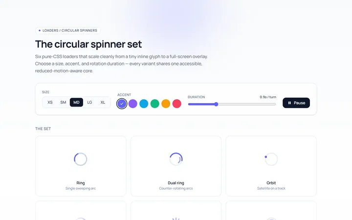
Spinner Set Loader
Originalset of circular spinners in sizes
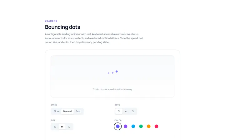
Dots Loader
Originalbouncing dots loader
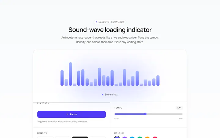
Bars Loader
Originalequalizer bars loader
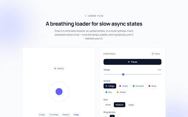
Pulse Loader
Originalpulsing circle loader
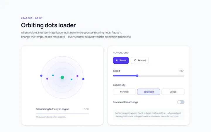
Orbit Loader
Originalorbiting dots loader
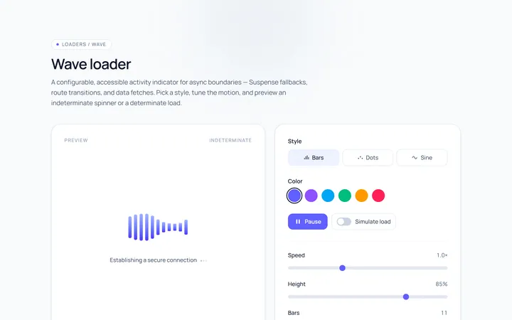
Wave Loader
Originalwave loader
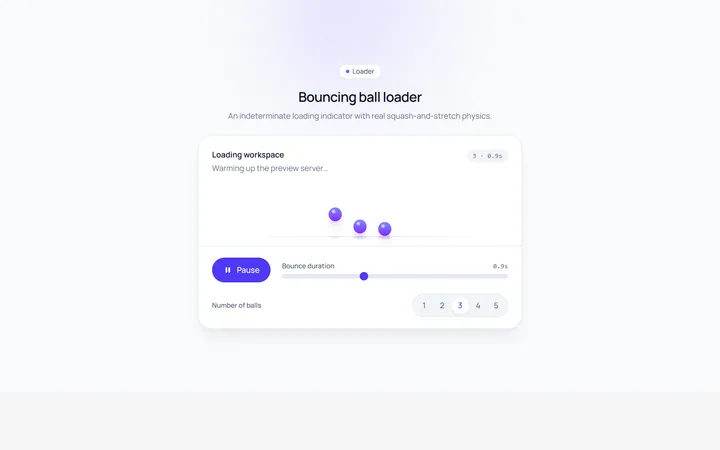
Bounce Loader
Originalbouncing ball loader
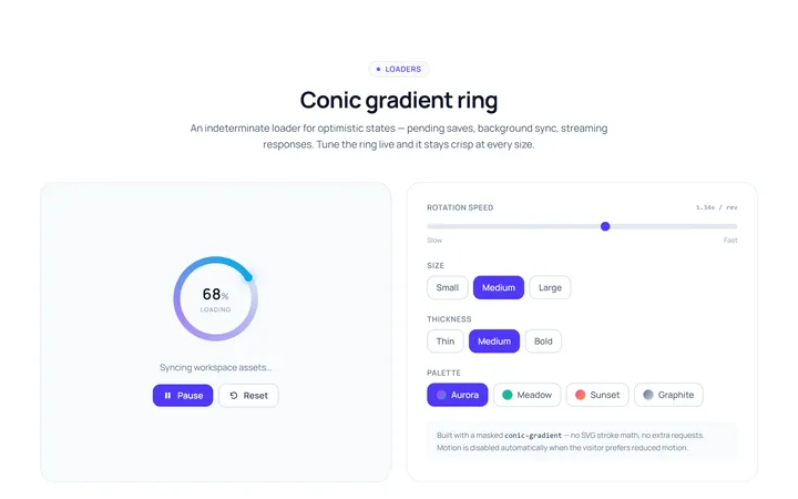
Gradient Ring Loader
Originalgradient conic ring spinner
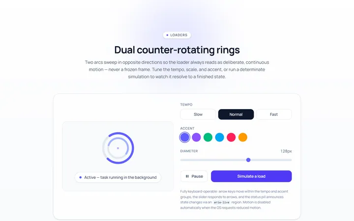
Dual Ring Loader
Originaldual counter-rotating rings
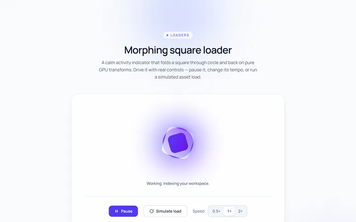
Square Loader
Originalmorphing square loader
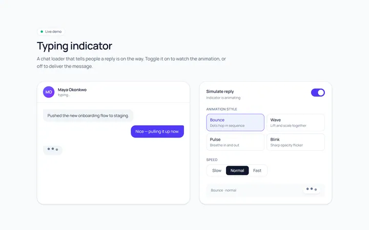
Typing Loader
Originaltyping indicator loader
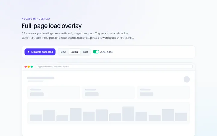
Page Overlay Loader
Originalfull-page loading overlay with progress