

Typing Loader
Original · freetyping indicator loader
byWeb InnoventixReact + Tailwind
loadtypingloaders
Copy prompt gives Claude Code, Cursor or v0 a ready-to-paste prompt that recreates this exact component.
npx shadcn@latest add https://webinnoventix.com/r/load-typing.jsonload-typing.tsx
"use client";

import { useId, useState } from "react";
import { motion, AnimatePresence, useReducedMotion } from "motion/react";

type Variant = "bounce" | "wave" | "pulse" | "blink";
type Speed = "slow" | "normal" | "fast";

const KEYFRAME: Record<Variant, string> = {
  bounce: "ltyp-bounce",
  wave: "ltyp-wave",
  pulse: "ltyp-pulse",
  blink: "ltyp-blink",
};

const DURATION: Record<Speed, number> = {
  slow: 1.5,
  normal: 1.05,
  fast: 0.7,
};

const VARIANTS: { id: Variant; label: string; hint: string }[] = [
  { id: "bounce", label: "Bounce", hint: "Dots hop in sequence" },
  { id: "wave", label: "Wave", hint: "Lift and scale together" },
  { id: "pulse", label: "Pulse", hint: "Breathe in and out" },
  { id: "blink", label: "Blink", hint: "Sharp opacity flicker" },
];

const SPEEDS: { id: Speed; label: string }[] = [
  { id: "slow", label: "Slow" },
  { id: "normal", label: "Normal" },
  { id: "fast", label: "Fast" },
];

function TypingDots({
  variant,
  speed,
  reduce,
}: {
  variant: Variant;
  speed: Speed;
  reduce: boolean;
}) {
  const dur = DURATION[speed];
  return (
    <span className="flex items-center gap-1.5" aria-hidden="true">
      {[0, 1, 2].map((i) => (
        <span
          key={i}
          className="ltyp-dot block h-2 w-2 rounded-full bg-slate-500 dark:bg-slate-400"
          style={{
            animationName: reduce ? "none" : KEYFRAME[variant],
            animationDuration: `${dur}s`,
            animationTimingFunction: "ease-in-out",
            animationIterationCount: "infinite",
            animationDelay: `${(i * dur * 0.16).toFixed(2)}s`,
            animationPlayState: reduce ? "paused" : "running",
            willChange: "transform, opacity",
          }}
        />
      ))}
    </span>
  );
}

export default function LoadTyping() {
  const reduce = useReducedMotion() ?? false;
  const groupId = useId();

  const [isTyping, setIsTyping] = useState<boolean>(true);
  const [variant, setVariant] = useState<Variant>("bounce");
  const [speed, setSpeed] = useState<Speed>("normal");

  const activeVariant = VARIANTS.find((v) => v.id === variant) ?? VARIANTS[0];

  const enter = reduce
    ? { initial: { opacity: 0 }, animate: { opacity: 1 }, exit: { opacity: 0 } }
    : {
        initial: { opacity: 0, y: 10, scale: 0.96 },
        animate: { opacity: 1, y: 0, scale: 1 },
        exit: { opacity: 0, y: -8, scale: 0.96 },
      };

  return (
    <section className="relative w-full bg-slate-50 px-4 py-16 text-slate-900 dark:bg-slate-950 dark:text-slate-100 sm:px-6 sm:py-24">
      <style>{`
        @keyframes ltyp-bounce {
          0%, 80%, 100% { transform: translateY(0); opacity: .5; }
          40% { transform: translateY(-6px); opacity: 1; }
        }
        @keyframes ltyp-wave {
          0%, 60%, 100% { transform: translateY(0) scale(1); opacity: .5; }
          30% { transform: translateY(-5px) scale(1.28); opacity: 1; }
        }
        @keyframes ltyp-pulse {
          0%, 100% { transform: scale(.65); opacity: .4; }
          50% { transform: scale(1.15); opacity: 1; }
        }
        @keyframes ltyp-blink {
          0%, 100% { opacity: .22; }
          50% { opacity: 1; }
        }
        @keyframes ltyp-caret {
          0%, 100% { opacity: 1; }
          50% { opacity: 0; }
        }
        @media (prefers-reduced-motion: reduce) {
          .ltyp-dot { animation: none !important; }
          .ltyp-caret { animation: none !important; }
        }
      `}</style>

      <div className="mx-auto max-w-5xl">
        <header className="mb-10 max-w-2xl">
          <span className="inline-flex items-center gap-2 rounded-full border border-slate-200 bg-white px-3 py-1 text-xs font-medium text-slate-600 dark:border-slate-800 dark:bg-slate-900 dark:text-slate-300">
            <span className="relative flex h-2 w-2">
              <span className="absolute inline-flex h-full w-full rounded-full bg-emerald-500/70 ltyp-caret" />
              <span className="relative inline-flex h-2 w-2 rounded-full bg-emerald-500" />
            </span>
            Live demo
          </span>
          <h2 className="mt-4 text-3xl font-semibold tracking-tight sm:text-4xl">
            Typing indicator
          </h2>
          <p className="mt-3 text-base leading-relaxed text-slate-600 dark:text-slate-400">
            A chat loader that tells people a reply is on the way. Toggle it on
            to watch the animation, or off to deliver the message.
          </p>
        </header>

        <div className="grid gap-6 lg:grid-cols-[1.15fr_1fr] lg:gap-8">
          {/* Chat preview */}
          <div className="overflow-hidden rounded-3xl border border-slate-200 bg-white shadow-sm dark:border-slate-800 dark:bg-slate-900">
            <div className="flex items-center gap-3 border-b border-slate-200 px-5 py-4 dark:border-slate-800">
              <span
                className="grid h-10 w-10 shrink-0 place-items-center rounded-full bg-gradient-to-br from-indigo-500 to-violet-600 text-sm font-semibold text-white"
                aria-hidden="true"
              >
                MO
              </span>
              <div className="min-w-0">
                <p className="truncate text-sm font-semibold">Maya Okonkwo</p>
                <p className="truncate text-xs text-slate-500 dark:text-slate-400">
                  {isTyping ? "typing…" : "online"}
                </p>
              </div>
            </div>

            <div className="flex flex-col gap-3 px-5 py-6">
              {/* Their message */}
              <div className="flex justify-start">
                <div className="max-w-[85%] rounded-2xl rounded-tl-sm bg-slate-100 px-4 py-2.5 text-sm leading-relaxed text-slate-800 dark:bg-slate-800 dark:text-slate-100">
                  Pushed the new onboarding flow to staging.
                </div>
              </div>

              {/* Your message */}
              <div className="flex justify-end">
                <div className="max-w-[85%] rounded-2xl rounded-tr-sm bg-indigo-600 px-4 py-2.5 text-sm leading-relaxed text-white">
                  Nice — pulling it up now.
                </div>
              </div>

              {/* Typing indicator / delivered message swap */}
              <div className="flex min-h-[3rem] items-end justify-start">
                <AnimatePresence mode="wait" initial={false}>
                  {isTyping ? (
                    <motion.div
                      key="typing"
                      initial={enter.initial}
                      animate={enter.animate}
                      exit={enter.exit}
                      transition={{ duration: reduce ? 0.12 : 0.28 }}
                      className="inline-flex items-center rounded-2xl rounded-tl-sm bg-slate-100 px-4 py-3 dark:bg-slate-800"
                    >
                      <TypingDots
                        variant={variant}
                        speed={speed}
                        reduce={reduce}
                      />
                    </motion.div>
                  ) : (
                    <motion.div
                      key="delivered"
                      initial={enter.initial}
                      animate={enter.animate}
                      exit={enter.exit}
                      transition={{ duration: reduce ? 0.12 : 0.28 }}
                      className="max-w-[85%] rounded-2xl rounded-tl-sm bg-slate-100 px-4 py-2.5 text-sm leading-relaxed text-slate-800 dark:bg-slate-800 dark:text-slate-100"
                    >
                      Take your time — the staging link is in the thread.
                    </motion.div>
                  )}
                </AnimatePresence>
              </div>
            </div>

            {/* Screen-reader live announcement */}
            <p className="sr-only" role="status" aria-live="polite">
              {isTyping
                ? "Maya Okonkwo is typing"
                : "Maya Okonkwo sent: Take your time — the staging link is in the thread."}
            </p>
          </div>

          {/* Controls */}
          <div className="flex flex-col gap-6 rounded-3xl border border-slate-200 bg-white p-6 shadow-sm dark:border-slate-800 dark:bg-slate-900">
            <div className="flex items-start justify-between gap-4">
              <div>
                <p className="text-sm font-semibold">Simulate reply</p>
                <p className="mt-1 text-xs text-slate-500 dark:text-slate-400">
                  {isTyping ? "Indicator is animating" : "Message delivered"}
                </p>
              </div>
              <button
                type="button"
                role="switch"
                aria-checked={isTyping}
                aria-label="Show typing indicator"
                onClick={() => setIsTyping((v) => !v)}
                className={`relative inline-flex h-7 w-12 shrink-0 items-center rounded-full outline-none transition-colors focus-visible:ring-2 focus-visible:ring-indigo-500 focus-visible:ring-offset-2 focus-visible:ring-offset-white dark:focus-visible:ring-offset-slate-900 ${
                  isTyping
                    ? "bg-indigo-600"
                    : "bg-slate-300 dark:bg-slate-700"
                }`}
              >
                <span
                  className={`inline-block h-5 w-5 transform rounded-full bg-white shadow transition-transform ${
                    isTyping ? "translate-x-6" : "translate-x-1"
                  }`}
                />
              </button>
            </div>

            {/* Variant radio group */}
            <fieldset>
              <legend className="mb-2 text-xs font-semibold uppercase tracking-wide text-slate-500 dark:text-slate-400">
                Animation style
              </legend>
              <div
                role="radiogroup"
                aria-label="Animation style"
                className="grid grid-cols-2 gap-2"
              >
                {VARIANTS.map((v) => (
                  <label key={v.id} className="cursor-pointer">
                    <input
                      type="radio"
                      name={`${groupId}-variant`}
                      value={v.id}
                      checked={variant === v.id}
                      onChange={() => setVariant(v.id)}
                      className="peer sr-only"
                    />
                    <span className="flex flex-col gap-0.5 rounded-xl border border-slate-200 px-3 py-2.5 text-sm transition-colors peer-checked:border-indigo-500 peer-checked:bg-indigo-50 peer-checked:text-indigo-700 peer-focus-visible:ring-2 peer-focus-visible:ring-indigo-500 peer-focus-visible:ring-offset-2 peer-focus-visible:ring-offset-white hover:border-slate-300 dark:border-slate-700 dark:peer-checked:border-indigo-400 dark:peer-checked:bg-indigo-500/15 dark:peer-checked:text-indigo-300 dark:peer-focus-visible:ring-offset-slate-900 dark:hover:border-slate-600">
                      <span className="font-medium">{v.label}</span>
                      <span className="text-xs text-slate-500 dark:text-slate-400">
                        {v.hint}
                      </span>
                    </span>
                  </label>
                ))}
              </div>
            </fieldset>

            {/* Speed radio group */}
            <fieldset>
              <legend className="mb-2 text-xs font-semibold uppercase tracking-wide text-slate-500 dark:text-slate-400">
                Speed
              </legend>
              <div
                role="radiogroup"
                aria-label="Speed"
                className="inline-flex rounded-xl border border-slate-200 p-1 dark:border-slate-700"
              >
                {SPEEDS.map((s) => (
                  <label key={s.id} className="cursor-pointer">
                    <input
                      type="radio"
                      name={`${groupId}-speed`}
                      value={s.id}
                      checked={speed === s.id}
                      onChange={() => setSpeed(s.id)}
                      className="peer sr-only"
                    />
                    <span className="block rounded-lg px-4 py-1.5 text-sm font-medium text-slate-600 transition-colors peer-checked:bg-slate-900 peer-checked:text-white peer-focus-visible:ring-2 peer-focus-visible:ring-indigo-500 peer-focus-visible:ring-offset-2 peer-focus-visible:ring-offset-white dark:text-slate-300 dark:peer-checked:bg-white dark:peer-checked:text-slate-900 dark:peer-focus-visible:ring-offset-slate-900">
                      {s.label}
                    </span>
                  </label>
                ))}
              </div>
            </fieldset>

            {/* Standalone preview swatch */}
            <div className="mt-auto flex items-center justify-between rounded-xl bg-slate-50 px-4 py-3 dark:bg-slate-800/60">
              <span className="text-xs text-slate-500 dark:text-slate-400">
                {activeVariant.label} · {speed}
              </span>
              <span className="inline-flex items-center rounded-full bg-white px-3 py-2 shadow-sm dark:bg-slate-900">
                <TypingDots variant={variant} speed={speed} reduce={reduce} />
              </span>
            </div>
          </div>
        </div>
      </div>
    </section>
  );
}
Dependencies
motion
Licence
Built by Web Innoventix. Free for personal and commercial use, no attribution required.
Built by Web Innoventix
Need a custom interface, a full website, or SEO that gets you cited by AI? We design, build and rank it end to end.
Get a free quoteSimilar components
Browse all →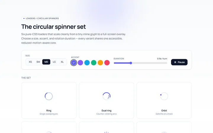
Spinner Set Loader
Originalset of circular spinners in sizes
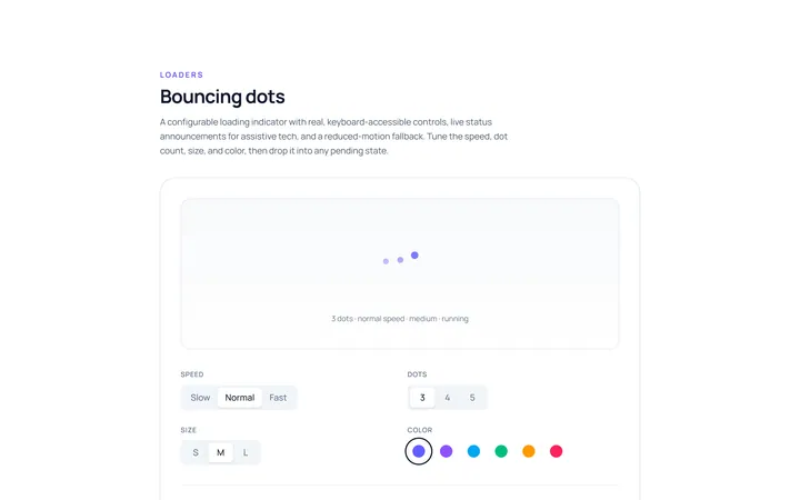
Dots Loader
Originalbouncing dots loader
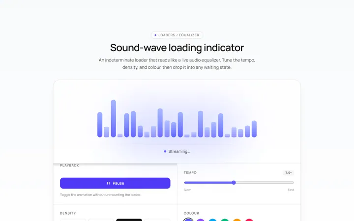
Bars Loader
Originalequalizer bars loader
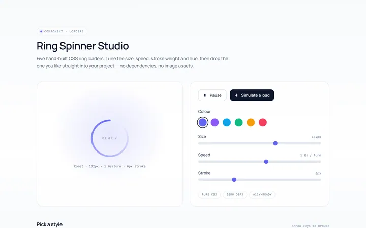
Ring Loader
Originalring spinner loader
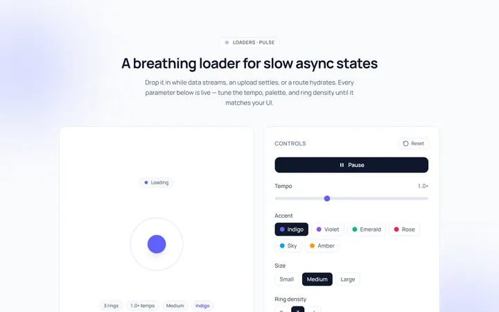
Pulse Loader
Originalpulsing circle loader
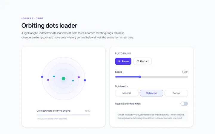
Orbit Loader
Originalorbiting dots loader
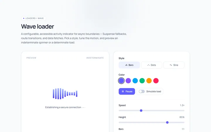
Wave Loader
Originalwave loader
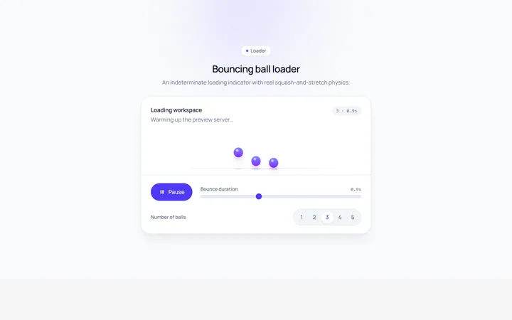
Bounce Loader
Originalbouncing ball loader
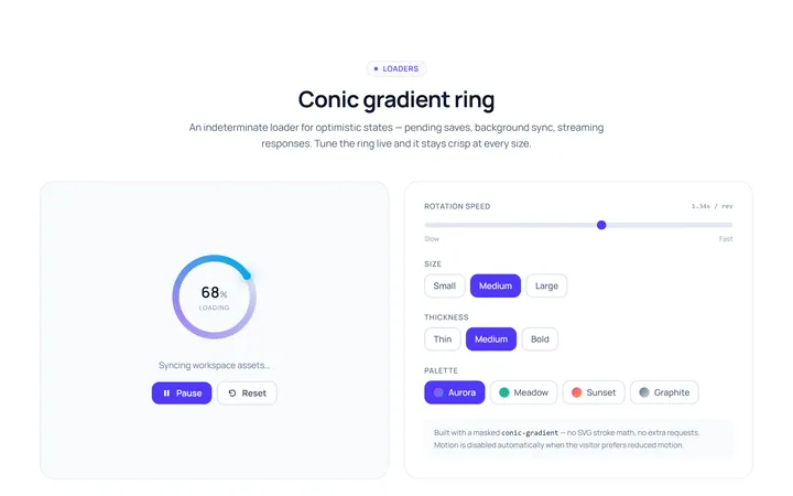
Gradient Ring Loader
Originalgradient conic ring spinner
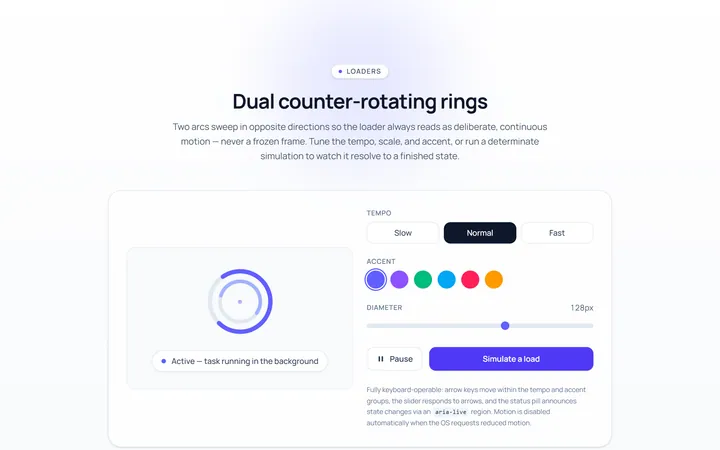
Dual Ring Loader
Originaldual counter-rotating rings
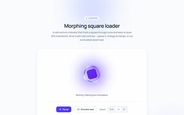
Square Loader
Originalmorphing square loader
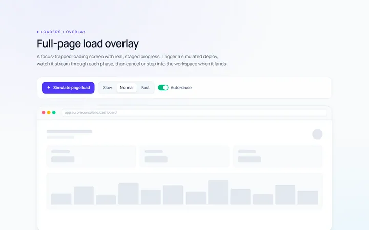
Page Overlay Loader
Originalfull-page loading overlay with progress