

Wave Loader
Original · freewave loader
byWeb InnoventixReact + Tailwind
loadwaveloaders
Copy prompt gives Claude Code, Cursor or v0 a ready-to-paste prompt that recreates this exact component.
npx shadcn@latest add https://webinnoventix.com/r/load-wave.jsonload-wave.tsx
"use client";
import { useEffect, useState, type CSSProperties, type ReactNode } from "react";
import { AnimatePresence, motion, useReducedMotion } from "motion/react";
type StyleKey = "bars" | "dots" | "sine";
type PaletteKey = "indigo" | "violet" | "sky" | "emerald" | "amber" | "rose";
type Palette = {
label: string;
swatch: string;
bar: string;
dot: string;
stroke: string;
accent: string;
chip: string;
};
const PALETTES: Record<PaletteKey, Palette> = {
indigo: {
label: "Indigo",
swatch: "bg-indigo-500",
bar: "bg-gradient-to-t from-indigo-600 to-indigo-300 dark:from-indigo-500 dark:to-indigo-300",
dot: "bg-indigo-500 dark:bg-indigo-400",
stroke: "text-indigo-500 dark:text-indigo-400",
accent: "accent-indigo-500",
chip: "peer-checked:border-transparent peer-checked:bg-indigo-50 dark:peer-checked:bg-indigo-500/15",
},
violet: {
label: "Violet",
swatch: "bg-violet-500",
bar: "bg-gradient-to-t from-violet-600 to-violet-300 dark:from-violet-500 dark:to-violet-300",
dot: "bg-violet-500 dark:bg-violet-400",
stroke: "text-violet-500 dark:text-violet-400",
accent: "accent-violet-500",
chip: "peer-checked:border-transparent peer-checked:bg-violet-50 dark:peer-checked:bg-violet-500/15",
},
sky: {
label: "Sky",
swatch: "bg-sky-500",
bar: "bg-gradient-to-t from-sky-600 to-sky-300 dark:from-sky-500 dark:to-sky-300",
dot: "bg-sky-500 dark:bg-sky-400",
stroke: "text-sky-500 dark:text-sky-400",
accent: "accent-sky-500",
chip: "peer-checked:border-transparent peer-checked:bg-sky-50 dark:peer-checked:bg-sky-500/15",
},
emerald: {
label: "Emerald",
swatch: "bg-emerald-500",
bar: "bg-gradient-to-t from-emerald-600 to-emerald-300 dark:from-emerald-500 dark:to-emerald-300",
dot: "bg-emerald-500 dark:bg-emerald-400",
stroke: "text-emerald-500 dark:text-emerald-400",
accent: "accent-emerald-500",
chip: "peer-checked:border-transparent peer-checked:bg-emerald-50 dark:peer-checked:bg-emerald-500/15",
},
amber: {
label: "Amber",
swatch: "bg-amber-500",
bar: "bg-gradient-to-t from-amber-500 to-amber-200 dark:from-amber-400 dark:to-amber-200",
dot: "bg-amber-500 dark:bg-amber-400",
stroke: "text-amber-500 dark:text-amber-400",
accent: "accent-amber-500",
chip: "peer-checked:border-transparent peer-checked:bg-amber-50 dark:peer-checked:bg-amber-500/15",
},
rose: {
label: "Rose",
swatch: "bg-rose-500",
bar: "bg-gradient-to-t from-rose-600 to-rose-300 dark:from-rose-500 dark:to-rose-300",
dot: "bg-rose-500 dark:bg-rose-400",
stroke: "text-rose-500 dark:text-rose-400",
accent: "accent-rose-500",
chip: "peer-checked:border-transparent peer-checked:bg-rose-50 dark:peer-checked:bg-rose-500/15",
},
};
const PALETTE_ORDER: PaletteKey[] = ["indigo", "violet", "sky", "emerald", "amber", "rose"];
const MESSAGES = [
"Establishing a secure connection",
"Syncing your workspace",
"Warming up the cache",
"Almost there",
];
function IconBars() {
return (
<svg viewBox="0 0 24 24" width="16" height="16" fill="none" stroke="currentColor" strokeWidth="2" strokeLinecap="round" aria-hidden="true">
<path d="M5 14v4M10 8v10M15 5v13M20 11v7" />
</svg>
);
}
function IconDots() {
return (
<svg viewBox="0 0 24 24" width="16" height="16" fill="currentColor" aria-hidden="true">
<circle cx="5" cy="15" r="2" />
<circle cx="12" cy="9" r="2" />
<circle cx="19" cy="15" r="2" />
</svg>
);
}
function IconSine() {
return (
<svg viewBox="0 0 24 24" width="16" height="16" fill="none" stroke="currentColor" strokeWidth="2" strokeLinecap="round" aria-hidden="true">
<path d="M2 12c2.5-6 5.5-6 8 0s5.5 6 8 0" />
</svg>
);
}
function IconPlay() {
return (
<svg viewBox="0 0 24 24" width="18" height="18" fill="currentColor" aria-hidden="true">
<path d="M8 5.14v13.72a1 1 0 0 0 1.53.85l10.79-6.86a1 1 0 0 0 0-1.7L9.53 4.29A1 1 0 0 0 8 5.14Z" />
</svg>
);
}
function IconPause() {
return (
<svg viewBox="0 0 24 24" width="18" height="18" fill="currentColor" aria-hidden="true">
<rect x="6" y="5" width="4" height="14" rx="1" />
<rect x="14" y="5" width="4" height="14" rx="1" />
</svg>
);
}
function IconRestart() {
return (
<svg viewBox="0 0 24 24" width="16" height="16" fill="none" stroke="currentColor" strokeWidth="2" strokeLinecap="round" strokeLinejoin="round" aria-hidden="true">
<path d="M3 12a9 9 0 1 0 3-6.7L3 8" />
<path d="M3 3v5h5" />
</svg>
);
}
const STYLE_OPTIONS: { key: StyleKey; label: string; icon: ReactNode }[] = [
{ key: "bars", label: "Bars", icon: <IconBars /> },
{ key: "dots", label: "Dots", icon: <IconDots /> },
{ key: "sine", label: "Sine", icon: <IconSine /> },
];
function sinePath(width: number, seg: number, amp: number, mid: number): string {
let d = `M 0 ${mid} q ${seg / 2} ${-amp} ${seg} 0`;
const n = Math.ceil(width / seg) - 1;
for (let i = 0; i < n; i += 1) d += ` t ${seg} 0`;
return d;
}
const FOCUS =
"focus:outline-none focus-visible:ring-2 focus-visible:ring-offset-2 focus-visible:ring-slate-900 dark:focus-visible:ring-slate-100 focus-visible:ring-offset-white dark:focus-visible:ring-offset-slate-950";
export default function LoadWave() {
const reduce = useReducedMotion();
const [style, setStyle] = useState<StyleKey>("bars");
const [palette, setPalette] = useState<PaletteKey>("indigo");
const [playing, setPlaying] = useState(true);
const [speed, setSpeed] = useState(1);
const [amplitude, setAmplitude] = useState(0.85);
const [count, setCount] = useState(11);
const [simulate, setSimulate] = useState(false);
const [progress, setProgress] = useState(0);
const [msgIndex, setMsgIndex] = useState(0);
const pal = PALETTES[palette];
const dur = 1.25 / speed;
const done = progress >= 100;
useEffect(() => {
if (!simulate || !playing || done) return;
const id = window.setInterval(() => {
setProgress((p) => Math.min(100, p + (Math.random() * 6 + 2.5)));
}, 340);
return () => window.clearInterval(id);
}, [simulate, playing, done]);
useEffect(() => {
if (simulate || !playing) return;
const id = window.setInterval(() => {
setMsgIndex((i) => (i + 1) % MESSAGES.length);
}, 2600);
return () => window.clearInterval(id);
}, [simulate, playing]);
const rounded = Math.round(progress);
const message = simulate
? done
? "All set — welcome aboard"
: progress < 30
? "Establishing a secure connection"
: progress < 65
? "Fetching your workspace"
: progress < 90
? "Optimizing your dashboard"
: "Just about ready"
: MESSAGES[msgIndex];
const msgAnim = reduce
? {}
: {
initial: { opacity: 0, y: 8 },
animate: { opacity: 1, y: 0 },
exit: { opacity: 0, y: -8 },
transition: { duration: 0.35, ease: "easeOut" as const },
};
function toggleSimulate() {
setSimulate((s) => {
const next = !s;
if (next) {
setProgress(0);
setPlaying(true);
}
return next;
});
}
const active = playing && !done;
function barStyle(i: number): CSSProperties {
const phase = (i / Math.max(1, count)) * Math.PI * 2;
const frozen = 0.24 + (amplitude - 0.24) * (0.5 + 0.5 * Math.sin(phase));
return {
animationName: reduce ? undefined : "lw-eq",
animationDuration: `${dur}s`,
animationTimingFunction: "cubic-bezier(0.36,0,0.32,1)",
animationIterationCount: "infinite",
animationDelay: `${-(i / Math.max(1, count)) * dur}s`,
animationPlayState: active ? "running" : "paused",
transform: `scaleY(${frozen.toFixed(3)})`,
transformOrigin: "center",
["--lw-amp"]: amplitude,
} as CSSProperties;
}
function dotStyle(i: number): CSSProperties {
const phase = (i / Math.max(1, count)) * Math.PI * 2;
const frozenY = -amplitude * 14 * (0.5 + 0.5 * Math.sin(phase));
return {
animationName: reduce ? undefined : "lw-bounce",
animationDuration: `${dur}s`,
animationTimingFunction: "cubic-bezier(0.36,0,0.32,1)",
animationIterationCount: "infinite",
animationDelay: `${-(i / Math.max(1, count)) * dur}s`,
animationPlayState: active ? "running" : "paused",
transform: `translateY(${frozenY.toFixed(2)}px)`,
["--lw-amp"]: amplitude,
} as CSSProperties;
}
const controlPause = !reduce;
return (
<section className="relative w-full overflow-hidden bg-slate-50 px-4 py-16 text-slate-900 dark:bg-slate-950 dark:text-slate-100 sm:px-6 sm:py-24">
<style>{`
@keyframes lw-eq {
0%, 100% { transform: scaleY(0.22); }
50% { transform: scaleY(var(--lw-amp, 0.85)); }
}
@keyframes lw-bounce {
0%, 100% { transform: translateY(0); opacity: 0.55; }
50% { transform: translateY(calc(var(--lw-amp, 0.85) * -22px)); opacity: 1; }
}
@keyframes lw-flow {
from { transform: translateX(0); }
to { transform: translateX(-50%); }
}
@keyframes lw-dotfade {
0%, 100% { opacity: 0.25; }
50% { opacity: 1; }
}
@media (prefers-reduced-motion: reduce) {
.lw-animated { animation: none !important; }
}
`}</style>
<div
aria-hidden="true"
className="pointer-events-none absolute -top-24 left-1/2 h-72 w-72 -translate-x-1/2 rounded-full bg-slate-200/50 blur-3xl dark:bg-slate-800/30"
/>
<div className="relative mx-auto max-w-5xl">
<header className="mb-10 max-w-2xl">
<span className="inline-flex items-center gap-2 rounded-full border border-slate-200 bg-white px-3 py-1 text-xs font-medium uppercase tracking-widest text-slate-500 dark:border-slate-800 dark:bg-slate-900 dark:text-slate-400">
<span className={`h-1.5 w-1.5 rounded-full ${pal.swatch}`} />
Loaders / Wave
</span>
<h2 className="mt-4 text-3xl font-semibold tracking-tight sm:text-4xl">Wave loader</h2>
<p className="mt-3 text-base leading-relaxed text-slate-600 dark:text-slate-400">
A configurable, accessible activity indicator for async boundaries — Suspense fallbacks,
route transitions, and data fetches. Pick a style, tune the motion, and preview an
indeterminate spinner or a determinate load.
</p>
</header>
<div className="grid gap-6 lg:grid-cols-[1.15fr_1fr]">
{/* Preview */}
<div className="flex flex-col justify-between rounded-3xl border border-slate-200 bg-white p-6 shadow-sm dark:border-slate-800 dark:bg-slate-900 sm:p-8">
<div className="flex items-center justify-between text-xs font-medium uppercase tracking-widest text-slate-400 dark:text-slate-500">
<span>Preview</span>
<span>{simulate ? "Determinate" : "Indeterminate"}</span>
</div>
<div
role={simulate ? "progressbar" : "status"}
aria-label={simulate ? "Loading progress" : "Loading"}
aria-valuenow={simulate ? rounded : undefined}
aria-valuemin={simulate ? 0 : undefined}
aria-valuemax={simulate ? 100 : undefined}
aria-valuetext={simulate ? `${rounded} percent` : undefined}
className="flex min-h-[168px] flex-1 flex-col items-center justify-center gap-6 py-8"
>
{/* Wave visual */}
<div className="flex h-24 w-full max-w-sm items-center justify-center">
{style === "bars" && (
<div className="flex h-20 items-center gap-[3px] sm:gap-1.5">
{Array.from({ length: count }).map((_, i) => (
<span
key={i}
className={`lw-animated h-full w-1.5 rounded-full sm:w-2 ${pal.bar}`}
style={barStyle(i)}
/>
))}
</div>
)}
{style === "dots" && (
<div className="flex h-20 items-center gap-2">
{Array.from({ length: count }).map((_, i) => (
<span
key={i}
className={`lw-animated h-2.5 w-2.5 rounded-full ${pal.dot}`}
style={dotStyle(i)}
/>
))}
</div>
)}
{style === "sine" && (
<svg
viewBox="0 0 240 80"
className={`h-20 w-full ${pal.stroke}`}
fill="none"
aria-hidden="true"
preserveAspectRatio="none"
>
<g
style={{ transform: `scaleY(${amplitude})`, transformOrigin: "center", transformBox: "fill-box" } as CSSProperties}
>
<g
className="lw-animated"
style={
{
transformBox: "fill-box",
animationName: reduce ? undefined : "lw-flow",
animationDuration: `${dur * 2}s`,
animationTimingFunction: "linear",
animationIterationCount: "infinite",
animationPlayState: active ? "running" : "paused",
} as CSSProperties
}
>
<path
d={sinePath(480, 30, 20, 40)}
stroke="currentColor"
strokeWidth={4}
strokeLinecap="round"
opacity={0.25}
transform="translate(0 7)"
/>
<path
d={sinePath(480, 30, 20, 40)}
stroke="currentColor"
strokeWidth={4}
strokeLinecap="round"
/>
</g>
</g>
</svg>
)}
</div>
{/* Caption */}
<div className="flex items-center gap-2 text-sm font-medium text-slate-600 dark:text-slate-300">
<div className="relative h-6 min-w-[220px] text-center">
<AnimatePresence mode="wait" initial={false}>
<motion.p key={message} className="absolute inset-x-0" {...msgAnim}>
{message}
</motion.p>
</AnimatePresence>
</div>
{!done && !reduce && (
<span className="flex gap-0.5" aria-hidden="true">
{[0, 1, 2].map((d) => (
<span
key={d}
className="lw-animated h-1 w-1 rounded-full bg-slate-400 dark:bg-slate-500"
style={{
animation: active ? `lw-dotfade ${dur}s ease-in-out ${d * 0.18}s infinite` : undefined,
}}
/>
))}
</span>
)}
</div>
</div>
{/* Progress track */}
{simulate && (
<div className="mt-2">
<div className="mb-2 flex items-center justify-between text-xs font-medium tabular-nums text-slate-500 dark:text-slate-400">
<span>{done ? "Complete" : "Loading"}</span>
<span>{rounded}%</span>
</div>
<div className="h-2 w-full overflow-hidden rounded-full bg-slate-200 dark:bg-slate-800">
<div
className={`h-full rounded-full ${pal.swatch} transition-[width] duration-300 ease-out`}
style={{ width: `${progress}%` }}
/>
</div>
</div>
)}
<p className="sr-only" aria-live="polite">
{simulate ? (done ? "Loading complete" : message) : playing ? `Loading. ${message}` : "Paused"}
</p>
</div>
{/* Controls */}
<div className="rounded-3xl border border-slate-200 bg-white p-6 shadow-sm dark:border-slate-800 dark:bg-slate-900 sm:p-8">
<div className="space-y-7">
{/* Style */}
<div>
<p className="mb-2.5 text-sm font-semibold">Style</p>
<div role="radiogroup" aria-label="Loader style" className="grid grid-cols-3 gap-2">
{STYLE_OPTIONS.map((opt) => (
<label key={opt.key} className="cursor-pointer">
<input
type="radio"
name="lw-style"
className="sr-only peer"
checked={style === opt.key}
onChange={() => setStyle(opt.key)}
/>
<span
className={`flex items-center justify-center gap-1.5 rounded-xl border px-2 py-2.5 text-sm font-medium transition-colors border-slate-200 text-slate-600 hover:bg-slate-50 dark:border-slate-700 dark:text-slate-300 dark:hover:bg-slate-800 peer-checked:text-slate-900 dark:peer-checked:text-slate-100 peer-focus-visible:ring-2 peer-focus-visible:ring-slate-900 dark:peer-focus-visible:ring-slate-100 ${pal.chip}`}
>
{opt.icon}
{opt.label}
</span>
</label>
))}
</div>
</div>
{/* Palette */}
<div>
<p className="mb-2.5 text-sm font-semibold">Color</p>
<div role="radiogroup" aria-label="Loader color" className="flex flex-wrap gap-2.5">
{PALETTE_ORDER.map((key) => (
<label key={key} className="cursor-pointer">
<input
type="radio"
name="lw-palette"
className="sr-only peer"
checked={palette === key}
onChange={() => setPalette(key)}
/>
<span
title={PALETTES[key].label}
className={`block h-8 w-8 rounded-full ring-2 ring-offset-2 ring-transparent ring-offset-white transition dark:ring-offset-slate-900 ${PALETTES[key].swatch} peer-checked:ring-slate-900 dark:peer-checked:ring-slate-100 peer-focus-visible:ring-slate-900 dark:peer-focus-visible:ring-slate-100`}
>
<span className="sr-only">{PALETTES[key].label}</span>
</span>
</label>
))}
</div>
</div>
{/* Transport */}
<div className="flex flex-wrap items-center gap-2.5">
<button
type="button"
onClick={() => setPlaying((p) => !p)}
aria-pressed={playing}
disabled={!controlPause}
className={`inline-flex items-center gap-2 rounded-xl px-4 py-2.5 text-sm font-semibold text-white transition active:scale-[0.97] disabled:cursor-not-allowed disabled:opacity-50 ${pal.swatch} ${FOCUS}`}
>
{playing ? <IconPause /> : <IconPlay />}
{playing ? "Pause" : "Play"}
</button>
<button
type="button"
onClick={toggleSimulate}
role="switch"
aria-checked={simulate}
className={`inline-flex items-center gap-2.5 rounded-xl border border-slate-200 px-3 py-2.5 text-sm font-medium text-slate-700 transition hover:bg-slate-50 dark:border-slate-700 dark:text-slate-200 dark:hover:bg-slate-800 ${FOCUS}`}
>
<span
className={`relative h-5 w-9 rounded-full transition-colors ${simulate ? pal.swatch : "bg-slate-300 dark:bg-slate-600"}`}
>
<span
className={`absolute top-0.5 h-4 w-4 rounded-full bg-white shadow transition-all ${simulate ? "left-[18px]" : "left-0.5"}`}
/>
</span>
Simulate load
</button>
{simulate && (
<button
type="button"
onClick={() => setProgress(0)}
className={`inline-flex items-center gap-2 rounded-xl border border-slate-200 px-3 py-2.5 text-sm font-medium text-slate-700 transition hover:bg-slate-50 dark:border-slate-700 dark:text-slate-200 dark:hover:bg-slate-800 ${FOCUS}`}
>
<IconRestart />
Restart
</button>
)}
</div>
{/* Sliders */}
<div className="space-y-5 border-t border-slate-100 pt-6 dark:border-slate-800">
<div>
<label htmlFor="lw-speed" className="mb-2 flex items-center justify-between text-sm font-medium">
<span>Speed</span>
<span className="tabular-nums text-slate-500 dark:text-slate-400">{speed.toFixed(1)}×</span>
</label>
<input
id="lw-speed"
type="range"
min={0.5}
max={2}
step={0.1}
value={speed}
onChange={(e) => setSpeed(Number(e.target.value))}
className={`h-2 w-full cursor-pointer appearance-none rounded-full bg-slate-200 dark:bg-slate-700 ${pal.accent} ${FOCUS}`}
/>
</div>
<div>
<label htmlFor="lw-amp" className="mb-2 flex items-center justify-between text-sm font-medium">
<span>Height</span>
<span className="tabular-nums text-slate-500 dark:text-slate-400">{Math.round(amplitude * 100)}%</span>
</label>
<input
id="lw-amp"
type="range"
min={0.4}
max={1}
step={0.05}
value={amplitude}
onChange={(e) => setAmplitude(Number(e.target.value))}
className={`h-2 w-full cursor-pointer appearance-none rounded-full bg-slate-200 dark:bg-slate-700 ${pal.accent} ${FOCUS}`}
/>
</div>
{style !== "sine" && (
<div>
<label htmlFor="lw-count" className="mb-2 flex items-center justify-between text-sm font-medium">
<span>{style === "bars" ? "Bars" : "Dots"}</span>
<span className="tabular-nums text-slate-500 dark:text-slate-400">{count}</span>
</label>
<input
id="lw-count"
type="range"
min={5}
max={24}
step={1}
value={count}
onChange={(e) => setCount(Number(e.target.value))}
className={`h-2 w-full cursor-pointer appearance-none rounded-full bg-slate-200 dark:bg-slate-700 ${pal.accent} ${FOCUS}`}
/>
</div>
)}
</div>
{reduce && (
<p className="rounded-xl border border-amber-200 bg-amber-50 px-3 py-2 text-xs leading-relaxed text-amber-800 dark:border-amber-500/30 dark:bg-amber-500/10 dark:text-amber-300">
Reduced motion is on, so the wave is shown as a static shape. Play, pause, and speed
are unavailable, but the loader stays fully accessible.
</p>
)}
</div>
</div>
</div>
</div>
</section>
);
}Dependencies
motion
Licence
Built by Web Innoventix. Free for personal and commercial use, no attribution required.
Built by Web Innoventix
Need a custom interface, a full website, or SEO that gets you cited by AI? We design, build and rank it end to end.
Get a free quoteSimilar components
Browse all →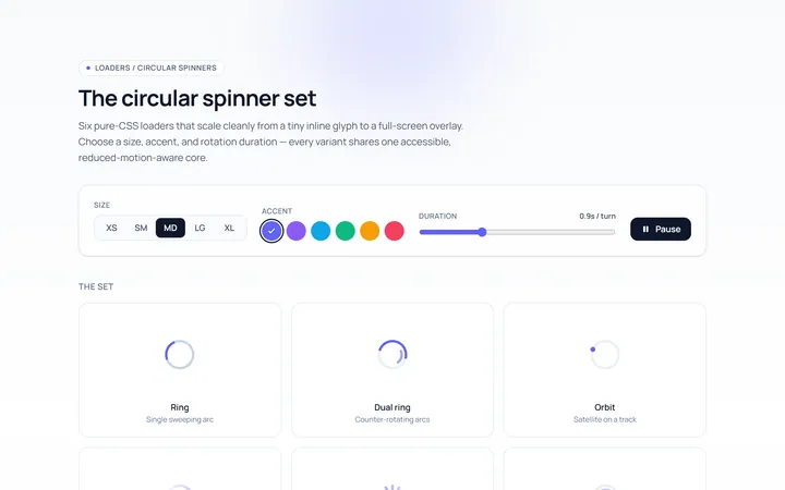
Spinner Set Loader
Originalset of circular spinners in sizes
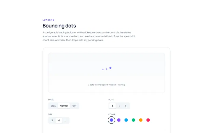
Dots Loader
Originalbouncing dots loader
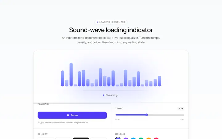
Bars Loader
Originalequalizer bars loader
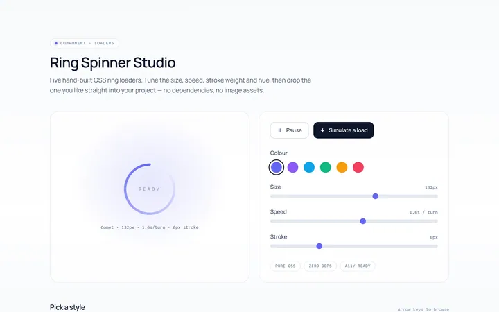
Ring Loader
Originalring spinner loader
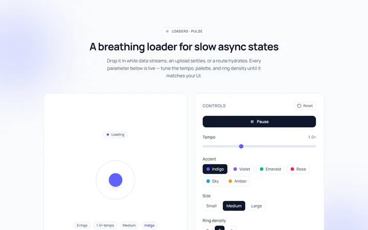
Pulse Loader
Originalpulsing circle loader
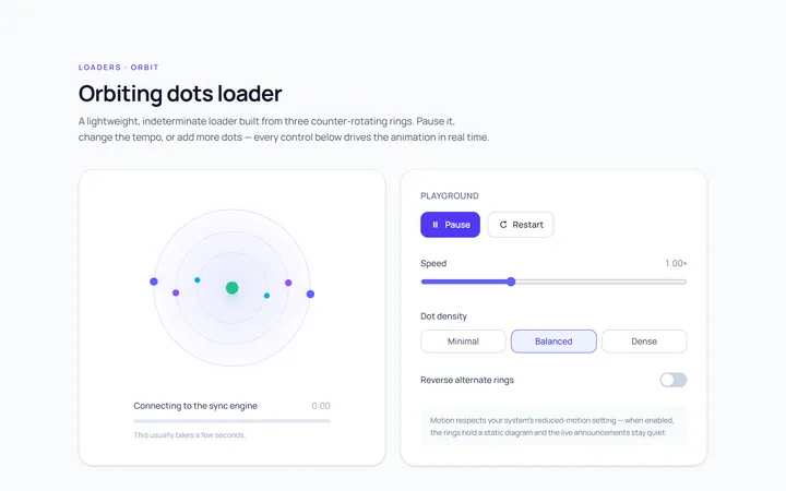
Orbit Loader
Originalorbiting dots loader
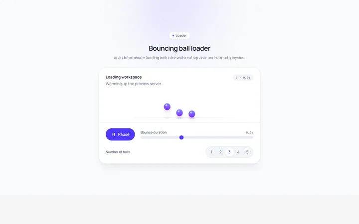
Bounce Loader
Originalbouncing ball loader
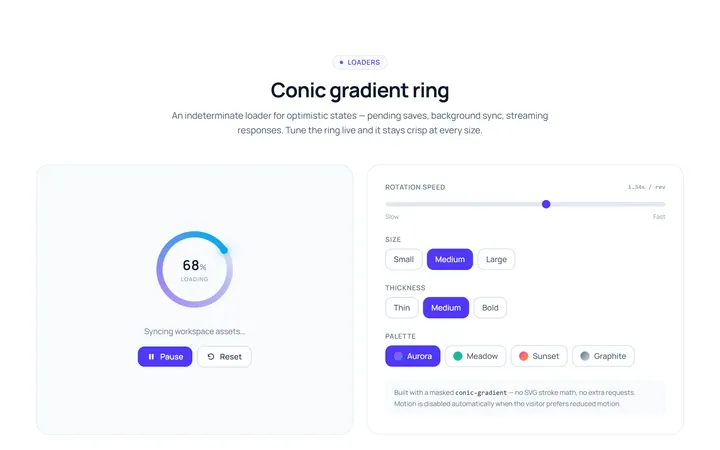
Gradient Ring Loader
Originalgradient conic ring spinner
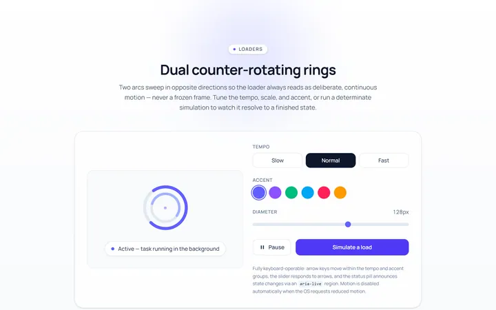
Dual Ring Loader
Originaldual counter-rotating rings
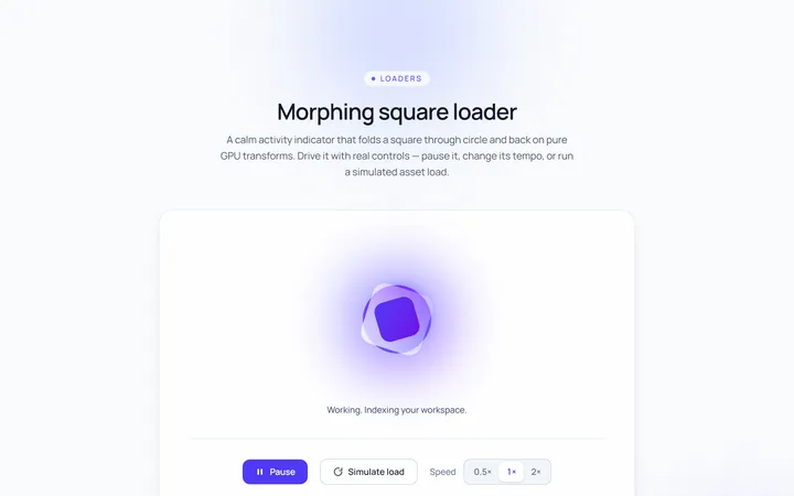
Square Loader
Originalmorphing square loader
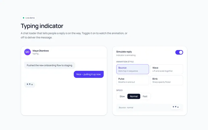
Typing Loader
Originaltyping indicator loader
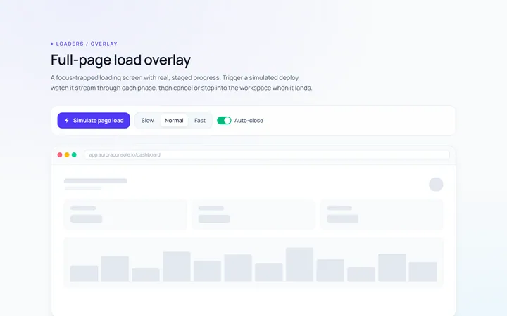
Page Overlay Loader
Originalfull-page loading overlay with progress