

Glass Navbar
Original · freeglassmorphic sticky navbar
Copy prompt gives Claude Code, Cursor or v0 a ready-to-paste prompt that recreates this exact component.
npx shadcn@latest add https://webinnoventix.com/r/navx-glass.json"use client";
import { useEffect, useId, useRef, useState } from "react";
import type { KeyboardEvent as ReactKeyboardEvent, ReactNode } from "react";
import {
AnimatePresence,
motion,
useMotionValueEvent,
useReducedMotion,
useScroll,
} from "motion/react";
type NavItem = { label: string; href: string };
type ProductItem = {
title: string;
description: string;
href: string;
icon: ReactNode;
};
const NAV_ITEMS: NavItem[] = [
{ label: "Solutions", href: "#solutions" },
{ label: "Pricing", href: "#pricing" },
{ label: "Changelog", href: "#changelog" },
];
const PRODUCT_ITEMS: ProductItem[] = [
{
title: "Visual Builder",
description: "Design automated flows on an infinite canvas.",
href: "#builder",
icon: (
<svg viewBox="0 0 24 24" fill="none" stroke="currentColor" strokeWidth={1.75} strokeLinecap="round" strokeLinejoin="round" aria-hidden="true" className="h-5 w-5">
<rect x="3" y="3" width="7" height="7" rx="1.5" />
<rect x="14" y="14" width="7" height="7" rx="1.5" />
<path d="M10 6.5h4a3 3 0 0 1 3 3V14" />
</svg>
),
},
{
title: "Triggers & Actions",
description: "Connect 400+ apps with strongly typed events.",
href: "#triggers",
icon: (
<svg viewBox="0 0 24 24" fill="none" stroke="currentColor" strokeWidth={1.75} strokeLinecap="round" strokeLinejoin="round" aria-hidden="true" className="h-5 w-5">
<path d="M13 2 4.5 13.5H11l-1 8.5L19.5 10H13l0-8Z" />
</svg>
),
},
{
title: "Live Metrics",
description: "Watch runs, latency, and errors in real time.",
href: "#metrics",
icon: (
<svg viewBox="0 0 24 24" fill="none" stroke="currentColor" strokeWidth={1.75} strokeLinecap="round" strokeLinejoin="round" aria-hidden="true" className="h-5 w-5">
<path d="M3 3v18h18" />
<path d="M7 14l3.5-4 3 3L21 6" />
</svg>
),
},
{
title: "Audit Log",
description: "Every change, who made it, and exactly when.",
href: "#audit",
icon: (
<svg viewBox="0 0 24 24" fill="none" stroke="currentColor" strokeWidth={1.75} strokeLinecap="round" strokeLinejoin="round" aria-hidden="true" className="h-5 w-5">
<path d="M12 3 4 6v5c0 5 3.4 8.4 8 10 4.6-1.6 8-5 8-10V6l-8-3Z" />
<path d="m9 12 2 2 4-4" />
</svg>
),
},
];
function BrandMark() {
return (
<span className="flex items-center gap-2.5">
<span className="relative inline-flex h-8 w-8 items-center justify-center overflow-hidden rounded-xl bg-gradient-to-br from-indigo-500 via-violet-500 to-sky-500 shadow-sm ring-1 ring-black/5 dark:ring-white/10">
<span className="navxglass-sheen pointer-events-none absolute inset-0 -translate-x-full bg-gradient-to-r from-transparent via-white/60 to-transparent" />
<svg viewBox="0 0 24 24" fill="none" stroke="currentColor" strokeWidth={2} strokeLinecap="round" strokeLinejoin="round" aria-hidden="true" className="h-4 w-4 text-white">
<path d="M4 17 10 7l4 6 6-9" />
</svg>
</span>
<span className="text-[17px] font-semibold tracking-tight text-slate-900 dark:text-white">
Meridian
</span>
</span>
);
}
const linkBase =
"rounded-lg px-3 py-2 text-sm font-medium text-slate-600 transition-colors hover:text-slate-900 hover:bg-slate-900/[0.04] focus-visible:outline-none focus-visible:ring-2 focus-visible:ring-indigo-500 focus-visible:ring-offset-2 focus-visible:ring-offset-white dark:text-slate-300 dark:hover:text-white dark:hover:bg-white/5 dark:focus-visible:ring-offset-slate-950";
function ProductDropdown() {
const [open, setOpen] = useState(false);
const menuId = useId();
const triggerRef = useRef<HTMLButtonElement | null>(null);
const containerRef = useRef<HTMLDivElement | null>(null);
const itemRefs = useRef<Array<HTMLAnchorElement | null>>([]);
const reduce = useReducedMotion();
useEffect(() => {
if (!open) return;
function onPointerDown(event: MouseEvent) {
if (containerRef.current && !containerRef.current.contains(event.target as Node)) {
setOpen(false);
}
}
document.addEventListener("mousedown", onPointerDown);
return () => document.removeEventListener("mousedown", onPointerDown);
}, [open]);
function focusItem(index: number) {
const count = PRODUCT_ITEMS.length;
const next = (index + count) % count;
itemRefs.current[next]?.focus();
}
function openAndFocusFirst() {
setOpen(true);
window.requestAnimationFrame(() => focusItem(0));
}
function onTriggerKeyDown(event: ReactKeyboardEvent<HTMLButtonElement>) {
if (event.key === "ArrowDown" || event.key === "Enter" || event.key === " ") {
event.preventDefault();
openAndFocusFirst();
} else if (event.key === "Escape") {
setOpen(false);
}
}
function onMenuKeyDown(event: ReactKeyboardEvent<HTMLAnchorElement>, index: number) {
switch (event.key) {
case "ArrowDown":
event.preventDefault();
focusItem(index + 1);
break;
case "ArrowUp":
event.preventDefault();
focusItem(index - 1);
break;
case "Home":
event.preventDefault();
focusItem(0);
break;
case "End":
event.preventDefault();
focusItem(PRODUCT_ITEMS.length - 1);
break;
case "Escape":
event.preventDefault();
setOpen(false);
triggerRef.current?.focus();
break;
case "Tab":
setOpen(false);
break;
default:
break;
}
}
return (
<div
ref={containerRef}
className="relative"
onMouseEnter={() => setOpen(true)}
onMouseLeave={() => setOpen(false)}
>
<button
ref={triggerRef}
type="button"
aria-expanded={open}
aria-haspopup="true"
aria-controls={menuId}
onClick={() => setOpen((value) => !value)}
onKeyDown={onTriggerKeyDown}
className={`inline-flex items-center gap-1 ${linkBase} ${open ? "text-slate-900 dark:text-white" : ""}`}
>
Product
<svg
viewBox="0 0 24 24"
fill="none"
stroke="currentColor"
strokeWidth={2}
strokeLinecap="round"
strokeLinejoin="round"
aria-hidden="true"
className={`h-4 w-4 transition-transform duration-200 ${open ? "rotate-180" : ""}`}
>
<path d="m6 9 6 6 6-6" />
</svg>
</button>
<AnimatePresence>
{open && (
<motion.div
id={menuId}
role="menu"
aria-label="Product"
initial={reduce ? { opacity: 0 } : { opacity: 0, y: 8, scale: 0.98 }}
animate={reduce ? { opacity: 1 } : { opacity: 1, y: 0, scale: 1 }}
exit={reduce ? { opacity: 0 } : { opacity: 0, y: 6, scale: 0.98 }}
transition={{ duration: reduce ? 0.12 : 0.18, ease: [0.16, 1, 0.3, 1] }}
className="absolute left-0 top-full z-50 mt-2 w-[22rem] origin-top-left rounded-2xl border border-slate-200/70 bg-white/80 p-2 shadow-xl shadow-slate-900/10 ring-1 ring-black/5 backdrop-blur-xl dark:border-white/10 dark:bg-slate-900/80 dark:shadow-black/40 dark:ring-white/5"
>
{PRODUCT_ITEMS.map((item, index) => (
<a
key={item.href}
ref={(node) => {
itemRefs.current[index] = node;
}}
href={item.href}
role="menuitem"
onKeyDown={(event) => onMenuKeyDown(event, index)}
onClick={() => setOpen(false)}
className="group flex items-start gap-3 rounded-xl p-3 transition-colors hover:bg-slate-900/[0.04] focus-visible:outline-none focus-visible:ring-2 focus-visible:ring-indigo-500 focus-visible:ring-offset-1 focus-visible:ring-offset-white dark:hover:bg-white/5 dark:focus-visible:ring-offset-slate-900"
>
<span className="mt-0.5 inline-flex h-9 w-9 shrink-0 items-center justify-center rounded-lg bg-indigo-50 text-indigo-600 ring-1 ring-indigo-100 transition-colors group-hover:bg-indigo-100 dark:bg-indigo-500/10 dark:text-indigo-300 dark:ring-indigo-400/20 dark:group-hover:bg-indigo-500/20">
{item.icon}
</span>
<span className="min-w-0">
<span className="block text-sm font-semibold text-slate-900 dark:text-white">
{item.title}
</span>
<span className="mt-0.5 block text-[13px] leading-snug text-slate-500 dark:text-slate-400">
{item.description}
</span>
</span>
</a>
))}
</motion.div>
)}
</AnimatePresence>
</div>
);
}
export default function NavxGlass() {
const [scrolled, setScrolled] = useState(false);
const [mobileOpen, setMobileOpen] = useState(false);
const mobilePanelId = useId();
const reduce = useReducedMotion();
const { scrollY } = useScroll();
useMotionValueEvent(scrollY, "change", (value) => {
setScrolled(value > 8);
});
useEffect(() => {
if (!mobileOpen) return;
function onKeyDown(event: KeyboardEvent) {
if (event.key === "Escape") setMobileOpen(false);
}
document.addEventListener("keydown", onKeyDown);
return () => document.removeEventListener("keydown", onKeyDown);
}, [mobileOpen]);
return (
<section className="relative w-full overflow-hidden bg-slate-50 text-slate-900 dark:bg-slate-950 dark:text-slate-100">
<style>{`
@keyframes navxglass-sheen {
0% { transform: translateX(-120%); }
55%, 100% { transform: translateX(220%); }
}
@keyframes navxglass-float {
0%, 100% { transform: translate3d(0, 0, 0) scale(1); }
50% { transform: translate3d(0, -22px, 0) scale(1.06); }
}
.navxglass-sheen { animation: navxglass-sheen 5.5s ease-in-out infinite; }
.navxglass-blob { animation: navxglass-float 16s ease-in-out infinite; }
@media (prefers-reduced-motion: reduce) {
.navxglass-sheen, .navxglass-blob { animation: none !important; }
}
`}</style>
{/* Decorative background so the glass has something to blur */}
<div aria-hidden="true" className="pointer-events-none absolute inset-0 overflow-hidden">
<div className="navxglass-blob absolute -left-24 -top-24 h-72 w-72 rounded-full bg-indigo-400/30 blur-3xl dark:bg-indigo-500/20" />
<div className="navxglass-blob absolute right-[-6rem] top-24 h-80 w-80 rounded-full bg-sky-400/25 blur-3xl dark:bg-sky-500/15" style={{ animationDelay: "-6s" }} />
<div className="navxglass-blob absolute left-1/3 top-[28rem] h-72 w-72 rounded-full bg-violet-400/25 blur-3xl dark:bg-violet-500/15" style={{ animationDelay: "-11s" }} />
</div>
{/* Sticky glass navbar */}
<header
className={`sticky top-0 z-50 w-full border-b transition-[background-color,border-color,box-shadow,backdrop-filter] duration-300 ${
scrolled
? "border-slate-200/70 bg-white/70 shadow-lg shadow-slate-900/5 backdrop-blur-xl dark:border-white/10 dark:bg-slate-950/60 dark:shadow-black/30"
: "border-transparent bg-white/40 backdrop-blur-md dark:bg-slate-950/25"
}`}
>
<nav aria-label="Primary" className="mx-auto flex h-16 max-w-6xl items-center justify-between gap-4 px-4 sm:px-6 lg:px-8">
<a
href="#top"
className="rounded-lg focus-visible:outline-none focus-visible:ring-2 focus-visible:ring-indigo-500 focus-visible:ring-offset-2 focus-visible:ring-offset-white dark:focus-visible:ring-offset-slate-950"
aria-label="Meridian home"
>
<BrandMark />
</a>
{/* Desktop nav */}
<div className="hidden items-center gap-1 md:flex">
<ProductDropdown />
{NAV_ITEMS.map((item) => (
<a key={item.href} href={item.href} className={linkBase}>
{item.label}
</a>
))}
</div>
<div className="flex items-center gap-2">
<a
href="#signin"
className="hidden rounded-lg px-3 py-2 text-sm font-medium text-slate-600 transition-colors hover:text-slate-900 focus-visible:outline-none focus-visible:ring-2 focus-visible:ring-indigo-500 focus-visible:ring-offset-2 focus-visible:ring-offset-white dark:text-slate-300 dark:hover:text-white dark:focus-visible:ring-offset-slate-950 sm:inline-flex"
>
Sign in
</a>
<a
href="#start"
className="inline-flex items-center gap-1.5 rounded-lg bg-slate-900 px-3.5 py-2 text-sm font-semibold text-white shadow-sm transition-colors hover:bg-slate-700 focus-visible:outline-none focus-visible:ring-2 focus-visible:ring-indigo-500 focus-visible:ring-offset-2 focus-visible:ring-offset-white dark:bg-white dark:text-slate-900 dark:hover:bg-slate-200 dark:focus-visible:ring-offset-slate-950"
>
Start free
<svg viewBox="0 0 24 24" fill="none" stroke="currentColor" strokeWidth={2.25} strokeLinecap="round" strokeLinejoin="round" aria-hidden="true" className="h-4 w-4">
<path d="M5 12h14" />
<path d="m13 6 6 6-6 6" />
</svg>
</a>
{/* Mobile toggle */}
<button
type="button"
aria-expanded={mobileOpen}
aria-controls={mobilePanelId}
aria-label={mobileOpen ? "Close menu" : "Open menu"}
onClick={() => setMobileOpen((value) => !value)}
className="inline-flex h-10 w-10 items-center justify-center rounded-lg text-slate-700 transition-colors hover:bg-slate-900/[0.05] focus-visible:outline-none focus-visible:ring-2 focus-visible:ring-indigo-500 focus-visible:ring-offset-2 focus-visible:ring-offset-white dark:text-slate-200 dark:hover:bg-white/10 dark:focus-visible:ring-offset-slate-950 md:hidden"
>
<svg viewBox="0 0 24 24" fill="none" stroke="currentColor" strokeWidth={2} strokeLinecap="round" strokeLinejoin="round" aria-hidden="true" className="h-5 w-5">
{mobileOpen ? (
<>
<path d="M6 6 18 18" />
<path d="M18 6 6 18" />
</>
) : (
<>
<path d="M4 7h16" />
<path d="M4 12h16" />
<path d="M4 17h16" />
</>
)}
</svg>
</button>
</div>
</nav>
{/* Mobile drawer */}
<AnimatePresence>
{mobileOpen && (
<motion.div
id={mobilePanelId}
initial={reduce ? { opacity: 0 } : { opacity: 0, height: 0 }}
animate={reduce ? { opacity: 1 } : { opacity: 1, height: "auto" }}
exit={reduce ? { opacity: 0 } : { opacity: 0, height: 0 }}
transition={{ duration: reduce ? 0.12 : 0.24, ease: [0.16, 1, 0.3, 1] }}
className="overflow-hidden border-t border-slate-200/70 bg-white/85 backdrop-blur-xl dark:border-white/10 dark:bg-slate-950/80 md:hidden"
>
<div className="space-y-1 px-4 py-4 sm:px-6">
<p className="px-3 pb-1 pt-2 text-[11px] font-semibold uppercase tracking-wider text-slate-400 dark:text-slate-500">
Product
</p>
{PRODUCT_ITEMS.map((item) => (
<a
key={item.href}
href={item.href}
onClick={() => setMobileOpen(false)}
className="flex items-center gap-3 rounded-xl px-3 py-2.5 text-sm font-medium text-slate-700 transition-colors hover:bg-slate-900/[0.05] focus-visible:outline-none focus-visible:ring-2 focus-visible:ring-indigo-500 dark:text-slate-200 dark:hover:bg-white/5"
>
<span className="inline-flex h-8 w-8 items-center justify-center rounded-lg bg-indigo-50 text-indigo-600 dark:bg-indigo-500/10 dark:text-indigo-300">
{item.icon}
</span>
{item.title}
</a>
))}
<div className="my-2 h-px bg-slate-200/70 dark:bg-white/10" />
{NAV_ITEMS.map((item) => (
<a
key={item.href}
href={item.href}
onClick={() => setMobileOpen(false)}
className="block rounded-xl px-3 py-2.5 text-sm font-medium text-slate-700 transition-colors hover:bg-slate-900/[0.05] focus-visible:outline-none focus-visible:ring-2 focus-visible:ring-indigo-500 dark:text-slate-200 dark:hover:bg-white/5"
>
{item.label}
</a>
))}
<div className="flex items-center gap-2 pt-3">
<a
href="#signin"
onClick={() => setMobileOpen(false)}
className="flex-1 rounded-lg border border-slate-300 px-3.5 py-2.5 text-center text-sm font-semibold text-slate-800 transition-colors hover:bg-slate-900/[0.04] focus-visible:outline-none focus-visible:ring-2 focus-visible:ring-indigo-500 dark:border-white/15 dark:text-slate-100 dark:hover:bg-white/5"
>
Sign in
</a>
<a
href="#start"
onClick={() => setMobileOpen(false)}
className="flex-1 rounded-lg bg-slate-900 px-3.5 py-2.5 text-center text-sm font-semibold text-white transition-colors hover:bg-slate-700 focus-visible:outline-none focus-visible:ring-2 focus-visible:ring-indigo-500 dark:bg-white dark:text-slate-900 dark:hover:bg-slate-200"
>
Start free
</a>
</div>
</div>
</motion.div>
)}
</AnimatePresence>
</header>
{/* Demo content so the sticky glass effect is visible while scrolling */}
<div id="top" className="relative mx-auto max-w-6xl px-4 pb-28 pt-20 sm:px-6 sm:pt-28 lg:px-8">
<div className="max-w-2xl">
<span className="inline-flex items-center gap-2 rounded-full border border-slate-200/70 bg-white/60 px-3 py-1 text-xs font-medium text-slate-600 backdrop-blur dark:border-white/10 dark:bg-white/5 dark:text-slate-300">
<span className="h-1.5 w-1.5 rounded-full bg-emerald-500" />
New: parallel run branches now in beta
</span>
<h1 className="mt-5 text-4xl font-semibold tracking-tight text-slate-900 sm:text-5xl dark:text-white">
Automate the work between your tools.
</h1>
<p className="mt-4 text-lg leading-relaxed text-slate-600 dark:text-slate-300">
Meridian connects your stack with typed triggers, a visual builder, and
real-time metrics — so the busywork runs itself. Scroll to watch the
navigation frost over the page.
</p>
<div className="mt-7 flex flex-wrap items-center gap-3">
<a
href="#start"
className="inline-flex items-center gap-1.5 rounded-lg bg-indigo-600 px-4 py-2.5 text-sm font-semibold text-white shadow-sm transition-colors hover:bg-indigo-500 focus-visible:outline-none focus-visible:ring-2 focus-visible:ring-indigo-500 focus-visible:ring-offset-2 focus-visible:ring-offset-slate-50 dark:focus-visible:ring-offset-slate-950"
>
Start building
</a>
<a
href="#demo"
className="inline-flex items-center gap-1.5 rounded-lg border border-slate-300 px-4 py-2.5 text-sm font-semibold text-slate-800 transition-colors hover:bg-white focus-visible:outline-none focus-visible:ring-2 focus-visible:ring-indigo-500 focus-visible:ring-offset-2 focus-visible:ring-offset-slate-50 dark:border-white/15 dark:text-slate-100 dark:hover:bg-white/5 dark:focus-visible:ring-offset-slate-950"
>
Book a demo
</a>
</div>
</div>
<div className="mt-16 grid gap-4 sm:grid-cols-2 lg:grid-cols-4">
{PRODUCT_ITEMS.map((item) => (
<div
key={item.href}
className="rounded-2xl border border-slate-200/70 bg-white/60 p-5 backdrop-blur transition-colors hover:border-slate-300 dark:border-white/10 dark:bg-white/5 dark:hover:border-white/20"
>
<span className="inline-flex h-9 w-9 items-center justify-center rounded-lg bg-indigo-50 text-indigo-600 dark:bg-indigo-500/10 dark:text-indigo-300">
{item.icon}
</span>
<h3 className="mt-3 text-sm font-semibold text-slate-900 dark:text-white">
{item.title}
</h3>
<p className="mt-1 text-[13px] leading-snug text-slate-500 dark:text-slate-400">
{item.description}
</p>
</div>
))}
</div>
<div className="mt-10 space-y-4">
{[
"Every workflow is versioned, so you can roll back a bad change in one click.",
"Runs stream their logs live — no waiting for a batch job to finish before you see failures.",
"Role-based access keeps production credentials out of the wrong hands.",
].map((line) => (
<p
key={line}
className="rounded-2xl border border-slate-200/70 bg-white/50 px-5 py-4 text-sm leading-relaxed text-slate-600 backdrop-blur dark:border-white/10 dark:bg-white/5 dark:text-slate-300"
>
{line}
</p>
))}
</div>
</div>
</section>
);
}Dependencies
Licence
Built by Web Innoventix. Free for personal and commercial use, no attribution required.
Built by Web Innoventix
Need a custom interface, a full website, or SEO that gets you cited by AI? We design, build and rank it end to end.
Get a free quoteSimilar components
Browse all →
Centred Logo Navbar
OriginalA three-column navbar with the brand logo centred between the primary links and the account actions, wrapped in a soft rounded card.
Left Logo Navbar With CTA
OriginalA classic left-aligned logo navbar with centred navigation links and a prominent pill call-to-action button on the right.
Navbar With Dropdown Menu
OriginalA navbar featuring a JS-free product dropdown built with native details and summary, revealing a two-item mega-menu panel with icons.
Glass Transparent Navbar
OriginalA frosted glass navbar floating over a colourful gradient hero backdrop, using backdrop blur and translucent borders for a modern overlay header.
Responsive Navbar with Mobile Menu
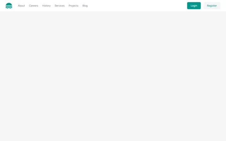
MITA marketing site header with a logo, inline nav links, login/register buttons, and a working hamburger toggle that reveals a stacked mobile menu below the md breakpoint. Fully keyboard/ARIA accessible with light and dark variants.
Underline Tabs
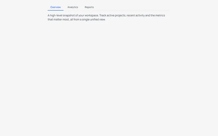
MITAn accessible underline-style tab switcher with a bottom-border active indicator and a live content panel. State-driven with proper role=tablist/tab/tabpanel and aria-selected wiring, styled for light and dark modes.
Split Button Dropdown Menu
MITA split-button control with a chevron trigger that opens a divided action menu, including a destructive delete item. Closes on outside-click and Escape, with a rotating chevron and full ARIA menu roles for both light and dark themes.
Mega Navbar
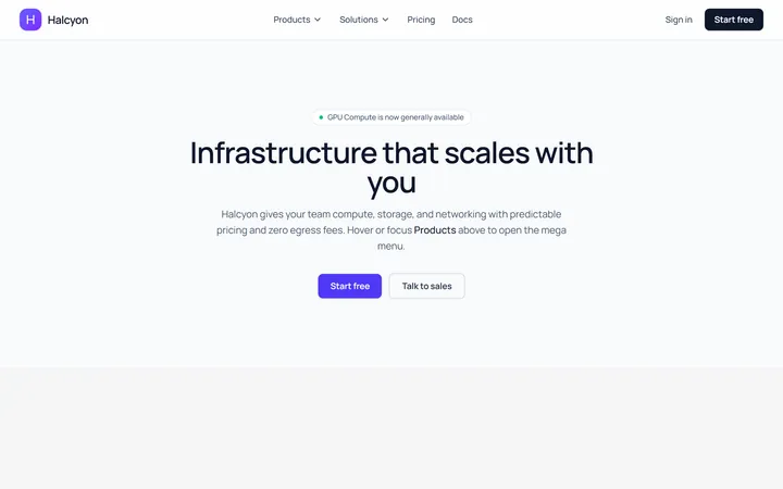
Originalnavbar with a mega dropdown
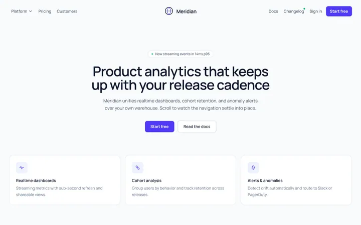
Centered Logo Navbar
Originalnavbar with centred logo and split links
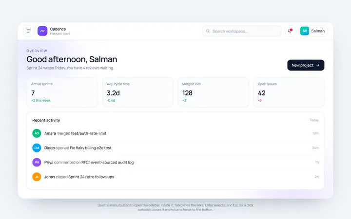
Sidebar Toggle Navbar
Originalnavbar with a sidebar toggle
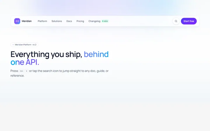
Search Navbar
Originalnavbar with an expanding search
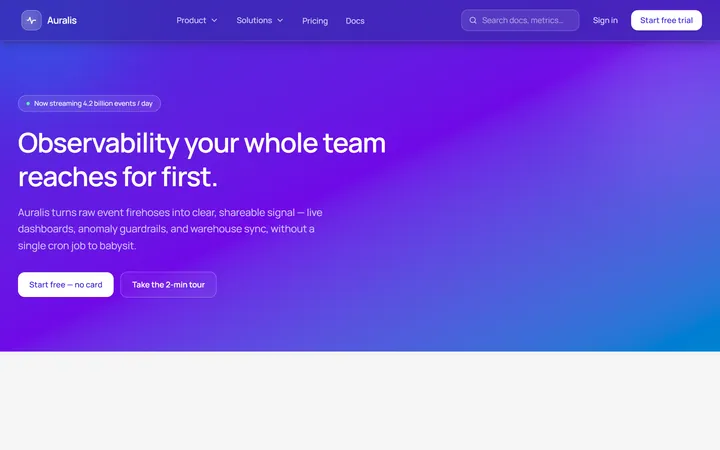
Gradient Navbar
Originalgradient navbar