

Mega Navbar
Original · freenavbar with a mega dropdown
Copy prompt gives Claude Code, Cursor or v0 a ready-to-paste prompt that recreates this exact component.
npx shadcn@latest add https://webinnoventix.com/r/navx-mega.json"use client";
import {
useCallback,
useEffect,
useId,
useRef,
useState,
type ReactNode,
} from "react";
import { AnimatePresence, motion, useReducedMotion } from "motion/react";
type MenuLink = {
title: string;
desc: string;
href: string;
tint: string;
icon: ReactNode;
};
type Feature = {
badge: string;
title: string;
desc: string;
cta: string;
href: string;
};
type Menu = {
key: string;
label: string;
links: MenuLink[];
feature: Feature;
};
const RING =
"focus-visible:outline-none focus-visible:ring-2 focus-visible:ring-indigo-500 focus-visible:ring-offset-2 focus-visible:ring-offset-white dark:focus-visible:ring-offset-slate-950";
const Svg = ({ children }: { children: ReactNode }) => (
<svg
viewBox="0 0 24 24"
fill="none"
stroke="currentColor"
strokeWidth={1.6}
strokeLinecap="round"
strokeLinejoin="round"
className="h-5 w-5"
aria-hidden="true"
>
{children}
</svg>
);
const MENUS: Menu[] = [
{
key: "products",
label: "Products",
links: [
{
title: "Compute",
desc: "Boot production VMs in under 30 seconds across 14 regions.",
href: "#compute",
tint: "bg-indigo-50 text-indigo-600 dark:bg-indigo-400/10 dark:text-indigo-300",
icon: (
<Svg>
<rect x="4" y="4" width="16" height="16" rx="2" />
<rect x="9" y="9" width="6" height="6" rx="1" />
<path d="M9 2v2M15 2v2M9 20v2M15 20v2M2 9h2M2 15h2M20 9h2M20 15h2" />
</Svg>
),
},
{
title: "Object Storage",
desc: "S3-compatible buckets with zero egress fees, ever.",
href: "#storage",
tint: "bg-sky-50 text-sky-600 dark:bg-sky-400/10 dark:text-sky-300",
icon: (
<Svg>
<path d="M12 3 3 8l9 5 9-5-9-5Z" />
<path d="M3 12l9 5 9-5" />
<path d="M3 16l9 5 9-5" />
</Svg>
),
},
{
title: "Managed Postgres",
desc: "High-availability databases with point-in-time restore.",
href: "#postgres",
tint: "bg-emerald-50 text-emerald-600 dark:bg-emerald-400/10 dark:text-emerald-300",
icon: (
<Svg>
<ellipse cx="12" cy="6" rx="8" ry="3" />
<path d="M4 6v6c0 1.7 3.6 3 8 3s8-1.3 8-3V6" />
<path d="M4 12v6c0 1.7 3.6 3 8 3s8-1.3 8-3v-6" />
</Svg>
),
},
{
title: "Edge Network",
desc: "A 280-POP CDN with sub-second global cache purge.",
href: "#edge",
tint: "bg-violet-50 text-violet-600 dark:bg-violet-400/10 dark:text-violet-300",
icon: (
<Svg>
<circle cx="12" cy="12" r="9" />
<path d="M3 12h18" />
<path d="M12 3c2.5 2.4 3.9 5.6 4 9-.1 3.4-1.5 6.6-4 9-2.5-2.4-3.9-5.6-4-9 .1-3.4 1.5-6.6 4-9Z" />
</Svg>
),
},
{
title: "Observability",
desc: "Metrics, logs, and traces in one queryable pane.",
href: "#observability",
tint: "bg-amber-50 text-amber-600 dark:bg-amber-400/10 dark:text-amber-300",
icon: (
<Svg>
<path d="M4 20V4" />
<path d="M4 20h16" />
<path d="M8 16l3-4 3 2 4-6" />
</Svg>
),
},
{
title: "Identity",
desc: "SSO, SCIM provisioning, and scoped access tokens.",
href: "#identity",
tint: "bg-rose-50 text-rose-600 dark:bg-rose-400/10 dark:text-rose-300",
icon: (
<Svg>
<path d="M12 3 5 6v5c0 4.4 3 8.3 7 9 4-.7 7-4.6 7-9V6l-7-3Z" />
<path d="M9.5 12l1.8 1.8 3.2-3.6" />
</Svg>
),
},
],
feature: {
badge: "New",
title: "GPU Compute",
desc: "H100 clusters are live in us-east-1 and eu-west-1. Reserve capacity from $2.10 per hour.",
cta: "Explore GPU Compute",
href: "#gpu",
},
},
{
key: "solutions",
label: "Solutions",
links: [
{
title: "For Startups",
desc: "A free tier plus $5,000 in credits via the Launch program.",
href: "#startups",
tint: "bg-indigo-50 text-indigo-600 dark:bg-indigo-400/10 dark:text-indigo-300",
icon: (
<Svg>
<path d="M5 15c-1 1-1.5 4-1.5 4s3-.5 4-1.5" />
<path d="M14 4c3 0 6 3 6 6-2.5 3.5-6 6-9 7l-4-4c1-3 3.5-6.5 7-9Z" />
<circle cx="14.5" cy="9.5" r="1.5" />
</Svg>
),
},
{
title: "For Enterprise",
desc: "SOC 2, HIPAA, and dedicated single-tenant deployments.",
href: "#enterprise",
tint: "bg-sky-50 text-sky-600 dark:bg-sky-400/10 dark:text-sky-300",
icon: (
<Svg>
<rect x="5" y="3" width="14" height="18" rx="1" />
<path d="M9 7h2M13 7h2M9 11h2M13 11h2M9 15h2M13 15h2" />
<path d="M10 21v-3h4v3" />
</Svg>
),
},
{
title: "For Ecommerce",
desc: "Absorb Black Friday spikes with autoscaling groups.",
href: "#ecommerce",
tint: "bg-emerald-50 text-emerald-600 dark:bg-emerald-400/10 dark:text-emerald-300",
icon: (
<Svg>
<circle cx="9" cy="20" r="1.4" />
<circle cx="17" cy="20" r="1.4" />
<path d="M3 4h2l2.2 11.2a1 1 0 0 0 1 .8h8.4a1 1 0 0 0 1-.8L20 8H6" />
</Svg>
),
},
{
title: "For AI Teams",
desc: "Serve models on GPUs that sit right next to your data.",
href: "#ai",
tint: "bg-violet-50 text-violet-600 dark:bg-violet-400/10 dark:text-violet-300",
icon: (
<Svg>
<path d="M12 3l1.8 4.8L18.6 9.6 13.8 11.4 12 16.2 10.2 11.4 5.4 9.6 10.2 7.8 12 3Z" />
<path d="M18 15l.7 1.8 1.8.7-1.8.7L18 20l-.7-1.8-1.8-.7 1.8-.7L18 15Z" />
</Svg>
),
},
{
title: "For Agencies",
desc: "Manage every client from a single billing organization.",
href: "#agencies",
tint: "bg-amber-50 text-amber-600 dark:bg-amber-400/10 dark:text-amber-300",
icon: (
<Svg>
<circle cx="9" cy="8" r="3" />
<path d="M3 20c0-3.3 2.7-6 6-6s6 2.7 6 6" />
<path d="M16 5.5a3 3 0 0 1 0 5.8" />
<path d="M17 14.3c2.3.7 4 2.8 4 5.2" />
</Svg>
),
},
{
title: "Migrations",
desc: "White-glove moves from AWS, GCP, or bare metal.",
href: "#migrations",
tint: "bg-rose-50 text-rose-600 dark:bg-rose-400/10 dark:text-rose-300",
icon: (
<Svg>
<path d="M4 8h13l-3-3" />
<path d="M20 16H7l3 3" />
</Svg>
),
},
],
feature: {
badge: "Customer story",
title: "Lumen cut infra spend 41%",
desc: "See how a 60-person data team consolidated three clouds onto Halcyon in a single quarter.",
cta: "Read the case study",
href: "#case-study",
},
},
];
const Chevron = ({ open }: { open: boolean }) => (
<svg
viewBox="0 0 24 24"
fill="none"
stroke="currentColor"
strokeWidth={2}
strokeLinecap="round"
strokeLinejoin="round"
className={`h-4 w-4 transition-transform duration-200 motion-reduce:transition-none ${
open ? "rotate-180" : ""
}`}
aria-hidden="true"
>
<path d="m6 9 6 6 6-6" />
</svg>
);
const Arrow = () => (
<svg
viewBox="0 0 24 24"
fill="none"
stroke="currentColor"
strokeWidth={2}
strokeLinecap="round"
strokeLinejoin="round"
className="h-4 w-4 transition-transform duration-200 group-hover:translate-x-0.5 motion-reduce:transition-none"
aria-hidden="true"
>
<path d="M5 12h14" />
<path d="m13 6 6 6-6 6" />
</svg>
);
export default function NavxMega() {
const uid = useId();
const reduce = useReducedMotion();
const [openMenu, setOpenMenu] = useState<string | null>(null);
const [mobileOpen, setMobileOpen] = useState(false);
const [mobileSection, setMobileSection] = useState<string | null>(null);
const navRef = useRef<HTMLElement | null>(null);
const panelRef = useRef<HTMLDivElement | null>(null);
const triggerRefs = useRef<Record<string, HTMLButtonElement | null>>({});
const closeTimer = useRef<number | null>(null);
const active = MENUS.find((m) => m.key === openMenu) ?? null;
const cancelClose = useCallback(() => {
if (closeTimer.current !== null) {
window.clearTimeout(closeTimer.current);
closeTimer.current = null;
}
}, []);
const scheduleClose = useCallback(() => {
cancelClose();
closeTimer.current = window.setTimeout(() => setOpenMenu(null), 140);
}, [cancelClose]);
const openHover = useCallback(
(key: string) => {
cancelClose();
setOpenMenu(key);
},
[cancelClose],
);
const focusFirst = useCallback(() => {
const first = panelRef.current?.querySelector<HTMLElement>(
"[data-navxmega-item]",
);
first?.focus();
}, []);
useEffect(() => {
if (!openMenu) return;
const onDoc = (e: MouseEvent) => {
if (navRef.current && !navRef.current.contains(e.target as Node)) {
setOpenMenu(null);
}
};
document.addEventListener("mousedown", onDoc);
return () => document.removeEventListener("mousedown", onDoc);
}, [openMenu]);
useEffect(() => {
if (!mobileOpen) return;
const prev = document.body.style.overflow;
document.body.style.overflow = "hidden";
return () => {
document.body.style.overflow = prev;
};
}, [mobileOpen]);
useEffect(() => () => cancelClose(), [cancelClose]);
const css = `
@keyframes navxmega-pulse { 0%, 100% { opacity: 1; transform: scale(1); } 50% { opacity: .45; transform: scale(.8); } }
@keyframes navxmega-sheen { 0% { background-position: 0% 50%; } 100% { background-position: 200% 50%; } }
.navxmega-pulse { animation: navxmega-pulse 1.8s ease-in-out infinite; }
.navxmega-sheen { background-size: 200% auto; animation: navxmega-sheen 4s linear infinite; }
@media (prefers-reduced-motion: reduce) {
.navxmega-pulse, .navxmega-sheen { animation: none !important; }
}
`;
return (
<section className="relative w-full bg-slate-50 text-slate-900 dark:bg-slate-950 dark:text-slate-100">
<style>{css}</style>
<header className="sticky top-0 z-50 border-b border-slate-200/80 bg-white/85 backdrop-blur-md dark:border-slate-800/80 dark:bg-slate-950/85">
<div className="mx-auto max-w-7xl px-4 sm:px-6 lg:px-8">
<div className="flex h-16 items-center justify-between gap-4">
{/* Brand */}
<a
href="#top"
className={`flex items-center gap-2.5 rounded-lg py-1 ${RING}`}
>
<span className="flex h-9 w-9 items-center justify-center rounded-xl bg-gradient-to-br from-indigo-500 to-violet-600 text-white shadow-sm">
<svg
viewBox="0 0 24 24"
fill="none"
stroke="currentColor"
strokeWidth={2.2}
strokeLinecap="round"
className="h-5 w-5"
aria-hidden="true"
>
<path d="M6 4v16M18 4v16M6 12h12" />
</svg>
</span>
<span className="text-lg font-semibold tracking-tight text-slate-900 dark:text-white">
Halcyon
</span>
</a>
{/* Desktop navigation */}
<nav
ref={navRef}
aria-label="Primary"
onMouseLeave={scheduleClose}
onKeyDown={(e) => {
if (e.key === "Escape" && openMenu) {
const key = openMenu;
setOpenMenu(null);
triggerRefs.current[key]?.focus();
}
}}
className="relative hidden lg:block"
>
<ul className="flex items-center gap-1">
{MENUS.map((menu) => {
const isOpen = openMenu === menu.key;
return (
<li
key={menu.key}
onMouseEnter={() => openHover(menu.key)}
>
<button
type="button"
ref={(el) => {
triggerRefs.current[menu.key] = el;
}}
aria-expanded={isOpen}
aria-haspopup="true"
aria-controls={`${uid}-${menu.key}-panel`}
onClick={() =>
setOpenMenu((prev) =>
prev === menu.key ? null : menu.key,
)
}
onKeyDown={(e) => {
if (e.key === "ArrowDown") {
e.preventDefault();
setOpenMenu(menu.key);
requestAnimationFrame(focusFirst);
}
}}
className={`inline-flex items-center gap-1 rounded-lg px-3 py-2 text-sm font-medium transition-colors motion-reduce:transition-none ${
isOpen
? "bg-slate-100 text-slate-900 dark:bg-slate-800 dark:text-white"
: "text-slate-700 hover:bg-slate-100 hover:text-slate-900 dark:text-slate-300 dark:hover:bg-slate-800 dark:hover:text-white"
} ${RING}`}
>
{menu.label}
<Chevron open={isOpen} />
</button>
</li>
);
})}
<li>
<a
href="#pricing"
className={`inline-flex items-center rounded-lg px-3 py-2 text-sm font-medium text-slate-700 transition-colors hover:bg-slate-100 hover:text-slate-900 motion-reduce:transition-none dark:text-slate-300 dark:hover:bg-slate-800 dark:hover:text-white ${RING}`}
>
Pricing
</a>
</li>
<li>
<a
href="#docs"
className={`inline-flex items-center rounded-lg px-3 py-2 text-sm font-medium text-slate-700 transition-colors hover:bg-slate-100 hover:text-slate-900 motion-reduce:transition-none dark:text-slate-300 dark:hover:bg-slate-800 dark:hover:text-white ${RING}`}
>
Docs
</a>
</li>
</ul>
{/* Mega dropdown panel */}
<AnimatePresence>
{active && (
<motion.div
key={active.key}
onMouseEnter={cancelClose}
initial={reduce ? false : { opacity: 0, y: 6 }}
animate={{ opacity: 1, y: 0 }}
exit={reduce ? { opacity: 0 } : { opacity: 0, y: 6 }}
transition={{
duration: reduce ? 0 : 0.18,
ease: [0.16, 1, 0.3, 1],
}}
className="absolute left-0 right-0 top-full z-40 mx-auto w-[min(56rem,90vw)] pt-3"
>
<div
ref={panelRef}
id={`${uid}-${active.key}-panel`}
role="region"
aria-label={active.label}
className="overflow-hidden rounded-2xl border border-slate-200 bg-white shadow-xl shadow-slate-900/10 dark:border-slate-800 dark:bg-slate-900 dark:shadow-black/40"
>
<div className="grid gap-6 p-6 lg:grid-cols-[1fr_18rem]">
<div>
<p className="mb-2 px-3 text-[11px] font-semibold uppercase tracking-wider text-slate-400 dark:text-slate-500">
All {active.label.toLowerCase()}
</p>
<ul className="grid gap-1 sm:grid-cols-2">
{active.links.map((link) => (
<li key={link.title}>
<a
href={link.href}
data-navxmega-item
onClick={() => setOpenMenu(null)}
className={`group flex gap-3 rounded-xl p-3 transition-colors hover:bg-slate-50 motion-reduce:transition-none dark:hover:bg-slate-800/60 ${RING}`}
>
<span
className={`flex h-10 w-10 flex-none items-center justify-center rounded-lg ${link.tint}`}
>
{link.icon}
</span>
<span className="min-w-0">
<span className="flex items-center gap-1 text-sm font-semibold text-slate-900 dark:text-white">
{link.title}
<span className="text-slate-300 opacity-0 transition group-hover:translate-x-0.5 group-hover:opacity-100 motion-reduce:transition-none dark:text-slate-600">
<Arrow />
</span>
</span>
<span className="mt-0.5 block text-xs leading-relaxed text-slate-500 dark:text-slate-400">
{link.desc}
</span>
</span>
</a>
</li>
))}
</ul>
</div>
<a
href={active.feature.href}
onClick={() => setOpenMenu(null)}
className={`group relative flex flex-col justify-between overflow-hidden rounded-xl border border-slate-200 bg-gradient-to-br from-slate-50 to-indigo-50/70 p-5 transition-colors hover:border-indigo-300 motion-reduce:transition-none dark:border-slate-800 dark:from-slate-900 dark:to-indigo-950/40 dark:hover:border-indigo-500/50 ${RING}`}
>
<div>
<span className="inline-flex items-center gap-1.5 rounded-full bg-emerald-100 px-2.5 py-1 text-xs font-semibold text-emerald-700 dark:bg-emerald-500/15 dark:text-emerald-300">
<span className="navxmega-pulse h-1.5 w-1.5 rounded-full bg-emerald-500" />
{active.feature.badge}
</span>
<h4 className="mt-3 bg-gradient-to-r from-slate-900 via-indigo-700 to-slate-900 bg-clip-text text-base font-semibold text-transparent navxmega-sheen dark:from-white dark:via-indigo-300 dark:to-white">
{active.feature.title}
</h4>
<p className="mt-1.5 text-sm leading-relaxed text-slate-600 dark:text-slate-400">
{active.feature.desc}
</p>
</div>
<span className="mt-4 inline-flex items-center gap-1 text-sm font-semibold text-indigo-600 dark:text-indigo-300">
{active.feature.cta}
<Arrow />
</span>
</a>
</div>
</div>
</motion.div>
)}
</AnimatePresence>
</nav>
{/* Desktop actions */}
<div className="hidden items-center gap-2 lg:flex">
<a
href="#signin"
className={`rounded-lg px-3 py-2 text-sm font-medium text-slate-700 transition-colors hover:bg-slate-100 hover:text-slate-900 motion-reduce:transition-none dark:text-slate-300 dark:hover:bg-slate-800 dark:hover:text-white ${RING}`}
>
Sign in
</a>
<a
href="#start"
className={`rounded-lg bg-slate-900 px-4 py-2 text-sm font-semibold text-white shadow-sm transition-colors hover:bg-slate-700 motion-reduce:transition-none dark:bg-white dark:text-slate-900 dark:hover:bg-slate-200 ${RING}`}
>
Start free
</a>
</div>
{/* Mobile toggle */}
<button
type="button"
aria-expanded={mobileOpen}
aria-controls={`${uid}-mobile`}
aria-label={mobileOpen ? "Close menu" : "Open menu"}
onClick={() => setMobileOpen((v) => !v)}
className={`inline-flex h-10 w-10 items-center justify-center rounded-lg text-slate-700 transition-colors hover:bg-slate-100 motion-reduce:transition-none lg:hidden dark:text-slate-300 dark:hover:bg-slate-800 ${RING}`}
>
<svg
viewBox="0 0 24 24"
fill="none"
stroke="currentColor"
strokeWidth={2}
strokeLinecap="round"
strokeLinejoin="round"
className="h-6 w-6"
aria-hidden="true"
>
{mobileOpen ? (
<path d="M6 6l12 12M18 6 6 18" />
) : (
<path d="M4 7h16M4 12h16M4 17h16" />
)}
</svg>
</button>
</div>
</div>
{/* Mobile menu */}
<AnimatePresence>
{mobileOpen && (
<motion.div
key="mobile"
id={`${uid}-mobile`}
initial={reduce ? false : { opacity: 0, height: 0 }}
animate={{ opacity: 1, height: "auto" }}
exit={reduce ? { opacity: 0 } : { opacity: 0, height: 0 }}
transition={{ duration: reduce ? 0 : 0.22, ease: [0.16, 1, 0.3, 1] }}
className="overflow-hidden border-t border-slate-200 bg-white lg:hidden dark:border-slate-800 dark:bg-slate-950"
>
<div className="max-h-[calc(100vh-4rem)] space-y-1 overflow-y-auto px-4 py-4 sm:px-6">
{MENUS.map((menu) => {
const expanded = mobileSection === menu.key;
return (
<div
key={menu.key}
className="rounded-xl border border-slate-200 dark:border-slate-800"
>
<button
type="button"
aria-expanded={expanded}
aria-controls={`${uid}-${menu.key}-msec`}
onClick={() =>
setMobileSection((prev) =>
prev === menu.key ? null : menu.key,
)
}
className={`flex w-full items-center justify-between rounded-xl px-4 py-3 text-sm font-semibold text-slate-800 dark:text-slate-100 ${RING}`}
>
{menu.label}
<Chevron open={expanded} />
</button>
<AnimatePresence initial={false}>
{expanded && (
<motion.div
id={`${uid}-${menu.key}-msec`}
initial={reduce ? false : { height: 0, opacity: 0 }}
animate={{ height: "auto", opacity: 1 }}
exit={reduce ? { opacity: 0 } : { height: 0, opacity: 0 }}
transition={{ duration: reduce ? 0 : 0.2 }}
className="overflow-hidden"
>
<ul className="space-y-1 px-2 pb-2">
{menu.links.map((link) => (
<li key={link.title}>
<a
href={link.href}
onClick={() => setMobileOpen(false)}
className={`flex items-center gap-3 rounded-lg px-2 py-2 hover:bg-slate-50 dark:hover:bg-slate-800/60 ${RING}`}
>
<span
className={`flex h-9 w-9 flex-none items-center justify-center rounded-lg ${link.tint}`}
>
{link.icon}
</span>
<span>
<span className="block text-sm font-medium text-slate-800 dark:text-slate-100">
{link.title}
</span>
<span className="block text-xs text-slate-500 dark:text-slate-400">
{link.desc}
</span>
</span>
</a>
</li>
))}
</ul>
</motion.div>
)}
</AnimatePresence>
</div>
);
})}
<a
href="#pricing"
onClick={() => setMobileOpen(false)}
className={`block rounded-xl px-4 py-3 text-sm font-semibold text-slate-800 hover:bg-slate-50 dark:text-slate-100 dark:hover:bg-slate-800/60 ${RING}`}
>
Pricing
</a>
<a
href="#docs"
onClick={() => setMobileOpen(false)}
className={`block rounded-xl px-4 py-3 text-sm font-semibold text-slate-800 hover:bg-slate-50 dark:text-slate-100 dark:hover:bg-slate-800/60 ${RING}`}
>
Docs
</a>
<div className="grid grid-cols-2 gap-2 pt-2">
<a
href="#signin"
onClick={() => setMobileOpen(false)}
className={`rounded-lg border border-slate-300 px-4 py-2.5 text-center text-sm font-semibold text-slate-800 dark:border-slate-700 dark:text-slate-100 ${RING}`}
>
Sign in
</a>
<a
href="#start"
onClick={() => setMobileOpen(false)}
className={`rounded-lg bg-slate-900 px-4 py-2.5 text-center text-sm font-semibold text-white dark:bg-white dark:text-slate-900 ${RING}`}
>
Start free
</a>
</div>
</div>
</motion.div>
)}
</AnimatePresence>
</header>
{/* Demo page context (shows the sticky navbar in situ) */}
<div id="top" className="mx-auto max-w-7xl px-4 py-20 sm:px-6 sm:py-28 lg:px-8">
<div className="mx-auto max-w-2xl text-center">
<span className="inline-flex items-center gap-2 rounded-full border border-slate-200 bg-white px-3 py-1 text-xs font-medium text-slate-600 dark:border-slate-800 dark:bg-slate-900 dark:text-slate-300">
<span className="h-1.5 w-1.5 rounded-full bg-emerald-500" />
GPU Compute is now generally available
</span>
<h1 className="mt-5 text-4xl font-semibold tracking-tight text-slate-900 sm:text-5xl dark:text-white">
Infrastructure that scales with you
</h1>
<p className="mx-auto mt-4 max-w-xl text-base leading-relaxed text-slate-600 dark:text-slate-400">
Halcyon gives your team compute, storage, and networking with
predictable pricing and zero egress fees. Hover or focus{" "}
<span className="font-medium text-slate-900 dark:text-slate-200">
Products
</span>{" "}
above to open the mega menu.
</p>
<div className="mt-8 flex flex-wrap items-center justify-center gap-3">
<a
href="#start"
className={`rounded-lg bg-indigo-600 px-5 py-2.5 text-sm font-semibold text-white shadow-sm transition-colors hover:bg-indigo-500 motion-reduce:transition-none ${RING}`}
>
Start free
</a>
<a
href="#sales"
className={`rounded-lg border border-slate-300 px-5 py-2.5 text-sm font-semibold text-slate-800 transition-colors hover:bg-white motion-reduce:transition-none dark:border-slate-700 dark:text-slate-100 dark:hover:bg-slate-900 ${RING}`}
>
Talk to sales
</a>
</div>
</div>
</div>
</section>
);
}Dependencies
Licence
Built by Web Innoventix. Free for personal and commercial use, no attribution required.
Built by Web Innoventix
Need a custom interface, a full website, or SEO that gets you cited by AI? We design, build and rank it end to end.
Get a free quoteSimilar components
Browse all →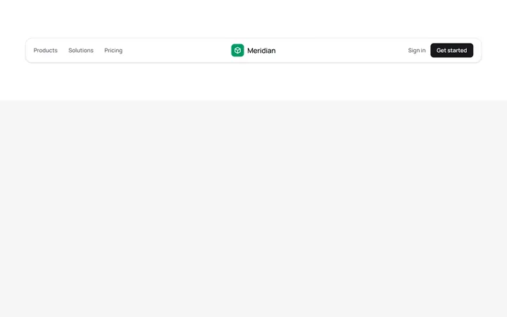
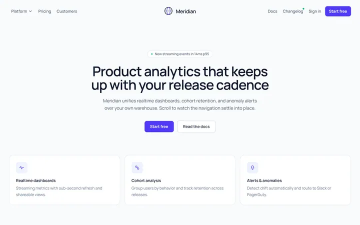
Centred Logo Navbar
OriginalA three-column navbar with the brand logo centred between the primary links and the account actions, wrapped in a soft rounded card.
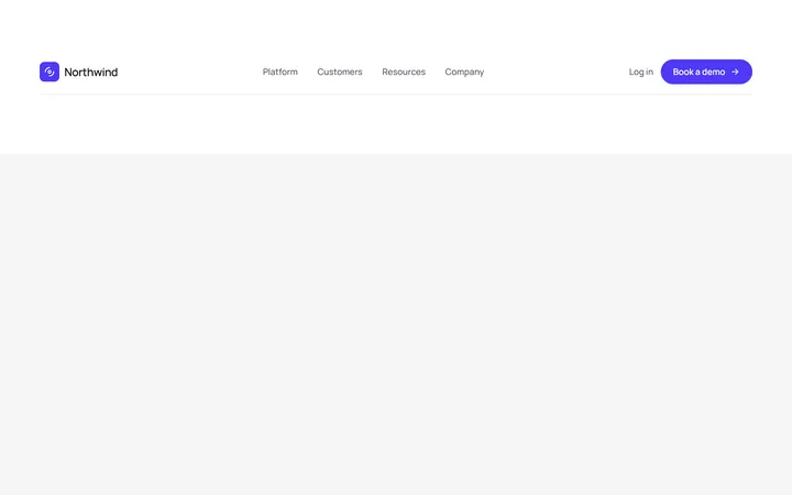
Left Logo Navbar With CTA
OriginalA classic left-aligned logo navbar with centred navigation links and a prominent pill call-to-action button on the right.
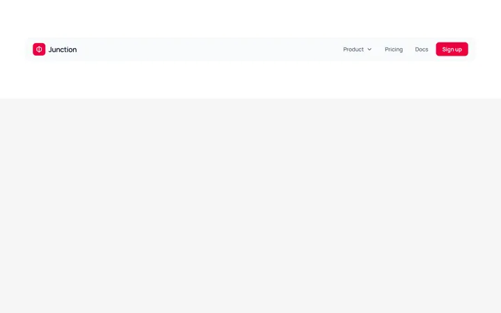
Navbar With Dropdown Menu
OriginalA navbar featuring a JS-free product dropdown built with native details and summary, revealing a two-item mega-menu panel with icons.
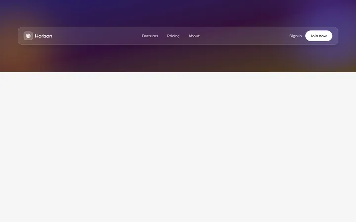
Glass Transparent Navbar
OriginalA frosted glass navbar floating over a colourful gradient hero backdrop, using backdrop blur and translucent borders for a modern overlay header.
Responsive Navbar with Mobile Menu
MITA marketing site header with a logo, inline nav links, login/register buttons, and a working hamburger toggle that reveals a stacked mobile menu below the md breakpoint. Fully keyboard/ARIA accessible with light and dark variants.
Underline Tabs
MITAn accessible underline-style tab switcher with a bottom-border active indicator and a live content panel. State-driven with proper role=tablist/tab/tabpanel and aria-selected wiring, styled for light and dark modes.
Split Button Dropdown Menu
MITA split-button control with a chevron trigger that opens a divided action menu, including a destructive delete item. Closes on outside-click and Escape, with a rotating chevron and full ARIA menu roles for both light and dark themes.
Glass Navbar
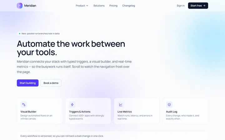
Originalglassmorphic sticky navbar
Centered Logo Navbar
Originalnavbar with centred logo and split links
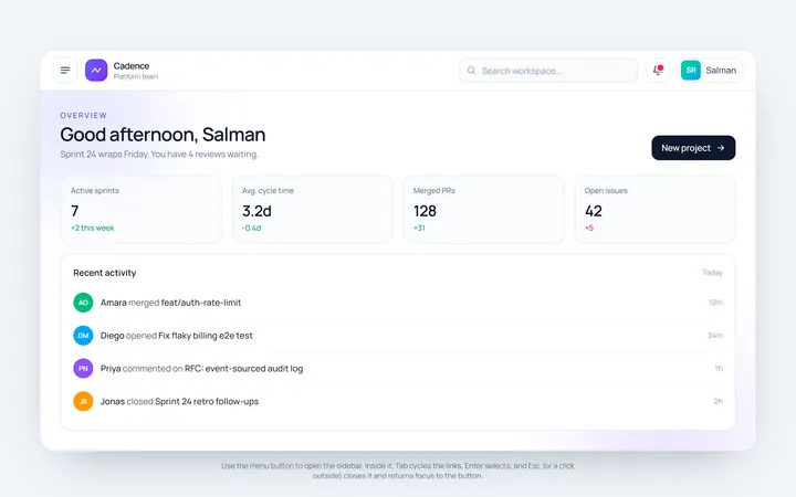
Sidebar Toggle Navbar
Originalnavbar with a sidebar toggle
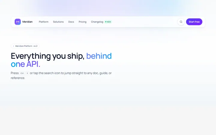
Search Navbar
Originalnavbar with an expanding search
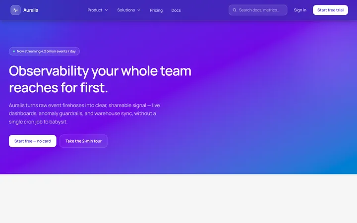
Gradient Navbar
Originalgradient navbar