

Progress Stat
Original · freestats with progress rings
Copy prompt gives Claude Code, Cursor or v0 a ready-to-paste prompt that recreates this exact component.
npx shadcn@latest add https://webinnoventix.com/r/statx-progress.json"use client";
import {
type KeyboardEvent,
type ReactNode,
useEffect,
useId,
useRef,
useState,
} from "react";
import { animate, motion, useReducedMotion } from "motion/react";
type Accent = "emerald" | "sky" | "violet" | "amber" | "indigo";
type PeriodId = "7d" | "30d" | "q";
type Metric = {
id: string;
label: string;
detail: string;
accent: Exclude<Accent, "indigo">;
target: number;
values: Record<PeriodId, number>;
prior: Record<PeriodId, number>;
};
const PERIODS: { id: PeriodId; short: string; long: string }[] = [
{ id: "7d", short: "7 days", long: "Last 7 days" },
{ id: "30d", short: "30 days", long: "Last 30 days" },
{ id: "q", short: "Quarter", long: "This quarter" },
];
const METRICS: Metric[] = [
{
id: "deploy",
label: "Deployment success",
detail:
"Production releases that shipped clean, with no rollback or hotfix in the first hour after cutover.",
accent: "emerald",
target: 98,
values: { "7d": 94, "30d": 96, q: 91 },
prior: { "7d": 90, "30d": 93, q: 89 },
},
{
id: "sprint",
label: "Sprint completion",
detail:
"Committed story points delivered inside the planned iteration window across all four squads.",
accent: "sky",
target: 90,
values: { "7d": 88, "30d": 82, q: 79 },
prior: { "7d": 85, "30d": 86, q: 81 },
},
{
id: "csat",
label: "Customer satisfaction",
detail:
"Average post-resolution rating across 1,204 support conversations, weighted by account tier.",
accent: "violet",
target: 95,
values: { "7d": 92, "30d": 90, q: 93 },
prior: { "7d": 90, "30d": 91, q: 90 },
},
{
id: "revenue",
label: "Revenue vs goal",
detail:
"Booked annual recurring revenue measured against the committed quarterly bookings plan.",
accent: "amber",
target: 100,
values: { "7d": 71, "30d": 76, q: 68 },
prior: { "7d": 66, "30d": 70, q: 64 },
},
];
const ACCENT: Record<
Accent,
{ arc: string; text: string; glow: string; selBg: string; selRing: string }
> = {
emerald: {
arc: "stroke-emerald-500",
text: "text-emerald-600 dark:text-emerald-400",
glow: "bg-emerald-400/20 dark:bg-emerald-500/25",
selBg: "bg-emerald-50 dark:bg-emerald-500/10",
selRing: "ring-emerald-400/70 dark:ring-emerald-500/50",
},
sky: {
arc: "stroke-sky-500",
text: "text-sky-600 dark:text-sky-400",
glow: "bg-sky-400/20 dark:bg-sky-500/25",
selBg: "bg-sky-50 dark:bg-sky-500/10",
selRing: "ring-sky-400/70 dark:ring-sky-500/50",
},
violet: {
arc: "stroke-violet-500",
text: "text-violet-600 dark:text-violet-400",
glow: "bg-violet-400/20 dark:bg-violet-500/25",
selBg: "bg-violet-50 dark:bg-violet-500/10",
selRing: "ring-violet-400/70 dark:ring-violet-500/50",
},
amber: {
arc: "stroke-amber-500",
text: "text-amber-600 dark:text-amber-400",
glow: "bg-amber-400/20 dark:bg-amber-500/25",
selBg: "bg-amber-50 dark:bg-amber-500/10",
selRing: "ring-amber-400/70 dark:ring-amber-500/50",
},
indigo: {
arc: "stroke-indigo-500",
text: "text-indigo-600 dark:text-indigo-400",
glow: "bg-indigo-400/20 dark:bg-indigo-500/25",
selBg: "bg-indigo-50 dark:bg-indigo-500/10",
selRing: "ring-indigo-400/70 dark:ring-indigo-500/50",
},
};
const KEYFRAMES = `
@keyframes statxp-rise {
from { opacity: 0; transform: translateY(14px); }
to { opacity: 1; transform: translateY(0); }
}
@keyframes statxp-ping {
0%, 100% { opacity: 0.55; transform: scale(1); }
50% { opacity: 0; transform: scale(2.1); }
}
.statxp-rise { animation: statxp-rise 0.6s cubic-bezier(0.22, 1, 0.36, 1) both; }
.statxp-ping { animation: statxp-ping 2.2s ease-in-out infinite; }
@media (prefers-reduced-motion: reduce) {
.statxp-rise, .statxp-ping { animation: none !important; }
}
`;
function CountUp({ value, reduced }: { value: number; reduced: boolean }) {
const [shown, setShown] = useState(value);
const currentRef = useRef(value);
useEffect(() => {
const controls = animate(currentRef.current, value, {
duration: reduced ? 0 : 1.1,
ease: [0.22, 1, 0.36, 1],
onUpdate: (latest: number) => {
currentRef.current = latest;
setShown(latest);
},
});
return () => controls.stop();
}, [value, reduced]);
return <span className="tabular-nums">{Math.round(shown)}</span>;
}
function Delta({ value }: { value: number }) {
const up = value > 0;
const down = value < 0;
const tone = up
? "text-emerald-700 dark:text-emerald-300 bg-emerald-500/10 ring-emerald-500/20"
: down
? "text-rose-700 dark:text-rose-300 bg-rose-500/10 ring-rose-500/20"
: "text-slate-600 dark:text-slate-300 bg-slate-500/10 ring-slate-500/20";
return (
<span
className={`inline-flex items-center gap-1 rounded-full px-2 py-0.5 text-xs font-semibold ring-1 ${tone}`}
>
<svg
viewBox="0 0 10 10"
aria-hidden="true"
className={`h-2.5 w-2.5 ${down ? "rotate-180" : ""} ${
!up && !down ? "hidden" : ""
}`}
>
<path d="M5 1.5 9 8H1z" fill="currentColor" />
</svg>
<span>
{up ? "+" : ""}
{value} pts
</span>
<span className="sr-only"> versus prior period</span>
</span>
);
}
function ProgressRing({
value,
target,
showTarget,
accentArc,
size,
stroke,
reduced,
ariaLabel,
children,
}: {
value: number;
target: number;
showTarget: boolean;
accentArc: string;
size: number;
stroke: number;
reduced: boolean;
ariaLabel?: string;
children?: ReactNode;
}) {
const r = (size - stroke) / 2;
const c = 2 * Math.PI * r;
const v = Math.max(0, Math.min(100, value));
const offset = c * (1 - v / 100);
const t = Math.max(0, Math.min(100, target));
const ang = (t / 100) * 2 * Math.PI - Math.PI / 2;
const tx = size / 2 + r * Math.cos(ang);
const ty = size / 2 + r * Math.sin(ang);
return (
<div
className="relative shrink-0"
style={{ width: size, height: size }}
role={ariaLabel ? "img" : undefined}
aria-label={ariaLabel}
aria-hidden={ariaLabel ? undefined : true}
>
<svg width={size} height={size} viewBox={`0 0 ${size} ${size}`} className="block">
<circle
cx={size / 2}
cy={size / 2}
r={r}
fill="none"
strokeWidth={stroke}
className="stroke-slate-200 dark:stroke-slate-800"
/>
<g transform={`rotate(-90 ${size / 2} ${size / 2})`}>
<motion.circle
cx={size / 2}
cy={size / 2}
r={r}
fill="none"
strokeWidth={stroke}
strokeLinecap="round"
className={accentArc}
strokeDasharray={c}
initial={{ strokeDashoffset: c }}
animate={{ strokeDashoffset: offset }}
transition={
reduced ? { duration: 0 } : { duration: 1.1, ease: [0.22, 1, 0.36, 1] }
}
/>
</g>
{showTarget && (
<circle
cx={tx}
cy={ty}
r={Math.max(2.5, stroke * 0.42)}
className="fill-slate-900 stroke-white dark:fill-white dark:stroke-slate-900"
strokeWidth={size > 100 ? 2.5 : 1.5}
/>
)}
</svg>
{children ? (
<div className="absolute inset-0 flex items-center justify-center">{children}</div>
) : null}
</div>
);
}
export default function StatxProgress() {
const reduced = !!useReducedMotion();
const uid = useId();
const [period, setPeriod] = useState<PeriodId>("30d");
const [showTargets, setShowTargets] = useState(false);
const [focusedId, setFocusedId] = useState<string | null>(null);
const tabRefs = useRef<(HTMLButtonElement | null)[]>([]);
function onTabKey(e: KeyboardEvent<HTMLButtonElement>, index: number) {
const count = PERIODS.length;
let next = index;
if (e.key === "ArrowRight" || e.key === "ArrowDown") next = (index + 1) % count;
else if (e.key === "ArrowLeft" || e.key === "ArrowUp")
next = (index - 1 + count) % count;
else if (e.key === "Home") next = 0;
else if (e.key === "End") next = count - 1;
else return;
e.preventDefault();
setPeriod(PERIODS[next].id);
tabRefs.current[next]?.focus();
}
const periodLong = PERIODS.find((p) => p.id === period)?.long ?? "";
const overallValue = Math.round(
METRICS.reduce((s, m) => s + m.values[period], 0) / METRICS.length,
);
const overallPrior = Math.round(
METRICS.reduce((s, m) => s + m.prior[period], 0) / METRICS.length,
);
const overallTarget = Math.round(
METRICS.reduce((s, m) => s + m.target, 0) / METRICS.length,
);
const focused = focusedId ? METRICS.find((m) => m.id === focusedId) ?? null : null;
const heroValue = focused ? focused.values[period] : overallValue;
const heroPrior = focused ? focused.prior[period] : overallPrior;
const heroTarget = focused ? focused.target : overallTarget;
const heroAccent: Accent = focused ? focused.accent : "indigo";
const heroLabel = focused ? focused.label : "Overall health";
const heroDetail = focused
? focused.detail
: "A blended index across deployment reliability, delivery pace, customer sentiment and revenue pacing for the selected window.";
return (
<section className="relative w-full overflow-hidden bg-slate-50 py-20 sm:py-28 dark:bg-slate-950">
<style>{KEYFRAMES}</style>
<div className="relative mx-auto max-w-6xl px-6">
<div className="flex flex-col gap-6 lg:flex-row lg:items-end lg:justify-between">
<div className="max-w-xl">
<div className="mb-4 inline-flex items-center gap-2 rounded-full border border-slate-200 bg-white px-3 py-1 text-xs font-medium text-slate-600 dark:border-slate-800 dark:bg-slate-900 dark:text-slate-300">
<span className="relative flex h-2 w-2">
<span className="statxp-ping absolute inline-flex h-full w-full rounded-full bg-emerald-400" />
<span className="relative inline-flex h-2 w-2 rounded-full bg-emerald-500" />
</span>
Live · synced 3 min ago
</div>
<h2 className="text-3xl font-bold tracking-tight text-slate-900 sm:text-4xl dark:text-white">
Performance at a glance
</h2>
<p className="mt-3 text-base text-slate-600 dark:text-slate-400">
Health metrics for the platform team. Change the reporting window, pin any
metric to compare it against the aggregate, and toggle quarterly targets onto
the rings.
</p>
</div>
<div className="flex flex-wrap items-center gap-5">
<div
role="tablist"
aria-label="Reporting window"
className="inline-flex rounded-full border border-slate-200 bg-slate-100 p-1 dark:border-slate-800 dark:bg-slate-900"
>
{PERIODS.map((p, i) => {
const selected = p.id === period;
return (
<button
key={p.id}
ref={(el) => {
tabRefs.current[i] = el;
}}
id={`${uid}-tab-${p.id}`}
role="tab"
type="button"
aria-selected={selected}
aria-controls={`${uid}-panel`}
tabIndex={selected ? 0 : -1}
onClick={() => setPeriod(p.id)}
onKeyDown={(e) => onTabKey(e, i)}
className={`rounded-full px-3.5 py-1.5 text-sm font-medium transition focus-visible:outline-none focus-visible:ring-2 focus-visible:ring-indigo-500 focus-visible:ring-offset-2 focus-visible:ring-offset-slate-100 dark:focus-visible:ring-offset-slate-900 ${
selected
? "bg-white text-slate-900 shadow-sm dark:bg-slate-700 dark:text-white"
: "text-slate-500 hover:text-slate-900 dark:text-slate-400 dark:hover:text-white"
}`}
>
{p.short}
</button>
);
})}
</div>
<div className="flex items-center gap-2.5">
<span
id={`${uid}-switch`}
className="text-sm font-medium text-slate-600 dark:text-slate-300"
>
Targets
</span>
<button
type="button"
role="switch"
aria-checked={showTargets}
aria-labelledby={`${uid}-switch`}
onClick={() => setShowTargets((v) => !v)}
className={`relative inline-flex h-6 w-11 items-center rounded-full transition focus-visible:outline-none focus-visible:ring-2 focus-visible:ring-indigo-500 focus-visible:ring-offset-2 focus-visible:ring-offset-slate-50 dark:focus-visible:ring-offset-slate-950 ${
showTargets ? "bg-indigo-500" : "bg-slate-300 dark:bg-slate-700"
}`}
>
<span
className={`inline-block h-5 w-5 transform rounded-full bg-white shadow transition ${
showTargets ? "translate-x-5" : "translate-x-0.5"
}`}
/>
</button>
</div>
</div>
</div>
<div
id={`${uid}-panel`}
role="tabpanel"
aria-labelledby={`${uid}-tab-${period}`}
tabIndex={0}
className="mt-8 rounded-3xl focus-visible:outline-none focus-visible:ring-2 focus-visible:ring-indigo-500 focus-visible:ring-offset-2 focus-visible:ring-offset-slate-50 dark:focus-visible:ring-offset-slate-950"
>
<div className="statxp-rise grid gap-10 rounded-3xl border border-slate-200 bg-white p-6 shadow-sm sm:p-8 lg:grid-cols-[minmax(0,0.9fr)_minmax(0,1.1fr)] dark:border-slate-800 dark:bg-slate-900">
<div className="relative flex flex-col items-center justify-center gap-4">
<div
aria-hidden="true"
className={`pointer-events-none absolute top-4 h-44 w-44 rounded-full blur-3xl ${ACCENT[heroAccent].glow}`}
/>
<span
className={`relative text-xs font-semibold uppercase tracking-wider ${ACCENT[heroAccent].text}`}
>
{focused ? "Focused metric" : "Aggregate score"}
</span>
<ProgressRing
size={208}
stroke={16}
value={heroValue}
target={heroTarget}
showTarget={showTargets}
accentArc={ACCENT[heroAccent].arc}
reduced={reduced}
ariaLabel={`${heroLabel}: ${heroValue} percent, against a ${heroTarget} percent target for ${periodLong}`}
>
<div className="flex flex-col items-center">
<div className="flex items-start text-5xl font-bold tracking-tight text-slate-900 dark:text-white">
<CountUp value={heroValue} reduced={reduced} />
<span className="mt-1 text-2xl text-slate-400 dark:text-slate-500">
%
</span>
</div>
<div className="mt-1 max-w-[7rem] text-center text-xs font-medium text-slate-500 dark:text-slate-400">
{heroLabel}
</div>
</div>
</ProgressRing>
<div className="relative flex items-center gap-2">
<Delta value={heroValue - heroPrior} />
<span className="text-xs text-slate-500 dark:text-slate-400">
vs prior {periodLong.toLowerCase()}
</span>
</div>
<p className="relative max-w-xs text-center text-sm text-slate-600 dark:text-slate-400">
{heroDetail}
</p>
<p className="relative text-xs font-medium text-slate-400 dark:text-slate-500">
Target {heroTarget}%{focused ? "" : " (blended)"}
</p>
</div>
<div
role="group"
aria-label="Platform metrics — activate a metric to focus it in the ring"
className="flex flex-col justify-center gap-2"
>
{METRICS.map((m, i) => {
const v = m.values[period];
const d = v - m.prior[period];
const on = focusedId === m.id;
const a = ACCENT[m.accent];
return (
<button
key={m.id}
type="button"
aria-pressed={on}
aria-label={`${m.label}: ${v} percent, ${
d >= 0 ? "up" : "down"
} ${Math.abs(d)} points. ${
on ? "Focused, activate to clear." : "Activate to focus in the ring."
}`}
onClick={() => setFocusedId((prev) => (prev === m.id ? null : m.id))}
style={{ animationDelay: `${140 + i * 70}ms` }}
className={`statxp-rise group flex w-full items-center gap-4 rounded-2xl border px-3 py-3 text-left transition focus-visible:outline-none focus-visible:ring-2 focus-visible:ring-indigo-500 focus-visible:ring-offset-2 focus-visible:ring-offset-white dark:focus-visible:ring-offset-slate-900 ${
on
? `${a.selBg} border-transparent ring-2 ${a.selRing}`
: "border-slate-200 bg-slate-50 hover:bg-slate-100 dark:border-slate-800 dark:bg-slate-900/60 dark:hover:bg-slate-800/60"
}`}
>
<ProgressRing
size={46}
stroke={6}
value={v}
target={m.target}
showTarget={showTargets}
accentArc={a.arc}
reduced={reduced}
/>
<div className="min-w-0 flex-1">
<div className="flex items-center justify-between gap-3">
<span className="truncate text-sm font-semibold text-slate-900 dark:text-white">
{m.label}
</span>
<span className="shrink-0 text-sm font-bold tabular-nums text-slate-900 dark:text-white">
{v}%
</span>
</div>
<div className="mt-1 flex items-center gap-2">
<Delta value={d} />
<span className="truncate text-xs text-slate-400 dark:text-slate-500">
target {m.target}%
</span>
</div>
</div>
<span
aria-hidden="true"
className="shrink-0 text-slate-300 transition group-hover:text-slate-400 dark:text-slate-600 dark:group-hover:text-slate-500"
>
{on ? (
<svg
viewBox="0 0 20 20"
className={`h-5 w-5 ${a.text}`}
fill="currentColor"
>
<path
fillRule="evenodd"
d="M10 18a8 8 0 100-16 8 8 0 000 16zm3.7-9.3a1 1 0 00-1.4-1.4L9 10.6 7.7 9.3a1 1 0 10-1.4 1.4l2 2a1 1 0 001.4 0l4-4z"
clipRule="evenodd"
/>
</svg>
) : (
<svg
viewBox="0 0 20 20"
className="h-5 w-5"
fill="none"
stroke="currentColor"
strokeWidth="2"
>
<path
strokeLinecap="round"
strokeLinejoin="round"
d="M7.5 5l5 5-5 5"
/>
</svg>
)}
</span>
</button>
);
})}
</div>
</div>
</div>
<p className="mt-6 text-center text-xs text-slate-400 dark:text-slate-500">
Figures are illustrative platform telemetry for the {periodLong.toLowerCase()}{" "}
window. Use the arrow keys on the window switcher to move between periods.
</p>
</div>
</section>
);
}Dependencies
Licence
Built by Web Innoventix. Free for personal and commercial use, no attribution required.
Built by Web Innoventix
Need a custom interface, a full website, or SEO that gets you cited by AI? We design, build and rank it end to end.
Get a free quoteSimilar components
Browse all →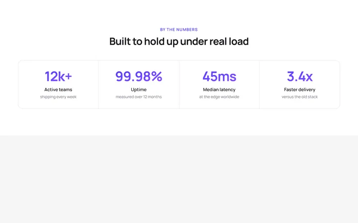
Four Stat Metric Band
OriginalA four-column metric band with gradient figures inside a hairline-divided card, ideal for headline numbers like uptime, latency and growth.
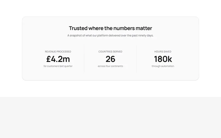
Labelled Stats With Dividers
OriginalThree centred stats separated by responsive dividers, each pairing a headline figure with an uppercase label and supporting detail.
Trusted By Logo Cloud
OriginalA responsive six-up logo strip using simple inline-SVG marks and wordmarks with a grayscale-to-colour hover, for a trusted-by section.
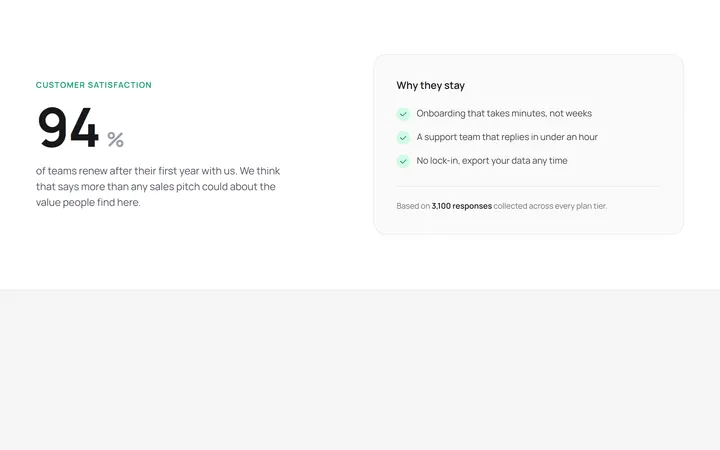
Hero Stat With Supporting Copy
OriginalA two-column layout pairing one oversized hero statistic with a supporting paragraph and a checklist card explaining the number.
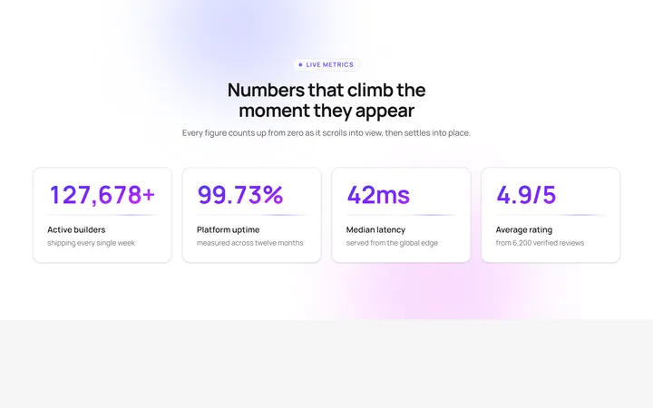
Count-up stats reveal
OriginalA four-card stat band whose gradient numbers count up from zero as the section scrolls into view, with staggered blur-in cards, a pulsing eyebrow, floating aurora blobs and a shimmering underline sweep.
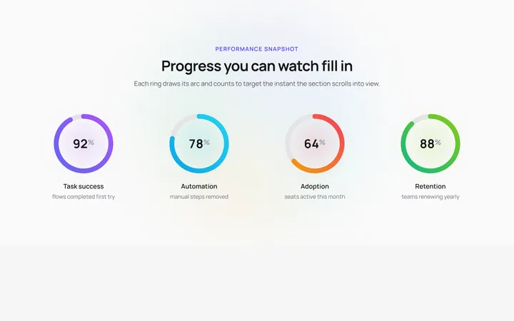
Animated SVG progress rings
OriginalFour circular SVG progress rings that draw their gradient arcs and count up to their target percentage the moment they enter view, over a slowly rotating conic halo with a soft glow pulse behind each ring.
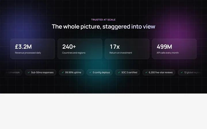
Staggered stat band with marquee ticker
OriginalA dark stat band where 3D-tilt cards stagger into view with count-up figures over an animated gradient mesh, finished by an infinite marquee ticker of highlight chips that pauses on hover.
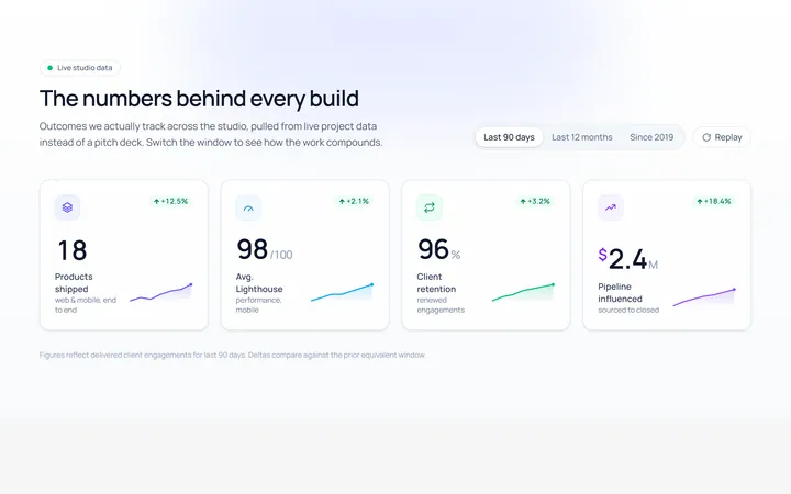
Counter Row Stat
Originalanimated counter stats row
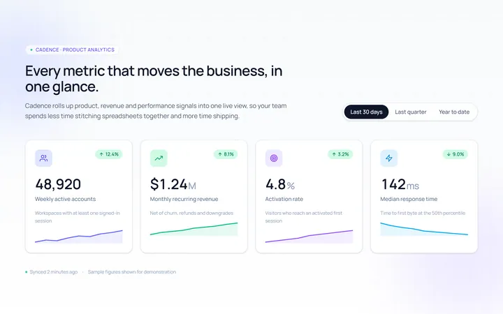
Cards Stat
Originalstat cards with icons
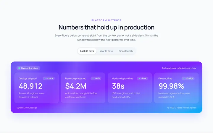
Gradient Stat
Originalgradient stats band
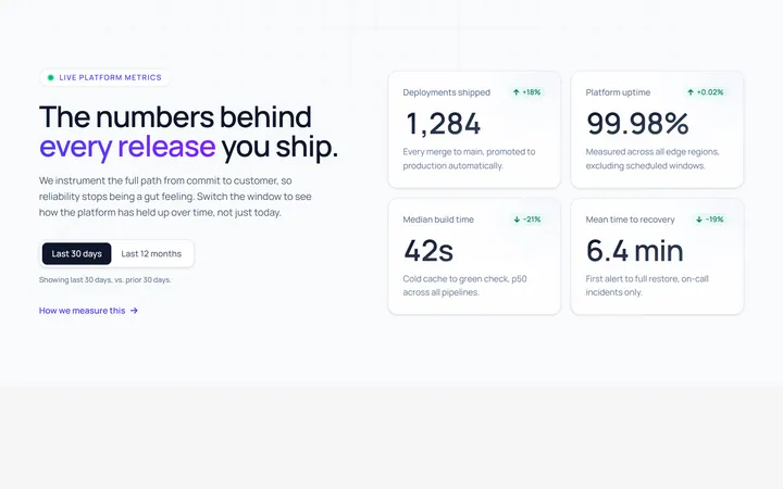
Split Stat
Originalstats beside copy
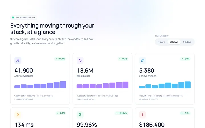
Icons Stat
Originalicon stat grid