

3D Text Effect
Original · freelayered 3D text
Copy prompt gives Claude Code, Cursor or v0 a ready-to-paste prompt that recreates this exact component.
npx shadcn@latest add https://webinnoventix.com/r/txfx-3d.json"use client";
import {
useId,
useMemo,
useRef,
useState,
type CSSProperties,
type PointerEvent as ReactPointerEvent,
} from "react";
import { useReducedMotion } from "motion/react";
type RGB = readonly [number, number, number];
interface Theme {
key: string;
name: string;
face: RGB;
mid: RGB;
deep: RGB;
}
interface Dir {
key: string;
label: string;
x: number;
y: number;
}
const THEMES: readonly Theme[] = [
{ key: "indigo", name: "Indigo", face: [165, 180, 252], mid: [79, 70, 229], deep: [30, 27, 75] },
{ key: "violet", name: "Violet", face: [196, 181, 253], mid: [124, 58, 237], deep: [46, 16, 101] },
{ key: "emerald", name: "Emerald", face: [110, 231, 183], mid: [16, 185, 129], deep: [6, 60, 46] },
{ key: "rose", name: "Rose", face: [253, 164, 175], mid: [225, 29, 72], deep: [76, 5, 25] },
{ key: "amber", name: "Amber", face: [253, 224, 135], mid: [217, 119, 6], deep: [69, 26, 3] },
{ key: "sky", name: "Sky", face: [125, 211, 252], mid: [2, 132, 199], deep: [8, 47, 73] },
];
const DIRS: readonly Dir[] = [
{ key: "nw", label: "Extrude up and left", x: -1, y: -1 },
{ key: "n", label: "Extrude up", x: 0, y: -1 },
{ key: "ne", label: "Extrude up and right", x: 1, y: -1 },
{ key: "w", label: "Extrude left", x: -1, y: 0 },
{ key: "e", label: "Extrude right", x: 1, y: 0 },
{ key: "sw", label: "Extrude down and left", x: -1, y: 1 },
{ key: "s", label: "Extrude down", x: 0, y: 1 },
{ key: "se", label: "Extrude down and right", x: 1, y: 1 },
];
const GRID_ORDER = ["nw", "n", "ne", "w", "center", "e", "sw", "s", "se"] as const;
const STEP = 2.2;
const MAX_DEPTH = 24;
const rgbStr = (c: RGB): string => `rgb(${c[0]}, ${c[1]}, ${c[2]})`;
const rgbaStr = (c: RGB, a: number): string => `rgba(${c[0]}, ${c[1]}, ${c[2]}, ${a})`;
const lerp = (a: RGB, b: RGB, t: number): RGB => [
Math.round(a[0] + (b[0] - a[0]) * t),
Math.round(a[1] + (b[1] - a[1]) * t),
Math.round(a[2] + (b[2] - a[2]) * t),
];
const DEFAULTS = {
text: "LAYERS",
depth: 14,
dirKey: "se",
themeKey: "indigo",
animate: true,
};
export default function Txfx3D() {
const uid = useId();
const reduced = useReducedMotion();
const [text, setText] = useState<string>(DEFAULTS.text);
const [depth, setDepth] = useState<number>(DEFAULTS.depth);
const [dirKey, setDirKey] = useState<string>(DEFAULTS.dirKey);
const [themeKey, setThemeKey] = useState<string>(DEFAULTS.themeKey);
const [animate, setAnimate] = useState<boolean>(DEFAULTS.animate);
const [tilt, setTilt] = useState<{ rx: number; ry: number }>({ rx: 0, ry: 0 });
const stageRef = useRef<HTMLDivElement>(null);
const theme = useMemo(
() => THEMES.find((t) => t.key === themeKey) ?? THEMES[0],
[themeKey],
);
const dir = useMemo(() => DIRS.find((d) => d.key === dirKey) ?? DIRS[7], [dirKey]);
const unit = useMemo(() => {
const mag = Math.hypot(dir.x, dir.y) || 1;
return { ux: dir.x / mag, uy: dir.y / mag };
}, [dir]);
const layers = useMemo(() => {
const arr: number[] = [];
for (let i = depth; i >= 1; i--) arr.push(i);
return arr;
}, [depth]);
const motionOn = animate && !reduced;
const displayText = text.length === 0 ? " " : text;
const faceStyle: CSSProperties = {
backgroundImage: `linear-gradient(100deg, ${rgbStr(theme.mid)} 0%, ${rgbStr(
theme.face,
)} 40%, rgba(255,255,255,0.9) 50%, ${rgbStr(theme.face)} 60%, ${rgbStr(theme.mid)} 100%)`,
backgroundSize: "220% 100%",
WebkitBackgroundClip: "text",
backgroundClip: "text",
color: "transparent",
WebkitTextFillColor: "transparent",
animation: motionOn ? "txfx3d-shimmer 6s linear infinite" : undefined,
};
const handlePointerMove = (e: ReactPointerEvent<HTMLDivElement>) => {
if (reduced) return;
const el = stageRef.current;
if (!el) return;
const rect = el.getBoundingClientRect();
const px = (e.clientX - rect.left) / rect.width - 0.5;
const py = (e.clientY - rect.top) / rect.height - 0.5;
setTilt({ rx: -py * 14, ry: px * 16 });
};
const resetTilt = () => setTilt({ rx: 0, ry: 0 });
const reset = () => {
setText(DEFAULTS.text);
setDepth(DEFAULTS.depth);
setDirKey(DEFAULTS.dirKey);
setThemeKey(DEFAULTS.themeKey);
setAnimate(DEFAULTS.animate);
resetTilt();
};
const arrowAngle = Math.round((Math.atan2(dir.y, dir.x) * 180) / Math.PI);
const dirName = uid + "-dir";
const themeName = uid + "-theme";
const textId = uid + "-text";
const depthId = uid + "-depth";
const ringBase =
"outline-none focus-visible:ring-2 focus-visible:ring-indigo-500 focus-visible:ring-offset-2 focus-visible:ring-offset-white dark:focus-visible:ring-offset-neutral-950";
return (
<section className="relative w-full overflow-hidden bg-white px-6 py-16 text-neutral-900 dark:bg-neutral-950 dark:text-neutral-100 sm:py-20">
<style>{`
@keyframes txfx3d-shimmer {
0% { background-position: 0% 50%; }
100% { background-position: 220% 50%; }
}
@keyframes txfx3d-float {
0%, 100% { transform: translateY(0); }
50% { transform: translateY(-10px); }
}
@media (prefers-reduced-motion: reduce) {
.txfx3d-face { animation: none !important; }
.txfx3d-float { animation: none !important; }
}
`}</style>
<div className="pointer-events-none absolute inset-x-0 top-0 mx-auto h-px max-w-6xl bg-gradient-to-r from-transparent via-neutral-300 to-transparent dark:via-neutral-700" />
<div className="mx-auto max-w-6xl">
<header className="mb-10 max-w-2xl">
<span className="inline-flex items-center gap-2 rounded-full border border-neutral-200 bg-neutral-50 px-3 py-1 text-xs font-medium uppercase tracking-widest text-neutral-500 dark:border-neutral-800 dark:bg-neutral-900 dark:text-neutral-400">
<span
aria-hidden="true"
className="h-1.5 w-1.5 rounded-full"
style={{ backgroundColor: rgbStr(theme.mid) }}
/>
Text effect
</span>
<h2 className="mt-4 text-3xl font-semibold tracking-tight sm:text-4xl">
Layered 3D Text
</h2>
<p className="mt-3 text-base leading-relaxed text-neutral-600 dark:text-neutral-400">
Real extruded depth built from stacked glyph layers — no images, no WebGL. Type your
word, drag the depth, and steer the light. Hover the stage to tilt it in space.
</p>
</header>
<div className="grid gap-6 lg:grid-cols-[1.5fr_1fr]">
{/* ---------- Stage ---------- */}
<div
ref={stageRef}
onPointerMove={handlePointerMove}
onPointerLeave={resetTilt}
className="relative flex min-h-[20rem] items-center justify-center overflow-hidden rounded-3xl border border-neutral-200 bg-gradient-to-br from-neutral-50 to-neutral-100 p-8 dark:border-neutral-800 dark:from-neutral-900 dark:to-neutral-950 sm:min-h-[24rem]"
style={{ perspective: "900px" }}
>
<div
aria-hidden="true"
className="pointer-events-none absolute inset-0 opacity-[0.35] dark:opacity-20"
style={{
backgroundImage:
"radial-gradient(circle at 1px 1px, currentColor 1px, transparent 0)",
backgroundSize: "22px 22px",
color: "rgb(148 163 184)",
maskImage: "radial-gradient(ellipse at center, black 40%, transparent 80%)",
WebkitMaskImage: "radial-gradient(ellipse at center, black 40%, transparent 80%)",
}}
/>
<div
className="relative"
style={{
transform: `rotateX(${tilt.rx}deg) rotateY(${tilt.ry}deg)`,
transformStyle: "preserve-3d",
transition: "transform 160ms ease-out",
}}
>
<div
className={motionOn ? "txfx3d-float" : undefined}
style={{
animation: motionOn ? "txfx3d-float 5s ease-in-out infinite" : undefined,
filter: `drop-shadow(0 18px 30px ${rgbaStr(theme.mid, 0.3)})`,
}}
>
<div
className="relative inline-block select-none whitespace-nowrap font-black leading-none tracking-tight"
style={{ fontSize: "clamp(3rem, 13vw, 8rem)" }}
>
{layers.map((i) => {
const t = depth > 1 ? (i - 1) / (depth - 1) : 0;
const color = lerp(theme.mid, theme.deep, t);
return (
<span
key={i}
aria-hidden="true"
className="absolute inset-0 block"
style={{
transform: `translate(${unit.ux * i * STEP}px, ${unit.uy * i * STEP}px)`,
color: rgbStr(color),
}}
>
{displayText}
</span>
);
})}
<span className="txfx3d-face relative block" style={faceStyle}>
{displayText}
</span>
</div>
</div>
</div>
</div>
{/* ---------- Controls ---------- */}
<div className="space-y-6 rounded-3xl border border-neutral-200 bg-neutral-50 p-6 dark:border-neutral-800 dark:bg-neutral-900">
{/* Text */}
<div>
<label
htmlFor={textId}
className="mb-2 block text-sm font-medium text-neutral-700 dark:text-neutral-300"
>
Display text
</label>
<input
id={textId}
type="text"
value={text}
maxLength={14}
onChange={(e) => setText(e.target.value.toUpperCase())}
placeholder="Type a word"
className={`w-full rounded-xl border border-neutral-300 bg-white px-3.5 py-2.5 text-sm font-semibold uppercase tracking-wide text-neutral-900 placeholder:font-normal placeholder:normal-case placeholder:tracking-normal placeholder:text-neutral-400 dark:border-neutral-700 dark:bg-neutral-950 dark:text-neutral-100 ${ringBase}`}
/>
</div>
{/* Depth */}
<div>
<div className="mb-2 flex items-baseline justify-between">
<label
htmlFor={depthId}
className="text-sm font-medium text-neutral-700 dark:text-neutral-300"
>
Extrusion depth
</label>
<span className="text-xs font-semibold tabular-nums text-neutral-500 dark:text-neutral-400">
{depth} {depth === 1 ? "layer" : "layers"}
</span>
</div>
<input
id={depthId}
type="range"
min={0}
max={MAX_DEPTH}
step={1}
value={depth}
onChange={(e) => setDepth(Number(e.target.value))}
aria-valuetext={`${depth} layers of depth`}
className={`w-full cursor-pointer ${ringBase} rounded-full`}
style={{ accentColor: rgbStr(theme.mid) }}
/>
</div>
{/* Direction */}
<fieldset>
<legend className="mb-2 text-sm font-medium text-neutral-700 dark:text-neutral-300">
Extrusion direction
</legend>
<div className="grid w-max grid-cols-3 gap-1.5">
{GRID_ORDER.map((key) => {
if (key === "center") {
return (
<div
key="center"
aria-hidden="true"
className="flex h-11 w-11 items-center justify-center rounded-lg border border-dashed border-neutral-300 dark:border-neutral-700"
>
<span className="text-[10px] font-semibold uppercase tracking-wide text-neutral-400 dark:text-neutral-500">
Face
</span>
</div>
);
}
const d = DIRS.find((item) => item.key === key)!;
const active = dirKey === key;
const angle = Math.round((Math.atan2(d.y, d.x) * 180) / Math.PI);
return (
<label
key={key}
className={`relative flex h-11 w-11 cursor-pointer items-center justify-center rounded-lg border transition-colors has-[:focus-visible]:ring-2 has-[:focus-visible]:ring-indigo-500 has-[:focus-visible]:ring-offset-2 has-[:focus-visible]:ring-offset-neutral-50 dark:has-[:focus-visible]:ring-offset-neutral-900 ${
active
? "border-transparent text-white"
: "border-neutral-300 bg-white text-neutral-500 hover:border-neutral-400 dark:border-neutral-700 dark:bg-neutral-950 dark:text-neutral-400 dark:hover:border-neutral-600"
}`}
style={active ? { backgroundColor: rgbStr(theme.mid) } : undefined}
>
<input
type="radio"
name={dirName}
value={key}
checked={active}
onChange={() => setDirKey(key)}
className="sr-only"
/>
<svg
viewBox="0 0 24 24"
className="h-4 w-4"
fill="none"
stroke="currentColor"
strokeWidth={2.5}
strokeLinecap="round"
strokeLinejoin="round"
aria-hidden="true"
style={{ transform: `rotate(${angle}deg)` }}
>
<path d="M5 12h13M13 6l6 6-6 6" />
</svg>
<span className="sr-only">{d.label}</span>
</label>
);
})}
</div>
</fieldset>
{/* Color */}
<fieldset>
<legend className="mb-2 text-sm font-medium text-neutral-700 dark:text-neutral-300">
Color
</legend>
<div className="flex flex-wrap gap-2">
{THEMES.map((t) => {
const active = themeKey === t.key;
return (
<label
key={t.key}
className={`relative flex h-11 w-11 cursor-pointer items-center justify-center rounded-lg ring-offset-2 ring-offset-neutral-50 transition-transform hover:scale-105 has-[:focus-visible]:ring-2 has-[:focus-visible]:ring-indigo-500 dark:ring-offset-neutral-900 ${
active ? "ring-2 ring-neutral-900 dark:ring-white" : ""
}`}
title={t.name}
>
<input
type="radio"
name={themeName}
value={t.key}
checked={active}
onChange={() => setThemeKey(t.key)}
className="sr-only"
/>
<span
aria-hidden="true"
className="h-full w-full rounded-lg"
style={{
backgroundImage: `linear-gradient(135deg, ${rgbStr(t.face)}, ${rgbStr(
t.mid,
)} 55%, ${rgbStr(t.deep)})`,
}}
/>
{active ? (
<svg
viewBox="0 0 24 24"
className="absolute h-4 w-4 text-white drop-shadow"
fill="none"
stroke="currentColor"
strokeWidth={3}
strokeLinecap="round"
strokeLinejoin="round"
aria-hidden="true"
>
<path d="M5 12l5 5L20 7" />
</svg>
) : null}
<span className="sr-only">{t.name}</span>
</label>
);
})}
</div>
</fieldset>
{/* Animate toggle + reset */}
<div className="flex items-center justify-between gap-4 border-t border-neutral-200 pt-5 dark:border-neutral-800">
<span className="flex flex-col">
<span className="text-sm font-medium text-neutral-700 dark:text-neutral-300">
Shimmer & float
</span>
<span className="text-xs text-neutral-500 dark:text-neutral-500">
{reduced ? "Off (reduced motion)" : animate ? "Animating" : "Static"}
</span>
</span>
<button
type="button"
role="switch"
aria-checked={animate && !reduced}
aria-label="Toggle shimmer and float animation"
disabled={!!reduced}
onClick={() => setAnimate((v) => !v)}
className={`relative inline-flex h-6 w-11 shrink-0 items-center rounded-full transition-colors disabled:cursor-not-allowed disabled:opacity-40 ${ringBase} ${
animate && !reduced ? "" : "bg-neutral-300 dark:bg-neutral-700"
}`}
style={animate && !reduced ? { backgroundColor: rgbStr(theme.mid) } : undefined}
>
<span
aria-hidden="true"
className={`inline-block h-4 w-4 transform rounded-full bg-white shadow transition-transform ${
animate && !reduced ? "translate-x-6" : "translate-x-1"
}`}
/>
</button>
</div>
<button
type="button"
onClick={reset}
className={`inline-flex items-center gap-1.5 text-sm font-medium text-neutral-500 transition-colors hover:text-neutral-900 dark:text-neutral-400 dark:hover:text-neutral-100 ${ringBase} rounded-md`}
>
<svg
viewBox="0 0 24 24"
className="h-4 w-4"
fill="none"
stroke="currentColor"
strokeWidth={2}
strokeLinecap="round"
strokeLinejoin="round"
aria-hidden="true"
>
<path d="M3 12a9 9 0 109-9 9 9 0 00-6.4 2.6L3 8" />
<path d="M3 3v5h5" />
</svg>
Reset to defaults
</button>
</div>
</div>
<p className="mt-4 text-sm text-neutral-500 dark:text-neutral-500" aria-live="polite">
{depth} stacked {depth === 1 ? "layer" : "layers"} extruded {dir.label
.replace("Extrude ", "")
.toLowerCase()} at {arrowAngle}°, in {theme.name.toLowerCase()}.
</p>
</div>
</section>
);
}Dependencies
Licence
Built by Web Innoventix. Free for personal and commercial use, no attribution required.
Built by Web Innoventix
Need a custom interface, a full website, or SEO that gets you cited by AI? We design, build and rank it end to end.
Get a free quoteSimilar components
Browse all →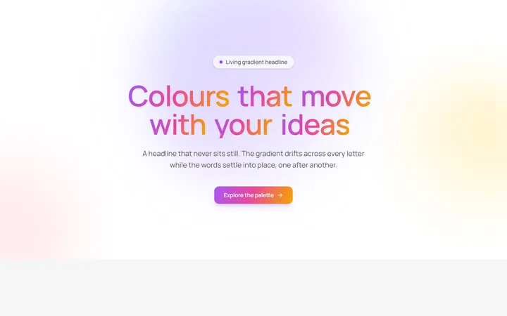
Aurora Gradient Headline
OriginalAn animated headline whose living multi-colour gradient drifts across every letter while the words blur and stagger into place on scroll.
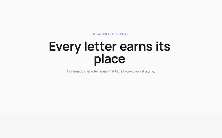
Character Reveal Heading
OriginalA cinematic heading that blurs and lifts in one character at a time with a staggered, scroll-triggered reveal.
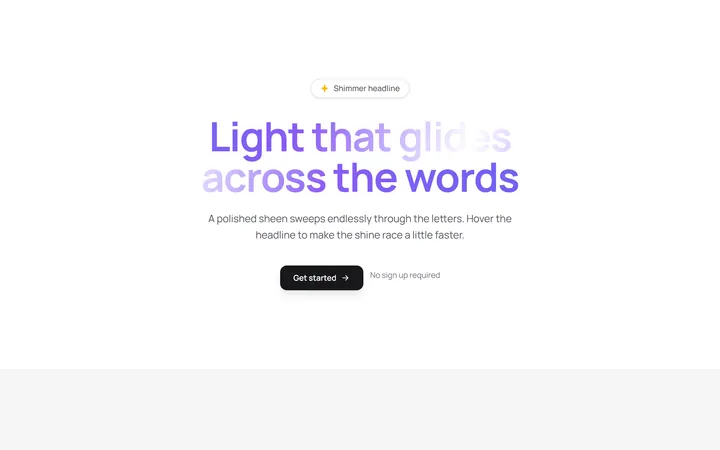
Shimmer Sweep Headline
OriginalA headline with a polished light sheen that glides endlessly across the letters and races faster on hover.
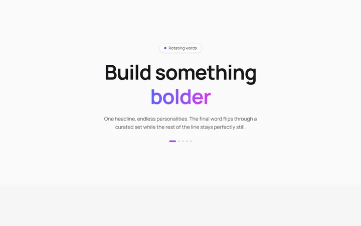
Rotating Words Headline
OriginalA headline whose final word flips through a curated set with a blurred vertical roll while the rest of the line stays perfectly still.
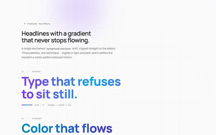
Gradient Animate Text Effect
Originalanimated gradient text
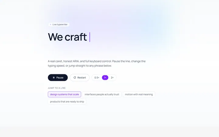
Typing Text Effect
Originaltypewriter text with caret
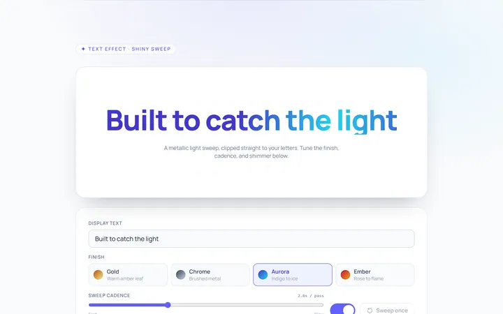
Shiny Text Effect
Originalshiny sweep text
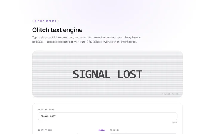
Glitch Text Effect
Originalglitch text effect
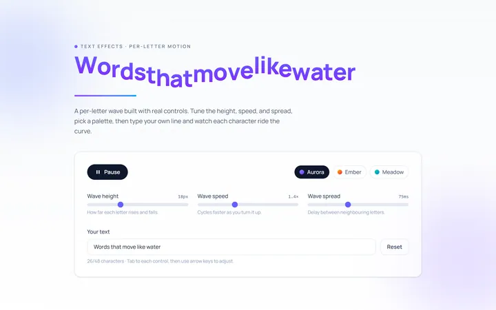
Wave Text Effect
Originalwavy letter animation
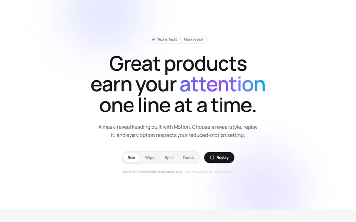
Reveal Mask Text Effect
Originalmask reveal heading
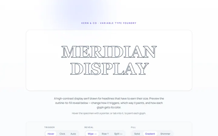
Outline Text Effect
Originaloutline-to-fill text
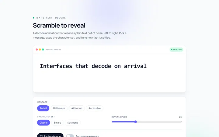
Scramble Text Effect
Originalscramble/decode text