

Highlight Text Effect
Original · freeanimated highlighter marker text
Copy prompt gives Claude Code, Cursor or v0 a ready-to-paste prompt that recreates this exact component.
npx shadcn@latest add https://webinnoventix.com/r/txfx-highlight.json"use client";
import { useRef, useState, type KeyboardEvent, type ReactNode } from "react";
import { motion, useInView, useReducedMotion } from "motion/react";
type HueKey = "amber" | "emerald" | "sky" | "rose" | "violet";
type StyleKey = "marker" | "underline" | "box";
type Hue = {
key: HueKey;
label: string;
dot: string;
mark: string;
line: string;
stroke: string;
};
const HUES: Hue[] = [
{
key: "amber",
label: "Amber",
dot: "bg-amber-400",
mark: "bg-amber-300/70 dark:bg-amber-300/30",
line: "bg-amber-400 dark:bg-amber-400/80",
stroke: "text-amber-500 dark:text-amber-300",
},
{
key: "emerald",
label: "Emerald",
dot: "bg-emerald-400",
mark: "bg-emerald-300/70 dark:bg-emerald-300/25",
line: "bg-emerald-400 dark:bg-emerald-400/80",
stroke: "text-emerald-500 dark:text-emerald-300",
},
{
key: "sky",
label: "Sky",
dot: "bg-sky-400",
mark: "bg-sky-300/70 dark:bg-sky-300/25",
line: "bg-sky-400 dark:bg-sky-400/80",
stroke: "text-sky-500 dark:text-sky-300",
},
{
key: "rose",
label: "Rose",
dot: "bg-rose-400",
mark: "bg-rose-300/70 dark:bg-rose-300/25",
line: "bg-rose-400 dark:bg-rose-400/80",
stroke: "text-rose-500 dark:text-rose-300",
},
{
key: "violet",
label: "Violet",
dot: "bg-violet-400",
mark: "bg-violet-300/70 dark:bg-violet-300/30",
line: "bg-violet-400 dark:bg-violet-400/80",
stroke: "text-violet-500 dark:text-violet-300",
},
];
const STYLES: { value: StyleKey; label: string }[] = [
{ value: "marker", label: "Marker" },
{ value: "underline", label: "Underline" },
{ value: "box", label: "Box" },
];
type MarkProps = {
children: ReactNode;
hue: Hue;
styleKey: StyleKey;
delay: number;
play: boolean;
reduce: boolean;
runId: number;
};
function Mark({ children, hue, styleKey, delay, play, reduce, runId }: MarkProps) {
const decoKey = `${runId}-${styleKey}`;
return (
<span className="relative inline-block whitespace-nowrap px-[0.12em] align-baseline">
{styleKey === "box" ? (
<svg
key={decoKey}
aria-hidden="true"
viewBox="0 0 100 100"
preserveAspectRatio="none"
fill="none"
className={`pointer-events-none absolute left-[-0.35em] top-[-0.2em] h-[calc(100%+0.4em)] w-[calc(100%+0.7em)] ${hue.stroke}`}
>
<motion.rect
x="4"
y="6"
width="92"
height="88"
rx="14"
stroke="currentColor"
strokeWidth="2.5"
strokeLinecap="round"
vectorEffect="non-scaling-stroke"
initial={{ pathLength: reduce ? 1 : 0, opacity: reduce ? 1 : 0 }}
animate={{ pathLength: play ? 1 : 0, opacity: play ? 1 : 0 }}
transition={
reduce
? { duration: 0 }
: {
pathLength: { delay, duration: 0.8, ease: "easeInOut" },
opacity: { delay, duration: 0.2 },
}
}
/>
</svg>
) : (
<motion.span
key={decoKey}
aria-hidden="true"
className={
styleKey === "underline"
? `pointer-events-none absolute bottom-[0.02em] left-0 right-0 h-[0.28em] rounded-full ${hue.line}`
: `pointer-events-none absolute inset-y-[0.05em] left-[-0.1em] right-[-0.1em] rounded-[0.25em] ${hue.mark}`
}
style={{ transformOrigin: "left center" }}
initial={{ scaleX: reduce ? 1 : 0 }}
animate={{ scaleX: play ? 1 : 0 }}
transition={reduce ? { duration: 0 } : { delay, duration: 0.55, ease: "circOut" }}
/>
)}
<span className="relative z-10">{children}</span>
</span>
);
}
type RadioGroupProps<T extends string> = {
label: string;
value: T;
options: { value: T; label: string }[];
onChange: (v: T) => void;
className?: string;
itemClassName?: string;
renderOption: (option: { value: T; label: string }, checked: boolean) => ReactNode;
};
function RadioGroup<T extends string>({
label,
value,
options,
onChange,
className,
itemClassName,
renderOption,
}: RadioGroupProps<T>) {
const refs = useRef<(HTMLButtonElement | null)[]>([]);
const activeIndex = Math.max(
0,
options.findIndex((o) => o.value === value),
);
const focusIndex = (i: number) => {
const n = options.length;
const next = ((i % n) + n) % n;
onChange(options[next].value);
refs.current[next]?.focus();
};
const onKeyDown = (e: KeyboardEvent<HTMLDivElement>) => {
switch (e.key) {
case "ArrowRight":
case "ArrowDown":
e.preventDefault();
focusIndex(activeIndex + 1);
break;
case "ArrowLeft":
case "ArrowUp":
e.preventDefault();
focusIndex(activeIndex - 1);
break;
case "Home":
e.preventDefault();
focusIndex(0);
break;
case "End":
e.preventDefault();
focusIndex(options.length - 1);
break;
default:
break;
}
};
const base =
"relative inline-flex items-center justify-center rounded-full outline-none transition focus-visible:ring-2 focus-visible:ring-offset-2 focus-visible:ring-slate-900 focus-visible:ring-offset-white dark:focus-visible:ring-white dark:focus-visible:ring-offset-slate-950";
return (
<div role="radiogroup" aria-label={label} onKeyDown={onKeyDown} className={className}>
{options.map((o, i) => {
const checked = o.value === value;
return (
<button
key={o.value}
ref={(el) => {
refs.current[i] = el;
}}
type="button"
role="radio"
aria-checked={checked}
tabIndex={checked ? 0 : -1}
onClick={() => onChange(o.value)}
className={`${base} ${itemClassName ?? ""}`}
>
{renderOption(o, checked)}
</button>
);
})}
</div>
);
}
export default function TxfxHighlight() {
const [hueKey, setHueKey] = useState<HueKey>("amber");
const [styleKey, setStyleKey] = useState<StyleKey>("marker");
const [runId, setRunId] = useState(0);
const reduceRaw = useReducedMotion();
const reduce = !!reduceRaw;
const rootRef = useRef<HTMLParagraphElement>(null);
const inView = useInView(rootRef, { amount: 0.35 });
const hue = HUES.find((h) => h.key === hueKey) ?? HUES[0];
const play = reduce ? true : inView;
const colorOptions = HUES.map((h) => ({ value: h.key, label: h.label }));
return (
<section className="relative w-full overflow-hidden bg-white text-slate-900 dark:bg-slate-950 dark:text-slate-100">
<style>{`
@keyframes txfxhl-blink { 0%, 45% { opacity: 1 } 50%, 95% { opacity: 0 } 100% { opacity: 1 } }
@keyframes txfxhl-float { 0%, 100% { transform: translateY(0) rotate(-8deg) } 50% { transform: translateY(-3px) rotate(-3deg) } }
.txfxhl-caret { animation: txfxhl-blink 1.1s steps(1, end) infinite; }
.txfxhl-pen { animation: txfxhl-float 3.4s ease-in-out infinite; }
@media (prefers-reduced-motion: reduce) {
.txfxhl-caret, .txfxhl-pen { animation: none !important; }
}
`}</style>
{/* ruled-paper texture */}
<div
aria-hidden="true"
className="pointer-events-none absolute inset-0 text-slate-900 opacity-[0.04] dark:text-slate-100 dark:opacity-[0.06]"
style={{
backgroundImage:
"repeating-linear-gradient(to bottom, currentColor 0, currentColor 1px, transparent 1px, transparent 2.25rem)",
}}
/>
{/* soft glow */}
<div
aria-hidden="true"
className="pointer-events-none absolute -top-24 left-1/2 h-56 w-[36rem] max-w-full -translate-x-1/2 rounded-full bg-indigo-200/25 blur-3xl dark:bg-indigo-500/10"
/>
<div className="relative mx-auto max-w-4xl px-6 py-20 sm:py-28">
<div className="mb-9 flex items-center gap-3">
<span className="txfxhl-pen inline-flex text-amber-500 dark:text-amber-300">
<svg
viewBox="0 0 24 24"
className="h-5 w-5"
fill="none"
stroke="currentColor"
strokeWidth="1.8"
strokeLinecap="round"
strokeLinejoin="round"
aria-hidden="true"
>
<path d="M4 20h4L18.5 9.5a2.12 2.12 0 0 0-3-3L5 17v3z" />
<path d="M13.5 6.5l3 3" />
<path d="M4 20h6" />
</svg>
</span>
<span className="text-xs font-semibold uppercase tracking-[0.22em] text-slate-500 dark:text-slate-400">
Text effect · Highlighter
</span>
</div>
<p
ref={rootRef}
className="text-3xl font-semibold leading-[1.55] tracking-tight text-slate-900 sm:text-4xl sm:leading-[1.5] dark:text-white"
>
Good writing earns a glance.{" "}
<Mark hue={hue} styleKey={styleKey} delay={0.1} play={play} reduce={reduce} runId={runId}>
Great writing
</Mark>{" "}
keeps the whole room quiet. The lines you{" "}
<Mark hue={hue} styleKey={styleKey} delay={0.5} play={play} reduce={reduce} runId={runId}>
mark by hand
</Mark>{" "}
are the ones a reader will{" "}
<Mark hue={hue} styleKey={styleKey} delay={0.9} play={play} reduce={reduce} runId={runId}>
actually remember
</Mark>
<span
aria-hidden="true"
className="txfxhl-caret ml-1 inline-block h-[0.95em] w-[0.11em] translate-y-[0.1em] rounded-sm bg-slate-400 align-baseline dark:bg-slate-500"
/>
</p>
<p className="mt-6 max-w-xl text-sm leading-relaxed text-slate-500 dark:text-slate-400">
Scroll the phrases into view, switch the marker color or stroke, then hit replay to draw
every mark again. Motion respects reduced-motion preferences.
</p>
<div className="mt-12 flex flex-col gap-7 rounded-2xl border border-slate-200 bg-slate-50/70 p-5 sm:flex-row sm:items-end sm:justify-between dark:border-slate-800 dark:bg-slate-900/40">
<div className="flex flex-col gap-6 sm:flex-row sm:gap-8">
<div>
<span className="mb-2 block text-[0.7rem] font-semibold uppercase tracking-wider text-slate-500 dark:text-slate-400">
Color
</span>
<RadioGroup
label="Highlighter color"
value={hueKey}
onChange={setHueKey}
options={colorOptions}
className="flex items-center gap-2.5"
itemClassName="p-1"
renderOption={(o, checked) => {
const oh = HUES.find((h) => h.key === o.value) ?? HUES[0];
return (
<>
<span className="sr-only">{o.label}</span>
<span
className={`block h-5 w-5 rounded-full ring-2 ring-inset ${oh.dot} ${
checked ? "ring-slate-900 dark:ring-white" : "ring-transparent"
}`}
/>
</>
);
}}
/>
</div>
<div>
<span className="mb-2 block text-[0.7rem] font-semibold uppercase tracking-wider text-slate-500 dark:text-slate-400">
Style
</span>
<RadioGroup
label="Highlight style"
value={styleKey}
onChange={setStyleKey}
options={STYLES}
className="inline-flex rounded-full border border-slate-200 bg-white p-1 dark:border-slate-700 dark:bg-slate-800"
renderOption={(o, checked) => (
<span
className={
checked
? "block rounded-full bg-slate-900 px-4 py-1.5 text-sm font-semibold text-white dark:bg-white dark:text-slate-900"
: "block rounded-full px-4 py-1.5 text-sm font-medium text-slate-600 hover:text-slate-900 dark:text-slate-400 dark:hover:text-slate-100"
}
>
{o.label}
</span>
)}
/>
</div>
</div>
<button
type="button"
onClick={() => setRunId((v) => v + 1)}
className="inline-flex items-center justify-center gap-2 rounded-full bg-slate-900 px-5 py-2.5 text-sm font-semibold text-white shadow-sm transition hover:bg-slate-700 active:scale-[0.98] focus-visible:outline-none focus-visible:ring-2 focus-visible:ring-slate-900 focus-visible:ring-offset-2 focus-visible:ring-offset-white dark:bg-white dark:text-slate-900 dark:hover:bg-slate-200 dark:focus-visible:ring-white dark:focus-visible:ring-offset-slate-950"
>
<svg
viewBox="0 0 24 24"
className="h-4 w-4"
fill="none"
stroke="currentColor"
strokeWidth="2"
strokeLinecap="round"
strokeLinejoin="round"
aria-hidden="true"
>
<path d="M3 12a9 9 0 1 0 3-6.7" />
<path d="M3 4v5h5" />
</svg>
Replay
</button>
</div>
</div>
</section>
);
}Dependencies
Licence
Built by Web Innoventix. Free for personal and commercial use, no attribution required.
Built by Web Innoventix
Need a custom interface, a full website, or SEO that gets you cited by AI? We design, build and rank it end to end.
Get a free quoteSimilar components
Browse all →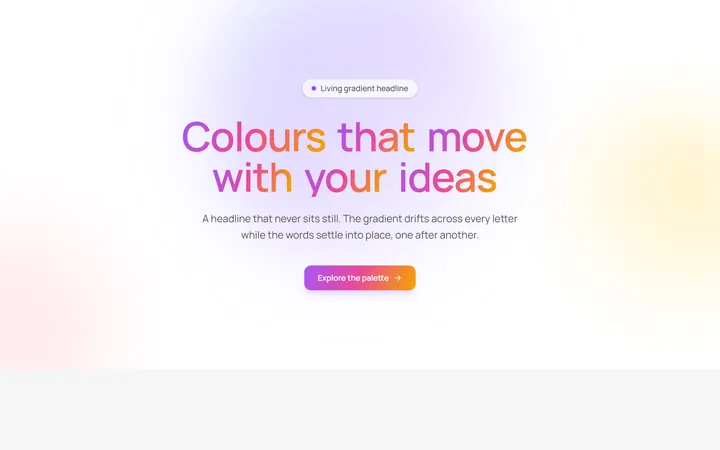
Aurora Gradient Headline
OriginalAn animated headline whose living multi-colour gradient drifts across every letter while the words blur and stagger into place on scroll.
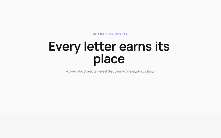
Character Reveal Heading
OriginalA cinematic heading that blurs and lifts in one character at a time with a staggered, scroll-triggered reveal.
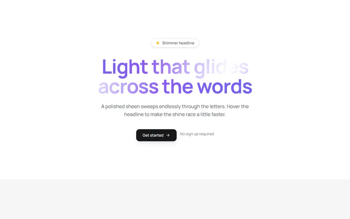
Shimmer Sweep Headline
OriginalA headline with a polished light sheen that glides endlessly across the letters and races faster on hover.
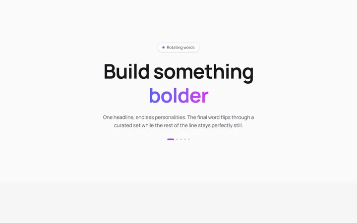
Rotating Words Headline
OriginalA headline whose final word flips through a curated set with a blurred vertical roll while the rest of the line stays perfectly still.
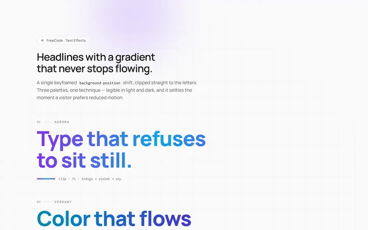
Gradient Animate Text Effect
Originalanimated gradient text
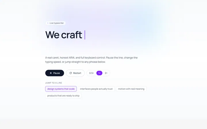
Typing Text Effect
Originaltypewriter text with caret
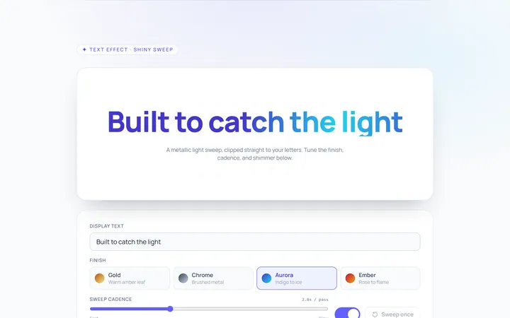
Shiny Text Effect
Originalshiny sweep text
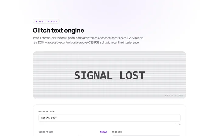
Glitch Text Effect
Originalglitch text effect
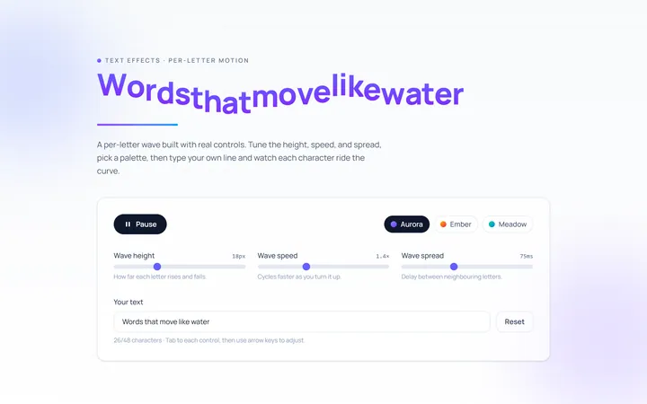
Wave Text Effect
Originalwavy letter animation
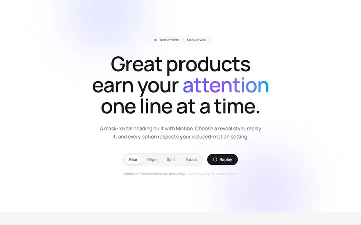
Reveal Mask Text Effect
Originalmask reveal heading
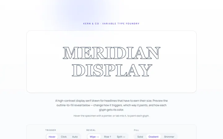
Outline Text Effect
Originaloutline-to-fill text
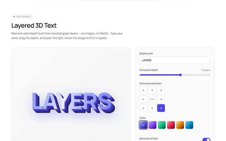
3D Text Effect
Originallayered 3D text