

Cards Timeline
Original · freetimeline with card entries
Copy prompt gives Claude Code, Cursor or v0 a ready-to-paste prompt that recreates this exact component.
npx shadcn@latest add https://webinnoventix.com/r/tl-cards.json"use client";
import { useCallback, useId, useMemo, useRef, useState } from "react";
import type { KeyboardEvent, ReactElement } from "react";
import { motion, useReducedMotion } from "motion/react";
type EntryType = "release" | "feature" | "fix" | "milestone";
type FilterKey = "all" | EntryType;
interface TimelineEntry {
id: string;
date: string;
version?: string;
type: EntryType;
title: string;
summary: string;
details: string[];
}
interface TypeMeta {
label: string;
dot: string;
ring: string;
badge: string;
Icon: () => ReactElement;
}
const ReleaseIcon = () => (
<svg viewBox="0 0 24 24" fill="none" aria-hidden="true" className="h-3.5 w-3.5">
<path
d="M13.5 3.5c3.2.6 5.6 3 6.8 6.2-2 4.4-5.8 8-10.4 9.6l-2.2-2.2C9 12.5 12.6 8.7 17 6.7c-.4-1.3-1.6-2.6-3.5-3.2Z"
stroke="currentColor"
strokeWidth="1.6"
strokeLinejoin="round"
/>
<circle cx="14.5" cy="9" r="1.6" stroke="currentColor" strokeWidth="1.6" />
<path d="M7.5 16.5 4 20M6 13c-1.4.3-2.4 1.4-2.6 3 1.6-.2 2.7-1.2 3-2.6" stroke="currentColor" strokeWidth="1.6" strokeLinecap="round" strokeLinejoin="round" />
</svg>
);
const FeatureIcon = () => (
<svg viewBox="0 0 24 24" fill="none" aria-hidden="true" className="h-3.5 w-3.5">
<path d="M12 3.5 13.8 9l5.5 1.8-5.5 1.8L12 18l-1.8-5.4L4.7 10.8 10.2 9 12 3.5Z" stroke="currentColor" strokeWidth="1.6" strokeLinejoin="round" />
<path d="M19 4v3M20.5 5.5h-3" stroke="currentColor" strokeWidth="1.6" strokeLinecap="round" />
</svg>
);
const FixIcon = () => (
<svg viewBox="0 0 24 24" fill="none" aria-hidden="true" className="h-3.5 w-3.5">
<path
d="M14.5 6.2a3.6 3.6 0 0 0 4.6 4.6l-8 8a2.3 2.3 0 0 1-3.2-3.2l6.6-9.4Z"
stroke="currentColor"
strokeWidth="1.6"
strokeLinejoin="round"
/>
<path d="m8.4 12-3-3a2.3 2.3 0 0 1 3.2-3.2l3 3" stroke="currentColor" strokeWidth="1.6" strokeLinecap="round" strokeLinejoin="round" />
</svg>
);
const MilestoneIcon = () => (
<svg viewBox="0 0 24 24" fill="none" aria-hidden="true" className="h-3.5 w-3.5">
<path d="M6 21V4.5" stroke="currentColor" strokeWidth="1.6" strokeLinecap="round" />
<path d="M6 5h11l-2 3 2 3H6" stroke="currentColor" strokeWidth="1.6" strokeLinejoin="round" />
</svg>
);
const TYPE_META: Record<EntryType, TypeMeta> = {
release: {
label: "Release",
dot: "bg-indigo-500",
ring: "ring-indigo-400/40 dark:ring-indigo-400/30",
badge:
"bg-indigo-100 text-indigo-700 ring-1 ring-indigo-200 dark:bg-indigo-500/15 dark:text-indigo-300 dark:ring-indigo-400/20",
Icon: ReleaseIcon,
},
feature: {
label: "Feature",
dot: "bg-violet-500",
ring: "ring-violet-400/40 dark:ring-violet-400/30",
badge:
"bg-violet-100 text-violet-700 ring-1 ring-violet-200 dark:bg-violet-500/15 dark:text-violet-300 dark:ring-violet-400/20",
Icon: FeatureIcon,
},
fix: {
label: "Fix",
dot: "bg-sky-500",
ring: "ring-sky-400/40 dark:ring-sky-400/30",
badge:
"bg-sky-100 text-sky-700 ring-1 ring-sky-200 dark:bg-sky-500/15 dark:text-sky-300 dark:ring-sky-400/20",
Icon: FixIcon,
},
milestone: {
label: "Milestone",
dot: "bg-emerald-500",
ring: "ring-emerald-400/40 dark:ring-emerald-400/30",
badge:
"bg-emerald-100 text-emerald-700 ring-1 ring-emerald-200 dark:bg-emerald-500/15 dark:text-emerald-300 dark:ring-emerald-400/20",
Icon: MilestoneIcon,
},
};
const ENTRIES: TimelineEntry[] = [
{
id: "e-42",
date: "Jul 9, 2026",
version: "v4.2",
type: "release",
title: "Realtime cohorts",
summary:
"Cohort tables now recompute as events stream in — no manual refresh, no stale funnels during a launch.",
details: [
"Sub-second propagation from ingestion to the cohort grid.",
"Incremental materialization keeps large cohorts under 200ms to redraw.",
"Backfill up to 90 days when you edit a cohort definition.",
],
},
{
id: "e-snip",
date: "Jun 18, 2026",
type: "feature",
title: "Saved SQL snippets",
summary:
"Store reusable query fragments and drop them into any exploration with a slash command.",
details: [
"Workspace-shared snippets with per-team visibility controls.",
"Parameterized placeholders resolve against the active date range.",
],
},
{
id: "e-tz",
date: "May 30, 2026",
type: "fix",
title: "Timezone drift in scheduled exports",
summary:
"CSV and Parquet exports now honor the viewer's timezone instead of defaulting to UTC at midnight.",
details: [
"Fixed off-by-one day bucketing for accounts east of UTC+8.",
"Historical exports can be re-run with the corrected boundaries.",
],
},
{
id: "e-10k",
date: "Apr 22, 2026",
type: "milestone",
title: "10,000 teams on Meridian",
summary:
"We crossed ten thousand active teams — from two-person studios to public companies analyzing billions of events a day.",
details: [
"Peak ingestion reached 4.1 million events per second.",
"Median query returns in 340ms across the fleet.",
],
},
{
id: "e-41",
date: "Mar 11, 2026",
version: "v4.1",
type: "release",
title: "Warehouse-native sync",
summary:
"Query your Snowflake and BigQuery tables directly — Meridian pushes down joins instead of copying data.",
details: [
"Zero-copy connections for Snowflake, BigQuery, and Redshift.",
"Column-level lineage surfaces which models feed each metric.",
"Row-level security policies are respected end to end.",
],
},
{
id: "e-anom",
date: "Feb 3, 2026",
type: "feature",
title: "Anomaly alerts",
summary:
"Get notified when a metric breaks its seasonal band, with the likely contributing segment attached.",
details: [
"Forecasting adapts to weekly and campaign-driven seasonality.",
"Alerts route to Slack, email, or a signed webhook.",
],
},
];
const FILTERS: { key: FilterKey; label: string }[] = [
{ key: "all", label: "All" },
{ key: "release", label: "Releases" },
{ key: "feature", label: "Features" },
{ key: "fix", label: "Fixes" },
{ key: "milestone", label: "Milestones" },
];
export default function TlCards() {
const reduce = useReducedMotion();
const uid = useId();
const [filter, setFilter] = useState<FilterKey>("all");
const [openId, setOpenId] = useState<string | null>("e-42");
const radioRefs = useRef<Array<HTMLButtonElement | null>>([]);
const counts = useMemo(() => {
const base: Record<FilterKey, number> = {
all: ENTRIES.length,
release: 0,
feature: 0,
fix: 0,
milestone: 0,
};
for (const entry of ENTRIES) base[entry.type] += 1;
return base;
}, []);
const visible = useMemo(
() => (filter === "all" ? ENTRIES : ENTRIES.filter((e) => e.type === filter)),
[filter],
);
const onRadioKeyDown = useCallback(
(event: KeyboardEvent<HTMLButtonElement>, index: number) => {
const last = FILTERS.length - 1;
let next = index;
if (event.key === "ArrowRight" || event.key === "ArrowDown") next = index === last ? 0 : index + 1;
else if (event.key === "ArrowLeft" || event.key === "ArrowUp") next = index === 0 ? last : index - 1;
else if (event.key === "Home") next = 0;
else if (event.key === "End") next = last;
else return;
event.preventDefault();
setFilter(FILTERS[next].key);
radioRefs.current[next]?.focus();
},
[],
);
const reveal = reduce
? {}
: {
initial: { opacity: 0, y: 22 },
whileInView: { opacity: 1, y: 0 },
viewport: { once: true, margin: "-64px" as const },
};
return (
<section className="relative w-full overflow-hidden bg-slate-50 py-20 text-slate-900 dark:bg-slate-950 dark:text-slate-100 sm:py-28">
<style>{`
@keyframes tlcards_pulse {
0% { transform: scale(1); opacity: 0.55; }
70% { transform: scale(2.4); opacity: 0; }
100% { transform: scale(2.4); opacity: 0; }
}
@keyframes tlcards_flow {
0% { background-position: 0 0; }
100% { background-position: 0 -320px; }
}
.tlcards-pulse::after {
content: "";
position: absolute;
inset: 0;
border-radius: 9999px;
background: currentColor;
animation: tlcards_pulse 2.6s ease-out infinite;
}
.tlcards-spine {
background-image: linear-gradient(to bottom, currentColor 55%, transparent 55%);
background-size: 2px 14px;
animation: tlcards_flow 9s linear infinite;
}
@media (prefers-reduced-motion: reduce) {
.tlcards-pulse::after { animation: none; }
.tlcards-spine { animation: none; }
}
`}</style>
{/* atmospheric wash */}
<div
aria-hidden="true"
className="pointer-events-none absolute inset-x-0 top-0 h-72 bg-[radial-gradient(60%_100%_at_50%_0%,rgba(99,102,241,0.14),transparent_70%)] dark:bg-[radial-gradient(60%_100%_at_50%_0%,rgba(129,140,248,0.16),transparent_70%)]"
/>
<div className="relative mx-auto max-w-3xl px-5 sm:px-8">
<header className="mb-12 sm:mb-14">
<span className="inline-flex items-center gap-2 rounded-full bg-white px-3 py-1 text-xs font-medium uppercase tracking-[0.18em] text-indigo-600 ring-1 ring-slate-200 dark:bg-slate-900 dark:text-indigo-300 dark:ring-slate-800">
<span className="h-1.5 w-1.5 rounded-full bg-indigo-500" />
Changelog
</span>
<h2 className="mt-5 text-balance text-3xl font-semibold tracking-tight text-slate-900 dark:text-white sm:text-4xl">
Everything we shipped to Meridian
</h2>
<p className="mt-3 max-w-xl text-pretty text-base leading-relaxed text-slate-600 dark:text-slate-400">
A running record of releases, features, fixes, and the milestones in between. Filter the
stream, then open any entry for the specifics.
</p>
<div
role="radiogroup"
aria-label="Filter timeline entries by type"
className="mt-7 flex flex-wrap gap-2"
>
{FILTERS.map((item, index) => {
const active = filter === item.key;
return (
<button
key={item.key}
ref={(el) => {
radioRefs.current[index] = el;
}}
role="radio"
aria-checked={active}
tabIndex={active ? 0 : -1}
onClick={() => setFilter(item.key)}
onKeyDown={(event) => onRadioKeyDown(event, index)}
className={[
"inline-flex items-center gap-2 rounded-full px-4 py-2 text-sm font-medium transition-colors",
"focus-visible:outline-none focus-visible:ring-2 focus-visible:ring-indigo-500 focus-visible:ring-offset-2 focus-visible:ring-offset-slate-50 dark:focus-visible:ring-offset-slate-950",
active
? "bg-slate-900 text-white ring-1 ring-slate-900 dark:bg-white dark:text-slate-900 dark:ring-white"
: "bg-white text-slate-600 ring-1 ring-slate-200 hover:text-slate-900 hover:ring-slate-300 dark:bg-slate-900 dark:text-slate-400 dark:ring-slate-800 dark:hover:text-slate-100 dark:hover:ring-slate-700",
].join(" ")}
>
{item.label}
<span
className={[
"rounded-full px-1.5 py-0.5 text-[11px] font-semibold tabular-nums",
active
? "bg-white/20 text-white dark:bg-slate-900/15 dark:text-slate-900"
: "bg-slate-100 text-slate-500 dark:bg-slate-800 dark:text-slate-400",
].join(" ")}
>
{counts[item.key]}
</span>
</button>
);
})}
</div>
<p className="sr-only" aria-live="polite">
Showing {visible.length} {visible.length === 1 ? "entry" : "entries"}
{filter === "all" ? "" : ` of type ${filter}`}.
</p>
</header>
<ol className="relative">
{/* animated spine */}
<span
aria-hidden="true"
className="tlcards-spine absolute bottom-2 left-[11px] top-2 w-0.5 text-slate-300 dark:text-slate-700 sm:left-[15px]"
/>
{visible.map((entry, index) => {
const meta = TYPE_META[entry.type];
const isOpen = openId === entry.id;
const regionId = `${uid}-panel-${entry.id}`;
const buttonId = `${uid}-trigger-${entry.id}`;
const Icon = meta.Icon;
return (
<motion.li
key={entry.id}
{...reveal}
transition={
reduce ? undefined : { duration: 0.5, ease: "easeOut", delay: index * 0.05 }
}
className="relative pb-8 pl-10 last:pb-0 sm:pl-14"
>
{/* node */}
<span className="absolute left-0 top-1.5 flex h-6 w-6 items-center justify-center sm:h-8 sm:w-8">
<span
className={[
"relative flex h-6 w-6 items-center justify-center rounded-full text-white ring-4 ring-slate-50 dark:ring-slate-950 sm:h-8 sm:w-8",
meta.dot,
].join(" ")}
>
<span className={isOpen ? "tlcards-pulse absolute inset-0 rounded-full" : "hidden"} />
<Icon />
</span>
</span>
<div
className={[
"group rounded-2xl border bg-white p-5 shadow-sm transition-colors dark:bg-slate-900 sm:p-6",
isOpen
? "border-slate-300 dark:border-slate-600"
: "border-slate-200 hover:border-slate-300 dark:border-slate-800 dark:hover:border-slate-700",
].join(" ")}
>
<div className="flex flex-wrap items-center gap-x-3 gap-y-2">
<span
className={[
"inline-flex items-center gap-1.5 rounded-full px-2.5 py-1 text-xs font-medium",
meta.badge,
].join(" ")}
>
<Icon />
{meta.label}
</span>
{entry.version ? (
<span className="rounded-md bg-slate-100 px-2 py-1 font-mono text-xs font-medium text-slate-600 dark:bg-slate-800 dark:text-slate-300">
{entry.version}
</span>
) : null}
<time className="ml-auto text-xs font-medium tabular-nums text-slate-400 dark:text-slate-500">
{entry.date}
</time>
</div>
<h3 className="mt-3 text-lg font-semibold tracking-tight text-slate-900 dark:text-white">
{entry.title}
</h3>
<p className="mt-1.5 text-sm leading-relaxed text-slate-600 dark:text-slate-400">
{entry.summary}
</p>
<button
id={buttonId}
type="button"
aria-expanded={isOpen}
aria-controls={regionId}
onClick={() => setOpenId((prev) => (prev === entry.id ? null : entry.id))}
className="mt-4 inline-flex items-center gap-1.5 rounded-md text-sm font-semibold text-indigo-600 transition-colors hover:text-indigo-500 focus-visible:outline-none focus-visible:ring-2 focus-visible:ring-indigo-500 focus-visible:ring-offset-2 focus-visible:ring-offset-white dark:text-indigo-300 dark:hover:text-indigo-200 dark:focus-visible:ring-offset-slate-900"
>
{isOpen ? "Hide details" : "What changed"}
<svg
viewBox="0 0 24 24"
fill="none"
aria-hidden="true"
className={[
"h-4 w-4 transition-transform duration-300",
isOpen ? "rotate-180" : "",
].join(" ")}
>
<path d="m6 9 6 6 6-6" stroke="currentColor" strokeWidth="2" strokeLinecap="round" strokeLinejoin="round" />
</svg>
</button>
<div
id={regionId}
role="region"
aria-labelledby={buttonId}
hidden={!isOpen}
className="grid transition-all duration-300 ease-out motion-reduce:transition-none"
style={{ gridTemplateRows: isOpen ? "1fr" : "0fr" }}
>
<div className="overflow-hidden">
<ul className="mt-4 space-y-2.5 border-t border-slate-200 pt-4 dark:border-slate-800">
{entry.details.map((detail) => (
<li key={detail} className="flex gap-2.5 text-sm leading-relaxed text-slate-600 dark:text-slate-300">
<svg viewBox="0 0 24 24" fill="none" aria-hidden="true" className="mt-0.5 h-4 w-4 flex-none text-emerald-500">
<path d="m5 12 4.5 4.5L19 7" stroke="currentColor" strokeWidth="2.2" strokeLinecap="round" strokeLinejoin="round" />
</svg>
<span>{detail}</span>
</li>
))}
</ul>
</div>
</div>
</div>
</motion.li>
);
})}
</ol>
<div className="relative mt-6 pl-10 sm:pl-14">
<span
aria-hidden="true"
className="absolute left-0 top-1 flex h-6 w-6 items-center justify-center sm:h-8 sm:w-8"
>
<span className="h-2.5 w-2.5 rounded-full bg-slate-300 ring-4 ring-slate-50 dark:bg-slate-600 dark:ring-slate-950" />
</span>
<p className="text-sm text-slate-400 dark:text-slate-500">
That’s the start of the log — Meridian shipped its first public build in 2021.
</p>
</div>
</div>
</section>
);
}Dependencies
Licence
Built by Web Innoventix. Free for personal and commercial use, no attribution required.
Built by Web Innoventix
Need a custom interface, a full website, or SEO that gets you cited by AI? We design, build and rank it end to end.
Get a free quoteSimilar components
Browse all →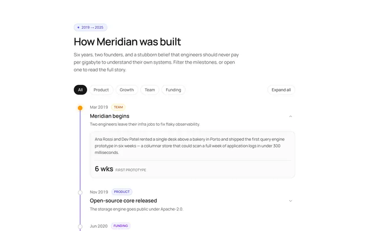
Vertical Timeline
Originalvertical timeline with dots
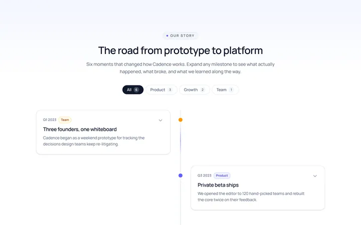
Centered Timeline
Originalcentred alternating timeline
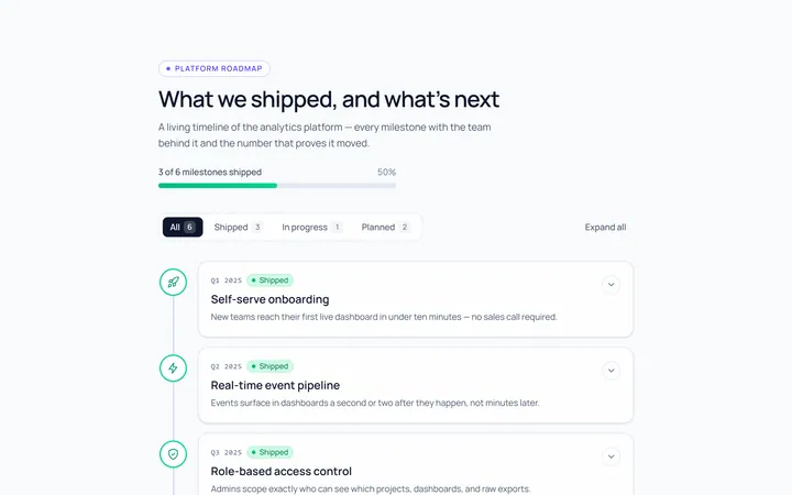
Icons Timeline
Originaltimeline with icon nodes
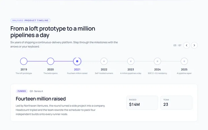
Horizontal Timeline
Originalhorizontal timeline
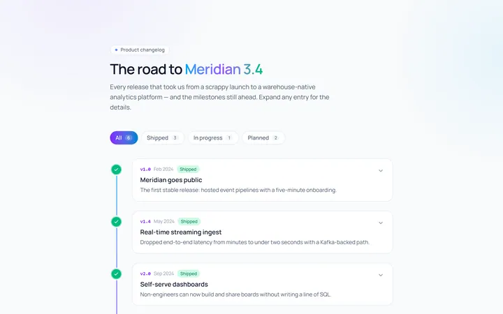
Gradient Timeline
Originaltimeline with a gradient line
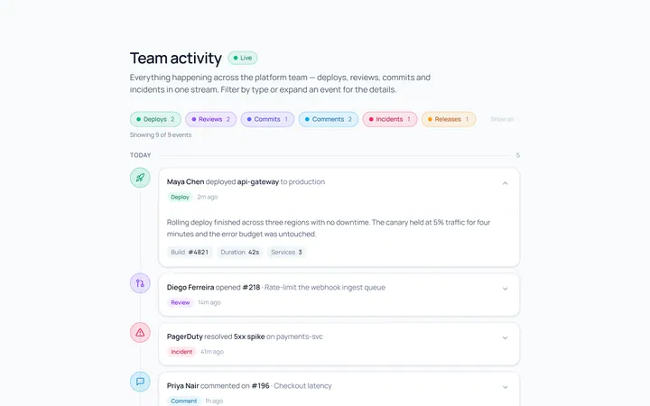
Activity Timeline
Originalactivity feed timeline
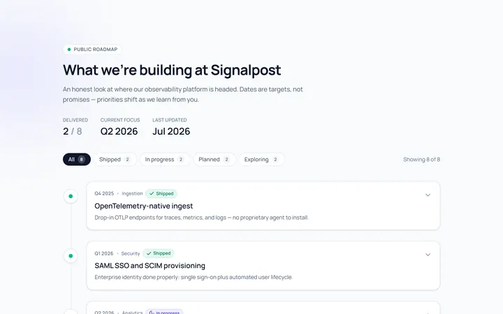
Roadmap Timeline
Originalproduct roadmap timeline
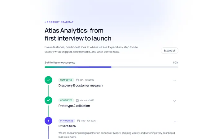
Numbered Timeline
Originalnumbered milestone timeline
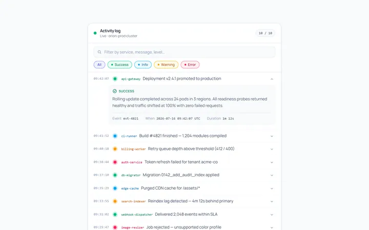
Compact Timeline
Originalcompact log timeline

Spotlight Hero
OriginalA centred hero with a soft radial spotlight, badge and dual call-to-action.

Split Hero
OriginalA two-column hero pairing a headline and CTAs with a product mock and social proof.

Gradient Spotlight Hero
OriginalA minimal centred hero with a soft gradient-mesh backdrop, announcement pill and dual call-to-action buttons.