

Gradient Timeline
Original · freetimeline with a gradient line
Copy prompt gives Claude Code, Cursor or v0 a ready-to-paste prompt that recreates this exact component.
npx shadcn@latest add https://webinnoventix.com/r/tl-gradient.json"use client";
import { useId, useMemo, useState } from "react";
import { AnimatePresence, motion, useReducedMotion } from "motion/react";
type Status = "shipped" | "progress" | "planned";
interface Milestone {
id: string;
date: string;
version: string;
title: string;
summary: string;
status: Status;
points: string[];
}
const MILESTONES: Milestone[] = [
{
id: "v1",
date: "Feb 2024",
version: "v1.0",
title: "Meridian goes public",
summary: "The first stable release: hosted event pipelines with a five-minute onboarding.",
status: "shipped",
points: [
"Managed ingestion for Postgres, Segment, and raw HTTP events",
"SOC 2 Type II controls in place from day one",
"Sub-second p95 query latency on datasets up to 50M rows",
],
},
{
id: "v14",
date: "May 2024",
version: "v1.4",
title: "Real-time streaming ingest",
summary: "Dropped end-to-end latency from minutes to under two seconds with a Kafka-backed path.",
status: "shipped",
points: [
"Exactly-once delivery guarantees across replicas",
"Backpressure handling that survives 10x traffic spikes",
"Live tail view for debugging events as they land",
],
},
{
id: "v2",
date: "Sep 2024",
version: "v2.0",
title: "Self-serve dashboards",
summary: "Non-engineers can now build and share boards without writing a line of SQL.",
status: "shipped",
points: [
"Drag-and-drop chart builder with 14 visualization types",
"Row-level permissions scoped to workspace roles",
"Scheduled exports to Slack, email, and Google Sheets",
],
},
{
id: "v26",
date: "Jan 2026",
version: "v2.6",
title: "Semantic query layer",
summary: "A shared metrics catalog so every team reads the same definition of 'active user'.",
status: "progress",
points: [
"Version-controlled metric definitions in plain YAML",
"Automatic lineage from raw table to final chart",
"Currently in private beta with 40 design partners",
],
},
{
id: "v3",
date: "Q2 2026",
version: "v3.0",
title: "Warehouse-native models",
summary: "Push compute down to Snowflake and BigQuery instead of copying data out.",
status: "planned",
points: [
"Zero-copy connectors that respect existing warehouse RBAC",
"Incremental materialization to keep cloud spend predictable",
"Bring-your-own dbt project support",
],
},
{
id: "v34",
date: "Q4 2026",
version: "v3.4",
title: "Anomaly alerting",
summary: "Forecast-aware alerts that page you before a metric quietly falls off a cliff.",
status: "planned",
points: [
"Seasonality-aware baselines, not naive thresholds",
"Root-cause hints that link the alert to the upstream change",
"PagerDuty and Opsgenie routing out of the box",
],
},
];
const STATUS_META: Record<Status, { label: string; badge: string; dot: string; ring: string }> = {
shipped: {
label: "Shipped",
badge:
"bg-emerald-100 text-emerald-700 dark:bg-emerald-500/15 dark:text-emerald-300",
dot: "bg-emerald-500",
ring: "ring-emerald-500/40 dark:ring-emerald-400/40",
},
progress: {
label: "In progress",
badge: "bg-amber-100 text-amber-700 dark:bg-amber-500/15 dark:text-amber-300",
dot: "bg-amber-500",
ring: "ring-amber-500/40 dark:ring-amber-400/40",
},
planned: {
label: "Planned",
badge: "bg-sky-100 text-sky-700 dark:bg-sky-500/15 dark:text-sky-300",
dot: "bg-sky-500",
ring: "ring-sky-500/40 dark:ring-sky-400/40",
},
};
type FilterKey = "all" | Status;
const FILTERS: { key: FilterKey; label: string }[] = [
{ key: "all", label: "All" },
{ key: "shipped", label: "Shipped" },
{ key: "progress", label: "In progress" },
{ key: "planned", label: "Planned" },
];
function ChevronIcon({ className }: { className?: string }) {
return (
<svg
className={className}
viewBox="0 0 20 20"
fill="none"
stroke="currentColor"
strokeWidth={1.75}
strokeLinecap="round"
strokeLinejoin="round"
aria-hidden="true"
>
<path d="M6 8l4 4 4-4" />
</svg>
);
}
function StatusGlyph({ status, className }: { status: Status; className?: string }) {
if (status === "shipped") {
return (
<svg className={className} viewBox="0 0 20 20" fill="none" stroke="currentColor" strokeWidth={2} strokeLinecap="round" strokeLinejoin="round" aria-hidden="true">
<path d="M4 10.5l3.5 3.5L16 5.5" />
</svg>
);
}
if (status === "progress") {
return (
<svg className={className} viewBox="0 0 20 20" fill="none" stroke="currentColor" strokeWidth={2} strokeLinecap="round" aria-hidden="true">
<path d="M10 3.5a6.5 6.5 0 1 0 6.5 6.5" />
</svg>
);
}
return (
<svg className={className} viewBox="0 0 20 20" fill="none" stroke="currentColor" strokeWidth={2} strokeLinecap="round" strokeLinejoin="round" aria-hidden="true">
<circle cx="10" cy="10" r="6.75" />
<path d="M10 6.5V10l2.5 1.5" />
</svg>
);
}
export default function TlGradient() {
const reduce = useReducedMotion();
const uid = useId();
const [filter, setFilter] = useState<FilterKey>("all");
const [open, setOpen] = useState<Set<string>>(() => new Set(["v26"]));
const counts = useMemo(() => {
const base: Record<FilterKey, number> = {
all: MILESTONES.length,
shipped: 0,
progress: 0,
planned: 0,
};
for (const m of MILESTONES) base[m.status] += 1;
return base;
}, []);
const visible = useMemo(
() => (filter === "all" ? MILESTONES : MILESTONES.filter((m) => m.status === filter)),
[filter],
);
function toggle(id: string) {
setOpen((prev) => {
const next = new Set(prev);
if (next.has(id)) next.delete(id);
else next.add(id);
return next;
});
}
const panelTransition = reduce ? { duration: 0 } : { duration: 0.28, ease: [0.22, 1, 0.36, 1] as const };
return (
<section className="relative w-full overflow-hidden bg-slate-50 py-20 text-slate-900 sm:py-28 dark:bg-slate-950 dark:text-slate-100">
{/* atmospheric backdrop */}
<div
aria-hidden="true"
className="pointer-events-none absolute inset-0 opacity-70 [background:radial-gradient(38rem_38rem_at_15%_-5%,theme(colors.violet.500/0.12),transparent_60%),radial-gradient(32rem_32rem_at_100%_10%,theme(colors.sky.500/0.10),transparent_55%)] dark:opacity-100"
/>
<div className="relative mx-auto max-w-3xl px-5 sm:px-6">
<header className="mb-10 sm:mb-12">
<span className="inline-flex items-center gap-2 rounded-full border border-slate-200 bg-white/70 px-3 py-1 text-xs font-medium tracking-wide text-slate-600 backdrop-blur dark:border-slate-800 dark:bg-slate-900/60 dark:text-slate-300">
<span className="h-1.5 w-1.5 rounded-full bg-gradient-to-r from-sky-400 to-violet-500" />
Product changelog
</span>
<h2 className="mt-4 text-3xl font-semibold tracking-tight sm:text-4xl">
The road to{" "}
<span className="bg-gradient-to-r from-sky-500 via-violet-500 to-emerald-500 bg-clip-text text-transparent">
Meridian 3.4
</span>
</h2>
<p className="mt-3 max-w-xl text-sm leading-relaxed text-slate-600 sm:text-base dark:text-slate-400">
Every release that took us from a scrappy launch to a warehouse-native analytics
platform — and the milestones still ahead. Expand any entry for the details.
</p>
</header>
{/* Filters */}
<div
role="group"
aria-label="Filter milestones by status"
className="mb-9 flex flex-wrap gap-2"
>
{FILTERS.map((f) => {
const active = filter === f.key;
return (
<button
key={f.key}
type="button"
aria-pressed={active}
onClick={() => setFilter(f.key)}
className={[
"inline-flex items-center gap-2 rounded-full px-3.5 py-1.5 text-sm font-medium transition-colors",
"focus:outline-none focus-visible:ring-2 focus-visible:ring-violet-500 focus-visible:ring-offset-2 focus-visible:ring-offset-slate-50 dark:focus-visible:ring-offset-slate-950",
active
? "bg-gradient-to-r from-violet-600 to-sky-600 text-white shadow-sm"
: "border border-slate-200 bg-white text-slate-600 hover:border-slate-300 hover:text-slate-900 dark:border-slate-800 dark:bg-slate-900 dark:text-slate-300 dark:hover:border-slate-700 dark:hover:text-slate-100",
].join(" ")}
>
{f.label}
<span
className={[
"rounded-full px-1.5 py-0.5 text-[0.68rem] leading-none tabular-nums",
active ? "bg-white/20 text-white" : "bg-slate-100 text-slate-500 dark:bg-slate-800 dark:text-slate-400",
].join(" ")}
>
{counts[f.key]}
</span>
</button>
);
})}
</div>
{/* Timeline */}
<ol className="relative">
{/* gradient rail */}
<span
aria-hidden="true"
className="absolute left-4 top-3 bottom-3 w-0.5 rounded-full bg-gradient-to-b from-sky-400 via-violet-500 to-emerald-400"
/>
{/* shimmer overlay travelling down the rail */}
<span
aria-hidden="true"
className="tlgrad-flow absolute left-4 top-3 h-24 w-0.5 -translate-x-[1px] rounded-full bg-gradient-to-b from-transparent via-white/70 to-transparent dark:via-white/40"
/>
<AnimatePresence initial={false} mode="popLayout">
{visible.map((m, i) => {
const meta = STATUS_META[m.status];
const isOpen = open.has(m.id);
const btnId = `${uid}-btn-${m.id}`;
const panelId = `${uid}-panel-${m.id}`;
return (
<motion.li
key={m.id}
layout={!reduce}
initial={reduce ? false : { opacity: 0, y: 12 }}
animate={{ opacity: 1, y: 0 }}
exit={reduce ? { opacity: 0 } : { opacity: 0, y: -8 }}
transition={reduce ? { duration: 0 } : { duration: 0.3, delay: i * 0.04, ease: [0.22, 1, 0.36, 1] as const }}
className="relative pb-6 pl-12 last:pb-0 sm:pl-14"
>
{/* node on the rail */}
<span
aria-hidden="true"
className={[
"absolute left-4 top-4 flex h-6 w-6 -translate-x-1/2 items-center justify-center rounded-full text-white ring-4 ring-slate-50 dark:ring-slate-950",
meta.dot,
].join(" ")}
>
<span
className={[
"absolute inset-0 rounded-full ring-2",
meta.ring,
isOpen && !reduce ? "tlgrad-pulse" : "",
].join(" ")}
/>
<StatusGlyph status={m.status} className="relative h-3.5 w-3.5" />
</span>
<div
className={[
"rounded-2xl border bg-white transition-colors dark:bg-slate-900/60",
isOpen
? "border-violet-300 shadow-lg shadow-violet-500/5 dark:border-violet-500/40"
: "border-slate-200 dark:border-slate-800",
].join(" ")}
>
<h3>
<button
id={btnId}
type="button"
aria-expanded={isOpen}
aria-controls={panelId}
onClick={() => toggle(m.id)}
className="group flex w-full items-start gap-3 rounded-2xl px-5 py-4 text-left focus:outline-none focus-visible:ring-2 focus-visible:ring-violet-500 focus-visible:ring-offset-2 focus-visible:ring-offset-slate-50 dark:focus-visible:ring-offset-slate-950"
>
<div className="min-w-0 flex-1">
<div className="flex flex-wrap items-center gap-2">
<span className="font-mono text-xs font-semibold text-violet-600 dark:text-violet-400">
{m.version}
</span>
<span className="text-xs text-slate-400 dark:text-slate-500">
{m.date}
</span>
<span
className={[
"inline-flex items-center gap-1 rounded-full px-2 py-0.5 text-[0.68rem] font-medium",
meta.badge,
].join(" ")}
>
{meta.label}
</span>
</div>
<p className="mt-1.5 text-base font-semibold leading-snug text-slate-900 dark:text-slate-100">
{m.title}
</p>
<p className="mt-1 text-sm leading-relaxed text-slate-600 dark:text-slate-400">
{m.summary}
</p>
</div>
<ChevronIcon
className={[
"mt-1 h-5 w-5 shrink-0 text-slate-400 transition-transform duration-300 group-hover:text-slate-600 dark:group-hover:text-slate-200",
isOpen ? "rotate-180" : "",
].join(" ")}
/>
</button>
</h3>
<AnimatePresence initial={false}>
{isOpen && (
<motion.div
key="panel"
id={panelId}
role="region"
aria-labelledby={btnId}
initial={{ height: 0, opacity: 0 }}
animate={{ height: "auto", opacity: 1 }}
exit={{ height: 0, opacity: 0 }}
transition={panelTransition}
className="overflow-hidden"
>
<ul className="space-y-2.5 border-t border-slate-100 px-5 pb-5 pt-4 dark:border-slate-800">
{m.points.map((point) => (
<li
key={point}
className="flex items-start gap-2.5 text-sm leading-relaxed text-slate-700 dark:text-slate-300"
>
<span
aria-hidden="true"
className={["mt-1.5 h-1.5 w-1.5 shrink-0 rounded-full", meta.dot].join(" ")}
/>
<span>{point}</span>
</li>
))}
</ul>
</motion.div>
)}
</AnimatePresence>
</div>
</motion.li>
);
})}
</AnimatePresence>
</ol>
{visible.length === 0 && (
<p className="py-8 text-center text-sm text-slate-500 dark:text-slate-400">
No milestones match this filter yet.
</p>
)}
</div>
<style>{`
@keyframes tlgrad-flow {
0% { transform: translate(-1px, 0); opacity: 0; }
12% { opacity: 1; }
88% { opacity: 1; }
100% { transform: translate(-1px, calc(100% + 100vh)); opacity: 0; }
}
@keyframes tlgrad-pulse {
0% { transform: scale(1); opacity: 0.9; }
70% { transform: scale(1.9); opacity: 0; }
100% { transform: scale(1.9); opacity: 0; }
}
.tlgrad-flow {
animation: tlgrad-flow 5.5s cubic-bezier(0.4, 0, 0.2, 1) infinite;
}
.tlgrad-pulse {
animation: tlgrad-pulse 2.2s ease-out infinite;
}
@media (prefers-reduced-motion: reduce) {
.tlgrad-flow, .tlgrad-pulse {
animation: none !important;
}
.tlgrad-flow { opacity: 0 !important; }
}
`}</style>
</section>
);
}Dependencies
Licence
Built by Web Innoventix. Free for personal and commercial use, no attribution required.
Built by Web Innoventix
Need a custom interface, a full website, or SEO that gets you cited by AI? We design, build and rank it end to end.
Get a free quoteSimilar components
Browse all →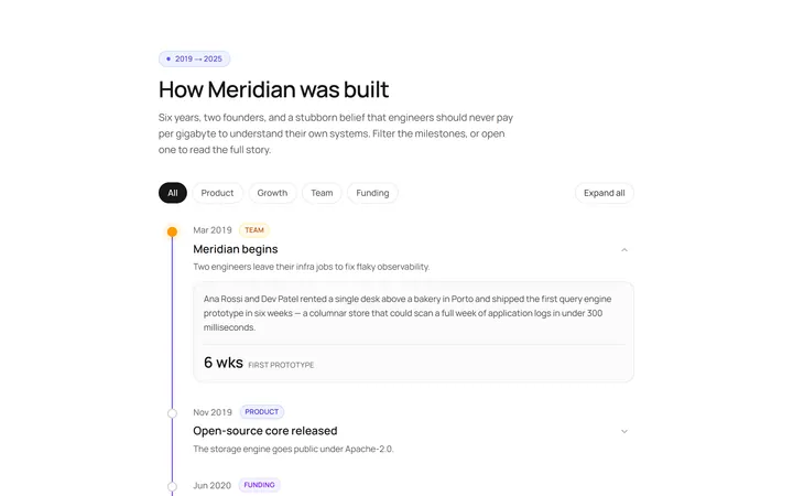
Vertical Timeline
Originalvertical timeline with dots
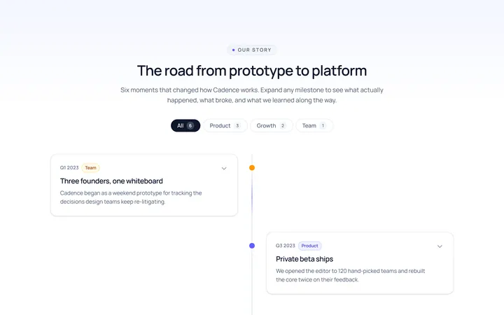
Centered Timeline
Originalcentred alternating timeline
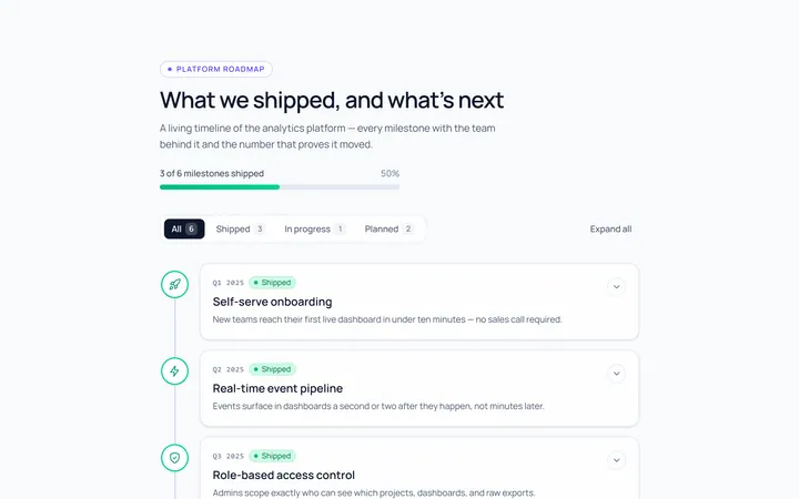
Icons Timeline
Originaltimeline with icon nodes
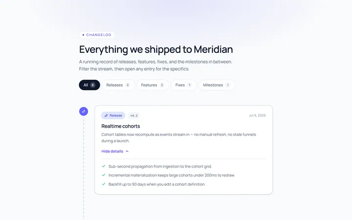
Cards Timeline
Originaltimeline with card entries
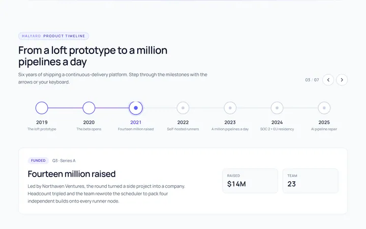
Horizontal Timeline
Originalhorizontal timeline
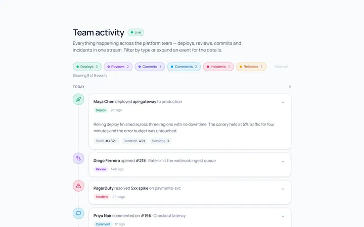
Activity Timeline
Originalactivity feed timeline
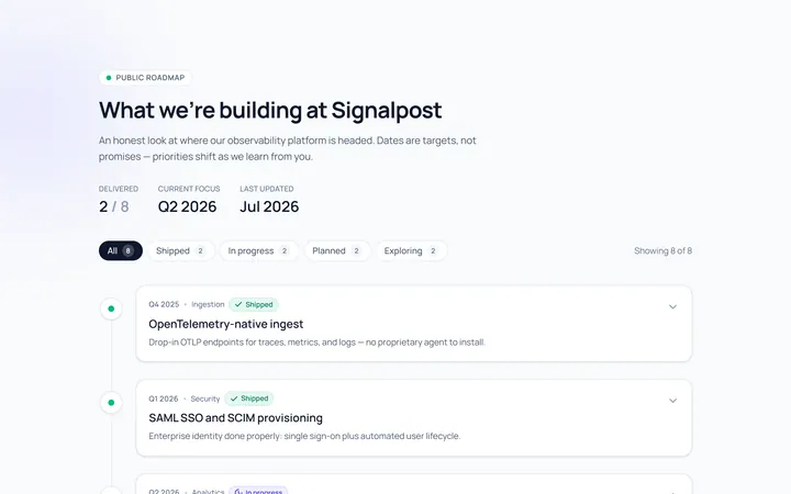
Roadmap Timeline
Originalproduct roadmap timeline
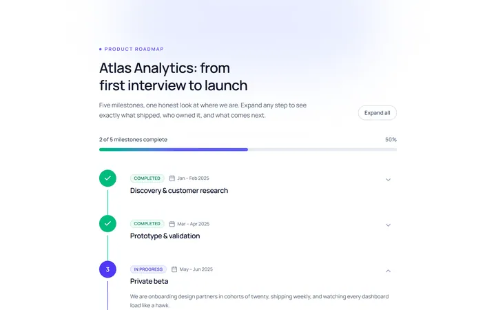
Numbered Timeline
Originalnumbered milestone timeline
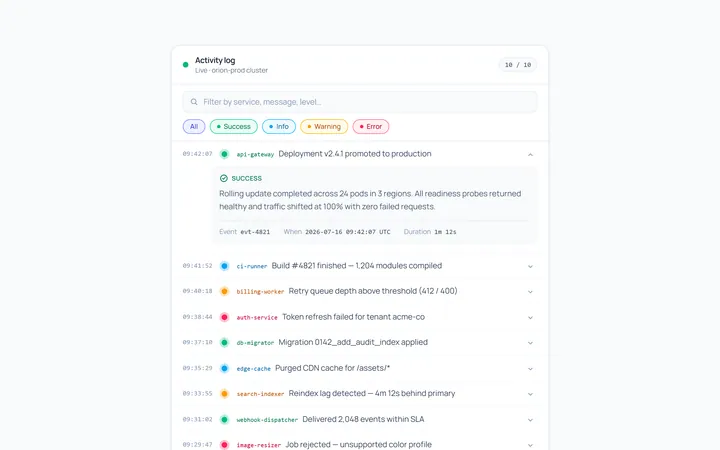
Compact Timeline
Originalcompact log timeline

Spotlight Hero
OriginalA centred hero with a soft radial spotlight, badge and dual call-to-action.

Split Hero
OriginalA two-column hero pairing a headline and CTAs with a product mock and social proof.

Gradient Spotlight Hero
OriginalA minimal centred hero with a soft gradient-mesh backdrop, announcement pill and dual call-to-action buttons.