

Horizontal Timeline
Original · freehorizontal timeline
Copy prompt gives Claude Code, Cursor or v0 a ready-to-paste prompt that recreates this exact component.
npx shadcn@latest add https://webinnoventix.com/r/tl-horizontal.json"use client";
import { useId, useRef, useState, type KeyboardEvent } from "react";
import { AnimatePresence, motion, useReducedMotion } from "motion/react";
type Stat = { label: string; value: string };
type Milestone = {
id: string;
year: string;
period: string;
title: string;
tag: string;
blurb: string;
stats: [Stat, Stat];
};
const MILESTONES: Milestone[] = [
{
id: "loft",
year: "2019",
period: "Q2 · Rotterdam",
title: "The loft prototype",
tag: "Origin",
blurb:
"Two ex-platform engineers rented a corner of a shipping-district co-working loft and shipped the first Halyard runner — a single Go binary that turned a YAML file into a reproducible build in under a minute.",
stats: [
{ label: "Team", value: "2" },
{ label: "Funding", value: "Bootstrapped" },
],
},
{
id: "beta",
year: "2020",
period: "Q1 · Public beta",
title: "The beta opens",
tag: "Launch",
blurb:
"Halyard 0.4 went public. 1,900 developers signed up in the first week, drawn by config that fit on a postcard and logs that streamed live instead of buffering to the very end of the run.",
stats: [
{ label: "Beta signups", value: "1,900" },
{ label: "Avg. build", value: "48s" },
],
},
{
id: "series-a",
year: "2021",
period: "Q3 · Series A",
title: "Fourteen million raised",
tag: "Funded",
blurb:
"Led by Northaven Ventures, the round turned a side project into a company. Headcount tripled and the team rewrote the scheduler to pack four independent builds onto every runner node.",
stats: [
{ label: "Raised", value: "$14M" },
{ label: "Team", value: "23" },
],
},
{
id: "self-hosted",
year: "2022",
period: "Q4 · GA",
title: "Self-hosted runners",
tag: "Release",
blurb:
"Enterprises wanted builds inside their own VPC. Self-hosted runners shipped with signed attestations, so any pipeline could prove exactly which commit and which machine produced every artifact.",
stats: [
{ label: "Enterprise", value: "40+" },
{ label: "Regions", value: "6" },
],
},
{
id: "million",
year: "2023",
period: "Q2 · Scale",
title: "A million pipelines a day",
tag: "Scale",
blurb:
"A quiet Tuesday crossed the seven-figure mark. The control plane held p99 queue latency under 900ms by sharding tenants across independent scheduler cells that fail without taking neighbours down.",
stats: [
{ label: "Pipelines/day", value: "1.2M" },
{ label: "p99 queue", value: "0.9s" },
],
},
{
id: "soc2",
year: "2024",
period: "Q1 · Trust",
title: "SOC 2 + EU residency",
tag: "Trust",
blurb:
"A clean Type II report and a Frankfurt data region unlocked regulated customers. Audit logs became immutable and stream in real time to the customer's own SIEM, no nightly export job required.",
stats: [
{ label: "Uptime", value: "99.98%" },
{ label: "Data regions", value: "3" },
],
},
{
id: "repair",
year: "2025",
period: "Q3 · Today",
title: "AI pipeline repair",
tag: "Today",
blurb:
"Halyard now reads a failed build, proposes the one-line fix, and opens a pull request against the config. Nine of ten flaky-cache failures are resolved before an engineer even opens the tab.",
stats: [
{ label: "Auto-fixed", value: "71%" },
{ label: "Median repair", value: "40s" },
],
},
];
function ChevronIcon({ dir }: { dir: "left" | "right" }) {
return (
<svg
viewBox="0 0 24 24"
aria-hidden="true"
className="h-5 w-5"
fill="none"
stroke="currentColor"
strokeWidth={2.2}
strokeLinecap="round"
strokeLinejoin="round"
>
{dir === "left" ? <path d="M15 6l-6 6 6 6" /> : <path d="M9 6l6 6-6 6" />}
</svg>
);
}
function CheckIcon() {
return (
<svg
viewBox="0 0 24 24"
aria-hidden="true"
className="h-4 w-4"
fill="none"
stroke="currentColor"
strokeWidth={3}
strokeLinecap="round"
strokeLinejoin="round"
>
<path d="M5 12.5l4.5 4.5L19 7" />
</svg>
);
}
export default function TlHorizontal() {
const reduce = useReducedMotion();
const uid = useId();
const [selected, setSelected] = useState(2);
const tabRefs = useRef<Array<HTMLButtonElement | null>>([]);
const count = MILESTONES.length;
const active = MILESTONES[selected];
const inset = 50 / count;
const fillWidth = (selected / count) * 100;
function focusTab(next: number) {
const clamped = Math.max(0, Math.min(count - 1, next));
setSelected(clamped);
tabRefs.current[clamped]?.focus();
}
function onTabKeyDown(event: KeyboardEvent<HTMLButtonElement>, index: number) {
switch (event.key) {
case "ArrowRight":
case "ArrowDown":
event.preventDefault();
focusTab(index + 1);
break;
case "ArrowLeft":
case "ArrowUp":
event.preventDefault();
focusTab(index - 1);
break;
case "Home":
event.preventDefault();
focusTab(0);
break;
case "End":
event.preventDefault();
focusTab(count - 1);
break;
default:
break;
}
}
const panelMotion = reduce
? {
initial: { opacity: 0 },
animate: { opacity: 1 },
exit: { opacity: 0 },
transition: { duration: 0.12 },
}
: {
initial: { opacity: 0, y: 14 },
animate: { opacity: 1, y: 0 },
exit: { opacity: 0, y: -10 },
transition: { duration: 0.34, ease: "easeOut" as const },
};
const ringBase =
"focus-visible:outline-none focus-visible:ring-2 focus-visible:ring-indigo-500 focus-visible:ring-offset-2 focus-visible:ring-offset-white dark:focus-visible:ring-offset-slate-950";
return (
<section className="relative w-full overflow-hidden bg-slate-50 px-6 py-20 text-slate-900 sm:py-28 dark:bg-slate-950 dark:text-slate-100">
<style>{`
@keyframes tlhz-pulse {
0% { transform: scale(1); opacity: 0.55; }
70% { transform: scale(2.1); opacity: 0; }
100% { transform: scale(2.1); opacity: 0; }
}
@keyframes tlhz-sheen {
0% { background-position: 200% 0; }
100% { background-position: -200% 0; }
}
.tlhz-pulse-ring { animation: tlhz-pulse 2.4s ease-out infinite; }
.tlhz-sheen {
background-size: 200% 100%;
animation: tlhz-sheen 3.2s linear infinite;
}
@media (prefers-reduced-motion: reduce) {
.tlhz-pulse-ring, .tlhz-sheen { animation: none !important; }
}
`}</style>
<div
aria-hidden="true"
className="pointer-events-none absolute inset-x-0 top-0 h-px bg-gradient-to-r from-transparent via-indigo-400/60 to-transparent"
/>
<div className="relative mx-auto max-w-6xl">
{/* Header */}
<div className="flex flex-col gap-6 sm:flex-row sm:items-end sm:justify-between">
<div className="max-w-2xl">
<span className="inline-flex items-center gap-2 rounded-full border border-indigo-200 bg-indigo-50 px-3 py-1 text-xs font-semibold uppercase tracking-[0.18em] text-indigo-700 dark:border-indigo-500/30 dark:bg-indigo-500/10 dark:text-indigo-300">
<span className="tlhz-sheen bg-gradient-to-r from-indigo-500 via-violet-400 to-indigo-500 bg-clip-text text-transparent">
Halyard
</span>
Product timeline
</span>
<h2 className="mt-4 text-3xl font-semibold tracking-tight text-slate-900 sm:text-4xl dark:text-white">
From a loft prototype to a million pipelines a day
</h2>
<p className="mt-3 text-base leading-relaxed text-slate-600 dark:text-slate-400">
Six years of shipping a continuous-delivery platform. Step through
the milestones with the arrows or your keyboard.
</p>
</div>
{/* Prev / Next controls */}
<div className="flex shrink-0 items-center gap-3">
<span
className="text-sm font-medium tabular-nums text-slate-500 dark:text-slate-400"
aria-hidden="true"
>
{String(selected + 1).padStart(2, "0")}
<span className="mx-1 text-slate-300 dark:text-slate-600">/</span>
{String(count).padStart(2, "0")}
</span>
<div className="flex items-center gap-2">
<button
type="button"
onClick={() => focusTab(selected - 1)}
disabled={selected === 0}
aria-label="Previous milestone"
className={`inline-flex h-10 w-10 items-center justify-center rounded-full border border-slate-300 bg-white text-slate-700 transition-colors hover:border-indigo-400 hover:text-indigo-600 disabled:cursor-not-allowed disabled:opacity-40 dark:border-slate-700 dark:bg-slate-900 dark:text-slate-200 dark:hover:border-indigo-500 dark:hover:text-indigo-300 ${ringBase}`}
>
<ChevronIcon dir="left" />
</button>
<button
type="button"
onClick={() => focusTab(selected + 1)}
disabled={selected === count - 1}
aria-label="Next milestone"
className={`inline-flex h-10 w-10 items-center justify-center rounded-full border border-slate-300 bg-white text-slate-700 transition-colors hover:border-indigo-400 hover:text-indigo-600 disabled:cursor-not-allowed disabled:opacity-40 dark:border-slate-700 dark:bg-slate-900 dark:text-slate-200 dark:hover:border-indigo-500 dark:hover:text-indigo-300 ${ringBase}`}
>
<ChevronIcon dir="right" />
</button>
</div>
</div>
</div>
{/* Timeline track */}
<div className="mt-14 overflow-x-auto pb-4 [scrollbar-width:thin]">
<div
role="tablist"
aria-label="Halyard milestones"
aria-orientation="horizontal"
className="relative mx-auto min-w-[720px]"
>
{/* base rail */}
<div
aria-hidden="true"
className="absolute top-[22px] h-0.5 -translate-y-1/2 rounded-full bg-slate-200 dark:bg-slate-800"
style={{ left: `${inset}%`, right: `${inset}%` }}
/>
{/* progress fill */}
<motion.div
aria-hidden="true"
className="absolute top-[22px] h-0.5 -translate-y-1/2 rounded-full bg-gradient-to-r from-indigo-500 via-violet-500 to-indigo-500"
style={{ left: `${inset}%` }}
initial={false}
animate={{ width: `${fillWidth}%` }}
transition={
reduce ? { duration: 0 } : { duration: 0.45, ease: "easeOut" }
}
/>
<div className="relative flex items-start">
{MILESTONES.map((m, i) => {
const isActive = i === selected;
const isPast = i < selected;
const tabId = `${uid}-tab-${i}`;
return (
<div
key={m.id}
className="flex flex-1 flex-col items-center px-1"
>
<button
type="button"
role="tab"
id={tabId}
ref={(el) => {
tabRefs.current[i] = el;
}}
aria-selected={isActive}
aria-controls={`${uid}-panel`}
tabIndex={isActive ? 0 : -1}
onClick={() => focusTab(i)}
onKeyDown={(e) => onTabKeyDown(e, i)}
className={`group relative z-10 flex h-11 w-11 items-center justify-center rounded-full border-2 bg-white transition-all dark:bg-slate-950 ${ringBase} ${
isActive
? "border-indigo-500 scale-110 shadow-[0_0_0_4px_rgba(99,102,241,0.14)]"
: isPast
? "border-indigo-500 bg-indigo-500 text-white dark:bg-indigo-500"
: "border-slate-300 text-slate-400 hover:border-indigo-400 dark:border-slate-700 dark:text-slate-500 dark:hover:border-indigo-500"
}`}
>
{isActive && (
<span
aria-hidden="true"
className="tlhz-pulse-ring absolute inset-0 rounded-full bg-indigo-500/25"
/>
)}
{isPast ? (
<CheckIcon />
) : (
<span
aria-hidden="true"
className={`block rounded-full transition-all ${
isActive
? "h-3 w-3 bg-indigo-500"
: "h-2.5 w-2.5 bg-slate-300 group-hover:bg-indigo-400 dark:bg-slate-600"
}`}
/>
)}
</button>
<span
className={`mt-4 text-base font-semibold tabular-nums transition-colors ${
isActive
? "text-indigo-600 dark:text-indigo-300"
: "text-slate-800 dark:text-slate-200"
}`}
>
{m.year}
</span>
<span className="mt-1 max-w-[8.5rem] text-center text-xs leading-snug text-slate-500 dark:text-slate-400">
{m.title}
</span>
</div>
);
})}
</div>
</div>
</div>
{/* Detail panel */}
<div
id={`${uid}-panel`}
role="tabpanel"
aria-labelledby={`${uid}-tab-${selected}`}
tabIndex={0}
className={`mt-10 rounded-2xl border border-slate-200 bg-white p-6 sm:p-8 dark:border-slate-800 dark:bg-slate-900/60 ${ringBase}`}
>
<AnimatePresence mode="wait" initial={false}>
<motion.div
key={active.id}
initial={panelMotion.initial}
animate={panelMotion.animate}
exit={panelMotion.exit}
transition={panelMotion.transition}
className="grid gap-8 md:grid-cols-[1.6fr_1fr] md:items-center"
>
<div>
<div className="flex flex-wrap items-center gap-3">
<span className="inline-flex items-center rounded-full bg-indigo-500/10 px-3 py-1 text-xs font-semibold uppercase tracking-wider text-indigo-700 dark:text-indigo-300">
{active.tag}
</span>
<span className="text-sm font-medium text-slate-500 dark:text-slate-400">
{active.period}
</span>
</div>
<h3 className="mt-4 text-2xl font-semibold tracking-tight text-slate-900 sm:text-3xl dark:text-white">
{active.title}
</h3>
<p className="mt-3 max-w-xl text-base leading-relaxed text-slate-600 dark:text-slate-300">
{active.blurb}
</p>
</div>
<dl className="grid grid-cols-2 gap-4">
{active.stats.map((s) => (
<div
key={s.label}
className="rounded-xl border border-slate-200 bg-slate-50 p-4 dark:border-slate-800 dark:bg-slate-950/40"
>
<dt className="text-xs font-medium uppercase tracking-wider text-slate-500 dark:text-slate-400">
{s.label}
</dt>
<dd className="mt-1 text-2xl font-semibold tabular-nums text-slate-900 dark:text-white">
{s.value}
</dd>
</div>
))}
</dl>
</motion.div>
</AnimatePresence>
</div>
</div>
</section>
);
}Dependencies
Licence
Built by Web Innoventix. Free for personal and commercial use, no attribution required.
Built by Web Innoventix
Need a custom interface, a full website, or SEO that gets you cited by AI? We design, build and rank it end to end.
Get a free quoteSimilar components
Browse all →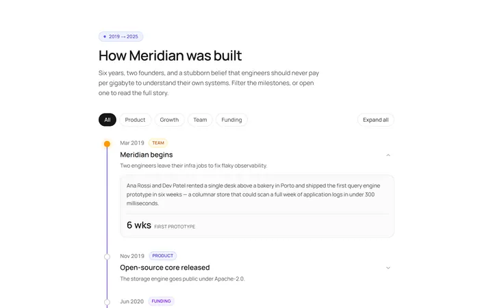
Vertical Timeline
Originalvertical timeline with dots
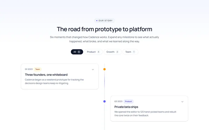
Centered Timeline
Originalcentred alternating timeline
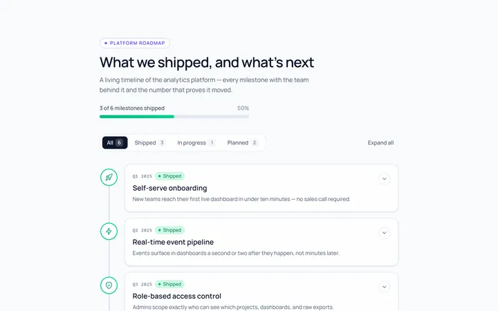
Icons Timeline
Originaltimeline with icon nodes
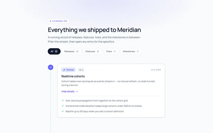
Cards Timeline
Originaltimeline with card entries
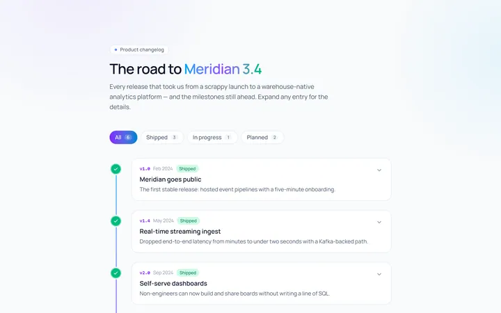
Gradient Timeline
Originaltimeline with a gradient line
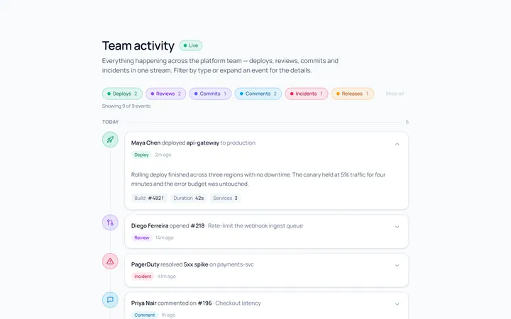
Activity Timeline
Originalactivity feed timeline
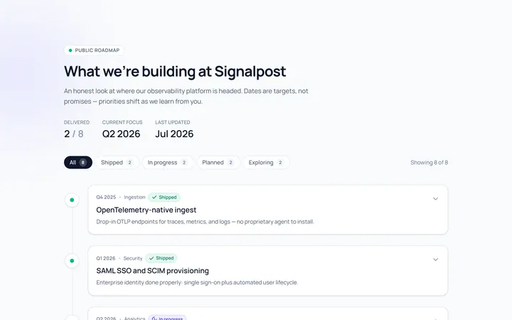
Roadmap Timeline
Originalproduct roadmap timeline
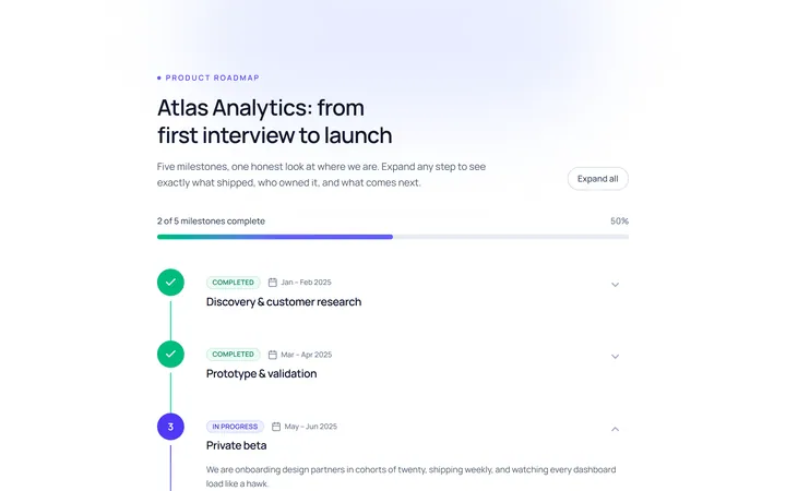
Numbered Timeline
Originalnumbered milestone timeline
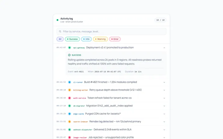
Compact Timeline
Originalcompact log timeline

Spotlight Hero
OriginalA centred hero with a soft radial spotlight, badge and dual call-to-action.

Split Hero
OriginalA two-column hero pairing a headline and CTAs with a product mock and social proof.

Gradient Spotlight Hero
OriginalA minimal centred hero with a soft gradient-mesh backdrop, announcement pill and dual call-to-action buttons.