

Numbered Timeline
Original · freenumbered milestone timeline
Copy prompt gives Claude Code, Cursor or v0 a ready-to-paste prompt that recreates this exact component.
npx shadcn@latest add https://webinnoventix.com/r/tl-numbered.json"use client";
import { useId, useRef, useState, type KeyboardEvent } from "react";
import {
AnimatePresence,
motion,
useReducedMotion,
type Variants,
} from "motion/react";
type Status = "done" | "active" | "upcoming";
interface Milestone {
id: string;
title: string;
window: string;
owner: string;
summary: string;
deliverables: string[];
status: Status;
}
const EASE: [number, number, number, number] = [0.22, 1, 0.36, 1];
const MILESTONES: Milestone[] = [
{
id: "discovery",
title: "Discovery & customer research",
window: "Jan – Feb 2025",
owner: "Product & Research",
status: "done",
summary:
"We started with a blank page and a hunch. Six weeks of interviews turned it into a validated problem worth building a company around.",
deliverables: [
"47 customer interviews across 6 industries",
"Competitive teardown of 9 analytics tools",
"Willingness-to-pay survey with 210 responses",
"Signed 12 design partners under NDA",
],
},
{
id: "prototype",
title: "Prototype & validation",
window: "Mar – Apr 2025",
owner: "Design & Engineering",
status: "done",
summary:
"A clickable prototype and an instrumented event pipeline let us test the real workflow before writing production code.",
deliverables: [
"Interactive prototype, 3 rounds of usability testing",
"Event pipeline handling 5M events/day in staging",
"Design system shipped with 80 components",
"Task success rate lifted from 61% to 89%",
],
},
{
id: "beta",
title: "Private beta",
window: "May – Jun 2025",
owner: "Engineering & Success",
status: "active",
summary:
"We are onboarding design partners in cohorts of twenty, shipping weekly, and watching every dashboard load like a hawk.",
deliverables: [
"120 beta accounts onboarded and active",
"Median dashboard load held under 400ms",
"SOC 2 Type I audit in progress",
"Weekly release train, zero critical incidents",
],
},
{
id: "launch",
title: "Public launch",
window: "Aug 2025",
owner: "Marketing & Growth",
status: "upcoming",
summary:
"Doors open to everyone. Self-serve signup, transparent pricing, and a launch loud enough to earn the first thousand workspaces.",
deliverables: [
"Launch on Product Hunt and Hacker News",
"Self-serve signup and metered billing live",
"Docs plus 20 ready-made template dashboards",
"Target: 1,000 activated workspaces in month one",
],
},
{
id: "scale",
title: "Scale & iterate",
window: "Q4 2025",
owner: "The whole company",
status: "upcoming",
summary:
"Turn early traction into durable revenue with the enterprise controls and integrations larger teams ask for on day one.",
deliverables: [
"Enterprise SSO and role-based access control",
"Regional data residency for EU and US",
"Public API and 15 native integrations",
"Clear path to $1M in annual recurring revenue",
],
},
];
const STATUS_META: Record<
Status,
{ label: string; badge: string; circle: string; dot: string }
> = {
done: {
label: "Completed",
badge:
"bg-emerald-50 text-emerald-700 ring-emerald-600/20 dark:bg-emerald-500/10 dark:text-emerald-300 dark:ring-emerald-400/25",
circle:
"bg-emerald-500 text-white border-emerald-500 dark:bg-emerald-500 dark:border-emerald-400",
dot: "text-emerald-500",
},
active: {
label: "In progress",
badge:
"bg-indigo-50 text-indigo-700 ring-indigo-600/20 dark:bg-indigo-500/10 dark:text-indigo-300 dark:ring-indigo-400/25",
circle:
"bg-indigo-600 text-white border-indigo-600 dark:bg-indigo-500 dark:border-indigo-400",
dot: "text-indigo-500",
},
upcoming: {
label: "Upcoming",
badge:
"bg-slate-100 text-slate-600 ring-slate-500/20 dark:bg-slate-800 dark:text-slate-300 dark:ring-slate-400/20",
circle:
"bg-white text-slate-500 border-slate-300 dark:bg-slate-900 dark:text-slate-400 dark:border-slate-700",
dot: "text-slate-400 dark:text-slate-500",
},
};
function CheckIcon() {
return (
<svg
viewBox="0 0 24 24"
fill="none"
stroke="currentColor"
strokeWidth={2.6}
strokeLinecap="round"
strokeLinejoin="round"
className="h-5 w-5"
aria-hidden="true"
>
<path d="M20 6 9 17l-5-5" />
</svg>
);
}
function ChevronIcon({ open }: { open: boolean }) {
return (
<svg
viewBox="0 0 24 24"
fill="none"
stroke="currentColor"
strokeWidth={2}
strokeLinecap="round"
strokeLinejoin="round"
className={
"h-5 w-5 shrink-0 transition-transform duration-300 ease-out " +
(open ? "rotate-180" : "rotate-0")
}
aria-hidden="true"
>
<path d="m6 9 6 6 6-6" />
</svg>
);
}
function CalendarIcon() {
return (
<svg
viewBox="0 0 24 24"
fill="none"
stroke="currentColor"
strokeWidth={1.8}
strokeLinecap="round"
strokeLinejoin="round"
className="h-4 w-4 shrink-0"
aria-hidden="true"
>
<path d="M8 2v4M16 2v4M3 10h18" />
<rect x="3" y="4" width="18" height="18" rx="2" />
</svg>
);
}
function TeamIcon() {
return (
<svg
viewBox="0 0 24 24"
fill="none"
stroke="currentColor"
strokeWidth={1.8}
strokeLinecap="round"
strokeLinejoin="round"
className="h-4 w-4 shrink-0"
aria-hidden="true"
>
<path d="M17 21v-2a4 4 0 0 0-4-4H5a4 4 0 0 0-4 4v2M9 11a4 4 0 1 0 0-8 4 4 0 0 0 0 8zM23 21v-2a4 4 0 0 0-3-3.87M16 3.13a4 4 0 0 1 0 7.75" />
</svg>
);
}
export default function TlNumbered() {
const uid = useId();
const reduce = !!useReducedMotion();
const headerRefs = useRef<Array<HTMLButtonElement | null>>([]);
const [open, setOpen] = useState<string[]>(() => {
const active = MILESTONES.find((m) => m.status === "active");
return active ? [active.id] : [MILESTONES[0].id];
});
const total = MILESTONES.length;
const doneCount = MILESTONES.filter((m) => m.status === "done").length;
const hasActive = MILESTONES.some((m) => m.status === "active");
const pct = Math.round(((doneCount + (hasActive ? 0.5 : 0)) / total) * 100);
const allOpen = open.length === total;
function toggle(id: string) {
setOpen((prev) =>
prev.includes(id) ? prev.filter((x) => x !== id) : [...prev, id],
);
}
function onHeaderKeyDown(
event: KeyboardEvent<HTMLButtonElement>,
index: number,
) {
let next = -1;
if (event.key === "ArrowDown") next = (index + 1) % total;
else if (event.key === "ArrowUp") next = (index - 1 + total) % total;
else if (event.key === "Home") next = 0;
else if (event.key === "End") next = total - 1;
if (next < 0) return;
event.preventDefault();
headerRefs.current[next]?.focus();
}
const container: Variants = {
hidden: {},
show: {
transition: {
staggerChildren: reduce ? 0 : 0.1,
delayChildren: reduce ? 0 : 0.06,
},
},
};
const item: Variants = reduce
? { hidden: { opacity: 1, y: 0 }, show: { opacity: 1, y: 0 } }
: {
hidden: { opacity: 0, y: 18 },
show: { opacity: 1, y: 0, transition: { duration: 0.5, ease: EASE } },
};
const focusRing =
"focus-visible:outline-none focus-visible:ring-2 focus-visible:ring-indigo-500 focus-visible:ring-offset-2 focus-visible:ring-offset-white dark:focus-visible:ring-offset-slate-950";
return (
<section className="relative w-full overflow-hidden bg-white px-5 py-20 text-slate-900 sm:px-8 sm:py-28 dark:bg-slate-950 dark:text-slate-100">
<style>{`
@keyframes tlnum-ping {
0% { transform: scale(1); opacity: 0.55; }
70% { transform: scale(2); opacity: 0; }
100% { transform: scale(2); opacity: 0; }
}
@media (prefers-reduced-motion: reduce) {
.tlnum-ping { animation: none !important; }
}
`}</style>
{/* atmospheric wash */}
<div
aria-hidden="true"
className="pointer-events-none absolute -top-24 left-1/2 h-72 w-[42rem] max-w-[90vw] -translate-x-1/2 rounded-full bg-indigo-200/40 blur-3xl dark:bg-indigo-500/10"
/>
<div className="relative mx-auto max-w-3xl">
<div className="flex flex-col gap-8 sm:flex-row sm:items-end sm:justify-between">
<div className="max-w-xl">
<span className="inline-flex items-center gap-2 text-xs font-semibold uppercase tracking-[0.2em] text-indigo-600 dark:text-indigo-400">
<span className="h-1.5 w-1.5 rounded-full bg-indigo-500" />
Product roadmap
</span>
<h2 className="mt-4 text-balance text-3xl font-semibold leading-tight tracking-tight sm:text-4xl">
Atlas Analytics: from first interview to launch
</h2>
<p className="mt-4 text-pretty text-base leading-relaxed text-slate-600 dark:text-slate-400">
Five milestones, one honest look at where we are. Expand any step
to see exactly what shipped, who owned it, and what comes next.
</p>
</div>
<button
type="button"
aria-pressed={allOpen}
onClick={() =>
setOpen(allOpen ? [] : MILESTONES.map((m) => m.id))
}
className={
"inline-flex shrink-0 items-center justify-center gap-2 rounded-full border border-slate-300 bg-white px-4 py-2 text-sm font-medium text-slate-700 transition-colors hover:border-slate-400 hover:bg-slate-50 dark:border-slate-700 dark:bg-slate-900 dark:text-slate-200 dark:hover:border-slate-600 dark:hover:bg-slate-800 " +
focusRing
}
>
{allOpen ? "Collapse all" : "Expand all"}
</button>
</div>
{/* progress summary */}
<div className="mt-10">
<div className="flex items-center justify-between text-sm font-medium">
<span className="text-slate-700 dark:text-slate-300">
{doneCount} of {total} milestones complete
</span>
<span className="tabular-nums text-slate-500 dark:text-slate-400">
{pct}%
</span>
</div>
<div
className="mt-3 h-2 w-full overflow-hidden rounded-full bg-slate-200/80 dark:bg-slate-800"
role="progressbar"
aria-valuenow={pct}
aria-valuemin={0}
aria-valuemax={100}
aria-label="Roadmap completion"
>
<motion.div
className="h-full rounded-full bg-gradient-to-r from-emerald-500 via-indigo-500 to-indigo-500"
initial={reduce ? { width: `${pct}%` } : { width: 0 }}
whileInView={{ width: `${pct}%` }}
viewport={{ once: true, margin: "-40px" }}
transition={{ duration: reduce ? 0 : 0.9, ease: EASE }}
/>
</div>
</div>
<motion.ol
aria-label="Product roadmap milestones"
className="mt-12"
variants={container}
initial="hidden"
whileInView="show"
viewport={{ once: true, margin: "-80px" }}
>
{MILESTONES.map((m, i) => {
const meta = STATUS_META[m.status];
const isOpen = open.includes(m.id);
const isLast = i === total - 1;
const buttonId = `${uid}-h-${i}`;
const panelId = `${uid}-p-${i}`;
return (
<motion.li
key={m.id}
variants={item}
className="relative flex gap-4 sm:gap-6"
>
{/* number rail */}
<div className="flex flex-col items-center">
<span className="relative flex h-11 w-11 shrink-0 items-center justify-center">
{m.status === "active" && (
<span
aria-hidden="true"
className="tlnum-ping absolute inset-0 rounded-full bg-indigo-500/40"
style={{ animation: "tlnum-ping 2.4s ease-out infinite" }}
/>
)}
<span
aria-hidden="true"
className={
"relative flex h-11 w-11 items-center justify-center rounded-full border text-base font-semibold tabular-nums shadow-sm " +
meta.circle
}
>
{m.status === "done" ? <CheckIcon /> : i + 1}
</span>
</span>
{!isLast && (
<span
aria-hidden="true"
className={
"mt-2 w-0.5 flex-1 rounded-full " +
(m.status === "done"
? "bg-emerald-400/80 dark:bg-emerald-500/60"
: m.status === "active"
? "bg-gradient-to-b from-indigo-500 to-slate-200 dark:to-slate-700"
: "bg-slate-200 dark:bg-slate-800")
}
/>
)}
</div>
{/* content */}
<div className={isLast ? "flex-1 pb-1" : "flex-1 pb-8 sm:pb-10"}>
<button
id={buttonId}
type="button"
ref={(el) => {
headerRefs.current[i] = el;
}}
aria-expanded={isOpen}
aria-controls={panelId}
onClick={() => toggle(m.id)}
onKeyDown={(e) => onHeaderKeyDown(e, i)}
className={
"group flex w-full items-start justify-between gap-4 rounded-xl px-3 py-3 text-left transition-colors hover:bg-slate-50 dark:hover:bg-slate-900/70 " +
focusRing
}
>
<span className="min-w-0">
<span className="flex flex-wrap items-center gap-x-3 gap-y-1.5">
<span
className={
"inline-flex items-center rounded-full px-2.5 py-0.5 text-[11px] font-semibold uppercase tracking-wide ring-1 ring-inset " +
meta.badge
}
>
{meta.label}
</span>
<span className="inline-flex items-center gap-1.5 text-xs font-medium text-slate-500 dark:text-slate-400">
<CalendarIcon />
{m.window}
</span>
</span>
<span className="mt-2 block text-lg font-semibold leading-snug tracking-tight text-slate-900 group-hover:text-indigo-700 dark:text-slate-50 dark:group-hover:text-indigo-300">
{m.title}
</span>
</span>
<span className="mt-1 text-slate-400 group-hover:text-slate-600 dark:text-slate-500 dark:group-hover:text-slate-300">
<ChevronIcon open={isOpen} />
</span>
</button>
<AnimatePresence initial={false}>
{isOpen && (
<motion.div
key="panel"
id={panelId}
role="region"
aria-labelledby={buttonId}
initial={
reduce
? { opacity: 0 }
: { height: 0, opacity: 0 }
}
animate={
reduce
? { opacity: 1 }
: { height: "auto", opacity: 1 }
}
exit={
reduce ? { opacity: 0 } : { height: 0, opacity: 0 }
}
transition={{
duration: reduce ? 0.15 : 0.34,
ease: EASE,
}}
className="overflow-hidden"
>
<div className="px-3 pt-1">
<p className="text-pretty text-sm leading-relaxed text-slate-600 dark:text-slate-400">
{m.summary}
</p>
<ul className="mt-4 grid gap-2.5">
{m.deliverables.map((d) => (
<li
key={d}
className="flex items-start gap-3 text-sm text-slate-700 dark:text-slate-300"
>
<span
className={"mt-0.5 shrink-0 " + meta.dot}
aria-hidden="true"
>
{m.status === "done" ? (
<CheckIcon />
) : (
<svg
viewBox="0 0 20 20"
fill="none"
className="h-5 w-5"
>
<circle
cx="10"
cy="10"
r="4"
stroke="currentColor"
strokeWidth={2}
/>
</svg>
)}
</span>
<span className="leading-relaxed">{d}</span>
</li>
))}
</ul>
<div className="mt-4 inline-flex items-center gap-2 rounded-lg bg-slate-50 px-3 py-1.5 text-xs font-medium text-slate-600 dark:bg-slate-900 dark:text-slate-400">
<TeamIcon />
<span>Owned by {m.owner}</span>
</div>
</div>
</motion.div>
)}
</AnimatePresence>
</div>
</motion.li>
);
})}
</motion.ol>
</div>
</section>
);
}Dependencies
Licence
Built by Web Innoventix. Free for personal and commercial use, no attribution required.
Built by Web Innoventix
Need a custom interface, a full website, or SEO that gets you cited by AI? We design, build and rank it end to end.
Get a free quoteSimilar components
Browse all →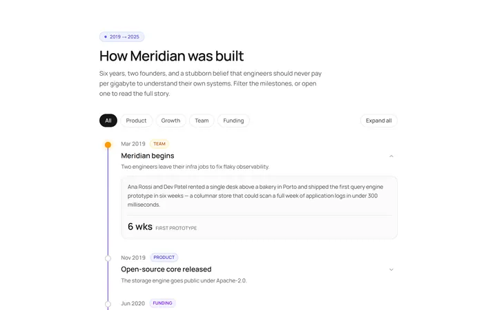
Vertical Timeline
Originalvertical timeline with dots
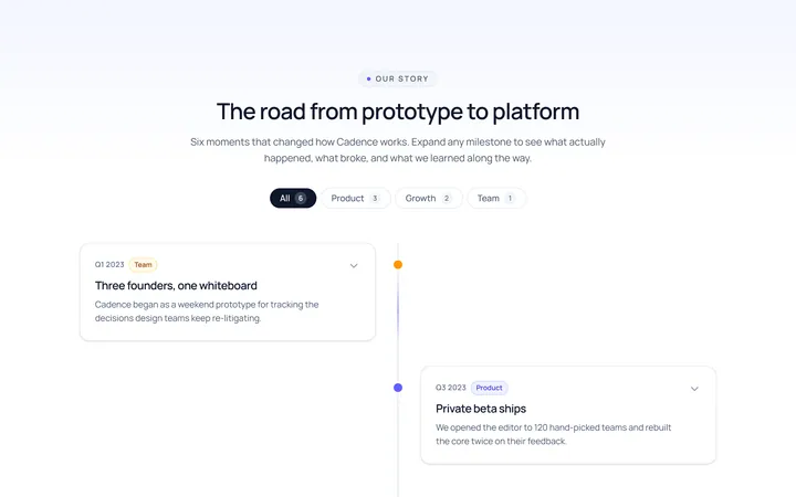
Centered Timeline
Originalcentred alternating timeline
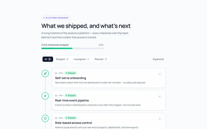
Icons Timeline
Originaltimeline with icon nodes
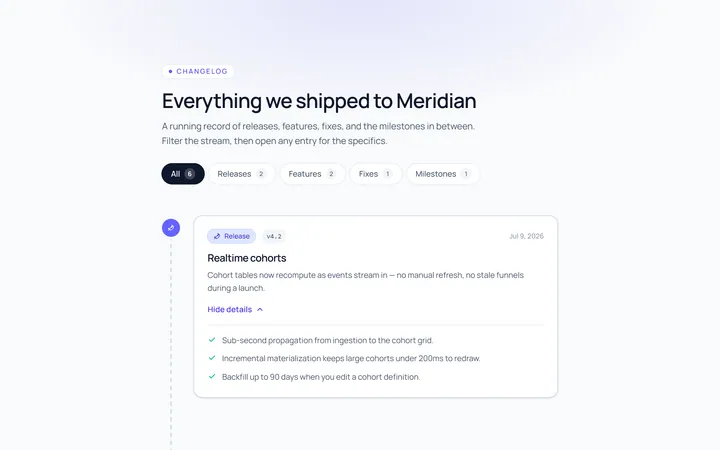
Cards Timeline
Originaltimeline with card entries
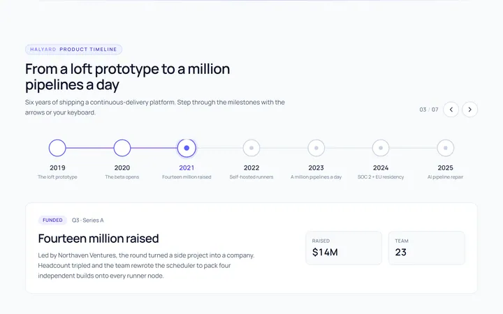
Horizontal Timeline
Originalhorizontal timeline
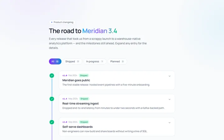
Gradient Timeline
Originaltimeline with a gradient line
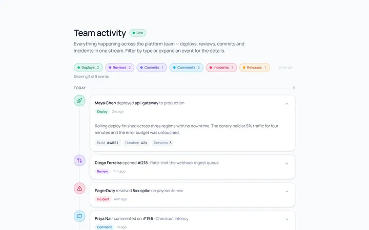
Activity Timeline
Originalactivity feed timeline
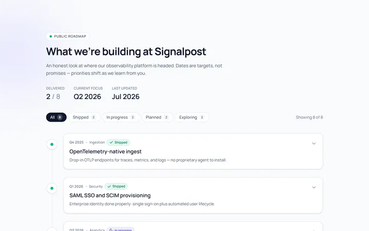
Roadmap Timeline
Originalproduct roadmap timeline
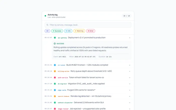
Compact Timeline
Originalcompact log timeline

Spotlight Hero
OriginalA centred hero with a soft radial spotlight, badge and dual call-to-action.

Split Hero
OriginalA two-column hero pairing a headline and CTAs with a product mock and social proof.

Gradient Spotlight Hero
OriginalA minimal centred hero with a soft gradient-mesh backdrop, announcement pill and dual call-to-action buttons.