

Gradient Shift Background
Original · freeshifting gradient background
Copy prompt gives Claude Code, Cursor or v0 a ready-to-paste prompt that recreates this exact component.
npx shadcn@latest add https://webinnoventix.com/r/bgx-gradient-shift.json"use client";
import {
useId,
useMemo,
useRef,
useState,
type CSSProperties,
type KeyboardEvent,
} from "react";
import { useReducedMotion } from "motion/react";
type CssVars = CSSProperties & Record<`--${string}`, string>;
type Palette = {
id: string;
name: string;
hint: string;
colors: [string, string, string, string];
};
const PALETTES: Palette[] = [
{
id: "aurora",
name: "Aurora",
hint: "indigo · violet · sky · emerald",
colors: ["#6366f1", "#8b5cf6", "#38bdf8", "#34d399"],
},
{
id: "ember",
name: "Ember",
hint: "rose · amber · rose · amber",
colors: ["#fb7185", "#f59e0b", "#f43f5e", "#fbbf24"],
},
{
id: "meadow",
name: "Meadow",
hint: "emerald · teal · sky · emerald",
colors: ["#10b981", "#14b8a6", "#38bdf8", "#34d399"],
},
{
id: "twilight",
name: "Twilight",
hint: "slate · indigo · violet · slate",
colors: ["#64748b", "#818cf8", "#a78bfa", "#475569"],
},
];
const BLOBS = [
{ name: "bgxgs-drift-a", varName: "--bgxgs-c1", top: "-12%", left: "-6%", size: "62%", blur: 72, durMul: 1, delay: 0 },
{ name: "bgxgs-drift-b", varName: "--bgxgs-c2", top: "4%", left: "46%", size: "56%", blur: 82, durMul: 1.4, delay: -4 },
{ name: "bgxgs-drift-c", varName: "--bgxgs-c3", top: "42%", left: "8%", size: "58%", blur: 76, durMul: 0.8, delay: -7 },
{ name: "bgxgs-drift-d", varName: "--bgxgs-c4", top: "38%", left: "50%", size: "52%", blur: 88, durMul: 1.15, delay: -2 },
] as const;
const GRAIN =
"data:image/svg+xml,%3Csvg xmlns='http://www.w3.org/2000/svg' width='140' height='140'%3E%3Cfilter id='bgxgs-n'%3E%3CfeTurbulence type='fractalNoise' baseFrequency='0.9' numOctaves='2' stitchTiles='stitch'/%3E%3C/filter%3E%3Crect width='100%25' height='100%25' filter='url(%23bgxgs-n)'/%3E%3C/svg%3E";
export default function BgxGradientShift() {
const prefersReduced = useReducedMotion();
const speedId = useId();
const [paletteId, setPaletteId] = useState<string>(PALETTES[0].id);
const [speed, setSpeed] = useState<number>(5);
const [grain, setGrain] = useState<boolean>(true);
const [playing, setPlaying] = useState<boolean>(true);
const optionRefs = useRef<Array<HTMLButtonElement | null>>([]);
const selectedPalette = useMemo(
() => PALETTES.find((p) => p.id === paletteId) ?? PALETTES[0],
[paletteId],
);
const duration = useMemo(() => 26 - speed * 2, [speed]);
const effectivePlaying = playing && !prefersReduced;
const playState = effectivePlaying ? "running" : "paused";
const backdropVars: CssVars = {
"--bgxgs-dur": `${duration}s`,
"--bgxgs-c1": selectedPalette.colors[0],
"--bgxgs-c2": selectedPalette.colors[1],
"--bgxgs-c3": selectedPalette.colors[2],
"--bgxgs-c4": selectedPalette.colors[3],
};
const handleOptionKey = (
event: KeyboardEvent<HTMLButtonElement>,
index: number,
) => {
const count = PALETTES.length;
let next = index;
switch (event.key) {
case "ArrowRight":
case "ArrowDown":
next = (index + 1) % count;
break;
case "ArrowLeft":
case "ArrowUp":
next = (index - 1 + count) % count;
break;
case "Home":
next = 0;
break;
case "End":
next = count - 1;
break;
default:
return;
}
event.preventDefault();
setPaletteId(PALETTES[next].id);
optionRefs.current[next]?.focus();
};
return (
<section className="relative flex min-h-[640px] w-full items-center overflow-hidden bg-slate-50 px-6 py-24 dark:bg-slate-950 sm:py-32">
<style>{`
@keyframes bgxgs-drift-a {
0% { transform: translate3d(-8%, -6%, 0) scale(1); }
100% { transform: translate3d(12%, 10%, 0) scale(1.25); }
}
@keyframes bgxgs-drift-b {
0% { transform: translate3d(6%, 8%, 0) scale(1.15); }
100% { transform: translate3d(-10%, -8%, 0) scale(0.95); }
}
@keyframes bgxgs-drift-c {
0% { transform: translate3d(-4%, 10%, 0) scale(1); }
100% { transform: translate3d(10%, -12%, 0) scale(1.2); }
}
@keyframes bgxgs-drift-d {
0% { transform: translate3d(8%, -10%, 0) scale(1.1); }
100% { transform: translate3d(-8%, 12%, 0) scale(1); }
}
@media (prefers-reduced-motion: reduce) {
.bgxgs-blob { animation: none !important; }
}
`}</style>
{/* Animated gradient backdrop */}
<div
aria-hidden
className="pointer-events-none absolute inset-0 bg-gradient-to-br from-slate-50 to-slate-100 dark:from-slate-950 dark:to-slate-900"
style={backdropVars}
>
{BLOBS.map((blob) => (
<div
key={blob.name}
className="bgxgs-blob absolute rounded-full mix-blend-multiply will-change-transform dark:mix-blend-screen"
style={{
top: blob.top,
left: blob.left,
width: blob.size,
height: blob.size,
opacity: 0.8,
backgroundImage: `radial-gradient(circle at 50% 50%, var(${blob.varName}) 0%, transparent 70%)`,
filter: `blur(${blob.blur}px)`,
animation: `${blob.name} calc(var(--bgxgs-dur) * ${blob.durMul}) ease-in-out ${blob.delay}s infinite alternate both`,
animationPlayState: playState,
}}
/>
))}
{grain ? (
<div
className="absolute inset-0 opacity-40 mix-blend-soft-light dark:opacity-30"
style={{ backgroundImage: `url("${GRAIN}")`, backgroundRepeat: "repeat" }}
/>
) : null}
{/* Legibility scrim */}
<div className="absolute inset-0 bg-white/25 dark:bg-slate-950/35" />
</div>
{/* Foreground content */}
<div className="relative z-10 mx-auto w-full max-w-2xl">
<p className="inline-flex items-center gap-2 rounded-full border border-slate-300/70 bg-white/60 px-3 py-1 text-xs font-medium uppercase tracking-[0.18em] text-slate-600 backdrop-blur dark:border-slate-700/70 dark:bg-slate-900/50 dark:text-slate-300">
<span className="h-1.5 w-1.5 rounded-full bg-indigo-500 dark:bg-indigo-400" />
Ambient backgrounds
</p>
<h2 className="mt-5 text-4xl font-semibold tracking-tight text-slate-900 drop-shadow-sm dark:text-white sm:text-5xl">
A gradient that never sits still
</h2>
<p className="mt-4 max-w-xl text-base leading-relaxed text-slate-700 dark:text-slate-200 sm:text-lg">
A living mesh of colour drifts behind your content. Pick a palette,
dial the tempo, and let it breathe — or freeze it in place for calmer
screens.
</p>
{/* Control panel */}
<div className="mt-8 rounded-3xl border border-slate-200/80 bg-white/70 p-5 shadow-xl shadow-slate-900/5 backdrop-blur-xl dark:border-slate-800/80 dark:bg-slate-900/60 sm:p-6">
{/* Palette selector */}
<div>
<span className="text-sm font-semibold text-slate-800 dark:text-slate-100">
Palette
</span>
<div
role="radiogroup"
aria-label="Gradient palette"
className="mt-3 grid grid-cols-2 gap-2 sm:grid-cols-4"
>
{PALETTES.map((palette, index) => {
const selected = palette.id === paletteId;
return (
<button
key={palette.id}
ref={(el) => {
optionRefs.current[index] = el;
}}
type="button"
role="radio"
aria-checked={selected}
tabIndex={selected ? 0 : -1}
onClick={() => setPaletteId(palette.id)}
onKeyDown={(event) => handleOptionKey(event, index)}
className={`flex items-center gap-2.5 rounded-2xl border px-3 py-2.5 text-left text-sm font-medium transition focus-visible:outline-none focus-visible:ring-2 focus-visible:ring-indigo-500 focus-visible:ring-offset-2 focus-visible:ring-offset-white dark:focus-visible:ring-offset-slate-950 ${
selected
? "border-indigo-500 bg-indigo-50 text-slate-900 dark:border-indigo-400 dark:bg-indigo-500/10 dark:text-white"
: "border-slate-200 bg-white/50 text-slate-600 hover:border-slate-300 dark:border-slate-800 dark:bg-slate-900/40 dark:text-slate-300 dark:hover:border-slate-700"
}`}
>
<span
aria-hidden
className="h-6 w-6 shrink-0 rounded-full ring-1 ring-inset ring-black/10 dark:ring-white/10"
style={{
backgroundImage: `linear-gradient(135deg, ${palette.colors.join(", ")})`,
}}
/>
<span className="truncate">{palette.name}</span>
</button>
);
})}
</div>
</div>
{/* Tempo slider */}
<div className="mt-6">
<label
htmlFor={speedId}
className="flex items-center justify-between text-sm font-semibold text-slate-800 dark:text-slate-100"
>
<span>Tempo</span>
<span className="tabular-nums font-normal text-slate-500 dark:text-slate-400">
{speed} / 10
</span>
</label>
<input
id={speedId}
type="range"
min={1}
max={10}
step={1}
value={speed}
onChange={(event) => setSpeed(Number(event.target.value))}
className="mt-3 h-2 w-full cursor-pointer appearance-none rounded-full bg-slate-200 accent-indigo-500 focus-visible:outline-none focus-visible:ring-2 focus-visible:ring-indigo-500 focus-visible:ring-offset-2 focus-visible:ring-offset-white dark:bg-slate-800 dark:focus-visible:ring-offset-slate-950"
/>
</div>
{/* Toggles */}
<div className="mt-6 flex flex-wrap items-center justify-between gap-4">
<button
type="button"
aria-pressed={playing}
onClick={() => setPlaying((value) => !value)}
className="inline-flex items-center gap-2 rounded-full bg-slate-900 px-4 py-2.5 text-sm font-semibold text-white transition hover:bg-slate-800 focus-visible:outline-none focus-visible:ring-2 focus-visible:ring-indigo-500 focus-visible:ring-offset-2 focus-visible:ring-offset-white dark:bg-white dark:text-slate-900 dark:hover:bg-slate-200 dark:focus-visible:ring-offset-slate-950"
>
{playing ? (
<svg aria-hidden viewBox="0 0 20 20" className="h-4 w-4" fill="currentColor">
<rect x="5" y="4" width="3.5" height="12" rx="1" />
<rect x="11.5" y="4" width="3.5" height="12" rx="1" />
</svg>
) : (
<svg aria-hidden viewBox="0 0 20 20" className="h-4 w-4" fill="currentColor">
<path d="M6 4.5v11a1 1 0 0 0 1.53.85l8.5-5.5a1 1 0 0 0 0-1.7l-8.5-5.5A1 1 0 0 0 6 4.5Z" />
</svg>
)}
{playing ? "Pause motion" : "Play motion"}
</button>
<div className="flex items-center gap-3">
<span
id={`${speedId}-grain`}
className="text-sm font-medium text-slate-700 dark:text-slate-200"
>
Film grain
</span>
<button
type="button"
role="switch"
aria-checked={grain}
aria-labelledby={`${speedId}-grain`}
onClick={() => setGrain((value) => !value)}
className={`relative inline-flex h-6 w-11 shrink-0 items-center rounded-full transition focus-visible:outline-none focus-visible:ring-2 focus-visible:ring-indigo-500 focus-visible:ring-offset-2 focus-visible:ring-offset-white dark:focus-visible:ring-offset-slate-950 ${
grain ? "bg-indigo-500" : "bg-slate-300 dark:bg-slate-700"
}`}
>
<span
className={`inline-block h-5 w-5 transform rounded-full bg-white shadow transition ${
grain ? "translate-x-5" : "translate-x-0.5"
}`}
/>
</button>
</div>
</div>
{/* Status */}
<p
aria-live="polite"
className="mt-5 border-t border-slate-200/70 pt-4 text-xs text-slate-500 dark:border-slate-800/70 dark:text-slate-400"
>
{selectedPalette.name} · {selectedPalette.hint} · tempo {speed}/10 ·
grain {grain ? "on" : "off"} ·{" "}
{effectivePlaying ? "playing" : "paused"}
{prefersReduced
? " — motion is reduced by your system settings"
: ""}
</p>
</div>
</div>
</section>
);
}Dependencies
Licence
Built by Web Innoventix. Free for personal and commercial use, no attribution required.
Built by Web Innoventix
Need a custom interface, a full website, or SEO that gets you cited by AI? We design, build and rank it end to end.
Get a free quoteSimilar components
Browse all →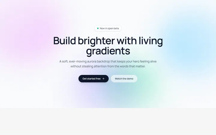
Aurora Blobs Background
OriginalAn animated hero section with soft, ever-drifting aurora gradient blobs floating behind staggered, blur-in content.
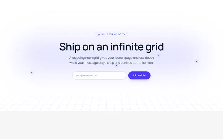
Retro Perspective Grid
OriginalA launch and waitlist section set over an infinite neon grid that scrolls into a glowing horizon with rising particles.
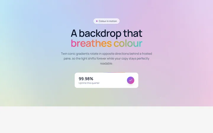
Conic Gradient Flow
OriginalA frosted hero backed by twin counter-rotating conic gradients, with flowing gradient text and an animated gradient-border stat card.
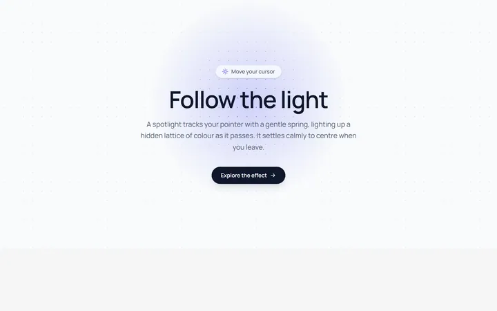
Spotlight Follow Background
OriginalA dot-grid section where a spring-eased spotlight follows the cursor and reveals a hidden lattice of coloured dots.
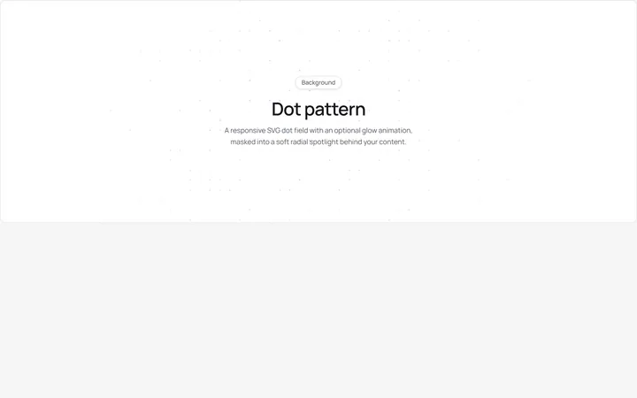
Dot Pattern Background
pattern.tsxA reusable animated background for React and Tailwind: dot pattern background.
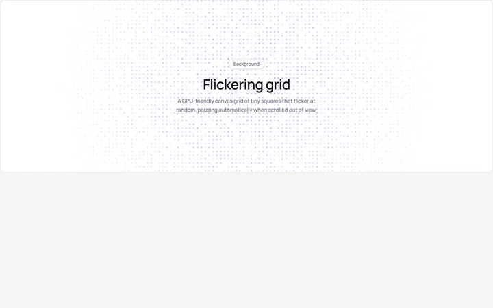
Flickering Grid Background
grid.tsxA reusable animated background for React and Tailwind: flickering grid background.
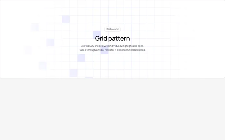
Grid Pattern Background
pattern.tsxA reusable animated background for React and Tailwind: grid pattern background.
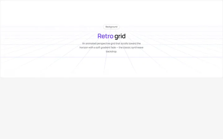
Retro Grid Background
grid.jsonA reusable animated background for React and Tailwind: retro grid background.
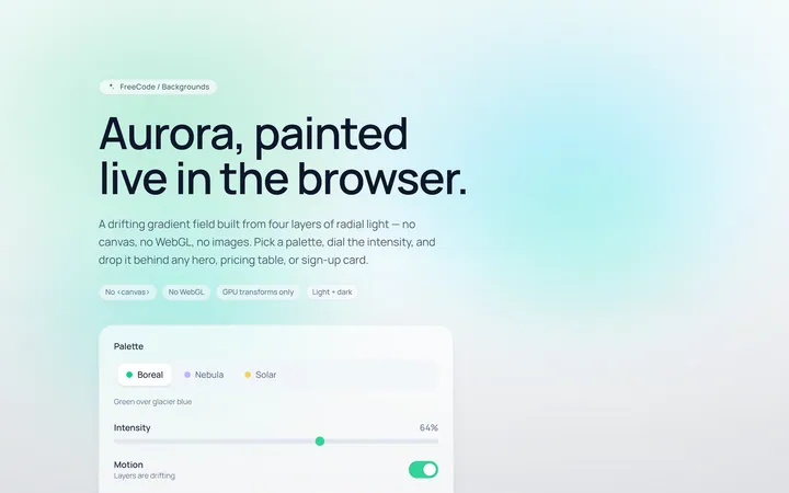
Aurora Background
Originalaurora gradient background
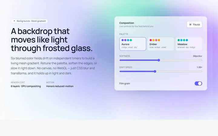
Mesh Gradient Background
Originalanimated mesh gradient background
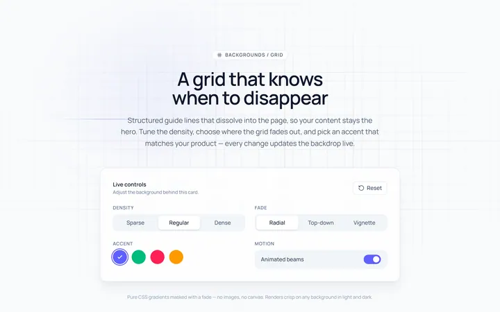
Grid Background
Originalgrid line background with fade
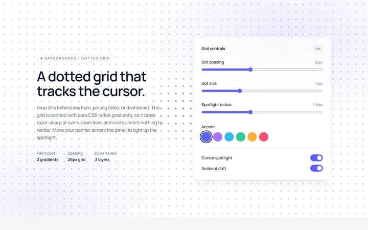
Dots Background
Originaldotted grid background