

Spotlight Background
Original · freecursor spotlight background
Copy prompt gives Claude Code, Cursor or v0 a ready-to-paste prompt that recreates this exact component.
npx shadcn@latest add https://webinnoventix.com/r/bgx-spotlight.json"use client";
import {
motion,
useMotionTemplate,
useMotionValue,
useMotionValueEvent,
useReducedMotion,
useSpring,
useTransform,
} from "motion/react";
import {
useCallback,
useEffect,
useId,
useRef,
useState,
type KeyboardEvent as ReactKeyboardEvent,
type PointerEvent as ReactPointerEvent,
} from "react";
type SpotColor = {
id: string;
label: string;
/** space-separated sRGB channels for the CSS rgb(r g b / a) form */
rgb: string;
swatch: string;
checkedRing: string;
accent: string;
};
const COLORS: SpotColor[] = [
{
id: "indigo",
label: "Indigo",
rgb: "129 140 248",
swatch: "bg-indigo-400",
checkedRing: "peer-checked:ring-indigo-400",
accent: "accent-indigo-500 dark:accent-indigo-400",
},
{
id: "violet",
label: "Violet",
rgb: "167 139 250",
swatch: "bg-violet-400",
checkedRing: "peer-checked:ring-violet-400",
accent: "accent-violet-500 dark:accent-violet-400",
},
{
id: "sky",
label: "Sky",
rgb: "56 189 248",
swatch: "bg-sky-400",
checkedRing: "peer-checked:ring-sky-400",
accent: "accent-sky-500 dark:accent-sky-400",
},
{
id: "emerald",
label: "Emerald",
rgb: "52 211 153",
swatch: "bg-emerald-400",
checkedRing: "peer-checked:ring-emerald-400",
accent: "accent-emerald-500 dark:accent-emerald-400",
},
{
id: "amber",
label: "Amber",
rgb: "251 191 36",
swatch: "bg-amber-400",
checkedRing: "peer-checked:ring-amber-400",
accent: "accent-amber-500 dark:accent-amber-400",
},
{
id: "rose",
label: "Rose",
rgb: "251 113 133",
swatch: "bg-rose-400",
checkedRing: "peer-checked:ring-rose-400",
accent: "accent-rose-500 dark:accent-rose-400",
},
];
const FALLBACK: SpotColor = COLORS[0] ?? {
id: "indigo",
label: "Indigo",
rgb: "129 140 248",
swatch: "bg-indigo-400",
checkedRing: "peer-checked:ring-indigo-400",
accent: "accent-indigo-500 dark:accent-indigo-400",
};
const clamp01 = (v: number): number => Math.min(1, Math.max(0, v));
export default function BgxSpotlight() {
const reduce = useReducedMotion();
const [colorId, setColorId] = useState<string>("indigo");
const [radius, setRadius] = useState<number>(340);
const [intensity, setIntensity] = useState<number>(72);
const [follow, setFollow] = useState<boolean>(true);
const [copied, setCopied] = useState<boolean>(false);
const active = COLORS.find((c) => c.id === colorId) ?? FALLBACK;
const uid = useId();
const radiusId = `${uid}-radius`;
const intensityId = `${uid}-intensity`;
const colorName = `${uid}-color`;
const hintId = `${uid}-hint`;
const stageRef = useRef<HTMLDivElement>(null);
const xLabelRef = useRef<HTMLSpanElement>(null);
const yLabelRef = useRef<HTMLSpanElement>(null);
const copyTimer = useRef<ReturnType<typeof setTimeout> | null>(null);
// Pointer position stored as 0..1 fractions so it survives resize.
const mx = useMotionValue(0.5);
const my = useMotionValue(0.36);
const springCfg = reduce
? { stiffness: 1600, damping: 90, mass: 0.6 }
: { stiffness: 130, damping: 20, mass: 0.42 };
const sx = useSpring(mx, springCfg);
const sy = useSpring(my, springCfg);
const px = useTransform(sx, (v) => `${(v * 100).toFixed(2)}%`);
const py = useTransform(sy, (v) => `${(v * 100).toFixed(2)}%`);
const glowAlpha = (0.14 + (intensity / 100) * 0.42).toFixed(3);
const coreAlpha = (0.2 + (intensity / 100) * 0.5).toFixed(3);
const coreRadius = Math.round(radius * 0.52);
const glow = useMotionTemplate`radial-gradient(${radius}px circle at ${px} ${py}, rgb(${active.rgb} / ${glowAlpha}), transparent 68%)`;
const core = useMotionTemplate`radial-gradient(${coreRadius}px circle at ${px} ${py}, rgb(${active.rgb} / ${coreAlpha}), transparent 66%)`;
const reveal = useMotionTemplate`radial-gradient(${Math.round(
radius * 0.72,
)}px circle at ${px} ${py}, black 8%, transparent 72%)`;
// Live readout without re-rendering the whole tree on every move.
useMotionValueEvent(sx, "change", (v) => {
if (xLabelRef.current) xLabelRef.current.textContent = String(Math.round(v * 100));
});
useMotionValueEvent(sy, "change", (v) => {
if (yLabelRef.current) yLabelRef.current.textContent = String(Math.round(v * 100));
});
// Idle drift when the spotlight is not tracking the pointer.
useEffect(() => {
if (follow || reduce) return;
let raf = 0;
let t = Math.PI / 2;
const loop = () => {
t += 0.006;
mx.set(clamp01(0.5 + 0.3 * Math.sin(t)));
my.set(clamp01(0.4 + 0.22 * Math.cos(t * 1.25)));
raf = requestAnimationFrame(loop);
};
raf = requestAnimationFrame(loop);
return () => cancelAnimationFrame(raf);
}, [follow, reduce, mx, my]);
useEffect(() => {
return () => {
if (copyTimer.current) clearTimeout(copyTimer.current);
};
}, []);
const moveToPointer = useCallback(
(event: ReactPointerEvent<HTMLDivElement>) => {
if (!follow) return;
const el = stageRef.current;
if (!el) return;
const rect = el.getBoundingClientRect();
if (rect.width === 0 || rect.height === 0) return;
mx.set(clamp01((event.clientX - rect.left) / rect.width));
my.set(clamp01((event.clientY - rect.top) / rect.height));
},
[follow, mx, my],
);
const onKeyDown = useCallback(
(event: ReactKeyboardEvent<HTMLDivElement>) => {
const step = event.shiftKey ? 0.12 : 0.045;
let handled = true;
switch (event.key) {
case "ArrowLeft":
mx.set(clamp01(mx.get() - step));
break;
case "ArrowRight":
mx.set(clamp01(mx.get() + step));
break;
case "ArrowUp":
my.set(clamp01(my.get() - step));
break;
case "ArrowDown":
my.set(clamp01(my.get() + step));
break;
case "Home":
mx.set(0.5);
my.set(0.36);
break;
default:
handled = false;
}
if (handled) event.preventDefault();
},
[mx, my],
);
const onCopy = useCallback(async () => {
const snippet = `import BgxSpotlight from "@/registry/bgx-spotlight/bgx-spotlight";`;
try {
await navigator.clipboard.writeText(snippet);
setCopied(true);
if (copyTimer.current) clearTimeout(copyTimer.current);
copyTimer.current = setTimeout(() => setCopied(false), 1900);
} catch {
setCopied(false);
}
}, []);
return (
<section className="relative w-full overflow-hidden bg-slate-50 px-4 py-16 text-slate-900 sm:px-6 sm:py-24 dark:bg-neutral-950 dark:text-white">
<style>{`
@keyframes bgxsl-breathe {
0%, 100% { opacity: .5; transform: scale(1); }
50% { opacity: .8; transform: scale(1.06); }
}
@keyframes bgxsl-sweep {
0% { transform: translateX(-140%); }
100% { transform: translateX(240%); }
}
@media (prefers-reduced-motion: reduce) {
.bgxsl-anim { animation: none !important; }
}
`}</style>
<div className="mx-auto grid max-w-6xl items-stretch gap-5 lg:grid-cols-[minmax(0,1.55fr)_minmax(0,1fr)]">
{/* ─── Interactive stage ─────────────────────────────── */}
<div
ref={stageRef}
role="application"
aria-label="Cursor spotlight canvas. Move the pointer, or focus this area and use the arrow keys to steer the light."
aria-describedby={hintId}
tabIndex={0}
onPointerMove={moveToPointer}
onPointerDown={moveToPointer}
onKeyDown={onKeyDown}
className="group relative flex min-h-[460px] flex-col justify-between overflow-hidden rounded-3xl border border-slate-200 bg-white p-7 shadow-sm outline-none sm:min-h-[560px] sm:p-10 focus-visible:ring-2 focus-visible:ring-slate-900 focus-visible:ring-offset-2 focus-visible:ring-offset-slate-50 dark:border-white/10 dark:bg-neutral-900 dark:focus-visible:ring-white dark:focus-visible:ring-offset-neutral-950"
>
{/* ruled grid texture */}
<div
aria-hidden="true"
className="pointer-events-none absolute inset-0 opacity-[0.5] dark:opacity-[0.28]"
style={{
backgroundImage:
"linear-gradient(to right, rgb(100 116 139 / 0.16) 1px, transparent 1px), linear-gradient(to bottom, rgb(100 116 139 / 0.16) 1px, transparent 1px)",
backgroundSize: "46px 46px",
}}
/>
{/* grid revealed brighter under the spotlight */}
<motion.div
aria-hidden="true"
className="pointer-events-none absolute inset-0"
style={{
backgroundImage:
"linear-gradient(to right, rgb(100 116 139 / 0.42) 1px, transparent 1px), linear-gradient(to bottom, rgb(100 116 139 / 0.42) 1px, transparent 1px)",
backgroundSize: "46px 46px",
maskImage: reduce ? undefined : reveal,
WebkitMaskImage: reduce ? undefined : reveal,
opacity: reduce ? 0 : 1,
}}
/>
{/* soft outer glow that trails the cursor */}
<motion.div
aria-hidden="true"
className="pointer-events-none absolute inset-0"
style={{ backgroundImage: glow }}
/>
{/* crisp inner core */}
<motion.div
aria-hidden="true"
className="pointer-events-none absolute inset-0"
style={{ backgroundImage: core }}
/>
{/* idle corner ember, always alive */}
<div
aria-hidden="true"
className="bgxsl-anim pointer-events-none absolute -right-16 -top-16 h-56 w-56 rounded-full bg-slate-400/20 blur-3xl dark:bg-white/10"
style={{ animation: reduce ? undefined : "bgxsl-breathe 7s ease-in-out infinite" }}
/>
{/* content */}
<div className="relative">
<span className="relative inline-flex items-center gap-2 overflow-hidden rounded-full border border-slate-200 bg-white/80 px-3.5 py-1.5 text-xs font-medium tracking-wide text-slate-600 backdrop-blur dark:border-white/10 dark:bg-white/5 dark:text-slate-300">
<span className={`h-2 w-2 rounded-full ${active.swatch}`} />
Interactive background
{!reduce && (
<span
aria-hidden="true"
className="bgxsl-anim absolute inset-y-0 -left-full w-1/2 -skew-x-12 bg-gradient-to-r from-transparent via-white/50 to-transparent dark:via-white/20"
style={{ animation: "bgxsl-sweep 4.5s ease-in-out infinite" }}
/>
)}
</span>
</div>
<div className="relative mt-auto max-w-xl">
<h2 className="text-3xl font-semibold tracking-tight sm:text-5xl">
Point anywhere. <br className="hidden sm:block" />
The light chases you.
</h2>
<p className="mt-4 text-sm leading-relaxed text-slate-600 sm:text-base dark:text-slate-400">
A live radial glow renders wherever your cursor lands and eases in on a
spring. Steer it with the pointer, or focus this panel and nudge it with
the arrow keys. Every value on the right is wired to real controls.
</p>
<div className="mt-7 flex flex-wrap items-center gap-3">
<button
type="button"
onClick={onCopy}
className="inline-flex items-center gap-2 rounded-full bg-slate-900 px-5 py-2.5 text-sm font-semibold text-white shadow-lg transition hover:bg-slate-700 focus-visible:outline-none focus-visible:ring-2 focus-visible:ring-slate-900 focus-visible:ring-offset-2 focus-visible:ring-offset-white dark:bg-white dark:text-slate-900 dark:hover:bg-slate-200 dark:focus-visible:ring-white dark:focus-visible:ring-offset-neutral-900"
>
{copied ? (
<svg viewBox="0 0 24 24" fill="none" stroke="currentColor" strokeWidth={2} strokeLinecap="round" strokeLinejoin="round" aria-hidden="true" className="h-4 w-4">
<path d="M20 6 9 17l-5-5" />
</svg>
) : (
<svg viewBox="0 0 24 24" fill="none" stroke="currentColor" strokeWidth={2} strokeLinecap="round" strokeLinejoin="round" aria-hidden="true" className="h-4 w-4">
<rect x="9" y="9" width="11" height="11" rx="2" />
<path d="M5 15V5a2 2 0 0 1 2-2h10" />
</svg>
)}
{copied ? "Copied import" : "Copy import"}
</button>
<a
href="#bgxsl-controls"
className="inline-flex items-center gap-2 rounded-full border border-slate-300 px-5 py-2.5 text-sm font-semibold text-slate-700 transition hover:border-slate-400 hover:bg-white focus-visible:outline-none focus-visible:ring-2 focus-visible:ring-slate-900 focus-visible:ring-offset-2 focus-visible:ring-offset-white dark:border-white/15 dark:text-slate-200 dark:hover:border-white/30 dark:hover:bg-white/5 dark:focus-visible:ring-white dark:focus-visible:ring-offset-neutral-900"
>
Tune the glow
<svg viewBox="0 0 24 24" fill="none" stroke="currentColor" strokeWidth={2} strokeLinecap="round" strokeLinejoin="round" aria-hidden="true" className="h-4 w-4">
<path d="M5 12h14M13 6l6 6-6 6" />
</svg>
</a>
<span aria-live="polite" className="sr-only">
{copied ? "Import statement copied to clipboard" : ""}
</span>
</div>
<p id={hintId} className="mt-6 flex flex-wrap items-center gap-x-4 gap-y-1 text-xs text-slate-500 dark:text-slate-500">
<span className="inline-flex items-center gap-1.5 font-mono">
<span className="rounded border border-slate-300 bg-slate-100 px-1.5 py-0.5 dark:border-white/10 dark:bg-white/5">x</span>
<span ref={xLabelRef} className="tabular-nums">50</span>
<span className="rounded border border-slate-300 bg-slate-100 px-1.5 py-0.5 dark:border-white/10 dark:bg-white/5">y</span>
<span ref={yLabelRef} className="tabular-nums">36</span>
</span>
<span>Arrow keys steer · Shift for bigger steps · Home recentres</span>
</p>
</div>
</div>
{/* ─── Control panel ─────────────────────────────────── */}
<div
id="bgxsl-controls"
className="flex flex-col gap-7 rounded-3xl border border-slate-200 bg-white p-6 shadow-sm sm:p-7 dark:border-white/10 dark:bg-neutral-900"
>
<div>
<h3 className="text-lg font-semibold tracking-tight">Spotlight studio</h3>
<p className="mt-1 text-sm text-slate-500 dark:text-slate-400">
Live-tune the beam. Changes render on the canvas instantly.
</p>
</div>
{/* colour */}
<fieldset>
<legend className="mb-3 text-xs font-semibold uppercase tracking-wider text-slate-500 dark:text-slate-400">
Beam colour
</legend>
<div role="radiogroup" aria-label="Spotlight colour" className="flex flex-wrap gap-3">
{COLORS.map((c) => (
<label key={c.id} className="relative cursor-pointer" title={c.label}>
<input
type="radio"
name={colorName}
value={c.id}
checked={colorId === c.id}
onChange={() => setColorId(c.id)}
className="peer sr-only"
/>
<span
aria-hidden="true"
className={`block h-9 w-9 rounded-full ring-2 ring-transparent ring-offset-2 ring-offset-white transition dark:ring-offset-neutral-900 ${c.swatch} ${c.checkedRing} peer-focus-visible:ring-slate-900 dark:peer-focus-visible:ring-white`}
/>
<span className="sr-only">{c.label}</span>
</label>
))}
</div>
</fieldset>
{/* radius */}
<div>
<div className="mb-2 flex items-baseline justify-between">
<label htmlFor={radiusId} className="text-xs font-semibold uppercase tracking-wider text-slate-500 dark:text-slate-400">
Beam radius
</label>
<span className="font-mono text-sm tabular-nums text-slate-700 dark:text-slate-200">{radius}px</span>
</div>
<input
id={radiusId}
type="range"
min={160}
max={540}
step={10}
value={radius}
onChange={(e) => setRadius(Number(e.target.value))}
className={`h-2 w-full cursor-pointer appearance-none rounded-full bg-slate-200 outline-none focus-visible:ring-2 focus-visible:ring-offset-2 focus-visible:ring-offset-white dark:bg-white/10 dark:focus-visible:ring-offset-neutral-900 focus-visible:ring-slate-900 dark:focus-visible:ring-white ${active.accent}`}
/>
</div>
{/* intensity */}
<div>
<div className="mb-2 flex items-baseline justify-between">
<label htmlFor={intensityId} className="text-xs font-semibold uppercase tracking-wider text-slate-500 dark:text-slate-400">
Intensity
</label>
<span className="font-mono text-sm tabular-nums text-slate-700 dark:text-slate-200">{intensity}%</span>
</div>
<input
id={intensityId}
type="range"
min={20}
max={100}
step={1}
value={intensity}
onChange={(e) => setIntensity(Number(e.target.value))}
className={`h-2 w-full cursor-pointer appearance-none rounded-full bg-slate-200 outline-none focus-visible:ring-2 focus-visible:ring-offset-2 focus-visible:ring-offset-white dark:bg-white/10 dark:focus-visible:ring-offset-neutral-900 focus-visible:ring-slate-900 dark:focus-visible:ring-white ${active.accent}`}
/>
</div>
{/* follow switch */}
<div className="flex items-center justify-between gap-4 rounded-2xl border border-slate-200 bg-slate-50 px-4 py-3.5 dark:border-white/10 dark:bg-white/5">
<span className="flex flex-col">
<span className="text-sm font-medium text-slate-800 dark:text-slate-100">Follow cursor</span>
<span className="text-xs text-slate-500 dark:text-slate-400">
{follow ? "Tracking your pointer" : "Drifting on autopilot"}
</span>
</span>
<button
type="button"
role="switch"
aria-checked={follow}
aria-label="Follow cursor"
onClick={() => setFollow((v) => !v)}
className={`relative inline-flex h-6 w-11 shrink-0 items-center rounded-full transition focus-visible:outline-none focus-visible:ring-2 focus-visible:ring-offset-2 focus-visible:ring-offset-slate-50 dark:focus-visible:ring-offset-neutral-900 focus-visible:ring-slate-900 dark:focus-visible:ring-white ${
follow ? "bg-emerald-500" : "bg-slate-300 dark:bg-white/20"
}`}
>
<span
aria-hidden="true"
className={`inline-block h-5 w-5 transform rounded-full bg-white shadow transition ${
follow ? "translate-x-5" : "translate-x-0.5"
}`}
/>
</button>
</div>
<p className="mt-auto text-xs leading-relaxed text-slate-500 dark:text-slate-500">
Honours <span className="font-medium text-slate-600 dark:text-slate-300">prefers-reduced-motion</span>: the spring settles instantly and idle
drift pauses. Fully keyboard-operable, works in light and dark.
</p>
</div>
</div>
</section>
);
}Dependencies
Licence
Built by Web Innoventix. Free for personal and commercial use, no attribution required.
Built by Web Innoventix
Need a custom interface, a full website, or SEO that gets you cited by AI? We design, build and rank it end to end.
Get a free quoteSimilar components
Browse all →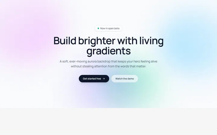
Aurora Blobs Background
OriginalAn animated hero section with soft, ever-drifting aurora gradient blobs floating behind staggered, blur-in content.
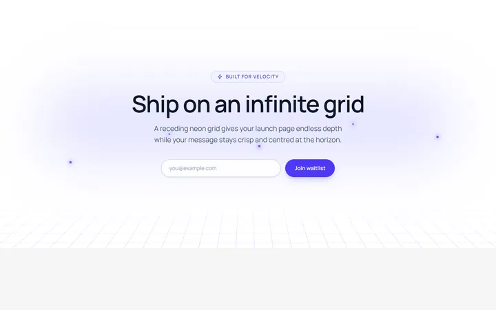
Retro Perspective Grid
OriginalA launch and waitlist section set over an infinite neon grid that scrolls into a glowing horizon with rising particles.
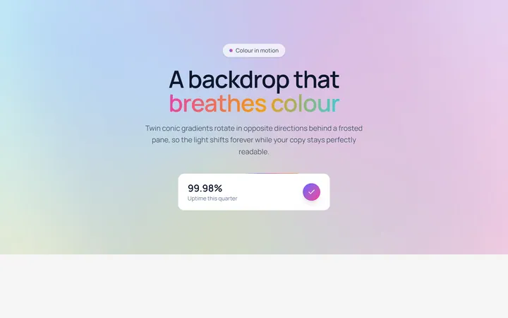
Conic Gradient Flow
OriginalA frosted hero backed by twin counter-rotating conic gradients, with flowing gradient text and an animated gradient-border stat card.
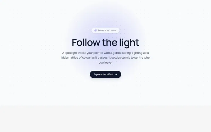
Spotlight Follow Background
OriginalA dot-grid section where a spring-eased spotlight follows the cursor and reveals a hidden lattice of coloured dots.
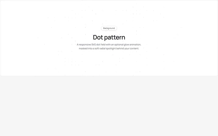
Dot Pattern Background
pattern.tsxA reusable animated background for React and Tailwind: dot pattern background.
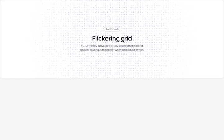
Flickering Grid Background
grid.tsxA reusable animated background for React and Tailwind: flickering grid background.
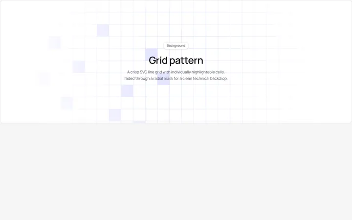
Grid Pattern Background
pattern.tsxA reusable animated background for React and Tailwind: grid pattern background.
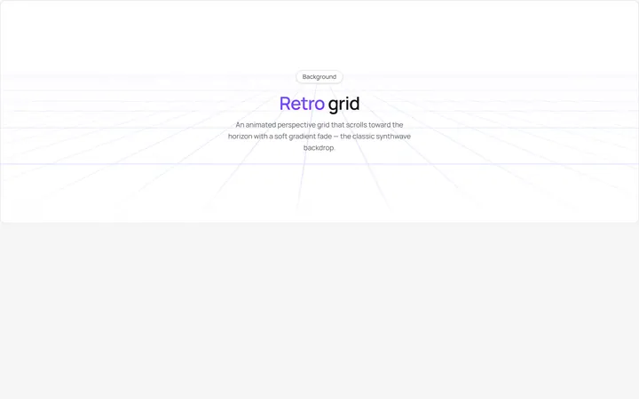
Retro Grid Background
grid.jsonA reusable animated background for React and Tailwind: retro grid background.
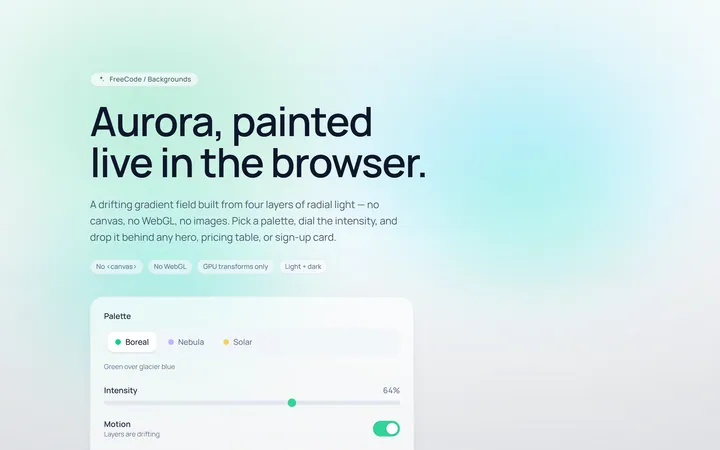
Aurora Background
Originalaurora gradient background
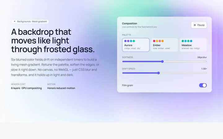
Mesh Gradient Background
Originalanimated mesh gradient background
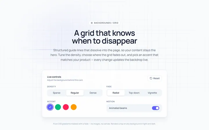
Grid Background
Originalgrid line background with fade
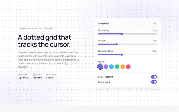
Dots Background
Originaldotted grid background