

Stripes Background
Original · freeanimated stripe background
Copy prompt gives Claude Code, Cursor or v0 a ready-to-paste prompt that recreates this exact component.
npx shadcn@latest add https://webinnoventix.com/r/bgx-stripes.json"use client";
import { useEffect, useMemo, useRef, useState, type CSSProperties } from "react";
import { motion, useReducedMotion } from "motion/react";
type CSSVars = CSSProperties & Record<`--${string}`, string>;
const PALETTES = [
{ id: "indigo", label: "Indigo", a: "rgba(99,102,241,0.55)", b: "rgba(139,92,246,0.26)" },
{ id: "aurora", label: "Aurora", a: "rgba(16,185,129,0.52)", b: "rgba(14,165,233,0.26)" },
{ id: "ember", label: "Ember", a: "rgba(245,158,11,0.52)", b: "rgba(244,63,94,0.26)" },
{ id: "slate", label: "Slate", a: "rgba(100,116,139,0.48)", b: "rgba(148,163,184,0.2)" },
] as const;
type PaletteId = (typeof PALETTES)[number]["id"];
const FEATURES = [
"Transform-only animation — it lives on the compositor and never touches layout.",
"Honors prefers-reduced-motion and pauses the moment you ask it to.",
"Angle, stripe width, palette and drift time all update live below.",
] as const;
function IconPlay() {
return (
<svg viewBox="0 0 24 24" className="h-4 w-4" fill="currentColor" aria-hidden="true">
<path d="M8 5.14v13.72a1 1 0 0 0 1.54.84l10.29-6.86a1 1 0 0 0 0-1.68L9.54 4.3A1 1 0 0 0 8 5.14Z" />
</svg>
);
}
function IconPause() {
return (
<svg viewBox="0 0 24 24" className="h-4 w-4" fill="currentColor" aria-hidden="true">
<rect x="6" y="5" width="4" height="14" rx="1.2" />
<rect x="14" y="5" width="4" height="14" rx="1.2" />
</svg>
);
}
function IconReverse() {
return (
<svg viewBox="0 0 24 24" className="h-4 w-4" fill="none" stroke="currentColor" strokeWidth={2} strokeLinecap="round" strokeLinejoin="round" aria-hidden="true">
<path d="M3 12a9 9 0 0 1 15.5-6.2L21 8" />
<path d="M21 3v5h-5" />
<path d="M21 12a9 9 0 0 1-15.5 6.2L3 16" />
<path d="M3 21v-5h5" />
</svg>
);
}
function IconCopy() {
return (
<svg viewBox="0 0 24 24" className="h-4 w-4" fill="none" stroke="currentColor" strokeWidth={2} strokeLinecap="round" strokeLinejoin="round" aria-hidden="true">
<rect x="9" y="9" width="11" height="11" rx="2.2" />
<path d="M5 15V5a2 2 0 0 1 2-2h8" />
</svg>
);
}
function IconCheck() {
return (
<svg viewBox="0 0 24 24" className="h-4 w-4" fill="none" stroke="currentColor" strokeWidth={2.4} strokeLinecap="round" strokeLinejoin="round" aria-hidden="true">
<path d="m5 13 4 4 10-11" />
</svg>
);
}
function RangeControl({
id,
label,
hint,
min,
max,
step,
value,
unit,
onChange,
}: {
id: string;
label: string;
hint: string;
min: number;
max: number;
step: number;
value: number;
unit: string;
onChange: (next: number) => void;
}) {
return (
<div>
<div className="flex items-baseline justify-between gap-3">
<label htmlFor={id} className="text-sm font-medium text-slate-700 dark:text-slate-200">
{label}
</label>
<span className="rounded-md bg-slate-100 px-2 py-0.5 text-xs font-semibold tabular-nums text-slate-600 dark:bg-slate-800 dark:text-slate-300">
{value}
{unit}
</span>
</div>
<input
id={id}
type="range"
min={min}
max={max}
step={step}
value={value}
aria-valuetext={`${value}${unit}`}
onChange={(e) => onChange(Number(e.target.value))}
className="mt-3 w-full cursor-pointer rounded accent-indigo-500 focus-visible:outline-none focus-visible:ring-2 focus-visible:ring-indigo-500 focus-visible:ring-offset-2 focus-visible:ring-offset-white dark:accent-indigo-400 dark:focus-visible:ring-offset-slate-900"
/>
<p className="mt-1.5 text-xs text-slate-500 dark:text-slate-400">{hint}</p>
</div>
);
}
export default function BgxStripes() {
const prefersReduced = useReducedMotion();
const reduce = !!prefersReduced;
const [paused, setPaused] = useState(false);
const [reverse, setReverse] = useState(false);
const [palette, setPalette] = useState<PaletteId>("indigo");
const [angle, setAngle] = useState(58);
const [width, setWidth] = useState(34);
const [drift, setDrift] = useState(11);
const [copied, setCopied] = useState(false);
const timerRef = useRef<number | null>(null);
useEffect(() => {
return () => {
if (timerRef.current !== null) window.clearTimeout(timerRef.current);
};
}, []);
const active = PALETTES.find((p) => p.id === palette) ?? PALETTES[0];
const running = !paused && !reduce;
const canvasStyle: CSSVars = {
"--bgx-angle": `${angle}deg`,
"--bgx-w": `${width}px`,
"--bgx-dur": `${drift}s`,
"--bgx-a": active.a,
"--bgx-b": active.b,
};
const stripeStyle: CSSProperties = {
animationPlayState: running ? "running" : "paused",
animationDirection: reverse ? "reverse" : "normal",
};
const cssSnippet = useMemo(
() =>
`.stripes {
background-image: repeating-linear-gradient(
${angle}deg,
${active.a} 0 ${width}px,
${active.b} ${width}px ${width * 2}px
);
animation: drift ${drift}s linear infinite${reverse ? " reverse" : ""};
}
@keyframes drift {
to { transform: translate3d(-${width * 2}px, 0, 0); }
}`,
[angle, width, drift, reverse, active],
);
const copy = async () => {
try {
await navigator.clipboard.writeText(cssSnippet);
setCopied(true);
if (timerRef.current !== null) window.clearTimeout(timerRef.current);
timerRef.current = window.setTimeout(() => setCopied(false), 2000);
} catch {
setCopied(false);
}
};
const toggleCls = (on: boolean) =>
`inline-flex items-center gap-2 rounded-xl border px-3.5 py-2 text-sm font-medium transition focus-visible:outline-none focus-visible:ring-2 focus-visible:ring-indigo-500 focus-visible:ring-offset-2 focus-visible:ring-offset-white disabled:cursor-not-allowed disabled:opacity-50 dark:focus-visible:ring-offset-slate-900 ${
on
? "border-indigo-500 bg-indigo-500 text-white shadow-sm shadow-indigo-500/30 dark:border-indigo-400 dark:bg-indigo-400 dark:text-slate-950"
: "border-slate-200 bg-white/70 text-slate-700 hover:bg-white dark:border-white/10 dark:bg-slate-800/60 dark:text-slate-200 dark:hover:bg-slate-800"
}`;
const enter = (delay: number) =>
prefersReduced
? {}
: {
initial: { opacity: 0, y: 20 },
whileInView: { opacity: 1, y: 0 },
viewport: { once: true, amount: 0.3 },
transition: { duration: 0.6, ease: [0.22, 1, 0.36, 1] as const, delay },
};
return (
<section className="relative w-full overflow-hidden bg-white text-slate-900 dark:bg-slate-950 dark:text-slate-100">
<style>{`
@keyframes bgx-stripes-drift {
from { transform: translate3d(0, 0, 0); }
to { transform: translate3d(calc(var(--bgx-w) * -2), 0, 0); }
}
@keyframes bgx-stripes-pulse {
0%, 100% { opacity: 1; transform: scale(1); }
50% { opacity: .35; transform: scale(.6); }
}
.bgx-rotor {
position: absolute;
top: 50%;
left: 50%;
width: 230%;
height: 230%;
transform: translate(-50%, -50%) rotate(var(--bgx-angle));
transform-origin: center;
transition: transform 500ms cubic-bezier(.22, 1, .36, 1);
}
.bgx-stripes {
position: absolute;
inset: -240px;
background-image: repeating-linear-gradient(
90deg,
var(--bgx-a) 0,
var(--bgx-a) var(--bgx-w),
var(--bgx-b) var(--bgx-w),
var(--bgx-b) calc(var(--bgx-w) * 2)
);
animation: bgx-stripes-drift var(--bgx-dur) linear infinite;
will-change: transform;
}
.bgx-dot { animation: bgx-stripes-pulse 2.4s ease-in-out infinite; }
@media (prefers-reduced-motion: reduce) {
.bgx-rotor { transition: none; }
.bgx-stripes { animation: none; }
.bgx-dot { animation: none; }
}
`}</style>
{/* Animated stripe field */}
<div className="absolute inset-0 overflow-hidden" style={canvasStyle} aria-hidden="true">
<div className="bgx-rotor">
<div className="bgx-stripes" style={stripeStyle} />
</div>
<div className="absolute inset-0 bg-gradient-to-b from-white/80 via-transparent to-white/85 dark:from-slate-950/85 dark:via-transparent dark:to-slate-950/90" />
<div className="absolute inset-0 bg-gradient-to-r from-white/45 via-transparent to-white/45 dark:from-slate-950/45 dark:via-transparent dark:to-slate-950/45" />
</div>
{/* Content */}
<div className="relative mx-auto grid w-full max-w-6xl items-center gap-8 px-6 py-20 sm:py-28 lg:grid-cols-2 lg:gap-12 lg:px-8">
<motion.div
{...enter(0)}
className="rounded-3xl border border-slate-200/70 bg-white/55 p-8 shadow-xl shadow-slate-900/5 backdrop-blur-md sm:p-10 dark:border-white/10 dark:bg-slate-900/45 dark:shadow-black/30"
>
<span className="inline-flex items-center gap-2 rounded-full border border-slate-200/70 bg-white/70 px-3 py-1 text-xs font-medium text-slate-600 dark:border-white/10 dark:bg-slate-800/70 dark:text-slate-300">
<span className="bgx-dot h-2 w-2 rounded-full bg-emerald-500 dark:bg-emerald-400" />
Live preview · GPU-drawn
</span>
<h1 className="mt-6 text-4xl font-semibold tracking-tight sm:text-5xl">
A backdrop that sets the tone before a word is read.
</h1>
<p className="mt-5 text-base leading-relaxed text-slate-600 dark:text-slate-300">
Drop this stripe field behind a hero, a pricing table, or a login screen. It drifts
quietly, keeps its distance from your type, and re-skins to match any brand in a single
click. Everything on the right is wired to the pattern you are looking at.
</p>
<ul className="mt-8 space-y-3">
{FEATURES.map((feature) => (
<li key={feature} className="flex items-start gap-3 text-sm text-slate-600 dark:text-slate-300">
<span className="mt-0.5 inline-flex h-5 w-5 flex-none items-center justify-center rounded-full bg-emerald-100 text-emerald-700 dark:bg-emerald-500/15 dark:text-emerald-300">
<IconCheck />
</span>
<span>{feature}</span>
</li>
))}
</ul>
</motion.div>
<motion.div
{...enter(0.12)}
className="rounded-3xl border border-slate-200/70 bg-white/60 p-6 shadow-xl shadow-slate-900/5 backdrop-blur-md sm:p-8 dark:border-white/10 dark:bg-slate-900/50 dark:shadow-black/30"
>
<div className="flex items-center justify-between gap-4">
<div>
<h2 className="text-lg font-semibold tracking-tight">Tune the field</h2>
<p className="text-sm text-slate-500 dark:text-slate-400">Live, keyboard-accessible controls.</p>
</div>
<button
type="button"
onClick={copy}
className="inline-flex items-center gap-2 rounded-xl border border-slate-200 bg-white/70 px-3 py-2 text-sm font-medium text-slate-700 transition hover:bg-white focus-visible:outline-none focus-visible:ring-2 focus-visible:ring-indigo-500 focus-visible:ring-offset-2 focus-visible:ring-offset-white dark:border-white/10 dark:bg-slate-800/60 dark:text-slate-200 dark:hover:bg-slate-800 dark:focus-visible:ring-offset-slate-900"
>
{copied ? <IconCheck /> : <IconCopy />}
{copied ? "Copied" : "Copy CSS"}
</button>
</div>
<span role="status" aria-live="polite" className="sr-only">
{copied ? "CSS copied to clipboard" : ""}
</span>
{/* Playback */}
<div className="mt-6 flex flex-wrap gap-2">
<button
type="button"
onClick={() => setPaused((p) => !p)}
disabled={reduce}
aria-pressed={running}
aria-label={running ? "Pause the animation" : "Play the animation"}
className={toggleCls(running)}
>
{running ? <IconPause /> : <IconPlay />}
{running ? "Pause" : "Play"}
</button>
<button
type="button"
onClick={() => setReverse((r) => !r)}
disabled={reduce}
aria-pressed={reverse}
className={toggleCls(reverse)}
>
<IconReverse />
Reverse
</button>
</div>
{reduce && (
<p className="mt-3 rounded-xl border border-amber-300/60 bg-amber-50 px-3 py-2 text-xs text-amber-800 dark:border-amber-400/25 dark:bg-amber-400/10 dark:text-amber-200">
Your system requests reduced motion, so drifting is held still. Colour, angle and width
still update the preview.
</p>
)}
{/* Palette */}
<fieldset className="mt-6">
<legend className="text-sm font-medium text-slate-700 dark:text-slate-200">Palette</legend>
<div className="mt-3 grid grid-cols-2 gap-2 sm:grid-cols-4">
{PALETTES.map((p) => (
<label
key={p.id}
className="group relative flex cursor-pointer items-center gap-2 rounded-xl border border-slate-200 bg-white/60 px-3 py-2 text-sm text-slate-600 transition hover:bg-white dark:border-white/10 dark:bg-slate-800/50 dark:text-slate-300 dark:hover:bg-slate-800 [&:has(:checked)]:border-indigo-500 [&:has(:checked)]:bg-indigo-50 [&:has(:checked)]:text-indigo-700 [&:has(:focus-visible)]:ring-2 [&:has(:focus-visible)]:ring-indigo-500 [&:has(:focus-visible)]:ring-offset-2 [&:has(:focus-visible)]:ring-offset-white dark:[&:has(:checked)]:border-indigo-400 dark:[&:has(:checked)]:bg-indigo-500/15 dark:[&:has(:checked)]:text-indigo-200 dark:[&:has(:focus-visible)]:ring-offset-slate-900"
>
<input
type="radio"
name="bgx-palette"
value={p.id}
checked={palette === p.id}
onChange={() => setPalette(p.id)}
className="sr-only"
/>
<span
aria-hidden="true"
className="h-3.5 w-3.5 flex-none rounded-full ring-1 ring-inset ring-black/10 dark:ring-white/15"
style={{ backgroundImage: `linear-gradient(135deg, ${p.a}, ${p.b})` }}
/>
{p.label}
</label>
))}
</div>
</fieldset>
{/* Sliders */}
<div className="mt-6 space-y-5">
<RangeControl
id="bgx-angle"
label="Angle"
hint="Rotates the whole field from flat to steep."
min={0}
max={180}
step={1}
value={angle}
unit="°"
onChange={setAngle}
/>
<RangeControl
id="bgx-width"
label="Stripe width"
hint="Sets how wide each band of colour is."
min={12}
max={72}
step={1}
value={width}
unit="px"
onChange={setWidth}
/>
<RangeControl
id="bgx-drift"
label="Drift time"
hint="Seconds for one full loop — higher is calmer."
min={3}
max={30}
step={1}
value={drift}
unit="s"
onChange={setDrift}
/>
</div>
</motion.div>
</div>
</section>
);
}Dependencies
Licence
Built by Web Innoventix. Free for personal and commercial use, no attribution required.
Built by Web Innoventix
Need a custom interface, a full website, or SEO that gets you cited by AI? We design, build and rank it end to end.
Get a free quoteSimilar components
Browse all →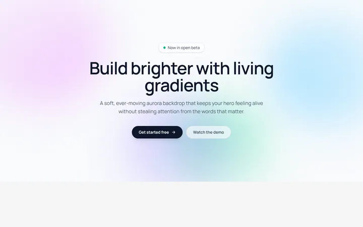
Aurora Blobs Background
OriginalAn animated hero section with soft, ever-drifting aurora gradient blobs floating behind staggered, blur-in content.
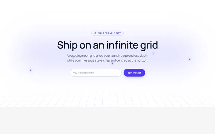
Retro Perspective Grid
OriginalA launch and waitlist section set over an infinite neon grid that scrolls into a glowing horizon with rising particles.
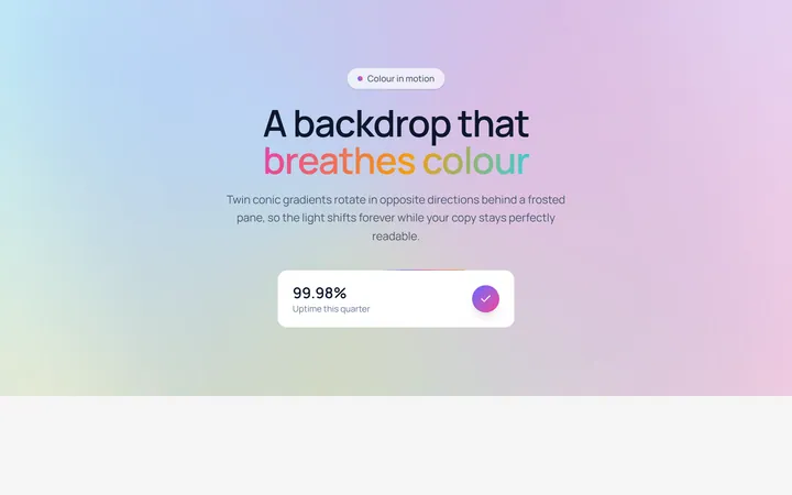
Conic Gradient Flow
OriginalA frosted hero backed by twin counter-rotating conic gradients, with flowing gradient text and an animated gradient-border stat card.
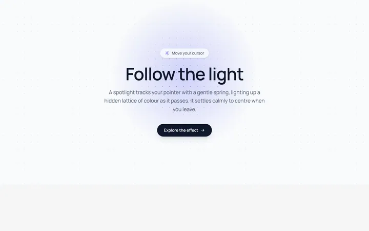
Spotlight Follow Background
OriginalA dot-grid section where a spring-eased spotlight follows the cursor and reveals a hidden lattice of coloured dots.
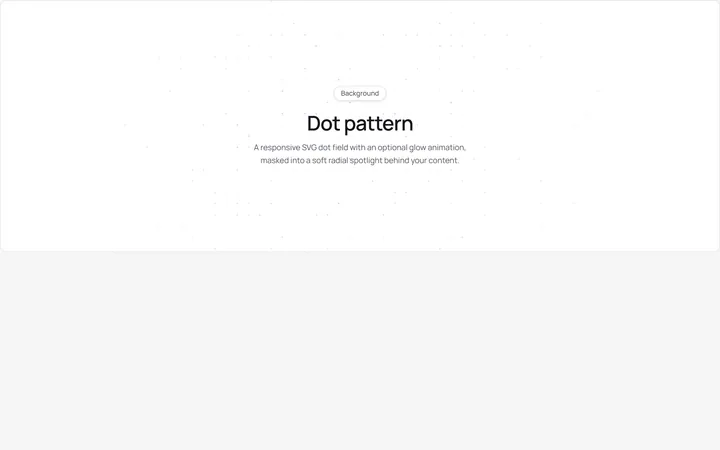
Dot Pattern Background
pattern.tsxA reusable animated background for React and Tailwind: dot pattern background.
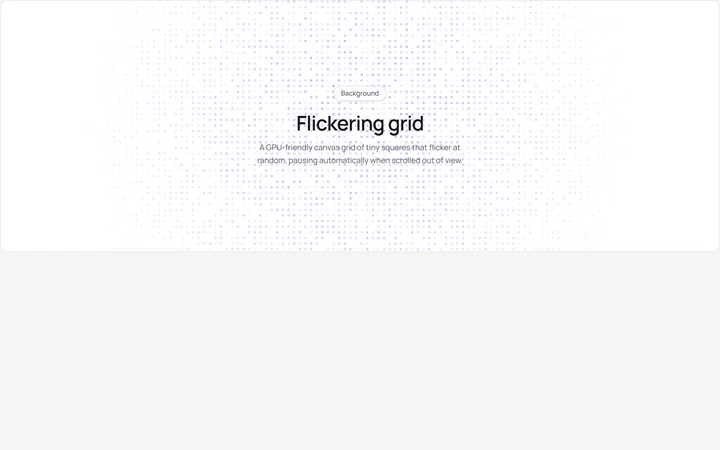
Flickering Grid Background
grid.tsxA reusable animated background for React and Tailwind: flickering grid background.
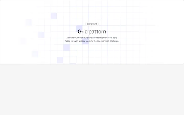
Grid Pattern Background
pattern.tsxA reusable animated background for React and Tailwind: grid pattern background.
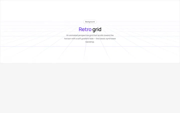
Retro Grid Background
grid.jsonA reusable animated background for React and Tailwind: retro grid background.
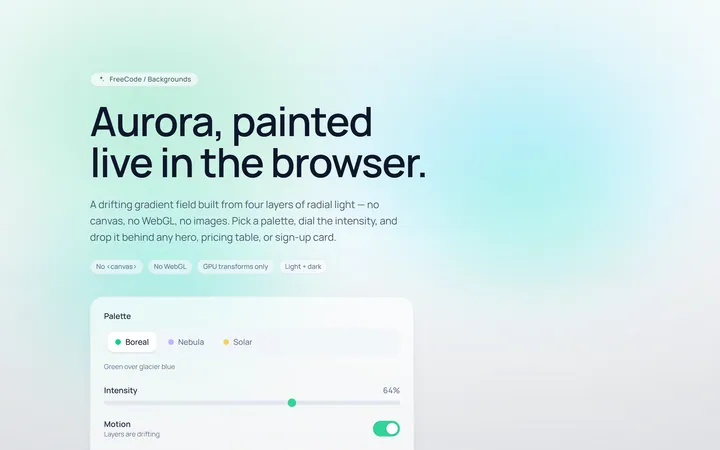
Aurora Background
Originalaurora gradient background
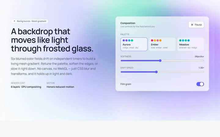
Mesh Gradient Background
Originalanimated mesh gradient background
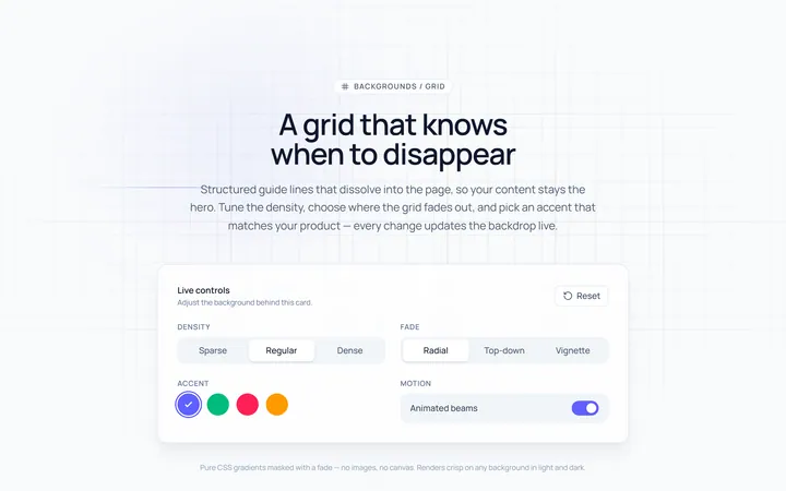
Grid Background
Originalgrid line background with fade
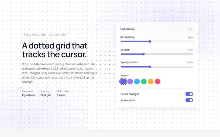
Dots Background
Originaldotted grid background