

Split Button
Original · freeA split button with a primary action and a dropdown caret menu.
Copy prompt gives Claude Code, Cursor or v0 a ready-to-paste prompt that recreates this exact component.
npx shadcn@latest add https://webinnoventix.com/r/btn-split.json"use client";
import { type KeyboardEvent, type ReactNode, useEffect, useId, useRef, useState } from "react";
import { AnimatePresence, motion, useReducedMotion } from "motion/react";
type MenuAction = {
id: string;
label: string;
hint?: string;
icon: ReactNode;
destructive?: boolean;
};
const CheckIcon = () => (
<svg viewBox="0 0 24 24" fill="none" stroke="currentColor" strokeWidth="2.4" strokeLinecap="round" strokeLinejoin="round" className="h-4 w-4" aria-hidden="true">
<path d="M20 6 9 17l-5-5" />
</svg>
);
const CaretIcon = () => (
<svg viewBox="0 0 24 24" fill="none" stroke="currentColor" strokeWidth="2.4" strokeLinecap="round" strokeLinejoin="round" className="h-4 w-4" aria-hidden="true">
<path d="m6 9 6 6 6-6" />
</svg>
);
const SpinnerIcon = () => (
<svg viewBox="0 0 24 24" fill="none" className="h-4 w-4" aria-hidden="true">
<circle cx="12" cy="12" r="9" stroke="currentColor" strokeOpacity="0.25" strokeWidth="3" />
<path d="M21 12a9 9 0 0 0-9-9" stroke="currentColor" strokeWidth="3" strokeLinecap="round" className="btnsplit-spin" style={{ transformOrigin: "12px 12px" }} />
</svg>
);
const SaveIcon = () => (
<svg viewBox="0 0 24 24" fill="none" stroke="currentColor" strokeWidth="1.9" strokeLinecap="round" strokeLinejoin="round" className="h-4 w-4" aria-hidden="true">
<path d="M19 21H5a2 2 0 0 1-2-2V5a2 2 0 0 1 2-2h11l5 5v11a2 2 0 0 1-2 2Z" />
<path d="M17 21v-8H7v8M7 3v5h8" />
</svg>
);
const BranchIcon = () => (
<svg viewBox="0 0 24 24" fill="none" stroke="currentColor" strokeWidth="1.9" strokeLinecap="round" strokeLinejoin="round" className="h-4 w-4" aria-hidden="true">
<circle cx="6" cy="6" r="2.5" />
<circle cx="6" cy="18" r="2.5" />
<circle cx="18" cy="8" r="2.5" />
<path d="M6 8.5v7M18 10.5c0 4-6 1.5-6 5.5" />
</svg>
);
const DraftIcon = () => (
<svg viewBox="0 0 24 24" fill="none" stroke="currentColor" strokeWidth="1.9" strokeLinecap="round" strokeLinejoin="round" className="h-4 w-4" aria-hidden="true">
<path d="M14 3H6a2 2 0 0 0-2 2v14a2 2 0 0 0 2 2h12a2 2 0 0 0 2-2V9z" />
<path d="M14 3v6h6M9 13h6M9 17h4" />
</svg>
);
const ScheduleIcon = () => (
<svg viewBox="0 0 24 24" fill="none" stroke="currentColor" strokeWidth="1.9" strokeLinecap="round" strokeLinejoin="round" className="h-4 w-4" aria-hidden="true">
<circle cx="12" cy="13" r="8" />
<path d="M12 9v4l2.5 2.5M9 2h6" />
</svg>
);
const TrashIcon = () => (
<svg viewBox="0 0 24 24" fill="none" stroke="currentColor" strokeWidth="1.9" strokeLinecap="round" strokeLinejoin="round" className="h-4 w-4" aria-hidden="true">
<path d="M3 6h18M8 6V4a1 1 0 0 1 1-1h6a1 1 0 0 1 1 1v2m2 0v14a2 2 0 0 1-2 2H7a2 2 0 0 1-2-2V6" />
<path d="M10 11v6M14 11v6" />
</svg>
);
const DownloadIcon = () => (
<svg viewBox="0 0 24 24" fill="none" stroke="currentColor" strokeWidth="1.9" strokeLinecap="round" strokeLinejoin="round" className="h-4 w-4" aria-hidden="true">
<path d="M12 3v12m0 0 4-4m-4 4-4-4M4 17v2a2 2 0 0 0 2 2h12a2 2 0 0 0 2-2v-2" />
</svg>
);
const CopyIcon = () => (
<svg viewBox="0 0 24 24" fill="none" stroke="currentColor" strokeWidth="1.9" strokeLinecap="round" strokeLinejoin="round" className="h-4 w-4" aria-hidden="true">
<rect x="9" y="9" width="12" height="12" rx="2" />
<path d="M5 15H4a2 2 0 0 1-2-2V4a2 2 0 0 1 2-2h9a2 2 0 0 1 2 2v1" />
</svg>
);
function SplitButton({
primaryLabel,
primaryIcon,
actions,
tone,
size,
onPrimary,
onSelect,
}: {
primaryLabel: string;
primaryIcon: ReactNode;
actions: MenuAction[];
tone: "indigo" | "emerald" | "neutral";
size: "sm" | "md";
onPrimary?: () => void | Promise<void>;
onSelect?: (action: MenuAction) => void;
}) {
const reduce = useReducedMotion();
const menuId = useId();
const [open, setOpen] = useState(false);
const [busy, setBusy] = useState(false);
const [active, setActive] = useState(-1);
const wrapRef = useRef<HTMLDivElement>(null);
const caretRef = useRef<HTMLButtonElement>(null);
const itemRefs = useRef<Array<HTMLButtonElement | null>>([]);
useEffect(() => {
if (!open) return;
const onDoc = (e: MouseEvent) => {
if (wrapRef.current && !wrapRef.current.contains(e.target as Node)) setOpen(false);
};
document.addEventListener("mousedown", onDoc);
return () => document.removeEventListener("mousedown", onDoc);
}, [open]);
useEffect(() => {
if (open && active >= 0) itemRefs.current[active]?.focus();
}, [open, active]);
const openMenu = (idx: number) => {
setActive(idx);
setOpen(true);
};
const closeMenu = (focusCaret = true) => {
setOpen(false);
setActive(-1);
if (focusCaret) caretRef.current?.focus();
};
const runPrimary = async () => {
if (busy || !onPrimary) {
onPrimary?.();
return;
}
setBusy(true);
try {
await onPrimary();
} finally {
setBusy(false);
}
};
const onCaretKey = (e: KeyboardEvent) => {
if (e.key === "ArrowDown" || e.key === "Enter" || e.key === " ") {
e.preventDefault();
openMenu(0);
} else if (e.key === "ArrowUp") {
e.preventDefault();
openMenu(actions.length - 1);
}
};
const onItemKey = (e: KeyboardEvent, idx: number) => {
if (e.key === "ArrowDown") {
e.preventDefault();
setActive((idx + 1) % actions.length);
} else if (e.key === "ArrowUp") {
e.preventDefault();
setActive((idx - 1 + actions.length) % actions.length);
} else if (e.key === "Home") {
e.preventDefault();
setActive(0);
} else if (e.key === "End") {
e.preventDefault();
setActive(actions.length - 1);
} else if (e.key === "Escape") {
e.preventDefault();
closeMenu();
} else if (e.key === "Tab") {
setOpen(false);
setActive(-1);
}
};
const pick = (action: MenuAction) => {
onSelect?.(action);
closeMenu();
};
const toneMap = {
indigo: {
solid:
"bg-indigo-600 text-white hover:bg-indigo-500 active:bg-indigo-700 dark:bg-indigo-500 dark:hover:bg-indigo-400 dark:active:bg-indigo-600",
divide: "border-indigo-500/60 dark:border-indigo-300/30",
ring: "focus-visible:ring-indigo-500 dark:focus-visible:ring-indigo-300",
accent: "text-indigo-600 dark:text-indigo-300",
},
emerald: {
solid:
"bg-emerald-600 text-white hover:bg-emerald-500 active:bg-emerald-700 dark:bg-emerald-500 dark:hover:bg-emerald-400 dark:active:bg-emerald-600",
divide: "border-emerald-500/60 dark:border-emerald-300/30",
ring: "focus-visible:ring-emerald-500 dark:focus-visible:ring-emerald-300",
accent: "text-emerald-600 dark:text-emerald-300",
},
neutral: {
solid:
"bg-zinc-900 text-white hover:bg-zinc-800 active:bg-zinc-950 dark:bg-zinc-100 dark:text-zinc-900 dark:hover:bg-white dark:active:bg-zinc-200",
divide: "border-white/20 dark:border-zinc-900/20",
ring: "focus-visible:ring-zinc-900 dark:focus-visible:ring-zinc-100",
accent: "text-zinc-900 dark:text-zinc-100",
},
}[tone];
const pad = size === "sm" ? "px-3.5 py-2 text-sm gap-2" : "px-5 py-2.5 text-[0.95rem] gap-2.5";
const caretPad = size === "sm" ? "px-2.5 py-2" : "px-3 py-2.5";
return (
<div ref={wrapRef} className="relative inline-flex">
<div
className={`inline-flex rounded-xl shadow-sm shadow-zinc-900/10 dark:shadow-black/40 ring-1 ring-inset ${
tone === "neutral" ? "ring-zinc-900/10 dark:ring-white/10" : "ring-transparent"
}`}
>
<button
type="button"
onClick={runPrimary}
disabled={busy}
aria-label={busy ? `${primaryLabel} in progress` : undefined}
className={`inline-flex items-center rounded-l-xl font-semibold transition-colors duration-150 outline-none focus-visible:z-10 focus-visible:ring-2 focus-visible:ring-offset-2 focus-visible:ring-offset-white dark:focus-visible:ring-offset-zinc-950 disabled:cursor-not-allowed disabled:opacity-70 ${pad} ${toneMap.solid} ${toneMap.ring}`}
>
<span className="grid place-items-center [&>svg]:transition-transform">
{busy ? <SpinnerIcon /> : primaryIcon}
</span>
{primaryLabel}
</button>
<div className={`w-px self-stretch border-l ${toneMap.divide}`} aria-hidden="true" />
<button
ref={caretRef}
type="button"
onClick={() => (open ? closeMenu() : openMenu(-1))}
onKeyDown={onCaretKey}
aria-haspopup="menu"
aria-expanded={open}
aria-controls={open ? menuId : undefined}
aria-label={`More ${primaryLabel.toLowerCase()} options`}
className={`inline-flex items-center rounded-r-xl font-semibold transition-colors duration-150 outline-none focus-visible:z-10 focus-visible:ring-2 focus-visible:ring-offset-2 focus-visible:ring-offset-white dark:focus-visible:ring-offset-zinc-950 ${caretPad} ${toneMap.solid} ${toneMap.ring}`}
>
<span className={`grid place-items-center transition-transform duration-200 ${open ? "rotate-180" : ""}`}>
<CaretIcon />
</span>
</button>
</div>
<AnimatePresence>
{open && (
<motion.div
id={menuId}
role="menu"
aria-label={`${primaryLabel} options`}
initial={reduce ? { opacity: 0 } : { opacity: 0, y: -6, scale: 0.97 }}
animate={reduce ? { opacity: 1 } : { opacity: 1, y: 0, scale: 1 }}
exit={reduce ? { opacity: 0 } : { opacity: 0, y: -6, scale: 0.97 }}
transition={{ duration: 0.16, ease: [0.22, 1, 0.36, 1] }}
className="absolute right-0 top-[calc(100%+0.5rem)] z-20 w-64 origin-top-right overflow-hidden rounded-2xl border border-zinc-200 bg-white p-1.5 shadow-xl shadow-zinc-900/10 dark:border-zinc-800 dark:bg-zinc-900 dark:shadow-black/60"
>
{actions.map((action, i) => (
<button
key={action.id}
ref={(el) => {
itemRefs.current[i] = el;
}}
type="button"
role="menuitem"
tabIndex={active === i ? 0 : -1}
onClick={() => pick(action)}
onKeyDown={(e) => onItemKey(e, i)}
onMouseEnter={() => setActive(i)}
className={`group flex w-full items-center gap-3 rounded-xl px-3 py-2.5 text-left text-sm outline-none transition-colors ${
action.destructive
? "text-rose-600 dark:text-rose-400"
: "text-zinc-700 dark:text-zinc-200"
} ${
active === i
? action.destructive
? "bg-rose-50 dark:bg-rose-500/10"
: "bg-zinc-100 dark:bg-zinc-800"
: ""
}`}
>
<span
className={`grid h-8 w-8 shrink-0 place-items-center rounded-lg border transition-colors ${
action.destructive
? "border-rose-200 bg-rose-50 text-rose-500 dark:border-rose-500/20 dark:bg-rose-500/10 dark:text-rose-400"
: `border-zinc-200 bg-zinc-50 dark:border-zinc-700 dark:bg-zinc-800 ${toneMap.accent}`
}`}
>
{action.icon}
</span>
<span className="min-w-0 flex-1">
<span className="block truncate font-medium">{action.label}</span>
{action.hint && (
<span className="block truncate text-xs text-zinc-400 dark:text-zinc-500">
{action.hint}
</span>
)}
</span>
</button>
))}
</motion.div>
)}
</AnimatePresence>
</div>
);
}
export default function BtnSplit() {
const [lastAction, setLastAction] = useState("Committed to main");
const [copied, setCopied] = useState(false);
const commitActions: MenuAction[] = [
{ id: "amend", label: "Commit & amend", hint: "Rewrite last commit", icon: <SaveIcon /> },
{ id: "branch", label: "Commit to new branch", hint: "feature/split-btn", icon: <BranchIcon /> },
{ id: "draft", label: "Save as draft", hint: "Local only", icon: <DraftIcon /> },
{ id: "discard", label: "Discard changes", hint: "Cannot be undone", icon: <TrashIcon />, destructive: true },
];
const publishActions: MenuAction[] = [
{ id: "schedule", label: "Schedule for later", hint: "Tue, 9:00 AM", icon: <ScheduleIcon /> },
{ id: "draft2", label: "Save draft", hint: "Autosaved 2m ago", icon: <DraftIcon /> },
{ id: "preview", label: "Preview post", hint: "Open in new tab", icon: <DownloadIcon /> },
];
const exportActions: MenuAction[] = [
{ id: "csv", label: "Export as CSV", hint: "report-q3.csv", icon: <DownloadIcon /> },
{ id: "copy", label: "Copy share link", hint: "app.acme.io/r/9f2a", icon: <CopyIcon /> },
{ id: "pdf", label: "Export as PDF", hint: "12 pages", icon: <DraftIcon /> },
];
const copyLink = async () => {
try {
await navigator.clipboard.writeText("https://app.acme.io/r/9f2a1c");
setCopied(true);
setLastAction("Copied share link to clipboard");
window.setTimeout(() => setCopied(false), 1600);
} catch {
setLastAction("Clipboard unavailable");
}
};
return (
<section className="relative w-full bg-white px-6 py-20 text-zinc-900 dark:bg-zinc-950 dark:text-zinc-100 sm:px-10 sm:py-28">
<style>{`
@keyframes btnsplit-rotate { to { transform: rotate(360deg); } }
.btnsplit-spin { animation: btnsplit-rotate 0.8s linear infinite; }
@media (prefers-reduced-motion: reduce) {
.btnsplit-spin { animation: none; }
}
`}</style>
<div className="mx-auto max-w-3xl">
<div className="mb-14 text-center">
<span className="inline-flex items-center gap-2 rounded-full border border-zinc-200 bg-zinc-50 px-3 py-1 text-xs font-medium text-zinc-500 dark:border-zinc-800 dark:bg-zinc-900 dark:text-zinc-400">
<span className="h-1.5 w-1.5 rounded-full bg-emerald-500" />
FreeCode / Buttons
</span>
<h2 className="mt-5 text-3xl font-semibold tracking-tight sm:text-4xl">Split buttons</h2>
<p className="mx-auto mt-3 max-w-md text-sm text-zinc-500 dark:text-zinc-400">
A primary action paired with a caret menu of related actions. Full keyboard
navigation, focus rings, and real clipboard support.
</p>
</div>
<div className="grid gap-10">
<div className="flex flex-col items-center gap-4">
<span className="text-xs font-medium uppercase tracking-wider text-zinc-400 dark:text-zinc-500">
Primary — indigo
</span>
<SplitButton
tone="indigo"
size="md"
primaryLabel="Commit changes"
primaryIcon={<SaveIcon />}
actions={commitActions}
onPrimary={() =>
new Promise<void>((res) =>
window.setTimeout(() => {
setLastAction("Committed 3 files to main");
res();
}, 1100),
)
}
onSelect={(a) => setLastAction(`Selected: ${a.label}`)}
/>
</div>
<div className="flex flex-col items-center gap-4">
<span className="text-xs font-medium uppercase tracking-wider text-zinc-400 dark:text-zinc-500">
Success — emerald
</span>
<SplitButton
tone="emerald"
size="md"
primaryLabel="Publish post"
primaryIcon={<CheckIcon />}
actions={publishActions}
onPrimary={() => setLastAction("Published “Designing tactile buttons”")}
onSelect={(a) => setLastAction(`Selected: ${a.label}`)}
/>
</div>
<div className="flex flex-col items-center gap-4">
<span className="text-xs font-medium uppercase tracking-wider text-zinc-400 dark:text-zinc-500">
Neutral — small
</span>
<SplitButton
tone="neutral"
size="sm"
primaryLabel="Export report"
primaryIcon={<DownloadIcon />}
actions={exportActions}
onPrimary={() => setLastAction("Exported report-q3.csv")}
onSelect={(a) => {
if (a.id === "copy") copyLink();
else setLastAction(`Selected: ${a.label}`);
}}
/>
</div>
</div>
<div
aria-live="polite"
className="mx-auto mt-14 flex max-w-md items-center justify-center gap-2 rounded-xl border border-zinc-200 bg-zinc-50 px-4 py-3 text-sm text-zinc-600 dark:border-zinc-800 dark:bg-zinc-900 dark:text-zinc-300"
>
<span
className={`grid h-5 w-5 place-items-center rounded-full text-white transition-colors ${
copied ? "bg-emerald-500" : "bg-zinc-300 dark:bg-zinc-700"
}`}
>
<CheckIcon />
</span>
<span className="truncate">{lastAction}</span>
</div>
</div>
</section>
);
}Dependencies
Licence
Built by Web Innoventix. Free for personal and commercial use, no attribution required.
Built by Web Innoventix
Need a custom interface, a full website, or SEO that gets you cited by AI? We design, build and rank it end to end.
Get a free quoteSimilar components
Browse all →
Shimmer Button
MITA dark pill button with a continuous conic-gradient light shimmer sweeping around its border.
Rainbow Gradient Button
MITA button wrapped in an animated multi-colour gradient border with a matching blurred underglow.
Interactive Hover Button
MITA pill button whose dot expands to fill the surface and reveals an arrow label on hover.
Pulsating Button
MITA solid button that emits a soft, continuously pulsing glow ring to draw the eye to the primary action.
Shiny Button
MITA frosted-glass button with a spring-animated light sweeping across its text and border.
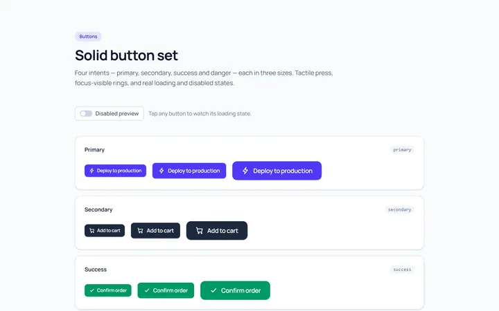
Solid Set Button
OriginalA set of solid buttons: primary, secondary, success and danger, in three sizes.
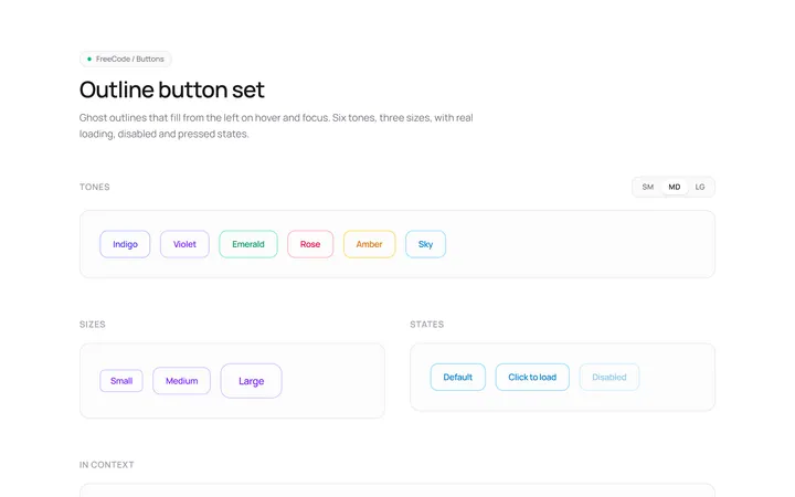
Outline Set Button
OriginalOutline button variants across colours and sizes with a hover fill.
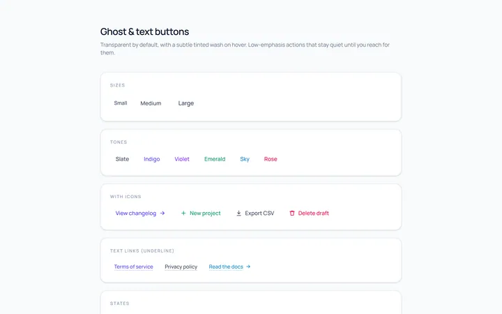
Ghost Set Button
OriginalGhost and text buttons with subtle hover backgrounds.
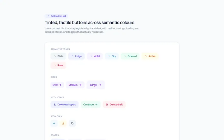
Soft Set Button
OriginalSoft, tinted buttons across semantic colours.
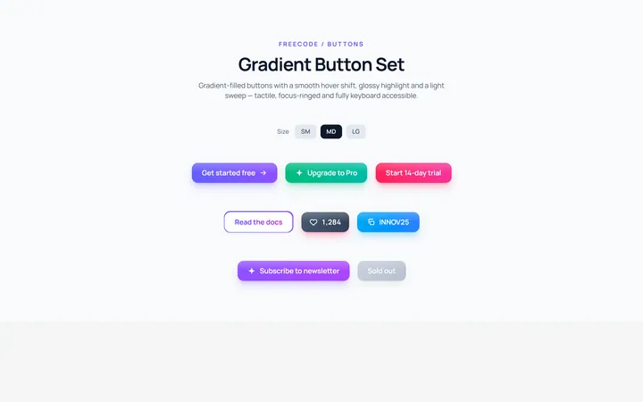
Gradient Set Button
OriginalGradient-filled buttons with a hover shift.
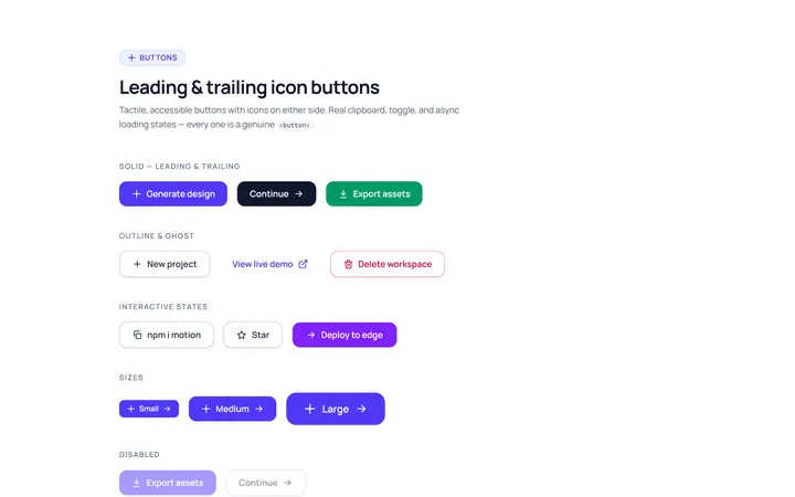
Icon Leading Button
OriginalButtons with leading and trailing icons.
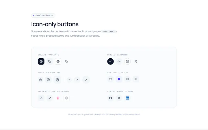
Icon Only Button
OriginalSquare and circular icon-only buttons with tooltips and aria-labels.