

Toggle Group Button
Original · freeA toggle button group supporting single and multi select.
Copy prompt gives Claude Code, Cursor or v0 a ready-to-paste prompt that recreates this exact component.
npx shadcn@latest add https://webinnoventix.com/r/btn-toggle-group.json"use client";
import { useId, useState, type ReactNode } from "react";
import { useReducedMotion } from "motion/react";
type Option = {
value: string;
label: string;
icon?: ReactNode;
};
type Accent = "indigo" | "violet" | "emerald" | "rose" | "sky" | "amber";
const ACCENT: Record<
Accent,
{ on: string; onText: string; ring: string; dot: string }
> = {
indigo: {
on: "bg-indigo-600 border-indigo-600 dark:bg-indigo-500 dark:border-indigo-500",
onText: "text-white",
ring: "focus-visible:ring-indigo-500",
dot: "bg-indigo-500",
},
violet: {
on: "bg-violet-600 border-violet-600 dark:bg-violet-500 dark:border-violet-500",
onText: "text-white",
ring: "focus-visible:ring-violet-500",
dot: "bg-violet-500",
},
emerald: {
on: "bg-emerald-600 border-emerald-600 dark:bg-emerald-500 dark:border-emerald-500",
onText: "text-white",
ring: "focus-visible:ring-emerald-500",
dot: "bg-emerald-500",
},
rose: {
on: "bg-rose-600 border-rose-600 dark:bg-rose-500 dark:border-rose-500",
onText: "text-white",
ring: "focus-visible:ring-rose-500",
dot: "bg-rose-500",
},
sky: {
on: "bg-sky-600 border-sky-600 dark:bg-sky-500 dark:border-sky-500",
onText: "text-white",
ring: "focus-visible:ring-sky-500",
dot: "bg-sky-500",
},
amber: {
on: "bg-amber-500 border-amber-500 dark:bg-amber-400 dark:border-amber-400",
onText: "text-amber-950",
ring: "focus-visible:ring-amber-500",
dot: "bg-amber-500",
},
};
const OFF_CLASSES =
"bg-white border-slate-200 text-slate-600 hover:bg-slate-50 hover:text-slate-900 " +
"dark:bg-slate-900 dark:border-slate-700 dark:text-slate-400 dark:hover:bg-slate-800 dark:hover:text-slate-100";
const SIZES = {
sm: "h-8 px-3 text-xs gap-1.5",
md: "h-10 px-4 text-sm gap-2",
lg: "h-12 px-5 text-base gap-2.5",
} as const;
type Size = keyof typeof SIZES;
function ToggleButton({
option,
pressed,
onToggle,
accent,
size,
iconOnly,
}: {
option: Option;
pressed: boolean;
onToggle: () => void;
accent: Accent;
size: Size;
iconOnly?: boolean;
}) {
const a = ACCENT[accent];
return (
<button
type="button"
aria-pressed={pressed}
aria-label={iconOnly ? option.label : undefined}
onClick={onToggle}
className={[
"btg-btn relative inline-flex items-center justify-center rounded-lg border font-medium",
"outline-none transition-colors duration-150",
"focus-visible:ring-2 focus-visible:ring-offset-2 focus-visible:ring-offset-white dark:focus-visible:ring-offset-slate-950",
"active:scale-[0.97]",
SIZES[size],
iconOnly ? "aspect-square px-0" : "",
a.ring,
pressed ? `${a.on} ${a.onText} shadow-sm` : OFF_CLASSES,
].join(" ")}
>
{option.icon ? (
<span className="shrink-0" aria-hidden="true">
{option.icon}
</span>
) : null}
{iconOnly ? null : <span>{option.label}</span>}
</button>
);
}
/* ---------- inline glyphs ---------- */
function IconBold() {
return (
<svg width="16" height="16" viewBox="0 0 24 24" fill="none" stroke="currentColor" strokeWidth="2.4" strokeLinecap="round" strokeLinejoin="round">
<path d="M7 5h6a3.5 3.5 0 0 1 0 7H7z" />
<path d="M7 12h7a3.5 3.5 0 0 1 0 7H7z" />
</svg>
);
}
function IconItalic() {
return (
<svg width="16" height="16" viewBox="0 0 24 24" fill="none" stroke="currentColor" strokeWidth="2.2" strokeLinecap="round" strokeLinejoin="round">
<line x1="15" y1="5" x2="9" y2="19" />
<line x1="9" y1="5" x2="17" y2="5" />
<line x1="7" y1="19" x2="15" y2="19" />
</svg>
);
}
function IconUnderline() {
return (
<svg width="16" height="16" viewBox="0 0 24 24" fill="none" stroke="currentColor" strokeWidth="2.2" strokeLinecap="round" strokeLinejoin="round">
<path d="M7 4v6a5 5 0 0 0 10 0V4" />
<line x1="5" y1="20" x2="19" y2="20" />
</svg>
);
}
function IconStrike() {
return (
<svg width="16" height="16" viewBox="0 0 24 24" fill="none" stroke="currentColor" strokeWidth="2.2" strokeLinecap="round" strokeLinejoin="round">
<path d="M6 12h12" />
<path d="M8 7a4 3 0 0 1 8 0" />
<path d="M8 16a4 3 0 0 0 8 0" />
</svg>
);
}
function IconAlignLeft() {
return (
<svg width="16" height="16" viewBox="0 0 24 24" fill="none" stroke="currentColor" strokeWidth="2.2" strokeLinecap="round" strokeLinejoin="round">
<line x1="4" y1="6" x2="20" y2="6" />
<line x1="4" y1="12" x2="13" y2="12" />
<line x1="4" y1="18" x2="16" y2="18" />
</svg>
);
}
function IconAlignCenter() {
return (
<svg width="16" height="16" viewBox="0 0 24 24" fill="none" stroke="currentColor" strokeWidth="2.2" strokeLinecap="round" strokeLinejoin="round">
<line x1="4" y1="6" x2="20" y2="6" />
<line x1="7" y1="12" x2="17" y2="12" />
<line x1="5" y1="18" x2="19" y2="18" />
</svg>
);
}
function IconAlignRight() {
return (
<svg width="16" height="16" viewBox="0 0 24 24" fill="none" stroke="currentColor" strokeWidth="2.2" strokeLinecap="round" strokeLinejoin="round">
<line x1="4" y1="6" x2="20" y2="6" />
<line x1="11" y1="12" x2="20" y2="12" />
<line x1="8" y1="18" x2="20" y2="18" />
</svg>
);
}
function IconAlignJustify() {
return (
<svg width="16" height="16" viewBox="0 0 24 24" fill="none" stroke="currentColor" strokeWidth="2.2" strokeLinecap="round" strokeLinejoin="round">
<line x1="4" y1="6" x2="20" y2="6" />
<line x1="4" y1="12" x2="20" y2="12" />
<line x1="4" y1="18" x2="20" y2="18" />
</svg>
);
}
function IconGrid() {
return (
<svg width="16" height="16" viewBox="0 0 24 24" fill="none" stroke="currentColor" strokeWidth="2" strokeLinecap="round" strokeLinejoin="round">
<rect x="4" y="4" width="7" height="7" rx="1" />
<rect x="13" y="4" width="7" height="7" rx="1" />
<rect x="4" y="13" width="7" height="7" rx="1" />
<rect x="13" y="13" width="7" height="7" rx="1" />
</svg>
);
}
function IconList() {
return (
<svg width="16" height="16" viewBox="0 0 24 24" fill="none" stroke="currentColor" strokeWidth="2" strokeLinecap="round" strokeLinejoin="round">
<line x1="9" y1="6" x2="20" y2="6" />
<line x1="9" y1="12" x2="20" y2="12" />
<line x1="9" y1="18" x2="20" y2="18" />
<circle cx="5" cy="6" r="1" />
<circle cx="5" cy="12" r="1" />
<circle cx="5" cy="18" r="1" />
</svg>
);
}
/* ---------- single-select demo (segmented) ---------- */
const VIEW_OPTIONS: Option[] = [
{ value: "grid", label: "Grid", icon: <IconGrid /> },
{ value: "list", label: "List", icon: <IconList /> },
];
const ALIGN_OPTIONS: Option[] = [
{ value: "left", label: "Align left", icon: <IconAlignLeft /> },
{ value: "center", label: "Align center", icon: <IconAlignCenter /> },
{ value: "right", label: "Align right", icon: <IconAlignRight /> },
{ value: "justify", label: "Justify", icon: <IconAlignJustify /> },
];
const PLAN_OPTIONS: Option[] = [
{ value: "monthly", label: "Monthly" },
{ value: "annual", label: "Annual" },
];
/* ---------- multi-select demo (formatting) ---------- */
const FORMAT_OPTIONS: Option[] = [
{ value: "bold", label: "Bold", icon: <IconBold /> },
{ value: "italic", label: "Italic", icon: <IconItalic /> },
{ value: "underline", label: "Underline", icon: <IconUnderline /> },
{ value: "strike", label: "Strikethrough", icon: <IconStrike /> },
];
function SingleGroup({
options,
value,
onChange,
accent,
size,
iconOnly,
label,
}: {
options: Option[];
value: string;
onChange: (v: string) => void;
accent: Accent;
size: Size;
iconOnly?: boolean;
label: string;
}) {
return (
<div
role="group"
aria-label={label}
className="inline-flex items-center gap-1 rounded-xl border border-slate-200 bg-slate-100/70 p-1 dark:border-slate-800 dark:bg-slate-900/70"
>
{options.map((opt) => (
<ToggleButton
key={opt.value}
option={opt}
pressed={value === opt.value}
onToggle={() => onChange(opt.value)}
accent={accent}
size={size}
iconOnly={iconOnly}
/>
))}
</div>
);
}
function MultiGroup({
options,
selected,
onToggle,
accent,
size,
iconOnly,
label,
}: {
options: Option[];
selected: Set<string>;
onToggle: (v: string) => void;
accent: Accent;
size: Size;
iconOnly?: boolean;
label: string;
}) {
return (
<div
role="group"
aria-label={label}
className="inline-flex flex-wrap items-center gap-2"
>
{options.map((opt) => (
<ToggleButton
key={opt.value}
option={opt}
pressed={selected.has(opt.value)}
onToggle={() => onToggle(opt.value)}
accent={accent}
size={size}
iconOnly={iconOnly}
/>
))}
</div>
);
}
export default function BtnToggleGroup() {
const reduce = useReducedMotion();
const uid = useId();
const [view, setView] = useState("grid");
const [align, setAlign] = useState("left");
const [plan, setPlan] = useState("annual");
const [format, setFormat] = useState<Set<string>>(new Set(["bold"]));
const [days, setDays] = useState<Set<string>>(new Set(["mon", "wed", "fri"]));
const toggleFormat = (v: string) =>
setFormat((prev) => {
const next = new Set(prev);
if (next.has(v)) next.delete(v);
else next.add(v);
return next;
});
const toggleDay = (v: string) =>
setDays((prev) => {
const next = new Set(prev);
if (next.has(v)) next.delete(v);
else next.add(v);
return next;
});
const DAY_OPTIONS: Option[] = [
{ value: "mon", label: "Mon" },
{ value: "tue", label: "Tue" },
{ value: "wed", label: "Wed" },
{ value: "thu", label: "Thu" },
{ value: "fri", label: "Fri" },
{ value: "sat", label: "Sat" },
{ value: "sun", label: "Sun" },
];
const formatSummary =
format.size === 0
? "None"
: FORMAT_OPTIONS.filter((o) => format.has(o.value))
.map((o) => o.label)
.join(", ");
return (
<section className="relative w-full bg-slate-50 px-4 py-16 text-slate-900 dark:bg-slate-950 dark:text-slate-100 sm:px-6 sm:py-24">
<style>{`
@keyframes btg-rise {
from { opacity: 0; transform: translateY(10px); }
to { opacity: 1; transform: translateY(0); }
}
.btg-card { animation: btg-rise 0.5s cubic-bezier(0.22,1,0.36,1) both; }
.btg-btn { will-change: transform; }
@media (prefers-reduced-motion: reduce) {
.btg-card { animation: none !important; }
.btg-btn { transition: none !important; }
.btg-btn:active { transform: none !important; }
}
`}</style>
<div className="mx-auto flex max-w-3xl flex-col gap-10">
<header className="flex flex-col gap-3">
<span className="inline-flex w-fit items-center gap-2 rounded-full border border-slate-200 bg-white px-3 py-1 text-xs font-medium text-slate-500 dark:border-slate-800 dark:bg-slate-900 dark:text-slate-400">
<span className="h-1.5 w-1.5 rounded-full bg-indigo-500" />
Toggle group
</span>
<h2 className="text-2xl font-semibold tracking-tight sm:text-3xl">
Single & multi-select toggles
</h2>
<p className="max-w-xl text-sm text-slate-500 dark:text-slate-400">
Tactile, keyboard-accessible toggle buttons. Single-select groups
behave like a segmented control; multi-select groups let any number
of buttons stay pressed. Every button reports its state with{" "}
<code className="rounded bg-slate-200 px-1 py-0.5 text-[0.7rem] text-slate-700 dark:bg-slate-800 dark:text-slate-300">
aria-pressed
</code>
.
</p>
</header>
{/* Single select — segmented */}
<div
className="btg-card flex flex-col gap-5 rounded-2xl border border-slate-200 bg-white p-6 shadow-sm dark:border-slate-800 dark:bg-slate-900"
style={reduce ? undefined : { animationDelay: "40ms" }}
>
<div className="flex items-center justify-between gap-4">
<h3 className="text-sm font-semibold uppercase tracking-wide text-slate-500 dark:text-slate-400">
Single select
</h3>
<span className="rounded-md bg-slate-100 px-2 py-1 text-xs font-medium text-slate-600 dark:bg-slate-800 dark:text-slate-300">
one active
</span>
</div>
<div className="flex flex-col gap-2">
<label
id={`${uid}-view`}
className="text-xs font-medium text-slate-500 dark:text-slate-400"
>
View mode
</label>
<SingleGroup
label="View mode"
options={VIEW_OPTIONS}
value={view}
onChange={setView}
accent="indigo"
size="md"
/>
</div>
<div className="flex flex-col gap-2">
<span className="text-xs font-medium text-slate-500 dark:text-slate-400">
Text alignment (icon-only)
</span>
<SingleGroup
label="Text alignment"
options={ALIGN_OPTIONS}
value={align}
onChange={setAlign}
accent="violet"
size="md"
iconOnly
/>
</div>
<div className="flex flex-col gap-2">
<span className="text-xs font-medium text-slate-500 dark:text-slate-400">
Billing period
</span>
<SingleGroup
label="Billing period"
options={PLAN_OPTIONS}
value={plan}
onChange={setPlan}
accent="emerald"
size="lg"
/>
<p className="text-xs text-slate-500 dark:text-slate-400">
{plan === "annual"
? "Billed $180/yr — save 25% vs monthly."
: "Billed $20/mo — cancel anytime."}
</p>
</div>
</div>
{/* Multi select */}
<div
className="btg-card flex flex-col gap-5 rounded-2xl border border-slate-200 bg-white p-6 shadow-sm dark:border-slate-800 dark:bg-slate-900"
style={reduce ? undefined : { animationDelay: "120ms" }}
>
<div className="flex items-center justify-between gap-4">
<h3 className="text-sm font-semibold uppercase tracking-wide text-slate-500 dark:text-slate-400">
Multi select
</h3>
<span className="rounded-md bg-slate-100 px-2 py-1 text-xs font-medium text-slate-600 dark:bg-slate-800 dark:text-slate-300">
any active
</span>
</div>
<div className="flex flex-col gap-2">
<span className="text-xs font-medium text-slate-500 dark:text-slate-400">
Text formatting
</span>
<MultiGroup
label="Text formatting"
options={FORMAT_OPTIONS}
selected={format}
onToggle={toggleFormat}
accent="sky"
size="md"
iconOnly
/>
<p className="text-xs text-slate-500 dark:text-slate-400" aria-live="polite">
Active: <span className="font-medium text-slate-700 dark:text-slate-200">{formatSummary}</span>
</p>
</div>
<div className="flex flex-col gap-2">
<span className="text-xs font-medium text-slate-500 dark:text-slate-400">
Active days ({days.size} selected)
</span>
<MultiGroup
label="Active days"
options={DAY_OPTIONS}
selected={days}
onToggle={toggleDay}
accent="amber"
size="sm"
/>
</div>
</div>
{/* Sizes reference */}
<div
className="btg-card flex flex-col gap-5 rounded-2xl border border-slate-200 bg-white p-6 shadow-sm dark:border-slate-800 dark:bg-slate-900"
style={reduce ? undefined : { animationDelay: "200ms" }}
>
<h3 className="text-sm font-semibold uppercase tracking-wide text-slate-500 dark:text-slate-400">
Sizes
</h3>
<div className="flex flex-col gap-4">
{(["sm", "md", "lg"] as Size[]).map((s) => (
<div key={s} className="flex items-center gap-4">
<span className="w-8 text-xs font-medium uppercase text-slate-400">
{s}
</span>
<SingleGroup
label={`View mode ${s}`}
options={VIEW_OPTIONS}
value={view}
onChange={setView}
accent="rose"
size={s}
/>
</div>
))}
</div>
</div>
</div>
</section>
);
}Dependencies
Licence
Built by Web Innoventix. Free for personal and commercial use, no attribution required.
Built by Web Innoventix
Need a custom interface, a full website, or SEO that gets you cited by AI? We design, build and rank it end to end.
Get a free quoteSimilar components
Browse all →
Shimmer Button
MITA dark pill button with a continuous conic-gradient light shimmer sweeping around its border.
Rainbow Gradient Button
MITA button wrapped in an animated multi-colour gradient border with a matching blurred underglow.
Interactive Hover Button
MITA pill button whose dot expands to fill the surface and reveals an arrow label on hover.
Pulsating Button
MITA solid button that emits a soft, continuously pulsing glow ring to draw the eye to the primary action.
Shiny Button
MITA frosted-glass button with a spring-animated light sweeping across its text and border.
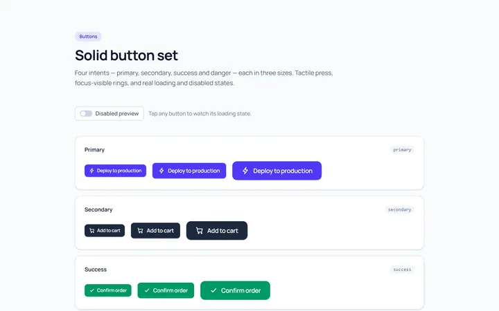
Solid Set Button
OriginalA set of solid buttons: primary, secondary, success and danger, in three sizes.
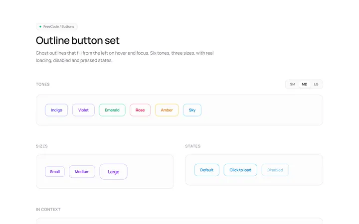
Outline Set Button
OriginalOutline button variants across colours and sizes with a hover fill.
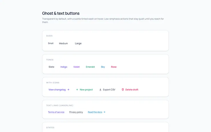
Ghost Set Button
OriginalGhost and text buttons with subtle hover backgrounds.
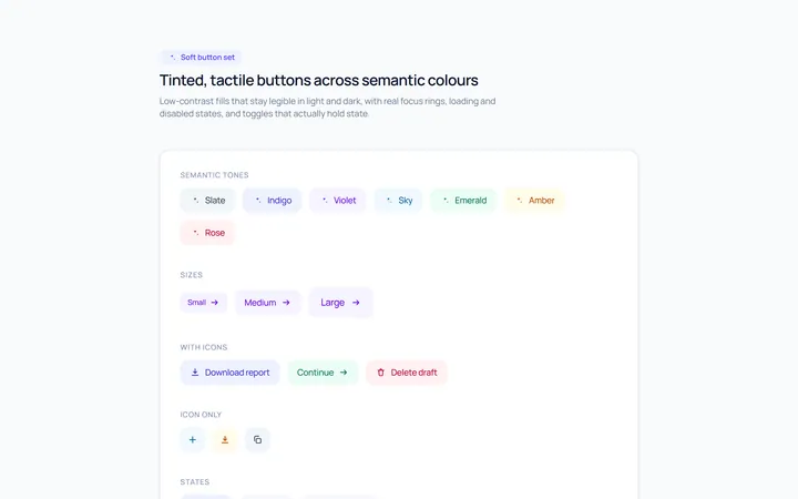
Soft Set Button
OriginalSoft, tinted buttons across semantic colours.
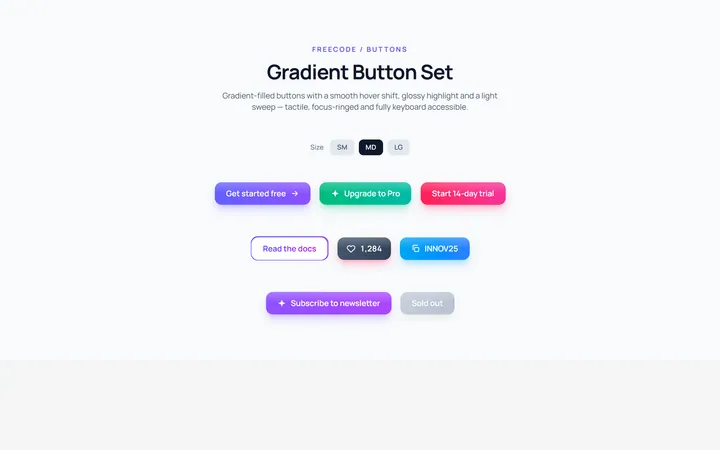
Gradient Set Button
OriginalGradient-filled buttons with a hover shift.
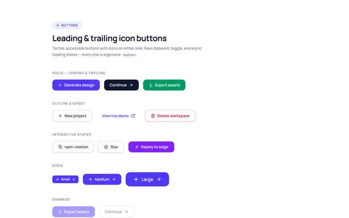
Icon Leading Button
OriginalButtons with leading and trailing icons.
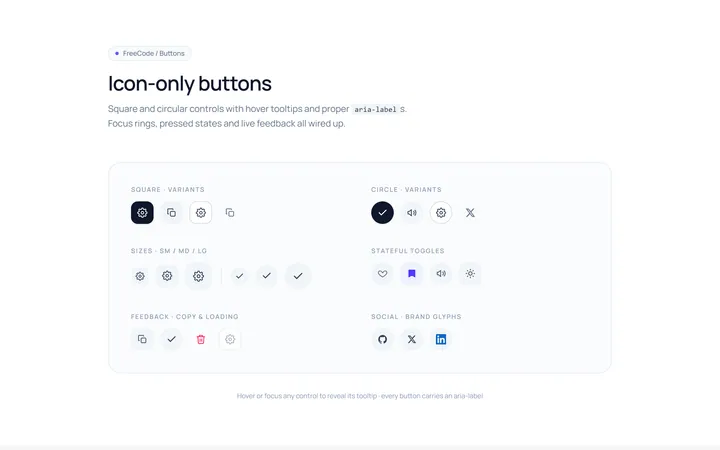
Icon Only Button
OriginalSquare and circular icon-only buttons with tooltips and aria-labels.